

About three weeks ago, I quickly painted a small flower painting while sharing my thoughts about painting softly (see this blog post, which also includes a video).
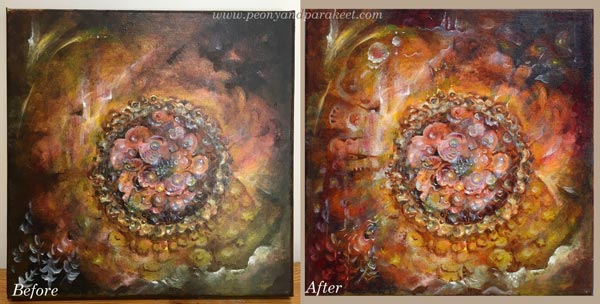
During the past weeks, I have been wondering what to do with the painting. I thought it could be a little more detailed and tell a bit more glorious story. So this morning, I decided to work more on it. Some artists are always afraid of “over-working” their paintings. But I belong to the group who thinks that the painting is almost never fully finished. There seem always to be more ideas I could add and more adjustments I should do.
1) Painting a Decorative Frame
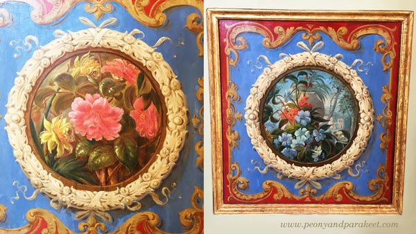
This time I decided to use a selection of old decorative art as an inspiration source. I picked photos that I took from the visit to Vatican Museums in June. I often work like this: letting images spark ideas that I will add to my work. It’s not so much “copying” but picking concepts or generic ideas. My first inspiration came from these decorative panels.
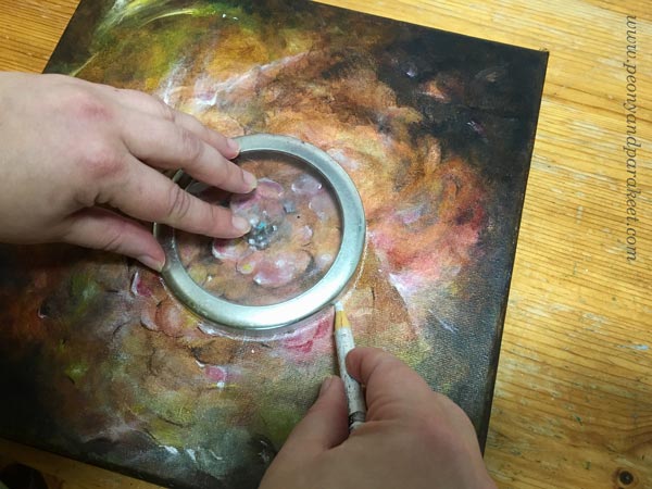
By using a Chinese marker, and a lid of a jar as a template I drew a circle on the center.
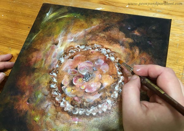
A huge porcelain piece and a beautiful ceiling inspired me to paint a frame with lots of swirls.
I just added some burnt umber around the drawn line and then painted the swirls in white. I added several translucent layers to make the shapes look more three-dimensional.
2) Playing with Colors and Shapes
The next ideas came from this picture. It’s one of the many beautiful ceilings, so full of images and details that it’s almost overwhelming.

The ceiling inspired me to add more color variation to the painting. I used mostly ultramarine blue, ochre, and cadmium yellow on the center, and quickly some elements with white on the bottom left corner. While waiting for each thin color layer to dry, I pondered what to do with the rest of the painting.

I almost heard a voice saying: “Stop right here, don’t ruin the painting!”
3) Letting Go – More is More!
While browsing the photos taken from Vatican Museums, I remembered the astonishment that came from the number of visitors there were. It was Friday afternoon, but the area was packed. Each huge corridor was filled by us, tourists walking and staring at the beautiful ceilings. The Sistine Chapel was even more crowded. Frescos, mosaics, statues, paintings and decorative textiles covered the surfaces. Everything was full in every possible way. And now in Finland, I was sitting in my half-empty studio with my half-empty painting.
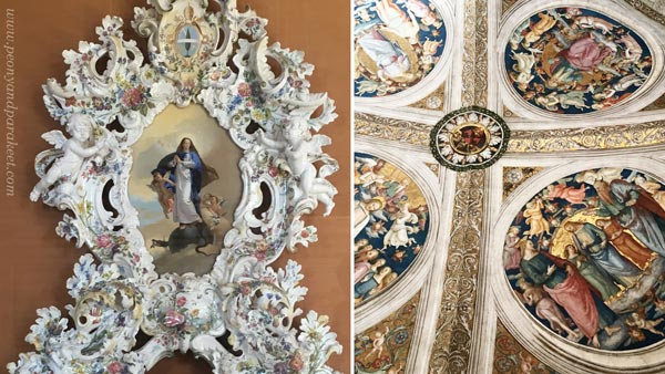
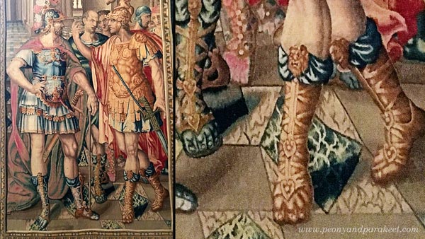
So I said to myself: “Go for it!” And took some extra boost for my confidence by examining a photo of a wonderful wall textile. If men can be this decorative, why not just continue the painting!
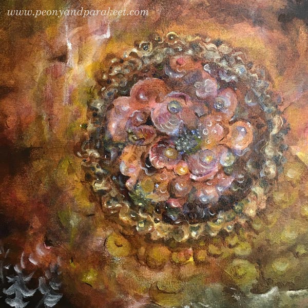
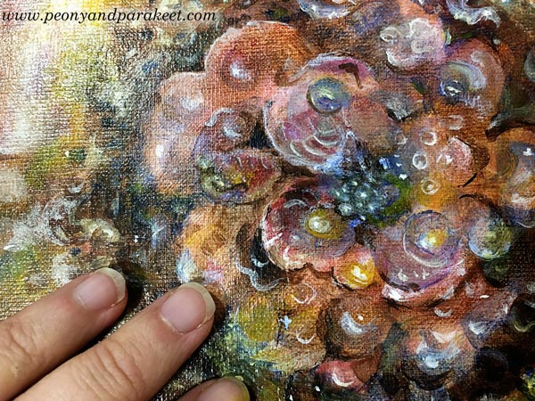
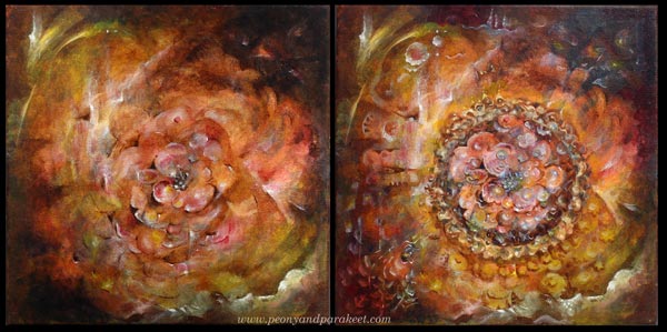
I worked more with the center of the painting, making it grow towards the edges.
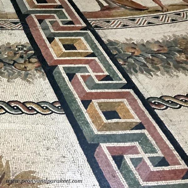
A detail of a mosaic floor gave me an idea to combine geometric shapes with curvier lines.
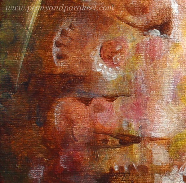
Here’s a close-up showing tiny additions on the left:
4) Bringing up the Expression – Highlighting the Visual Message
Before the final touches, I still had some stiffness in expression. To me, it’s often difficult to fully trust my intuition unless I know what I am expressing. I was almost finished when I realized that my painting is about being a queen of the fantasy, ruling every little detail, making ships change their direction on the sea, and wearing a crown that shines further than anyone could imagine.
Some Close-Up Photos of the Flower Painting
Ships sailing:

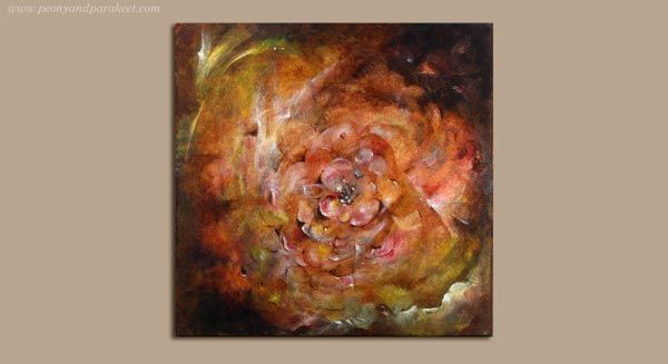
The center. This is a very small painting, only 12 by 12 inches total:
Floral Fantasies
Lately, I have been more and more aware of the fact that I want to paint fantasies. To me, the first version of the painting was too bland. I dress modestly, I hate wearing too much jewelry, my home is not full of stuff, and still, I want my art to be full, to go beyond what’s expected and accepted.
I am currently preparing a new online workshop about painting flowers … If all goes well, it will take begin in October.
Let me be your art teacher: Subscribe to my weekly emails!
This makes me smile, oh Queen of Fantasy!
Thank you, Carla 🙂
I love the sailboats! Thank you for this mini lesson. I could see your phase paintings but not your references photos.
Thanks, Wendy!
this is so helpful to be in your head and thoughts…thanks for sharing the process
Thank you, Carol!
You always inspire me so much! Thank you for your courage and your ability to encourage others!
Thanks, Vicky, so good to hear that!
Agree with the lovelies who posted above. Loved your original and would never have dreamed to enhance it the way you did – so beautiful, so much richer and, with your narrative, really fascinating! I too take tons of photos “for reference” on holiday and yet never know how to use them in my paintings. Will try to relook at them now…
I came back to look at this lesson again and now I can see all the images that you are using. I am amazed the painting is only 12×12!
Thank you, Wendy! After observing this painting for a while now, I think I am going to change a couple of details before varnishing it.
From the beginning, my favorite part of this wonderful painting is in the bottom right corner – what I thought were clouds. Then I was able to see clearly they were waves on a turbulent but awesome sea. Thanks to Wendy’s comment above, I see the sail boats – I’m so glad I didn’t miss those. Truly wonderous painting.
Thank you, Mary! That’s my favorite detail too!
I also have a question – did you stand at a distance to make the geometric shapes? I would think that it was very hard to do without looking contrived unless you were at a distance. Is that why acrylic and oil brushes are longer? Oh, I also love that little bubble at the top left with tiny ones attached. At least I think it is a bubble. If I could wiggle my nose and say some magic words, I would instantly be in your home looking closely at your wonderful works of art – what a wonderful wish come true that would be.
Mary, when painting something this small, I don’t stand at a distance but sit at the table!