Artistic Line Drawing – What Do You Think About This Course Idea?
To me, all visual art begins with drawing. When you want to get to know yourself, draw! When you want to develop as an artist—say, as a painter—draw! To draw is to think. Make your lines come alive, and gradually, a whole new world will emerge, even on a small piece of paper. That’s what artistic line drawing is about.

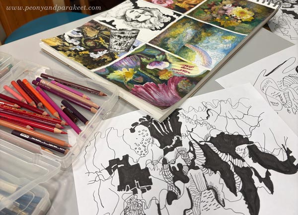
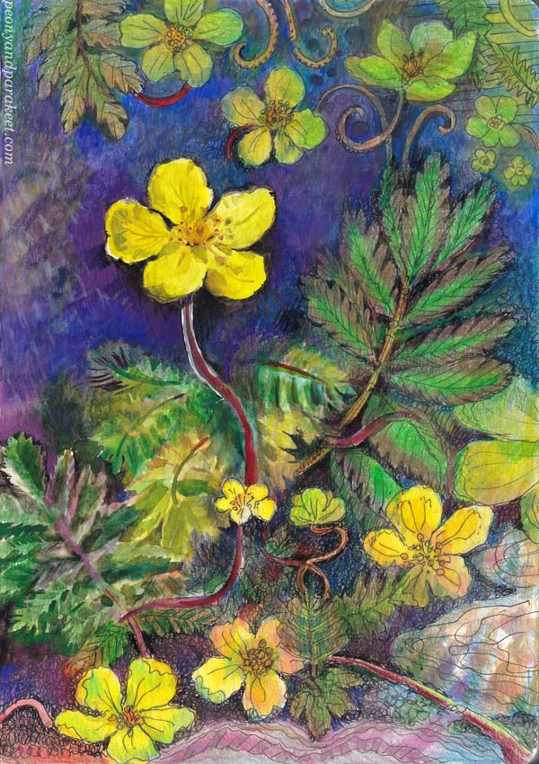
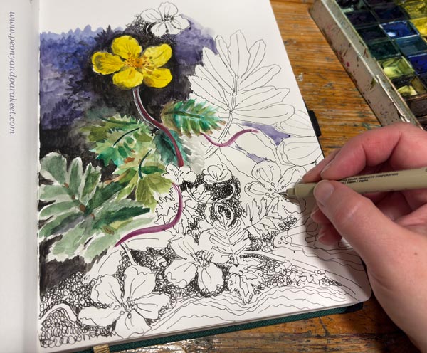
Black drawing pen and colored pencils.
Past and Present Drawing Courses
In most of my courses, drawing plays some role. Free and artistic line drawing is especially close to my heart. In the past, I have taught two courses on the subject: Inspirational Drawing and Inspirational Drawing 2.0. These are already retired. Of my current courses, Mystical Minis comes closest to these.

Passion For Teaching Artistic Line Drawing
For some time, I have wanted to offer more help with line drawing. Not just how to draw, but also how to alter the process to take it in a more artistic direction. By “artistic,” I mean moving beyond the conventional and creating something that is both personal and at least partly abstract. I want to speak especially to those of you who want to create freely and push your boundaries—both in how you think and how you create.

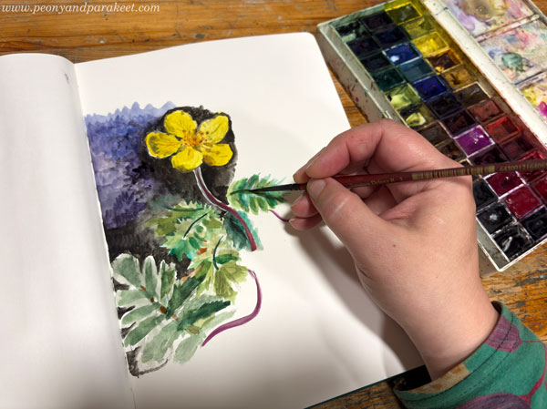
Watercolors and colored pencils.
At first, I thought the material I had gathered over the past few months would be just for these blog posts. But as I have started to unpack the topics, I find myself wanting to share more than what fits into a single post—to show things in both theory and practice. So, I’ve started developing a new course, under the working title Artistic Drawing.
Artistic Line Drawing – Course Themes

Here are the themes I have selected for the upcoming course:
- Ways to Start a Drawing: I want to help you explore how you begin. You can approach your drawing like an architect, building a clear structure first—or like a gardener, letting everything grow from a single seed.
- Letting Go: If drawing does not make sense and feels directionless, letting go can be difficult. I want to give tips on how to feel free and draw anything without too much inner resistance.
- Interaction: I want to help you notice the possibilities of interaction in the creative process. This is about both how you speak to yourself and how you work with drawing. For example, a line you draw can invite another line to join the conversation.
- The Scale of Shapes: An impressionist draws in a pixel-like manner, placing tiny dots one after another. An expressionist creates larger, vector-like shapes. I want to help you use both approaches and find the combination you enjoy most.
- Presence: At its best, your drawing radiates presence. I want to help you become like a singer who doesn’t just go through the notes, but pours their whole soul out to the audience.
- Clarity: You can begin a drawing with plenty of elements, but towards the end, it is worth striving for clarity. I want to help you discover a minimalism that is not based on scarcity, but on the ability to pick the essential.
- Sense of Style: I want to help you find the things you want to add to your drawings, and the ones you want to get rid of. It is not just about developing a style, but also about developing your sense of style.
Which of these themes interests you the most? What else do you hope to be included in the course?
Three Brave Questions to Ask Yourself about Your Art
This week, I have questions about your art, and I will also share my answers as an example.
As an artist, you’re always asked: 1) where do you get your inspiration, 2) how is your art made, and 3) what does it represent or mean? But when you want to go deeper and find answers for yourself, answer my set of questions instead!

My questions about your art are not positive, but negative. They are braver, but also more grounded, and I think they can be more useful than the ordinary set. When you look at your art through what you don’t instead of do, it can be easier to see what’s truly closest to your heart. If you only dare to admit the truth…
Question #1 – What Subject Do You Always Return to (No Matter How Much You Resist It)
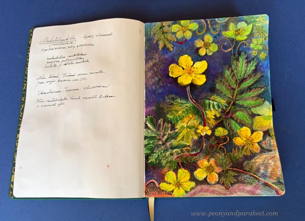
For some, it’s portraits; for others, landscapes. For me, it’s flowers. I actually feel a bit embarrassed about being a flower painter. A woman over fifty, painting flowers … you know the stereotype.

But I feel like my love for flowers and plants runs deeper than many artists. I have rare orchids, a flower garden, and I see flowers as pets with personalities.

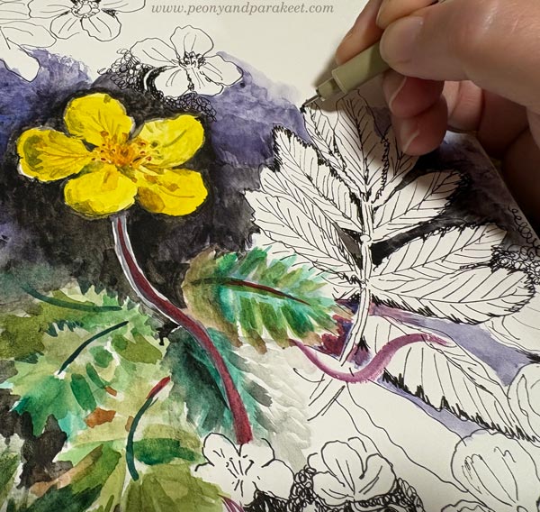
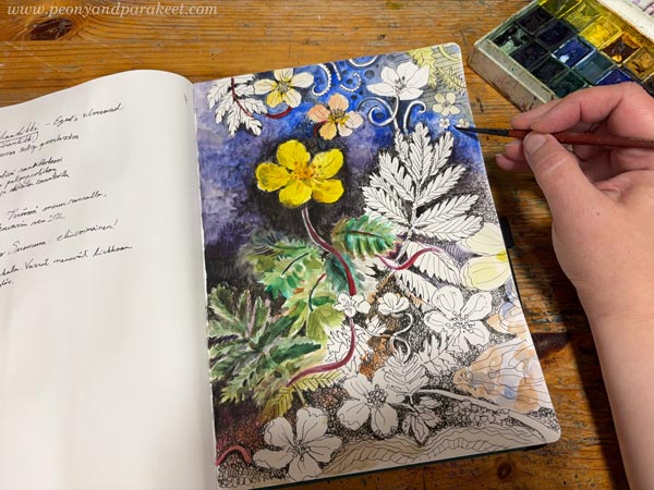
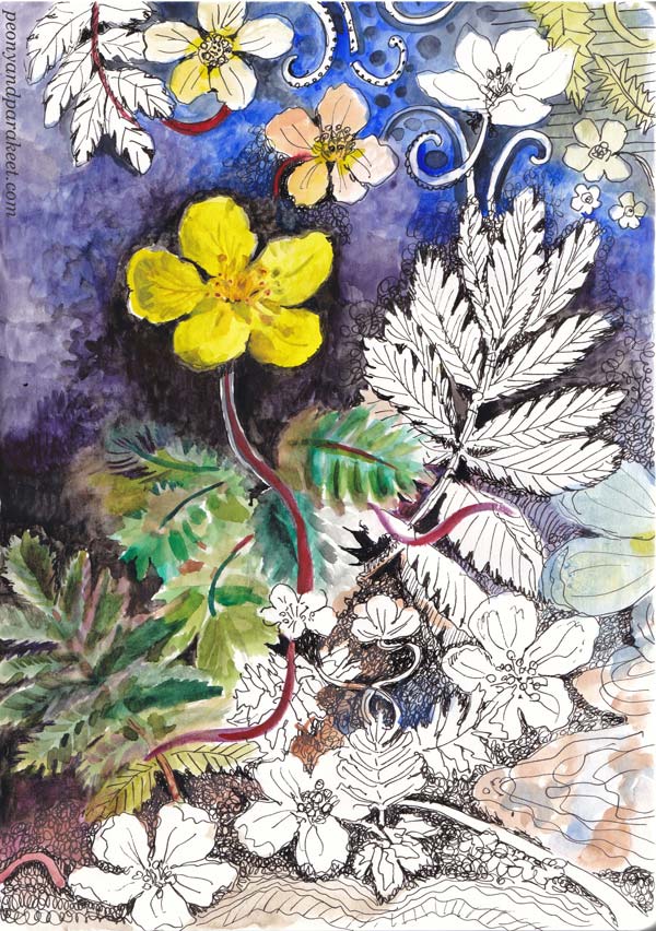
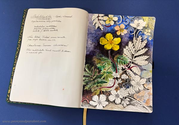
But I also have to admit that I planned to create a drawing of a female figure for this blog post. It never got past the early stages; I just wasn’t inspired. Then I tried an abstract idea. I started several, but still nothing. I wasted at least four hours and filled the bin with my scribbles. Finally, I gave in and drew those flowers.

It was so much fun. I felt like I found myself again. “This is so superficial, Päivi!” a voice inside me said, while at the same time: “I love this world above the clouds, where flowers bloom, and everything shines.” So, I’m sorry to post flowers again!
Question #2 – What Do You Break in Your Creative Process?
Rather than convincing yourself how you follow the tradition and how you build the image, think about the cracks in your process. What should you do, but you really don’t? How does that affect your art?
There’s one stage I always try to avoid: sketching. Predictability just kills my motivation. That might be why I don’t draw people so often. When I was creating the course Doll World, I learned how to sketch human anatomy. It’s a very useful skill, but it didn’t stop me from avoiding it. It’s nice to know I can draw a person in any position, but at the end of the day, I’d rather be drawing flowers or ornaments.

For my oil paintings, I do some prep work by researching and writing down ideas. Sometimes I’ll doodle something small in my planner among the written notes.

But I do practice drawing a lot. Even the drawing for this post is kind of a study for my paintings.

However, I never recreate the same image. I want to break that predictability and leave room for those sudden “aha!” moments.

No sketching, no pencil/eraser thing – I’m a little embarrassed by this answer. I have so much respect for the old masters like Rubens and his peers; I think about them every day. I’m also constantly trying to improve my technical skills. But — and Rubens is probably rolling his eyes now — I try to do it without sketching!
Question #3 – What Do You Defy With Your Art?
The world is full of good things that inspire us and that we want to promote. Of course, we would like those things to add meaning to our art as well. But I believe that creativity can’t be forced. You can try to overlay meanings onto your art, but that will only obscure its essence and remove its clarity.
With my art, I’m not defying authority, climate change, social division, inequality, or war. There are many things I oppose as a person, but for some strange reason, they have nothing to do with my art. My art is about defying something as mundane as everyday life.

I respect those who capture the everyday, but that’s just not me. I’m not the kind of artist who sketches the houses in her neighborhood or portrays the ordinary lives of ordinary people. My art doesn’t come from the beauty of the everyday; for me, beauty begins where the everyday ends.

Now I should mention that I’m not a particularly “special” person myself, even though I’m a full-time artist. I work regularly and with discipline. In my free time, I mostly walk the dogs, take care of the plants, do crafts, and clean. I wear wool and cotton.

But when I’m making art, everyday life is far away. I admire the Baroque, rare collectibles, palaces, luxurious fabrics, and historical gowns. I’m a romantic, a nostalgist, and an avant-garde thinker—anything that rises above the mundane pulls me in like a magnet.

I suppose there’s something superficial and embarrassing in that, too. Isn’t luxury the indication of a materialistic mindset?
What’s Behind the Questions about Your Art?
Behind the awkwardly truthful answers, I see a kind of sacredness that inspires me immensely. It’s a connection to nature’s ultimate luxury, to my own intuition, and to a human-made beauty that lifts the spirit.
How would you answer these three questions about your art?
You Can Draw Patterned Papers!
This week, I answer the question: “I want to draw, but don’t know how or what! How to start?” My suggestion is to start with patterns. So, draw repeated shapes and make a collection of patterned papers that you can use for collage art, for example.

The No-Pencil Approach
I usually start my line drawings with a black thin-tipped drawing pen or a blue ball-point pen.
If you say you can’t draw, say goodbye to the pencil era. Don’t be one of those who sketch many parallel lines and erase all the time! A pencil is a crutch that might feel helpful, but trust that you can walk and pick up a pen. The first steps may be scary, but when you risk more, you draw better. Your line is not just a vague and neutral curve, but one that expresses your existence.
Let’s draw four patterned papers!
Paper #1 – Small Flowery Shapes
Pick a tiny piece of paper and a pen, not a pencil. When you can’t erase, you focus more and draw better. Small paper doesn’t need anything grand, so clusters of tiny flowery circles are enough, and if not, you can add some leaves.

I colored my pattern with colored pencils. The fun thing with colored pencils is that you can use an eraser to add more patterning. I have a precision eraser pen that is handy for small dots. If you use a bigger eraser, color the dots smaller after erasing.

I love colored pencils because it’s easy to layer the colors to get a variety of tones.

People may say: “It’s just a pattern, not a picture.” Or: “Tiny scraps mean nothing.” But I think it’s a packet of seeds, ready to grow and expand. The first paper may be a secret thing, something you glue on your notebook or planner, to freshen up all the mundane words like “To do” or “Meeting at 9 AM.”

Paper #2 – Big Nested Shapes
Let’s get bolder and pick a bigger paper! The shapes should now be so big that most of them are only partly visible.

Draw nested shapes. The first lines define the inner shapes, and the second lines are the outer shapes that group them. These are fun to color! I used felt-tipped pens and strong contrasts.
Then I added circles, stripes, and some color variation with colored pencils.

When the motifs are big and the colors bold, the shapes can be quite simple. The Finnish design company Marimekko has produced great patterns over the years. See inspiring examples here at Marimekko’s site!
Paper #3 – Dynamic Strokes
Pick a pen with a brush tip. You can also use ink or watercolors with a paintbrush. Draw clusters of three intersecting strokes. Then draw curvy lines that travel around the strokes. The result is dynamic and looks like flying trees or the sight when looking up at the trees. You can add small, flowery shapes and circles too.

I also played with the background and added a free-form low-contrast grid that is like a city map or a tiled wall. The more you draw patterns, the more you will cluster and layer. This way, you will gradually move towards making expressive art rather than staying in the area of surface design.
Paper #4 Traveling Line
Now let your line travel more freely. Repeat what you have learned in the previous exercises, but do it in a more relaxing way, without too much care about what comes on paper. Think about the line being just a foundation for coloring.

When the first lines are just a foundation, you can add decorations like swirls and small dots, which are often seen in surface patterns. Some motifs might be more decorative than others, and the result becomes more like scenery than a design.

I used a regular ball-point pen for the first lines, then colored the paper with watercolors, and finally added decorative details with colored pencils.
To Draw Freely? – What It Is
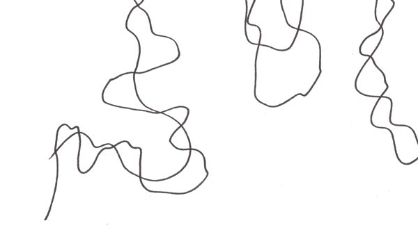
Drawing means letting your pen take the lead. It means guiding it forward, meandering, and turning. It means traveling your own paths, daring to go back, and driving over and past them. When drawing freely, you don’t really care about the destination, but you want to enjoy the ride.
Your pencil should be firmly on the road, but not so heavily that it’s hard to move. A person who travels with their pencil and focuses on the line knows how to draw, unlike those whose line merely flits across the paper before fleeing. Drawing isn’t about the line representing something, but about the line having someone who treasures it.

Extra – From Hand-drawn Paper to Digital Kaleidoscope Pattern
If you can use image processing software like Adobe Photoshop, scan or photograph your design and duplicate it several times. Flip some copies vertically and some horizontally to build a continuous kaleidoscope pattern.

Draw and Use Patterned Papers -More Inspiration
Use your papers! See this project: Painterly Collage in Rut Bryk’s style
Create more paper and make collages: See the class Collageland
Draw freely: See the classes Intuitive Coloring, Joyful Coloring, and Mystical Minis
Modernistic Style – Create Abstract Art Step by Step!
This week, we take a practical dive into modernistic style. My favorite modernist painters are Birger Carlstedt (1907-1975) and Sam Vanni (1908-1992) from Finland. The most famous modernist was, of course, Pablo Picasso, who was Spanish.
My piece has some figurative elements. Although it’s abstract, you can also see plants and light.

With this technique, you can create a fully abstract piece like Birger Carlsted (see examples from the past exhibition at the Amos Rex art museum), play with the perspective like Sam Vanni (see his artwork called Polydimensional Space), or use linework boldly like Pablo Picasso (see how he used strong outlines in his famous artwork Weeping Woman).
Supplies – Watercolor pencils or Use What you Have!
I created my piece on thick drawing paper with watercolor pencils and water. Its size is 16 x 16 inches (about 40,5 x 40,5 cm). You can choose your supplies and the size of your artwork freely.
Step 1 – Fill the Background with Colors
Don’t overthink, but just start adding colors!

You can play with shapes if it helps you keep going.

The idea is to cover most of the paper. Leave an area near the center blank if you are not working with paints that have bright white. For colored pencils, watercolor pencils, and watercolors, the best white is always paper white. To get some white and other pale colors in your finished piece, leave a fairly large area white at this point. Later, you can reduce its size and break it into several shapes.

My paper is quite big, so I change the orientation once in a while. I move from one area to another by first coloring an area with a pencil and then spreading the color with water.

Add layers and darker colors. At the end of this step, your paper looks like a landscape without the horizon.

Step 2 – Draw the Shapes
Use the filled background as inspiration and draw intersecting geometric shapes. A ruler can be handy here.

I use watercolor pencils for drawing the outlines.

Step 3 – Color the Shapes
Modernistic art often has strong colors. Now add more color to the shapes.

You can fill shapes creatively. Use stripes and add textures. Some shapes can have bold colors, others more muted. If there are nice details in the background, leave them visible.
You can also draw new geometric or more freeform shapes.

You can adjust the shapes, for example, by changing a straight line to a slightly curvy one.

After you have gone through all the shapes, decide how abstract you want your piece to be.

I wanted to add a bit more realism: make more organic shapes and express light as well.
Step 4 – Finishing
Carefully go through every shape one more time. Don’t just look at the big picture and adjust the composition. Focus on a small area at a time, and make it as expressive as you can. Remember that a modernistic style is quite minimalistic and based on abstract expression. Refine existing colors and shapes instead of creating more and more new ones.

Make sure that all the shapes are not similar in size. I created small dots by removing paint with water and drew some thin lines.

Simple But Rich Modernistic Style
By starting with the background first, you can achieve subtle richness for a minimalistic look. Here’s a close-up where you can see the effects of the background layer.

It’s good to keep all the best things – bold colors and interesting details – in the center. Often, the composition needs nothing else!

The more you learn about different styles, the more unique your own style will be. A style is never just one thing, but a combination of many. I hope you enjoyed this exercise!

P.S. Check my class Mystical Minis for creating more modernistic abstract art!