
How I Reworked and Softened My Watercolor Painting
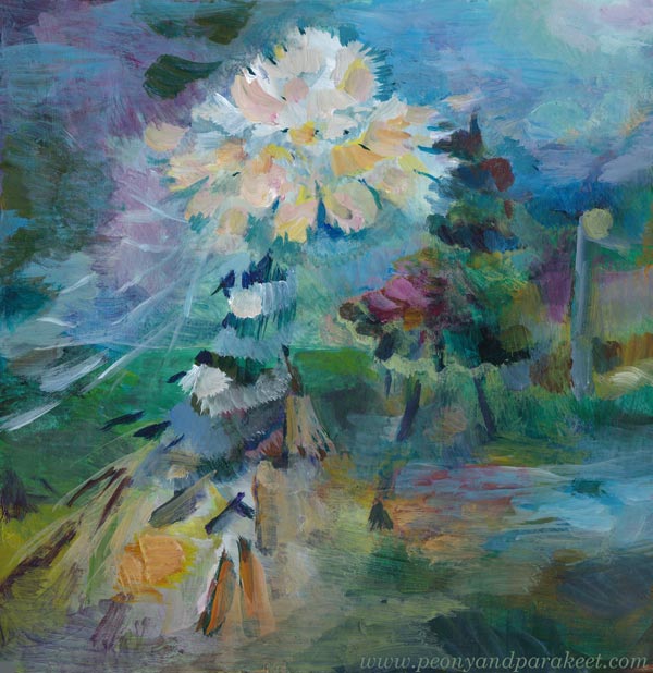
This week, I brought out a flower painting I made three years ago and reworked it. Or I would rather say: softened it.
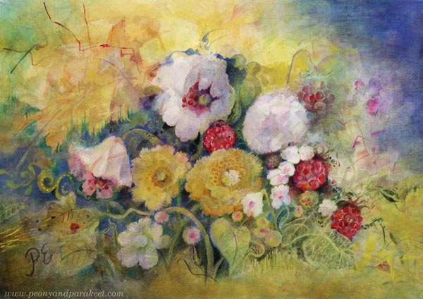
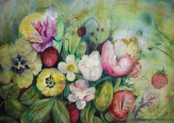
Here you can see the original version. In it, I had practiced a technique I teach in my course Freely Grown, where you start with watercolors and finish with colored pencils.
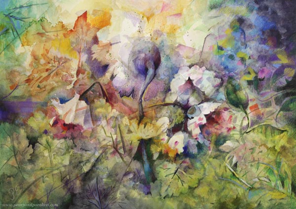
At the end of 2023, soon after finishing this piece, I had a clear vision of the kind of watercolors I wanted to start creating.
Expressing Joy and Comfort
I don’t want to bring the grand, worldly feel of my oil paintings into watercolor paintings. Instead, I want my watercolors to tell small, comforting stories about flowers that keep going through windy times—bringing joy to each other and to the viewer.
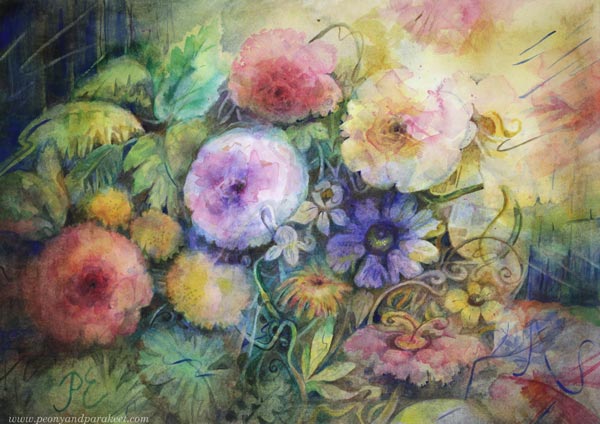
See more pics: How to Create Comforting Art
The flowers in my oil paintings are like wild beasts, divas, or eccentric characters.
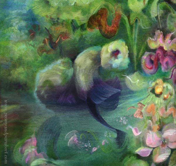
See more pics: Ikigai – Making Intuitive Painting Feel Natural
But the flowers in my watercolors are like fairytale creatures or sweet pets.

See more pics: Emotional Connection with Childhood Novels
With watercolors, I’m not telling an intense story about the birth of the world, but sharing a short bedtime story that lets you fall asleep with a peaceful heart.
Softening the Mood
In this project, I wanted to soften the mood of the original painting, turn the main flower toward the viewer, and remove the colored pencil completely. I started by erasing the pencil marks with an eraser. Then, I soaked the paper in water so the colors would fade. High-quality cotton paper is very durable, so it wasn’t damaged by this process at all. My current favorite brand is Arches.
Then, little by little, I began to paint the flowers into view. I worked slowly, without a clear idea of the exact story yet.
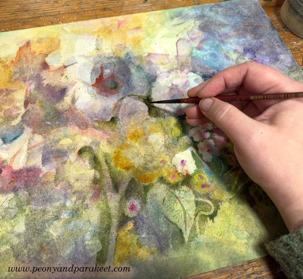
Step by step, the idea grew to add blue and balance it with some smaller red shapes.
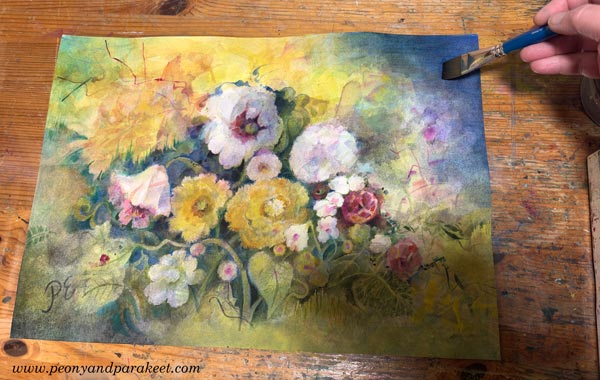
I often add small treats to my watercolor pieces, often strawberries.
But they can be other things as well. Here I added a decorative key.
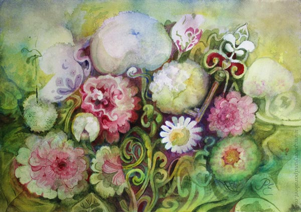
This time, I turned the red spots into raspberries. The raspberries became the main theme of the whole painting: the flowers are serving and eating them, even though autumn has already darkened the sky. I named this watercolor Myöhään kypsyneet (Late ripened).
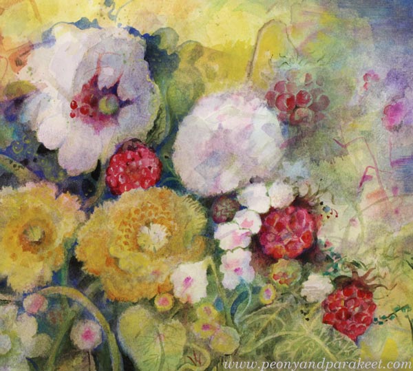
How to Get the Softened Watercolor Painting
When you want to tell a sweet story and share a soft feeling, bring the elements closer to each other so that they are also directed towards each other.
Make most of the angular shapes rounder. You may first feel that your painting is full of roundness, but that’s not usually true. You may have straight stems, angular or pointy petals, and lots of outlined sharpness that isn’t soft at all. Pick a thin brush and slowly add tiny corrections!
Also, reduce business by removing unnecessary elements. Put most contrast in the middle, not near the edges. See how the atmosphere changed when I softened my painting.
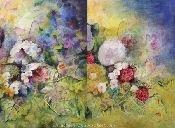
Not All Art Has to Be Soft, but Some Needs to Be
If I paint these sweet little pieces all the time, I get bored and start longing for bigger adventures. But if I don’t paint them at all, the world starts to feel cold, and the only remedy is to come back to my “pets.”
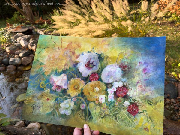
I find it truly lovely when people buy these as gifts. It feels meaningful to be part of that chain of goodness passed from one person to another.
Have you reworked your old watercolor pieces? Would softening work for them?
Recent News with Mystical Thoughts
This week, I’m sharing a bit about what I’ve been up to. This fall has been and will be full!
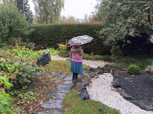
Giving Life to a Line
Creating the course Drawing Soulfully has been one of my biggest projects this year. The videos are packed with content, and making them took a lot of time.
Now, it has been wonderful to see the participants’ drawings and discuss them together. Everyone has their own unique line, and I tried to design the exercises to bring that out as well as possible.
My motto is: Art begins with a line!
And you could also say: Style begins with a line.
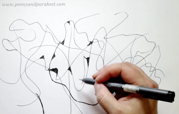
A line can be so much more than just an outline. It can express emotion, movement, space, and spirit.
Tough Break Ended
In August, I finished a series of 10 oil paintings that I had started last year. That was another big project, but as I was finishing up the final details, new ideas were already starting to pop up.
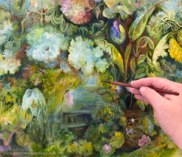
Most of the time, my ideas are connected to broader themes rather than exact subjects or techniques. These thematic thoughts are verbal, so I write them down in my calendar. But writing is not the same thing as expressing yourself visually. The breaks between paintings are always tough for me. First, I’m exhausted, but as new ideas start to pile up, I feel restless and suffocated. It’s like being a fish without water!
Fortunately, I’ve now been able to release the tension and start the first painting of a new series this week. It’s still in its early stages, but I look forward to working on it week by week.
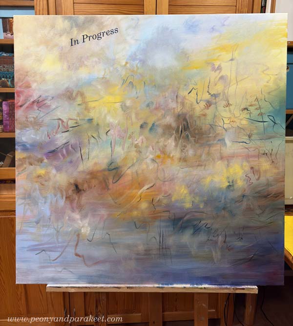
I usually work on two paintings at once, because that way, each painting has a sibling, so to speak, and doesn’t have to grow up alone. And even now, I have a canvas of the same size waiting that I hope to start soon.
Babies, Toddlers, and Hamsters – One Killed!
In my dreams, unfinished paintings and courses appear as babies or toddlers, while smaller tasks appear as hamsters. I used to raise hamsters a long time ago, and even though I don’t have them anymore, my subconscious has somehow given them a symbolic role.
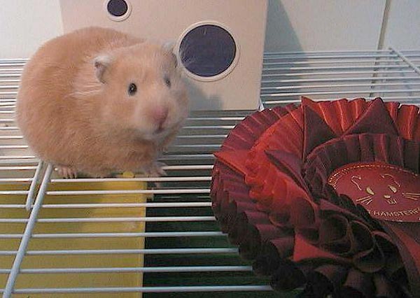
Usually in these dreams, I suddenly realize I’ve forgotten to feed the hamsters—but recently, I had a nightmare where I was trying to kill a hamster. When I woke up, I knew I had to let go of the mentoring program I had been advertising lately.
So, there won’t be a mentorship group, but if you buy any of my courses, you’ll get access to my Bloom and Fly Facebook group where I am very active!
Sales Table Preparation
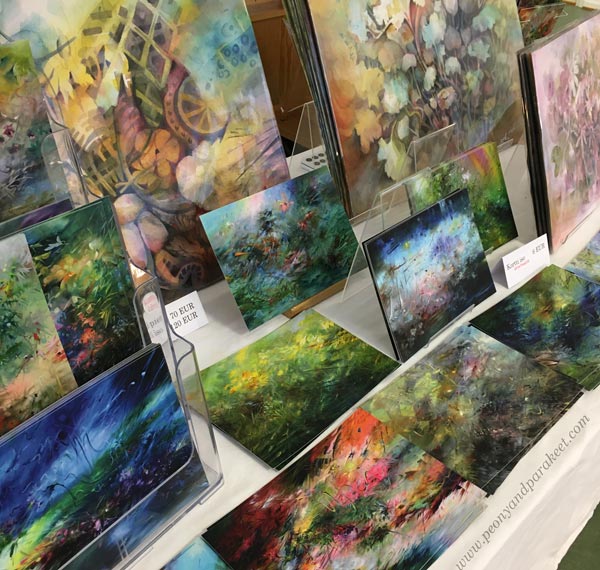
I’m attending at least one art fair at the end of this year. I’ll have cards and prints with me, but I also dug out some of my old watercolors from storage. I should probably touch up a few of them from this pile, as my skills have developed over the years.
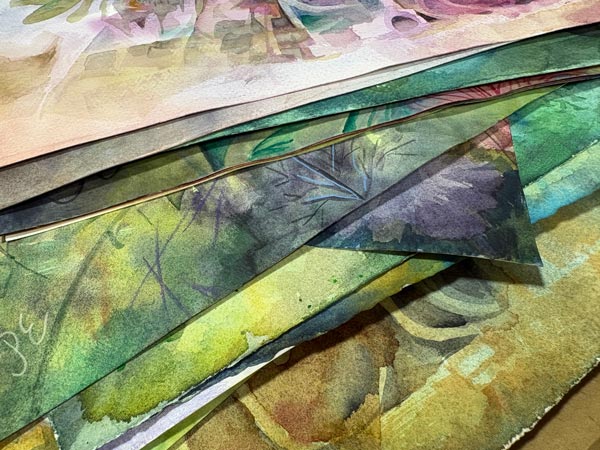
Do you like to see revamped projects here on my blog? Do you ever revamp your art?
My biggest paintings have their own sales channels, but attending a fair is a great way to meet people and see their reactions. The last time I had a sales table was in 2022, so it’s about time!
Mystical Meetup!
Do you remember when I launched a course called Mystical Minis at the turn of the year? Making that course was a mystical experience. It started when I heard a whisper: “Intuitive Power.” I then connected the words to the Swedish esoteric artist Hilma af Klint. The course was made in a flow state, and it’s perhaps my most unusual course yet. I took its structure from a short story by Virginia Woolf and included a third artist, the English painter Georgiana Houghton, in the exercises.

And guess what? At the end of October, a super-interesting exhibition called Arcana Borealis – Northern Women and Esotericism opens in Helsinki. It features paintings by Hilma af Klint and her partner Anna Cassel, alongside other Nordic female artists. I will go to see the exhibition and hope that Hilma starts whispering to me again. I’d love to make a new mystical course!
More Mystical Thoughts
It’s a bit sad that winter is coming to Finland. Our summer is exceptionally bright, but our winter is very dark. Still, I think the turn of the year is the best time for esoterics, as we find ourselves in a kind of extreme state.
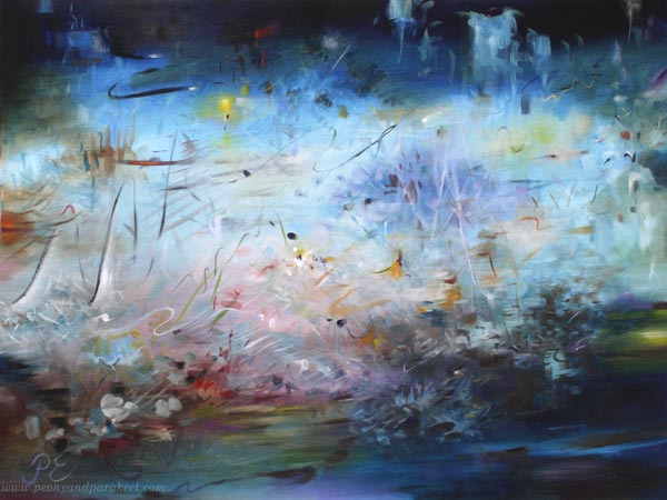
I’ve also been thinking a lot about what our world needs right now. My thoughts are that in the middle of fast consumption, we need a deeper connection with ourselves. Whether one believes in the supernatural or not, there is always something mystical and unexpected in going deeper. I also feel that in art, we don’t have to decide what is imagination, what is intuition, or what is a stream flowing directly from the outside.
Just by stopping to look and listen more closely, we bring mystical depth into our work. Visual poems start to rise, quieting the outer world.
What do you think?
Loosen Up Your Art!
This week, I want to share what I think about the popular art term: “loosening up”. For me, loosening up isn’t about interpreting a reference minimalistically and thus aiming for something more abstract. Instead, I loosen up when I create freely. Imagination, empathy, and playfulness play an important role in this kind of art-making.
Loosen Up Your Art – Watch the 1-minute Video!
I find this free approach inspiring, and it makes every piece an adventure.
Imagination and Intuition
The longer I have created freely, the more I have started to value the ideas and expression behind the drawings and paintings, and not just focus on their technical quality.
Yes, we want to grow our technical skills, but it can’t be the only goal! The flow of ideas and inner connection matter. Thus, loosening up is freeing the mind and creating a mental connection, not just strokes.
Imagination and intuition – how important are they to you?
Join My Mentorship Group at Mastrius!
My mentorship group is for aspiring artists who want to create freely without references and find their style.
Together, we will step away from the traditional route and enter the jungle where anything is possible. That jungle is the place where loosening up happens.
Mentorship Group in a Nutshell
- Zoom meetings in a small group.
- Personal guidance and feedback.
- Ongoing monthly membership. Join and cancel anytime.
>> Join here!
Painting Nature, Releasing the Dragon
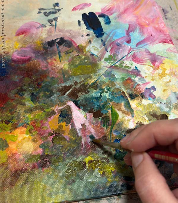
I love painting nature freely and intuitively —without reference photos, or even a clear image in my conscious mind.
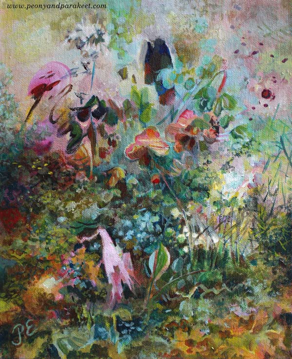
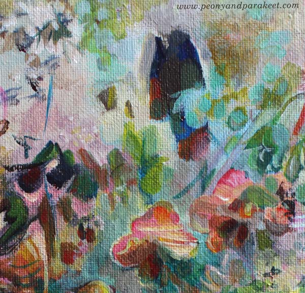
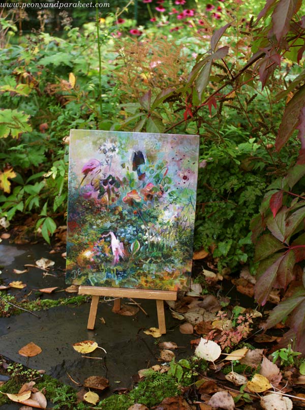
For me, the best way to create is when the picture simply flows from the pen or brush. It feels like my whole existence is tied to it. When I took this small abstract painting to the garden, it became clear where the inspiration had come from.
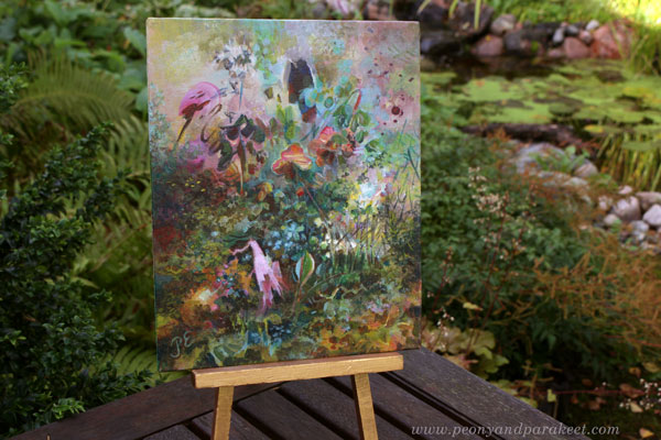
For me, nature feels freedom. And if I cannot make art freely, I get irritable and the colors disappear from my life.
Living in Between
Recently when I have been living in between painting series. One series ended, and the next one has not started yet. I have been gathering materials and ideas, thinking about canvas sizes, and all that planning is driving me crazy.
Yes, crazy!
I feel like I just need to create and create—the new images are already pushing to come out!
Still, this time has been meaningful. I have been working on my newest course, Drawing Soulfully, which is very close to my heart. As I have edited the instructional videos, it has been satisfying to pack deeply considered content – the explanations of how to create freely and grow that skill – into each minute.
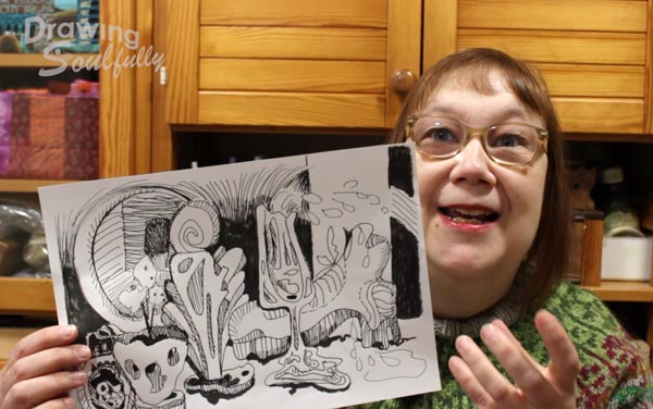
And it has been a pleasure to see the artworks from the participants. They are amazing, and I am so grateful I am able to see them.
Intuitive Nature Painting
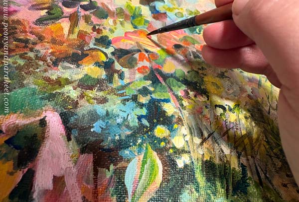
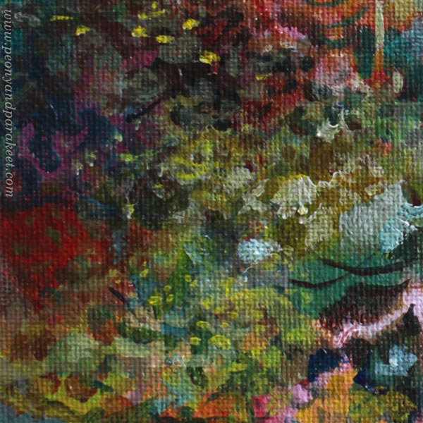
This week on Monday, however, I rushed into my small studio feeling like I was about to burst. “Give me some paper or anything!” I yelled to myself. I found a small canvas board, grabbed my acrylic paints, and started painting.
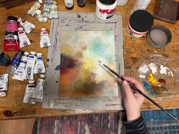
“What are you painting, Päivi?” I felt like asking myself, but soon swallowed the question.
There are artists who choose reference photos, plan color palettes, study the direction of light, reflections, and shadows, and paint landscapes of clearly recognizable places. All honor to them! But to me, nature appears as a system where one thing follows another.
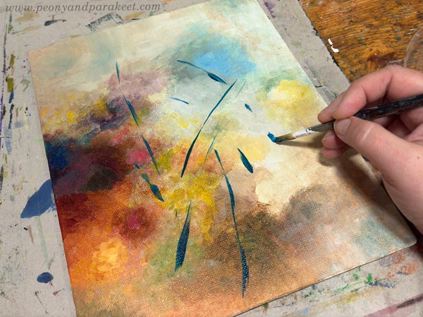
When I start painting, it’s like turning on a machine, and the machine feels both intuitive and logical.
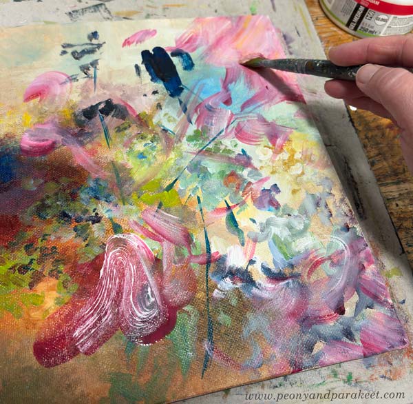
As the picture begins to take shape, I feel like I jump inside it, breathe its air, and hear its sounds. At the same time, I feel the tension inside me loosen and peace return to my mind. It’s the magic of intuitive painting! No shopping, scrolling, or even walking in nature gives me that same feeling.
Creative People Have Their Dragons
There is a lot of creativity in the world that people try to suppress by consuming more stuff, looking at more content, and seeking more experiences.
I also do those things. I often get the feeling that I should go buy new art supplies, browse master paintings online, or take photos of nature—right when the best solution is to just start creating. It is as if I have a dragon inside me that eats up beauty the longer it is kept locked up. But once it is released, it flies, carrying even heavy burdens with ease.
How about you? Do you ever catch yourself consuming or planning when you should just be creating?