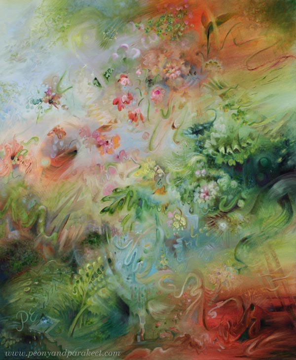
Ikigai – Making Intuitive Painting Feel Natural
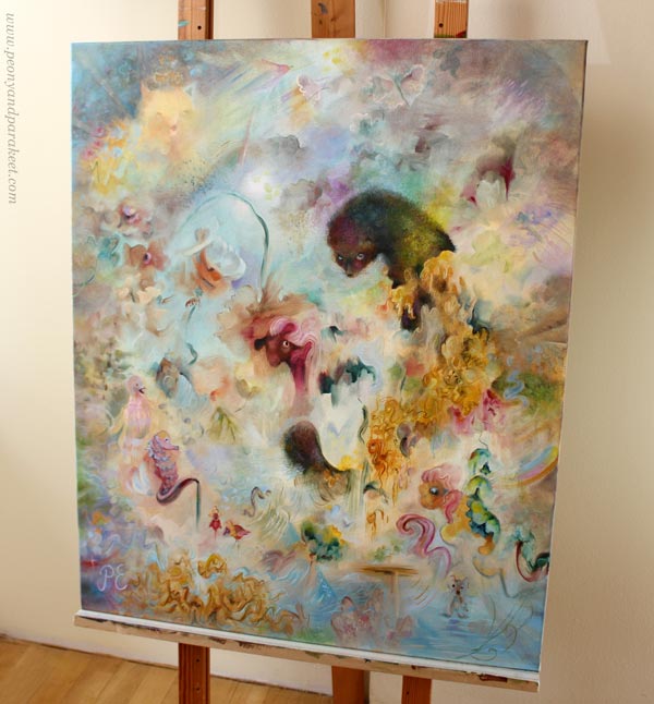
This week, I show you my newest oil painting, ‘Ikigai,’ and talk about how intuitive painting can become logical, and how a logical painting can feel natural.
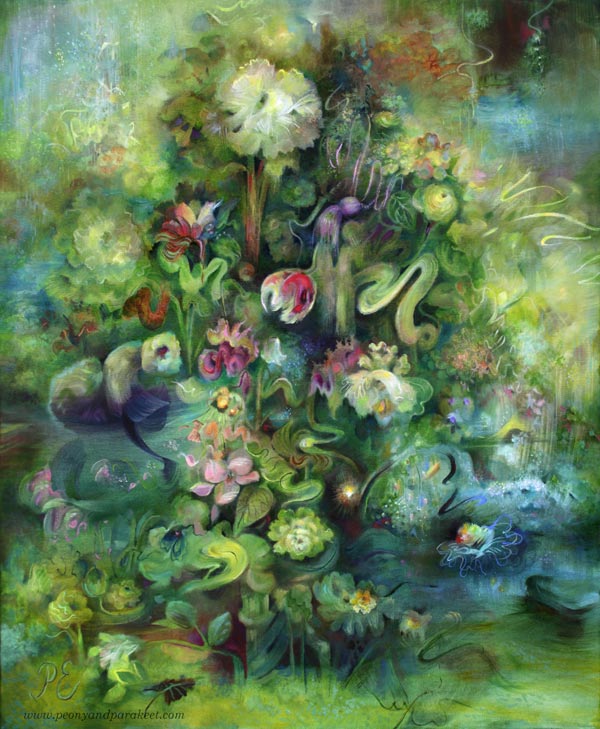
There are many extraordinary elements in this painting, but it still feels quite realistic and natural.
Find the Guiding Element
When you create intuitively, the first layers get all kinds of random details. After that, it is about:
- What to save
- What to tone down
- What to highlight
- What to hide
- What to add
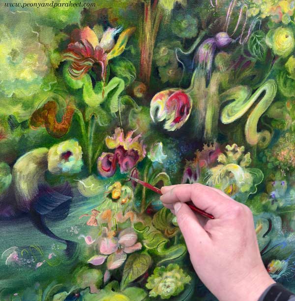
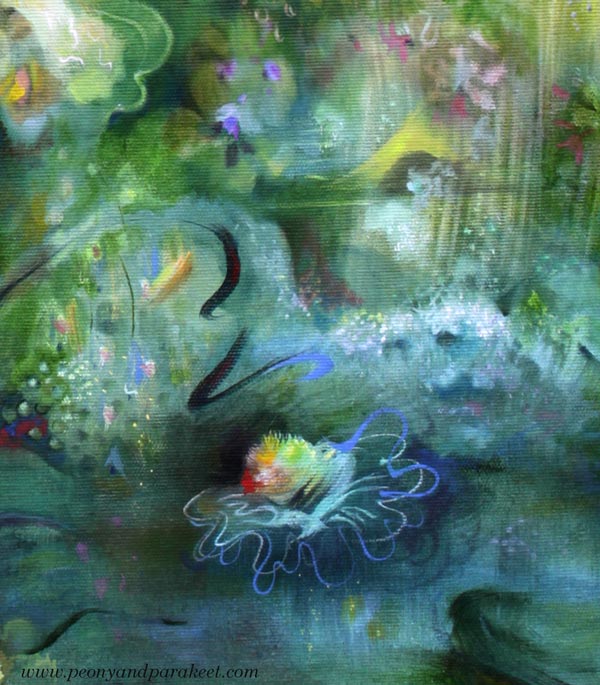
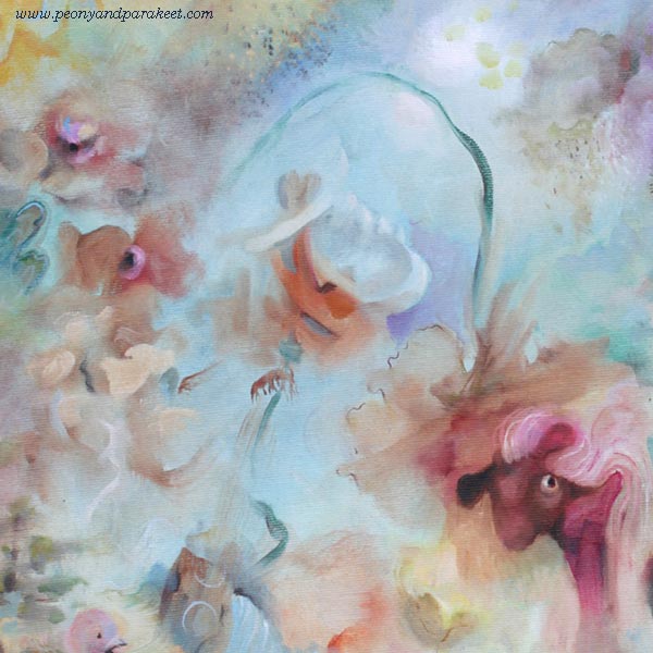
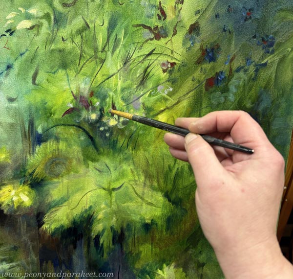
In Ikigai, I looked for an element where the canvas had already come to life as a painting. When I found it, I protected that pulsating spot so that its spirit spread and a small world grew around it.
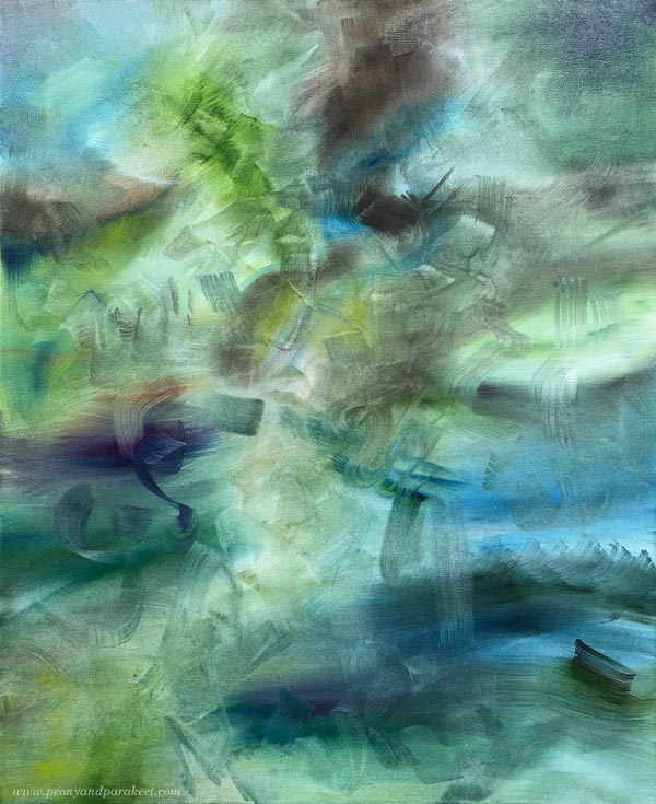
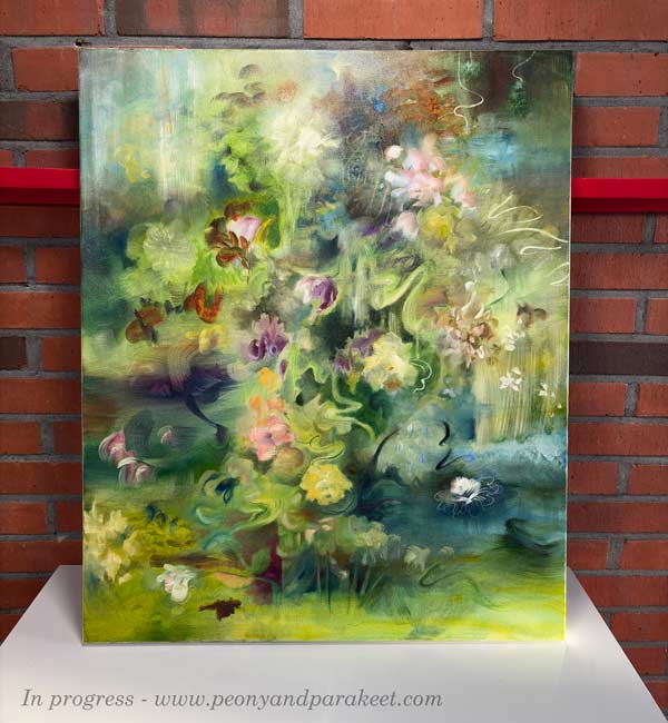
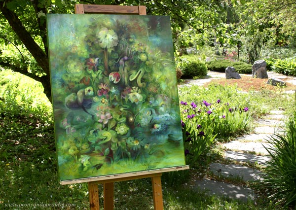
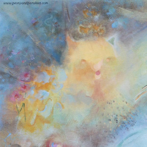
Can you already guess what element guided me through the whole painting? The picture above is the first layer, and the picture below shows the painting in progress.
Intuition is like a whisper that can expand into a stronger sense of presence. That requires time and skills, but also logic.
From Writing a Course to Painting a Picture
Lately, I have been writing a script for a new course (some info). The more courses I make, the more I realize how important the script is. Having a script doesn’t mean I cannot choose my words freely when speaking to the camera. It also does not stop me from throwing myself fully into the drawing exercises while the camera is rolling.
Course videos include many different elements: theory, examples, explanations of the process, and reflections on artistic thinking. All of this needs a good rhythm. I need to know what I am saying and how freely I am speaking in different parts of the videos. My goal is to build a logical educational structure behind the course, without forgetting the human side of making art. I want my courses to be inspiring, entertaining, and encouraging, but also educational, so that you will move forward in your art-making.
Painting is very much like making videos. Even if you didn’t sketch beforehand, you still need structures and ways to connect single elements into a whole. You need both technical and expressive skills. It’s also beneficial to be able to see what is essential and to understand the role of logic.
The Logic Makes the Magic
When a painting is logical, it feels natural. Logic in painting does not mean that the picture has to be realistic. Instead, it means that there is interaction between the elements. For example, a weak line can humbly take a curve to go around a strong dot. Or a bright line can send small rays of light over nearby shapes, changing their color. The interaction ties everything together.
Even a static image can feel alive. At its best, you can look at a painting like an event. It’s fascinating how interaction makes the unreal elements feel real. Being able to express ourselves freely on paper and canvas is one of the best things in life.
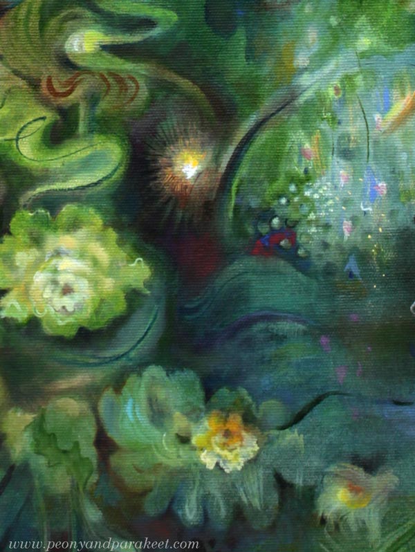
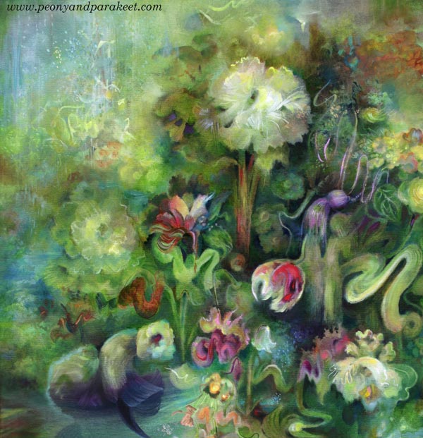
Details of Ikigai
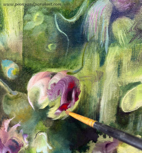
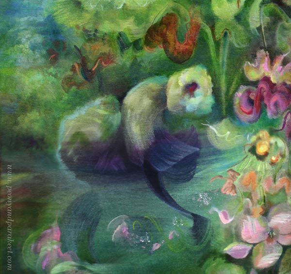
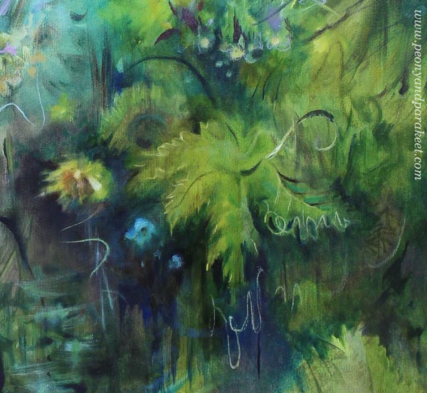
Here’s the guiding element in my painting. I have made some additions to the original strokes, but the spirit is the same.
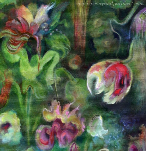
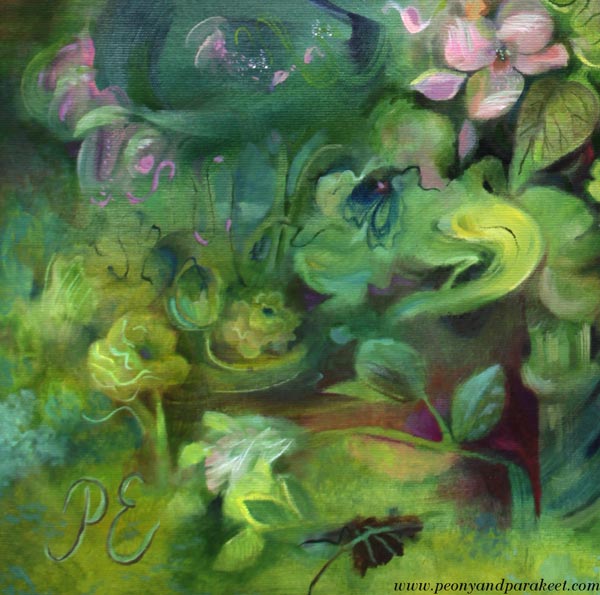
I have noticed that in my paintings, the guiding element is rarely a focal point. Here’s the focal point – the tulip and her two red friends.
Ikigai – a reason to live, a reason to wake up in the morning. According to this Japanese philosophy, we should orient ourselves toward the point where our passion, mission, calling, and profession meet. I feel like ikigai is condensed into the exact moment where night and morning meet.
In the morning, deep reflection is interrupted by the call to action – get things going! And we get up despite all our responsibilities, but also because of them.
I love this kind of contradiction and complexity of life, and I try to bring it out as naturally as possible in my paintings.
The Four Principles of Ikigai and Making Art
Passion – What you love – Intuitively found
Calling – Why you exist, what’s your inner purpose – Naturally rising
Mission – What you do in practice – Needs logic
Profession – Where you are good at – Skill-oriented
The sweetspot is where all are met and aligned.
What do you think?
Can Playful Art Be Serious?
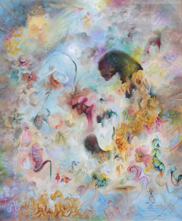
This week, I want to talk about my newly finished painting titled Fauna. This is one of my most peculiar pieces, filled with strange ideas. With this, I want to challenge us to ponder the question: Can playful art be serious?
Ideas Have a Mental Age
This painting combines many ideas. I tend to come up with all sorts of ideas quite easily, and I usually try to categorize them: some make it here to the blog, some become sketches in my planner, and others turn into courses. Only the most mature ones are usually included in the paintings.
But let’s think about this word: mature.
Ideas have a mental age. Some ideas are like those of a five-year-old, while others contain ancient wisdom. For a long time, I have tried to ensure that my best ideas are “sensible adults”.
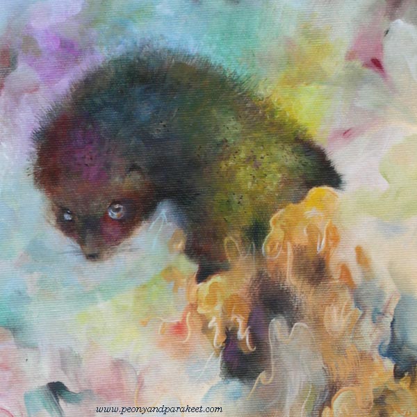
Fauna’s Ideas
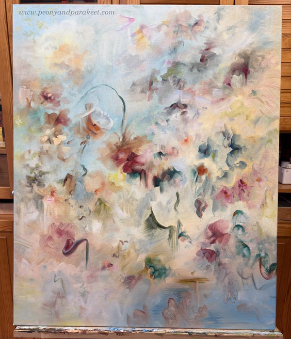
Fauna started from an old idea: the Baroque style and historical ceiling murals. So I thought that the painting could feature flowers and have plenty of light blue. Here’s how it started:
But then I heard my inner child whisper that I should include an animal: “Fur is so wonderful to paint. Let’s include something like a ferret!” The adult me wondered, “Who would want a painting featuring a weasel?” But you know, some ideas are like tiny butterflies that appear and vanish in an instant, while others are like moose that take over your entire mind. And this was a “moose idea.” It wouldn’t leave me alone, so fine —let there be a weasel of some kind!
But what else could be included?
Words help when I am brainstorming. I read through various word lists and wait for the moment my intuition says “Bingo!” That’s how I found the word “hunaja” – honey. I thought about the intricate swirls of the Baroque style and the way honey drips, and I boldly added them to the painting.
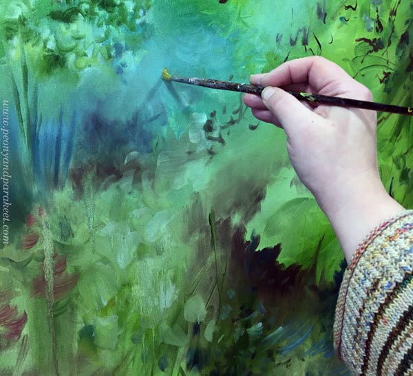
Here I am painting the fur. I use not only short strokes, but also paint small patches with different tones. Layering is the key!
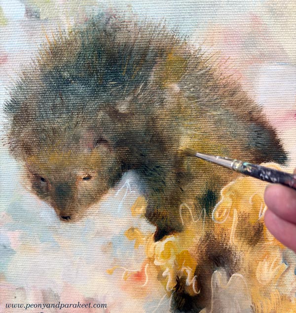
In the final version, the fur is softer and shorter, and lit by a rainbow. It took some time to decide whether the fur should be spiky or softer.
With the idea of painting honey, I found myself on a “mad path” where I stopped categorizing my ideas and challenged myself instead: could I create a painting that looks like a floral piece from a distance, but reveals a more playful character upon closer inspection? Could the animal theme lead toward animal figures—even toys? I wanted to achieve a purity of style that isn’t tied to a single era, but rather to my own way of dealing with shapes and lines.
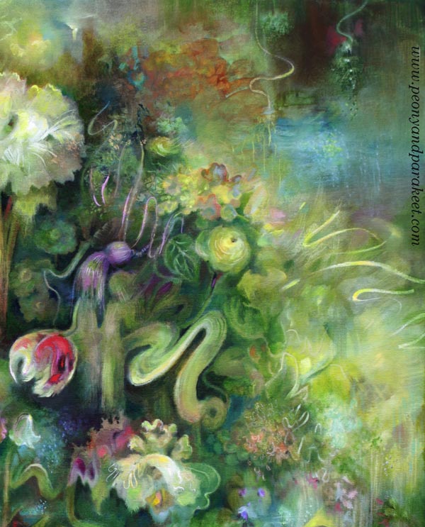
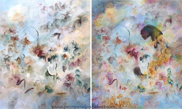
Here you can see the beginning and the end side by side.
Playful Art – Drawing Animals
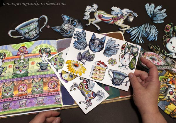
I have always loved animals and have drawn them a lot. Drawing with a pen is much easier than drawing with a brush.
Animal Inkdom and Magical Inkdom have been highlights of my course creation because, while making them, I decided to believe that everyone wants to draw animals. That mindset brought a lot of confidence and joy to the process, which also translates into the atmosphere of the courses.
I have had so much fun with all the animals drawn in those courses. My father used to draw with quite a similar technique, so I have continued on his path here.

The Playfulness is in the Details
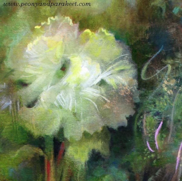
Fauna is full of playful details. Many of them are quite subtle, barely noticeable. Here are some detail pics.
I see myself in this painting—all the versions of me at different ages, with ideas of all ages.
Even if Fauna was a challenge to create, it was also fun. I think I will create more of this kind of playful art.
Age of Ideas – Just Playing or Only Focusing on the Serious Side
This painting process made me reflect on how people who start making art often fixate on the “age” of their ideas. Some decide they are just having fun and playing. Others believe that skills—and thus art—can only be born through realism. But as artistic thinking and skills develop, there is an opportunity to combine the playful with the more serious. It is possible to be a child, an adult, and an elder all at once. Art doesn’t need to be narrowed down, because creating is a search not just for oneself, but for a broader understanding of humanity.
Fauna is a bit different from Halo – the painting that I showed last week.
See the blog post about creating this painting
See more pics and a video at Taiko Finnish Online Art Store
Which one do you like more – Halo or Fauna?
I Did the Same Drawing Twice!
I rarely sketch my drawings beforehand, but this time I wanted to try something different: creating the same piece twice and recording the process.

The first version was done freely with watercolor pencils. The second was a study of the first, but created using traditional colored pencils. These drawings have many kinds of flowers, including roses and tulips, but I don’t think you always have to know which real flower you are creating; you can have fantasy flowers as well.
Same Drawing Twice – Watch the Video!
When I began the first one, I didn’t have a reference or a model. I simply decided to draw flowers. Watch the video to see how it went!
Which Was Faster?
Both of the drawings took me about the same time—around two hours each. Watercolor pencils are definitely faster for covering the paper, but since I was starting from scratch with the first one, I had a lot of puzzles to solve with the composition and the overall mood. With the regular colored pencils, the process itself was much slower, but since I was just following my first drawing, it didn’t take nearly as much mental energy.
I hope the video inspired you to pick up your colored pencils! I am also curious to know: Have you ever tried an experiment like this?
Try Intuitive Coloring for a simple start to coloring freely, or explore Joyful Coloring if you’re into watercolor pencils. And for those looking to combine watercolors and colored pencils, check out Freely Grown!
Inside the Creative Process: Art, Words, and Morning Robes
I often find that the bridge between painting and words is a difficult one to cross – especially when your latest work decides to speak a language of its own.
Even though I’ve always loved writing, being a visual artist often brings moments inside the creative process where words simply disappear.
Lately, I’ve been painting a lot. The more I paint, the harder it feels to write all those applications and descriptions that an artist is constantly expected to produce. It’s just as difficult to read what other artists write about their work—and even harder to read a critic’s take on anyone’s paintings.
It feels like words just bounce off the surface of a painting without ever sinking in. When you paint, you are inside the artwork, living between wordless layers. It’s a good place to be. At least until you make the mistake of asking yourself: “Hey, what exactly are you painting right now? Tell the camera! Write it down! Share it with the world!”
When that happens, my confident grip on the brush vanishes, and I start to stutter: “I’m just… putting some green here… and a little bit of red. Just a tiny bit …”
Inside the Creative Process: When the Painting Speaks First
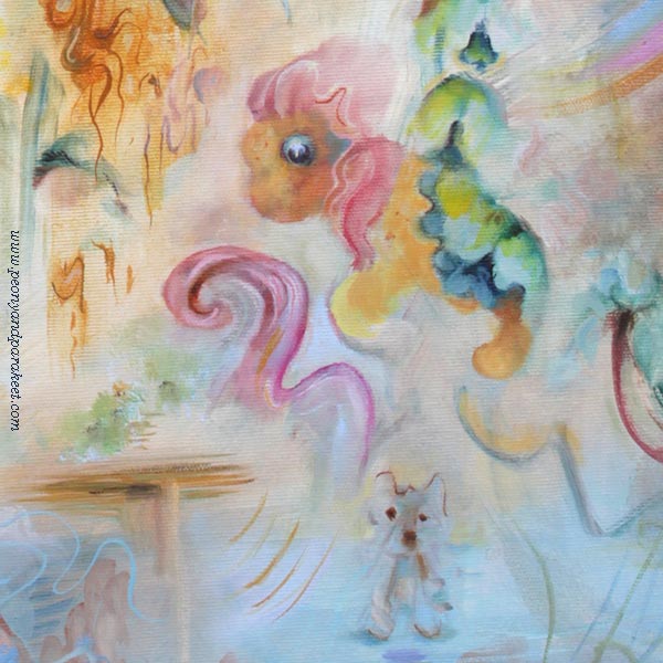
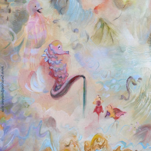
As a painting gets closer to being finished, the words come more easily. Or rather, it feels like I don’t have to go looking for them because the painting has something to say for itself. Even though I don’t speak French, I feel like my latest work speaks the language. I call her Boheme. She is like a woman opening her front door in a morning robe, with everything in her life a bit scattered and messy.
In my own life, I think I’ve only opened the door in a morning robe once when a surprise package arrived. Back then, the postman certainly didn’t see a mess behind me — everything was in its place. So, it’s a mystery why this opposite creature appeared on my canvas. I knew from the start that I couldn’t control her with a heavy hand. Not because Boheme would be afraid of orders, but because I have no desire to fight that kind of energy. I’d rather let her grow, be free, and express her own kind of beauty.
Dreams I Didn’t Know I Had
Maybe that’s where the conflict lies. My own world is small, and I find myself quite uninteresting as a person. Yet, my paintings reach further and bring out things I didn’t even realize I was thinking about. That’s my favorite part of this job—seeing your dreams come true, especially the dreams you didn’t even remember having.
Despite all this “unconsciousness,” it’s still good to recognize the words, music, scents, and moods that belong to your artistic vision.
Finding the Right Mood
A few weeks ago, my husband told me about a record review he had read. He hadn’t heard the album yet, but the description stuck with him. Just from his brief explanation, I got a strong feeling it could be interesting for my art. We searched for the article to find the singer’s name. It was the album LUX by the Spanish artist Rosalía, and it felt familiar from the very first notes. I love her track Bergheim. It mixes different styles with classical music, creating a luxurious, grand, and slightly mystical atmosphere.
Boheme and I have been listening to the song together. Through her, I’ve realized that when it comes to morning robes, the mint-green terry cloth one my mother once bought me has nothing to do with the luxurious creations Boheme has in her closet. And those are the kind of closets you actually want to leave open when you answer the door.
And that’s the true beauty of art: it always gives you a better view.
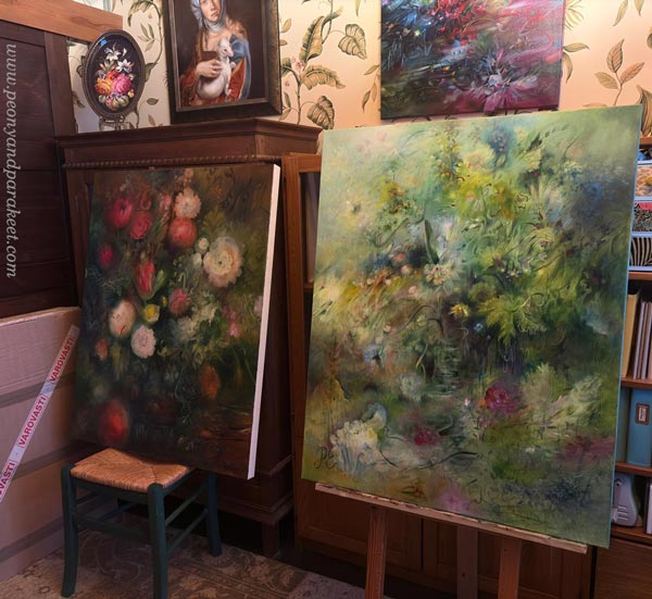
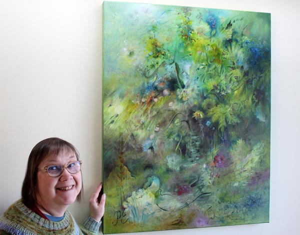
The annual major painting event, the Sales Event of the Finnish Painters’ Union, takes place in March at the Cable Factory, Helsinki. I am participating in the event with this painting, along with a few others.