Drawing a Summer Ornament
This week, I want to show that an ornament can be more than just a decoration. An ornament can be a framework for expression in the same way as a portrait, a still life, or a landscape.
I love drawing ornaments. It feels as though the universe is shouting at me: “This is right, this is a good thing!” If I’ve had past lives, I’d think this is the work I’ve always done in some form, because it feels so natural.
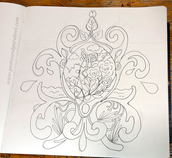
Step 1 – Grid
If I decide to draw an ornament, nothing holds me back—not even the requirement of symmetry. This time, I made a grid to help me achieve similarity on both sides more easily.
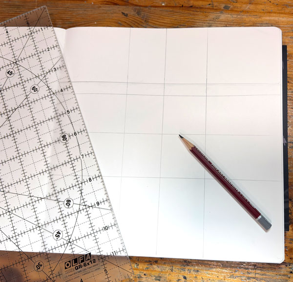
It’s good to have center guidelines, but there can be more and placed anywhere. All guidelines are helpful when drawing the ornament freely.
Step 2 – Pencil Sketch
I sketch the biggest symmetrical parts in pencil. But I try to keep this phase short because the best part of drawing ornaments is letting loose and discovering how the symmetry can be broken.
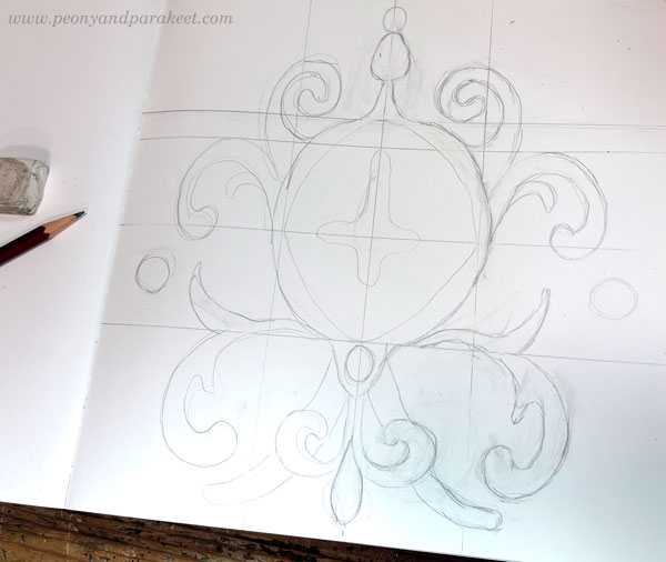
Drawing an ornament is like putting your soul into a lion’s cage and then watching it break out with cleverness, rather than violence.
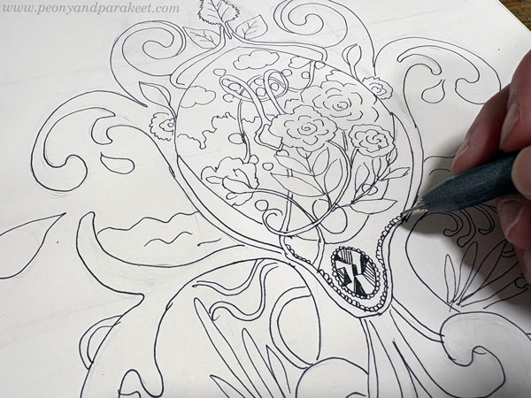
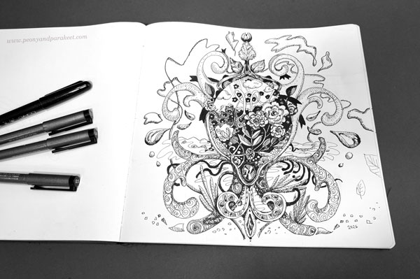
Step 3 – Getting Creative with a Non-Erasable Pen
For the actual drawing, I use black markers. Here, I’m using Copic FineLiner pens and a Copic Gasenfude brush pen. An ornament is like a meandering canvas where you can draw anything. You can draw both the realistic and the abstract, and it all looks great because it’s embedded in the ornamental structure.
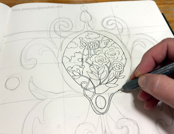
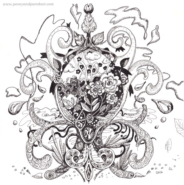
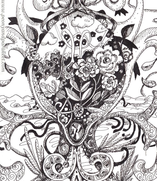
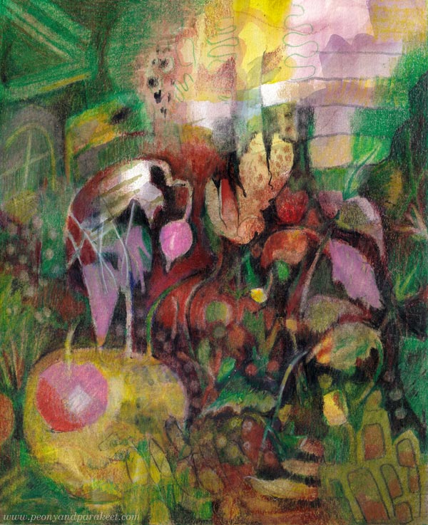
We currently have summer here in Finland, so I wanted to draw summer-related things: the sea, a garden, and birch leaves.
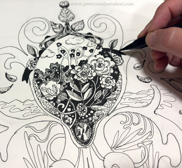
Step 4 – Getting Lost in the Details
When I have most of the things in place, I put on an audiobook or a talk show and focus on the details!
My ornaments almost always have jewels because I find them fun to draw and the result rewarding. A jewel comes to life when you draw geometric shapes with a fine pen and fill them differently.
I always include elements that are pitch-black to create contrast. The brush pen is quick in these details.
The Freedom in Drawing Ornaments
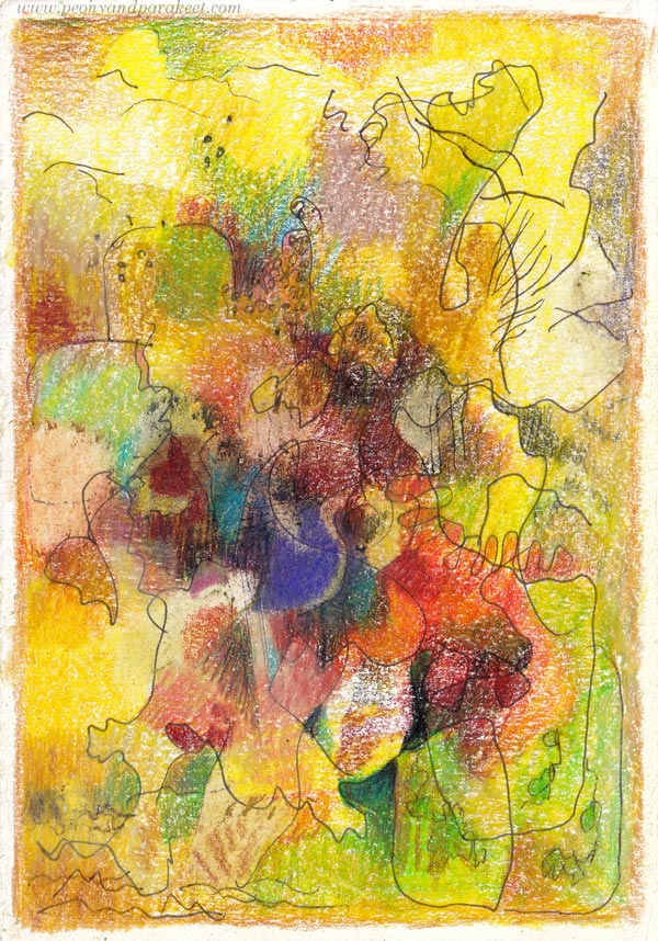
The longer I draw, the more I want to create tension and asymmetry. In this ornament, the lines took on a life of their own and spread beyond its borders. Ah, so liberating!
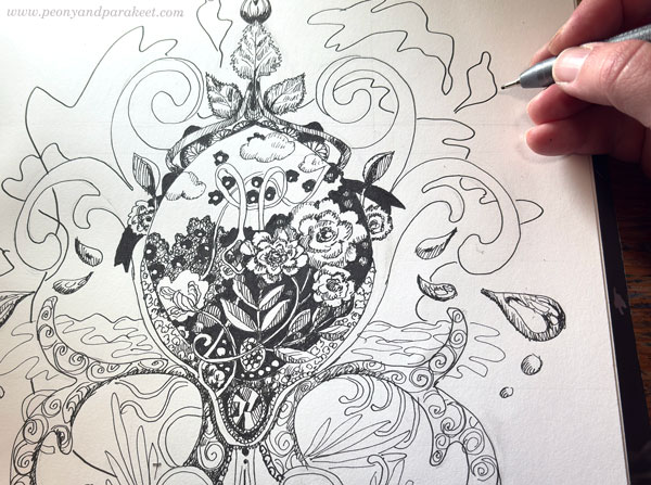
It’s exciting and even contradictory that such freedom can be evoked from a rigid ornament.
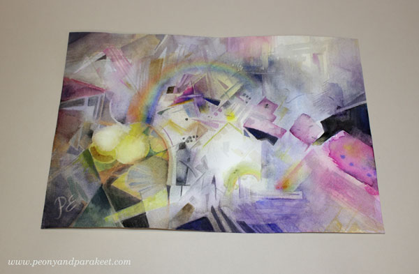
The Summer Ornament
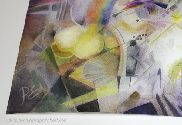
Here you can see how I’ve used the pens for the fine details in the center.
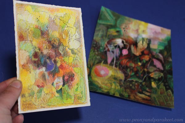
I hope this summer ornament inspires you to pick up your pens and start drawing!
For more inspiration, see also these blog posts:
Abstract Composition in Watercolor
This week, we create geometric and modern art. Pick your supplies, and make an abstract composition!
>> See this painting bigger at the Taiko online art store
Lately, I’ve been exploring the extremes of my own style, especially when it comes to visual language. I’ve been searching for something angular and adventurous for inspiration, as my style has recently drifted perhaps a bit too much toward the organic direction. Quite by chance, I noticed the summer issue of Watercolor Artist magazine in a local shop, which introduced me to an interesting artist named John Salminen.
John Salminen uses photos of urban landscapes as the foundation for his work. He converts the photo into a high-contrast image and sketches an abstract composition from it. He calls this approach “abstracted realism.” I like his paintings a lot. To me, they feel sophisticated yet masculine and go close to one extreme of my own style.
Starting an Abstract Composition
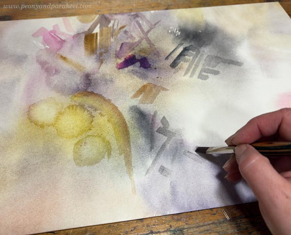
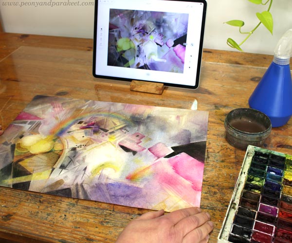
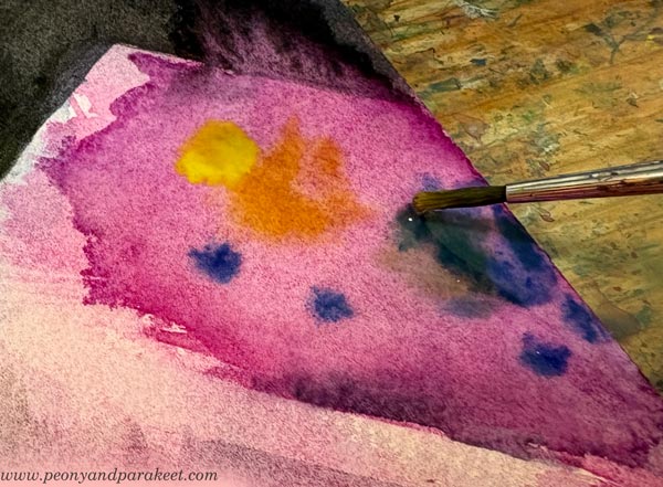
I now wanted to create an abstract watercolor using mainly geometric shapes. Unlike John, I started my work freely without any reference photos. First, I used plenty of water.
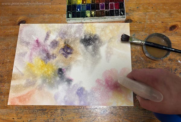
In the next layers, I applied less water to make sharper shapes.
Geometrical Abstract Composition
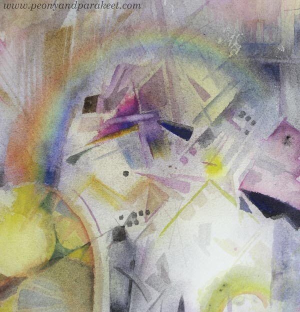
The basic idea is to create both small and large shapes, arranged in an asymmetrical composition on the paper.
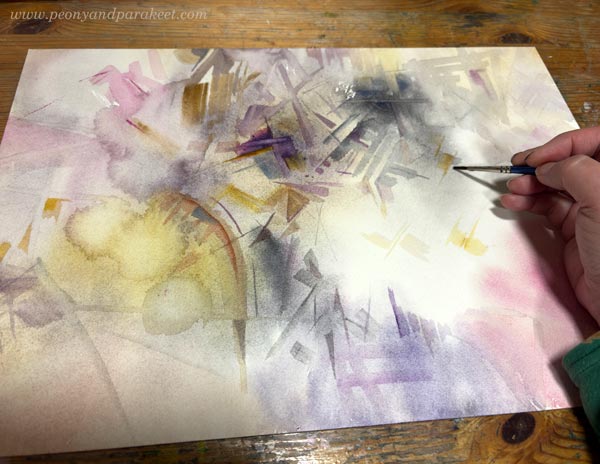
You don’t need a ruler for geometric shapes. Thin brushes make lines easy to achieve, and a flat brush is perfect for angular forms.
What Do You See?
When painting abstract art, it’s best to first focus on the shapes themselves and forget about looking for realistic objects in the painting.
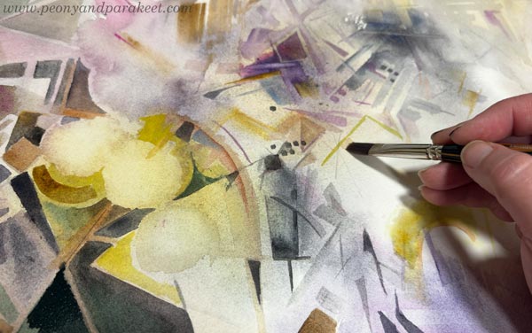
In my project, everything was going well until I realized that I was creating yet another flower painting. I’ve painted flower arrangements so many times that their structure is deeply rooted in my subconscious.
I turned my work upside down, hoping it would look different, but the flowers in the vase were staring right back at me! Give me any unfinished or finished painting, and I’ll turn it into a floral arrangement in a moment!
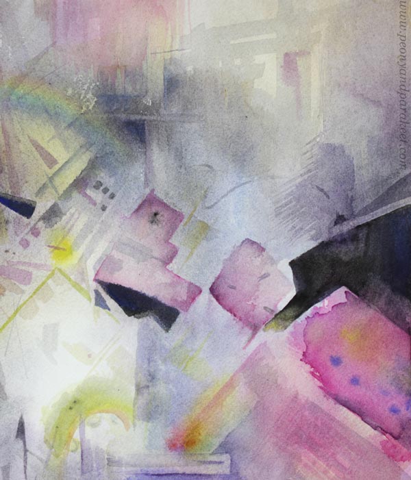
Shifting Direction – Making a Plan
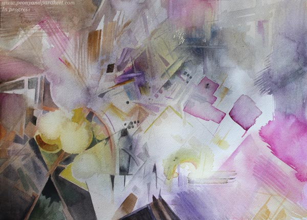
This time, I didn’t want to paint flowers. I wanted a sense of space and adventure. So, I moved from my small painting studio to the computer and opened Photoshop. I planned out the perspective and started looking for shapes to support it.
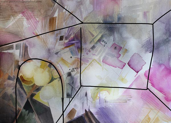
Then, I designed the composition. I could have worked this out through painting as well, but then the final piece wouldn’t look quite as effortless. You can wipe watercolor away with water, but it’s hard to get the paper completely clean again.
Here are my digital additions created on top of the unfinished painting.
Purity, Clarity, Effortlessness
Lately, I’ve been inspired specifically by purity, clarity, and effortlessness. I’ve been watching a Finnish TV show called “Tähdet, tähdet” (Stars, Stars). It’s a singing competition looking for the country’s best performer. Each season features about ten professional performers, most of whom are musicians. The performers are pushed out of their comfort zones, as each episode focuses on a different musical genre.
In the latest season, one of the performers was the reggae musician Jukka Poika. I had never really paid attention to his vocals before. However, the other musical styles truly brought out the singer in him. His voice emerged pure, direct, and yet full of rich tones (listen to an example on YouTube).
Isn’t that exactly what we all want in visual arts: for our own voice and thoughts to come through pure and clear? “It’s so inspiring to think about the purity, clarity, and effortlessness we can achieve when we know exactly what to do in its simplest form, and have the skills to do it
The plan allowed me to bring beautiful tones and nuances into my watercolor without having to stress about perspective and composition.
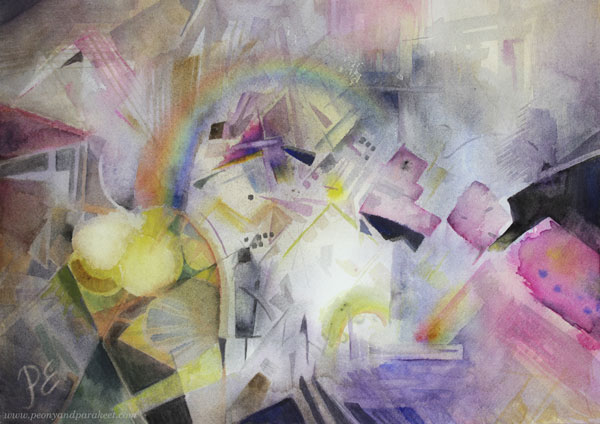
Finished Piece – The Portal of Hope
I named this piece “Toivon portaali” (The Portal of Hope). There are situations in life that require going through the darkest of times – through a grey stone, as we say in Finnish. It is risky and requires a fighting spirit, but at the same time, the situation is also exciting as it’s a way to move forward.
Here are some photos of the details.
This was much faster to paint than flower paintings of a similar size. There were fewer layers, and geometric shapes are quick to execute.
I hope this inspires you to try an abstract composition with watercolors or colored pencils—or use a combination of both. My painting was done entirely with watercolors.
P.S. Check also this blog post, with more detailed instructions and for watercolor pencils: Modernistic Style – Create Abstract Art Step by Step!
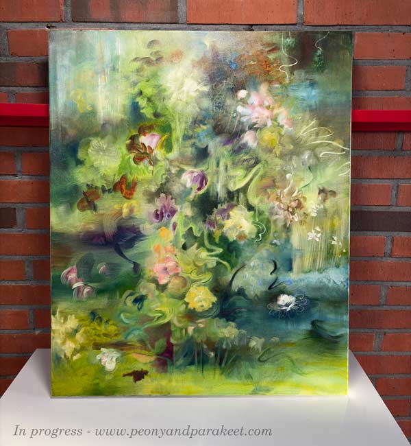
Ikigai – Making Intuitive Painting Feel Natural
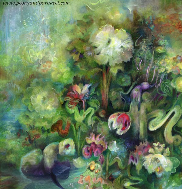
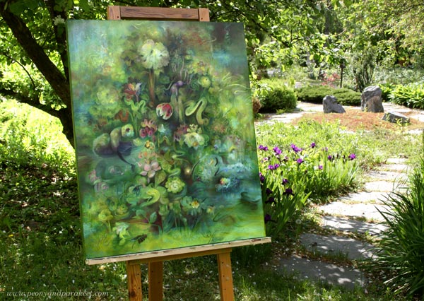
This week, I show you my newest oil painting, ‘Ikigai,’ and talk about how intuitive painting can become logical, and how a logical painting can feel natural.
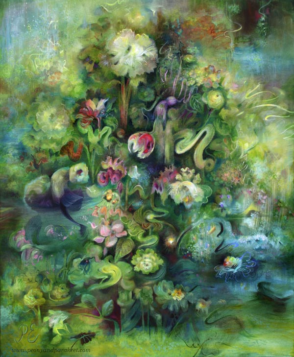
There are many extraordinary elements in this painting, but it still feels quite realistic and natural.
Find the Guiding Element
When you create intuitively, the first layers get all kinds of random details. After that, it is about:
- What to save
- What to tone down
- What to highlight
- What to hide
- What to add
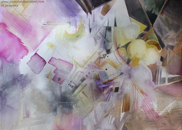
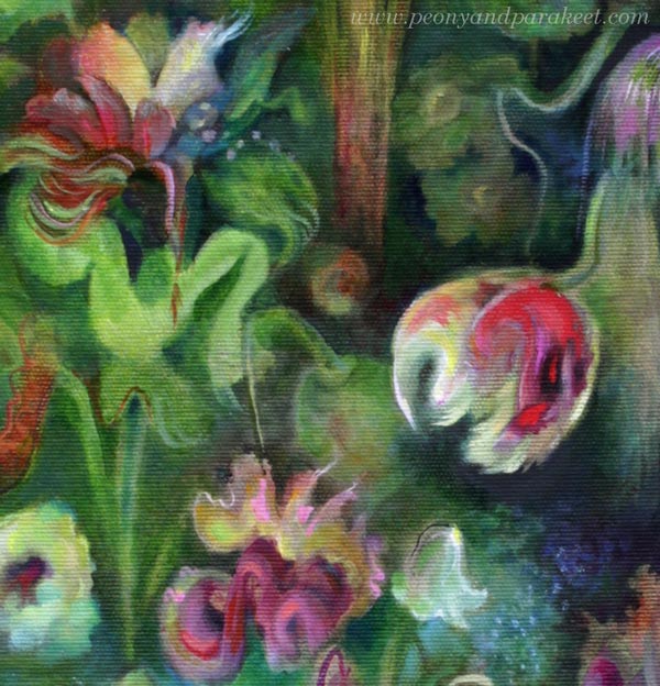
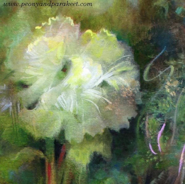
In Ikigai, I looked for an element where the canvas had already come to life as a painting. When I found it, I protected that pulsating spot so that its spirit spread and a small world grew around it.
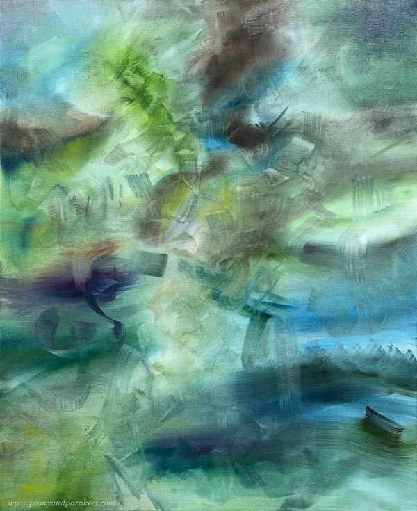
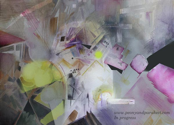
Can you already guess what element guided me through the whole painting? The picture above is the first layer, and the picture below shows the painting in progress.
Intuition is like a whisper that can expand into a stronger sense of presence. That requires time and skills, but also logic.
From Writing a Course to Painting a Picture
Lately, I have been writing a script for a new course (some info). The more courses I make, the more I realize how important the script is. Having a script doesn’t mean I cannot choose my words freely when speaking to the camera. It also does not stop me from throwing myself fully into the drawing exercises while the camera is rolling.
Course videos include many different elements: theory, examples, explanations of the process, and reflections on artistic thinking. All of this needs a good rhythm. I need to know what I am saying and how freely I am speaking in different parts of the videos. My goal is to build a logical educational structure behind the course, without forgetting the human side of making art. I want my courses to be inspiring, entertaining, and encouraging, but also educational, so that you will move forward in your art-making.
Painting is very much like making videos. Even if you didn’t sketch beforehand, you still need structures and ways to connect single elements into a whole. You need both technical and expressive skills. It’s also beneficial to be able to see what is essential and to understand the role of logic.
The Logic Makes the Magic
When a painting is logical, it feels natural. Logic in painting does not mean that the picture has to be realistic. Instead, it means that there is interaction between the elements. For example, a weak line can humbly take a curve to go around a strong dot. Or a bright line can send small rays of light over nearby shapes, changing their color. The interaction ties everything together.
Even a static image can feel alive. At its best, you can look at a painting like an event. It’s fascinating how interaction makes the unreal elements feel real. Being able to express ourselves freely on paper and canvas is one of the best things in life.
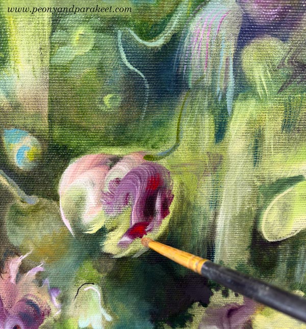
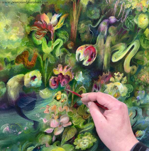
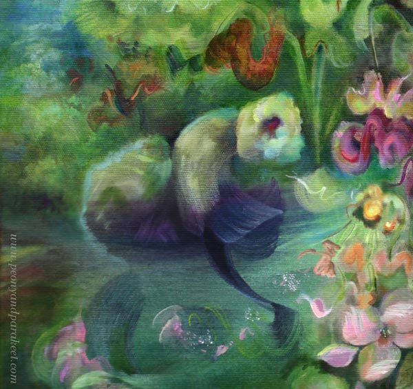
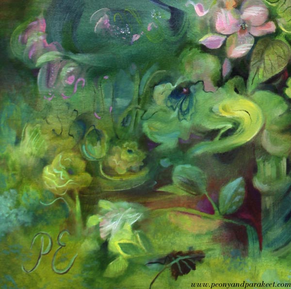
Details of Ikigai
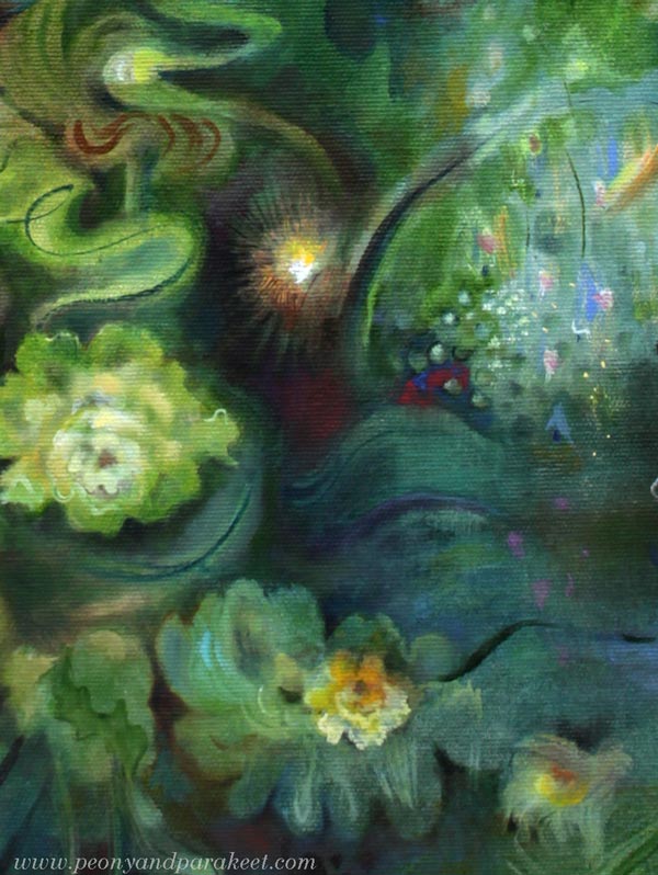
Here’s the guiding element in my painting. I have made some additions to the original strokes, but the spirit is the same.
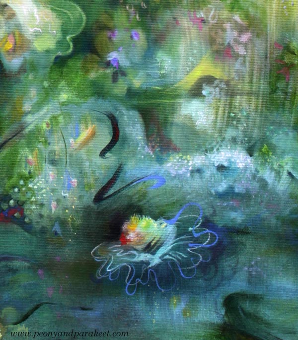
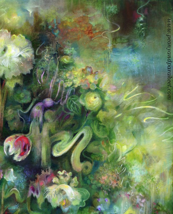
I have noticed that in my paintings, the guiding element is rarely a focal point. Here’s the focal point – the tulip and her two red friends.
Ikigai – a reason to live, a reason to wake up in the morning. According to this Japanese philosophy, we should orient ourselves toward the point where our passion, mission, calling, and profession meet. I feel like ikigai is condensed into the exact moment where night and morning meet.
In the morning, deep reflection is interrupted by the call to action – get things going! And we get up despite all our responsibilities, but also because of them.
I love this kind of contradiction and complexity of life, and I try to bring it out as naturally as possible in my paintings.
The Four Principles of Ikigai and Making Art
Passion – What you love – Intuitively found
Calling – Why you exist, what’s your inner purpose – Naturally rising
Mission – What you do in practice – Needs logic
Profession – Where you are good at – Skill-oriented
The sweetspot is where all are met and aligned.
What do you think?
Artistic Line Drawing – What Do You Think About This Course Idea?
To me, all visual art begins with drawing. When you want to get to know yourself, draw! When you want to develop as an artist—say, as a painter—draw! To draw is to think. Make your lines come alive, and gradually, a whole new world will emerge, even on a small piece of paper. That’s what artistic line drawing is about.
Black drawing pen and colored pencils.
Past and Present Drawing Courses
In most of my courses, drawing plays some role. Free and artistic line drawing is especially close to my heart. In the past, I have taught two courses on the subject: Inspirational Drawing and Inspirational Drawing 2.0. These are already retired. Of my current courses, Mystical Minis comes closest to these.

Passion For Teaching Artistic Line Drawing
For some time, I have wanted to offer more help with line drawing. Not just how to draw, but also how to alter the process to take it in a more artistic direction. By “artistic,” I mean moving beyond the conventional and creating something that is both personal and at least partly abstract. I want to speak especially to those of you who want to create freely and push your boundaries—both in how you think and how you create.
Watercolors and colored pencils.
At first, I thought the material I had gathered over the past few months would be just for these blog posts. But as I have started to unpack the topics, I find myself wanting to share more than what fits into a single post—to show things in both theory and practice. So, I’ve started developing a new course, under the working title Artistic Drawing.
Artistic Line Drawing – Course Themes
Here are the themes I have selected for the upcoming course:
- Ways to Start a Drawing: I want to help you explore how you begin. You can approach your drawing like an architect, building a clear structure first—or like a gardener, letting everything grow from a single seed.
- Letting Go: If drawing does not make sense and feels directionless, letting go can be difficult. I want to give tips on how to feel free and draw anything without too much inner resistance.
- Interaction: I want to help you notice the possibilities of interaction in the creative process. This is about both how you speak to yourself and how you work with drawing. For example, a line you draw can invite another line to join the conversation.
- The Scale of Shapes: An impressionist draws in a pixel-like manner, placing tiny dots one after another. An expressionist creates larger, vector-like shapes. I want to help you use both approaches and find the combination you enjoy most.
- Presence: At its best, your drawing radiates presence. I want to help you become like a singer who doesn’t just go through the notes, but pours their whole soul out to the audience.
- Clarity: You can begin a drawing with plenty of elements, but towards the end, it is worth striving for clarity. I want to help you discover a minimalism that is not based on scarcity, but on the ability to pick the essential.
- Sense of Style: I want to help you find the things you want to add to your drawings, and the ones you want to get rid of. It is not just about developing a style, but also about developing your sense of style.
Which of these themes interests you the most? What else do you hope to be included in the course?