Drawing a Summer Ornament
This week, I want to show that an ornament can be more than just a decoration. An ornament can be a framework for expression in the same way as a portrait, a still life, or a landscape.
I love drawing ornaments. It feels as though the universe is shouting at me: “This is right, this is a good thing!” If I’ve had past lives, I’d think this is the work I’ve always done in some form, because it feels so natural.
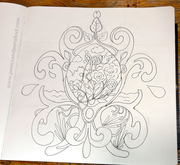
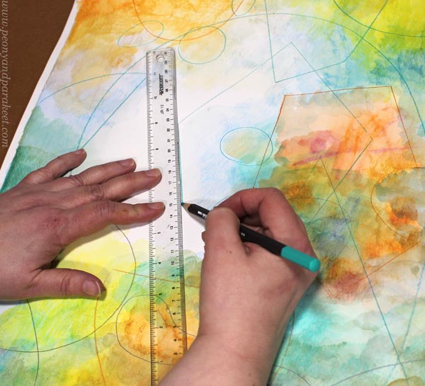
Step 1 – Grid
If I decide to draw an ornament, nothing holds me back—not even the requirement of symmetry. This time, I made a grid to help me achieve similarity on both sides more easily.
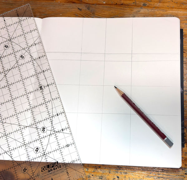
It’s good to have center guidelines, but there can be more and placed anywhere. All guidelines are helpful when drawing the ornament freely.
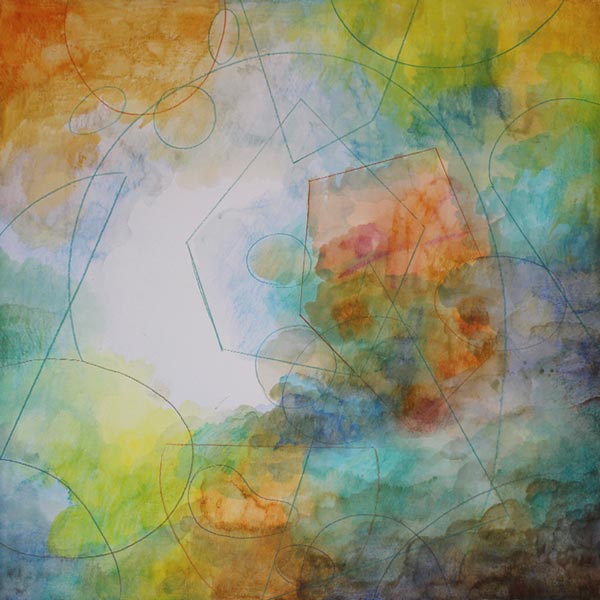
Step 2 – Pencil Sketch
I sketch the biggest symmetrical parts in pencil. But I try to keep this phase short because the best part of drawing ornaments is letting loose and discovering how the symmetry can be broken.
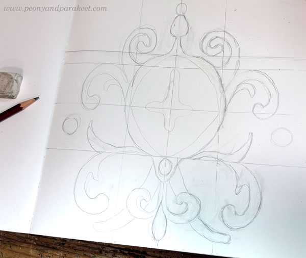
Drawing an ornament is like putting your soul into a lion’s cage and then watching it break out with cleverness, rather than violence.
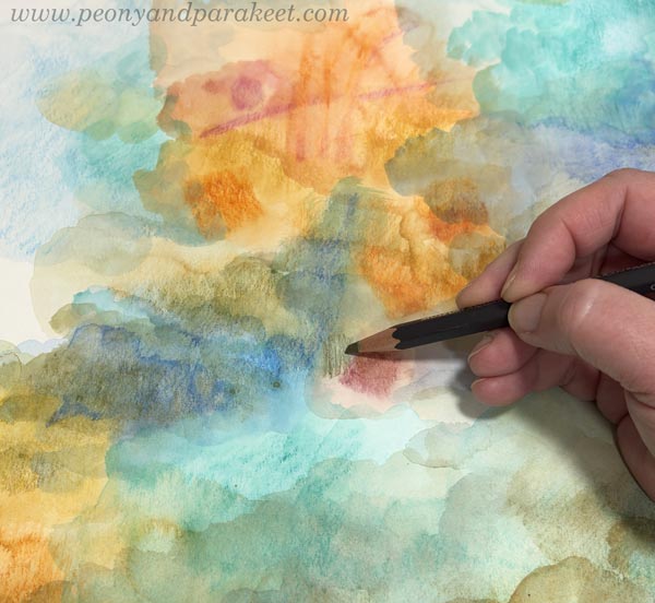
Step 3 – Getting Creative with a Non-Erasable Pen
For the actual drawing, I use black markers. Here, I’m using Copic FineLiner pens and a Copic Gasenfude brush pen. An ornament is like a meandering canvas where you can draw anything. You can draw both the realistic and the abstract, and it all looks great because it’s embedded in the ornamental structure.
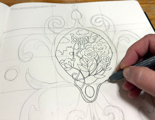
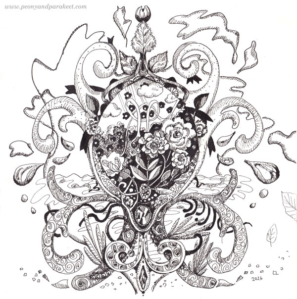
We currently have summer here in Finland, so I wanted to draw summer-related things: the sea, a garden, and birch leaves.
Step 4 – Getting Lost in the Details
When I have most of the things in place, I put on an audiobook or a talk show and focus on the details!
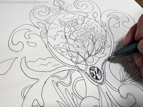
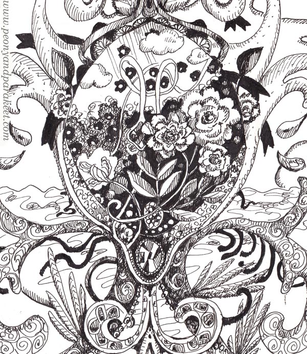
My ornaments almost always have jewels because I find them fun to draw and the result rewarding. A jewel comes to life when you draw geometric shapes with a fine pen and fill them differently.
I always include elements that are pitch-black to create contrast. The brush pen is quick in these details.
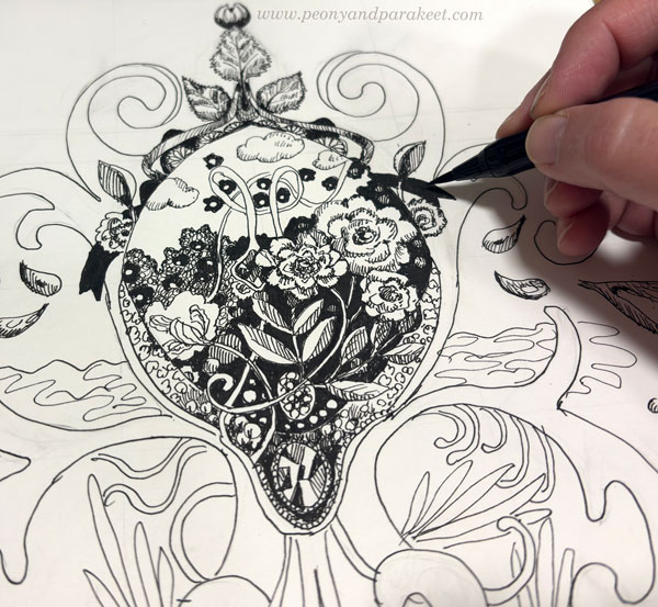
The Freedom in Drawing Ornaments
The longer I draw, the more I want to create tension and asymmetry. In this ornament, the lines took on a life of their own and spread beyond its borders. Ah, so liberating!
It’s exciting and even contradictory that such freedom can be evoked from a rigid ornament.
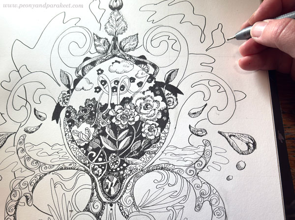
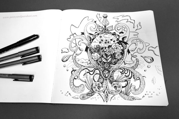
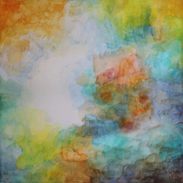
The Summer Ornament
Here you can see how I’ve used the pens for the fine details in the center.
I hope this summer ornament inspires you to pick up your pens and start drawing!
For more inspiration, see also these blog posts:
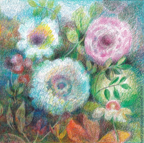
Dramatic Peonies with Colored Pencils and Black Pens
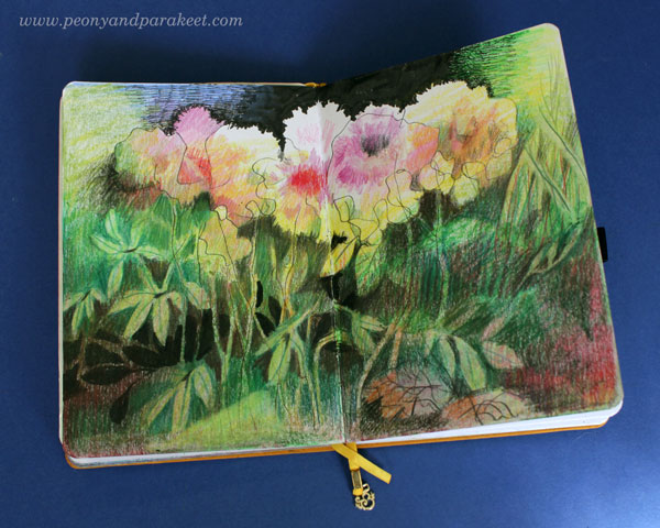
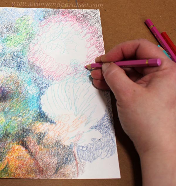
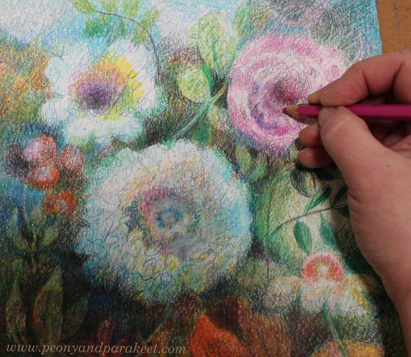
This week, I have a free video for you. Create these dramatic peonies with me!
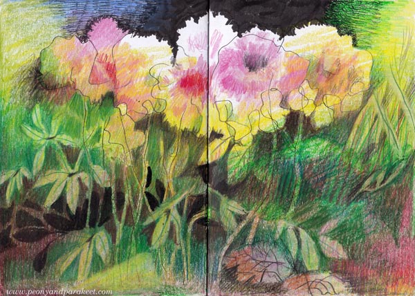
Use colored pencils to add the softness and color, and black pens to bring in the drama!
I used regular colored pencils and two black pens – thick and thin. My thick pen is the Copic Gasenfude brush pen, and the thin one is a Copic fineliner, size 0.5. You can use any brands. This is an exciting project with many things to learn.
Dramatic Peonies – Watch the Video!
By following the video, you can create your dramatic peonies. Start with the soil, and then grow a garden on it. Watch the video below!
It took me about an hour to create the dramatic peonies, so this is not a big project. The effect is based on sharp contrasts rather than details.
Dramatic Peonies and Your Living Line
In the video, I talk about discovering your living line. The longer I have been an artist, the more significant that has started to feel. When I look at my past work and compare it with the current paintings, I can see a glimpse of my style here and there. It all started with a simple line, so I wish I could inspire you to wake up your line and let it show the way. I am currently building a new course where learning from your line is the key content. Stay tuned!
Inspiration for Colored Pencil Journal
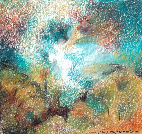
You can create dramatic peonies either on a separate sheet of paper or in an art journal. I created mine in an A5-size colored pencil journal, and the drawing fills the whole spread.
Useful links for you who want to start or make more pages for the colored pencil journal:
- Starting a Colored Pencil Journal
- All posts tagged with “Archer & Olive notebook”
- The course Fun Botanicum – Make a chapter for your colored pencil journal!
Modernistic Style – Create Abstract Art Step by Step!
This week, we take a practical dive into modernistic style. My favorite modernist painters are Birger Carlstedt (1907-1975) and Sam Vanni (1908-1992) from Finland. The most famous modernist was, of course, Pablo Picasso, who was Spanish.
My piece has some figurative elements. Although it’s abstract, you can also see plants and light.
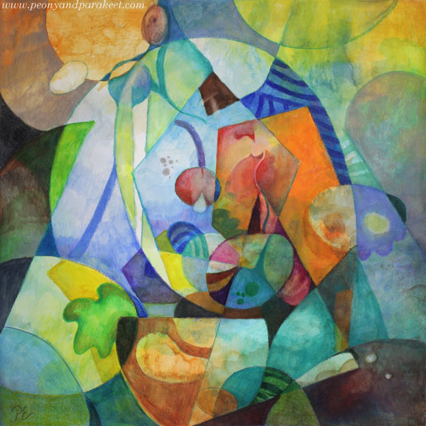
With this technique, you can create a fully abstract piece like Birger Carlsted (see examples from the past exhibition at the Amos Rex art museum), play with the perspective like Sam Vanni (see his artwork called Polydimensional Space), or use linework boldly like Pablo Picasso (see how he used strong outlines in his famous artwork Weeping Woman).
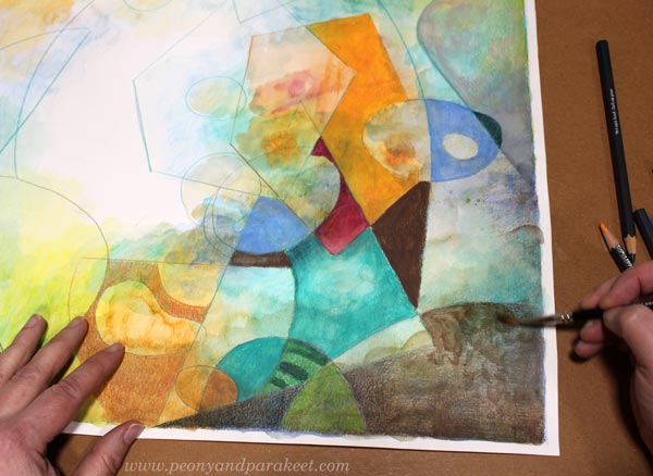
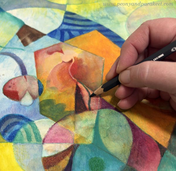
Supplies – Watercolor pencils or Use What you Have!
I created my piece on thick drawing paper with watercolor pencils and water. Its size is 16 x 16 inches (about 40,5 x 40,5 cm). You can choose your supplies and the size of your artwork freely.
Step 1 – Fill the Background with Colors
Don’t overthink, but just start adding colors!
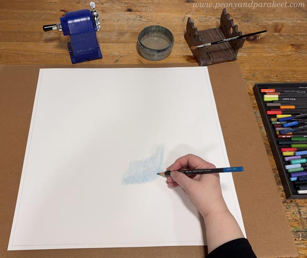
You can play with shapes if it helps you keep going.
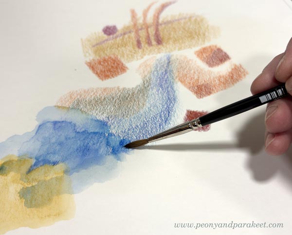
The idea is to cover most of the paper. Leave an area near the center blank if you are not working with paints that have bright white. For colored pencils, watercolor pencils, and watercolors, the best white is always paper white. To get some white and other pale colors in your finished piece, leave a fairly large area white at this point. Later, you can reduce its size and break it into several shapes.
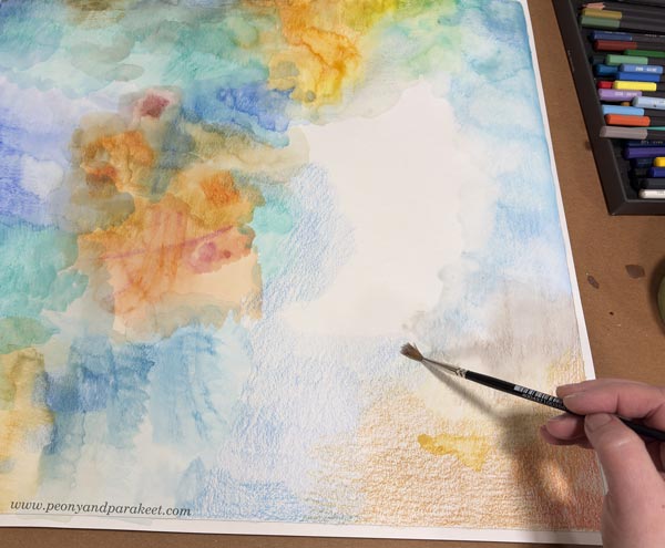
My paper is quite big, so I change the orientation once in a while. I move from one area to another by first coloring an area with a pencil and then spreading the color with water.
Add layers and darker colors. At the end of this step, your paper looks like a landscape without the horizon.
Step 2 – Draw the Shapes
Use the filled background as inspiration and draw intersecting geometric shapes. A ruler can be handy here.
I use watercolor pencils for drawing the outlines.
Step 3 – Color the Shapes
Modernistic art often has strong colors. Now add more color to the shapes.
You can fill shapes creatively. Use stripes and add textures. Some shapes can have bold colors, others more muted. If there are nice details in the background, leave them visible.
You can also draw new geometric or more freeform shapes.
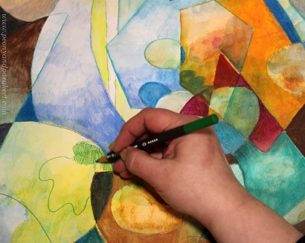
You can adjust the shapes, for example, by changing a straight line to a slightly curvy one.

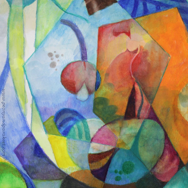
After you have gone through all the shapes, decide how abstract you want your piece to be.
I wanted to add a bit more realism: make more organic shapes and express light as well.
Step 4 – Finishing
Carefully go through every shape one more time. Don’t just look at the big picture and adjust the composition. Focus on a small area at a time, and make it as expressive as you can. Remember that a modernistic style is quite minimalistic and based on abstract expression. Refine existing colors and shapes instead of creating more and more new ones.
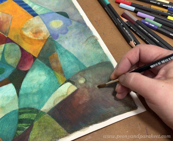
Make sure that all the shapes are not similar in size. I created small dots by removing paint with water and drew some thin lines.
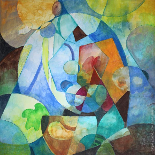
Simple But Rich Modernistic Style
By starting with the background first, you can achieve subtle richness for a minimalistic look. Here’s a close-up where you can see the effects of the background layer.
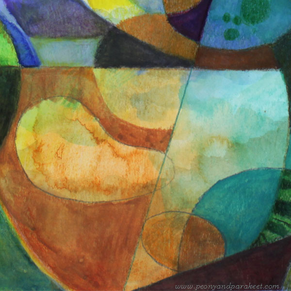
It’s good to keep all the best things – bold colors and interesting details – in the center. Often, the composition needs nothing else!
The more you learn about different styles, the more unique your own style will be. A style is never just one thing, but a combination of many. I hope you enjoyed this exercise!
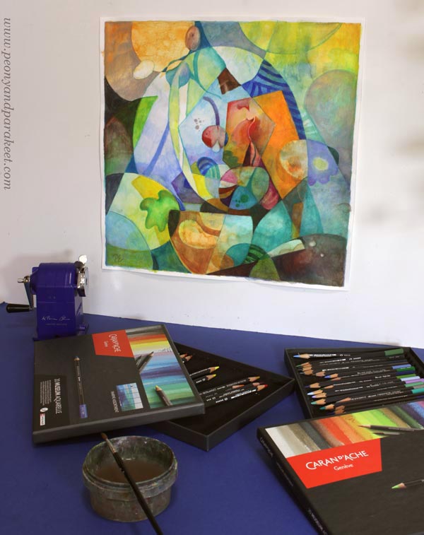
P.S. Check my class Mystical Minis for creating more modernistic abstract art!
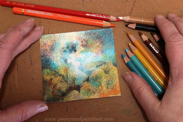
Circulism – Freely with Colored Pencils by Using Circular Motions
This week, I want to bring up a technique called circulism. It’s great for colored pencils when you want to achieve a soft and somewhat vintage look. It’s also a useful technique if you find shading with colored pencils difficult or are hesitant about mixing colors.
In this blog post, I show you how to use this technique to create freely and expressively, without any reference photos or even outlines. You can just pick a pencil and start making continuous circular lines without a specific plan, and let your intuition and imagination take over.
You can also combine circles with other kinds of lines, and thus create different textures that are like meshes on paper.
When you are close to finishing, include sharper lines to reduce the blur in the drawing.
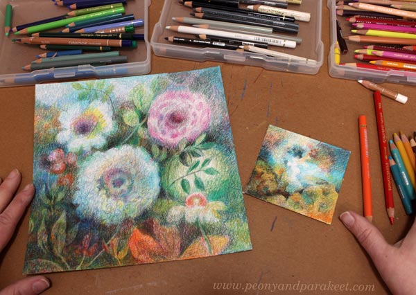
Sounds simple, right? Let’s explore this technique in detail by coloring a mini scenery.
Circulism Tutorial – Mini Scenery Step by Step
Here’s my mini scenery, but yours can have different colors and a different atmosphere. The idea is to draw circular lines with different colors and get soft color transitions and mixtures.
I got the idea for this mini-scenery after I visited Galerie Forsblom in Helsinki to see Petri Ala-Maunus‘s exhibition. His art is based on very small strokes, and the result is stunning and historical-looking. We can achieve a quite similar effect in colored pencil by using circulism.
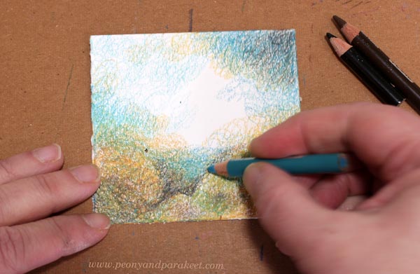
Step 1 – First Circular Strokes
You only need colored pencils and a small piece of paper. Start by practicing the continuous circular line and, at the same time, marking the corners with different tones. Calm down and keep the circles small!
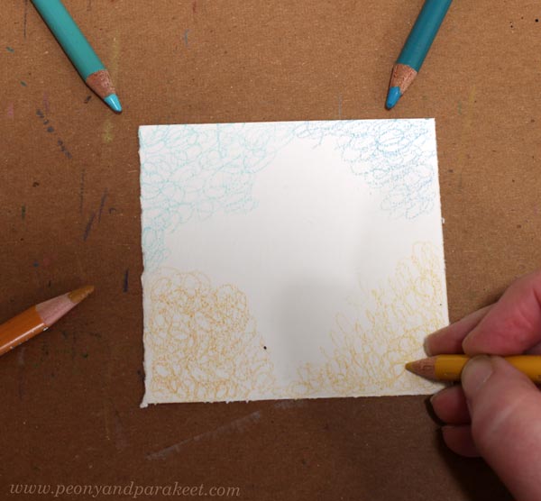
I have darker and lighter tones of two different colors. When every corner is a little different, either in color or in darkness, it’s easier to get inspired.
Step 2 – Layered Corners
Add some darker neutrals to your color selection. I have black, dark brown, and a little lighter, warmer brown. Add more layers to the corners by making circles with the first four colors and with the new neutrals.
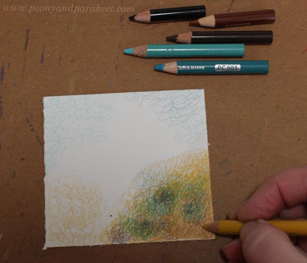
Work on one corner at a time. Make sure that the original color from step 1 dominates, even if you also use other colors. Don’t just color evenly, but create blurry clusters.
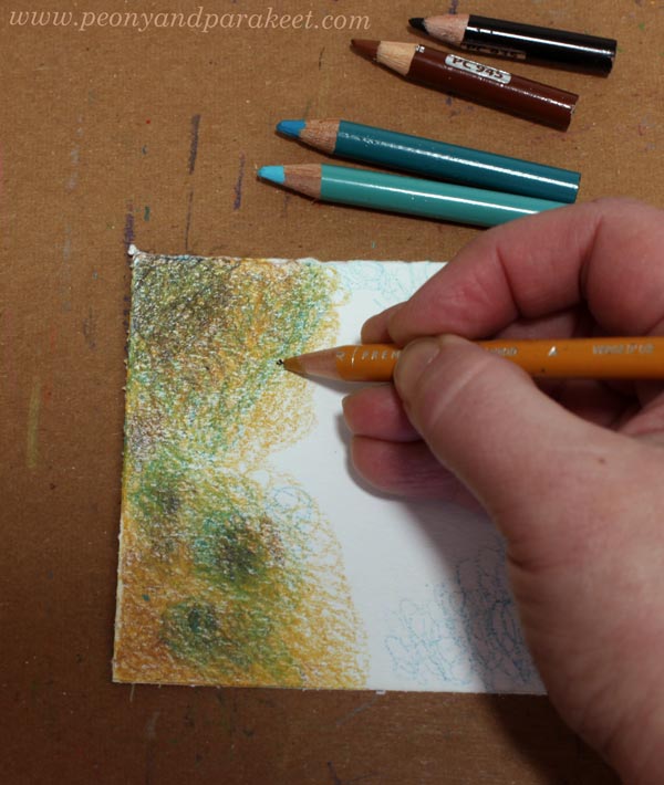
Change the orientation of the paper to achieve a more balanced circular mesh. Treat every corner a little differently.
Here you can see how my corners are different. One is very light, for example.
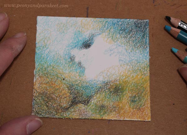
Step 3 – Valley
Add a valley between the lower corners. Draw a route across the landscape and add the horizon. Use circular strokes wherever you can.
Make sure your valley is dark on the bottom. Keep the center blank.
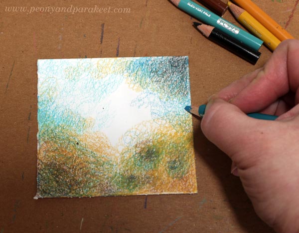
Step 4 – Clouds
Make the sky more expressive. With circular motion, draw clouds by adding contrast and colors to the sky. Remember to keep the color transitions soft.
Step 5 – More Layers
Color more details in the earth and the sky. Color over all the layers so that the coverage becomes better. The sky can have some very smooth and pale parts, and there you can use a white pencil.
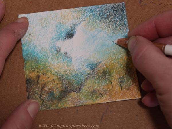
Notice the dark lines that define the valley and some trees.
Step 6 – Finishing Touches
Adjust the shape of the blank center area by coloring its surroundings.
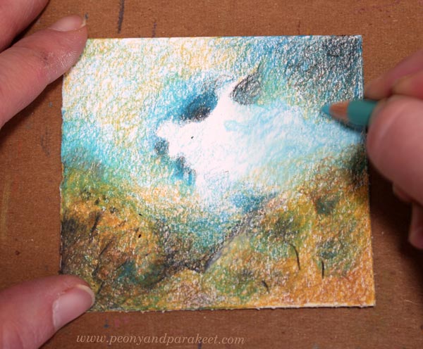
Bring in a couple of accent colors to make the color scheme richer.
The Possibilities of Circulism
Try combining circular strokes with different methods to add depth to your art. We usually think about colors and layout, but don’t forget the texture. This enriches your visual language and makes the drawing much more interesting. Softness also brings more depth and adds spirit to your work.
So, when you are working on my colored pencil courses, for example, Intuitive Coloring, you can add some circulism there too!