How to Mix Colors?
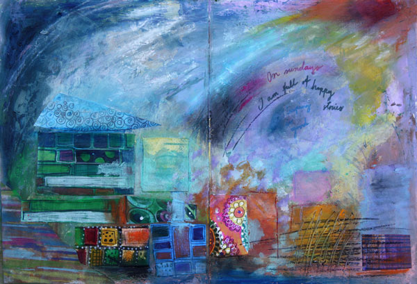
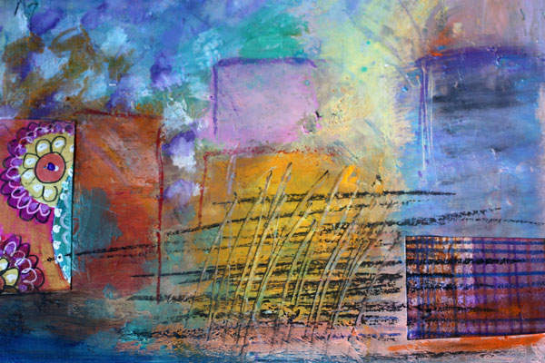
Here’s an art journaling page that I made to show you the gentleness of pastels and the strength of muted, darker shades. I often see art journaling pages that have a potential to be awesome, only if the color palette would be more unified! Meaning: only if the artist would have mixed the colors instead of using them straight from the tubes.
Choosing Color Combinations
Here’s the problem: we are pampered with many great colors by the art supply manufacturers. Like the colors of my Faber & Castell Gelatos, they look so pretty!
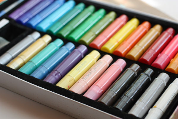
Still, you can pick colors there that won’t look so great together. Those colors have no common base color. Like the bright red, blue purple and mint green shown below. They have nothing in common. The bright red is a primary red; blue-purple is muted with black and mint green is muted with white. If you take out the mint green and mix the red and blue- purple, you can get a better combination. The brown, which is the mix of purple and red, ties the two colors together.
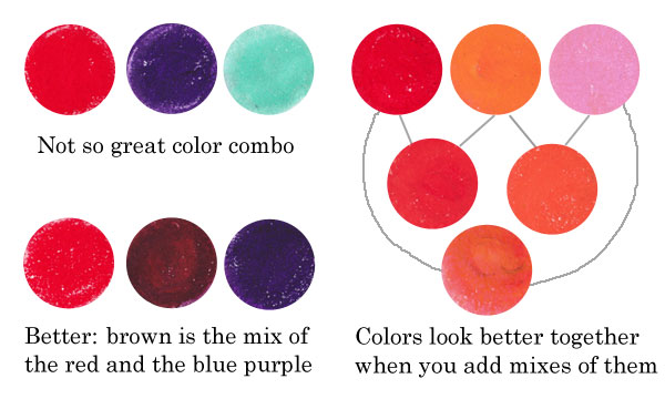
Similarly, if you use only red, orange and pink straight from the box, they look more separate than if you also use the colors that are mixes of them. Like parents and children, they form a unified color family.
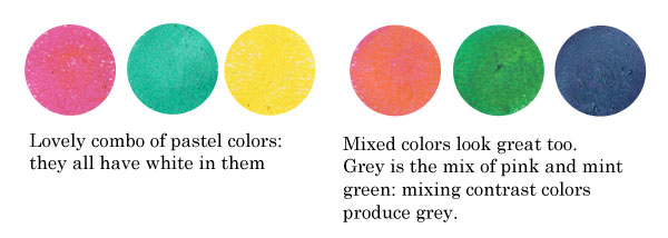
Another example: the colors that have a common base color, like the pastels below, suit well together. You can also mix them without fear: they produce lovely combinations. If you don’t want grays or muddy browns, avoid mixing contrast colors together. The contrast color pairs are red and green, blue and orange, yellow and blue-purple.
Sometimes people are afraid of getting grays and browns, and so they avoid mixing any colors. But those muddy colors make the brighter colors pop. See how muddy colors support the other colors in the art journal page that I made.
Playing with Tints and Shades
 One reason to mix colors is to get more natural, lively look. If you look at any photo, you can see a lot of colors there. The variation of light causes the huge amount of colors.
In the late 19th century, there was a genre of artists called impressionists. They were inspired by the daylight. They wanted to focus on the light, not on the objects themselves. If you are afraid of mixing the colors, look closely at Claude Monet’s Cliffs at Etretat and count the various tones there!
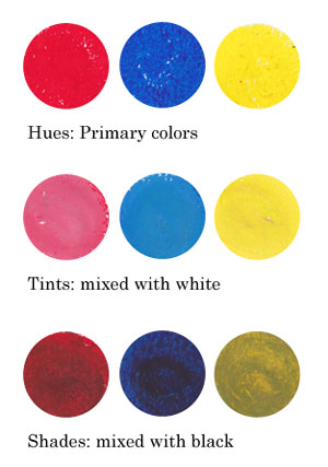
Instead of using primary colors like basic bright reds, blues and yellows and mixes of them, I encourage you to play with tints and shades: mix white or black to the primaries and get softer colors!
Using Faber & Castell Gelatos
When I began creating the art journal page, I chose to use gelato sticks with acrylics and hand decorated papers. I decided to use the background that I had made weeks ago, as its pastel colors reflected the cheerful mood I was having.

I like to create backgrounds when I am tired or uninspired. Then, when I start creating, I feel that I am already half done. When using various supplies in each layer of a page, I will get more variation in color without extra effort.

Faber & Castell Gelatos look like lipsticks, and they have similar kind of waxy feel. You can dilute them with water, but I think the greatest way is to mix them with a paper towel or soft sponge.
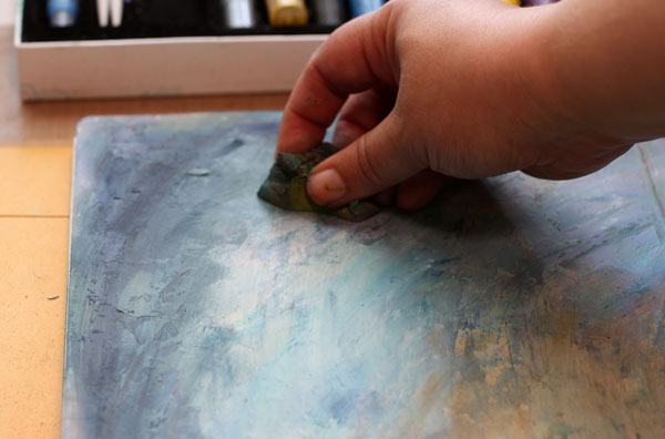
Gelatos work great on a painted surface. Notice that I created color mixes with slight variation in darkness. I used both tinted colors (mixed with white) and shaded tones (mixed with black).

Repeating Colors
One more thing to consider: color repeats. I am very careful of not repeating the same color too much. In general, when the color is used only once, it represents an individual. If it’s used twice or three times and the areas are closely located, they represent a group. But if the same color is here and there or evenly spread, it is often just a mess. The rational side of us wants to create color repeats. But once the work is finished it does not look rational at all! One more reason to mix those readymade tones!
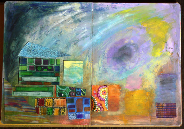
When I began to add hand decorated papers, I followed the same rule of controlling the number of repeats: not too much of the same paper.
Using hand decorated papers is a great way to add thin lines to a page. The gelatos have a waxy surface that can be difficult to handle with thin markers. For the journaling, I used Faber & Castell PITT brush pens.
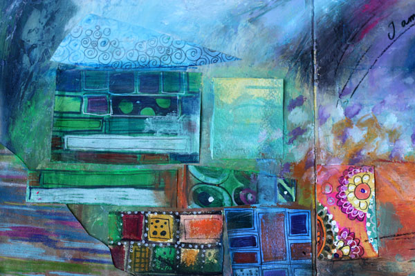
To make the collage look more integrated to the page, I added color with Gelatos on the papers.
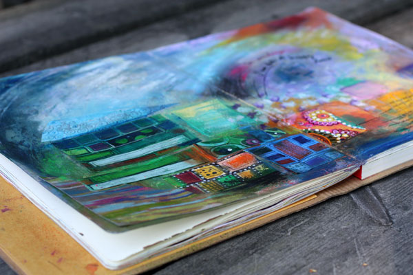
If I had to define art shortly, the definition would be: creating great color mixes and communicating with them. At least that is the step to take when you feel that the page you made does not represent what you wanted to create!
Read more about colors: Yellow, 5 Tips to Choosing Colors
Let me be your art teacher: Subscribe to my weekly emails!
12 thoughts on “How to Mix Colors?”
Comments are closed.
I felt like I was attending an art class! Thank you so much!
Thank you, Laura! I tried not to overwhelm anybody with color theory but give some basic advice on what to consider!
Thank you. Haven’t tried the gelatos yet. Your insight and guidance and lovely art pages is such an inspiration.
Thanks, Nea!
What a great post on mixing colors. Do you mind if I give a shout out on my blog?
Kate
Kate, thanks! I appreciate it!
Paivi, I am learning and enjoying your tutorials so much! Your use of colors and artistic spontaneity reflects such joy. I’m hoping to invest in some gelatos based on your recommendation. Thank you!
Thank you, Evie! I often think that self-expression is one of the greatest pleasures in life and hope to guide others to it too!
Great insight. Thank you for your generosity and for sharing. Your page is delightful
Thanks, Tina!
Wonderful tutorial, Paivi! I have a much better understanding of how you create some of your lovely art effects with gelatos. 2 questions: can gelatos be smudged once ‘finished’ or do you apply a sealant?
Thank you, Malini! The gelatos dry a bit once finished. So you do not need to add any sealant. I usually don’t.