Mixed Media Painting Idea – Revisiting Your Old Style
Between 2010-2014 I was enthusiastic about decorative art. I called myself as a “decorative artist” and saw myself more as a designer than as an artist who focuses on expression. My upcoming class Collageland (thank you, everyone, for the feedback you gave in the last blog post!), is a retrospective to that period in my life. While editing the videos, I have been pondering about what inspired me back then and how it’s different from what motivates me now.
Some themes and styles often feel too familiar to me. They don’t seem to challenge me anymore, so I have moved on. But now it hit me how harsh it sounds and how unnecessarily harsh it sometimes also is. So when creating the pieces shown in this blog post, I gave myself permission to take it easy and get decorative. I also became curious about comparing my past decorative work with the pieces that I would produce today.
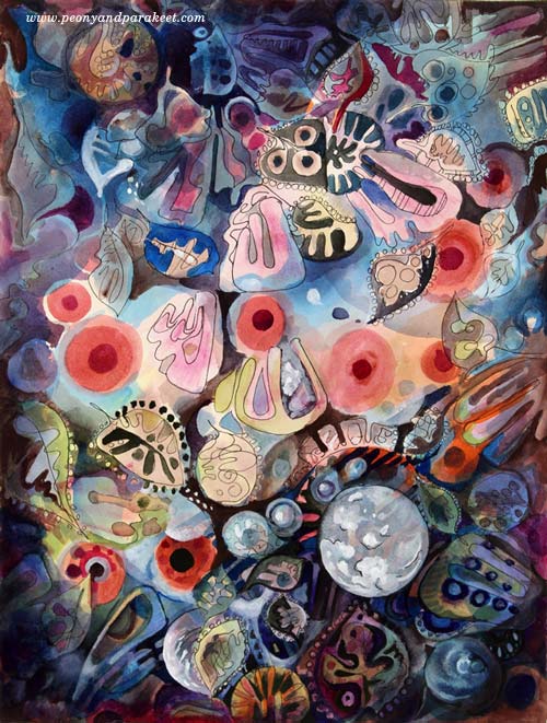
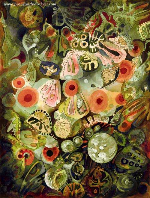
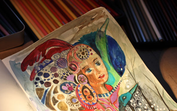
My comfort zone is getting inspired by design and translating that inspiration into art. So I made a mixed media painting that is inspired by the world of fashion, jewelry, lace, Renaissance murals, and botanical art. I call it “Lost and Found”. To embrace a designer’s approach to art, I also made two different color versions by processing the photo of the original artwork digitally in Photoshop.
Here’s Marine:

And here’s Botanical:
I don’t have many phase photos because I wanted to relax with that too but this is what I drew on my planner the previous day:

These quick sketches are the core of my creative process.
Another Painting with the Same Idea
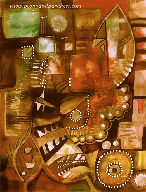
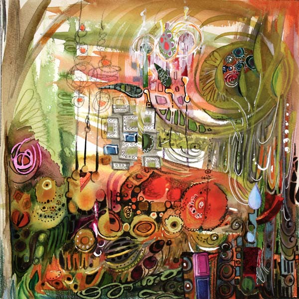
I also made another design-inspired painting. The idea came from the ceramic art of the 1960s.
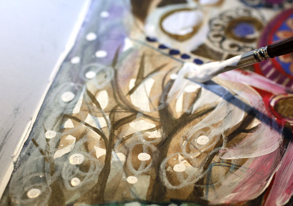
The photo below shows how the piece looked like before adding the decorative layers. Glowing watercolors remind me of the glazing used in ceramics. When this happens, I feel like I am a ceramic artist, playing with colors.
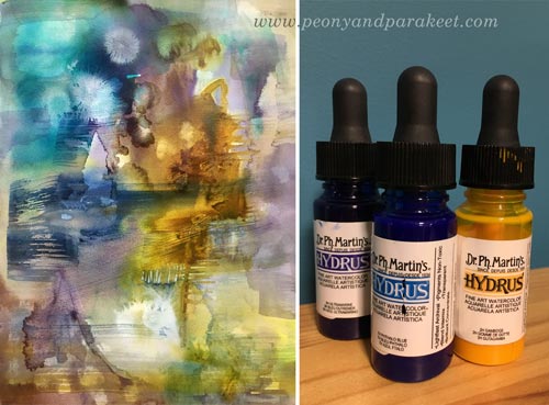
A student of mine kindly donated Dr. Ph. Martin’s Hydrus watercolors some time ago. First, I liked them, now I adore them. They are intensive and easy to use, and I especially love the coverage of white. I used Hydrus watercolors for “Lost and Found” too.
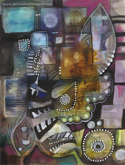
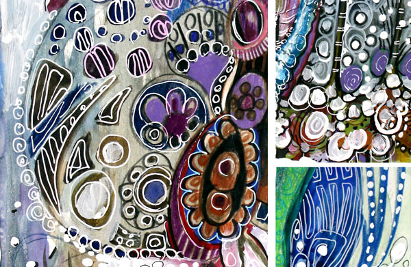
Here’s the finished painting called “Retro Living”. It is also a mixed media piece. I used colored pencils, PITT Artist Pens, and a correction pen for the last layers. I love these muted colors, so typical for the Finnish ceramics from the 60s. But then, I thought they might be too gloomy for many, so I made another version digitally that reminds me of furniture from that era:
Comparison
See my new gallery showing decorative art and designs from 2011 to this day. When I look at the newly-created pieces as a part of that collection, it looks to me like I have traveled a long journey in art. And I have – I just never thought that it would show in this decorative style as well. It makes me want to explore more of this and also, see exciting challenges in this direction too.
My challenge to you: Pick an old piece and make a new one using the similar techniques and style!
Let me be your mentor in art: Subscribe to my weekly emails!
From Movie Posters to Art Journal Pages
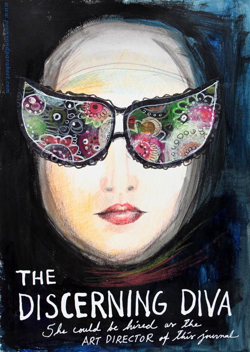
“The Discerning Diva – She could be hired as the art director of this journal.”
This page is my version of the poster for the movie “The Big Lebowski”. I have borrowed the concept of weird glasses and the composition from the poster, but it is still a separate artwork, not an exact copy.
The Discovery of Movie Posters
After learning that I like to use alphabet stamps in the art journal pages, I had been thinking about the next step in journaling. Last week I watched the poster artist James Victore‘s course Bold & Fearless Poster Design on Creative Live. His style has very little to do with mine, but I became fascinated by the visual concept of posters.
Last weekend I found a book about 1990’s movie posters at the local library. I became fascinated by the compositions used in the posters. Then it hit me: maybe I could replace the main elements with my own and apply the visual concept of the poster to my personal stories!
How to pick ideas from movie posters?
I will show you how to make your own “Discerning Diva” (very easy) but before that, I want to show you another poster-inspired page.

The page on the left is inspired by the poster for the movie “The Matrix”. I picked few main elements and the general atmosphere from the poster. The page on the right is made a long time ago, but I like how the two pages tell the story about being inside someone’s brain.
Four tips for picking ideas from the movie posters:
1) Composition: Examine the placement of the title, the grouping of the main elements and the most noticeable color contrasts.
2) Subject: Think about how your life could be applied to the movie.
3) Process: Examine the poster carefully but when you start creating, focus on your page and make it your own.
4) Imagine: Remember that you can replace the elements of the poster with whatever you like. For example, a person can be replaced with a vase of flowers.
Create Your Discerning Diva!
1) Paint the background of the page.
I used acrylic paints to make the background strong and heavy-looking. Leave an unpainted area for the face. Add water to the paint and gently brush the area around the face. Wet strokes create the impression of a thin scarf and add dimension.

2) Color the face.
I used colored pencils to maintain the big contrast between the background and the face. Add some color to the skin. Draw a mouth and a nose.

3) Add glasses.
Go to your box of hand drawn papers. Cut two lenses. Attach with glue or gel medium. Add frames with pens. Make the glasses as decorative as you like!

4) Add text.
Pick a color that has a high contrast with the background and journal on the bottom of the page. I have used a correction pen for the title and a white gel pen (Uni-Ball Signo) for the text below the title.

5) Add finishing strokes.
With colored pencils, add some strokes below the face to represent a scarf.
Add few strokes to outline the scarf near the forehead.
More Ideas for Compositions

Believe or not, this page is inspired by Austin Powers movie poster and hand embroidery! I think that hand embroidery has a lot in common with hand drawing.
Learn to draw from imagination and inspiration!
>> Buy Inspirational Drawing 2.0
Get the Most Out of Art Critique
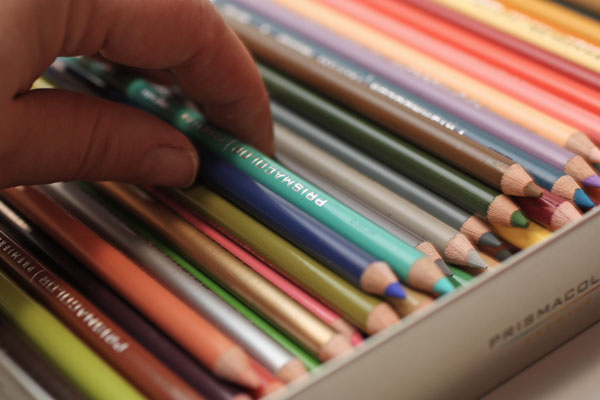
My latest art journal page is inspired by a discussion in an art journal group. It was about how to deal with the criticism towards your art. One woman told a story which touched me deeply. Someone had accidentally seen photos of her art and asked if they were made by her little grandchildren. After that she did not feel comfortable making art again. The story made me think about how important other people’s reactions to our arts and crafts is. How much we yearn for comments and how the critique can scare us. I also share those feelings. These are my conclusions of the subject. (And yes, I have new pencils!)
1) Pick Your Specialists
“Can you simplify, Paivi?”, said my teachers in so many words while I was studying industrial design. Because, in design, it all starts from the basic concepts, basic shapes and little alterations to them. I have always loved decorating. So I rushed through the first design decisions to get into adding swirls and tiny dots to the each of the designs. When I completed a sketch for a bar code reader, a teacher said: “What can I say, it is like a Russian icon painting with a flair of folk”. And he did not even know I had painted icons as a child!
“Your sketches all look the same”, he continued.
I did not get it. For me, they were all so different.
– “The same shape is repeated all over again.”
When I went back home, I thought that studying industrial design was going to change me to the direction I did not like. Within a year I would be living on a white box with no carpets on the floor and wear black glasses. But the end result was nothing like. My interest in art history and decorative art only increased within the time as practicing different styles helped me realize there’s no need to create a too narrow image of my own art.
At the end of the studies, one of the teachers said to me, carelessly: We just got an application from a person who reminded you: so many details, so little simplifying! We can’t accept him in. To design is to simplify. Despite your beginning, you do have learned that.” It meant a world to me – according to her, I was a simplifier, a designer.
In today’s world, there’s a specialist for everything. I yearned for the specialist to testify, objectively. And once she did, I was happy. But later I have begun to think that actually, in art, everyone has to define their own specialists. The range of art and design is huge and surely, everybody doesn’t like every piece of art.
So, don’t even expect that everybody likes your art – is a specialist of your style. Pick those that you want to please and forget the rest!
2) Improve Your Communication
An artist Ann Rea has said: “Art is communication”. I think that focusing on what we want to say with our art is often more beneficial than focusing on the techniques. When someone comments our art, whether the feedback is positive or negative, we can always ask: “What do you see here? How does it make you feel? What do you like the most?” (Or “like the least”, if you are brave enough, and if you have chosen the person to be your specialist.)
Sometimes it is not so much about delivering a certain message, but touching people. When we are touched by our own art, it may seem surprising that others do not get touched by it. Then we need to improve our visual communication or fill in the story verbally. (The power of art journaling!)
Instead of thinking “I want to become a better artist” you may want to think “I want to become a better visual communicator.” After that, you will often find art critique easier to swallow!
3) Set the Risk Level
If you only want to hear positive comments, set the risk level low. One way to do that is to stick with the realistic art and copy those who have a lot of general acceptance.
But if you want to find your own style and in the end, truly touch people, take more risks! Experiment, observe, let go of the definitions you use for yourself, think about before you start to create and while creating, stop thinking! You can set the risk level for each individual piece, and go higher from one artwork after another.
Once in a while, give yourself a permission to make high-risk art! Sometimes it may also be good to take high risks when asking for comments! But never let anyone keep you away from creating when you are on the way of unique self-expression.
In need of experimenting? – Join me for an art journaling workshop!
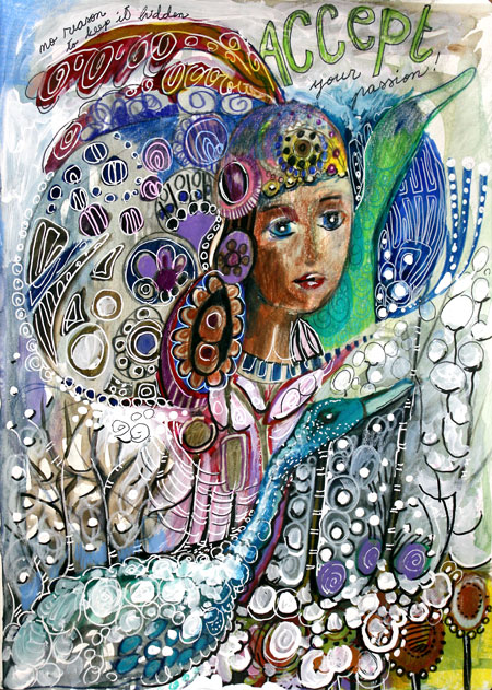
This is one of the many art journal pages inspired by embroidery techniques. Meet me at 21 Secrets Art Journaling Workshop where I will show you my favorite embroidered textiles and teach you how to imitate the embroideries with pens and paper! The perfect project if you want to stretch your style in a safe environment! The workshop begins in April, but you can preorder now!
The Power of Positive Self-Criticism in Art
My latest mixed media artwork is called “Positivity Grows”. It is dedicated to all of you who have a strong inner critic. If you want to improve, it is essential to evaluate your own work. But sometimes the self-criticism can have too negative tone. Have you experienced any of these?
1) Big Picture Panic
The artwork gets evaluated as a whole in a too early stage. It is like making a meal and after tasting the raw potatoes, you’d decide that it’s not going to succeed. “I must have done something wrong when peeling those potatoes!”
2) Overclean Obsession
You take the safe way: you don’t mix colors, don’t let anything intersect, draw sloo-owly, keep everything plain, simple and controlled. This reminds me of a tadpole (a baby frog) which I got from my friend when I was a child. The tadpole lived in a jar filled with muddy water. I picked a clean vase, poured plenty of tap water and put the little frog there. It did not live long. I did my best to take care of it but did not understand that for the tadpole, there was nothing to eat, nowhere to hide. So – Mix those colors! Add diversity! Give some nourishment to the growing artist in you!
3) Mistake Hunt
If you focus on the things that “went wrong” instead of those which “went right”, you are playing the wrong game. Art is in small nuances, it requires sensitivity and openness. If your self-evaluation is too negative, you do not notice the beautiful little details that appear in your art. They are often lucky accidents if you take care of the diversity. When enhanced, those details can take over and bring your end result to the new level.
Positive Self-Criticism
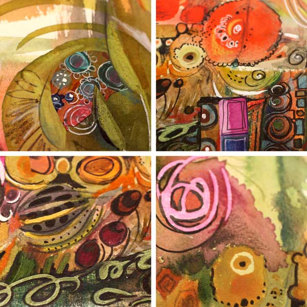
You can get cured of any of those diseases with a healthy dose of positive self-criticism. From the moment you make the first brush stroke, focus on the details and look for beautiful and interesting areas. I will show you how I did that while creating the artwork of this post.
Phase 1 – Watercolors
When I began the artwork of this post, I just made a mess with watercolors. I kind of made the muddy jar for tadpoles to prosper!
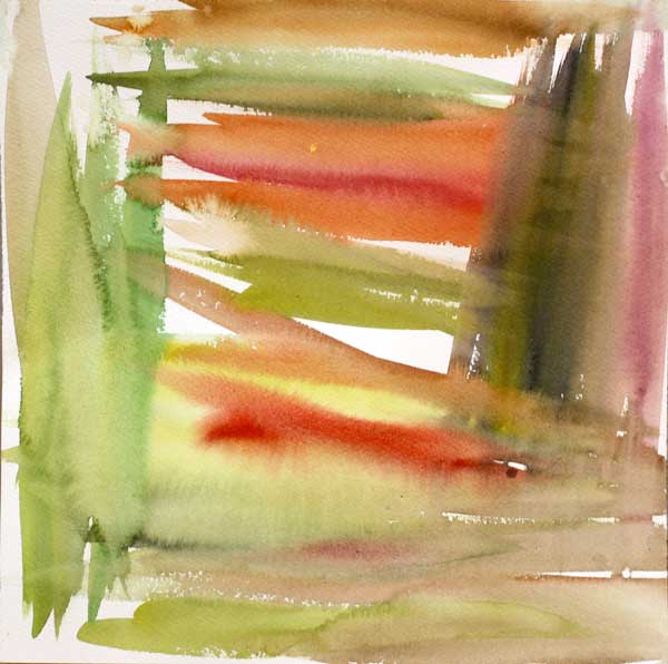
After painting this, I could have just quitted and called it ruined. Or I could have tried to make that dark muddy area brighter. But instead, I began to investigate the painting closely.
My inner critic pointed the little details with so much beauty that I began to feel confident and excited. The whole process of making this artwork began to feel like an adventure. Instead of mistakes, I was hunting treasures!
Phase 2 – Watercolors
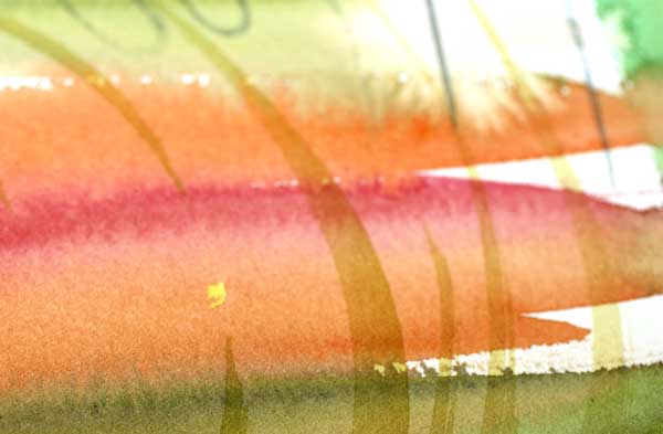
Next, I continued with watercolors and created new layers of elements. I took care of the diversity: there’s a lot of various hues and shapes. And even more important: the layers intersect so that they create new happy accidents.
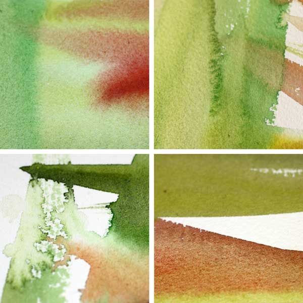
After painting this, I enjoyed this tiny detail: a yellow spot. It was like a little star! I felt I was lucky and genius at the same time.
I spent some time searching for more beautiful areas and enjoying them. With watercolors, the edges of brush strokes are often really beautiful.

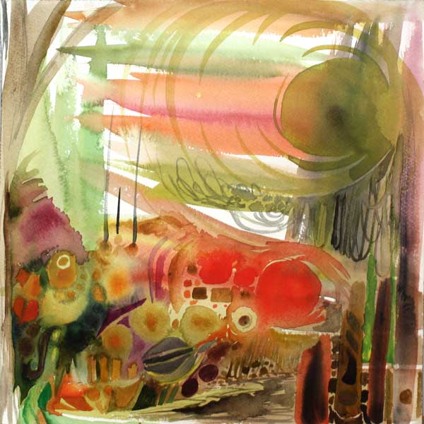
Phase 3 – Colored Pencils
To keep the diversity level high, I changed watercolors to colored pencils. I also changed the music I was listening to. Working from a small area to another, I enlarged the beautiful details found after another.
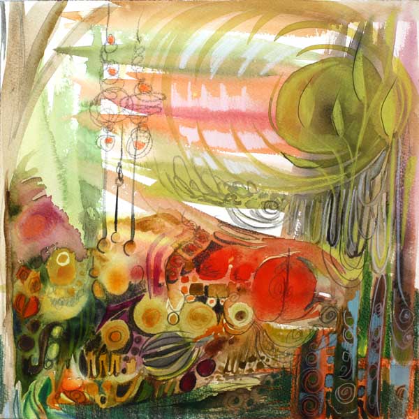
In this phase I realized that the main theme of the artwork would be growth. I searched for the details that would express the theme. I found several and they made me happy!
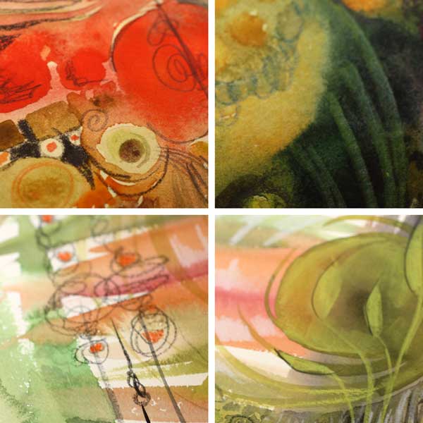
Phase 4 – Pens
New music and new supplies! This time I picked a black PITT Artist Brush Pen and a white gel pen (Uni-Ball Signo). I was encouraging myself to create strong contrasts. They would make the pretty details really pop. Again, I was not worrying about hiding the not-so-pretty details but enhancing the good ones.

In this phase I began to look the artwork as a whole. However, instead of correcting the poor composition, I analyzed which of the details looked most appealing and how they were located.
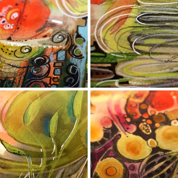
Phase 5 – Finishing
When finishing, I like to listen to the rhythmic music which gives me the confidence to carefully adjust the balance of the work. I picked a white correction pen and a box of hand decorated papers. By doodling and cutting papers, I changed the composition so that the eye would find all the pretty little details one by one.
The Summary
You can be analytical and critical when making art. You can also be strict: mix the colors, change the tempo, keep the image alive! But maintaining the gentleness and sensitivity is crucial too. Let the little details that appeal to you be the foundation for your self-expression!

Blank Page Syndrome before Big Picture Panic?
Buy the video “Watercolor 101 for Intuitive Painting” where I will show you how you can get a fast start and keep going! Click here for the preview!