
Make Old Art Journal or Sketchbook New Again
This week, I have a 1-minute video about revamping my old art journal!
This sketchbook is from 2018, back when I was practicing different portraits and creating a course called Innovative Portraits. There’s still plenty of empty space left in the book.
My Old Journal and How the Cover Was Decorated
My old art journal is from The Pink Big. I decorated the cover around 2020.
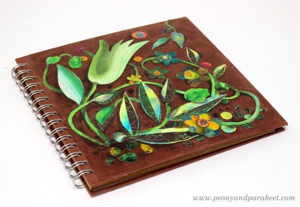
I cut hand-painted papers, added shadows, and protected the collage with gel medium. See an old blog post about how to create the collage!
Now I brought the book back out to start filling it up again.
Oil Pastels in A Journal
The first page was done with smudgy oil pastels, so I left the opposite page empty.
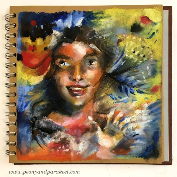
Oil pastels are fun, but maybe not the most practical for journals. See an old blog post about ideas for using oil pastels!
Abstract with Colored Pencils
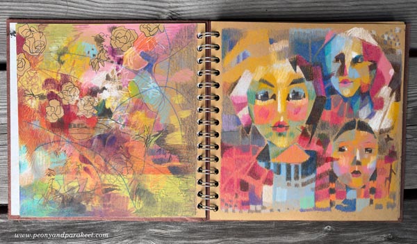
On the next page, I made an abstract drawing using colors that go well with the original 2018 page.
Fun with Sakura Gel Pens
These brown pages are great for trying out gel pens. I made a new drawing on the opposite side.
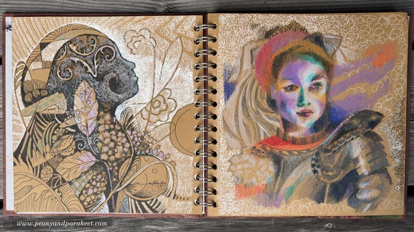
My newest course Drawing Soulfully is about drawing all kinds of lines, and it was fun to use those techniques here.
Flowers and Fabric with Colored Pencils
I placed a paper sheet to protect the previous page, and then colored flowers with colored pencils. The opposite page only had three faces, so I added flowers there, too. I love historical styles, so the main figure got a big, decorative sleeve with dramatic folds.
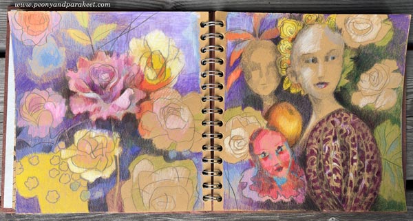
The next spread is already waiting! I hope this inspired you to make an old art journal or sketchbook new again and use your past pages as inspiration.
P.S. You can still sign up for Drawing Soulfully! >>Sign Up Now!
Black Art Journal Pages as Banners
I want my Black Friday campaigns to be inspiring for art-making, and this year my theme is “Black Berry Friday.” It means juicy art journal pages on black paper. I am pretty sure you have one like my black and square Dylusions Creative Journal (affiliate link).
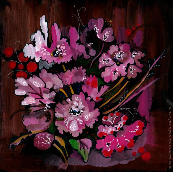
I use my black art journal for using up old supplies that don’t inspire me anymore. And if I have leftover paint on a palette, I make a few brush strokes on a page rather than toss the paint away. This floral page was born from those kinds of careless strokes and now, much later, I finished it with paint markers.
Edges and Banners
Usually, the center of the page is the most important area, but for banners, the edges need to draw attention. Here, the circular floral design, enhances the center text area beautifully.

I made the banner in Photoshop, and boosted the colors a bit.
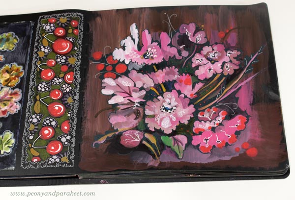
I also drew a long rectangle of cherries that not only makes a great banner but also looks great on the journal. I think we treat art journal pages too often as one unit when a page could be divided in sections and thus bring more variation to the journal.
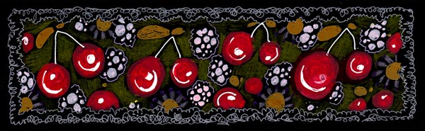
My banner wasn’t long enough for all the purposes, so I made it longer by duplicating the design in Photoshop.

Colored Pencils on Black Art Journal Pages
I like to use colored pencils with paint markers. Marker pens produce thick and opaque shapes but colored pencils are softer and more translucent. Colored pencils are great for backgrounds. Look at these stripes!
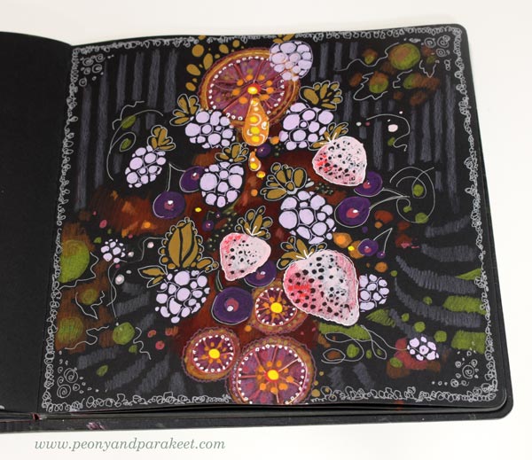
I also used gel pens to add thin lines.
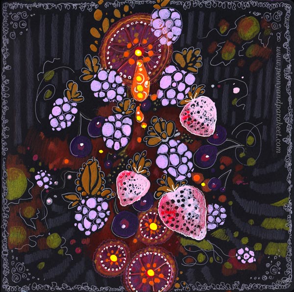
Again, I became more interested in the background than the center. The center is not very elegant, but here, in the banner you mostly see the edges.

Doodling on Black Art Journal Pages
My Black Friday offer is simple: All classes are 20% OFF. So I wanted the banners have some simplicity too. Doodling circles is easy and doesn’t require much thinking.
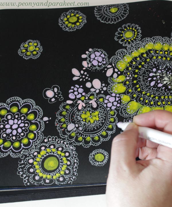
I got a bit carried away though!
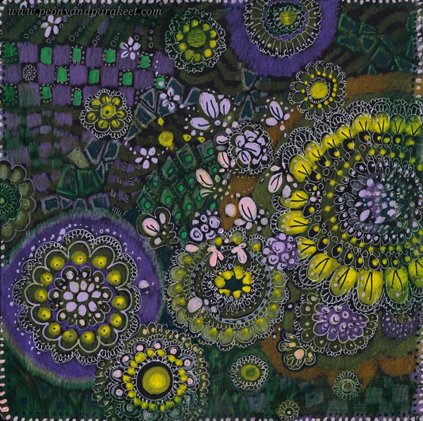
I was talking on the phone and watching a movie while doodling, and once I stopped, I thought that I doodled too much. But the banner looks great and of course, there can’t be too much of anything in art!

Designs for Fabric
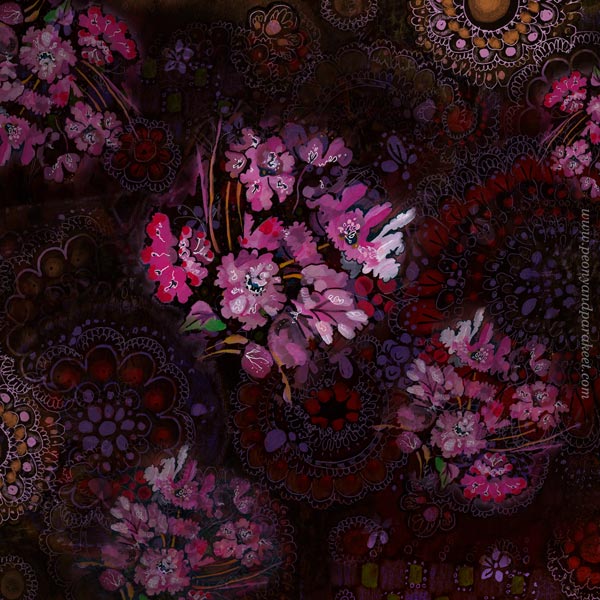
I got so inspired making these pages, that I had to play with Photoshop a bit more than necessary. I combined many pages into one design and I think something like this would make a great fabric.
Black Over Painted Background
I have been contemplating whether I should use both sides of the pages on my black art journal. Using only one side would give a blank page to protect the art on the opposite page. But the journal looks much more inspiring when both pages are covered!
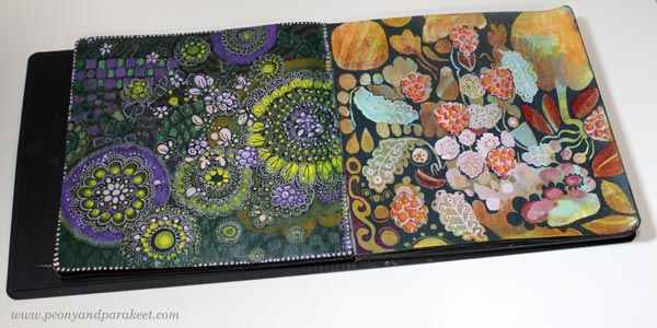
Here’s one more idea for an art journal page, and this works on any journal. When you have painted backgrounds, use dark marker or paint on top to make shapes from the background.
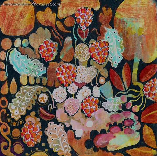
I wanted to make one banner that has fall and thanksgiving themes with berries. The page became a bit busy, but again, the banner is ok, I think!
And now: it’s time to shop the sale!
The Black Berry Friday sale ends on Dec 2, 2024, at midnight PST.
Using White as a Color in Painting and Drawing
In this post, we explore the color white and find ideas on how we could change the way we use it in art-making.
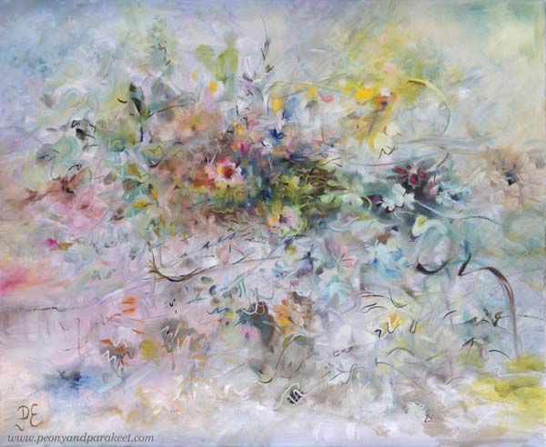
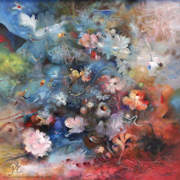
I posted this painting about a month ago, but I still had to fix it! You might not notice the difference, but it matters to me. I have changed the center of the painting so that it is more abstract.
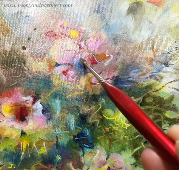
A long time ago I thought that it doesn’t matter if I don’t like some detail of my work or if I don’t like some of my work in general. I thought there would always be someone who would like it.
But the longer I’ve been painting, the more important it has become that I have to be a fan of my own work. When you are a beginner, quantity is more important than quality. But I’ve been working for a long time and the equation has thus turned the other way.
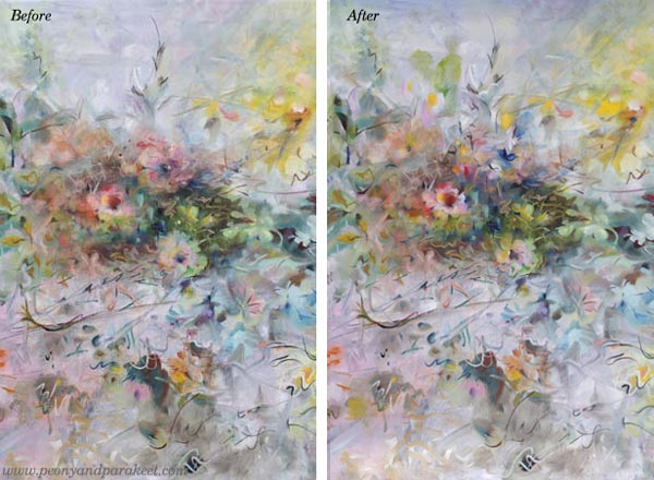
I know some would prefer the more realistic flowers, but I don’t! I have too much reality around me, especially now when the weather has been too cold to be spring.
Living in a White Country
This painting is also special because it has so much color that is difficult for me – white! There is far too much white here in Finland. Even if now is the end of April, we got a lot of snow a couple of days ago!

I think white is a terrible color because it is full of emptiness.
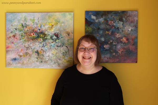
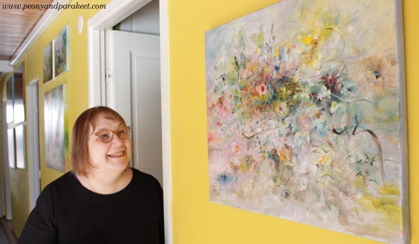
Finnish people usually have white walls and white furniture, but our home is full of colors. I love to display my paintings on this yellow wall.
Not One White But Many Whites
In the recent painting, I wanted to play with pastels and show the side of white that is often not talked about.
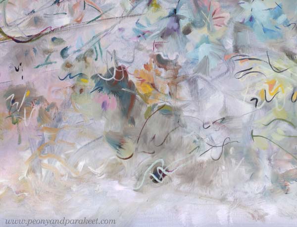
For an artist, there is not just one white. There is a warm white that holds the promise of the sun. There is a purple-toned white that falls in love when it sees a deep cold red. There is a white that allures you with a hint of sweet mint. So, many whites, not just one Finnish white!
It’s exciting to mix various whites and then see how the pastel colors slowly begin to appear. You need a lot of white and just a little bit of color to get the toned whites and pale pastels.
Titanium or Zinc White?
The most common white in paint tubes are Titanium White and Zinc White. In oils, you have to be careful with zinc white because it can cause crackles. I mostly use only Titanium White. I would love to use Zinc White because it’s more transparent. In this painting, I have tried my best to bring the soft transparent effects mostly with Titanium White, but it’s not easy!
In acrylics and gouache paints, you can use Zinc White more freely.
When White is Not Needed
Beginners think that adding white on top can fix everything. Ten years ago, I was madly doodling with a white gel pen. What went wrong, got covered with white circles. But white also can make the piece busy and destroy depth. Here’s a quick example of the small collage piece that I made in 2014 (here’s the old blog post with the video too). The first is the old piece and the second is a photoshopped version showing how I would fix it now.
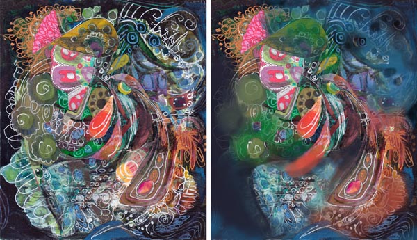
When I tone down the white, the image gets clearer and the depth grows. The highlights in the central parts get more attention and it’s easier to know where to look. I wish someone would have pointed this out to me back then. It took a lot of time to realize this!
If White Were a Person …
I am pretty sure that if White were a person she would say: “I have much more potential than you think. Stop seeing me as a blank background or a quick fix to a piece that lacks contrasts!”
What’s your relationship with White?
Happy Valentine’s Day!
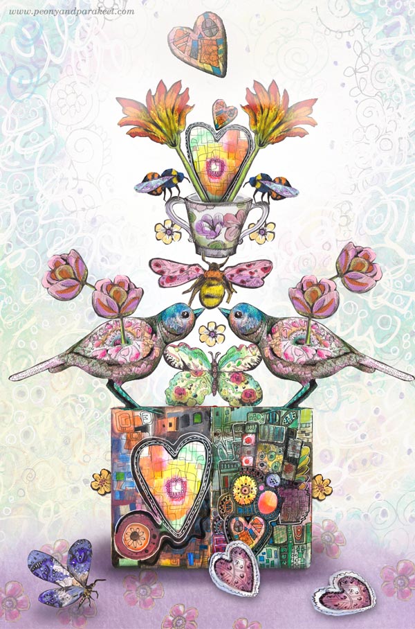
When like-minded hearts gather together, life feels wonderful.
What starts from a simple circle can grow wings,
and then support others.
Isn’t that what creating is all about?
Happy Valentine’s Day!
Start drawing your world of fantasy! – Subscribe to my weekly emails and get a free mini-course!