Pop Music in Art Journal
This week – turn some pop music on and start art journaling!
Since I started working full-time as an artist in 2014, my taste for music has gone wider. Listening to different genres has enriched not only my life but also my art. Music has taken me to all kinds of visual worlds. Even one sound can bring color or a shape to mind.
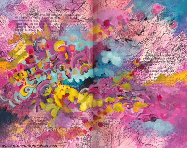
I have an old book as a music-inspired art journal. I like how the variety of music is shown on its pages. Now I wanted to make a spread inspired by Asian pop.
Sometimes Music is a Human, Other Times a Machine
Asian pop music is fun to listen and very easy-going – like an acquaintance who is always ready for a visit to a candy shop and to have a light conversation about current movies.
But when I paint big paintings, I prefer music that’s more like a vehicle – no melodies, only interesting sounds that make me go deeper and deeper in concentration.
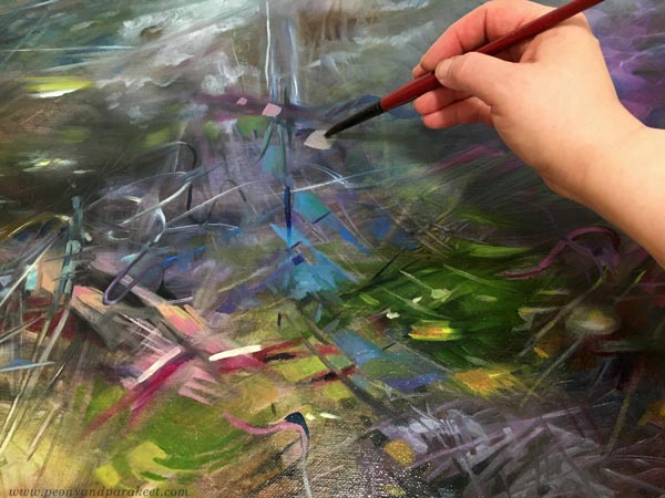
Without a repeating chorus and clear rhythm, I don’t feel the need to express the music or paint at its speed. That’s how I have become a fan of contemporary classics that I used to find too boring.
Pop Music in Art Journal – Playtime with a Friend
But this week, I wanted my friend back. I went to the Finnish radio website and turned on the newest of “Papananaaman K-Pop Show” which plays current Asian pop. My candy store was the box where I keep my red, pink, purple, and orange colored pencils.
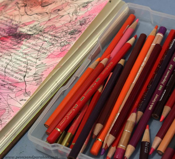
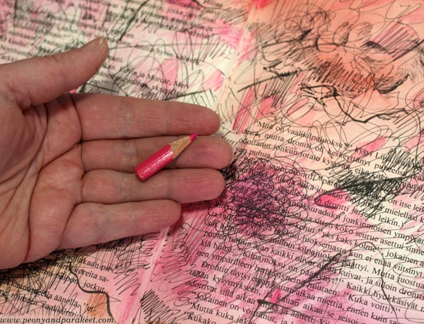
My music-inspired pages are in the “beautiful mess” style that I show step-by-step in an art journal mini-class called Music. It’s relaxing to create step by step and not worry too much about the “proper” supplies. I played with black pens, stamping inks, and the shortest pencils.
When I create canvas paintings, I use oil paints, but acrylics are great for this kind of messy play.
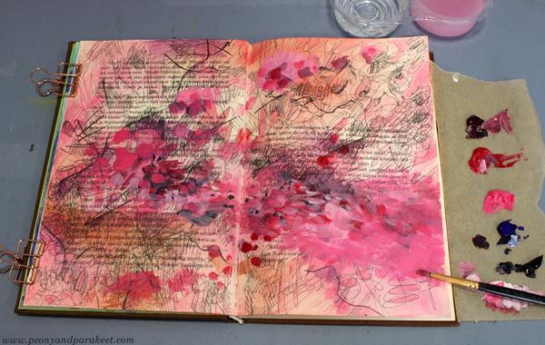
The spread started as red, but I then introduced a wider range of candy colors gradually. This mono-tone approach is great when you want to keep things simple first, and then splash the colors in.
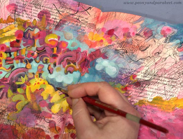
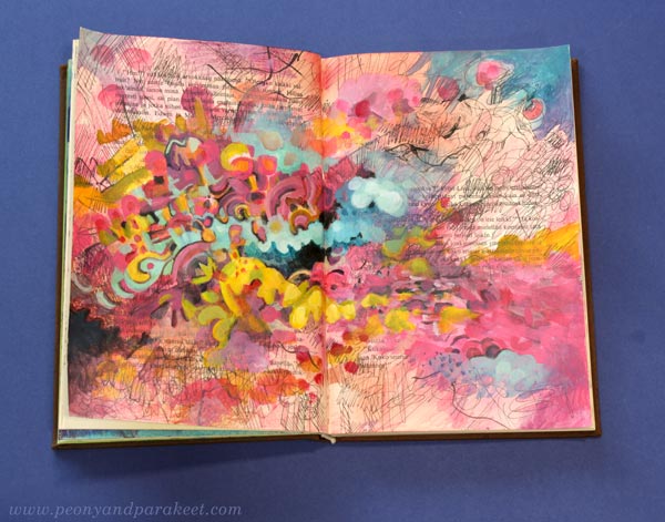
I like the candy colors and the informal look of the finished spread – pop music in an art journal!
I showed the spread to my Blythe dolls and they also gave their approval: “If that’s how you see Asian pop, we can live with that.”
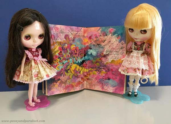
Maybe these dolls have made me listen to Asian pop in the first place! One thing so often leads to another.
Music in Art Journal – Step by Step!

The art journal mini-class Music is now available as an individual class. But you have to be quick – it will go away on Feb 7! >> Buy here!
Start a Music-Inspired Art Journal!
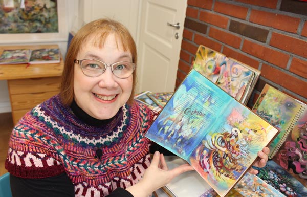
In 2020, I made a mini-class for a collaboration project that included several artists. Each picked a topic that raised the feeling of gratitude.
I chose music. I had just seen a documentary about a musician called Avicii. He was a young Swedish boy who got into composing electronic music and, within a few years, became a world star. His story ended too soon, though.
This month, I read a biography about Avicii. The book had more explanations for why the life that everybody envied was unbearable. But still, his music feels pure and bright.
When I hear A Sky Full of Stars, I am a little girl on a cold Tuesday evening in Eastern Finland. After participating in an icon painting group, I walked down the snowy hill looking up. The starry sky was blue-black, I realized. Not black like for those who glance carelessly or blue like for those whose skies were always blue. Working with colors had made the world look more beautiful.
What song takes you back in time?
What colors do you find there?
Avicii composed dance music but was inspired by folk songs and old pop music that his father used to play. He open-mindedly mixed different styles and genres.
Which things can you bring from the past to refresh your art?
Which ideas from your queue could you combine?
Avicii started a song from a few sounds and short melodies and then layered them together.
Pick a pen and scribble something small along with your favorite music, then layer colors on the top!

So, I suggest starting a music-inspired art journal!

I can now offer the class from the collaboration of 2020 individually. Only 15 EUR (about 17 USD), but be quick, the class is available for purchase only today to Feb 7!
3 Tips for Improving Busy Mixed Media Pieces
This week, I have a revamped old piece, and share three tips about making busy mixed media pieces more attractive for the viewer.
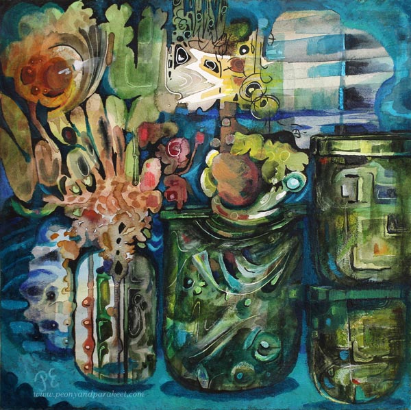
The image above is a revamped version of the busy mixed media piece below. It’s 12 by 12 inches, and I originally made it back in 2014 for a blog post about how to paint glass.
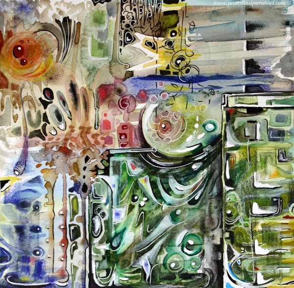
I visited the Finnish Glass Museum a couple of weeks ago, so this piece felt really inspiring again! Let’s dive deeper into how I changed it.
Tip #1 – Cure the White Spot Fever
Back in 2014, I had fallen in love with all kinds of white pens, paints, and correction fluids. A little dot here, another there, and the element looked prettier. But adding dots and spots also make the piece busier. For the viewer, it’s like trying to find its way through crowded streets where everyone is trying to get the attention: “Hey, hey, hey, you there, look at me!”
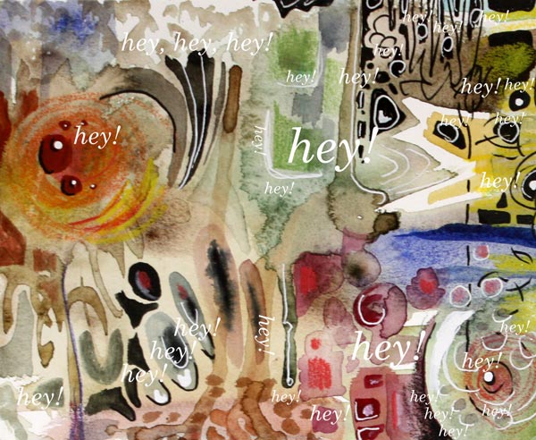
When you are a doctor for the white spot fever, start by toning down all the spots that are located near the edges. We want to steer the eye to the middle first, so the edges don’t have to be so eye-catching. If this is the first time you work on this job, watercolors can be a good choice. Even if the pigment wouldn’t stick on all the surfaces, you get the impression of how the piece looks if you make the edges less noticeable. Turn the piece upside down, so that it’s easier to focus on the task, and not look at the big picture.
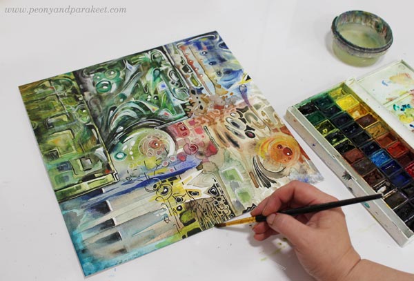
Of course, your pieces can have fever, even if it’s not the white spot fever. The general advice for any fever is to remove all the eye-catching small elements that are located near the edges.
Tip #2 – Form Friendships between Elements
Often when we don’t feel connected with the image, the image itself doesn’t express connection. When the elements are floating separately, there can be a lonely undertone in the whole piece. On the other hand, if there is no contrast between the elements, the image can look busy no matter how connected the elements are.
Here are my two versions side by side. In the old version, there are big glass jars, but the contrast between them is not very clear. There are a lot of small shapes that are floating lonely.
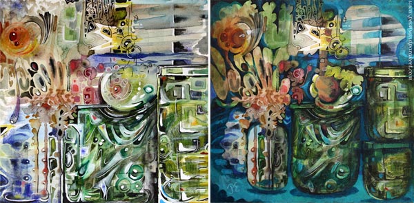
At best, adding connections make the image to deliver a message. When I looked at my piece, it was unclear to me what it was about. In the old blog post, I had written: “It’s about parents trying to protect their children. The parents have good intentions, and they do their best, but in the end, they have to let the child step into the world. I have painted two glass vases to represent the parents. The child sees the world through the parents, and even if they want to protect the child, they are fragile too.”
But now, I found the element that looked like jaws most intriguing. It seemed to be a rising spirit, a small but powerful baby dragon, which only needed a neck to become a central element.
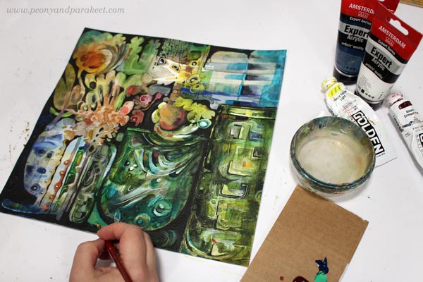
I used dark india inks and black pen to quickly sketch how I would connect the elements, and then continued the work with acrylics and lighter colors. I broke the biggest jar near the edge to two jars so that they won’t compete with the focal point so much.
Tip #3 – Make a Highway for the Viewer
Busy pieces often have so many paths for the eye that it’s not clear where to start and how to continue. The best thing is to be clear and make a highway that goes around the image. The viewer can then take smaller scenic routes around the details, but there’s always the big safe road to return to that leads to the main attractions.
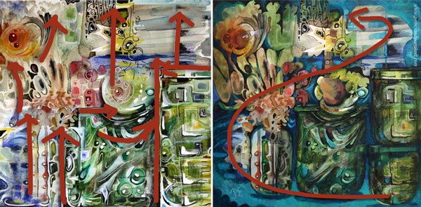
Building a highway requires that you know what your main elements are. After finding the spirit of the jar, I made the red circle communicate with it. Now I added a couple of white spots so that it looks like there’s a voice or a reflection flying between the two. So there’s use for those white dots, just use them sparingly and near the places where you want to lead the eye!
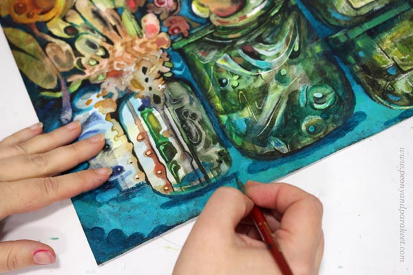
With turquoise tones, I painted a route from the right bottom corner to the two central elements. I also added more depth to the image by painting shadows. Shadows would be my fourth tip, but it’s worth a separate post, so I will get back to it sometimes later.
No More Busy Mixed Media!
I named the revamped version as “Song of Glass” because it’s now about finding the singing spirit of the silent jars.

I hope you found this post helpful for busy mixed media pieces. See my classes for more handy tips and advice!
Inktober Warm-Up Exercise
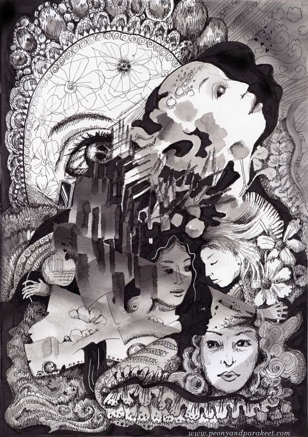
It’s soon October and with that – Inktober! Last year, I did all 31 prompts. Read about my previous experience here and here!
This year, I intend to make at least some drawings. And because Inktober was such a great experience for me last year, I want to support you to take it too. Here’s an Inktober warm-up exercise. I hope it inspires you to use inks and black felt-tipped pens to create black and white art. Follow the steps to keep going!
1) Paint an Abstract Composition
Let’s start by playing with liquid ink! Mine is Dr. Ph. Martin’s Bombay India Ink. I make the image on Leuchtturm 1917 Sketchbook.
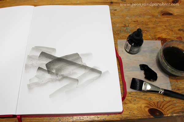
Put a few drops of black ink on a palette. Mix some water to the ink so that it’s grey rather than pitch black. Make some pale strokes with a flat brush. Then add new strokes on the top of previous ones. Work slowly! Enjoy each stroke and the translucency of it.
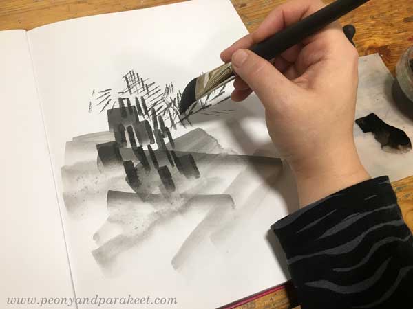
Turn the brush upward and make narrow strokes by using the tip of the flat brush. Experiment with both wet and dry brush.
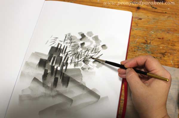
Pick a small round brush and add some ink on the top of the narrow strokes. Now you should have an abstract composition that has a variety of painted elements.
2) Fill Spaces Between the Painted Areas
Use a brush pen or black ink that hasn’t been watered down. Focus on the center of your composition.
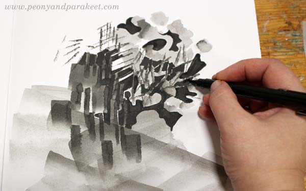
Fill most of the spaces between the painted areas with black ink. Leave some white to highlight the best parts. Black adds depth to the grey composition.
3) Draw Realistic Objects
Select black thin-tipped drawing pens of various thicknesses. I use Copic Multiliners from 0.05 to 1.0.
Choose a realistic object that you want to repeat in the image. My choice was women’s faces. For example, flowers or birds could be great too.
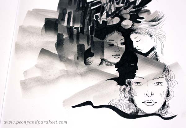
Look at the abstract composition and seek for places where you can add the objects. Add more black, and adjust the shape of the pale areas so that they partly outline the objects. When drawing the objects, play with the scale so that some are big and some small no matter where they are located in the image. All the objects don’t have to be fully visible. Some can hide partly behind the abstract elements.
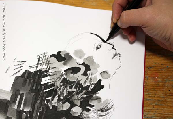
I like to draw faces so that I sketch it first with a thin ink pen, and then adjust it by adding a black element beside the face. (In my classes Animal Inkdom and Magical Inkdom, I show easy step-by-step methods for drawing all kinds of fun figures.)
4) Doodle Decorations
Continue with the black drawing pens, and doodle on the blank and pale areas. I also use a handmade oval template to get a big geometric shape that is fun to decorate.
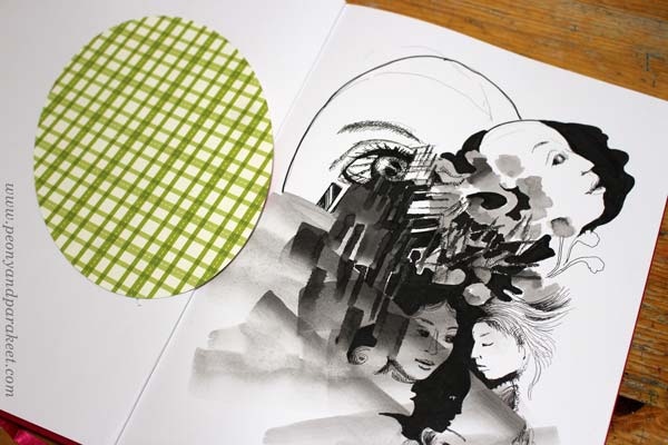
For decoration, the sky is the limit, but I like jewels, frills, laces, waves, and flowers!
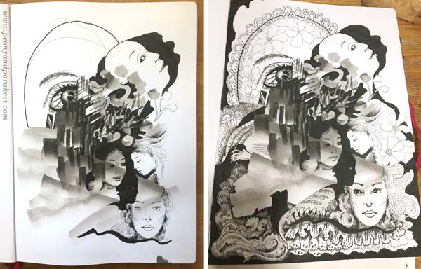
When doodling, I also add shadows to the elements by drawing thin lines side by side.
5) Finishing Touches: Shadows and Highlights
Squeeze your eyes and point all the white areas. Usually, there are too many and it makes the image look busy. Pick a brush and paint most of the white with diluted black ink.
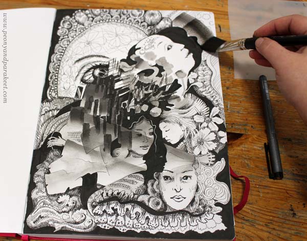
Especially the areas that are near the edges are worth toning down.
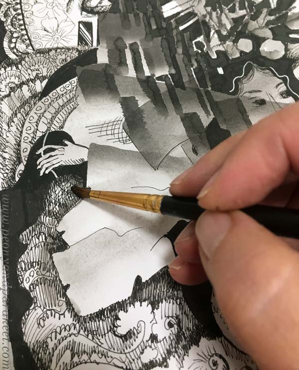
I also like to paint over the shadowed areas to give them a softer look.
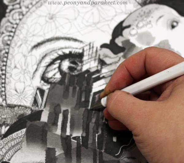
White gel pen can be handy for those areas that need a little bit more white.
Inktober Warm-Up – Finished Piece
Here’s my finished piece again. See how limited the number of white areas is.

I hope you enjoyed this Inktober warm-up! Tell me – are you going to participate in Inktober?