
Modernistic Style – Create Abstract Art Step by Step!
This week, we take a practical dive into modernistic style. My favorite modernist painters are Birger Carlstedt (1907-1975) and Sam Vanni (1908-1992) from Finland. The most famous modernist was, of course, Pablo Picasso, who was Spanish.
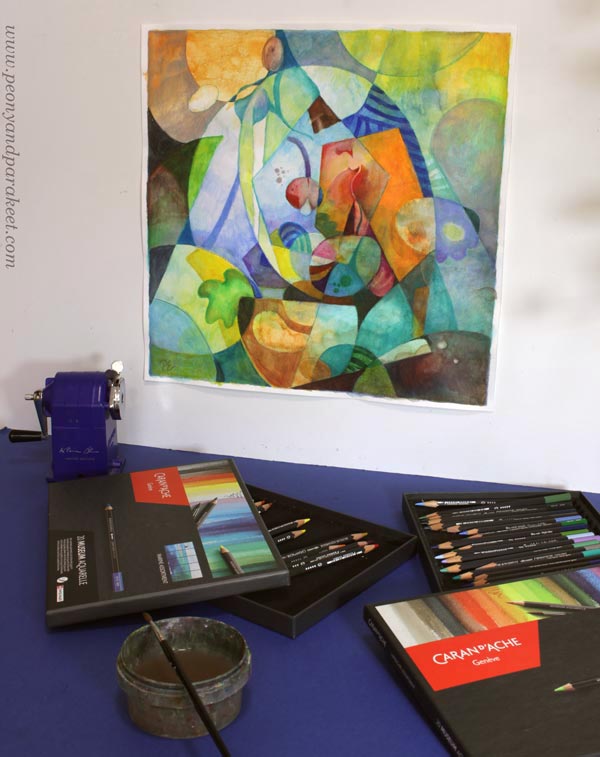
My piece has some figurative elements. Although it’s abstract, you can also see plants and light.
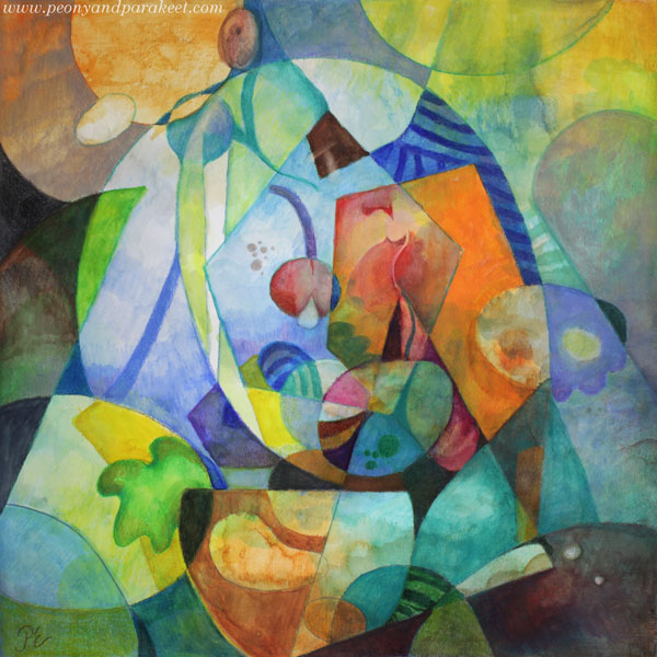
With this technique, you can create a fully abstract piece like Birger Carlsted (see examples from the past exhibition at the Amos Rex art museum), play with the perspective like Sam Vanni (see his artwork called Polydimensional Space), or use linework boldly like Pablo Picasso (see how he used strong outlines in his famous artwork Weeping Woman).
Supplies – Watercolor pencils or Use What you Have!
I created my piece on thick drawing paper with watercolor pencils and water. Its size is 16 x 16 inches (about 40,5 x 40,5 cm). You can choose your supplies and the size of your artwork freely.
Step 1 – Fill the Background with Colors
Don’t overthink, but just start adding colors!
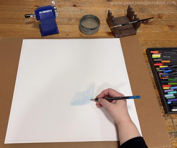
You can play with shapes if it helps you keep going.
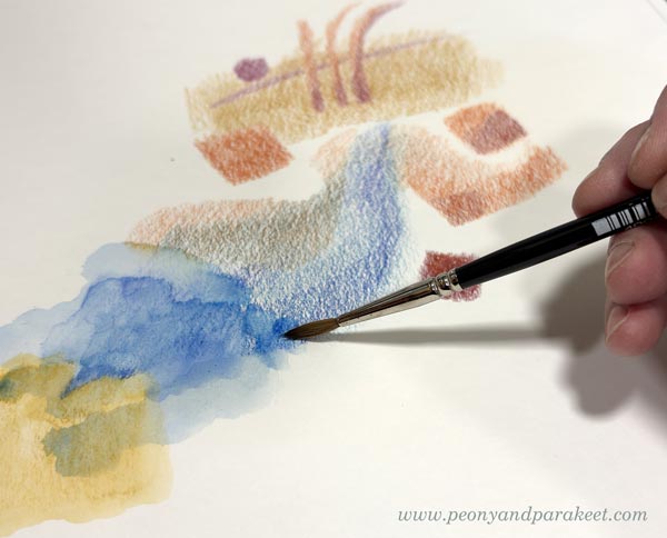
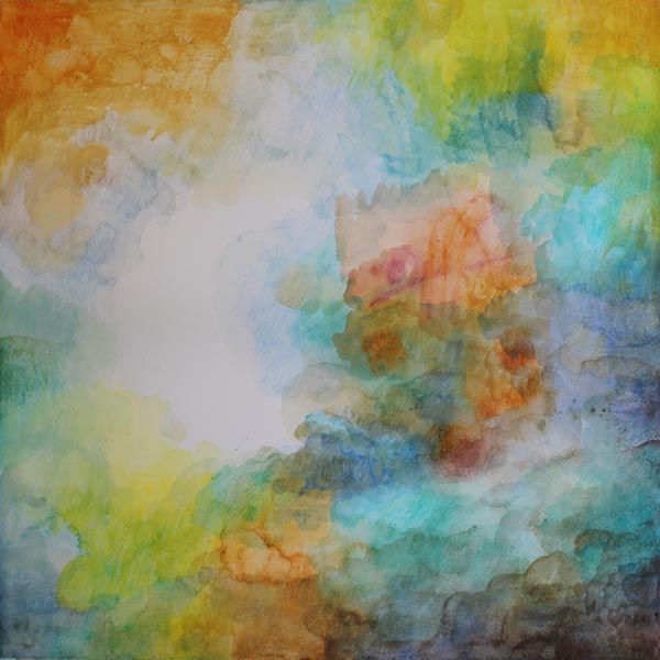
The idea is to cover most of the paper. Leave an area near the center blank if you are not working with paints that have bright white. For colored pencils, watercolor pencils, and watercolors, the best white is always paper white. To get some white and other pale colors in your finished piece, leave a fairly large area white at this point. Later, you can reduce its size and break it into several shapes.
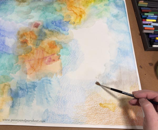
My paper is quite big, so I change the orientation once in a while. I move from one area to another by first coloring an area with a pencil and then spreading the color with water.
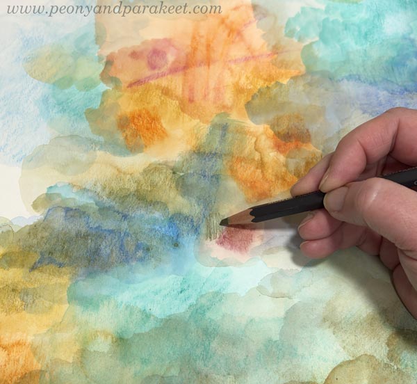
Add layers and darker colors. At the end of this step, your paper looks like a landscape without the horizon.
Step 2 – Draw the Shapes
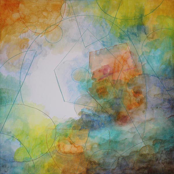
Use the filled background as inspiration and draw intersecting geometric shapes. A ruler can be handy here.
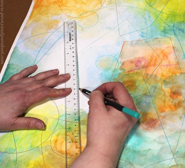
I use watercolor pencils for drawing the outlines.
Step 3 – Color the Shapes
Modernistic art often has strong colors. Now add more color to the shapes.
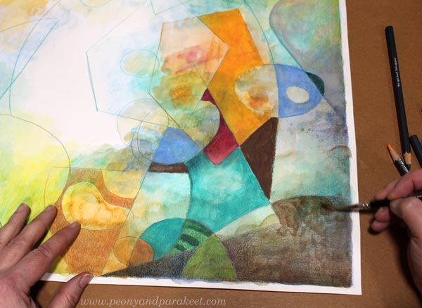
You can fill shapes creatively. Use stripes and add textures. Some shapes can have bold colors, others more muted. If there are nice details in the background, leave them visible.
You can also draw new geometric or more freeform shapes.
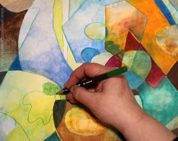
You can adjust the shapes, for example, by changing a straight line to a slightly curvy one.
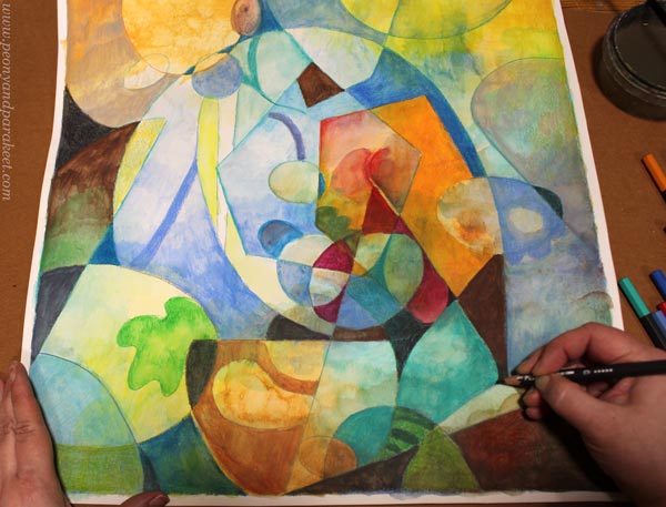
After you have gone through all the shapes, decide how abstract you want your piece to be.
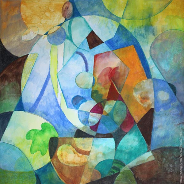
I wanted to add a bit more realism: make more organic shapes and express light as well.
Step 4 – Finishing
Carefully go through every shape one more time. Don’t just look at the big picture and adjust the composition. Focus on a small area at a time, and make it as expressive as you can. Remember that a modernistic style is quite minimalistic and based on abstract expression. Refine existing colors and shapes instead of creating more and more new ones.
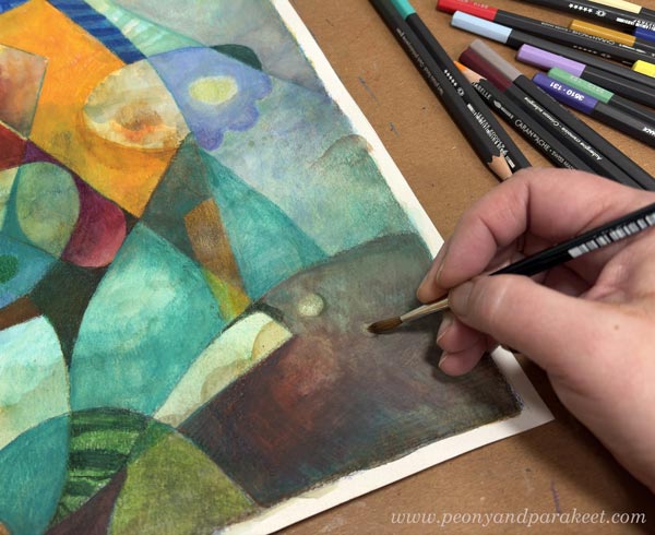
Make sure that all the shapes are not similar in size. I created small dots by removing paint with water and drew some thin lines.
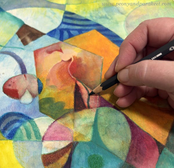
Simple But Rich Modernistic Style
By starting with the background first, you can achieve subtle richness for a minimalistic look. Here’s a close-up where you can see the effects of the background layer.
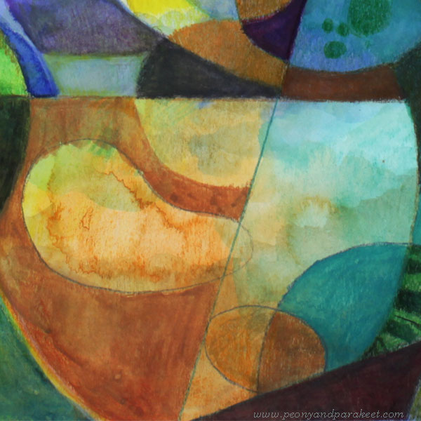
It’s good to keep all the best things – bold colors and interesting details – in the center. Often, the composition needs nothing else!
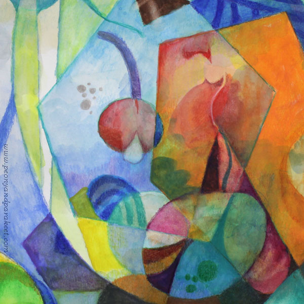
The more you learn about different styles, the more unique your own style will be. A style is never just one thing, but a combination of many. I hope you enjoyed this exercise!
P.S. Check my class Mystical Minis for creating more modernistic abstract art!
I Did the Same Drawing Twice!
I rarely sketch my drawings beforehand, but this time I wanted to try something different: creating the same piece twice and recording the process.

The first version was done freely with watercolor pencils. The second was a study of the first, but created using traditional colored pencils. These drawings have many kinds of flowers, including roses and tulips, but I don’t think you always have to know which real flower you are creating; you can have fantasy flowers as well.
Same Drawing Twice – Watch the Video!
When I began the first one, I didn’t have a reference or a model. I simply decided to draw flowers. Watch the video to see how it went!
Which Was Faster?
Both of the drawings took me about the same time—around two hours each. Watercolor pencils are definitely faster for covering the paper, but since I was starting from scratch with the first one, I had a lot of puzzles to solve with the composition and the overall mood. With the regular colored pencils, the process itself was much slower, but since I was just following my first drawing, it didn’t take nearly as much mental energy.
I hope the video inspired you to pick up your colored pencils! I am also curious to know: Have you ever tried an experiment like this?
Try Intuitive Coloring for a simple start to coloring freely, or explore Joyful Coloring if you’re into watercolor pencils. And for those looking to combine watercolors and colored pencils, check out Freely Grown!
Joyful Flowers with Watercolor Pencils – Watch the Video!
This week, I have a free video where I create these joyful flowers with watercolor pencils. These are inspired by fabric prints and are more motif-like than many of my colored pencil pieces. I love this kind of playing with style.

This is a small piece, just 8 x 8 inches. It’s colored freely with watercolor pencils on thick drawing paper.
Joyful Flowers – Watch the Video!
In the video, I talk about finding inspiration for art-making and tell stories about things that have affected my style. I just read abstract painter Darby Bannard‘s quote:
“Inspiration doesn’t follow style, it creates it.”
It made me want to share my thoughts about inspiration and style. I also wanted to create something colorful and cheerful that is not realistic, but more design-oriented. These joyful flowers were fun to make. After drawing the joyful flowers, I made something small to add to my boxes of joy. You can see that little flowery thing in the video too. Watch the video!
This video is a little longer than I usually post, but I personally like to watch long videos, and maybe you do too?
Joyful Coloring
My newest course Joyful Coloring teaches a color-oriented approach to watercolor pencils.
Start with blank paper and create freely with joy and sunshine! >> Buy here!
Revamping Watercolor Painting with Watercolor Pencils
This week, I am revamping an old watercolor painting and sharing some things I have learned over the last five years. Let’s make your paintings more fantastic with five tips!

The size of my example is 28.5 cm x 28.5 cm, so 11.25 inches x 11.25 inches.
Revamping a Watercolor Painting – Best Candidates
Here are the original and the revamped paintings side by side.

I got the idea of the revamp when I was going through my old pieces to find ideas for the new course Joyful Coloring. The watercolor painting from 2019 had good paper and fairly light colors, so I knew it could be revamped quite easily. A part of the revamp is to wipe off some paint, so it helps if the paper is thick and durable. And the fewer layers the painting has, the easier it is to alter it.
Making the Old Version – Watch a Video from 2019!
In this video, I teach the negative painting technique. It’s very useful for watercolor because when you paint around the shape, you can highlight all the lightness and loveliness that has been born in the first layers.
The problem with highlighting the best parts is that we see too many. There’s a mental barrier to paint over them in later layers. And that makes the painting less atmospheric and more busy. Then it also remains less finished-looking than it could be. My painting definitely had these problems. Now I see it as a nice start, but not a finished piece.
Using Watercolor Pencils for Finishing
I could have continued the old painting with watercolors, but I want to grow my skills in using watercolor pencils. So I picked Caran d’Ache Museum Aquarelle pencils, filled a water cup, and chose a couple of narrow brushes. It’s easy to do very detailed things with watercolor pencils so they are suitable for finishing. The watercolor paper of my old painting was the Cold Press quality, so fairly textured, and Hot Press would have worked better for watercolor pencils. But I made the color more even with water, and it worked fine.
You can use any supplies for these tips! Tip #1 is the most important, so start your revamp with it.
Revamp #1 – Less Modesty – Make the Focal Point More Dashing!
What’s the central element in your piece? Is it the best treat of the painting, making you look at it again and again?
Mine was some sort of a daisy, much too modest and simple to my liking, and a bit clumsy too.
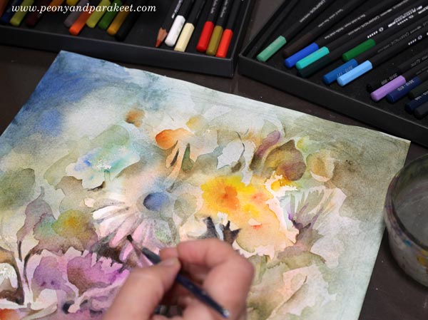
I started wiping off the darkest parts and then made it a peony. It’s a flower that has many layers of petals and is not a shy wallflower at all. Much more eye-catching!

It’s good to arrange some breathing room for the central element and add contrast to the background so that it stands out.
Revamp #2 – Less Bulkiness – Make Shapes More Elegant!
Do you have thick or straight lines? Do the shapes have extra angles? Are the negative shapes (background shapes) as beautiful as the actual shapes? Are many shapes connected to each other?
My painting had a lot of thick stems. Making them narrower immediately adds elegance to the flower. The stems were also very close to the flower and that makes the painting look flat. I added a dark color where the stem and the flower meet so that the flower stands out more.

My old painting had many shapes that looked quite random and not finished at all. I made them more organic and sharper.

But when revamping a watercolor painting, remember that everything doesn’t have to be sharp. The painting can have blurry spots as well, especially near the edges. Blurriness makes the sharp center stand out.
Revamp #3 – Less Evenness – Add More Subtle Patterns!
Have you used only one color on one area? Does your background look boring? Does your piece have an atmosphere?
My old piece had a background that was much too simple for my current taste. It didn’t have a sense of place at all. I want all my paintings to answer the question: “Where am I?” Even if it would be just an imaginary location, at best, the viewer can continue the scenery in her mind.

The background can have patterns. You can pick any idea suitable for fabric design! I wiped off the paint so that I got stripes going in all directions. This kind of bold patterning doesn’t improve the painting right away, but after tip #4, everything will get so much better!
Revamp #4 – Less Separate Color Areas – Add a Dominating Color to the Background!
Are your colors separate islands? Do you see problems in the composition? Is there too much of everything and a need to simplify?
The atmosphere can be often as simple as one color that dominates the background. However, it doesn’t mean that the background only has one tone. You can first add a variety of colors, and then color over them with one color. Separate colors are like strangers, but once they get the same color over them, they become a family. My choice was green, but yours can be any color.

Color a thin top layer so that the lower layers show through. You can color lightly and dilute the color with water.
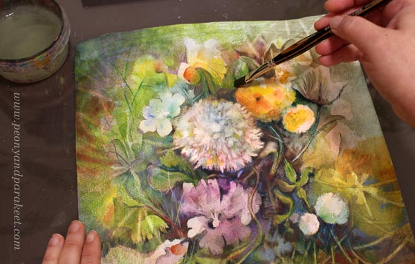
Don’t color over everything though. Leave out the details that you want to keep front!
Revamp #5 – Less Distracting Details – Choose Only a Few Shiny Stars!
Do you still see problems in the composition? Is there still too much to look at? Go through the painting and point your finger to every light and every dark area!
You most probably have too many white or pale pastel areas and/or too many dark areas. If you use high contrasts or very bright colors near the edges, the painting looks busy. Unfortunately, the best details often are born near the edges, but we don’t want the viewer to look there, so we must let them go.
When revamping a watercolor painting, use the dominating background color to cover the less important details. Compare the two pictures below and see how I have reduced the bright spots, for example, the two round flowers in the right bottom corner have been colored green in the final version.


In the center, the contrasts are good. So I made the background near my shiniest star – the peony – darker.
What a difference – isn’t it?!
I hadn’t signed the old painting, but I am so satisfied with the revamped version that I added my signature to it.
Joyful Coloring for Watercolor Pencils
Learn more about using watercolor pencils and create enjoyable projects!