
Floral Watercolor Painting – Finding the Expression from the Details
This painting, “Touched by an Angel,” is the latest in a series of three floral watercolors I’ve created for the Finnish Painters’ Union’s art sales event. I will also have two oil paintings available there, but the three watercolors were also an effort because they have a lot of details.
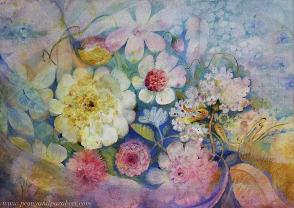
Finding the Name
It’s quite rare for me, but I had the name for this watercolor in mind very early on. The other two paintings in this series were about scent and taste, so I wanted this third one to be about touch.
The title “Touched by an Angel” reminded me of the 90s TV show, but it also made me think of old churches with their beautiful decorations. In addition to peace and timelessness, I wanted to express spirituality, lightness, and gentleness.
My Creative Process
I usually start my watercolors simply by playing with water and paint.
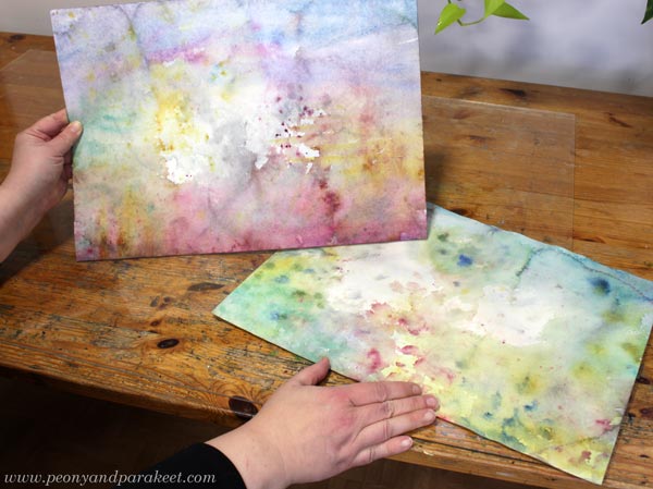
Once that “mess” has dried, the real work begins. I start with the background, and the flowers slowly find their shape.
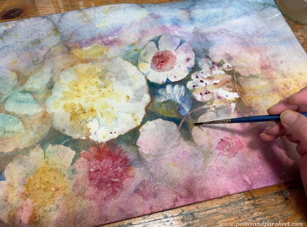
This is a process I teach in my Wild Garden course.
The Power of Subtle Details
I have found great joy in painting details in watercolor. I like to forget the “big picture” and focus on making one small part as expressive as possible. When every detail speaks to the theme in its own way, the whole painting comes together naturally.
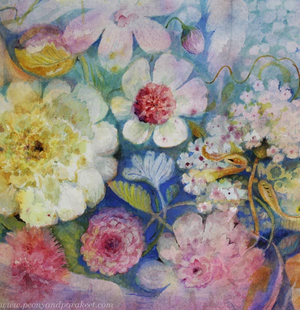
Not every detail has the same role, though. For example, you can paint a lot of detail in the background so that it doesn’t distract the viewer. The secret is to keep the contrast low.
Believe it or not, this simple thing took me a long time to learn. The light details seem so modest, yet they make the painting so much richer!
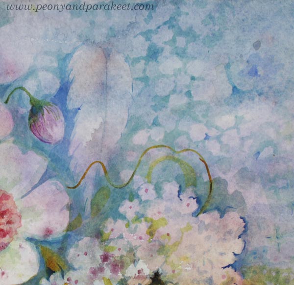
The heart of the expression is often not about the subject you choose, but how you work on the details. When every detail builds the story, the whole painting becomes expressive. In my piece, I wanted every detail to bring up the angelic touch.
Details also make a painting feel more finished. Even if those tiny, delicate brushstrokes seem invisible to some, they add significant value to the final piece.
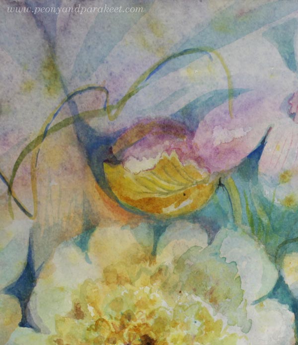
Also notice that when you paint details with a light touch, you can keep the color scheme more limited, and thus, more elegant!
Three Watercolor Paintings with Details – Scent, Taste, Touch
Here are all three paintings of the series.
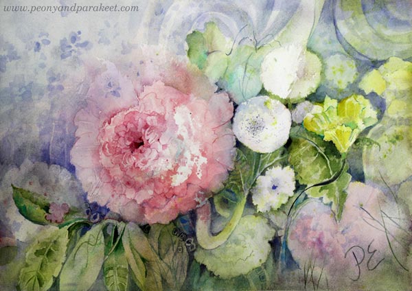
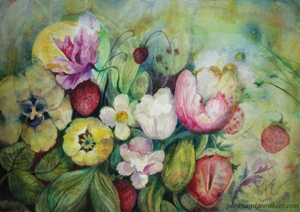
Tell me, which of these is your favorite?
22 thoughts on “Floral Watercolor Painting – Finding the Expression from the Details”
Comments are closed.
Minusta kaikki ovat aivan ihania ja on vaikea valita vain yhtä. Mutta jos pakko niin valitsisin Enkelin kosketuksen, koska se on niin moniulotteinen ja syvällinen teos.
Kiitos, Marjo!
Kauniita kaikki-
Enkelin kosketus on kuitenkin suosikkini, jos valita pitää.
Kiitos, Pirkko-Liisa!
These are all beautiful and dreamy! The second is probably my favorite, though it’s hard to choose between them. The flowers and strawberries seem to be dancing. Love the colors too!
Thank you, Melinda!
Extremely difficult to choose, but I say number 2 is my favourite. Muistojen maku – Taste of Memories, thought I love them all!
Thank you, Susanna!
I particularly like the second one. The deeper colours and detail appeal to me. But all three are lovely
Thank you, Elizabeth!
I like “Touched by an angel” best, though they’re all very pretty.
Thank you, Anja!
These are each quite beautiful.
I loved seeing the details you pulled out of the painting to show us, it is wonderful to see how the details are lovely even taken out of the whole.
It is hard to choose a favorite, so I thought if i were to choose one to purchase and #3 is the one that called to me.
Thank you, Tammie!!
I love the blue in Touched by an Angel, very divine! My favorite is the Scent of Wishes. I love the big peony and small blue flowers next to it 😍
Thank you, Julia, kiitos!
Scent of Wishes is my favorite (#1)
Light green and yellow gently touches pink and violet. Rich and delicate in the same time. I can imagine a sweet sense of pink and a freshness of a gentle greens. Ahhh…
Thank you, Natalka!
The third one is my favourite. I love how the shapes in the background appear almost translucent. And the combination of colours is so beautiful.
Thank you, G.S.!
Initially I was going to choose number two as i enjoyed the liveliness of the different color flowers but then I chose number one because of the focal flower and its lovely hue. But I ended up choosing number three due to its harmony and subtle colors. I looked at the details of the petals to try to figure out just how it is you do that. You are so incredibly talented it blows me away.
Thanks so much, Jeanine!