
What Tsubaki Stationery Store Taught Me About Making Art
I listened to a wonderful book. It was like a refreshing rain pouring straight into my heart.
The book is new and by the Japanese author Ito Ogawa. Its Finnish title is Paperikauppa Tsubaki, and it is also being released in English as Tsubaki Stationery Store (Amazon – affiliate link, Goodreads)
Tsubaki Stationery Store
The book tells the story of Hatoko, who has inherited a small paper shop from her late grandmother. It isn’t a sticker shop, but a very minimalistic one. Additionally, Hatoko offers handwriting services. For Hatoko, “beautiful” isn’t a static concept. Case by case, she carefully considers not only the message itself, but also the shape of the letters, the paper she chooses, the writing instrument, the envelope, and even the postage stamps.
You absolutely must read this book.
Refreshing Rain
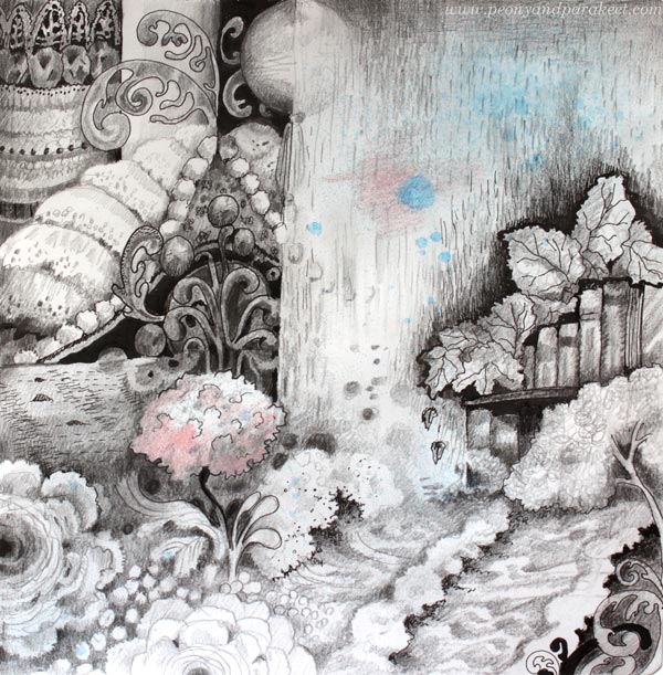
I loved the book so much that I wanted to make a drawing about its impact. It started by spraying some ink.
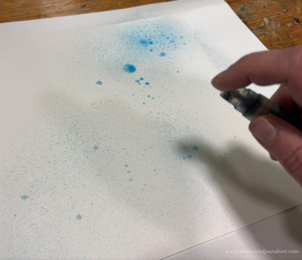
I got the idea of spraying ink when browsing the pages of my sketchbook. See this blog post from 2019: 10 Black and White Art Techniques with Personal Stories
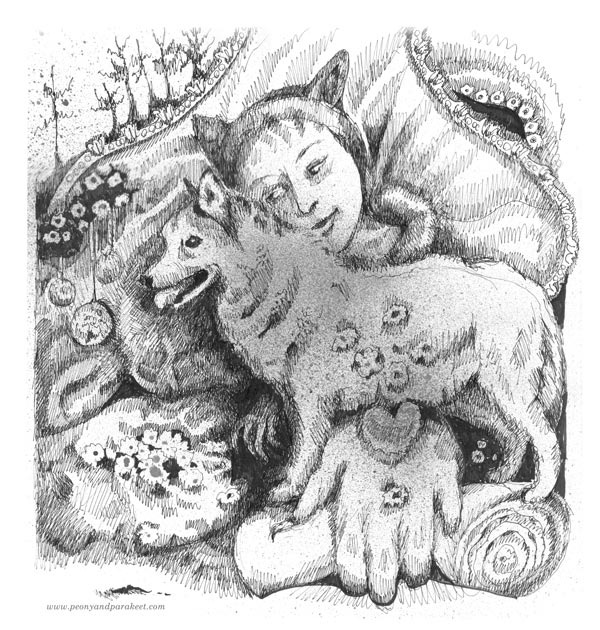
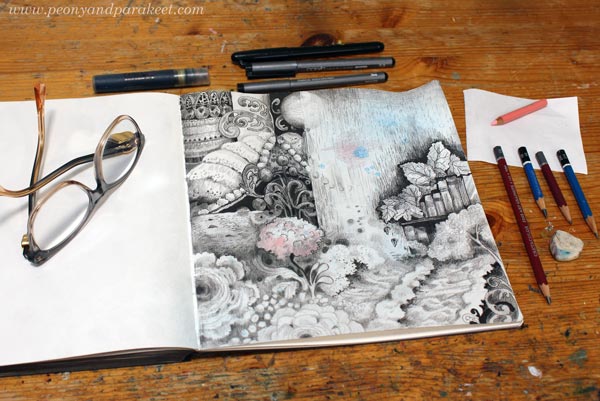
I then made the drawing with pencils and ink pens (Copic brand).
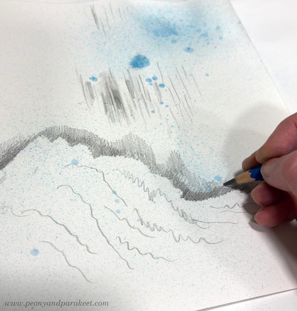
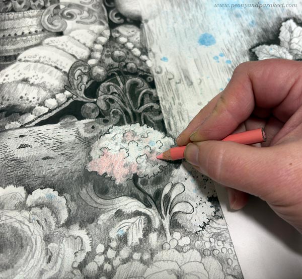
I started with graphite pencils.
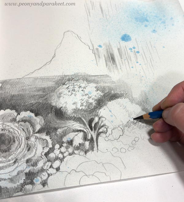
And then introduced black ink pens.
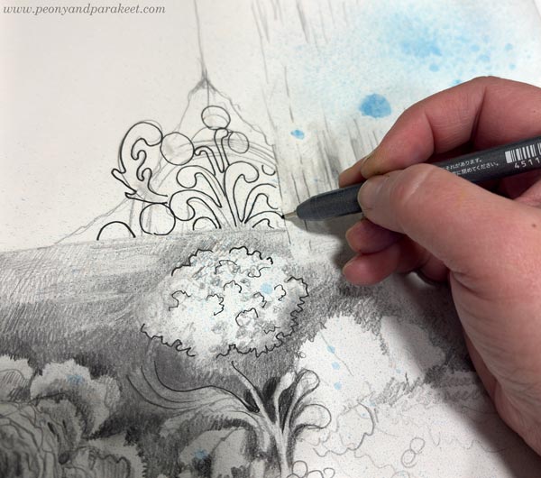
When I wanted to have something darker or more clearly outlined, I used the ink pens. The pencils were for softer greys and shadowing.
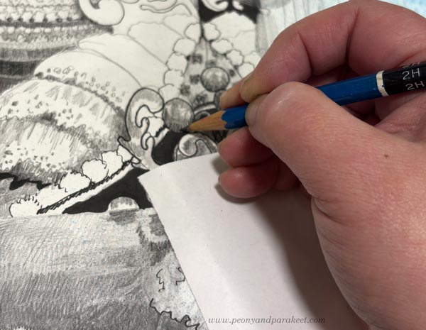
A piece of paper under the hand protects the drawing.
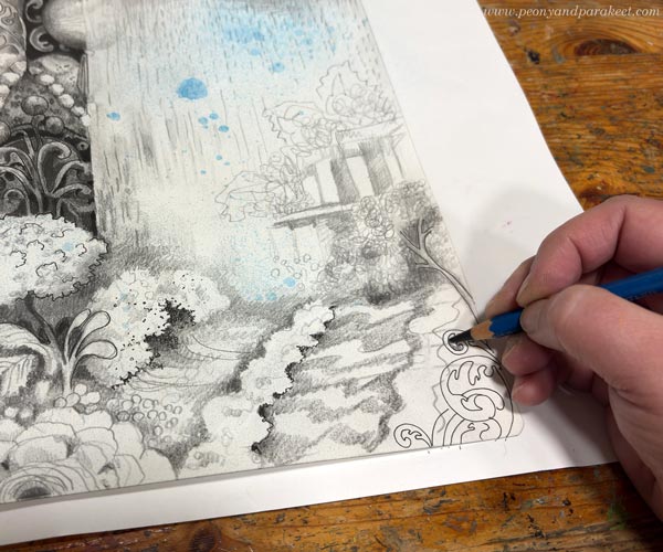
I wanted the drawing to grow freely and express the impact that the book had on me. The last step was to add a little color to the central flower.
Here’s the finished piece again. I had so much fun drawing the waves. When I draw, I try to follow the principle: “Draw what you love.”
This is about my inner world getting the refreshing rain from Ito Ogawa’s wonderful book.
Simple and Small Can Lead to Better
Tsubaki Stationery Store made me think about how simple things can become when we stop ignoring the basic truth.
You see, this spring I have been thinking a lot about how I could make better paintings. It has felt like a complicated question. Just breaking down what “better” means takes time. The choices feel big, as if I were standing at a highway junction in the middle of this constantly changing, chaotic world.
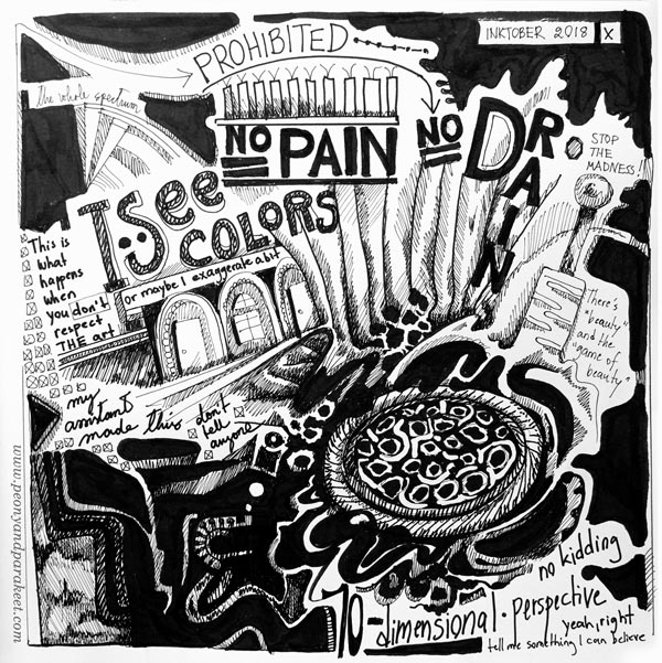
But Ito Ogawa’s book brought me back to a small street. A series of small decisions that naturally follow each other can overcome grand choices. At its best, that is exactly what drawing is about, too. One thing leads to another, and only small adjustments are needed to take the drawing to the next level.
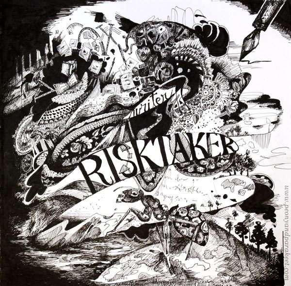
Tiny Things in Practice
Instead of this week’s small drawing project, I was actually planning to show you a much bigger one – a painting called Ikigai. I have been working on it for a couple of months now. But after listening to the first few chapters of the book, I realized that the painting isn’t finished yet. The book helped me to see small fixes that would make the painting “better.”
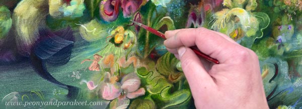
Now, Ikigai needs to dry before I photograph it. You will see it in a week or two.
But in the meantime, let’s keep drawing!
Art Deco Journal Covers
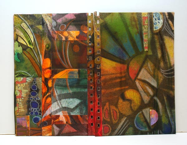
My sisters will get empty handmade journals from me for Christmas. They both like writing and literature so I hope they will put the journals in use. My idea is to include some photos, decorative papers, scrap pictures and such – so that the journal is like a handmade version of Smash book more than a basic blank book. I have also chosen the themes for the journals. The older sister will get an art deco themed book and the younger sister will get flowers and fairies. Here’s a snapshot of the latter.
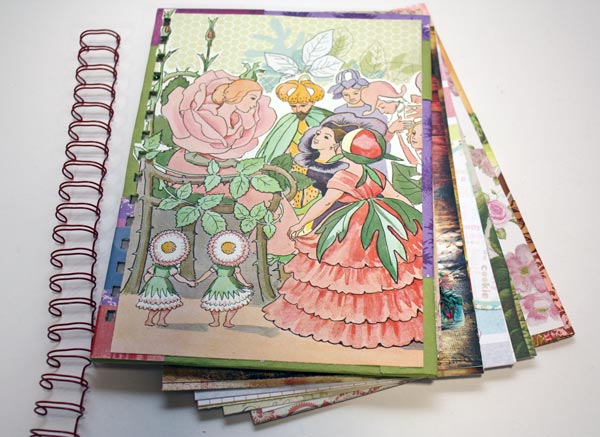
I had an old Elsa Beskow’s children’s book which I used for the cover image. There are plenty of pretty papers too! My other sister would not have this, it is much too cute for her. She likes something more artistic.
I chose art deco as I have been thinking a lot about that style lately. I love the muted, sliding color transitions combined with black and white. And I have been more and more into using graphic, sharp shapes.
Art Deco Journal Covers
I will show you how I made the covers for the art deco themed journal. First, I picked some Sticky Canvas by Claudine Helmuth Studio. It is a canvas sheet that is like a huge sticker. You can attach it without glue after you have finished it. You do not need sticky canvas for this project. You can use a drawing paper or thin fabric instead.
1) Background Colors
I started with watercolors, then used some Dylusions ink sprays. As the canvas got all wet, it got wrinkled. I emphasized the wrinkles by brushing Distress ink pads against the canvas.
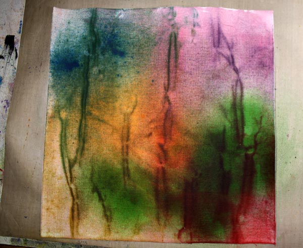
Now I got the muted, soft color transitions. Next task was to add contrasts and sharpness to it.
2) Background Motifs
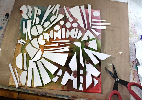
I cut art deco styled shapes from old cardboard boxes and arranged them on the canvas.
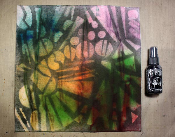
Then I sprayed with the black Dylusions ink spray over the shapes.
3) Finishing the Covers
I cut two thick cardboard pieces for covers. Then I covered them with the sticky canvas. I had a couple of handmade decorated papers which I wanted to use too.
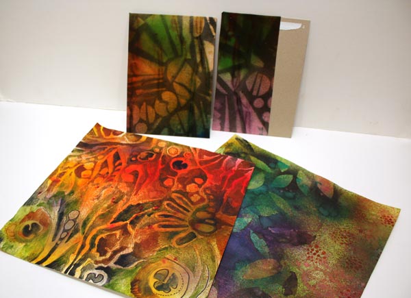
I added decorated papers to the covers. Colored pencils were used to highlight the muted tones. The holes were punched with Zutter Bind-It-All. It is amazing how thick it can cut!
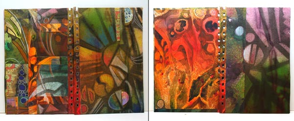
The front and back covers are shown on the left, and the inside covers on the right.
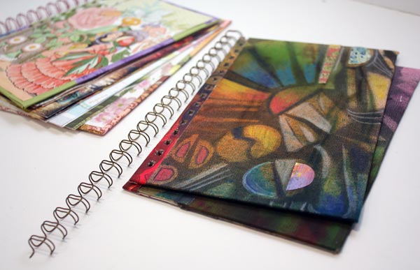
Now I just have to add pages, draw some art deco style ornaments to them and find a photo of my sister where she looks a bit like a beauty of that era!
Art Deco appeared first time in 1920-40s, just after Art Nouveau.
Leave a comment, what do you like in Art Deco or have you noticed it at all? Have you ever made anything Art Deco?
Move Towards the Flow State!
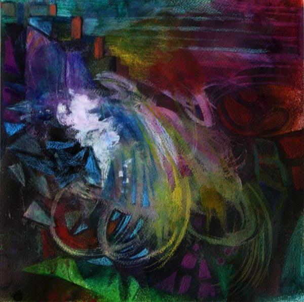
This mixed media painting is called Waterfall. It is inspired by the light in dark spaces.
Last week, I visited two places with old glass windows. The first was National Museum of Finland in Helsinki. The second was the Finnish painter Pekka Halonen’s summer cottage “Halosenniemi” in Tuusula. Both of them were built at the beginning of 20th century. Despite their windows, there’s fairly dark inside. While walking there, I saw how dark colors can be seen as soft and how daylight can look sharp.
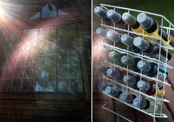
Perhaps the especially hot summer weather had it’s role too. No wonder I thought so positively about shadows and … water! I was tempted to use color sprays for this artwork. That way I could work outside and move around while creating.
A Big Mess with Acrylic Paints
Before spraying, I used acrylic paints to create color areas. They would work as a resist so that I could reveal them again after spraying. But the most important thing with the acrylics was: I grabbed a wide brush and said goodbye to rational thinking.
When you start with big brushes and create intersecting layers, you will naturally get into the creative mood. You will also begin to move. It’s often necessary to even stand up to make those big strokes wide enough. Check the front page of Heikki Marila’s website. He is a Finnish painter who creates huge paintings inspired by art history. See how those paintings are created, lots of movement there!
Also remember to change and mix colors as often as possible! Think that you are climbing towards the flow state where the creativity meets the happiness! Each interruption, the change in the movement and color, is one step closer to the flow.

The mess that I created with acrylics made my rational side cry and emotional side warm up. I was ready to get some fresh air and start even the bigger mess with sprays.
Entering the Flow State using Spray Mists and Handcut Stencils
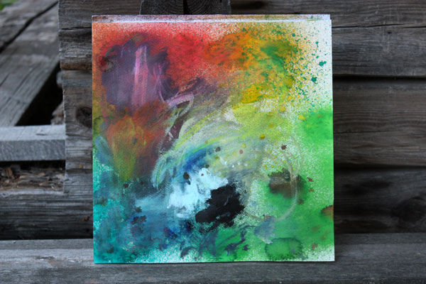
Here’s the first sprayed layer. Moving around the lawn and shaking the spray bottles were like a jump towards the flow state. I shook away the last rational thoughts and entered the happy state. I was flying.
Now, this is important: Be prepared to work quickly! When you get creative, you will get faster. There should be no need to rationalize what to do next or where to get the materials. They all have to be there. I had taken the scissors and a piece of paper with me. That allowed me to create stencils while waiting the layers to dry. I had also set up the blow dryer near the back door.
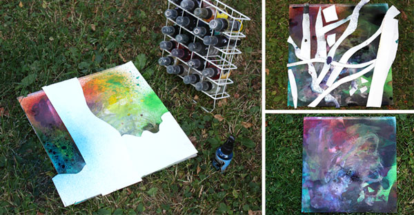
Running around the back garden with spray bottles, then inside to dry layers, then back again, I sprayed about five layers in total. As a result, I got the ugly mess shown in the photo right below. But I was not worried. I thought it looked amazing! One good thing when moving towards the flow: the inner critic leaves far behind!
I ended the day with spraying some areas with water. When wiping some of the spray ink away the acrylic paint areas were revealed.
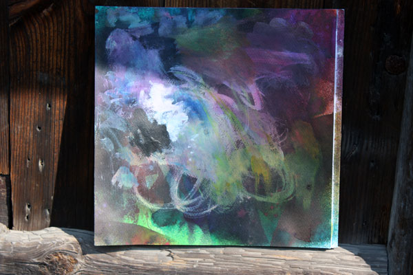
Next morning I had a problem to solve. How to finish the painting? I decided to create small geometric shapes with colored pencils to resemble the sharpness that light makes in the dark space.
Finishing with Colored Pencils
When using big brushes and big movements, creating details with small strokes adds interest and balance.

Colored pencils are wonderful to highlight the best and reshape the worst areas. When working with small details, I try to focus on one small area at the time.
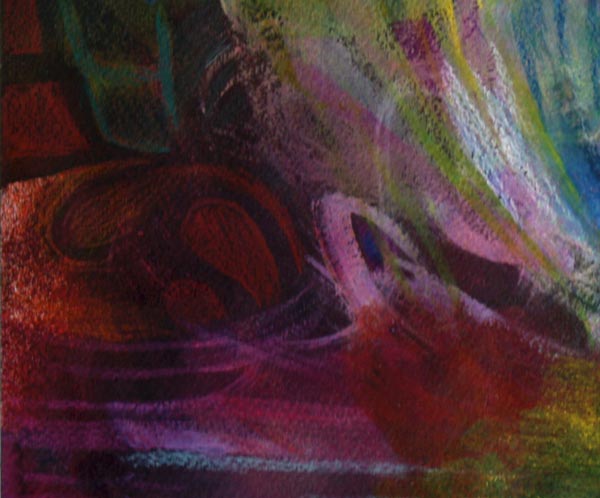
In the “big” phase, my focus was in the big picture. Now, when working small, my focus is in the details.
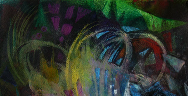
Balanced Composition
When I had gone through all the areas, I began to look at the big picture again. Then I made the final tweaks. So here it is:
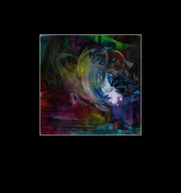
Hmm … wait a minute! Now it is upside down! Well, while coloring the work, I thought the direction would be this. But then, I noticed that it could be any of these three:
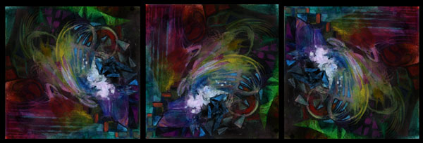
If the composition is balanced, the work will look balanced in any directions. By changing the direction, you can test if your composition is successful. Still, I rarely come to the result where changing the direction not only works but also tells the same story. I think that moving around the lawn had an impact here!
Experiment this in your art: Try to include physical movement into your creative process!
Subscribe to my weekly emails – Get a free mini-course!