50 Art Ideas in an Art Journal
This week I have a special treat for you: a flip-through video of my full Dylusions Creative Journal. It has 50 art ideas, not only for art journaling but for art-making in general.
The pages are mostly made with colored pencils, watercolors, and acrylic paints. I also have many that have hand-drawn collage pieces.
I started the journal in 2020 and finally finished it now in 2025. There are so many memories saved in it. But I didn’t want the nostalgy to take over, but tried to make the video as useful and as easy to watch as possible.
50 Art Ideas – Watch Now!
There’s so much ideas that I thought it would be handy for you to have all the ideas and links listed.
List of Art Ideas and Links to Related Content
#1 Borders
Get inspiration from books and paint covers so that they have borders.
#2 Draw a Tassel!
Draw a decorative object like a tassel rather than an animal or a person.
Blog post: Making the Art Journal More Magical
Course: Animal Inkdom
Course: Magical Inkdom
#3 Forgotten Supplies
Check what supplies you have and use those that you haven’t used for a very long time. At the same time you can decide if you really want to keep them.
Blog post: Art Supplies I Should Not Use Anymore
#4 Introduce Yourself!
Tell who you are in words and pictures.
#5 Title
Give the book a title that inspires you.
Blog post: Adding Text and Layers to Your Pages
#6 Makeover
Paint over any page so that the previous layers show through. Then add details on top of everything.
#7 Alice in Worderland
Paint a place where strange things happen.
Blog post: Painting a Mystery
Blog post: Wonderland Art – Inspiration from Alice in Wonderland
#8 Indoors and Outdoors
Paint a room with large, open windows. Imagine that the outside world floods in.
Blog post: Painting a Mystery
#9 Cafe Bakery
Imagine a lovely cafe where you bake cakes.
Course: Decodashery
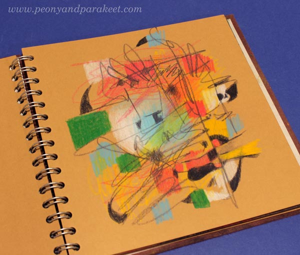
#10 Paint with Pencils
Use colored pencils like they are paints and color without outlines.
Course: Intuitive Coloring
#11 Child’s Drawing
Use a child’s drawing as a starting point for a page.
#12 Hole
Make a window from one page to another by cutting a hole.
#13 Scribbles
Pick a black pen and scribble and doodle your heart out. Then use the drawing as a coloring page.
Blog Post: Don’t Just Create Circles
Blog Post: Doodler’s Sampler Step by Step
#14 Transparency
Draw on a transparent film or print your drawing on the film.
Blog post: Creating Wood by Doodling Layers
#15 Safari
Draw animals and use unconventional colors and details.
Course: Animal Inkdom
#16 Time Travel
Combine your art from several years into one spread.
#17 Happy
Collect happy things and write comforting and hopeful thoughts.
Blog post: Mini Drawings on Art Journal Pages
#18 Inner Child
By creating, we cherish our inner child. Let her face appear in one of your pages.
Blog post: Coloring with the Inner Child
#19 Columns
Add drawings and paintings as vertical stripes on the spread.
#20 Free Video: Colored Pencils – Intuitive Approach
Blog post: Colored Pencils – Intuitive Approach
#21 Underwater
Let blue tones dominate the background and create an underwater scenery.
#22 Nighttime
Imagine what can happen in the night when no one is watching.
#23 Fairytale
Make up a fairy tale while you draw.
Blog post: Picture Prompts – Creating Art Journal Pages with Handdrawn Animals
Course: Animal Inkdom
#24 Wings
You can draw wings on almost anything.
Blog post: Picture Prompts – Creating Art Journal Pages with Handdrawn Animals
Blog post: Angel Drawing for the Inner Child
Course: Magical Inkdom
#25 Four Seasons
Express spring, summer, fall, and winter in one spread.
#26 Seed Flower
Start with a single flower.
Blog post: Flower for Your Art Journal
Blog post: Expressive Watercolor Flower Collage
#27 Floralize!
Leave some happy parts of bad art visible and then paint flowers on the top.
More ideas for revamping:
Blog post: Revamp Art Journal Pages So That They Spark Joy!
Blog post: Revamping Watercolor Painting with Watercolor Pencils
Blog post: Art Makeover – Revamp Your Old Paintings!
#28 Carve & Stamp!
Carve a lino plate and use it as a stamp.
You can also use a gelli plate.
Blog post: Gelli Plate Meets Fine Art – Monoprinting Ideas for Art Lovers
#29 Lemons
Express your appreciation for lemons or other fruits by painting or drawing them.
Blog post: Painting And Drawing Fruits
Course: Fun Botanicum
#30 Vermeer Girl
Re-create the face from Johannes Vermeer’s painting Girl with Pearl Earring.
Blog post: Vermeer Girl with Heart – Draw with Me!
#31 Glow
Make a drawing that glows without using any glitter. Use soft transitions from light to dark.
Blog post: Bringing Old-World Feel to Abstract Painting
#32 Spirit
Visualize the person’s spirit, not only the face.
Blog post: Intuitive Art Journaling
Blog post: Coloring an Intuitive Selfie
#33 Puzzle
Glue a couple of small drawings on the page and continue their outlines so that they form a new image.
Blog post: Mini Drawings on Art Journal Pages
#34 Easy Start
Paint the background with watercolors and then use it as an inspiration for coloring.
Blog post: Why Draw in the Ready-Made World?
#35 Stripes
Paint stripes of your current favorite colors.
#36 Scan, Print, Collage!
Scan your drawings and print them smaller. Use the printed images for a fun collage with stripes.
Blog post: Making the Art Journal More Magical
Course: Magical Inkdom
#37 Block
Paint rectangles and triangles to make a design.
Blog post: Building and Breaking – Revealing Artistic Potential
Blog post: Art Quilts in a Modern Way
About Paul Klee
Blog post: Paul Klee and the Art of Learning
Course: Floral Freedom
#38 Chapter
Make a themed chapter of several pages for your art journal.
Course: Hearts and Stories
Course: Fun Botanicum
#39 Storybook
Make a storybook page.
Blog Post: Art Journal as a Storybook
#40 Childhood Memories
Get inspired by your childhood and draw things you loved back then.
Blog post: Maximalist or Minimalist? Style Experiments in Art Journal Pages
Blog post: Choosing the Word for 2025
#41 Dolls
Rather than drawing a realistic person, design a doll with all the accessories.
Course: Decodashery
Course: Doll World
#42 Dark Background
Make an impact with the contrast between bright flowers and dark background color.
Blog post: Imagining Flower’s Spirit
#43 From Back to Front
Add more than one color to the background and, at the same time, adjust the shape of the foreground objects.
Course: Freely Grown
Course Wild Garden
#44 Modern
Make organic shapes more angular and thus more abstract and modern.
Blog post: Making Florals More Modern
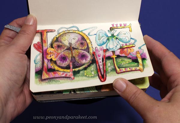
#45 Letters
Imagine that the letters are fictional characters and add expression and decorations to them.
Blog post: Making the Art Journal More Magical
Blog post: Draw Your Own Fonts
#46 Watercolor Love
Paint flowers with watercolors.
Course: Wild Garden
Course: Freely Grown
#47 Castle
Imagine a building that is full of fun details.
Blog post: Intuitive Art Journaling
#48 Experience
Imagine being in an imaginary place.
Blog post: Intuitive Art Journaling
#49 More Is More
Be a maximalist, and get inspired by nature’s abundance.
Blog post: Maximalist or Minimalist? Style Experiments in Art Journal Pages
Blog post: Following the Inner Color
#50 Jewelbox
Divide the page into small compartments and color the compartments one by one.
Need More Than These 50 Art Ideas?
See the blog post from 2020: 75 Ideas in an Art Journal
I hope you enjoyed this post and put the art ideas in use. Let’s keep creating!
Half-Empty Art Journals I Should Fill Up
Last month, I went through my art supplies and wrote a post about the supplies I shouldn’t use anymore. After the post, I gave most of those useless-to-me supplies away. Now I have reviewed my art journals and have come to the conclusion that I have too many half-empty ones. I should fill these up and at the same time, end one era in my artistic journey.
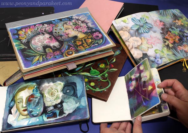
I don’t mean I shouldn’t have any art journals or sketchbooks anymore, but I think I could do well with only one or two. I have grown my skills by drawing a lot, but now I feel I am more of a painter. Most of my creative energy nowadays goes into painting, and I mostly make either watercolor or canvas paintings. So, the books don’t serve me as much as they have in the early years.
Ten of my art journals are half-empty. I don’t think it’s realistic to fill them in a short time. On the other hand, I have small pieces and hand-drawn motifs that I could attach to the pages and make collage art. Anyway, I wanted to share my inventory. Time will tell how quickly these will be filled!
Art Journal #1 – Smash Book
Who remembers the Smash Books by K&Company? I have several, but only one of them is unfinished. This one has the best cover as I have attached my fabric drawing to it.

This journal has all kinds of pages, but I want to show you the spread that has slow stitching. I have just glued the hand-embroidered fabrics on the pages.
Maybe I could continue this journal with the fabric theme and search for other hand-embroidered pieces from my needlework stash?
Art Journal #2 – Accordion Book
This art journal is really fancy. It’s an accordion book with a separate casing. The paper holds watercolor well but it’s smooth enough for drawing and coloring too. I have got this as a gift from a student of my courses.
This journal has quite a many filled pages, but as it’s an accordion book, I could fill the rest of the pages with a watercolor painting that would continue from one page to another.
Art Journal #3 – Spiral Bound Sketchbook
I shared the process of making the collage cover in this blog post from 2020.

When I start making a new course, I often buy a new sketchbook, and that’s what happened here too. This book has mostly portrait drawings. They were drawn when practicing and gathering ideas for the course Innovative Portraits. Some portraits are very abstract like the one below.
This book has still many empty pages. Here, I could gather other face drawings that I have made over the years. I think that at some point, every artist wants to draw faces.
Art Journal #4 – Small Sketchbook
Most of my art journals are filled with colorful art and contain fairly little writing or black-and-white sketches. This little sketchbook has some interesting ideas and it’s more like a notebook about art-making.
This sketchbook is almost full, and could be filled very quickly with the ideas for the upcoming paintings and courses.
Art Journal #5 – Colored Pencil Diary
This journal is an Archer & Olive Notebook that I call my colored pencil diary. I have filled many pages already. For example, see the blog post about coloring without limits!
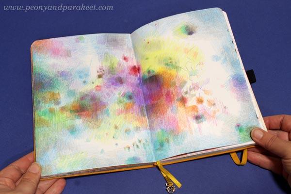
My favorite part of the book is the chapter that has fun plant-themed pages. I made them for the course Fun Botanicum.
Even if this journal has many filled pages, it still has a lot of blank pages. However, I feel the journal is ready to be called finished. Should I remove the blank pages? What do you suggest?
Art Journal #6 – Bullet Journal
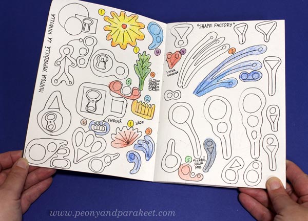
I love bullet journals but don’t usually draw in them. However, in 2018-2019 I bought a dot-grid journal just for small drawings. These became inspiration pieces for the course Animal Inkdom.
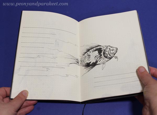
The drawings leave room for writing, and there are many empty pages left. I think I should remove this journal from my art journal shelf and use it for bullet journaling once my current bullet journal gets full.
Art Journal # 7 – Tiny Sketchbook
My smallest art journal is still quite empty. It has some lovely drawings, though!
Should I continue this, or just take out the pages and glue them on another art journal? When I carry a journal with me, I prefer a bigger one.
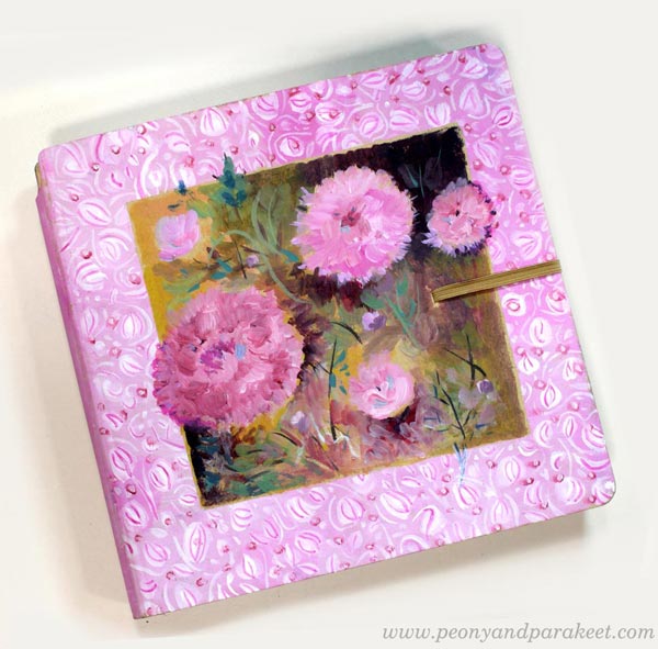
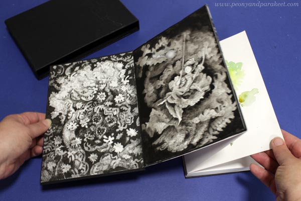
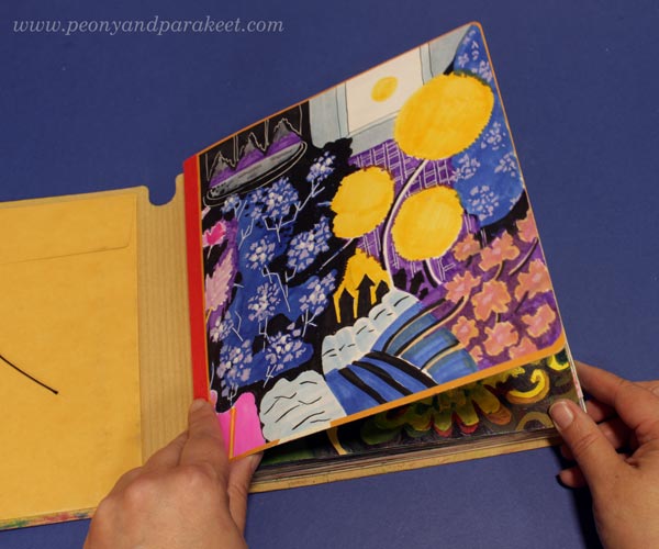
Art Journal #8 – Dylusions Creative Journal Square with Black Pages
Dylusions Creative Journals are sturdy and their paper is quite thick. I like to practice painting by filling their page. Black is a nice background, especially when I use leftover paints from the palette.
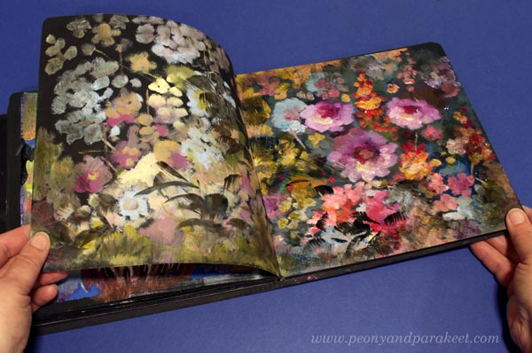
This is the kind of journal I still want and need. It will get filled over the years and there’s no pressure to do it right away.
Art Journal #9 – Moleskine Watercolor Notebook
Moleskine watercolor notebook is a small journal, but it has lovely panorama spreads and nice paper. See this blog post for more inspiration!
I am going to continue this one, for sure!
Art Journal #10 – Dylusions Creative Journal Square with Cream Pages
Dylusions Creative Journal with cream-colored pages is my favorite art journal. This journal works well with colored pencils, for example, see this drawing tutorial of Vermeer Girl!
The inside cover is colored freely with felt-tipped pens. I used thin marker paper for the drawing and then glued the paper on the cover.
I started this journal about five years ago, and have almost filled it. But I like to keep working on the older pages, making them more beautiful. Like with the black journal, leftover paints find their way here.
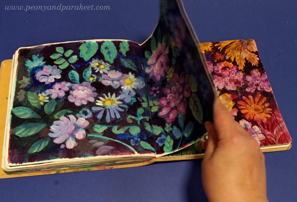
The paper holds water fairly well, and I use watercolors, acrylics, and oils there. I only wish that the paper would be bright white, not cream-colored. When the journal is full, I will record a flip-through video of it.
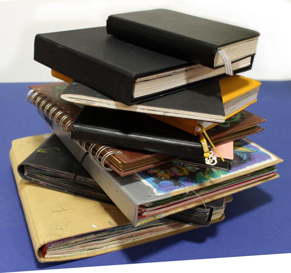
Half-Empty Art Journals – Question!
I have a shelf that has many full art journals. I have now put the half-empty ones on the right, so that they don’t get mixed with the full ones.
How many half-empty art journals do you have? Leave a comment!
Wild Garden – Paint with Me!
In the upcoming course Wild Garden we will paint flowers freely, intuitively, and expressively in watercolor. Watch the video and sign up now!
Wild Garden will begin on September 22, 2025. Sign up here!
Creating Menagerie
This week, I share a recent acrylic painting called Menagerie and talk about the process. This is an example of making the most of the rich visual vocabulary – the topic that I talked about in last week’s video, but now we focus more on the idea of the piece rather than the style.

Recently, I have been thinking about the news feeds and their many truths. Although things are presented in beautiful phrases and pictures, the truth is much more complicated, and there are layers behind them. The same applies to people. Even though we try to be human, we are still animals, too.
When I paint, I struggle with the same thing: should I paint a flower or a soul?

I want to create beautiful paintings, but on the other hand, a painting is like a person. If you treat the painting superficially, you don’t get to see its true beauty.

I seem to paint better if I can partly focus on something else!
My goal is to give my paintings the freedom to be themselves and this painting really revealed its heart to me.

However, my task is not only to reveal the wild nature of the painting, but also to gently train it.

Menagerie is sold already. I hope it will bring joy to its new owner.
Details of Menagerie
Here are detail pics of the finished piece. I like how the style of this painting is partly illustrative. It looks like it’s partly drawn with a brush.

I wanted to create an impression that the animals are captive but still wild and strong enough to break free.

This painting has many layers and details.

I tried to bring up the similarity between flowers and animals.

Here you can see the big flower up close. The brush strokes are loose, but still, I painted them with a lot of thought and care.

I hope this inspires you to create too!
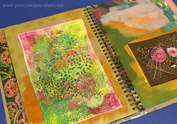
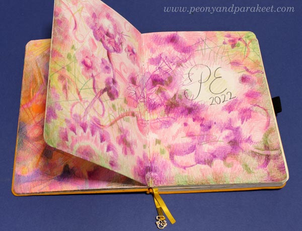
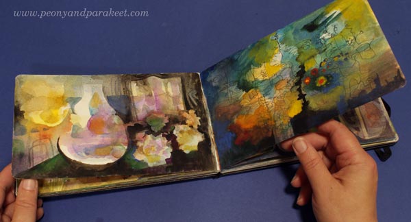
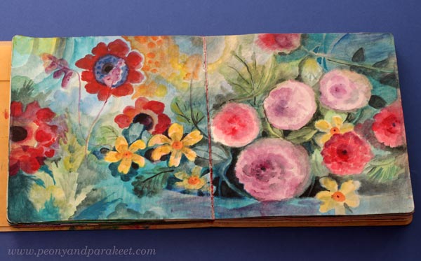
Filling an Art Journal
One of my projects this summer is to fill one of my art journals – Dylusions Creative Journal Square. I hope that these pics from my current in-progress journal, inspire you to start filling your art journal!

Reaching Saturation Point in Filling Art Journal
I think art journals have a saturation point. When most of the pages are full, you have to give the book a little more attention than usual. This journal was started in 2020, and I have filled it here and there over the years.

One spread can have things done in many different years. So the book is full of temporal layers, and I think they make the best art journal.

and finally added a zebra made in the style of Animal Inkdom.
Magical Inkdom also has fun projects for these kind of small drawings.
Practicing in an Art Journal
My courses appear a lot in my art journal, because I often practice on the pages or later glue pictures I made for the courses into it. I hope my course participants do the same!

and then added some more painted petals in acrylic.
Journaled “Sweet” with watercolors.
Part of being an artist is to be happy with your own development, and also to be interested in what you have done before.
This and That Will Magically Come Together
When my art journal is full, I will make a video of it, where I go through it and talk about each spread. I also know that when the journal is finished, the flow of the spreads feels much more coherent than when I was filling them.
In the style of Freely Grown.
One thing that applies to all art journals, sketchbooks, and notebooks is that they are most beautiful when full. When you purchase one, it looks too beautiful to fill, but once you hold a full one, it feels much more valuable. I am looking forward to that!