
You Can Draw Patterned Papers!
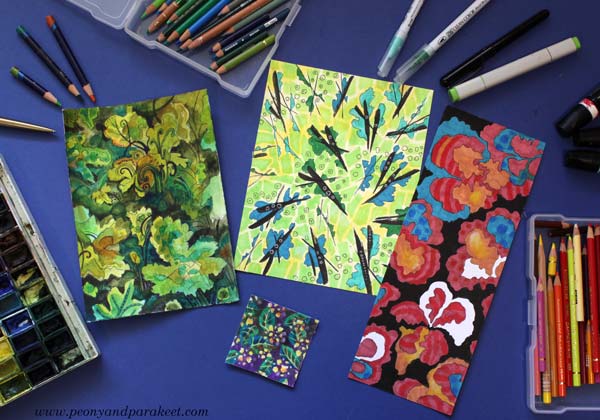
This week, I answer the question: “I want to draw, but don’t know how or what! How to start?” My suggestion is to start with patterns. So, draw repeated shapes and make a collection of patterned papers that you can use for collage art, for example.
The No-Pencil Approach
I usually start my line drawings with a black thin-tipped drawing pen or a blue ball-point pen.
If you say you can’t draw, say goodbye to the pencil era. Don’t be one of those who sketch many parallel lines and erase all the time! A pencil is a crutch that might feel helpful, but trust that you can walk and pick up a pen. The first steps may be scary, but when you risk more, you draw better. Your line is not just a vague and neutral curve, but one that expresses your existence.
Let’s draw four patterned papers!
Paper #1 – Small Flowery Shapes
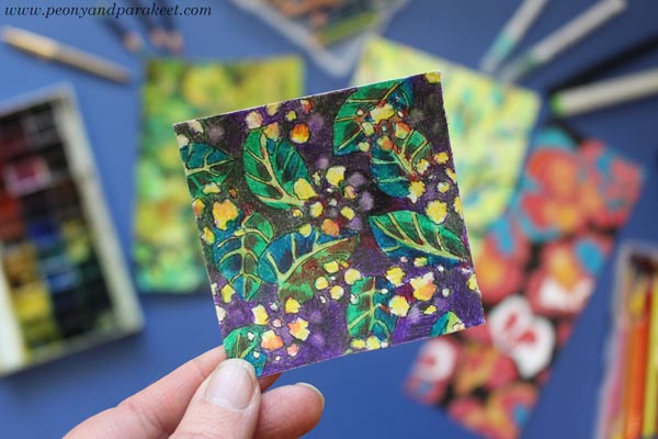
Pick a tiny piece of paper and a pen, not a pencil. When you can’t erase, you focus more and draw better. Small paper doesn’t need anything grand, so clusters of tiny flowery circles are enough, and if not, you can add some leaves.
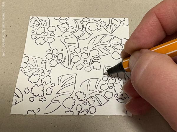
I colored my pattern with colored pencils. The fun thing with colored pencils is that you can use an eraser to add more patterning. I have a precision eraser pen that is handy for small dots. If you use a bigger eraser, color the dots smaller after erasing.
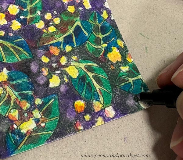
I love colored pencils because it’s easy to layer the colors to get a variety of tones.
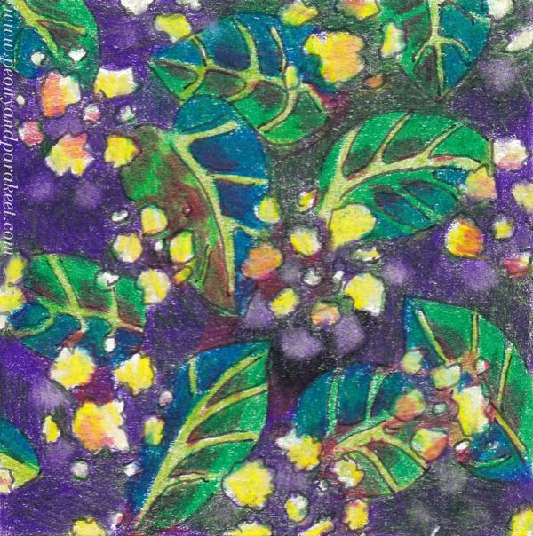
People may say: “It’s just a pattern, not a picture.” Or: “Tiny scraps mean nothing.” But I think it’s a packet of seeds, ready to grow and expand. The first paper may be a secret thing, something you glue on your notebook or planner, to freshen up all the mundane words like “To do” or “Meeting at 9 AM.”
Paper #2 – Big Nested Shapes
Let’s get bolder and pick a bigger paper! The shapes should now be so big that most of them are only partly visible.
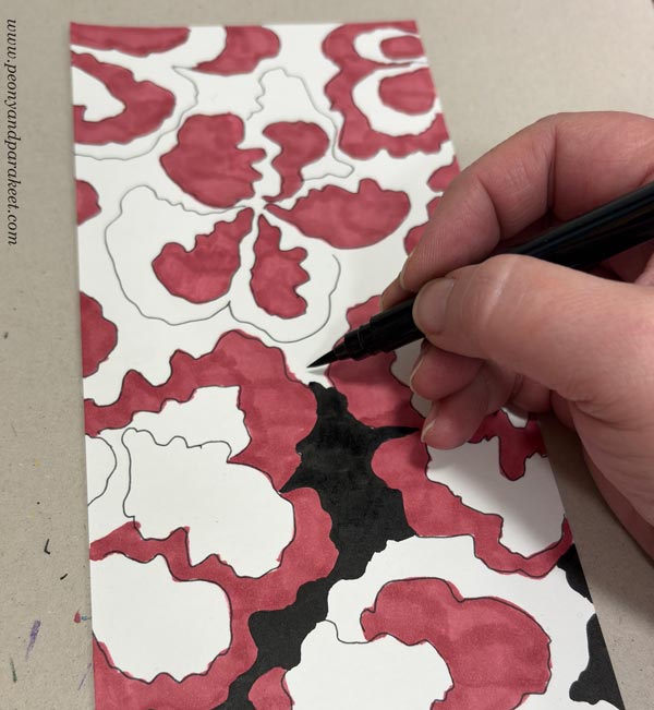
Draw nested shapes. The first lines define the inner shapes, and the second lines are the outer shapes that group them. These are fun to color! I used felt-tipped pens and strong contrasts.
Then I added circles, stripes, and some color variation with colored pencils.
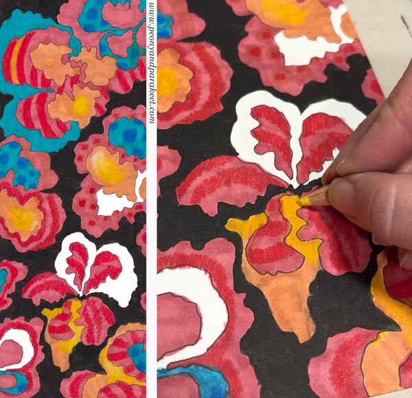
When the motifs are big and the colors bold, the shapes can be quite simple. The Finnish design company Marimekko has produced great patterns over the years. See inspiring examples here at Marimekko’s site!
Paper #3 – Dynamic Strokes
Pick a pen with a brush tip. You can also use ink or watercolors with a paintbrush. Draw clusters of three intersecting strokes. Then draw curvy lines that travel around the strokes. The result is dynamic and looks like flying trees or the sight when looking up at the trees. You can add small, flowery shapes and circles too.
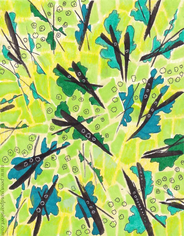
I also played with the background and added a free-form low-contrast grid that is like a city map or a tiled wall. The more you draw patterns, the more you will cluster and layer. This way, you will gradually move towards making expressive art rather than staying in the area of surface design.
Paper #4 Traveling Line
Now let your line travel more freely. Repeat what you have learned in the previous exercises, but do it in a more relaxing way, without too much care about what comes on paper. Think about the line being just a foundation for coloring.
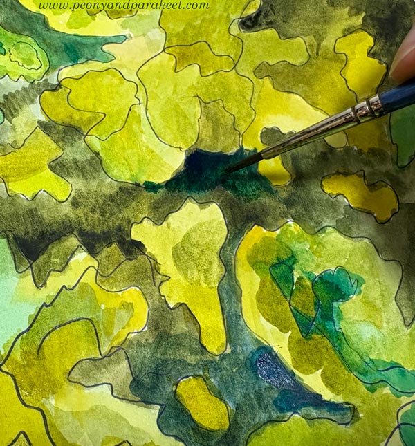
When the first lines are just a foundation, you can add decorations like swirls and small dots, which are often seen in surface patterns. Some motifs might be more decorative than others, and the result becomes more like scenery than a design.
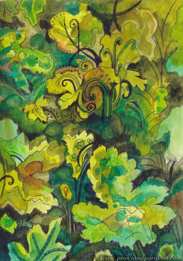
I used a regular ball-point pen for the first lines, then colored the paper with watercolors, and finally added decorative details with colored pencils.
To Draw Freely? – What It Is
Drawing means letting your pen take the lead. It means guiding it forward, meandering, and turning. It means traveling your own paths, daring to go back, and driving over and past them. When drawing freely, you don’t really care about the destination, but you want to enjoy the ride.
Your pencil should be firmly on the road, but not so heavily that it’s hard to move. A person who travels with their pencil and focuses on the line knows how to draw, unlike those whose line merely flits across the paper before fleeing. Drawing isn’t about the line representing something, but about the line having someone who treasures it.
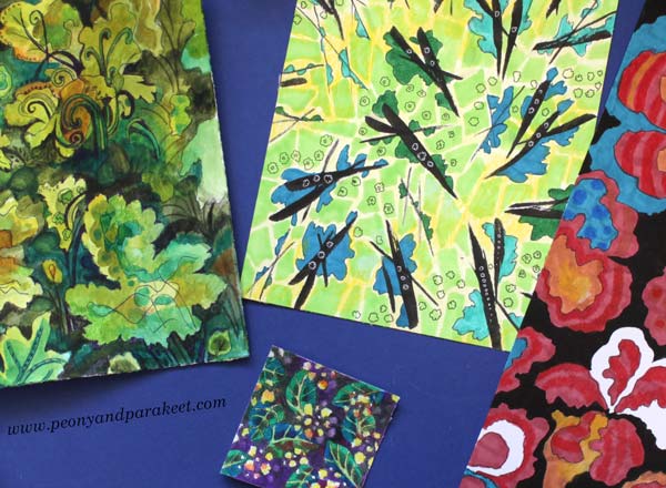
Extra – From Hand-drawn Paper to Digital Kaleidoscope Pattern
If you can use image processing software like Adobe Photoshop, scan or photograph your design and duplicate it several times. Flip some copies vertically and some horizontally to build a continuous kaleidoscope pattern.
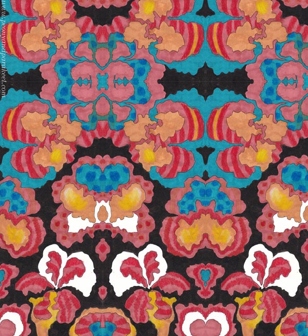
Draw and Use Patterned Papers -More Inspiration
Use your papers! See this project: Painterly Collage in Rut Bryk’s style
Create more paper and make collages: See the class Collageland
Draw freely: See the classes Intuitive Coloring, Joyful Coloring, and Mystical Minis
Joyful Flowers with Watercolor Pencils – Watch the Video!
This week, I have a free video where I create these joyful flowers with watercolor pencils. These are inspired by fabric prints and are more motif-like than many of my colored pencil pieces. I love this kind of playing with style.

This is a small piece, just 8 x 8 inches. It’s colored freely with watercolor pencils on thick drawing paper.
Joyful Flowers – Watch the Video!
In the video, I talk about finding inspiration for art-making and tell stories about things that have affected my style. I just read abstract painter Darby Bannard‘s quote:
“Inspiration doesn’t follow style, it creates it.”
It made me want to share my thoughts about inspiration and style. I also wanted to create something colorful and cheerful that is not realistic, but more design-oriented. These joyful flowers were fun to make. After drawing the joyful flowers, I made something small to add to my boxes of joy. You can see that little flowery thing in the video too. Watch the video!
This video is a little longer than I usually post, but I personally like to watch long videos, and maybe you do too?
Joyful Coloring
My newest course Joyful Coloring teaches a color-oriented approach to watercolor pencils.
Start with blank paper and create freely with joy and sunshine! >> Buy here!
Art On the Wall – Displaying Canvas Paintings
Our home is full of art. Almost all my canvas paintings are displayed on the walls. The arrangements change when old ones are sold and new ones are born. In this blog post, I show some of the paintings and how they are displayed at the moment.
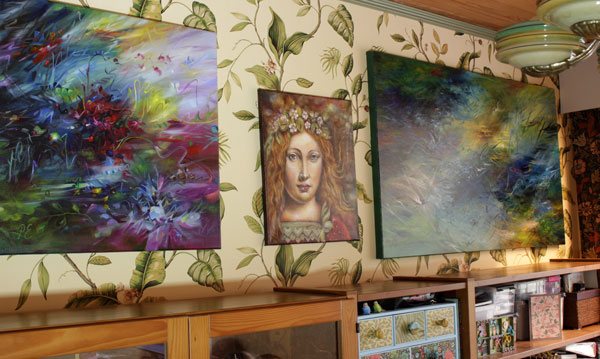
When using stretched canvases, framing is not necessary. I hope this inspires you to create some canvas art. Check out my acrylic painting course Floral Freedom and see more of my paintings at paivieerola.com/gallery!
In the Gallery Corner
Our library room is on the darker side of our house, but I think that the lack of daylight and a heavy atmosphere goes well with the books and nostalgic-style paintings.
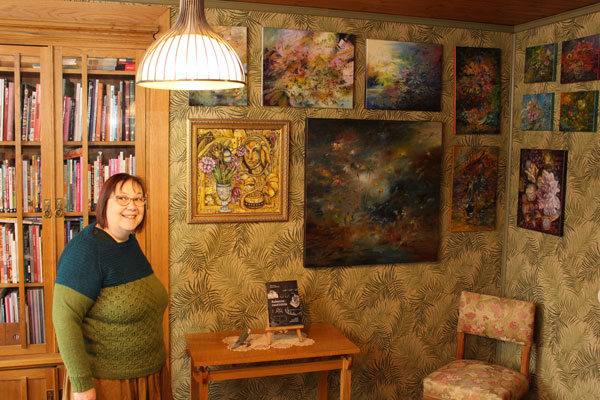
Displaying different sizes of canvas paintings on the same wall looks great but needs planning. I made a plan in Photoshop first, and then we hung them all at once.
Above the Aquarium
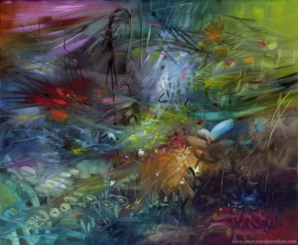
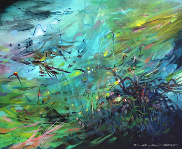
People often say that all my canvas paintings express the underwater world. That hasn’t been intentional because I am actually afraid of deep waters. But my husband has had aquariums for decades, and they must have affected my art.
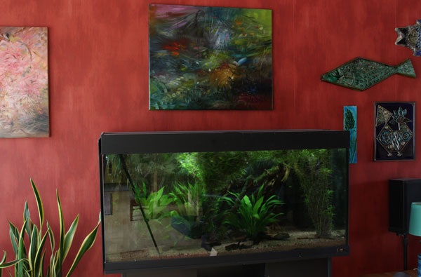
The painting continues the aquarium view. And it was not planned at all!
Best Lit
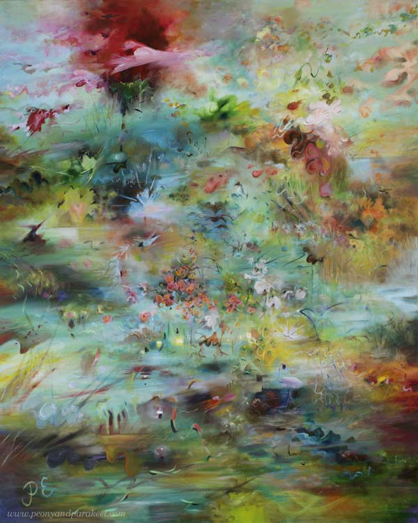
Our dining area has special lighting for a big painting – LED strips in two directions that have adjustable color and intensity.
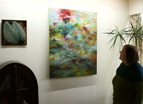
The colors of any painting are highly affected by the amount and color of light.
When I Wake Up
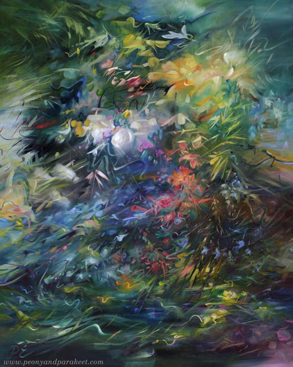
The bedroom is our darkest room, but every morning when I wake up, I look at the wall that is filled with my paintings.
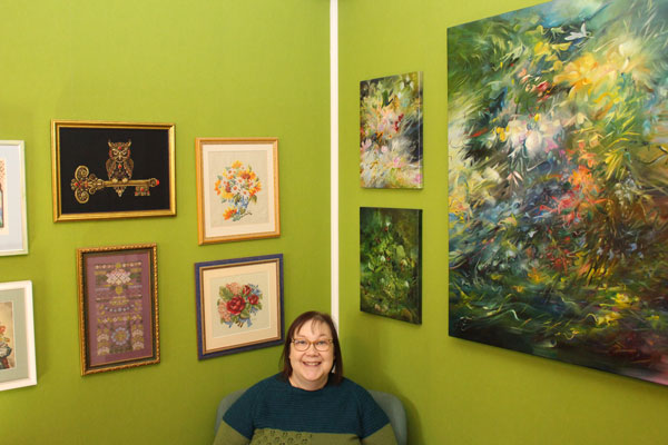
There is also a collection of my cross-stitch projects. Stitching is just a hobby but I like the combination.
In the Hallway Gallery
I love our yellow hallway and how the color unifies a mixed collection of paintings. Displaying canvas paintings can be this easy!
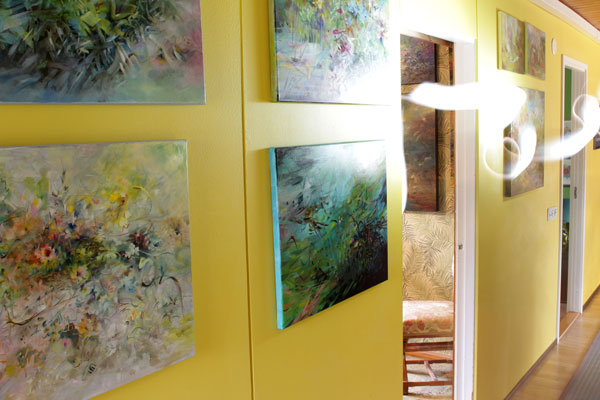
This narrow hallway was super boring before we painted it and added art on the walls.
Entrance Art
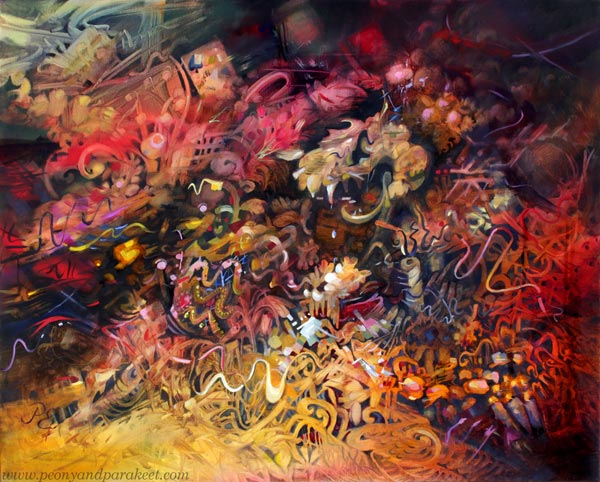
Our house has a space right after the entrance where I often change a painting to one that feels current. I also decorate the top of the sideboard cabinet that’s under the painting. Now it’s time for some darker art.
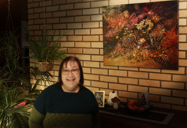
Happy Halloween!
How Your Personal Story is Related to Your Art
This week, I share how my newest painting was born. At the same time, I talk about how the artist’s personal story affects the outcome.
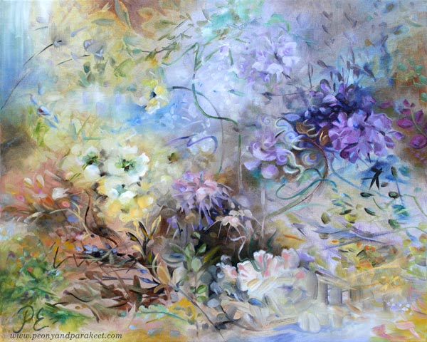
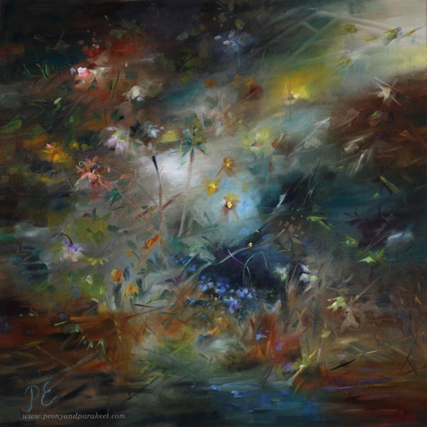
My paintings usually reflect the current season. But now, when there’s a fall in Finland, something springy appeared on my canvas. I call this one “The Spring of Dreams.”
Observing a Flower – Engineer’s and Romantic’s Approaches
Last spring was beautiful. The apple and cherry trees were blossoming.
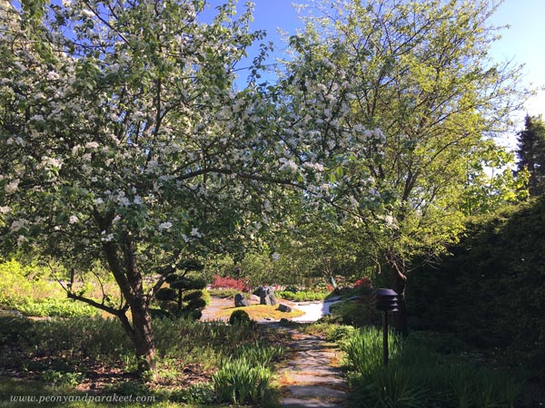
And with the early summer came wonderful irises.
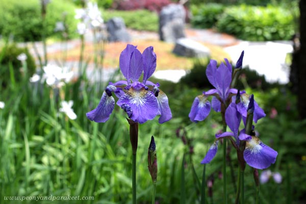
I often take photos in the garden and examine the plants. As a former engineer, I try to see how they are constructed. Not how the petals are attached and such, but how the light constructs the flower, adding its own brushmark to it. As a romantic, I try to see a face of a flower. I look at it like it would be an animal or a human – like it has a name and a history. I am not searching for its eyes but trying to sense its needs and dreams.
This way, I don’t need to copy photos but can paint freely and intuitively. Then when random shapes begin to look like a lighted plant, I try to give it what it wants, even if it’s often a species that doesn’t even exist.
The Fight Between Too Stiff and Too Messy
However, the painting process is not always as straightforward as it sounds. Often the engineer adds something stiff, and the romantic wipes it off. Then the romantic makes a mess, and the engineer tries to clean it.
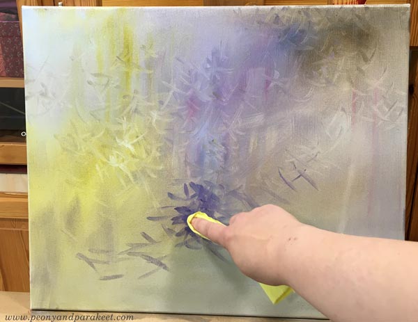
The engineer in me likes to build things with a brush: “There’s a chair, look!”
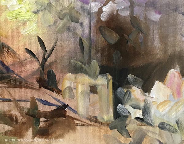
The romantic in me likes leaves and swirls more.
Artistic Direction and Setting Guidelines
To stop the fights, I gave an artistic direction that set challenges for both of them: “We will be making a dreamy floral that has purple. The painting should fit a modern, feminine home that has some rustic elements as well.” Both the engineer and the romantic understand had a common understanding of style when picturing a space where the painting should fit. When I use this method, I choose a location in my home or a picture in an interior design book, or a photo found on Instagram.
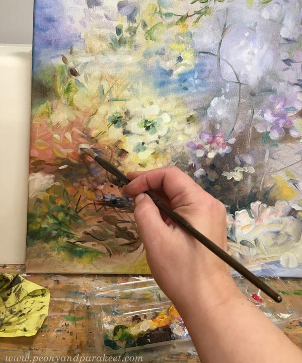
When I was studying industrial design, these kinds of simple and concrete guidelines were called design drivers. Design drivers are different from design principles. Design principles are general guidelines to make your image more expressive and aesthetic. Design drivers are project-based and loosely define the outcome.
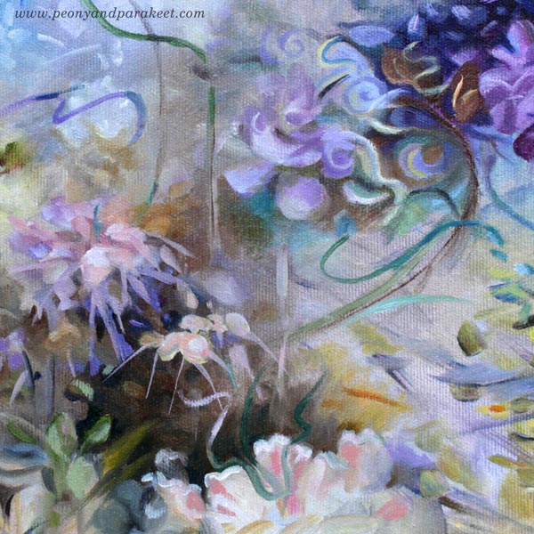
Design drivers prevent me from painting this and that, but I try to make them so general that I can get creative and freely express myself. For example, the requirement to use purple in a painting is not a big limitation.
Personal Story and Art Projects
Behind design drivers, there’s a more general foundation, an artistic vision. My paintings always lean toward the past and have a historical feel. As an artist, I want to combine the past and the present in an uplifting way, creating a fantasy of immortality for the interior space. Because I lost both of my parents at a young age, I never thought I would live old. This way, my artistic vision, and personal story are connected.

I claim that art-making has many layers. It’s not only about the process, techniques, or assignment. The artistic vision and the personal story matter as well. You always have a chance to bring them in, whether you are painting or drawing. For example, if a course sets the starting point, the creative challenge is how to include your artistic vision and story in the projects. This time, rather than listing things you love, go deeper and think about your struggles. How do they define what you want to achieve in art?