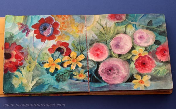
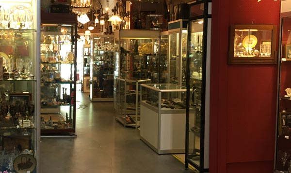
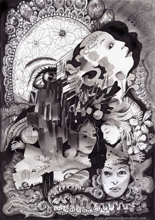
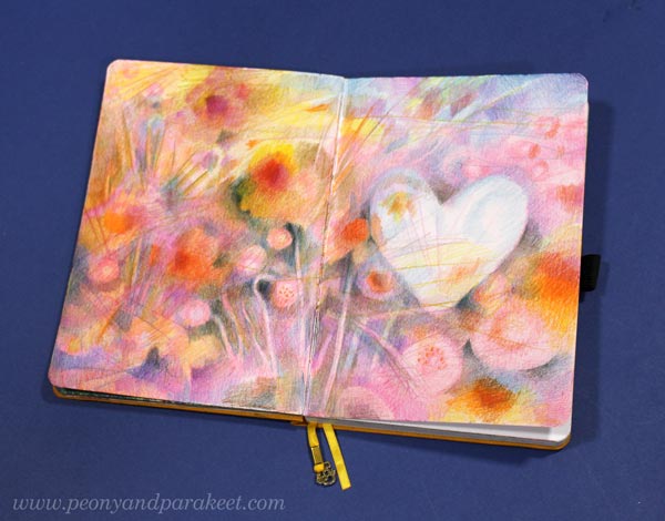
Filling an Art Journal
One of my projects this summer is to fill one of my art journals – Dylusions Creative Journal Square. I hope that these pics from my current in-progress journal, inspire you to start filling your art journal!

Reaching Saturation Point in Filling Art Journal
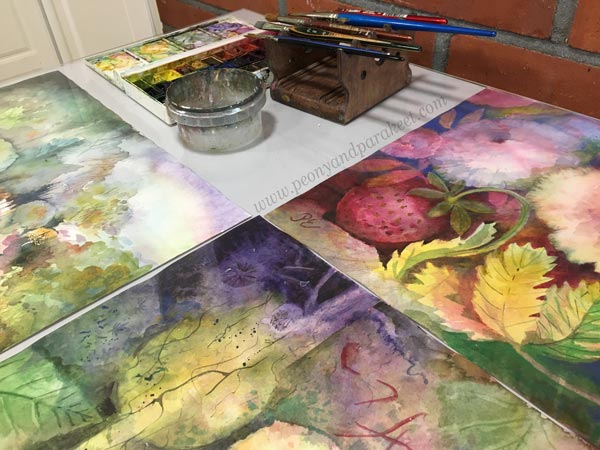
I think art journals have a saturation point. When most of the pages are full, you have to give the book a little more attention than usual. This journal was started in 2020, and I have filled it here and there over the years.

One spread can have things done in many different years. So the book is full of temporal layers, and I think they make the best art journal.

and finally added a zebra made in the style of Animal Inkdom.
Magical Inkdom also has fun projects for these kind of small drawings.
Practicing in an Art Journal
My courses appear a lot in my art journal, because I often practice on the pages or later glue pictures I made for the courses into it. I hope my course participants do the same!

and then added some more painted petals in acrylic.
Journaled “Sweet” with watercolors.
Part of being an artist is to be happy with your own development, and also to be interested in what you have done before.
This and That Will Magically Come Together
When my art journal is full, I will make a video of it, where I go through it and talk about each spread. I also know that when the journal is finished, the flow of the spreads feels much more coherent than when I was filling them.
In the style of Freely Grown.
One thing that applies to all art journals, sketchbooks, and notebooks is that they are most beautiful when full. When you purchase one, it looks too beautiful to fill, but once you hold a full one, it feels much more valuable. I am looking forward to that!
Summer Sale!
Ready to start filling your art journal? Remember the annual summer sale! All classes are 20% off.

The sale ends on July 20, 2025, at midnight PDT. >> Buy Now!
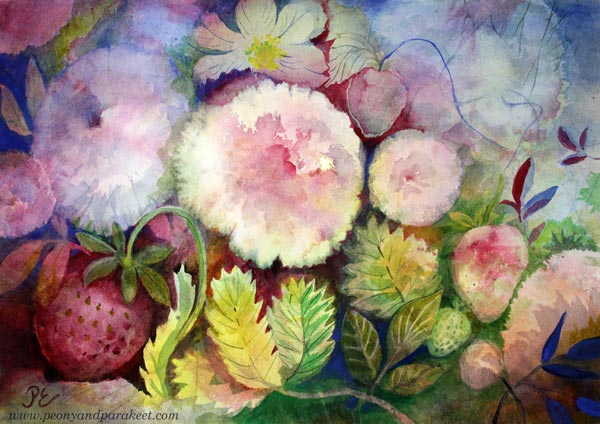
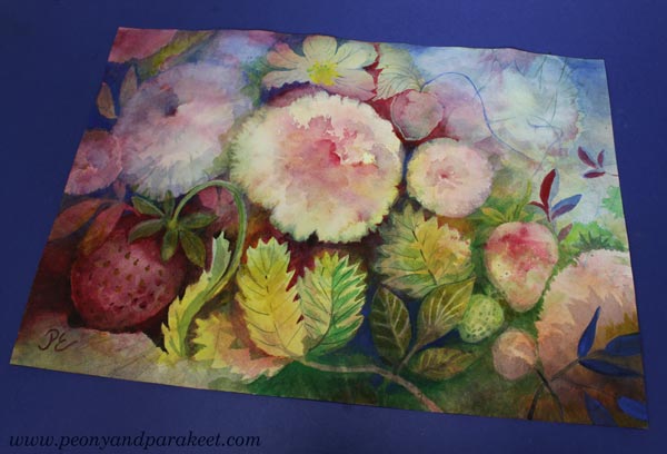
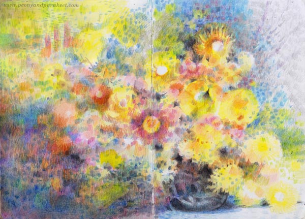
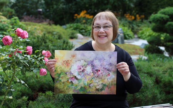
Summer Watercolor Art with Origin and Attitude!
This week, I talk about creating summer watercolor art so that it’s fun and interesting. The season that you currently have doesn’t matter. It’s all about finding your origin and attitude!
>> See more pics at the Taiko online art store!
Although the seasons influence my paintings, I mostly want to paint summer. In winter I yearn for summer, in spring I plan for summer, in summer I live summer and in autumn I remember summer!
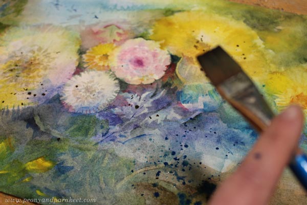
Starting Summer Watercolor Art
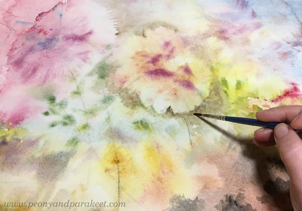
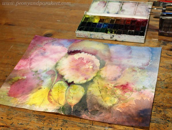
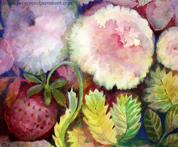
The best summer month in Finland is July because it’s warm and of course, has peonies and strawberries like in the painting. But when I started the painting, I had no idea what would come up. There were just splashes of color and plenty of water.
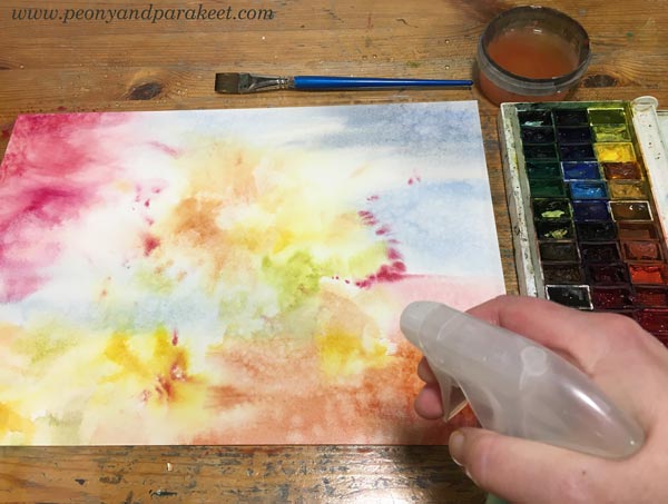
I like my summer watercolor art to have this kind of intuitive foundation with exciting randomness.
Finnish Summer
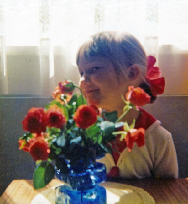
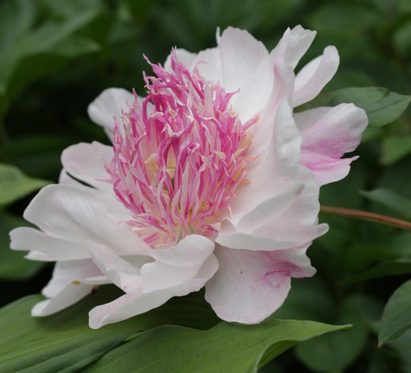
Peonies bloom at the turn of June and July and that is also when the best strawberry season begins. Finnish strawberries are really sweet, because the Finnish summer ripens them slowly. As a child, when asked for a favorite meal, I answered: Strawberries and whipped cream. I guess I was quite a romantic already!
Peonies are my favourite flowers and I have written a lot about them on this blog. Our garden has over ten different peonies and I am eager to see them bloom. I hope that winter has not disciplined the most delicate varieties too much.
In summer, everything turns upside down: frost turns into heat, darkness into light, heavy turns into light, and light turns into heavy. Summer makes the big picture blurred and the details become more important. What felt heavy in winter is hardly remembered in summer. And small moments, even small irritations, become more noticeable in summer. This must be the effect of continuous light.
I know foreigners who come to Finland in summer with eye patches. But for me, lack of sleep and summer go together. I am done with the pitch-black winter when morning sleep is still deep. The boring black-and-white sceneries are finally replaced by the rich colorful details that is food for my paintings.
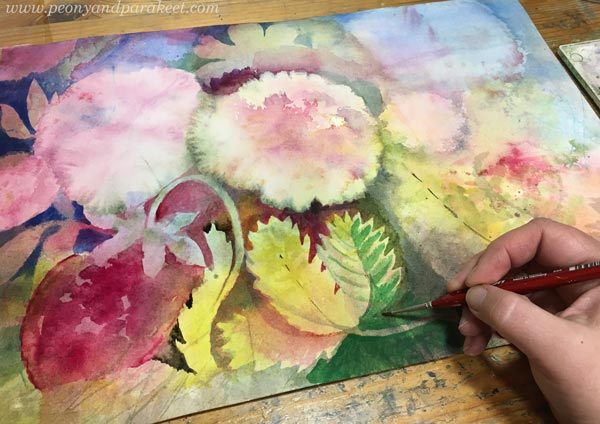
Look how the leaves changed when I started adding details!
Finnish Simplicity vs. Central European
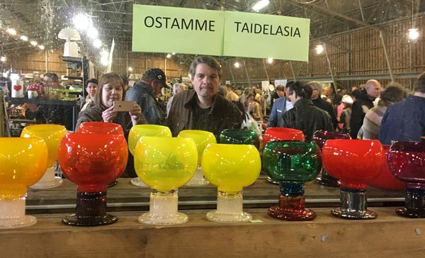
When we visited Amsterdam in May, we went to the Antiekcentrum, which is a huge antique flea market.
If there were a place like that in Finland, it would be full of Nordic design from the 1900s to the 1950s. Finnish high culture has a short history and our taste is a much more simplified version of Central European styles.
Our straightforwardness is not only in design, but it’s everywhere in Finland. We speak directly, often too directly, and value simplicity.
But despite the yearn for simplify, Finland is full of hidden romantics. The inner world of the seemingly rude people can surprise you. Our connection to nature is so immediate that not only strawberries and peonies but all the nature’s treasures creep into our souls so that we are not separate from them. Finnish people are confusingly simple and at the same time enormously diverse.
Details Make Any Peony Your Unique Peony
After the trip, I am increasingly aware that this is a part of Finland and Finnishness that I want to convey to you through this blog and my courses. I am aware that even if we share the love for art, we all have a little different point of view if we pass the big picture and turn our attention to the details. So, nuances in visual language and vocabulary!
If you look at the world as a big picture, your art becomes too mundane. When a peony is just a flower, art-making gets boring like Finnish winter: “How to draw a peony,” you will google and then draw a picture that has nothing unique.
Instead, think about your origin and attitude! Surrender to the details and let the heaviness of the earth and the lightness of the sky immerse you in what you draw. Maybe there’s a cloud who dreams about staying still, and a peony who dreams about seeing the world from the sky. By taking the creative attitude, the strawberries can grow bigger than their stems can hold.
Of course, these are just examples. My point is that in art, you can change everything and make anything possible when you:
- know your origin: Find what already grows in you!
- stretch the idea of any mundane thing: Allow imagination and empathy!
- work the details long enough: Give time for your creativity to find you!
What do you think?
P.S. I am currently recording a new course about watercolor painting. It’s an independent sequel to Freely Grown and focuses on the idea of building a visual vocabulary.
Visual Vocabulary First, Style Second
This week is about visual vocabulary and how to widen it.
I often hear the worry about finding the style, but more rarely about widening the vocabulary. Style is a quality word, but vocabulary is more about quantity. Still, it’s as important, and you can’t find the style without growing the vocabulary!
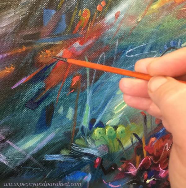
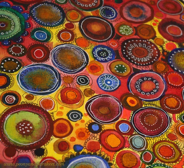
Often when we create art, we use a limited variety of shapes and lines and often the most ordinary ones. For example, your strokes may be quite straight and have very little variety in thickness. Or your shapes can be mostly basic geometric shapes. When I started, I mainly drew circles and my pieces were very symmetrical in general.
Forget the Style, Grow the Visual Vocabulary!
When you want to widen your visual vocabulary, look at the details of your work. There are seeds that can grow into great things. For example, could you repeat a random spot that almost disappears into the background and build a subtle texture from it?
Look at your drawing line and think about whether it could deviate slightly from its path. Could you make a notch somewhere and thus make the shape more interesting?

Imagine you are a child who knows only a few words. Then it’s not important to question what the topic should be, but to find more words to tell any. Stop worrying whether you should create faces or landscapes and make a wide range of art to grow the visual vocabulary.
When you can draw a wide range of shapes, curves, lines and have many ways to color, repeat, break up and assemble them, you can produce visual stimuli on the paper that makes your imagination work. From this collaboration, art is born.
Outer Inspiration – Borrowing “Words” from Others
By looking at art, you can find words, i.e. shapes, that you want to incorporate into your own vocabulary, i.e. style.
Art history is like an encyclopedia where we can pick what we like. Any art can be seen as abstract – just focus on finding a variety of shapes and colors.


Your vocabulary can be inspired of not only fine art, but crafts as well.
Imagination Sets Who You Are
Too much outer inspiration causes copying, so don’t leave your imagination out of the equation! Imagine you are a singer who takes a popular song into your repertoire. Then you enter a singing competition and are told: “You sound a lot like the original singer of the song, but we want to hear who you are.”
So we need not only to expand our expressive language, but also to develop our imagination. Visual vocabulary and imagination are a pair, and art needs both.
For example, you can draw a circle and give it a meaning, but can others see it? With imagination alone, the expression remains hidden. With a rich expressive language, we can make art enjoyable for others as well.
Welcome to My Courses + What I Want to Teach
The goal of my courses is to develop both your visual vocabulary and imagination.
First, I want to get you to draw something a little differently than you have done before and thus enrich your visual vocabulary. Second, I want to make a crack in your everyday thinking and plant imagination in it. I want you to ask: “What if?” and to respond with something completely crazy – something that makes you feel free to tell completely new kinds of stories.
When art emerges from this starting point, richly and vividly expressing itself, you will find your style.
Let’s Paint like Emily Wrote – Emotional Connection with Childhood Novels
This week, we are reminiscing about childhood novels while painting naturally with watercolors. Do you have this kind of emotional connection with the books from your childhood?

See more pics at Taiko Finnish Online Art Store
Now that spring has arrived in Finland and the plants have started to grow, two words have risen above others: “warm” and “natural.”
In January, I decided that my word of the year would be “Release.” This word takes my thoughts to childhood. Again, I want to be a person who is expressive, but also warm and natural.
Can Art Be Natural?

I think art can be abstract and original, but still natural. In this introductory video for the course Freely Grown, I open up about this way of creating.
Watercolors are perhaps the most natural art supplies. When a color meets water, it blooms, and as Henri Matisse said, “There are always flowers for those who want to see them.”

When painting naturally, seeing and creating alternate. A hazy spot that looks like a mistake can be the seed for something bigger.


Natural vs. What You Expect from Yourself
With the word “Release”, I have been thinking about how difficult it is to let go of conventional interpretations and expectations. Can you paint dandelions – doesn’t everyone want roses?
To some extent, I identify more with the dandelion: persistent, sometimes pushy and overwhelming, often stepping over the borders.

The more I think about my shortcomings, the more I think about L.M. Montgomery’s Emily of New Moon, a brave orphan girl who wanted to be a poet. She felt like a real person to me. Her story was also a growth story of an artist that had a big impact on my life. I recognize this kind of emotional connection with other childhood novels, too.
The Brave Girls of Childhood Novels

In Finland, we had a popular children’s book series written by Anni Polva. The main character there is Tiina, a pretty wild young girl. Tiina isn’t an artist, but an adventurer. Isn’t it so that to release is also to go for an adventure?

What about Enid Blyton’s The Famous Five books? You could also go on an adventure in those, and in good company.

I also read L.M. Montgomery’s Anne of Green Gables series and Louisa M. Alcott’s Little Women books. Memories of these girls’ books and the word “Release” strongly resonate with me right now. We are living turbulent times, and need to be brave and adventurous – but still in a warm and natural way.
Do you too have an emotional connection to childhood novels?
P.S. I also wrote about children’s books in these blog posts:
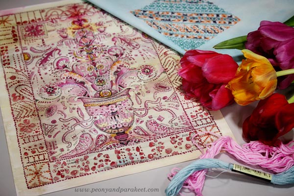
In 2023: Watercolor Flowers in Louisa M. Alcott Style
and in 2022: Turning Memories into Paintings