Making Florals More Modern
This week, we are making florals more modern! So, when you want to get away from a botanical look, and draw and paint flowers that are more abstract and expressive, here are my tips for you!
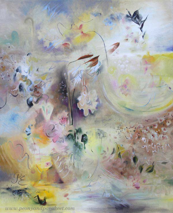
In my recent painting Gossamer, I have stretched my style to a modern direction. The painting was born much faster than usually if you count the actual painting time only. But that’s not the whole truth because I practiced this style several times. You too, can make your florals more modern in this way!
#1 Choose Your Muse!
Pick a painter that has a modern abstract style for flowers.
My choice was Helene Schjerbeck (1862-1946). She was a famous Finnish modernist, and even if I find many of her paintings a bit too melancholic, her style fascinates me.
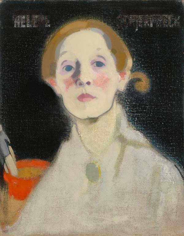
Helene is more of a portrait painter, but she also painted many still lives. (By the way – I also have a blog post about mimicking Helene Schjerfbeck’s style in portraits in colored pencil.)
#2 Make Many Tiny Sketches on One Page
Paint or draw small sketches where you pick ideas from your muse’s paintings. Combine many paintings on one page. When the size is small, you need to simplify and thus, find the core of your muse’s modern style.
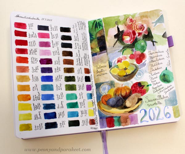
I examined several Helene Schjerfbeck’s paintings in watercolor and combined them on one art journal page.
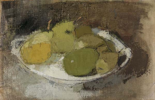
Focus on the shapes and lines and answer to these questions while working:
- Are the muse’s shapes light or heavy?
- How angular are the single strokes?
- How light and shadows are expressed?
- Where can you find playfulness and creativity?
Helene Schjerfbeck’s shapes are rather heavy, and her strokes are quite angular. The light and shadows are treated like they are objects as well. The result is a puzzle where the material and immaterial are treated identically.
I didn’t first think that Helene’s paintings are playful, but when I browsed more of her paintings, I started to see humor in the way she painted the shadows. There is something human in their shapes. It is shown brilliantly in this piece “Trees and Sunset.”
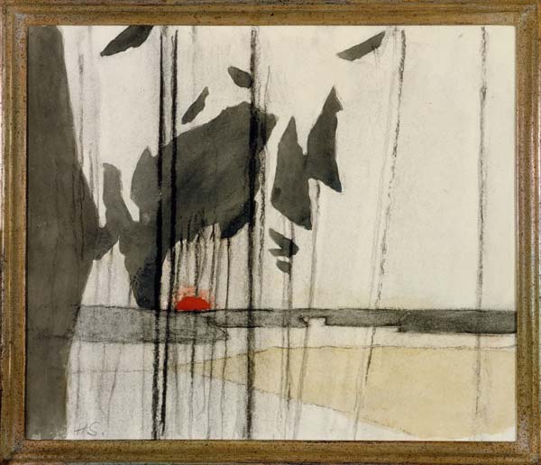
I started to think that maybe for my muse, the shadows were like animals, or dolls, and that they could be a little like toys in my paintings too.
#3 Create a Bigger Study More Freely
Next, use your observations to create a bigger study. Work freely and mix the observations with your original style.
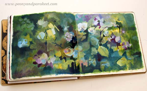
I used left-over oil paints and made this spread for my Dylusions Creative Journal. I really like how playful the shadows are, and painting this was a lot of fun!
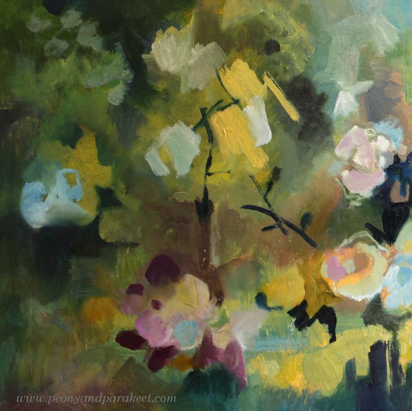
In the detail pic below, you see how angular my strokes are.
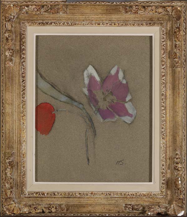
When searching for images for this blog post, I found this small painting from Helene Schjerfbeck. My flowers are different, but still there are similarities as well.
My best tips for making florals more modern:
- While working, think about surface patterns in interiors and clothing rather than the actual flowers.
- Use angular strokes to build puzzle-like compositions.
- Similarly to the parts of the colorful flowers, see the shadows and light as the shapes of the puzzle.
#4 Make the More Modern Piece
After practicing, you can now create a piece where you spend more time for finishing. Modern strokes often appear quick and careless, but they are still packed with aesthetics and style. Those kind of strokes can take a lot of attention and focus.
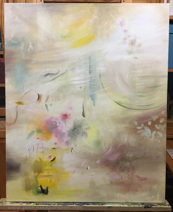
Here’s a pic from the early stage of my painting Gossamer. I started with a narrow color scheme, and many of the shapes and strokes were more like suggestions – a whispering start, you could say!
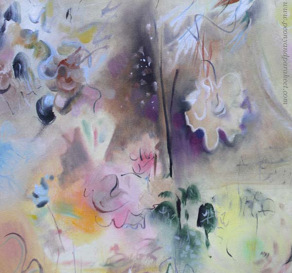
In the finished piece, I especially enjoy the playful color changes in the background and the new playfulness is present in lines too.
#5 Old and New – Compare!
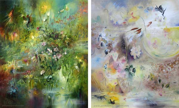
Here you can see my previous painting of the same size and the finished Gossamer side by side. The styles of the two paintings are slightly different, but not totally!
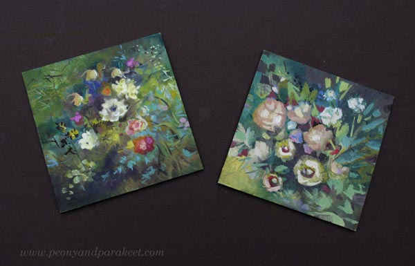
I used leftover paints for these two miniature paintings. The one on the left is more of my original style, the other one is more modern.
If the weather allows, I always take the photo of the final piece outdoors. This fall has been exceptionally long and warm. There are still leaves in the apple tree, and it’s November!
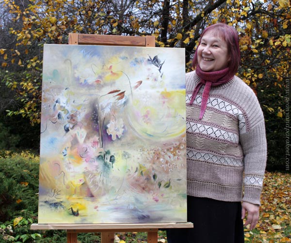
I hope you enjoyed this little tutorial on how to make florals more modern!
How Realistic Should Your Art Be?
In this post, I divide visual art into two parts. The division is a bit extreme, but it helps us to ponder about this: How realistic should my art be?
Realistic or Abstract?
Realistic expression emphasizes drawing, while abstract work more often emphasizes painting.
When we draw realistically, we express things through the external world.
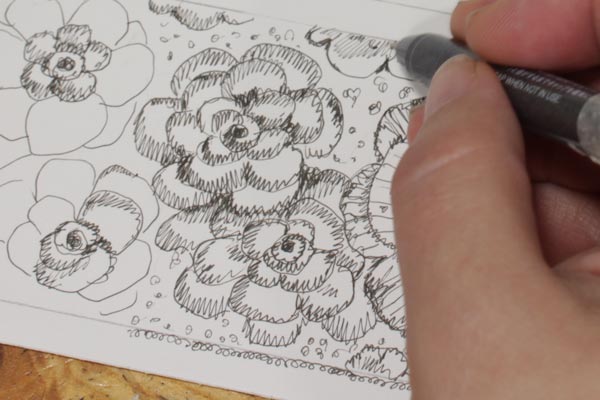
When we paint abstract, we use shapes and colors more freely so the tools for expression come from the inner world.
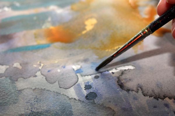
Realistic art can still express the inner world and abstract art the outer world – it is more about the means than the actual content.
It’s good to alternate between the realistic and the abstract approaches, even if one of them would feel more natural. Here’s why:
Two Extremes – Same Result
First, imagine a person who only draws representational pictures.
The danger is that the longer she continues on this path, the narrower her perception of reality becomes. All the leaves are green, the roads are brown, and the flowers are red and yellow. Everything is outlined with a pen, and the outlined shapes are then colored. When she creates freely without references, her shapes become more and more similar to each other. There is only one kind of leaves and the flowers are always drawn in the same way. When she repeats the same thing long enough, the expression gets narrower and narrower.
The person wonders why drawing no longer brings excitement and joy, even though she actually draws exactly what feels most natural to her.
Second, imagine a person who only paints abstract.
The danger is that the longer she continues on this path, the narrower her perception of reality becomes. The person begins to repeat a very limited number of shapes and colors without realizing it. All the spots are vague and quite the same size. The person begins to wonder if her output is something really fine and profound or just a random mess. Her motoric skills and the use of colors fall short because she does not really have a reference point: after all, she is only painting the stream of consciousness.
The person wonders why painting no longer brings excitement and joy, even though she actually paints exactly what feels most natural to her.
Creative Block
They say that there are only two ways to live your life. One is as though nothing is a miracle. The other is as though everything is a miracle.
The two imaginary people have the same problem: their art no longer have miracles. They have stayed in their current comfort zone for too long.
How to Move Forward?
In this photo, you can see both abstract and representational elements; there’s very little division.
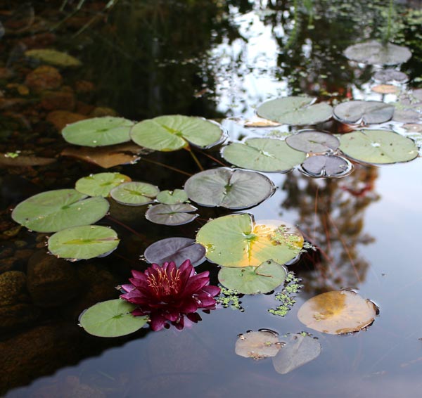
Ask, what is truly real?
- How do light and shadows express the object?
- How abstract is the nature of light? Look for motifs and patterns created by light.
- How light, on the one hand, blurs the boundaries of objects and, on the other hand, highlights details?
- How multi-colored nature is? Even a piece of grass contains a huge number of tones.
- Develop your eye and hand to embrace subtle diversity! Simple leaves or circles don’t express it.
Wassily Kandinsky has said:
“The observer must learn to look at the picture as a graphic representation of a mood and not as a representation of objects. “
Learning New Things Keeps the Artist in You Alive
It’s good that, from time to time art-making involves discomfort, questioning, and wondering about reality from strange perspectives. And when art starts to take you away from yourself, that’s not a bad thing either. Once you open up to what feels silly, scary, and not allowed, you’ll find that you’re closer to yourself and to humanity than ever before.
So, how realistic should your art be?
More realistic than what you currently create.
Pablo Picasso has said:
There is no abstract art. You must always start with something. Afterward you can remove all traces of reality.
Wild Garden – You Can Still Hop in!
In Wild Garden, we will paint freely, intuitively, and expressively from Sept 22 to Nov 14. We will begin with floral greeting cards and gradually move forward in expression.
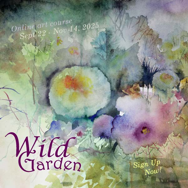
The course has just started but you can still hop in!
>> Sign up now!
Maximalist or Minimalist? Style Experiments in Art Journal Pages
This week, we experiment between maximalist and minimalist styles.
Every time I open one of my art journals, I feel a sense of relaxation. It’s time for experimentation and risk-taking. In art journals, failure can also be success. Page by page, I learn to know myself better and thus, express things that can also be relevant to others. Now I wanted to experiment with style and picked my Dylusions Creative Journal for that.
Maximalist – Multiply!
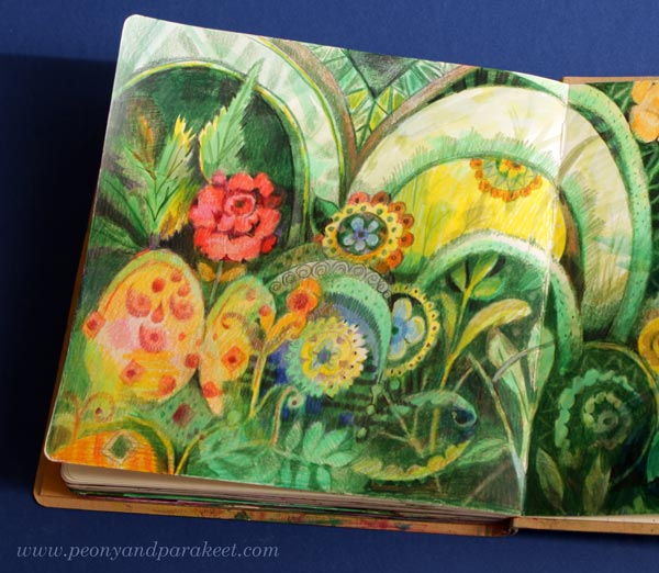
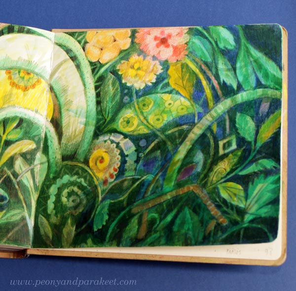
I know that I’m more of a maximalist than a minimalist, so I started with that and made a spread with the principle of “more is more”.
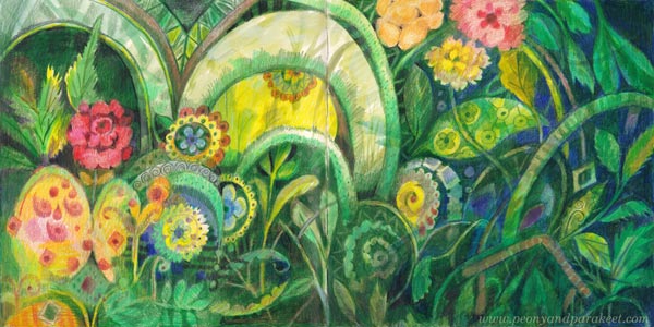
I’ve started to be fascinated by buildings, both exterior and interior, and here too motifs began to create a sense of space as they turned into ornaments.
It was so fun to add a new detail on top of another that I forgot to take more pictures of the different stages, but I started with watercolors and soon moved on to colored pencils.
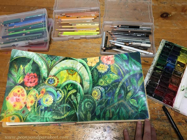
I’m fascinated by abundance and luxury. I connect that with the courage to be brave and let it all out. When I feel like that, the maximalist style is born effortlessly.
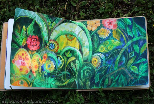
Adding details and dividing one shape to many can be done over and over again. I could have refined my drawing even more!
Maximalist or Minimalist – Adult or Child?
For me, maximalism is associated with adulthood and minimalism with childhood, although many probably think the opposite: that as a child you sprawl and as an adult you can prune. But when I look at my childhood drawings, I can say that my poor drawing skills made me a natural minimalist as a child.

It was a little unpleasant that the organizer has written the prize in the drawing,
but now it just adds a nostalgic flair to it.
But let’s remember that even as an adult, we can grab a light marker and start coloring with clumsy strokes and without outlines.
Minimalist – Simplify!
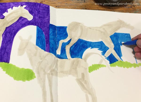
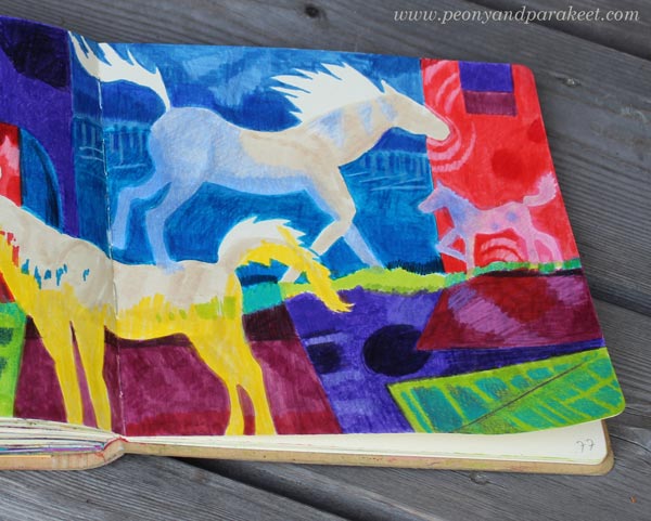
I colored the shapes of horses directly on a blank piece of paper without outlines. When I colored the background, I then refined the shapes.
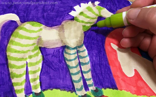
As a child, I loved playing with plastic horses and red tights were my favorite accessory.
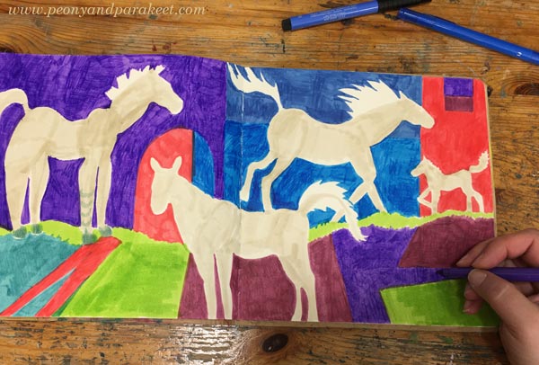
While making this art journal spread, I felt a deep connection not only to my childhood in the 1970s, but also to my teenage years in the 80s.
Back then, everything was still possible and ahead. The horses galloped wildly in my small room, but my mind was already far away in the outside world.
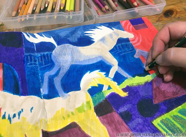
The controversy between the style and the content is the key here. The picture is clear, and the colors are raw, but the atmosphere is intense and a little mysterious.
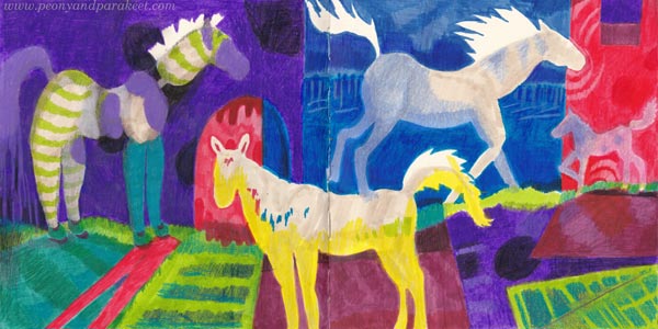
It is as if I were each of those four horses. At the same time, a playing child, a baby seeking support, a galloping youth, and an adult whose life is still a mystery.
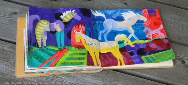
When I compare these two spreads, I think that I could give the minimalist a little more space, and it would not reduce the expression, maybe vice versa?
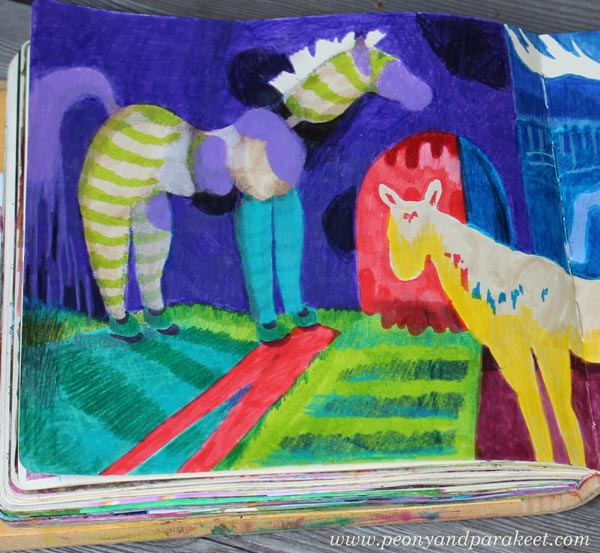
What do you think? See the pics below and leave a comment!
Exercise: Maximalist or Minimalist?
Try the same experiment in your art journal!
Creating Menagerie
This week, I share a recent acrylic painting called Menagerie and talk about the process. This is an example of making the most of the rich visual vocabulary – the topic that I talked about in last week’s video, but now we focus more on the idea of the piece rather than the style.

Recently, I have been thinking about the news feeds and their many truths. Although things are presented in beautiful phrases and pictures, the truth is much more complicated, and there are layers behind them. The same applies to people. Even though we try to be human, we are still animals, too.
When I paint, I struggle with the same thing: should I paint a flower or a soul?

I want to create beautiful paintings, but on the other hand, a painting is like a person. If you treat the painting superficially, you don’t get to see its true beauty.

I seem to paint better if I can partly focus on something else!
My goal is to give my paintings the freedom to be themselves and this painting really revealed its heart to me.

However, my task is not only to reveal the wild nature of the painting, but also to gently train it.

Menagerie is sold already. I hope it will bring joy to its new owner.
Details of Menagerie
Here are detail pics of the finished piece. I like how the style of this painting is partly illustrative. It looks like it’s partly drawn with a brush.

I wanted to create an impression that the animals are captive but still wild and strong enough to break free.

This painting has many layers and details.

I tried to bring up the similarity between flowers and animals.

Here you can see the big flower up close. The brush strokes are loose, but still, I painted them with a lot of thought and care.

I hope this inspires you to create too!