How Does the World Look Like?

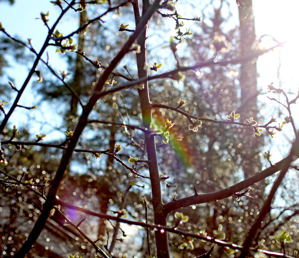
When I was a child, I used to draw with my sisters. My sisters are over 15 years older than me so I asked a lot from them. One winter day I asked my oldest sister: What color is snow? And my sister answered: snow reflects a lot of colors so you can use a rainbow of colors. That’s a brilliant answer! It answers any questions of what color to use for nature-themed art. Yes, you can use a rainbow of colors! Like I did in this forest themed card.
I take a lot of photos just to learn from the nature. Here are a couple of them just to prove how realistic my little collage is. There really is a lot of colors and variety in nature!

Speaking of rainbows …
My advice is: when you create, stop repeating and start adding variety.
Use combinations of various papers and colors. Add layers and create elements and group with various sizes. Let your art grow and change like the plants and trees do.

What do you think? How does the world look like to you?
P.S. Here’s another card that uses the same principles.
Let me be your art teacher: Subscribe to my weekly emails!
Yellow Color
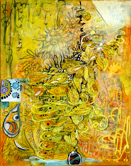
If I had to pick only one color, I would choose yellow. It is unconventional, energetic, and brilliant with other colors, mixed or not. I love to make green by mixing yellows with blues or black. Yes, isn’t it surprising that you’ll get olive green if you mix yellow with black! Best oranges come when mixing yellows with reds instead of buying ready-made oranges. I often put a tiny portion of black to get a slightly muted shade.
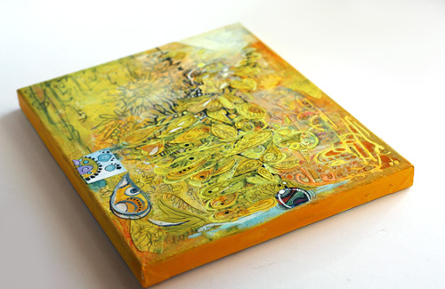
I created the yellow collage on a canvas mostly with acrylic paints. If you buy only one tube of acrylic paint, I would recommend buying good quality yellow, warm or cold. Then create your art with color pencils, markers or watercolors and finally add a very thin layer of yellow on one or two areas. You will witness the arrival of the sun, warmth, and all the good things!
If you buy two tubes of paint, I would recommend yellow and another primary color, red or blue. You can create almost anything with those. The intensity of good quality yellow paint is amazing and in acrylics, I prefer to buy few and good quality instead of buying cheap sets.
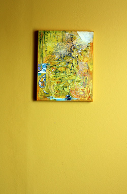 In our house, we have a long hallway painted yellow. It is a particular shade of yellow that was not found in any color charts. I mixed it myself by adding some black to the closest yellow I could find. I saw this yellow first time in Tricia Guild’s old book Design and Detail about 20 years ago. I fell in love with it, and when we bought our house a few years ago, I knew that the dark hallway would look amazing with that yellow.
I think that yellow has a special connection to two colors. The first is black. Try this: pick your yellows and think about blacks. If it helps, find music that represents black for you and turns it on. Paint yellow and think about black. I love that mind game!
Another color that I connect yellow with is blue purple. It is the contrast color of yellow, and it makes yellow pop even more and vice versa. If you look at the collage, there are a couple of tiny circles on the small square on the left. Yellow makes them look lovely and bigger than they really are.
Yellow Color begins a blog post series about color. I will post these color-themed posts now and then. Hopefully, you’ll enjoy these!
Let me be your art teacher: Subscribe to my weekly emails!
Fire With Water(colors)
One Friday evening I was so fed up with seeing white and grey all week. In Finland all the public places, offices, most homes (excluding mine!) are white or pale grey. And now when the colour starts to fade from the nature too, it’s just too much, or should I say little, for me!
I needed this – to play with colors:

I was not interested in the composition or shapes this time, I yearned for color and spent hours mixing water colors. Then I added small details with pens and color pencils.

The end result reminds me of wood that is burning in the fireplace! Using water colors can be a really fun way to set the colors on fire!
5 Tips to Choosing Colors

People often comment the colors on my work. No wonder as my design process is very color driven! Here are some guidelines that I have developed for choosing colors.
1) Start with the color
Whether I am about to dye, paint, knit or make a new design, I often start with the feeling that I want to express. I see the feeling in color; there’s often the exact hue that comes to my mind. Sometimes it’s a combination of two or three colors.
I have learned to interpret abstract things to colors by observing color in everything I see. Try to omit the functions, shapes, and patterns of the objects and concentrate on colors. Do not worry about what you are going to make, choose the materials by their hue and start creating!

My paper designs often start with color. This lime yellow represents the warmth of summer for me!
2) Mix the colors you hate with the colors you love
The one mistake you can make is that you only give attention to the colors that cause positive reactions. I often go deep into hues that I hate. I have noticed that by combining them with the colors I love creating great impressions that are more real than if I use only my positive colors. And within the time I learn to see the beauty in every color.
Like I used to hate pink. Nowadays one of my favorite color combinations is muted orange red and pink. I get emotional when I see these colors together. They represent something about my childhood that I cannot put into words.

Alku yarn in Eleanor colorway, the hated pink and the loved orange-red!
3) Control the quantity of each color
I like to control the quantity of each color. I often have a few colors that cover the most of the surface and then some that I use in small amounts. When making a color palette for your design, keep in mind that you don’t need large quantities of the color you want to turn the attention to. Small colored areas that locate in the main focal points can create great impact. The colors interact with the composition of your work.
You can practice this by taking photos and analyzing them. Analyze why the certain colors in a photo draw your attention.
 This photo looks black and white to me. The focal point is the place where the light hits the road. It emphasizes the darkness of the shadow.
4) Make your own colors
I try to avoid colors that come straight from the jar. Even if they look beautiful. At the end of the creative process, they look artificial anyway. Probably because it’s so easy to use them in too large quantities!
If you mix your own colors, you will get exciting variations of the same color. This makes your work look more natural. You can also use the same components in many different colors. This makes them go better together. When you start with the blues, yellows, and reds, you can create a huge amount of colors and hues with less cost and with better controllability. And if you end up creating ugly colors, see step two!
I often add a hint of black to create a muted tone, but you might prefer pastels and use white instead.

Mixing black with yellow to achieve the right hue for the hall (the result is shown in the first photo of this post). / Using white to create soft pastels in knitted fabric.
5) Put the color theory into practice
With this blog post, I do not want to underestimate the value of color theory. I have learned Josef Albers color theory during the designer studies. For Josef Albers, the color was everything, see this inspiring video of him and his works! Whether you learn the basic color theory or dwell deeper into Josef Albers experiments, it’s always good to experiment too. Get your safe color combos and then move to the more dangerous ones! You can never know too much about colors!

Here’s a snapshot of the library room where I like to create most of the color combinations. I am surrounded here by colors, textures, and patterns, and I find it so inspiring! One of my newest fabrics is on the chair, and I think it suits the room perfectly!
Let me be your art teacher: Subscribe to my weekly emails!