Gelli Plate Meets Fine Art – Monoprinting Ideas for Art Lovers
Old paintings are full of nuances and flow that we often don’t see when focusing on the subject only. This week, I am a rebel and use a Gelli plate for bringing up those elements. The Gelli Plate, like any mono-printing tool, is a bit clumsy for adding details. But also full of potential because you can easily produce repeated motifs that are not exactly similar. It enables you to add diversity and uplifting rhythm to your art without extra efforts.
Gelli Plate Meets Fine Art – Watch the Video!
This video is a replay of a live broadcast where I am sharing my secrets about the process.
I also include the images and the summary here in this blog post so that you can more easily refer back to these instructions.
Project 1 – Expressive Portrait on White Background
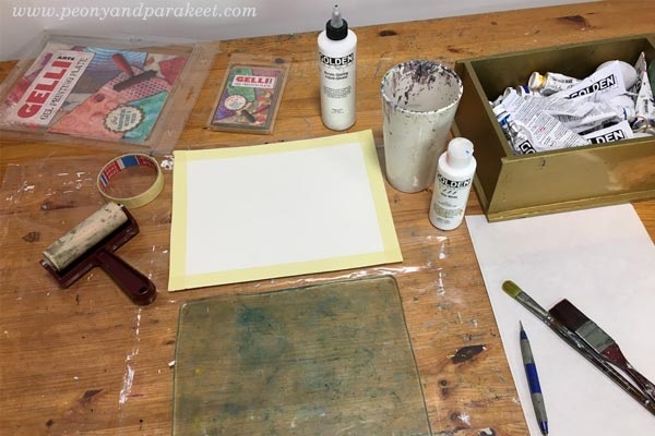
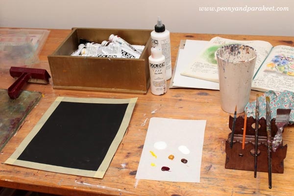
Supplies: Gelli Plates (mine are 8 x 10 and 3 x 5 inches), watercolor paper, brayer, brushes, any blunt stick, acrylic paints, glazing liquid (or gel medium).
This project started by intuitively adding layers with a Gelli plate on a white watercolor paper.
My only intention was to make a mess that has enough diversity so that I could see something appearing.
The big spot looked like woman’s face to me, so I made a stencil by quickly sketching one on paper.

I added more elements and shadows, so that worked one area at the time.

When the big elements were in their places, I changed to a smaller plate and added more details.
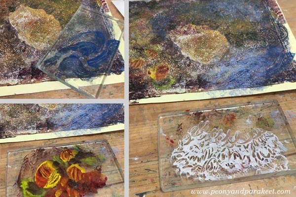
Here’s the monoprint before I changed to painting with brushes.
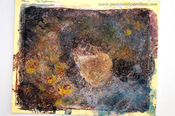
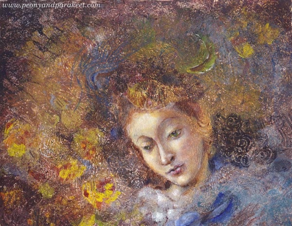
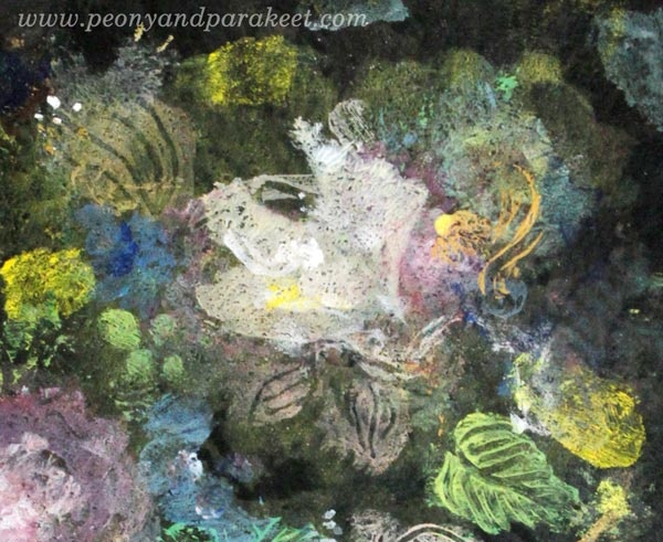
Using Botticelli’s Madonna of the Book as a loose reference, I painted the face and some details with fine brushes and thin layers.
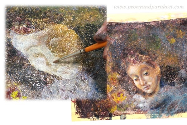
Here’s the close-up of the face. I realized that the eyes look to a bit different direction, but I didn’t want to change that because this piece is called Nostalgia. I think it’s a mixed feeling because then we are admiring the past, but at the same time, being sad that there’s no way to travel back in time.
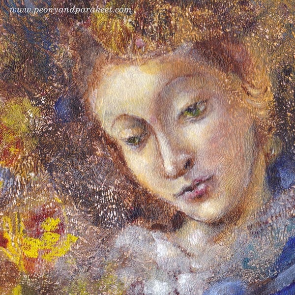
Here’s the full painting again.
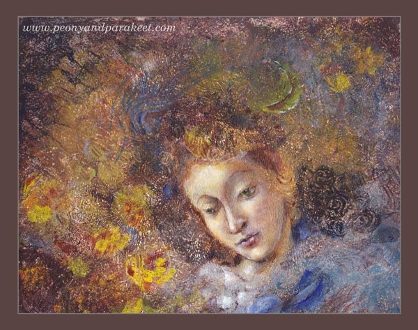
Do you like this one? The original piece is for sale in my shop!
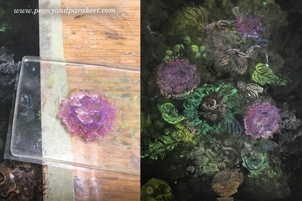
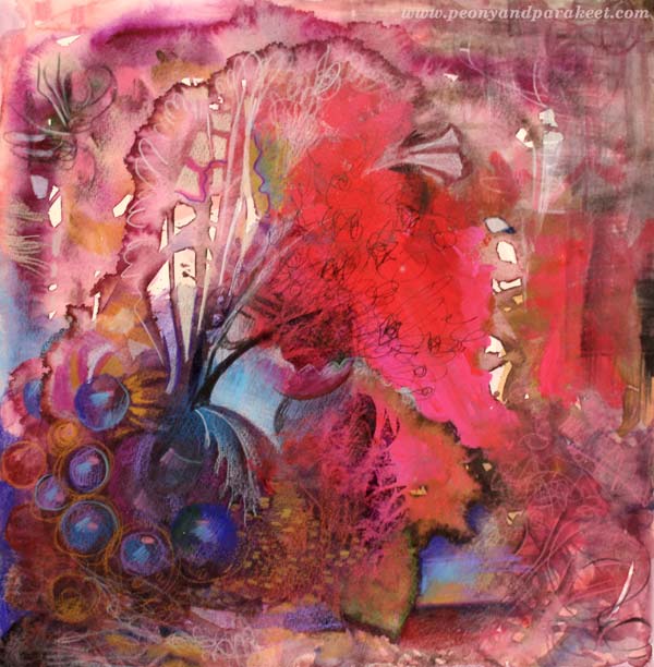
Project 2 – Floral Still-Life on Black Background
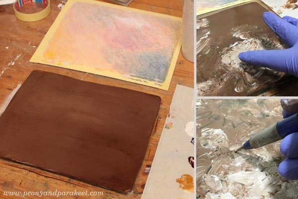
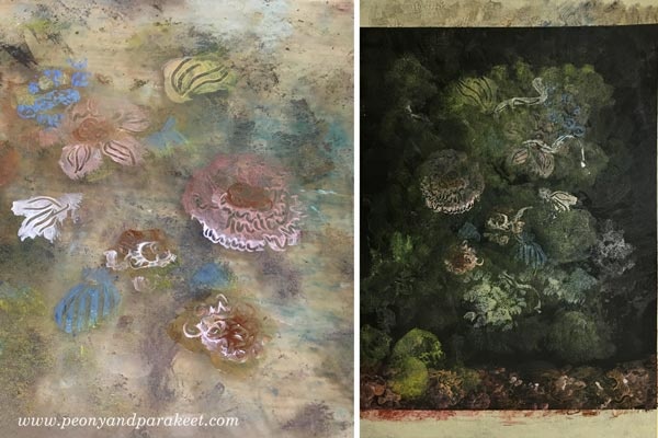
This piece started by adding a layer of black gesso on a watercolor paper. I had a clear goal from the very beginning – to create a floral still-life honoring Dutch Golden Age paintings from the 17th century. I also wanted to use Gelli plates only and see if it’s possible to create a detailed piece by mono-printing only.
The first layers were very subtle and translucent. The idea is to build depth by slowly increasing the brightness of the mono printed layers.

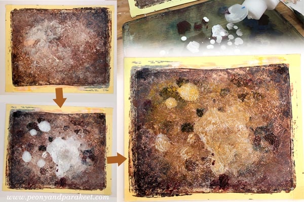
Like in the previous project, many layers only had few elements. I like how detailed they look when adding lines with the stick on the plate.
I also made a paper stencil for this project. At this point, I changed to a smaller plate.
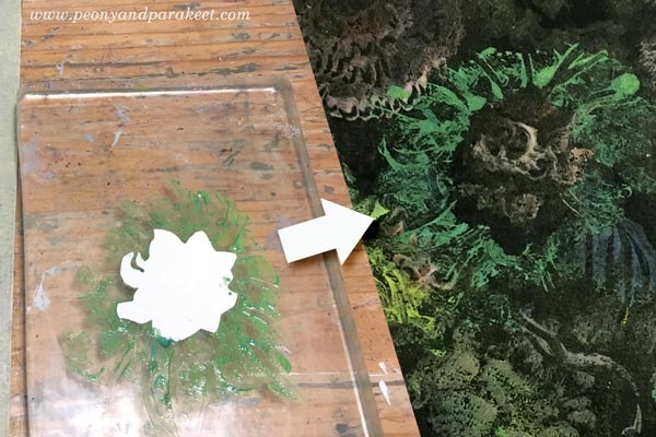
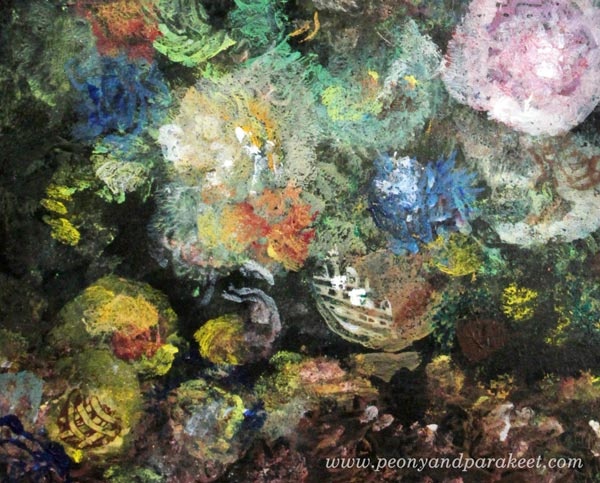
I used paler and darker tones of pink to make a flower. It’s also handy to stamp the same flower several times.
Dots and splashes of paint all add up. I also like to use cotton cloth for making a sharp edge to a free-form shape.
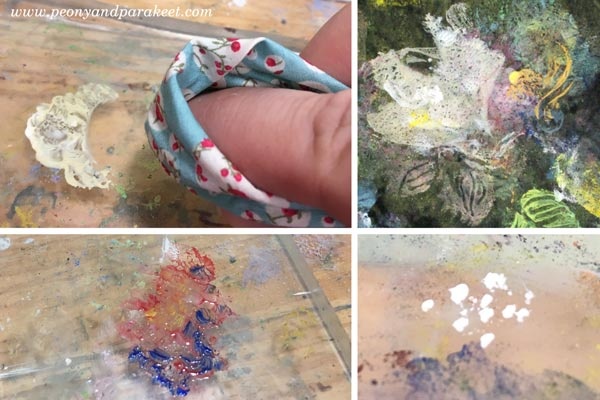
When using a little too much paint, it forms “skins” that look like intricate leaves. It was also fun to add a surface pattern to a vase.
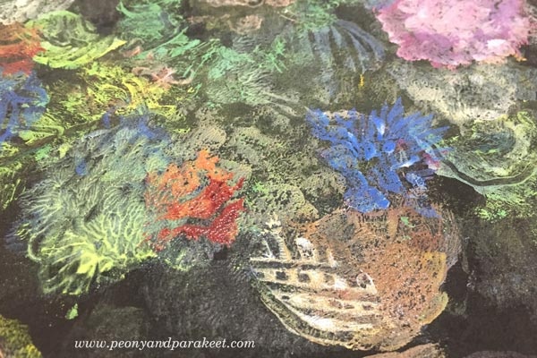
I used dark browns and black to tone down some elements, and white to highlight others.
Here’s one of my favorite details:
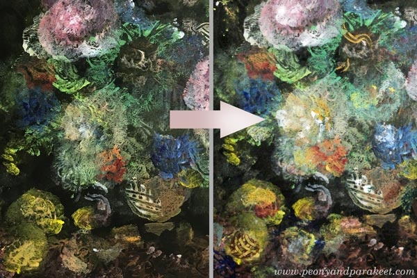
Another one, showing how the vase glows.
Here’s the finished piece in full size:

What next?
Continue to create with Paivi: Subscribe to my weekly emails
Learn the basics of mono-printing and create your visual wonderland: Buy Collageland
Stop the stiffness – let Paivi help you to move forward: Join Bloom and Fly
Subscribe to Paivi’s weekly emails – Get a free mini-course Loosen Up!
Coming Up: Fine Art Monoprinting!
I am running a free live broadcast Gelli Plate Meets Fine Art on Wednesday, May 23, 9 AM BST (London), 6 PM AEST (Sydney). This session is for you who loves old paintings from Renaissance to Impressionism but who also likes to play with Gelli plate or other mono-printing tools.
Inspiration from Historical Paintings
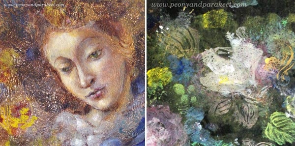
Old art is full of nuances and inspiration. I will show you how you can get more out of old masterpieces and apply the lessons to your art too. I will use two pieces as an example of how you can stretch Gelli plate’s limits. The first one has brushwork in addition to printed motifs. The second one is a still life that was made with a Gelli plate only. The pics of this post show some details of them.
Gelli Plate Meets Fine Art – Come Along!
Reserve your spot here: https://www.crowdcast.io/e/gelli-plate
You can watch the replay via the link or here on my blog if you can’t make it.
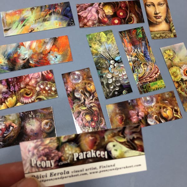
Artist Statement, Portfolio, Prints – Presenting a New Website for My Art!
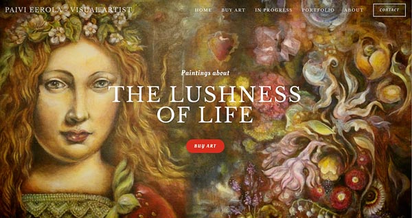
I have a new website for my art! It has an online shop filled with originals and prints, a portfolio, pictures of the paintings in progress, and my story. Go to paivieerola.com!
This Peony and Parakeet site will also continue, as well as blogging, classes, etc. but I wanted to have a better presentation of myself as an artist, not only as an art teacher. First, my intention was just to update this site, but it is already full of information, many of which I would like to bring more rather than less visible. So I decided to keep this site for art education and create a new site for selling art. Time will tell if having two sites is too confusing, hopefully not!
Artist Statement or Not?
I re-wrote the About page tens of times! It was quite easy to pick the things that I wanted to say, but it’s still difficult to not to be too boring! I decided not to put it in the form of an artist statement because I didn’t want to alienate anyone with long and grandiose sentences although the first sentences under the title could be seen as one:
“When Paivi Eerola is painting, she is a scientist who plays with the reality. Ducks can become plants, a fruit can replace fabric, and flowers can form a factory that produces glass. In this new world, everything is changing and moving, and it’s all celebrating the lushness of life.”
I wrote my story in the third person so that it can be used easily on other occasions too. While writing my story, I questioned if it’s really how you see me and my art. But in the end, everyone has their interpretations of the images, and this is just how and what I think when I am creating them. One thing that I left out is how I test my paintings.
Original Canvas Paintings and How I Test Them
When I paint on canvas, my goal is to create a treasure rather than just an image. I test the painting so that I lay it flat on the table, walk away from it and then turn back to see what my gut reaction is. If I just make a mark that there’s a painting on the table, I need to continue working on it. If the painting looks more like a thing, a glowing treasure box, then I have achieved my goal.
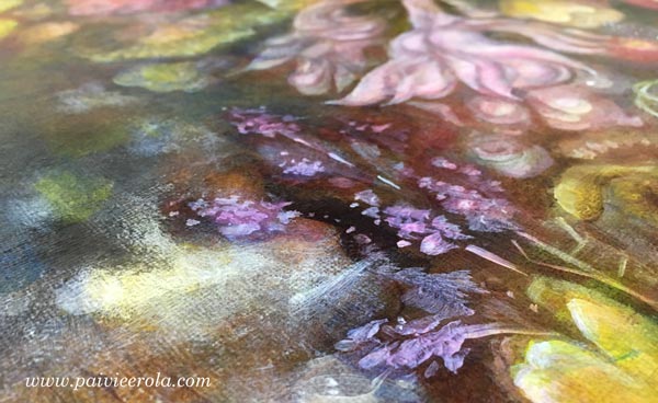
It’s really important to me to make paintings that stand the test of time. I have spent tens of hours painting these, and I hope that they will live longer than me. Sometimes I wonder if I have this strong aspiration because I don’t have any children.
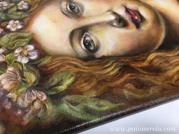
Nothing beats the luxury of an original painting, especially when it’s varnished and the colors glow like the paint would still be wet. See the originals that I have currently available!
Prints from Me to You
So far, I have sold prints via Saatchi Art. It’s great for US customers especially because the prints are delivered directly from there, and they also provide canvas prints. However, I also want to have few prints available directly from me, and there’s a small selection at my new store. I have printed them with an inkjet printer on a lovely fine art paper.
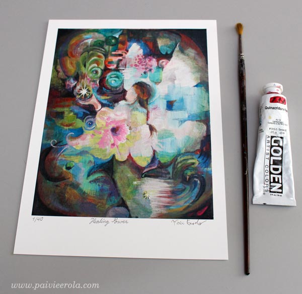
I am selling one of the prints as a limited edition. Every copy of it is signed and numbered. The painting in the print is called Healing Power. The original painting is sold, and I only produce 40 art prints from the image. So if you wish to have some healing power, would like to give that to someone, get your copy!
Portfolio
To show a big picture of what I have done, I wanted to include a portfolio that is like a small art gallery on my new website. I tried to pick the pieces that present my style but there was a lot to select from.
For example, I didn’t pick this one because I didn’t want to add too many. Anyway, I have a gallery on this site too, and it can be less curated!
Picking pieces for the portfolio is a really good exercise. It made me think about my artist’s path and see how my ideas have merged and grown to produce new work.
Paintings in Progress
I always aim to be as transparent as possible. Being very secretive has never worked for me, it’s against my personality. So there’s a section called In Progress which shows the paintings that I currently work on. Now it shows my first series of oil paintings. Here’s one of them so far:

Oil paintings take even more time than acrylic paintings because I need to let them dry properly before adding a new layer. You can follow the progress at the new site. I also have a separate mailing list for all who are interested in buying my paintings. Subscribe to the list here!
Hopefully, you enjoy the new site!
How to Add Depth when Creating Abstract Mixed Media Florals

When I started drawing and painting as an adult, it took quite a long time for me to understand the power of creating visual depth. Before that, every time I wanted to highlight a particular element, I added more lines to it and it just looked stiffer and stiffer. When you add depth, your art is not like a sentence where every word is underlined.
Instead, your art becomes more like a paragraph that invites the viewer to dig deeper.
How to Add Depth – Create with Me!
In the video, I create a floral painting without any reference photos and give you some basic tips along the way. I use a mixed media approach and combine pens with paints to make the job easier!
Come and Create Unique Floral Treasures!
Level up your skills, find the process you love and let flowers show the way to expressive art! You don’t want to miss this class!
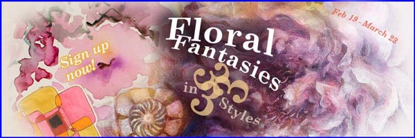
Floral Fantasies in 3 Styles begins on Feb 19th – sign up now!