
Mimicking Embroidery with Colored Pencils
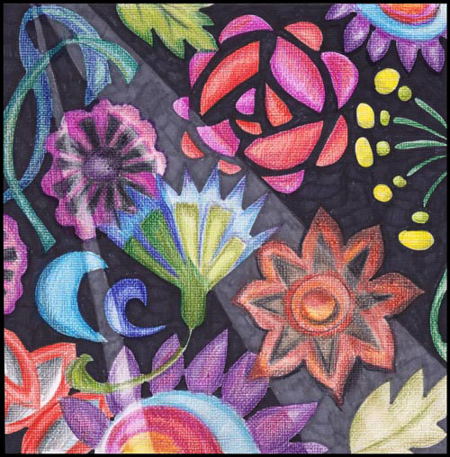
With summer, I have had more time for hand embroidery. After holding a needle in my hand, I got the idea to embroider with the colored pencils too.
Mimicking Embroidery – A Rough Sketch
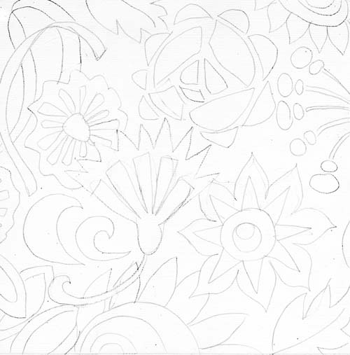
I began with white 8-by-8 inches sized cardstock. If you look closely, you can see some texture on the surface. I used a white weave textured cardstock turned upside down so that the surface is smooth enough for colored pencils. Before picking up the colored pencils, I made a rough sketch of the shapes first.

Coloring the Shapes with Colored Pencils
Remember these when using colored pencils:
1) Keep the direction of the strokes the same. Especially if you want to mimic embroidery as I have done here.
2) Control the color intensity with the number of strokes. When coloring, press lightly and create thin layers of color.
3) Mix colors by adding thin layers of various colors. Mixed colors always look better!
4) Keep your pencils fairly sharp. If you have an electronic pencil sharpener, use it to make your pencils last longer.
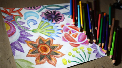
I have tried several brands of colored pencils but here are the ones that I like most at the moment:
1) Garan d’Ache Pablo (soft waxy finish)
2) Derwent Colorsoft (work great on watercolored surface)
3) Derwent Inktense (water soluble)
I have also heard that Prismacolor colored pencils are great.
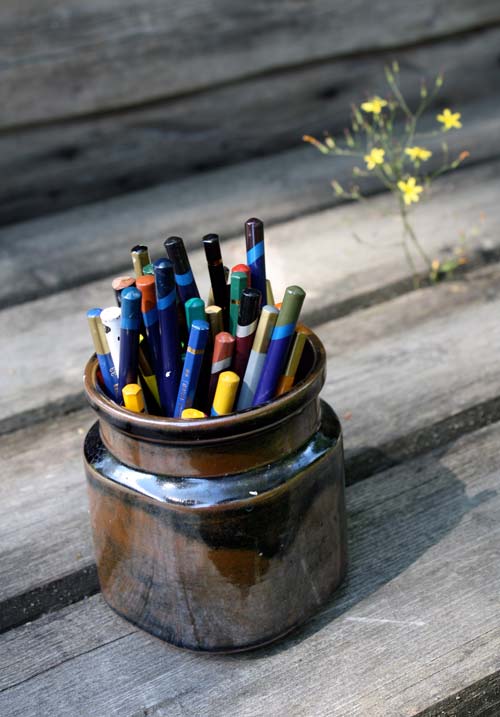
I store my pencils in a jar. Whatever brand they are, they all go into the same jar. This way they take very little space and I can keep them visible all the time. When I see them, I will use them!
Coloring the Background with Markers

After coloring the sketched shapes, the background was colored with black and dark gray markers. To emphasize the fabric look and to make the background interesting too, I created lined areas for the shades. I aimed for an impression of the light shining on the fabric cloth. Using markers created a contrast between the soft colored shapes. (Copic markers used: 100 black and C7 Cool Gray)
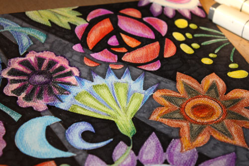
Darkening the Shapes
After creating the background, I began to darken the areas of the shapes that were on the black background. The darkening shows well in this second artwork which I made after the first one.
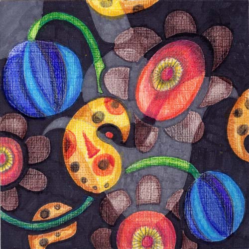
After finishing this, I realized that my recent activity of picking up lily leaf beetles from my garden had lurked into my art. Oh, my! There they are, those orangy yellow swirls!
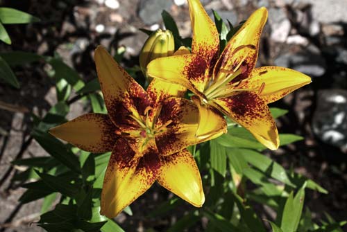
The first lilies have just opened… Hopefully, my subconscious will replace the images of the leaf beetles with the lily flowers!
Express more with colored pencils: Buy my e-book Coloring Freely!
The Art of Finishing

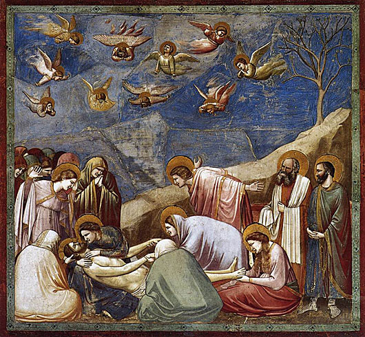
This collage is called Dawn of Change. It is inspired by the history of art. There was a time when I preferred modern art. If I went to an exhibition showing older than 20th century’s art, I used to yawn and think how pretentious it was. But the more I have examined art, the more I see in the old art. I see colors and concepts that can be reproduced in many different angles. Also, seeing good art makes me think of finishing – how much it affects the experience of the viewer.
The Creative Process
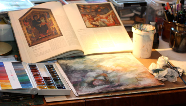
When I began to create Dawn of Change, I kept the painting of Giotto di Bondone visible on the table. I did not copy the image; I just kept it as a reminder of what to aim for.
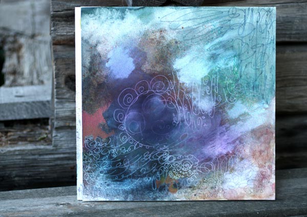
The first layers were painted with watercolors. Then I added some Copic Opaque White to create lighter areas. The white layers were rubbed so that they shined vaguely on the watercolored surface. I also sprayed some Dylusions mists to make the background even foggier.
After a little bit of doodling with colored pencils, black marker, and white gel pen, the background started to show the guidelines for collage pieces.
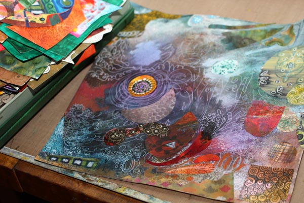
Then I picked up the box of hand decorated papers and began to attach the paper pieces. In this phase, I always get surprised how well the papers fit the artwork even if they are all different. Creating your own papers will bring you that happiness! Try to avoid using same papers many times in the same artwork. That way the result looks more interesting.
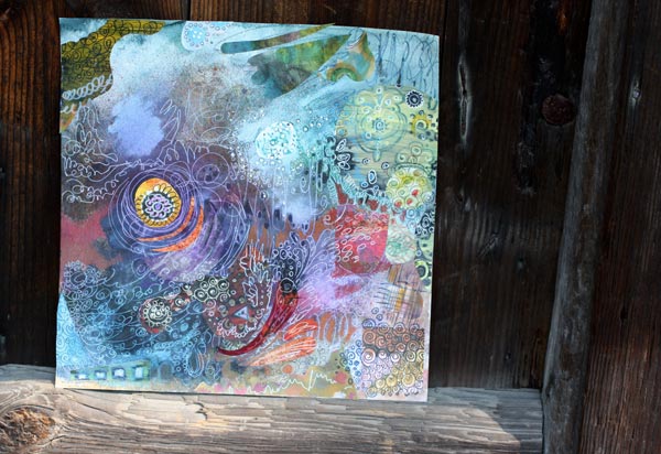
After a little bit of doodling, I was getting tired and decided to end my session. Even if the composition was accomplished and nothing major decisions left to make, I felt that the work was incomplete. I needed to ponder how I was going to finish it. Over the years I have noticed that finishing does make a difference. In arts and crafts, the finishing rarely alters either the message or the use of the work, but still has a high impact on how appealing we will find it. Sometimes that extra addition of quality will change entirely what we think about it.
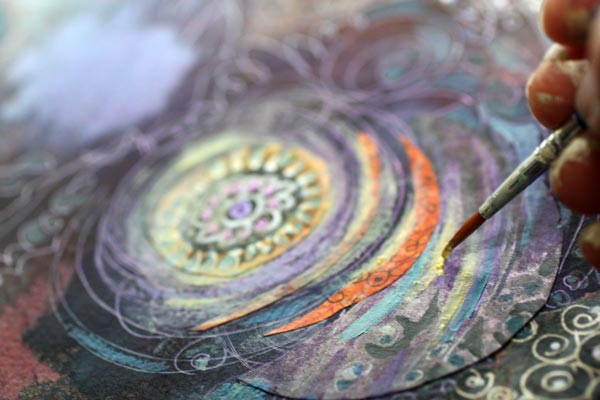
So, if you want to improve your results, get into the habit of taking breaks. I like to have a good night sleep, walk the dogs or work in the garden. Especially physical activities make the subconscious work best. Then, when I grab the thin brush I know exactly what I want to achieve and how to do it.
Finishing Art – Making Subtle Changes
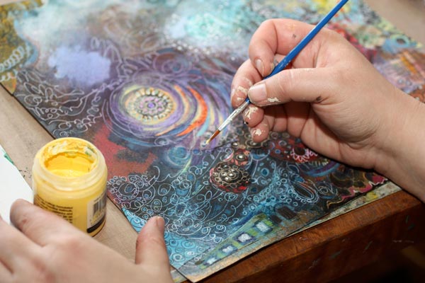
In this piece, I wanted to increase the impression of the colors fading together. The acrylic paints were the best to accomplish that. I added small strokes of various shades of grays to create a more muted look. Then I also added some pale yellow and off-white to create the fading in lighter areas.

The difference between before and after is not big. When placing the two pictures side by side, you have to search for the differences. But I claim that the overall experience of the quality is better after finishing.
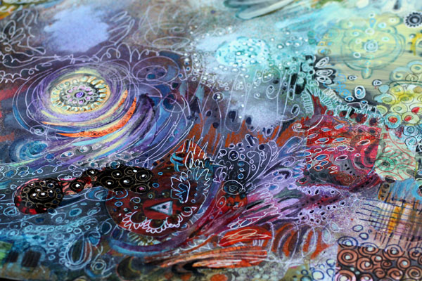
So I challenge you to finish your work – even if it already feels finished!
Let me be your mentor in art: Subscribe to my weekly emails!
From Photos to Art Nouveau – Doodling on Photos
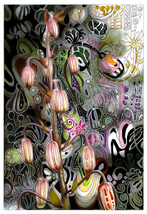
One of my favorite styles, art nouveau, thrives from natural forms. So, when I am walking in the garden, I see art nouveau everywhere. I often have a camera in my hand, and I snap photos while admiring the flowers.
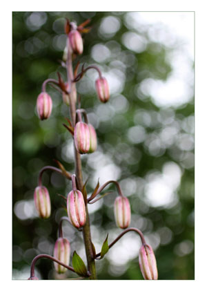 When checking photos after one of those walks, this snapshot of martagon’s flower buds caught my eye. It almost shouted art nouveau to me. Its shape reminded me of the Mackintosh lamp shades seen in Scotland a month ago.
Art Nouveau Martagon
I printed the photo on Canon matte photo paper. Simply using markers and gel pens, I doodled streamlined shapes to move the martagon to the era of renewal and decorative beauty.
In the original photo, the direction of the elements was downwards. I wanted to change the composition so that it would be upwards. The upward direction would refer to the spiritual renewal, a centric theme in art nouveau. I doodled several upward shapes like the flower seen in the upper right corner.

The colors of the plant were also a source of inspiration. I wanted to keep the narrow range of colors seen in the stem but also brighten the muted tones with splashes of bright green and pink.

Drawing on a photo was such a fun process that I will do it again. One idea would be to create art nouveau portraits. Art Nouveau style doodles would look great on portrait photos too. Actually, like in the best days of art nouveau, anything can be “beautified”!
Doodling on Photos
This was not the first time I used the technique of drawing on the photo.
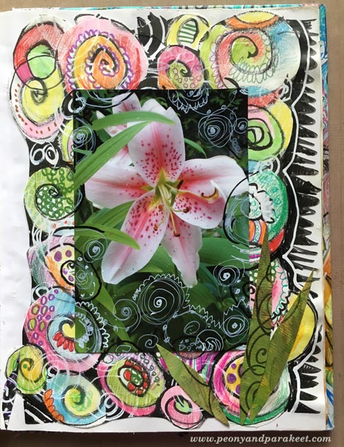
In 2010, I combined doodles and a photo. This page was also very easy to do:
1) doodle with pens on the background paper
2) attach a photo and then doodle on the photo.
More projects with doodling on prints
These posts also combine printed images and doodling:
>> Subconscious Goals
>> Creating Wood
Let me be your mentor in art: Subscribe to my weekly emails!
Find Where You Belong to

It took just a few seconds looking at the pictures of folk dresses to become almost overwhelmingly inspired. I hurried to my fashion themed Smash book and created this art journal spread.
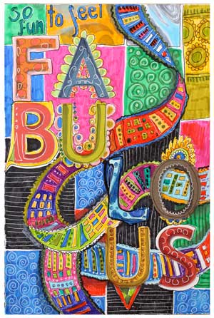 And then I had to make even one more page. Folklore and folk art always make me feel like this: fabulous! They give me both the sense of belonging and the sense of freedom. I feel that I am one part of the long chain of all the women, of Finnish women, of my mother and grandmothers. At the same time I am not defined by them, just empowered by them. With folk style, I can express my roots and origin without constraints.
They say that one of the basic needs is to belong to someone, to somewhere. I think that creating art can greatly enforce that feeling.
What kind of art makes you feel like that you are included? Maybe enjoying creating is not so much about finding one’s personal style but finding ways to feel belonged.
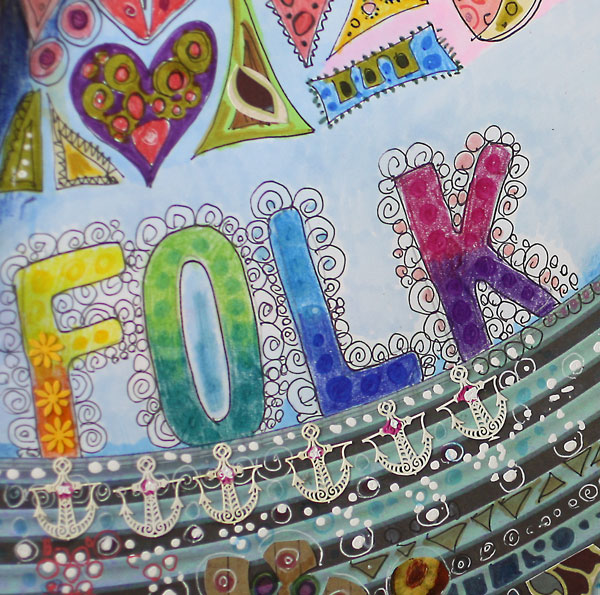
If you want to develop, it will be insufficient to create art that touches only you. You will want to get connected to other people as well. I claim that the deeper you go in your own self-expression, the more you will also touch others. Our mothers and grandmothers may have very little in common but we can share the goal to create something new and original from our heritage.
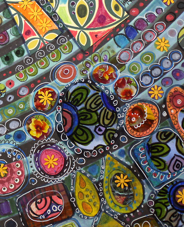
We do not have to think shapes or lines. It is often enough to dive into the colors. For me, colors represent the feeling. Shapes and lines are just to support them.

Find the colors from your origin and mix them with the colors of your present life. You are free to create any combinations! The best colors give you the sense of belonging. They will also inspire you to create art that is filled with meaning.
See this journal fully finished! >> Watch the flip-through video!