How to Make Your Art More Captivating
Captivating is a big word, but I like to explore it from many angles. In this blog post, I give you six tips with examples. The first two are more related to the process of creating art than to the result. I believe that if the process itself doesn’t captivate, it’s less likely that the final piece will! The last four tips are about finishing your art so that it will be compelling.
1) Captivating Supplies – Choose What Gets You Going!
Using too many art supplies can cause overwhelm and unnecessary distraction. I choose the supplies based on how many hours I want to work on the project.
- Under an hour: Black drawing pen and colored pencils. They are quick to grab and work on any paper.
- Few hours: Water-soluble media like watercolors or inks. They cover big areas quickly, but they also allow detailed work, especially when combined with colored pencils.
- Tens of hours: Acrylic or oil paints. The result lasts time and can include tens of layers.
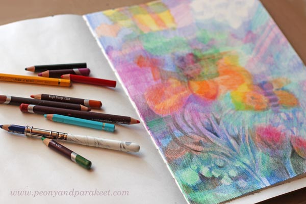
The projects shown in this blog post have taken 2-4 hours. These are all created with water-soluble media but this time, not with watercolors or inks. Namely, while organizing my supplies, I found Faber-Castell Gelatos and Derwent Artbars from my stash. I bought them many years ago when I was obsessed with having all the mixed media artist’s stuff. I purchased this and that, tried everything for few times, and then got disappointed because they didn’t improve my art. My solution back then was to reduce the number of art supplies and learn more about the basics of visual communication. It worked much better than hoping for the miracle with the new supplies!
But now when I opened the boxes, I was looking at Fabel-Castell Gelatos and Derwent Artbars with the new perspective. They could be quick and handy for sketchbooks and art journals. Because both of them are water-soluble, they could watercolors and inks once in a while.
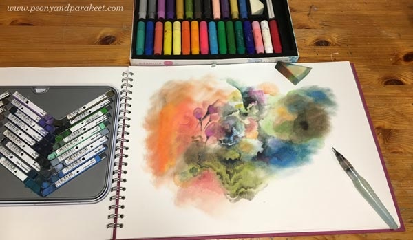
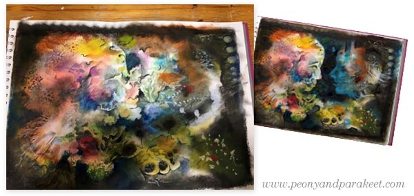
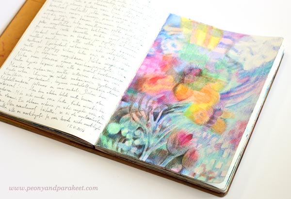
I have now used Derwent Artbars and Faber-Castell Gelatos for my big sketchbook. I use Artbars for detailed brushwork and Gelatos for big and blurry areas.It has been quick and fun. The downside is that the result is quite waxy and I don’t think it will endure time very well. Furthermore, I can’t cover the opposite page because the staining would ruin it. However, the old and neglected supplies have managed to inspire me, and I think it shows in my recent work as well. The image above shows how I started the piece that you can find at the beginning of this blog post.
2) Captivating Looseness – Start without Intention!
The second captivating thing is related to the process of creating as well. I like to start most of my pieces, whether they are small sketches, bigger art journal pages, or big paintings intuitively without accurate planning. Sometimes I have an image, a word or a style in mind. It inspires me to start, but as soon as I have sat down and made the first strokes, I try to let go of it and just enjoy creating freely from the imagination. In this short video, you see me working with Derwent Artbars and Faber-Castell Gelatos.
More videos: I have explained my adventurous creative process shortly in a mini-course called Loosed Up! It’s free for the subscribers of my weekly emails. If you haven’t a subscriber yet, subscribe here!
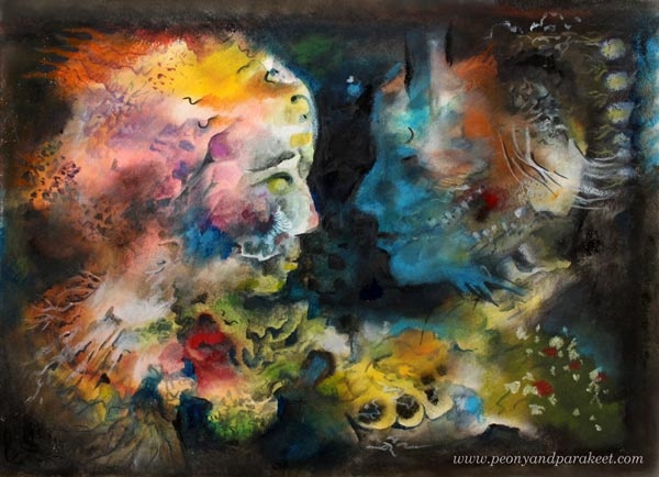
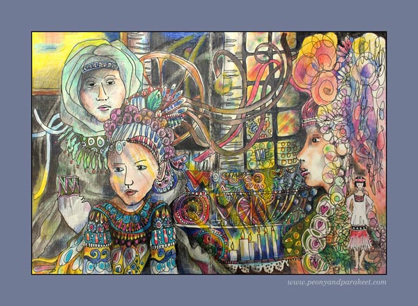
3) Captivating Story – Make Fantasy Portraits!
Artists often talk about communicating a story through art. Usually, referring to the story doesn’t mean so much what’s in the image, but how the image can deliver a handle to the viewer’s personal stories. One of the easiest ways to embark stories is to make a portrait that is relatable.
Even if you have started freely and intuitively, you can turn almost any blotch to a face, especially a side profile, by adding a color area that defines it. In my piece, I realized that with black, I could bring up two persons. I was intrigued by showing the connection between the two fantasy figures. To me, they express the two sides of me, when I am creating. One side is more feminine, full of emotion and ideas, and the other more masculine, trying to figure out how to put the ideas into subsequent steps. At best, these two sides work together and enter the same flow.
In the enlargement, you can see that the dark areas also include subtle details so that they are not monotone and so that they communicate the connection. The colors also play a role here. Blue expresses the connection that the two share together.
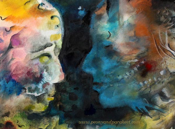
The story that you see in this piece doesn’t have to be the same than what I have told. For you, the image can bring a romantic moment to mind. Or it can take you to a fantasy movie. In the same way, the art that you make can have several meanings and when creating, focusing on the general message makes it more captivating. In this case, the message is the shared connection, and I have tried to adjust the details so that they all support this message.
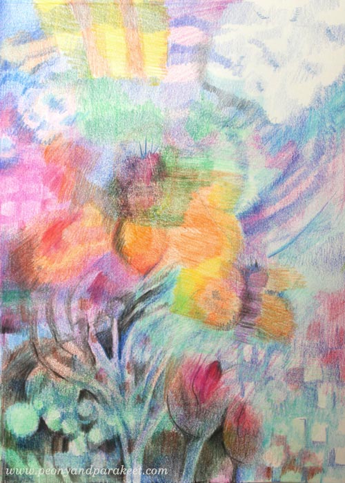
4) Captivating Richness – Build a System!
Usually, the longer we work with one piece, the more valuable it will become. Not only that we get more attached to it ourselves, or that it has a higher monetary value, but also that time brings the richness of the details. This is especially the case if you don’t try to get the piece finished in one sitting but let it captivate your mind between the sessions.
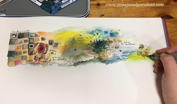
Many artists are afraid of “overworking,” but to my experience, “underworking” is more common. Also, only creating tiny pieces can be one form of underworking. See how a small art journal page, a modest scene, grew to a captivating system or a map when I continued the page!

When working with a detailed big picture, remember to leave some breathing space between crowded areas. Connected lines between the clusters make sure that your system is like a running machine with all the necessary pieces.

5) Captivating Clarity – Highlight a Direction!
Sometimes clarity can be more captivating than an overwhelming amount of details. My example is an orange that I drew one morning after a fruity breakfast.
I apologize for the low quality of the first image below. There you can see a shadow of me shooting the photo with my mobile phone. But actually, it brings up a good point about the clarity: when you are in doubt what to add, take a photo. It helps you to see your work with different eyes. You can zoom out to test if your image looks both clear and interesting when it’s small. You can also analyze, how your eye wanders around the work and where do you want to lead it. If your art looks like one big mess, adding a direction also brings more clarity.
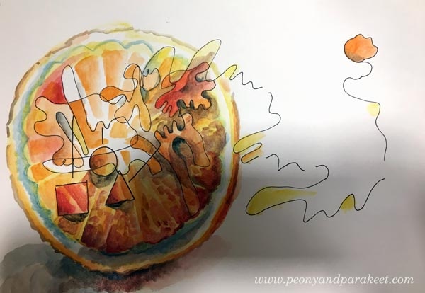
With the orange, I wanted to express the forward-thinking attitude that I usually have in the early mornings. I wanted to add more importance to the single juicy drop that leaves the orange with the bouncing energy. The idea behind the illustration was not just express a fruit that explodes but how a source of energy can keep you moving forward. It’s similar to the idea of my community Bloom and Fly – to keep you inspired to create and remove creative blocks that prevent you from that!
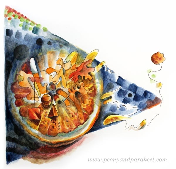
6) Captivating Contrast – Use Two Different Styles!
The last tip is about contrast. However, this time I don’t bring up the contrast in color, value, or size, but in style! Now you might say: “Paivi, I have been searching for a personal visual voice for so long. Are you talking about mixing different styles to one piece?” I certainly am! Don’t be a one-trick pony but go to see all kinds of art and practice all sorts of styles! Your technical skills will grow, and you will get ground-breaking ideas. Showing the versatility can also make your art more captivating. See how I combined abstract with realism how it makes the images more captivating and thought-provoking.

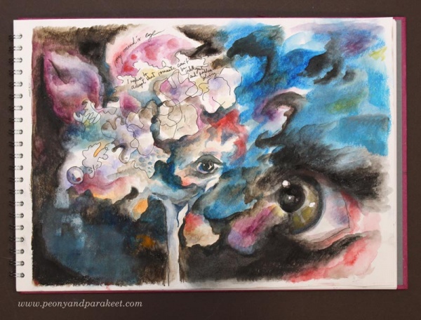
With a realistic pansy, I was able to communicate the contradiction that we all get when we envy someone: “When a jewel wants to feel free and be a pansy … And when the pansy secretly wishes to live forever and be the jewel.”

By adding the realistic eye, I was able to express the difference between two different worlds – the inner and the outer world. Paul Klee has said it so brilliantly: One eye sees, the other feels.”
Set Your Goals and Start Creating!
My community Bloom and Fly is for all who want to start and keep on creating. You can get help and encouragement for any art project, and we also have monthly themes.
January’s theme is “Mixed Media Sketchbook as a Tool for Setting Your Goals.” You will get ideas on how to use a sketchbook or an art journal for creative goals. Rather than feeling restricted, you will feel energized by the possibilities behind the goals. An art journal can be a playbook that keeps you moving forward!
With January’s theme, you will also get easy jumpstarts for stepping into the world of art journaling without feeling the pressure to buy more supplies. The money spent on staying inspired and connected with like-minded artists can be more useful than adding extra supplies to your stash.
Make sure that 2018 is your year of art – Join Bloom and Fly!
Bringing Life to Illustrations – Coloring the Air
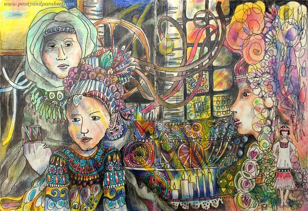
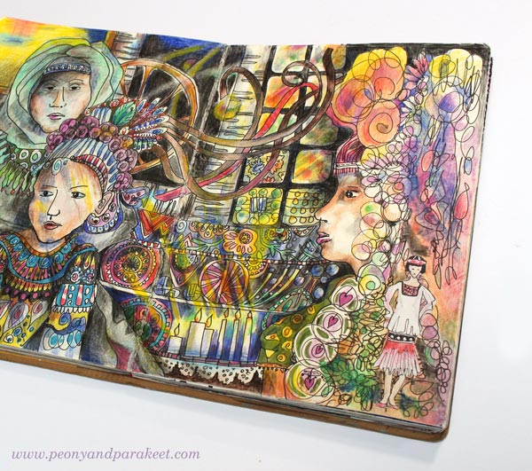
This is an art journal spread called “Chain of Generations.” I made this to express how decorative arts and crafts have connected women through generations. I feel I am part of that long chain, one foot in crafting and another in creating art.

From an Accidental Start to an Intentional Theme
The making of the art journal spread began almost accidentally. I had doodled a border on the right page a long time ago. Then many months later, I had quickly drawn a woman from 1920s and glued it beside the doodles.
A few weeks ago, I saw wonderful photos of Ukrainian folk art (pinned some to my Pinterest board Fantastic Folk Art). I got an idea of women connected with flying ribbons. I made a quick sketch with a pencil and then added more details with a drawing pen. I also got started with the coloring, but finishing felt too much work back then.

This happens to me often: I begin with one idea and end with another sometime later. I think it’s one of the best things in creating art and especially in creating art journal pages. When there are no fixations, surprising connections can happen. Like here, the women on the right are from different eras: Rococo and 1920s, just perfect to tell the story of how folk art and fashion and their timeless connection.
Inspiration from Atmosphere
While coloring the spread, I thought how I have always felt disconnected with folk art of my country Finland. Instead, I have always loved Russian and other Slavic countries’ approach to it. Finnish folk art feels very plain and unimaginative to me. Before the success in IT and education, Finland was a poor country. Many who come to Finland are surprised how few historic buildings there are and how modest the life seems to have been.
I have been born in Eastern Finland, near the Russian border, but visited Russia only three years ago. The grand atmosphere of the big churches in St. Petersburg made a big impact on me. The mosaics at Church of the Savior on Blood (yes, all the “paintings” are made from tiny mosaic pieces) lighted by the candles inspired my coloring.

The atmosphere in these kinds of old, precious buildings is amazing. As the theme of the spread was not only practical but also spiritual, an atmosphere of an old church felt a good choice to bring in.
Coloring “The Air”
Imagine that I had colored the spread so that I had stayed inside the outlines only. The page would have been much flatter, contained much less atmosphere and emotion. When I color, I also try to color “the air”. I try to think not only about the light but also how the air feels on the face and how it interacts with the light.
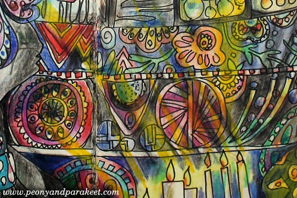
Things don’t have only one color when they are exposed to light. When coloring, think about the air and the lights flowing through space. Color over the outlines and show those less obvious, but so essential streams!
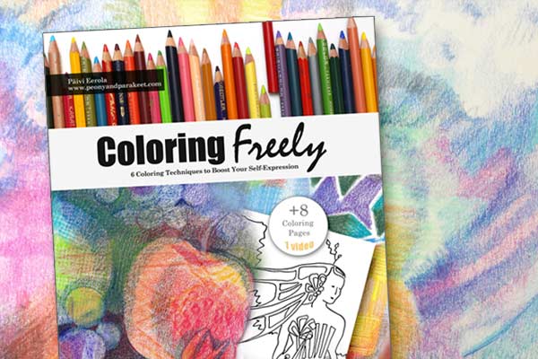
Buy the E-Book – Coloring Freely!
Coloring doesn’t only have to be calming. It can be expressive and inspirational. Purchase my e-book Coloring Freely to learn more about coloring freely with colored pencils. The book can be used with any coloring page or with any blank page. Buy now!
Avoid Stiffness with Blurry Coloring!
This is a recent art journal page made with colored pencils. I call this “Spring Bee.” It’s all about sunny spring arriving in Finland. The page is also inspired by the techniques that I discovered while writing my latest e-book Coloring Freely.
Magical Blurriness
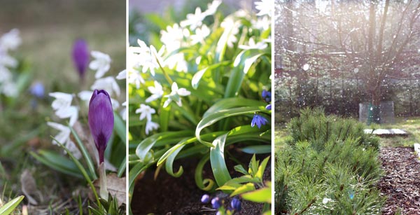
Every spring, when the first flowers pop up, I can’t resist taking photos of them. We in Finland have a long and cold winter. It’s such a joy to see colors, even subtle, again. This spring, I’ve been thinking a lot about softness and blurriness. The more I see it, a more magical the whole world looks. When taking photos, I aim for sharp details, but in the end, it’s the blurriness in the background that makes the image.
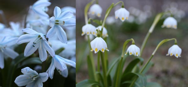
These pictures are from past springs, but they show well how distance, light, and rain cause blurriness. To my eye, blurry elements look soft, magical. It’s like they could be anything my imagination can reach! I believe that this is the way we should look at the world now and then, to see its natural beauty.
Less Stiffness – More Blurriness
When your art is less stiff, it allows the imagination to step in. It’s amazing what can appear from those blurry background layers.

I had no idea what the page would represent before the bee showed up! By freely coloring with odd, short colored pencils found from my growing collection, I continued filling the page. Like in photos, everything doesn’t have to be sharp and understandable in your art. You can let the viewer make their assumptions too.
In the end, I drew some sharp lines and colored additional dark areas on the front. These welcome the eye to explore the rest of the page.

This page has been created with colored pencils only. It has no sketching. It has been created just by coloring freely.
Journaling
When the page was finished, I wrote my thoughts about the magic of blurriness on the opposite page. When I open this spread after few months, I will be happily surprised by the spring feelings.
From Observations to Coloring Techniques
When I wrote Coloring Freely, I didn’t want just to explain how to use the techniques. I wanted to guide you to observe your surroundings. With the guided observation prompts, you will realize why the techniques work and what kind of insights they are based on. That way you don’t just color rationally, but also connect emotionally.
If your images are full of stiff outlines, it’s time to explore the world with different glasses and
start coloring freely!
Coloring Freely: Buy the e-book!
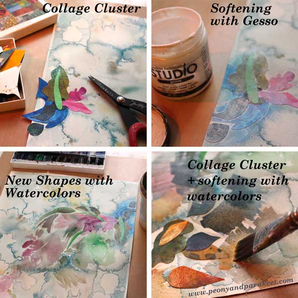
Less Sketching, More Creativity!

Did you see my latest video: “Art is a Conversation”? I have made this piece by applying the principle presented in the video: letting one detail lead to another. No sketching involved!
The Creative Process with No Sketching Involved
I picked a random background made with watercolors and started adding collage pieces. They, in turn, inspired me to paint some elements with watercolors.
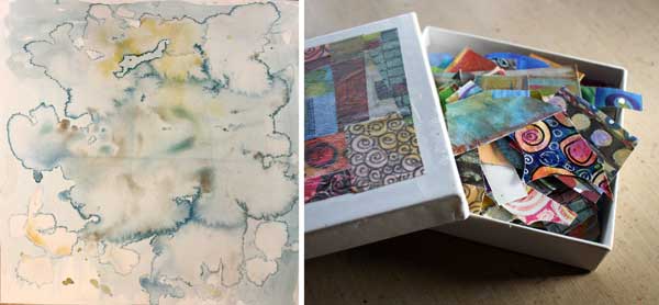
Here are the first steps:
Why Sketch? Why Not?
You might feel the need for sketching because filling the blank page feels too scary. Some people want to sketch because they find it difficult to bring ideas that lead to something. If they create a collage, the result is just an evenly spread pattern and then what?
Dogs have taught me many things. One thing is to focus on the present. I try to teach them new things by dividing them into small steps. When I focus on explaining the next step only, they will listen and respond. They will do their best to understand and make most of my advice.
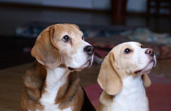
My beagles say: Stay close, focus and stop controlling what we can’t comprehend yet.
Those principals can be applied to art making too. Add new element close and partly on top of another. Enjoy each stroke, each color, and shape at a time. Stop worrying about the areas where you have not reached yet. Let creating grow your thoughts instead of being fixed to one idea.

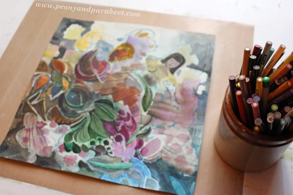
When I reached the upper right corner, I saw a watercolor splotch that looked a little bit like a fairytale princess, so I quickly emphasized those shapes!
I believe that too much sketching brings too much stiffness: the stiffness of ideas, the stiffness of lines, the stiffness of composition.
When we try to create with control, it is like trying to trace better than dogs do. We can guide them to sniff, but we also have to let them do the job.

Subscribe to my weekly emails – Get a free mini-course!