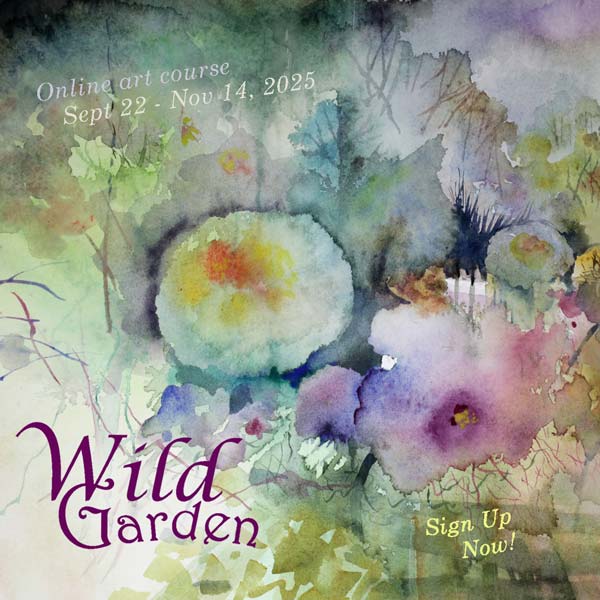
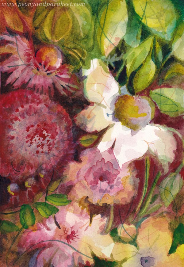
Sneak Peeks at the Watercolor Course Wild Garden

The new watercolor course Wild Garden will start next week! Exciting! I have been working on this course since the beginning of June and have tried to make it my best course ever. >> Sign up here!
I recorded the intro in various places in our garden on a sunny day last month.

There is a variety of projects, big and small, and I also share some short technique practices.

My goal is that you feel like you are sitting right beside me, and we are creating together at my home.

We will create freely so that you won’t be accurately copying my piece, but you get techniques, tips, and ideas so that your painting grows with mine.

There are practices that grow your skills for making the paintings beautiful.

We examine light, shadows, hope, and mysteries that can be found in a garden and in nature in general.

Bold strokes are combined with thin and more delicate ones.

And of course, we play with color and let water also make the blooms.

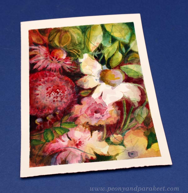
Wild Garden – Sign Up Now!
This is the watercolor course who loves nature and flowers. In Wild Garden, we will paint freely, intuitively, and expressively from Sept 22 to Nov 14. We will begin with floral greeting cards and gradually move forward in expression. The projects are fun, and I will be there in the videos even more present than ever.
>> Sign up now!
Watch the inspiring video and sign up now!
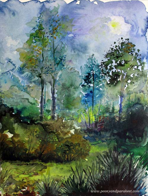
Our Garden in Watercolor
This week, I tell about our garden and share my watercolor paintings that have been influenced by it.

We create something like this in the course Wild Garden!
We bought our current house in the fall of 2011. We had had small terraced yards before so at first, we didn’t pay much attention to the yard and mostly focused on the house.
However, the big lawn slowly turned into a garden when my husband and I started adding plants.
See how I made this!
And now when I look back at my art years later, plants slowly started to take over there too. We bought the house, but it was the surrounding yard that changed us.
See how I made this!

Big Changes
My husband really got into gardening and in 2018 he made his long-time dream come true when the front yard was transformed into a Japanese garden.

In 2023, the backyard got a bigger makeover when my husband built a pond and the boring lawn was transformed into a pergola with English-style plantings and meadows.


See how I made this!


We create something like this in the course Wild Garden!
Local Nature and Watercolor
The words “English” or “Japanese” don’t describe our garden as well as “forest” and “water.” Our garden is a mix of external influences and Finnish nature. We have pines, birches, and wild flowers too.

We create something like this in the course Wild Garden!
There is water – not only in a pond loved by small birds – but we also have a stone water bowl “tsukubai”, and an imaginary water area built of sand.

See how I made this!
Our garden has a couple of berry bushes, strawberries for birds, two apple trees and a cherry tree, but it cannot be called a vegetable garden.

See how I made this!
See how I made this!
The front yard is dominated by conifers and flowers such as a huge hydrangea and many peonies and roses. The backyard has grasses and flowering perennials.

See how I made this!

See how I made this!
Garden in Watercolor
The garden is my husband’s artwork, but for me, weeding and planting is not enough, I need brushes.

See how I made this!
By painting, the story of a place changes to a more personal story. Rather than accurately sketching the specific locations, we should let nature immerse in us, and then express its beauty freely.

Wild Garden – Paint with Me!
In the upcoming course Wild Garden we will paint flowers freely, intuitively, and expressively in watercolor. Sign up here!
Wild Garden will begin on September 22, 2025. Sign up now!
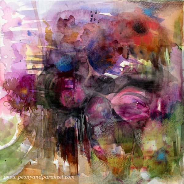
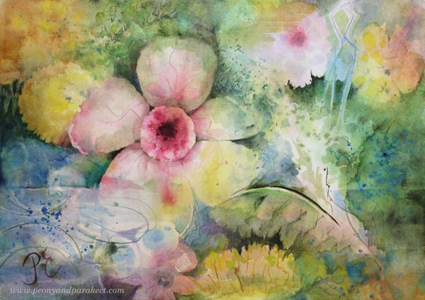
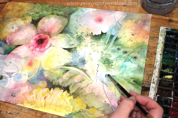
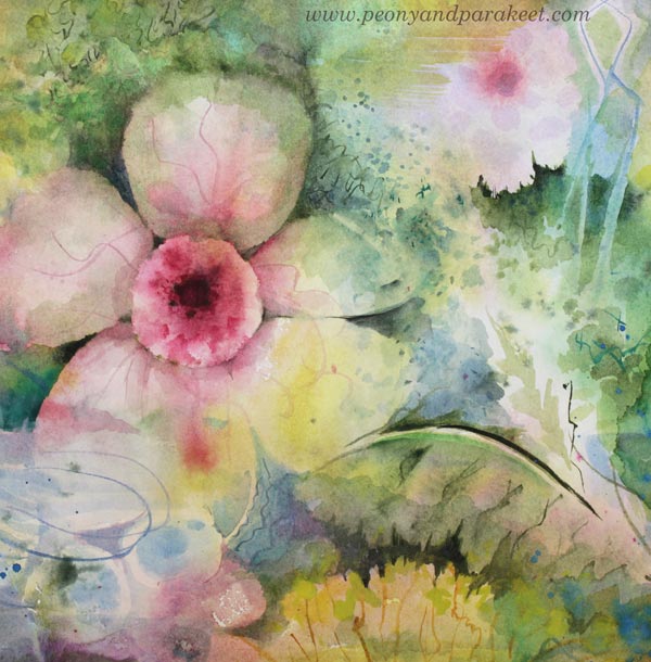
Abstract Watercolor Flower Card
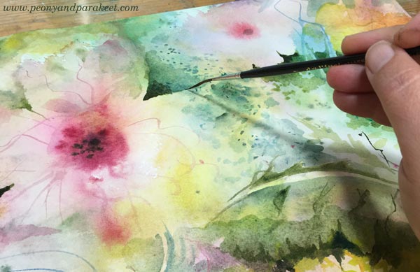
This week, I invite you to paint with me. Let’s make an abstract watercolor flower card!
Abstract Watercolor Flower Card – Watch the Video!
In this video, you see me both creating and talking about abstract floral art. Watch the video and paint with me!
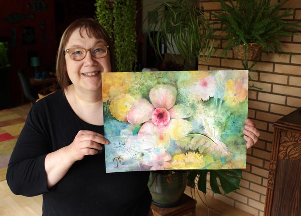
I hope my love for abstract florals is contagious! Here’s the finished card again.
Watercolor cards are just precious. You can never have too many, and there’s always someone you gan give one to. That’s why the new course Wild Garden has many card projects.
Wild Garden – Paint with Me!
In the upcoming course Wild Garden we will paint flowers freely, intuitively, and expressively in watercolor. Sign up here!
Wild Garden will begin on September 22, 2025. Sign up now!
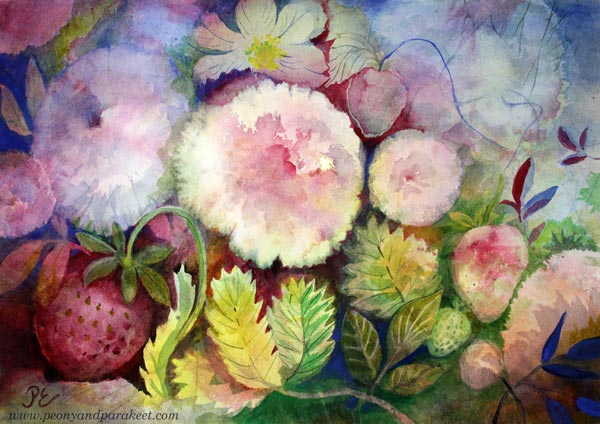
Gentle Morning – Expression Through Watercolor
This week, I share a watercolor painting that has more expression than correct botanical details.
I created a sweet, luminous atmosphere for this delicate flower painting, where the water appears soft, refreshing, and nurturing.
>> See more pics on the Taiko online art store
The gentle water and morning light express new beginnings that are filled with hope.
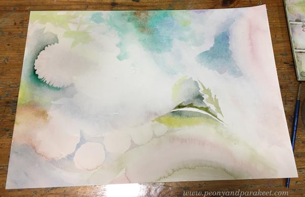
Life sometimes gives us gentle mornings – wonderful new beginnings. The mere thought of them lifts the spirit.
I feel that the delicacy of watercolors enables us to express in such a lightness that it deeply touches the soul. Real flowers also have a similar kind of comforting lightness.
I love to add tiny details and surface patterning on my watercolor pieces.
I am not a flower painter in the traditional sense. My flowers can tell stories.
You can express anything with flowers when painting freely. It inspires me so much! For example, when I see a color scheme that I really like, I think: “That could make a great flower painting!” Currently, I am thinking about Gothic-style flowers and dark colors.
Wild Garden – Paint with Me!
In the upcoming course Wild Garden we will paint flowers freely, intuitively, and expressively in watercolor. Watch the video and sign up now!
Wild Garden will begin on September 22, 2025. The early-bird sale will end on August 24 (at midnight PDT). Sign up here!