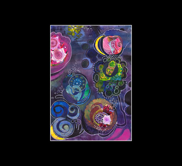
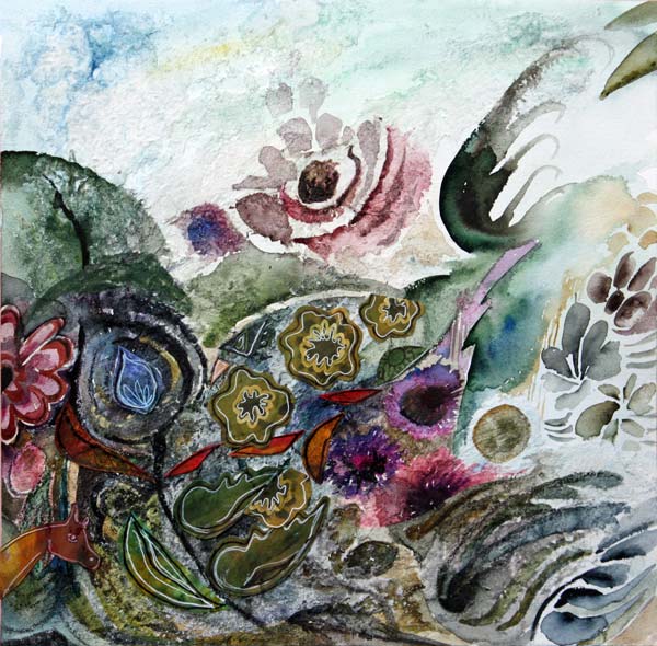
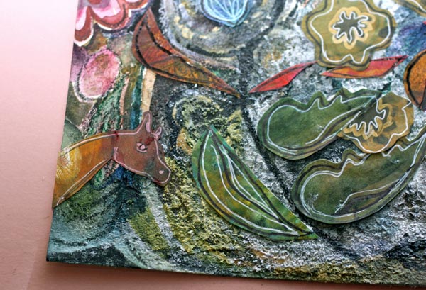
Create Abstract Botanical Art!
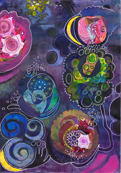
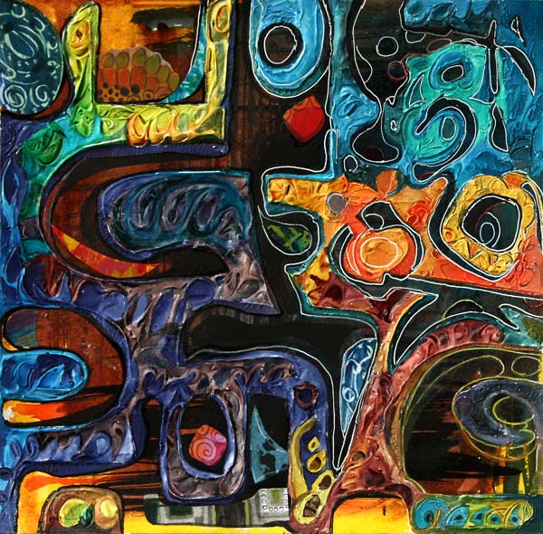
Last Friday I saw impressive paintings. When I see something that appeals to me, I try to analyze that in pieces. It is fascinating to find out little things that make a painting so memorable. I created this collage called “The Odd Nature” by using those factors. The whole subject – abstract botanical art – is mind-blowing.
Inspired by Hilma af Klint
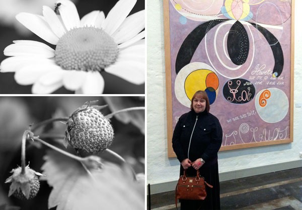
Starting from the beginning: I was at Hilma af Klint‘s exhibition at Kunsthalle Helsinki. I had seen a few of her works before, but never this many at the same time. Hilma af Klint (1862-1944) painted botanical art and landscapes but then moved to create abstract art. She was a female artist and one of the pioneers of abstract art. When that is combined with her interest in spiritual ideas, no wonder she did not make her work public. In fact, she ordered that her work should be shown not earlier than 20 years after her death! Look at some of Hilma af Klint’s paintings on the Swedish Moderna Museet’s website.
Here’s what inspired me with Hilma af Klint’s art:
1) Odd compositions that were skillfully balanced.
2) Graphic, often decorative shapes which reminded me of plants and biology.
3) The combination of bright and muted colors with great contrasts.
Zoom in on Nature!
After the exhibition, I began to think about how far we often look at the world around us. To me, it felt like Hilma af Klint had divided living objects like plants into small components and then constructed new pieces out of them. So I began to zoom in on the photos I had taken from my garden this year.

When thinking about the structure of apple blossom, I remembered something which is small too: the little box where I save the tiniest scraps of my hand-decorated papers.
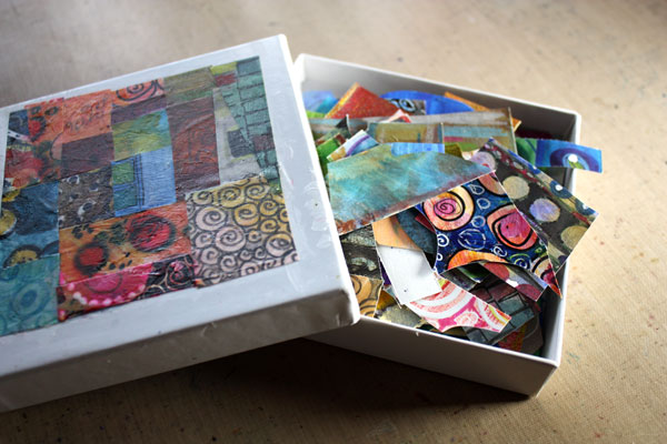
Creating abstract botanicals from the paper scraps would be the thing to do!
Color Inspiration
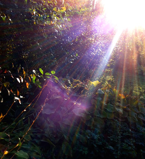
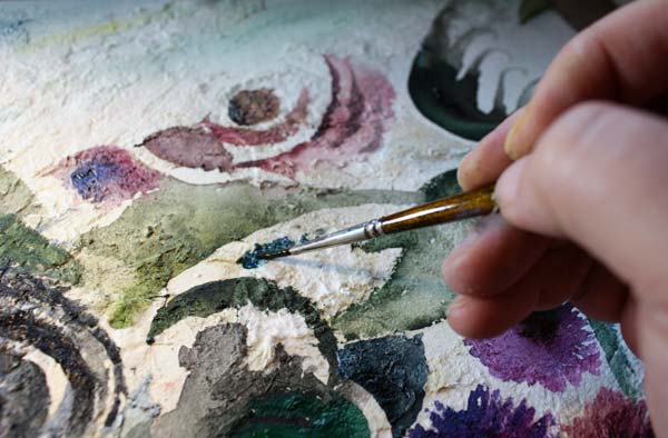
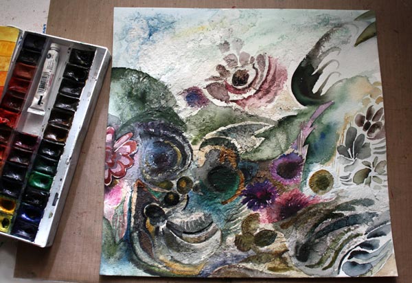
The idea for the color scheme and the atmosphere came from this photo, taken just a while ago. I painted the background blue purple by adding several layers with watercolors.
Collage Shapes
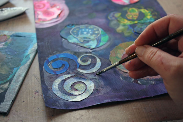
After the background had been finished, I began to create the abstract shapes.
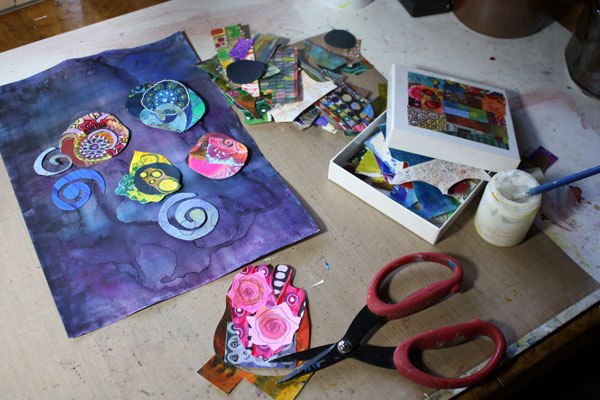
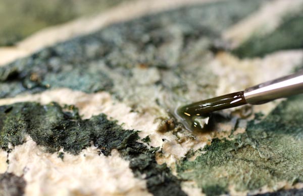
You can easily create intriguing collage pieces by combining small scraps together. Your cut shape does not need to be perfect before gluing it on the background. You can think of the shape as the beginning of the final shape. You can add more details with paint and pen around the shape later.
Composition
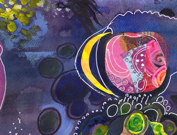
When gluing the shapes before they are finished, you need to make bold moves in the composition. I advise not to think of the composition more than this: make sure that the shapes are not evenly spread in the background. After the preliminary shapes are glued, you can then continue working with them by expanding them with painting and drawing. At the same time combine some of the shapes together and create new, smaller shapes to balance the work.
In my work, the center of the work is left almost empty. There I created a tiny detail that adds dimension to the work: a blue horizontal line near the two small circles.
So why not pick up your scraps and honor Hilma by creating surrealistic botanical art!
Read also
Fun Designs from Decorative Papers – An easy technique to create collage elements.
How to Draw a Rose – A simple rose seen in the collage above. You might want to use it as a decorative element too.
5 Ways Music Can Improve Your Art
This mixed media collage is called “Opera”. For me, visual images have always been more important than sounds, but I still think that there’s a lot in common and a lot to learn from music.
Tip 1: Let Music Challenge You!
How would jazz look like as a collage? Paint the voice of your favorite artist! Create a rhythm to your artwork!
A week ago was my first time in opera. I had bought the tickets as a birthday present for my husband who is a very cultured person. I was a bit worried about how I would endure the experience as I had disliked opera for all my life. At least the play was one of the easiest pieces, The Marriage of Figaro. While listening to the beautiful sopranos, I saw strong colors and lines in my mind. I began to think how powerful and intellectual music can be. I felt I was challenged! Could I ever express visually what I was experiencing?
However, when I began to create the collage, I did not think of opera. I knew that it would come out someday or another. Like many times, I just had a compelling idea of the technique I was going to use. I was going to create strong shapes with a molding paste.

But before opening the paste jar, I grabbed a sheet of heavy-weight watercolor paper and the box of india inks. Painting the background was fast with a thick brush.
Tip 2: Think Your Artwork as a Space for Music!
I read an interesting interview from the newspaper Helsingin Sanomat. They had interviewed a famous Finnish painter Marika Mäkelä. She quoted another Finnish artist, Leena Luostarinen. She had said that you should imagine a lighting inside the painting. Even the colors of the painting should be considered through the lighting. I think it is ingeniously said. It made me think about the space I would create inside my artwork and how the lights, shadows and color contrasts should flow there. My addition to this thinking is: if the music was played in that space, think about how it would sound. Pick the shapes and lines to express that!
With these deep thoughts, I cut both heavy and light cardboard into pieces. They were attached to the background with a masking tape.

See how irregular the handcut shapes are! I love the uniqueness that only handcuts can give! I can’t understand the popularity of machine-cut stencils.

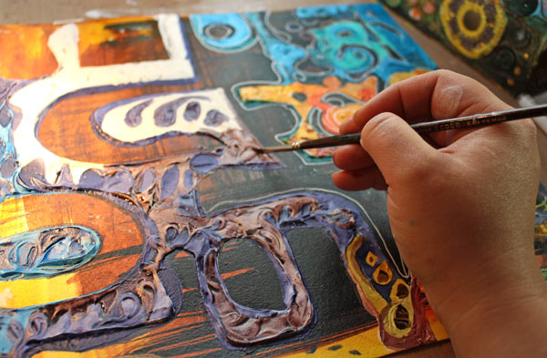
After placing the masks on the background, I added the molding paste, a lot of it! Some swirls were doodled on the paste, so that the surface would look lively.

I removed the masks carefully before the paste was dry. Drying time was really long, almost a day, even if I used a heat gun to fasten the process. I usually like to take breaks from creating, so this extra waiting time did not frustrate me at all. While I was waiting, I was thinking about how I was going to paint the artwork. How would the light flow around these dramatic shapes?
Tip 3: Pick the Colors from the Music
I like to think music as colors. The lower the notes, the darker the colors are. A melancholic song is also darker than the cheerful one. Red and orange are for deep, rich voices. You do not need to overanalyze it: just get into the feeling of the music and pick the colors that come to your mind! The Marriage of Figaro has both bright and dark sounds. I also wanted to express the dramatic nature of the music with colors.
Tip 4: Move to the Rhythm of the Music While Creating
When the painting gets near the end, I often stand up. I need to see my work properly to find the essence of it. This is the stage where I usually put the music on if I have not done it before. I wave my hands and take steps to the rhytm of the music. I try to get as close as possible to the feeling that I want to express. I also try to be as focused as possible.
White gel pen and black markers were in use as I dived into the melodies of the opera.
Tip 5: Focus Your Energy with the Help of Music
It is important not to change the music too much when you want to focus. If you listen to the variety of songs just when you make the final touches, it might not do good for your work. I often play the same song repeatedly when I am finishing the work.

On the other hand, when I am in the earlier stages of the work, I am not that careful. I listen to this and that as long as it gives me the energy to continue. I like to listen to the music that gives me confidence and which doesn’t feel too themed. Here are my recent favorites for boosting the creative process: A Sky Full of Stars (Coldplay), Viva La Vida (Coldplay), This Years Love (David Grey), Change (Tracy Chapman), September (Earth, Wind & Fire), Flower (Kylie Minogue), Thorn in My Side (Eurythmics), I Say a Little Prayer (Aretha Franklin).
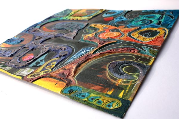
I love how dimensional my artwork became. I am also happy how finished it looks. Hand decorated papers were helpful while finishing the work. With them, it is easy to add details that are interesting and different. Just do not use the same paper too much!
Sometimes I aim for flying lines and relaxed touch, but this time – it was all about opera! My computer was playing The Marriage of Figaro in high volume and I was pushing my boundaries to express the quality of the music. Then finally, after placing the two red pieces, I felt that I have solved it, the riddle of opera music!

What music do you listen to while creating? Try changing the music if you want to fine-tune your art or expand to new areas!
Subscribe to my weekly emails – Get a free mini-course!
Gobelin Tapestry in Mixed Media
I like the sources of inspiration be quite distant. They should not instantly make my mind figure out the result. While packing craft supplies to empty a sewing room for renovation, I found some pieces of woven upholstery fabric. Those reminded me of a Gobelin tapestry, the woven wall hangings.
You could think there’s nothing more conservative and static than those, but I was immediately inspired by two things: 1) to show how beautiful muted colors can be 2) to create a dynamic composition that still reminded of textiles.
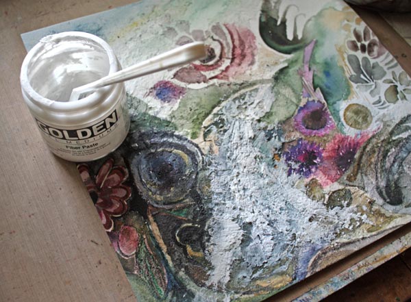
Fiber Paste in Mixed Media Art
To get into the spirit of heavy woven tapestry, I chose to use a lot of fiber paste to create a texture on a fairly smooth watercolor paper.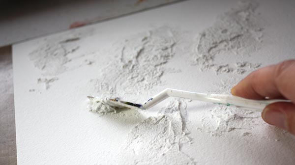
Now, the rational thing would be to spread the paste evenly. Or to spread the splotches evenly. But as I wanted to create a dynamic composition, I chose to add fiber paste mostly to the left side of the work.
With fiber paste, you can create interesting, uneven surfaces by using tissue paper or various tools to spread the paste. You can also use fiber paste for creating layers and attaching collage pieces (more about those later in this post).
One more good thing in fiber paste is that once it’s dried, you can paint with watercolors over it. I find the change in the surface texture somehow good for my creativity. It is impossible to paint accurately when working on fiber pasted area. That makes me accept the imperfections right at the beginning. Too much self-control can be destructive to the creativity. So, fiber paste is one of my medicines to let go!
Watercolors
Here I chose to work with watercolors instead of acrylic paints because they are much faster when creating delicate color variations. I usually mix watercolors by dipping the brush to many color pans on the same go and letting them mix naturally on paper.
With watercolors, you can easily change the intensity of color. I often start with a fairly dry brush and intensive color. After a stroke or two, I then add plain water to dilute the color. This technique is shown well in the video where I paint watercolor postcards. On the fiber paste surface, you can use a lot of water for lighter shades.
Mixing Colors
I still remember my moment of mixing black with other colors. I was a teenager, and it was a warm summer day. Acrylic paints were quite new to me, and I wondered how they should be mixed to express the hot weather.
The dark shadows made me think of black. I remember the surprise of getting beautiful purples and browns. That was a moment when I realized that the power of colors is not just what I admire in other people’s work, I can learn it too. By mixing colors, I could express anything!
Just this year when I bought my newest watercolor set, I discovered browns. I wondered why there are so many brown shades in the set, but now I know: mixing colors with browns create beautiful hues! In this piece, I have mixed the colors from both browns and blacks.
Collage
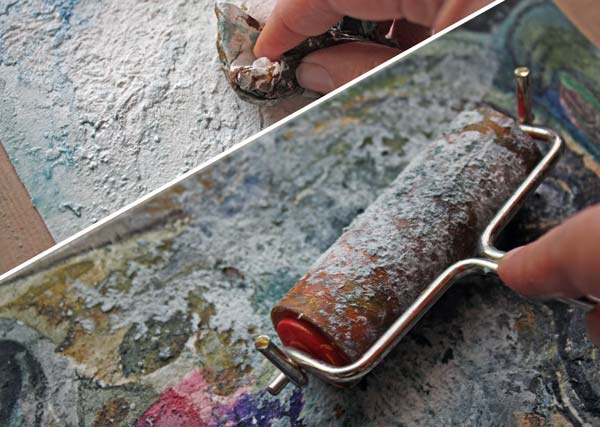
I was pretty happy with most of the painting – except the lower center area. The composition of the center elements did not work. To create something totally new, I used my most common method: to make it ugly and then try to save it. I took the jar of fiber paste and began to cover the bad areas with the paste.
“You have ruined it now,” said a bitter voice in my head.
Have you ever experienced the same? It is the moment where you can truly stop pleasing others and begin creating art.
I took the pile of hand decorated papers and started cutting. Fast!
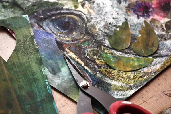
Some time ago, when I made those decorated papers, they were so ugly I almost threw them away. But now they looked like they were made for this muted color palette! And the fiber paste works as glue so it was easy to attach the pieces.
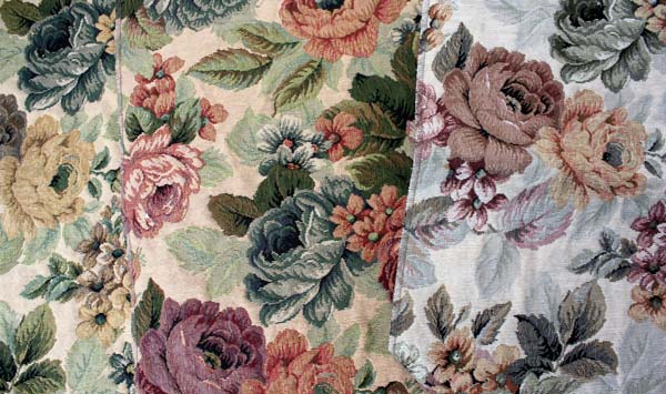
While cutting the pieces, I watched the fabric of the two chairs in the library room where most of the creating happen. I found the chairs at a recycling center a few years ago. I took them for renovation, so I was able to choose the fabric.
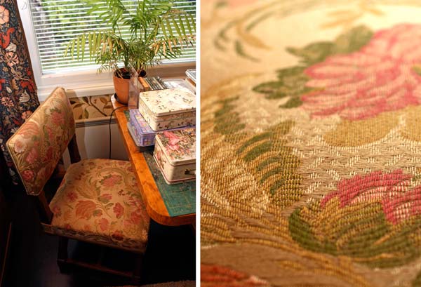
I love the fabric’s silky texture, romantic pattern and how well it goes with the wallpaper and William Morris’s curtains! Looking at that chair made me realize what I needed to add the feel of fabric to the artwork. To cut several similar flowers to represent a repeating pattern!
Finishing
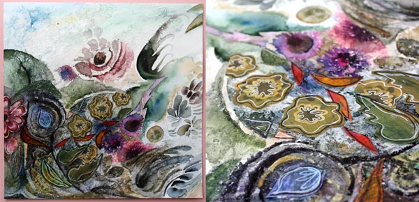
After drawing some detailed lines with colored pencils and markers, the collage seemed to be finished. But then I remembered the original idea: Gobelin wallhangings. Don’t they often have deer in them? A small deer was added in the lower left corner to wonder about the blowing winds!
I have noticed that many mixed media pieces are made from commercial products. I want to encourage you to create your own elements and textures. Your art will be much more original and complete. No factory-made flower can express your emotions as accurately as the ones you make yourself!
Let me be your art teacher: Subscribe to my weekly emails!
Art Journal Inspiration from Children’s Books

The art journal spread shown above is created from hand decorated papers, colored pencils, and markers. The main message here is “You can ride with your imagination in any way you want.” As it implies, I like my art journaling to capture dreams and fairy tales, not so much everyday life.
Mini-Worlds and Fantasies
I think that an art journal can be childish and playful. The way I see it, children’s books are the predecessors of them. Children’s books also combine illustrations and text to create mini-worlds and stories. I love to add both decorative and naive elements on the same page, and children’s books are great inspiration for that!
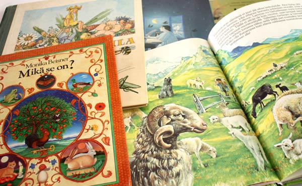
I buy used children’s books from recycling centers. They cost only a few euros (few dollars). That is a fantastic value considering all the inspiration they can give. I pick the books that have a lot of good quality illustrations. As I love detailed drawings, I try to find books with sharp lines and many details. Browsing children’s books can be a good practice for finding your artistic style. Pick the books that you feel most drawn to and then list all the things they have in common. I prefer books that have matte pages because I sometimes create collages from them. Then it is good if I can draw or paint on them.
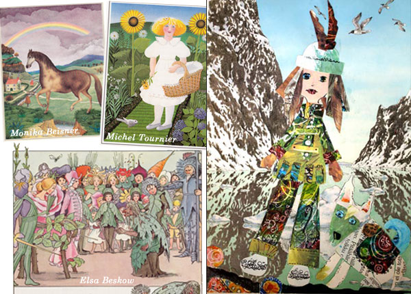
I made the collage on the right while teaching at a workshop last fall. It’s one of the pages where I have used the papers from children’s books. I often give few pages from various books for each participant of the workshop. It’s much easier to start creating when you don’t need to stare blank paper.
That little explorer resembles anyone who is entering the world of children’s books!
Subscribe to my weekly emails – Get a free mini-course!