The Art of Finishing

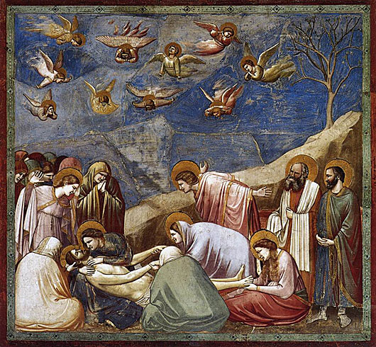
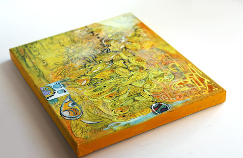
This collage is called Dawn of Change. It is inspired by the history of art. There was a time when I preferred modern art. If I went to an exhibition showing older than 20th century’s art, I used to yawn and think how pretentious it was. But the more I have examined art, the more I see in the old art. I see colors and concepts that can be reproduced in many different angles. Also, seeing good art makes me think of finishing – how much it affects the experience of the viewer.
The Creative Process
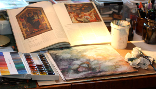
When I began to create Dawn of Change, I kept the painting of Giotto di Bondone visible on the table. I did not copy the image; I just kept it as a reminder of what to aim for.
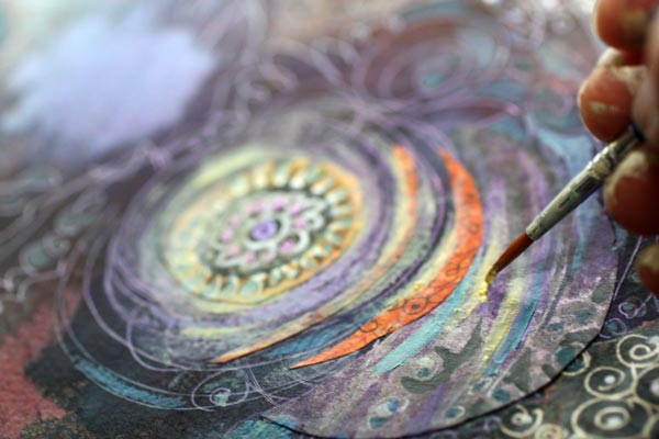
The first layers were painted with watercolors. Then I added some Copic Opaque White to create lighter areas. The white layers were rubbed so that they shined vaguely on the watercolored surface. I also sprayed some Dylusions mists to make the background even foggier.
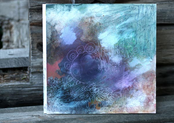
After a little bit of doodling with colored pencils, black marker, and white gel pen, the background started to show the guidelines for collage pieces.
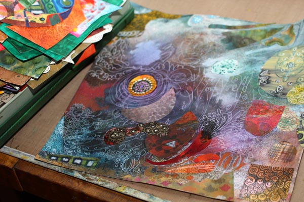
Then I picked up the box of hand decorated papers and began to attach the paper pieces. In this phase, I always get surprised how well the papers fit the artwork even if they are all different. Creating your own papers will bring you that happiness! Try to avoid using same papers many times in the same artwork. That way the result looks more interesting.
After a little bit of doodling, I was getting tired and decided to end my session. Even if the composition was accomplished and nothing major decisions left to make, I felt that the work was incomplete. I needed to ponder how I was going to finish it. Over the years I have noticed that finishing does make a difference. In arts and crafts, the finishing rarely alters either the message or the use of the work, but still has a high impact on how appealing we will find it. Sometimes that extra addition of quality will change entirely what we think about it.
So, if you want to improve your results, get into the habit of taking breaks. I like to have a good night sleep, walk the dogs or work in the garden. Especially physical activities make the subconscious work best. Then, when I grab the thin brush I know exactly what I want to achieve and how to do it.
Finishing Art – Making Subtle Changes
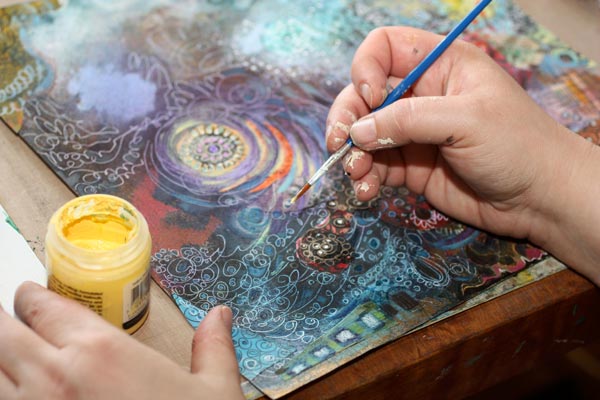
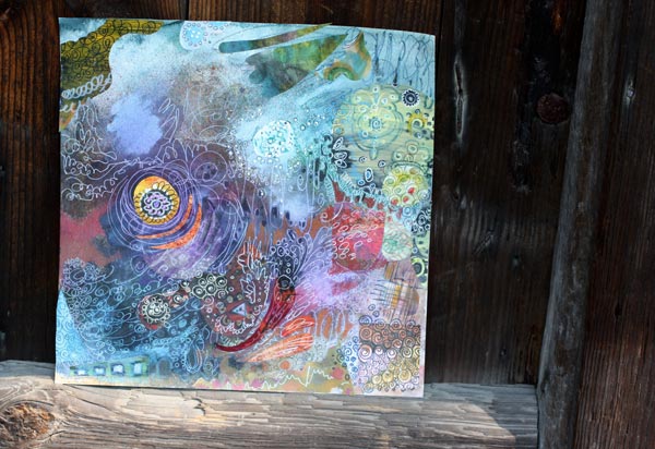
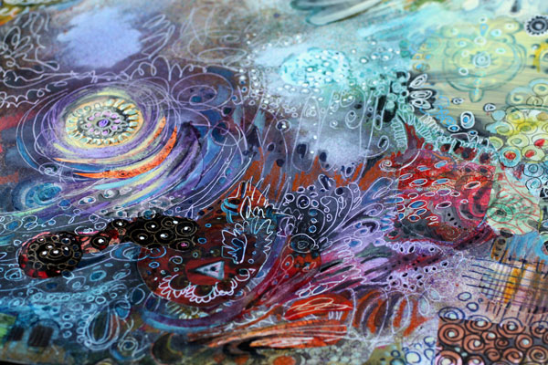
In this piece, I wanted to increase the impression of the colors fading together. The acrylic paints were the best to accomplish that. I added small strokes of various shades of grays to create a more muted look. Then I also added some pale yellow and off-white to create the fading in lighter areas.

The difference between before and after is not big. When placing the two pictures side by side, you have to search for the differences. But I claim that the overall experience of the quality is better after finishing.
So I challenge you to finish your work – even if it already feels finished!
Let me be your mentor in art: Subscribe to my weekly emails!
Kiwi Patterned Paper

I am continuing the theme of the week to celebrate yellow. Here are step-by-step instructions for a striking patterned paper where yellow and orange are combined with dark colors. You can make variations on the pattern by choosing different colors, adding you own details and picking the materials that you prefer.
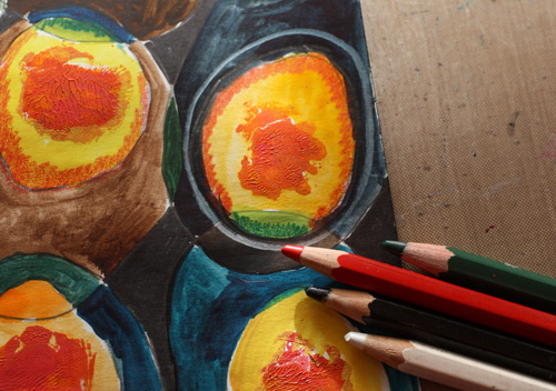
1) Fill the Paper with Big and Small Ovals
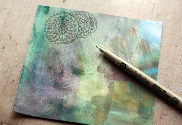
Fill the paper with intersecting ovals using freely cut templates. Cut plastic templates for a big and a small oval. To achieve an organic form, handcut the shapes freely. I used transparent plastic from a plastic sleeve meant for name tags. Also transpacency sheets for overhead projectors or any easy to cut plastic will do.
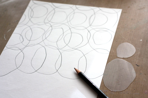
Starting with the bigger template, draw ovals on the paper so that they intersect slightly. Change the orientation of the template now and them. That way the pattern will look more lively. After filling the paper with bigger ovals, draw smaller ovals inside the bigger ones. Each smaller oval should cross one or two lines of the bigger ovals. Change the orientation and placement of the smaller ovals as you did with the bigger ones.
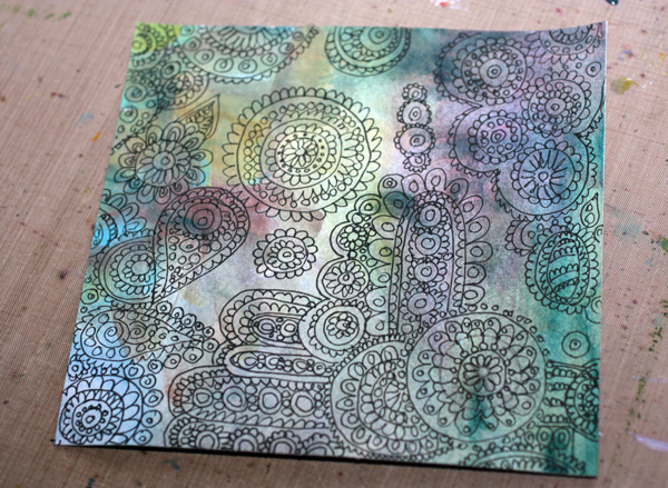
2) Paint the Centers of Small Ovals
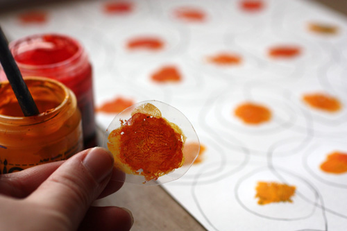
Add acrylic paint to the centers of the smaller ovals. Paint the centre of the smaller template and press one center at a time. Mix yellows and reds to get orange hues on the template. Each center can be a bit different from another.
3) Add Watercolor to the Smaller Ovals
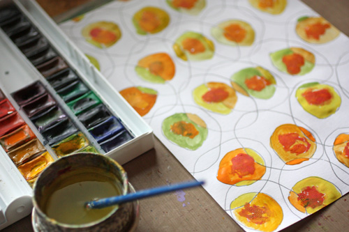
After the acrylic paint has dried, paint the smaller ovals with watercolors. Use yellows mixed with blues and reds. Color each part of the oval with different color. This way you will get an appealing look of ovals that have many hues.
4) Add Watercolor to the Bigger Ovals
After the smaller ovals have dried, paint the bigger ovals with watercolors. Use mixes of browns, blues and blacks. Color each part of the oval with different color.
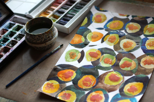
5) Fill The Background
Using black marker, color pencil or watercolor, fill the small white background areas with black.
6) Add Details with Colored Pencils
Draw white lines around smaller ovals. Add black outline for smaller ovals. Color the edges of smaller ovals with red and green depending on the hue of the oval.
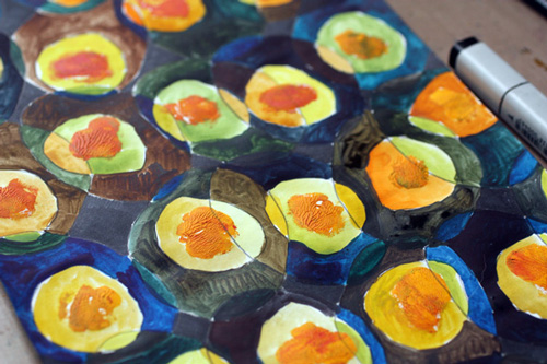
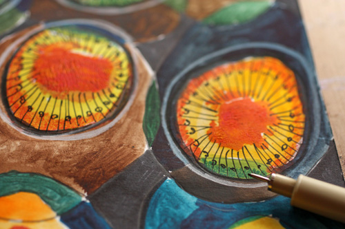
7) Final Touch: Thin Lines and Dots
Finally pick a thin black marker or drawing pen. Add radial lines to the smaller ovals and decorate the lines with dots.
Let me be your art teacher: Subscribe to my weekly emails!
Yellow Color
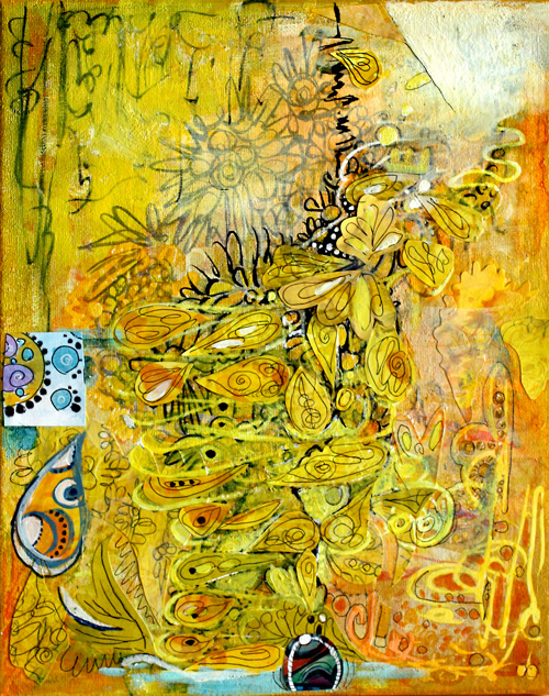
If I had to pick only one color, I would choose yellow. It is unconventional, energetic, and brilliant with other colors, mixed or not. I love to make green by mixing yellows with blues or black. Yes, isn’t it surprising that you’ll get olive green if you mix yellow with black! Best oranges come when mixing yellows with reds instead of buying ready-made oranges. I often put a tiny portion of black to get a slightly muted shade.
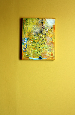
I created the yellow collage on a canvas mostly with acrylic paints. If you buy only one tube of acrylic paint, I would recommend buying good quality yellow, warm or cold. Then create your art with color pencils, markers or watercolors and finally add a very thin layer of yellow on one or two areas. You will witness the arrival of the sun, warmth, and all the good things!
If you buy two tubes of paint, I would recommend yellow and another primary color, red or blue. You can create almost anything with those. The intensity of good quality yellow paint is amazing and in acrylics, I prefer to buy few and good quality instead of buying cheap sets.
 In our house, we have a long hallway painted yellow. It is a particular shade of yellow that was not found in any color charts. I mixed it myself by adding some black to the closest yellow I could find. I saw this yellow first time in Tricia Guild’s old book Design and Detail about 20 years ago. I fell in love with it, and when we bought our house a few years ago, I knew that the dark hallway would look amazing with that yellow.
I think that yellow has a special connection to two colors. The first is black. Try this: pick your yellows and think about blacks. If it helps, find music that represents black for you and turns it on. Paint yellow and think about black. I love that mind game!
Another color that I connect yellow with is blue purple. It is the contrast color of yellow, and it makes yellow pop even more and vice versa. If you look at the collage, there are a couple of tiny circles on the small square on the left. Yellow makes them look lovely and bigger than they really are.
Yellow Color begins a blog post series about color. I will post these color-themed posts now and then. Hopefully, you’ll enjoy these!
Let me be your art teacher: Subscribe to my weekly emails!
Doodled Lace Patterns

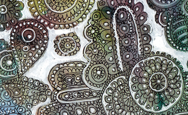
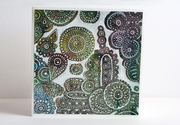
I am constantly inspired by surface patterns and textures. From a pile of doodled papers I found lace like doodling on unbleached printing paper. I decided to decorate it by adding white on some of the details and empty areas. It was a quick card: just adding the white and cutting it to the proper size. I pretty liked it so I made another card using the same concept but with different background paper. So, here are instructions to create these fun lace cards!
Doodled Lace on Paper
You can create an interesting effect of color changes in the background by painting the background paper with watercolors. Pick a thin black pen for doodles. I love making doilies that look like they are on the top of another. Draw the doily on the top first. Group your doodles and leave some empty areas around the groups.
Add White to the Background
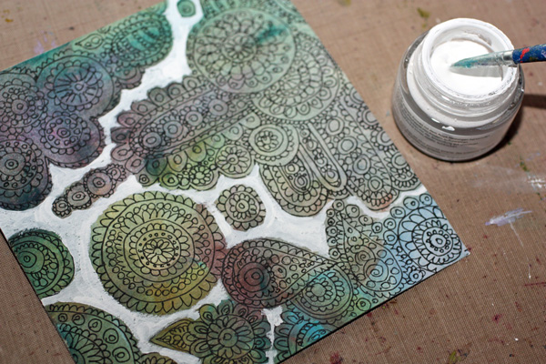
I used Copic Opaque White in a jar for bigger areas and Uniball Signo pen for smaller areas. A white color pencil was used too. White acrylic paint does the job too.
You can easily make georgeus and unique projects with this technique!
Let me be your art teacher: Subscribe to my weekly emails!