
Yellow Color
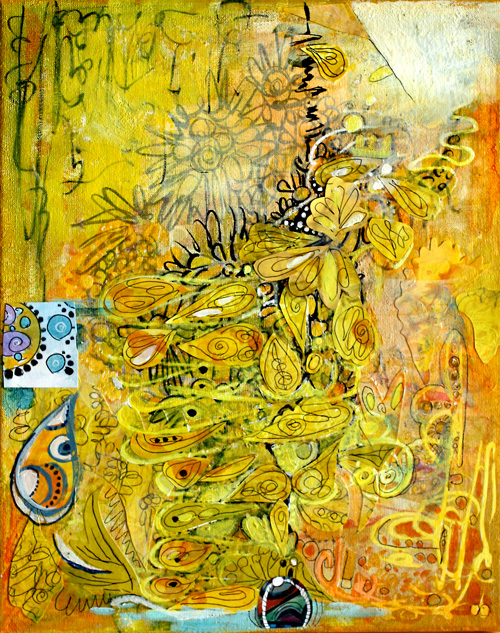
If I had to pick only one color, I would choose yellow. It is unconventional, energetic, and brilliant with other colors, mixed or not. I love to make green by mixing yellows with blues or black. Yes, isn’t it surprising that you’ll get olive green if you mix yellow with black! Best oranges come when mixing yellows with reds instead of buying ready-made oranges. I often put a tiny portion of black to get a slightly muted shade.
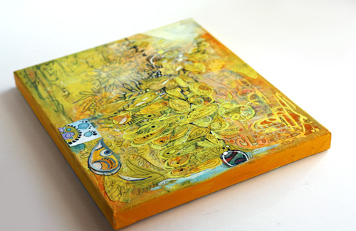
I created the yellow collage on a canvas mostly with acrylic paints. If you buy only one tube of acrylic paint, I would recommend buying good quality yellow, warm or cold. Then create your art with color pencils, markers or watercolors and finally add a very thin layer of yellow on one or two areas. You will witness the arrival of the sun, warmth, and all the good things!
If you buy two tubes of paint, I would recommend yellow and another primary color, red or blue. You can create almost anything with those. The intensity of good quality yellow paint is amazing and in acrylics, I prefer to buy few and good quality instead of buying cheap sets.
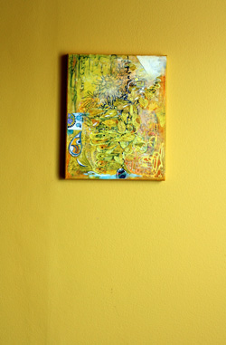 In our house, we have a long hallway painted yellow. It is a particular shade of yellow that was not found in any color charts. I mixed it myself by adding some black to the closest yellow I could find. I saw this yellow first time in Tricia Guild’s old book Design and Detail about 20 years ago. I fell in love with it, and when we bought our house a few years ago, I knew that the dark hallway would look amazing with that yellow.
I think that yellow has a special connection to two colors. The first is black. Try this: pick your yellows and think about blacks. If it helps, find music that represents black for you and turns it on. Paint yellow and think about black. I love that mind game!
Another color that I connect yellow with is blue purple. It is the contrast color of yellow, and it makes yellow pop even more and vice versa. If you look at the collage, there are a couple of tiny circles on the small square on the left. Yellow makes them look lovely and bigger than they really are.
Yellow Color begins a blog post series about color. I will post these color-themed posts now and then. Hopefully, you’ll enjoy these!
Let me be your art teacher: Subscribe to my weekly emails!
Doodled Lace Patterns

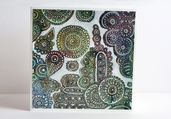
I am constantly inspired by surface patterns and textures. From a pile of doodled papers I found lace like doodling on unbleached printing paper. I decided to decorate it by adding white on some of the details and empty areas. It was a quick card: just adding the white and cutting it to the proper size. I pretty liked it so I made another card using the same concept but with different background paper. So, here are instructions to create these fun lace cards!
Doodled Lace on Paper
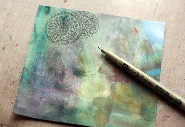
You can create an interesting effect of color changes in the background by painting the background paper with watercolors. Pick a thin black pen for doodles. I love making doilies that look like they are on the top of another. Draw the doily on the top first. Group your doodles and leave some empty areas around the groups.
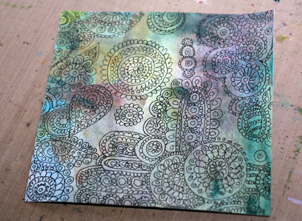
Add White to the Background
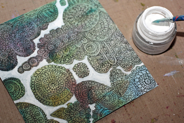
I used Copic Opaque White in a jar for bigger areas and Uniball Signo pen for smaller areas. A white color pencil was used too. White acrylic paint does the job too.
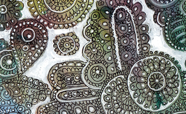
You can easily make georgeus and unique projects with this technique!
Let me be your art teacher: Subscribe to my weekly emails!
Wait till the Painting is Finished

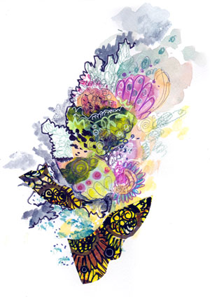
What’s the definition of art? For me, art happens when something unexpected is allowed to step into the creative process. Today’s story begins with the watercolor background that I painted without further thinking. Just had some fun with my favorite media. Watercolors are so easy, light and forgiving!
After the background had dried, I decided to increase the color intensity in some spots with color pencils. I did not mean to start doodling but those pencils spoke to me: “Come on, let us dance a little”. How could I say no!
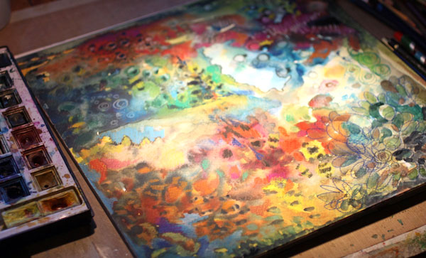
At some point, I got deeper into my thoughts. I saw something happening in the painting.
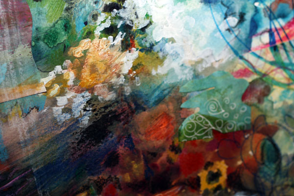
The strokes of acrylic paint shortened. Some collage papers were added. The smaller the area I worked, the clearer the big picture looked. That phase was so exciting! Like opening the door and getting ready for the view.
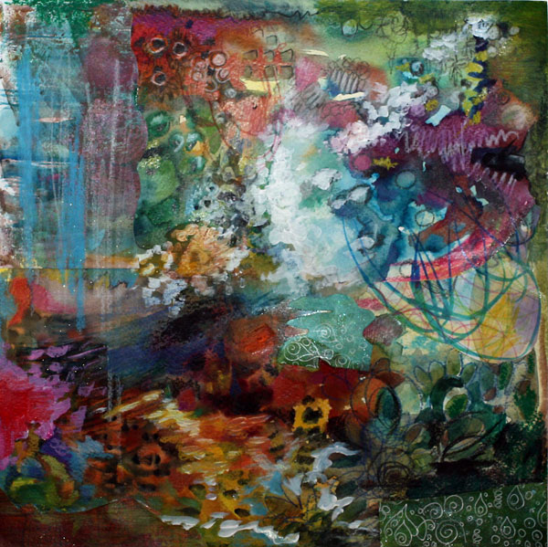
Style Change
Once the painting was finished, I heard my own comment: “You’ve been there before. The colors, the atmosphere – nothing new here! Get your greys and paint it over!” And then, louder: “Jump, JUMP!” And while my left brain cried and right brain celebrated, I mixed the greys and painted how I felt and what I longed for.

I could have stopped at any phase and declare the painting finished. But after jumping from cliff to cliff I found something new: the beauty of blacks, the simplicity behind the decorative style! So, my advice is: when you think about tossing that art journal page or craft project, don’t do that. Step towards the unexpected and let art reveal what you have escaped from!
Subscribe to my weekly emails – Get a free mini-course!
What Art Supplies Do I Need?
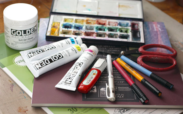
One of the most popular questions that I get is: What art supplies do I need? What brands to buy? Here are my favourite principals in purchasing art supplies and the products that I most often buy.
Use What You have
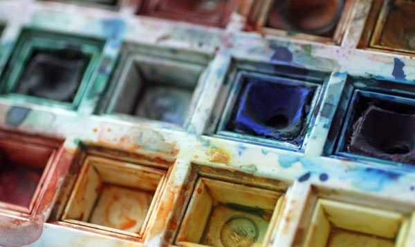
My first advice would be: before investing a lot of money use the stuff that you already have as long as you can. Creating art should not create more chaos and clutter. It should make you feel more content with your life. If you need to buy something, buy quality. That sends you the message that you value what you do. And you get better intensity of colors and most out of the various techniques.
Background Papers
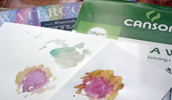
If you make collages like I mostly do, most of your papers should be fairly thin. It is easier to cut and paste thin pieces of paper. The background that you are using can be canvas, watercolor paper, cardboard or any thicker surface. I often use acid-free Canson Drawing paper (thickness 120 g/m2, 80 lbs). And my favourite background paper is Fabriano cold pressed fine grain watercolour paper (thickness 200 g/m2, 90 lbs).
Journals
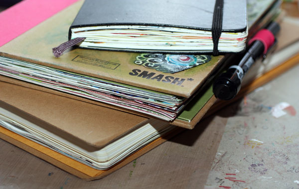
I also recommend that you buy a sketch book and make it your art journal. You can use a journal page as a background or glue or tape the background paper to the page. With the journal your creativity and self-acceptance grows page by page. Constantly getting back into what you have created enforces your style and makes you love what you do. I like the size of the bigger Dylusions Creative Journal. I also love Moleskine books and Smash books.
Colors – You Can Mix Them!
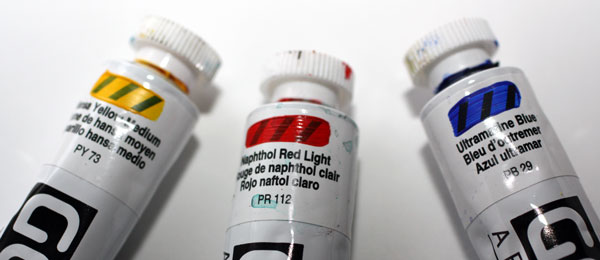
I want to give general advice on colors first before digging deeper into various qualities and brands. If you have a fixed budget, use your money on quality instead of quantity. With three primary colors, yellow, red and blue, you create a pretty wide range of other colors and hues. If you only afford one, buy yellow. If you only afford two, buy yellow and red or blue considering which one you like more.
If you can afford five, buy white, black, red, blue and yellow. With that amount, you’ll survive a long time. When you mix black with the primary colors, you get beautiful melancholic muted shades. And with white, more cheerful pastels. If you can buy some more, buy another set of primary colors just different hues. If you have warm and cold yellows, reds and blues plus black and white, you can create a huge colour palette.
Watercolors
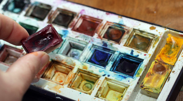
I love using watercolours and combining them with other materials like colour pencils. My watercolor set is an old Windsor & Newton set (pretty similar to this one). I have complemented that with some new White Nights pans. I love the quality of White Nights watercolors and recommend it for those who hate watercolor painting just because they use pans that do give the intensity needed. I also have gouache tubes but no not use them often. I love my little pans! For those who really want great pigments and less opacity, I would highly recommend Schminke gouache paints or watercolors in tubes.
Acrylic Paints
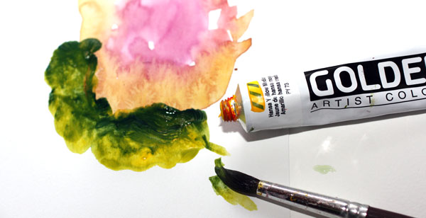
I know many people that hate acrylic paints. The reason is usually that they have poor quality paints that they try to use like watercolors. Low-quality acrylic paints have poor intensity and gloss and coarse structure instead of smooth. While watercolors represent everything light weighted, acrylic paints are heavy and strong. Better than mixing them with plenty of water is to use little water or gel mediums (introduced later in this post).
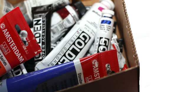
My favorite brand in acrylics is Golden. They have affordable introductory sets that I highly recommend. Use very small amounts of color at a time. The color pigments are great, and the set will last for a long time. If you find it hard to squeeze small amounts and tend to use a lot of acrylic paints, Amsterdam has big economic tubes of acrylics in their standard series.
Gel Medium
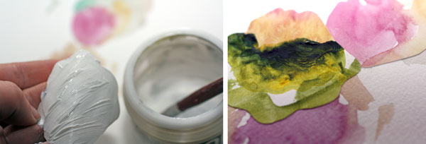
I use gel medium to glue the pieces of my paper collages. I also use it with acrylic paints to give them more elasticity. For me, gel medium is a must have. I have tried several brands and spent plenty of time to find what I like most. My favourite is Golden Soft Gel Gloss. I also like the matte version of it.
Brushes
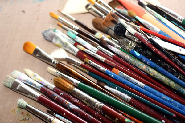
After preaching about quality over quantity I must admit that I do prefer to have a lot of brushes. And many of them are low-quality cheap brushes. I have come to this situation for two reasons. First, in the heat of creating I often forget to put the brush into the water and it gets ruined. Second, the more you vary the size and quality of the brush the more interesting your artwork will look like. So when buying your first brushes, buy a set that has both flat and round brushes in various sizes.
Colored Pencils
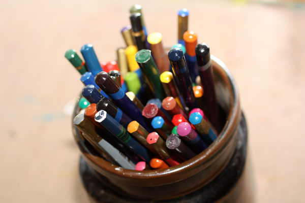
Colored pencils have come a long way since I was a child. They used to be hard and many times they tore the paper when trying to get something out of them. Nowadays there are wonderful colour pencils that everybody should use, including children! Caran d’Ache Pablo pencils have wax-like finish; I adore them! I also love Derwent Colorsoft and Derwent Inktense pencils. Inktense pencils are water soluble, and you can use them instead of watercolors in small areas.
Markers
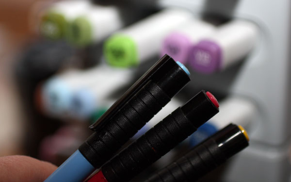
Some people prefer markers over colour pencils because markers are easier to use. I use both. I often combine them so that some layers or areas are colored with markers, some with color pencils. My ultimate favorite is Faber-Castell PITT Artist Brush Pen. They can be used on almost any surface. They can be bought in small sets or separately so you can acquire only a few ones first. I also have a collection of Copic markers. They are high quality and serve me well as they can be filled again and again. But if you start small, get few PITT pens, and you will be happy.
Bright White
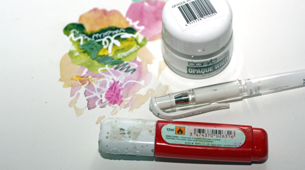
If you have followed me, you know that I do not make white art. I do not create white areas or spend a great deal of time creating romantic scenes like putting off-white tulips on a white background. But having something bright white is essential for me. I love to put some white spots and then color them with markers or paints. That makes colors shine! I take my bright whites very seriously and have spent too much money to find the ones that work for me.
In gel pens, Uniball Signo is my favorite. I also use correction pens and Copic’s Opaque White that comes in small jars. You can replace these with white acrylic paint using a thin brush, so nothing to worry if you do not purchase any of these.
So – What Art Supplies Do I Really Need?
If you have read this far, it might feel like you need plenty. But really, you only need some pens and paper to get started.
Few pans of watercolors, maybe a couple of color pencils or PITT markers and you are good to go. Supplies do not make you an artist. The constant practice does.
Let me be your art teacher: Subscribe to my weekly emails!