
Year 2016 in Review – In Terms of Art Supplies
I am not usually so keen on “year in reviews,” but I thought it would be interesting to look back regarding art supplies used in 2016. When people ask me what supplies do I use, my quick response is: “Acrylic paints, watercolors, and colored pencils.” If I get detailed questions, I often refer to these blog posts: What Art Supplies Do I need? and What Acrylic Colors to Buy?
But it hit me that I have used a more diverse selection of supplies in 2016. And then, there are all kinds of necessary stuff that we don’t often mention but still use all the time. So, I dedicate this blog post to supplies. It’s not so much about the single pieces created in 2016. If you want to have a look at those, go to 2016 Gallery!
Must-Haves for Collage Art
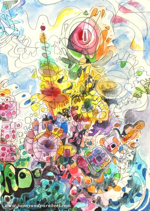
The image that is at the beginning of this post is a collage made for January’s lesson at Inspirational Drawing 2.0 while teaching how to create unique collage pieces and enjoy freehand drawing. I have been blown away by the beautiful art created by my students, and I am more certain than ever that introducing the ideas for drawing piece by piece makes freehand drawing and the use of imagination easier than trying to build a bigger illustration in one piece. (You can still sign up for the class and get the first lesson immediately after the purchase!)
I like to create collage art to my biggest art journals. I have two of large Dylusions Creative Journals. The first one is almost full, so I hope I can fill it in 2017 and make a flip-through video of it. I purchased the second one last year because I love the quality of the paper. It’s perfectly smooth for colored pencils and sturdy enough for collage art.
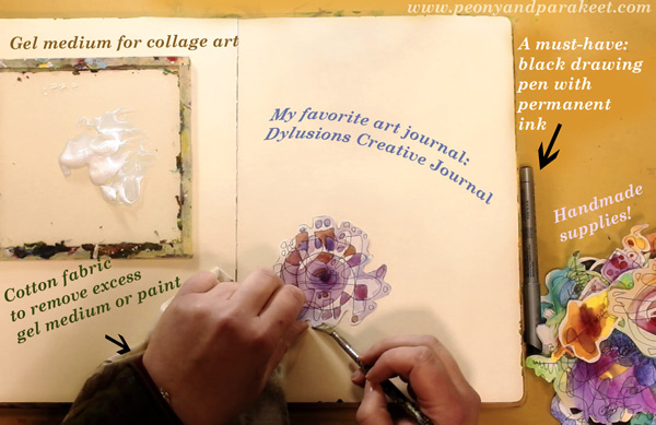
Like in the previous years, I have used “Golden Soft Gel Gloss” gel medium for attaching the collage pieces and Tim Holtz’s non-stick scissors for cutting the pieces.
A new discovery is to use a piece of cotton cloth to remove excess gel medium. First, I started using old t-shirts for finger painting. But when learning old masters painting techniques at a class, we used old linens for cleaning the brushes and realized that they work well for wiping off too. Since then, I have been a collector of old cotton fabric pieces. A fellow artist told me that she has several plastic bags filled with waste cotton fabric for art making!
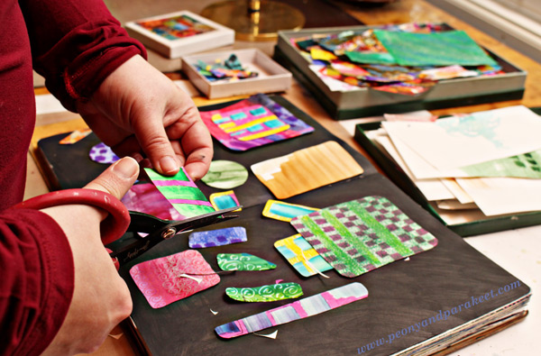
Speaking of collecting, I am still a collector of the best handmade supplies: hand drawn and hand painted paper pieces! If you have never tried creating collage pieces, see Step by Step page for basic instructions! I also have a mini-course called Doodled Luxury, that shows how to combine doodling with collage techniques.
Colored Pencils – Not for Art-Making Only!
Because I create a lot with colored pencils, I often get questions about which colored pencils to buy. Many contemplate between regular and water-soluble pencils. I love regular colored pencils because they are easy to carry and easy to use when you only have a minute or two. I use regular colored pencils also outside my art-making. I love to use them to make written notes more visual and add visual ideas to my notebooks and planners.
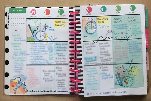
It’s why I always have colored pencils in my reach, and I think it’s also why I find it so easy to create with them. If I have to create something quickly that isn’t very big in size, it feels natural to choose them. I use Prismacolor Soft Core pencils when I create art pieces and a selection of old pencils for more mundane purposes. My e-book Coloring Freely focuses on regular colored pencils and shows easy techniques for creative coloring.
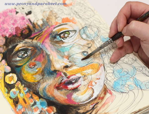
I also have a mixed selection of watercolor pencils, and I enjoy using them too, especially in the beginning of coloring. Using water makes it quicker to fill a paper with a soft mix of colors. It is the technique I use a lot at Inspirational Drawing 2.0: starting the coloring with watercolor pencils, inks or watercolors and then moving on to dry supplies like colored pencils and felt-tipped pens.
Using Watercolor Paper – and Not!
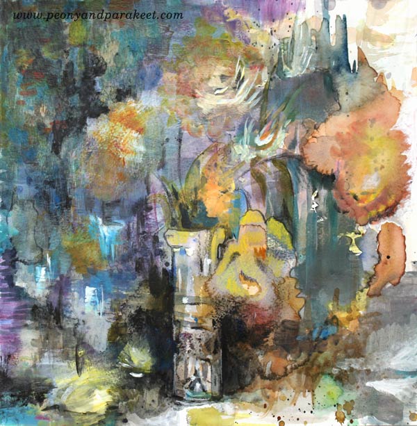
This is a supply that makes my heart sing – I only have to touch it: a good quality watercolor paper! My absolute favorite: St Cuthberts Mill’s Saunders Waterford HP watercolor paper. It’s smooth and thick (300 gm2/140 lbs), and it’s perfect for both watercolors and colored pencils. I especially enjoy creating intuitive still lifes on the thick paper. I often cut the paper to a square to enable easy changes in orientation. See this blog post to watch me creating the intuitive mixed media painting below on a watercolor paper!
Even if I love smooth watercolor paper, I don’t want to limit the use of watercolors. I use watercolors constantly and often with paper that is not designed for it. I like to carelessly splash watercolors on any paper because there are a lot more opportunities to use watercolors than to use watercolor paper. For example, watercolor paper is not good for collage pieces because it’s too thick. I like to use sketching paper instead.
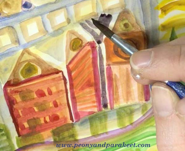
The best exploration with watercolors so far happened in 2016. I studied Friedensreich Hundertwasser’s way of using watercolors and created a mini-course about imaginative painting style. This painting style uses only a little water, and it’s easy to apply on almost any paper. See the mini-course Painter’s Ecstasy!
The Year of Canvas
If I had to name one supply that marks 2016, it would be canvas. I have created more canvas pieces than ever before. I have painted five small acrylic paintings and two medium-sized paintings. “Human Nature” was not a wall-sized, but so far the biggest that I have painted. See this blog post: 5 Lessons Learned When Painting on Big Canvas
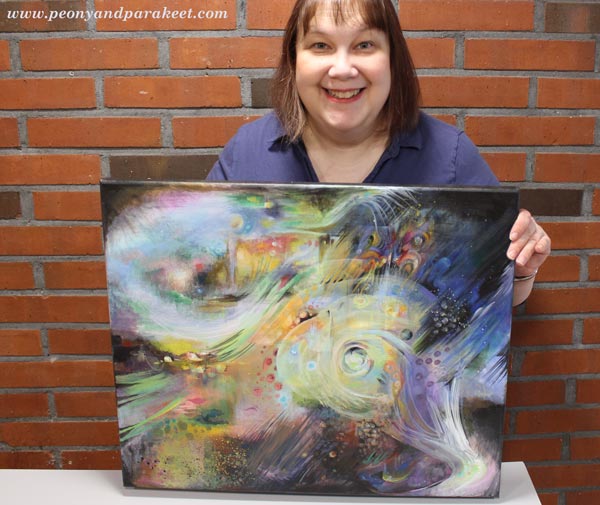
I always take the canvas more seriously than if I create a painting on a watercolor paper or an art journal. A blank paper syndrome is nothing compared to a blank canvas syndrome! But I enjoy larger projects between smaller ones, and I have two blank canvases waiting for 2017 creations.
Experiments with New Supplies
Oil paints
I would have never guessed that I would be 47 years old before trying out oil paints for the first time, but that was how it went. I started painting as a young teenager and my parents purchased acrylic paints to me. They explained that using oil paints would require all kinds of liquids that would not be safe and acrylic paints were better in that way. They were so right! Not to mention all the smells! I live in a house built in the 1960s, and the smell stays there for some time. It would be impossible to me to use oil paints daily just because of that.
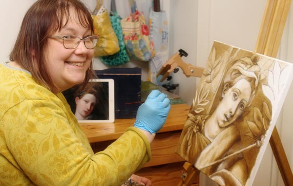
But I have signed up for an art class and will start my second oil painting next week using the old masters’ techniques. (See this blog post to read what any artist can learn from old masters!) I love the pigment and gloss of good quality oil paints. We are using Schminke’s Mussini oil paints, and they are the best quality paints that I have ever experimented with.
Soft Pastels
During 2016, I saw quite a lot of art that was created with soft pastels. I almost bought Unison soft pastels to treat myself but then realized that I already had a small set of Rembrandt soft pastels. I had purchased them many years ago for industrial design studies, but we had been using them very differently than how people use them usually. We scraped them to get powder and used the powder to create soft shadows.
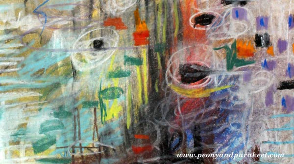
I created an art journal page (see the full image in the middle of this blog post) to try them out. Now I just grabbed the sticks and drew with them, but it felt like there was powder everywhere. And then, in the end, I had to use fixative, of course. It felt tedious even if it was not. I had no desire for new pastels anymore, but afterward, I have wondered if I gave up too easily. Maybe I should try the soft pastels again sometimes in 2017.
Liquid Watercolors and Watercolor Markers
In the late fall, I got a couple of surprise packages from one of my students! I got to use liquid watercolors and watercolor markers for the first time, and I liked both of them.
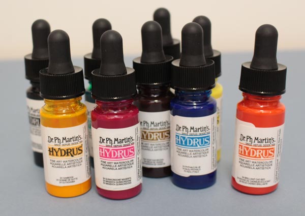
I like the intensity of color in liquid watercolors. Mine are Dr. Ph. Martins’s Hydrus watercolors.
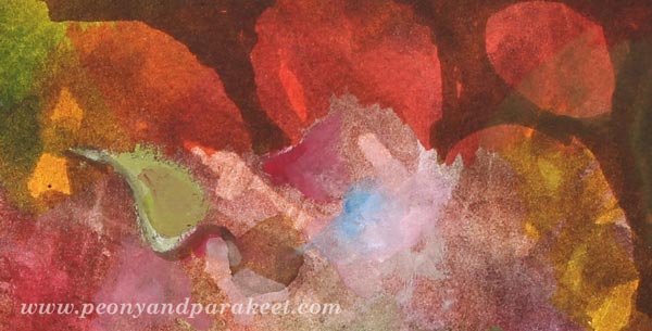
Watercolor markers seem to be very versatile because you can use them with or without water. I also received a set of gouache paints, and they encouraged me to dig out my old gouache tubes as well. To see what I created with the new supplies, watch this video blog post!
Going Digital?
Based on 2016, my answer is both yes and no. Yes, I have created digital art, see this blog post especially! I have used Adobe Photoshop CS5 for so many years that it feels very intuitive and I don’t have to think about the commands and such, I can just focus on the fun stuff.

But when I create digital art, I like to use my hand-drawn and hand-painted pieces as building blocks. I know that many buy stock photos, but it feels much more exciting to me to use my art as a starting point. Sometimes when I don’t work I buy a digital kit and have fun with it, but that’s just playing in my spare time (Sometimes I do wonder, how much do I have to create, to stop creating …)
I have a student at Inspirational Drawing 2.0 who is adapting the exercises to work with her iPad mostly. I look forward to seeing more of this happening because I see a potential of more people going into creating art. However, I don’t want to spend all of my time with devices, so I enjoy creating pieces by hand and as long as I can do it, I think I will, also in 2017!
What about you? What supplies were new to you in 2016, and what supplies are you going to continue using in 2017?
What Any Artist Can Learn from Old Masters
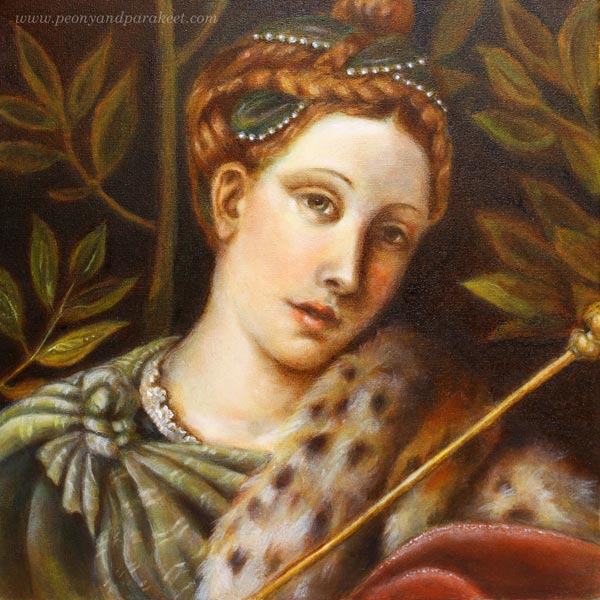
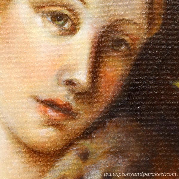
If you have followed me on Instagram or Facebook, you’ve already seen that I have had a special project in November. I have been painting a replica of an old painting and learning techniques that artists used already hundreds of years ago. These are called old master painting techniques. Famous old masters like Leonardo da Vinci and Johannes Vermeer used them when creating their masterpieces. My painting is a copy of a detail from Moretto da Brescia‘s painting “Portrait of a Lady as Salome.” I call mine “Dreaming Salome” because I gave her a more dreamy look and different meaning. The portrait was painted in the course organized by The National Museum of Finland. The teacher of the course was Emmi Mustonen.
5 Tips You Can Learn from Old Masters
After painting my first oil painting, and the first one that uses these techniques, I feel that there is still a lot to learn. So I will be painting another one with these techniques during the spring. However, I have already found out a lot of things that can be used with any supplies, and I wanted to write a blog post about what you can take from my experience. These tips can be applied to any themes, even to abstract art. At the end of this post, there’s also a short video (watch it on YouTube) that shows more images from the process.
1) Don’t Get Discouraged in The Beginning!
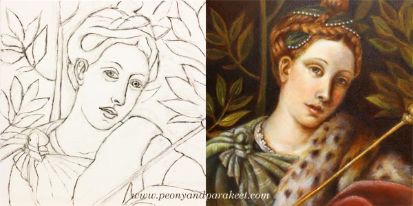
My process of making the painting started with a charcoal sketch. While sketching, I felt I was just making a big mess. I pressed too hard, and the drawing wasn’t detailed enough. The image shows the sketch once it was cleaned with an eraser – just before the first layer of paint. If you compare it with the finished painting, there’s a huge difference between the two. The expression of the lady looked sad in the drawing, but she has a half-smile in the finished version. I understood that the facial features and characteristics are so subtle that it takes a long time to get them right.
When sketching, I hadn’t the persistence to finish her hair and shawl, but still, I was able to make them quite detailed during the painting process. If I had made the original sketch without attending the course, I would have called it a failure and lost my hope of achieving something that would look like an old painting.
I often talk about raw ideas (see this blog post) and that applies to realistic art too. The first lines are just the beginning of understanding what the final work will be. When I was sketching, I only had a rough idea of how my lady should differ from the original version. But once I continued the painting process, my vision got clearer. So, stay curious about the insights that you will get during creating, and don’t get discouraged in the beginning!
2) Before Diving Deeper, Limit Your Supplies!
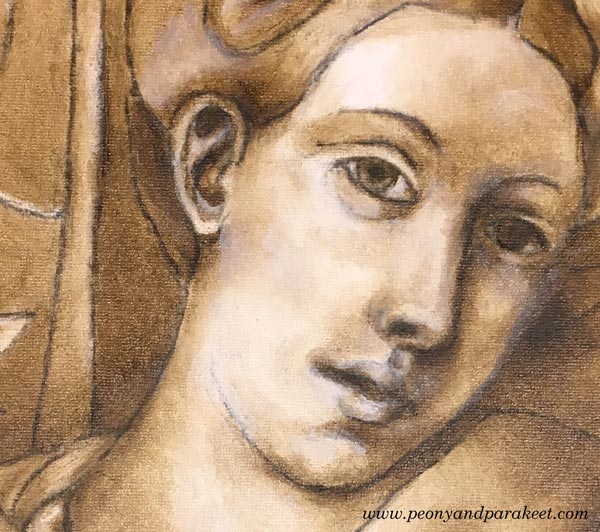
In my painting, the first layers were made with just two colors: burnt umber and zinc white. These first layers form a so-called underpainting that shows where the shadows and lighted areas are. It enforces the painter to look for contrasts, and on the other hand, it enables working with details without making color choices. The philosophy of underpainting can be applied to any media and style when it’s seen as a phase where you limit your supplies and add more content to the piece. When you go through every area in your work and make sure that it connects well with the next one, you will control the big picture through details. I find this much more enjoyable than trying to see everything at one glance all the time.
3) Slow Down to Maintain a Gentle Focus!
I was surprised by the positive feelings I went through while painting with old masters’ techniques. I thought that there would be a lot of demanding voices in my head, but the process surprised me. Even if I was stretched out from my comfort zone, I realized that there could be “a gentle focus,” where you put all your energy into work so that it improves your self-image too. I believe that this kind of new self-acceptance was based on two things.
First, I knew that it would take a long time to finish the painting. Six sessions in the classroom weren’t enough. I also had to do homework. Each of the layers had to dry before adding a new one, and drying took several days. This slow pace felt old fashioned but good too. It made me think how much gentler we would be in general if weren’t so busy all the time. I also noticed how I became less worried about mistakes. When the progress is slow, mistakes start small, and it’s easier to correct them.
The second thing that helped me was that we were using a finger to remove the brush strokes. When I gently caressed the canvas with paint, it affected my whole thinking. It felt like the beauty created and seen by Moretto da Brescia caressed my brain.
4) Don’t Try to Make Your Middle Look Like the End
Before attending the course, I made one decision: I would do my best to follow the teacher’s advice. Because I was not familiar with the techniques, I didn’t know beforehand how the painting should look after each layer. When I teach art, I often see people worry over details that will look gorgeous once they just move on to the next steps. It’s human to compare your middle to the desired end. But if you can set your criteria according to each phase, it will lead to better quality.
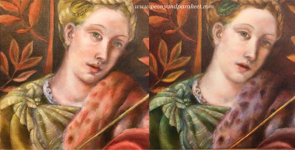
So, when laying the colors one by one, I tried to quench my worries about how yellow the dress looked or how red the fur was. When using old masters techniques, colors are not mixed on a palette. The pigments from the tubes are laid in thin layers as they are. So if you want green, you will start with yellow, let it dry for few days and then move on to blue. The transparent layers with soft edges result in mixed color and a realistic look.
When painting these thin layers of color, I couldn’t help thinking that the skin was too uneven. But my teacher advised me to continue creating color differences to get the painting ready for “a white wash.” A thin layer of zinc white made the skin more even, and all the previous layers made sense. Try this approach of seeing layers and elements as building blocks to new ones!
5) Sharpen The Soft, Not Vice Versa!
I was often reminded to make every area and detail softer. Even most of the tiny spots were softened with a finger to make them more translucent and blurry without sharp edges. As a result of that, the painting looked blurry and untidy. But when finishing, sparingly added sharp lines and dots did the trick. It felt magical how suddenly the whole painting looked accurate. I learned that it’s very easy to sharpen the softness. Adding few strokes finished the fur. Adding a tiny sharp dot finished the eye. The nose didn’t need sharpening at all because I wanted to bring the eye to the mouth where I added a small white spot.
When you add softness, you will also make your work look more dimensional. Leonardo da Vinci has said:
“The beginnings and ends of shadow lie between the light and darkness and may be infinitely diminished and infinitely increased. Shadow is the means by which bodies display their form. The forms of bodies could not be understood in detail but for shadow.”
After painting my “Dreaming Salome,” I have become fascinated by watching the edges of items and how soft they are. I know that today’s world is sharp. We aim for sharp photos, a clean graphic look, and turn on the fluorescent lighting. The things we use are industrially made and as perfect as they have been designed on a computer. But try visiting Leonardo’s softer world! Light a candle and observe the lights and shadows. Let everything soft inspire you when you are creating art and reflect that softness towards yourself too!
Bonus: Make it Meaningful – Watch the Video!
My “Dreaming Salome” is now framed and she has a special place in our library room. I was so happy to be able to finish her before Christmas.
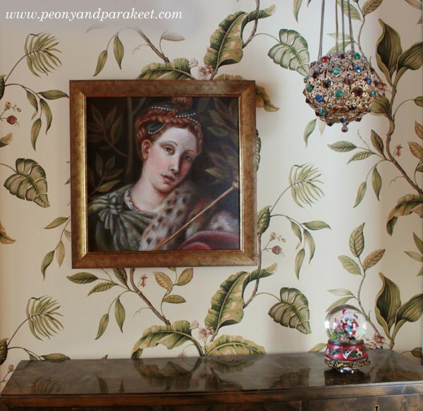
This painting is my first exercise when learning from old masters, but it also has other symbolic meanings. I have made a short video showing the images from the class and how she was painted layer by layer. At the same time, I also explain what Dreaming Salome symbolizes to me.
Learn old masters’ techniques and more!
>> Sign up for Floral Fantasies!
5 Lessons Learned When Painting on a Big Canvas
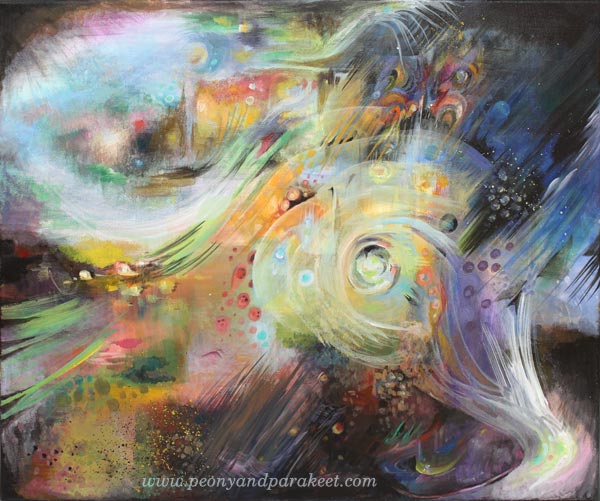
I have now finished my first big canvas painting. It is called “Human Nature.”
1) Smaller Paintings Can Take As Much Time
About two years ago, when I left my day job, I had a dream about creating a big painting. But my job is to teach art, and I don’t have much spare time, so it felt impossible to fit in the schedule. Now when I think about that, I kind of feel that the lack of time was an excuse. I think I was intimidated even by the thought of painting on a big canvas. The usual question raised: “What should I paint?” And then: “How could I maintain my focus for such a long time?” I exaggerated the time that painting would take. I thought it would take months and months. But when I started painting, I realized that I could use broader brushes and be less detailed. If you have ever tried to make small paintings as finished and polished as possible, it takes a long time. Adjusting the details on a big canvas is much easier.
2) Use an Easel, at Least in the Beginning and Finishing Phases
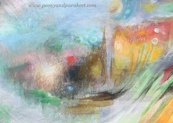
My canvas was not huge. It’s 60 cm x 50 cm (appr. 23.5 x 19.5 inches) Still, it was hard to see the whole painting when it was laid down on the table. I painted parts of the canvas so that it was on the table but set the foundation and finished the final details with the help of the easel.
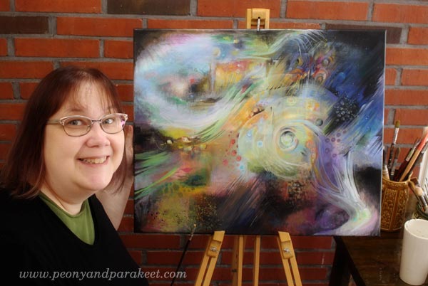
My easel also has sentimental value. My father who passed away a long time ago has made it. He was a skilled woodworker. We didn’t talk much, but I think that making the easel was his way to encourage me to paint.
3) Eat the Elephant One Bite at a Time
I got the courage to start the painting when I realized that I could combine painting with building an art class. My upcoming workshop Nature in Your Mind (do sign up!) has instructions for the techniques that I used. I treated the canvas as my sketching board for the class.
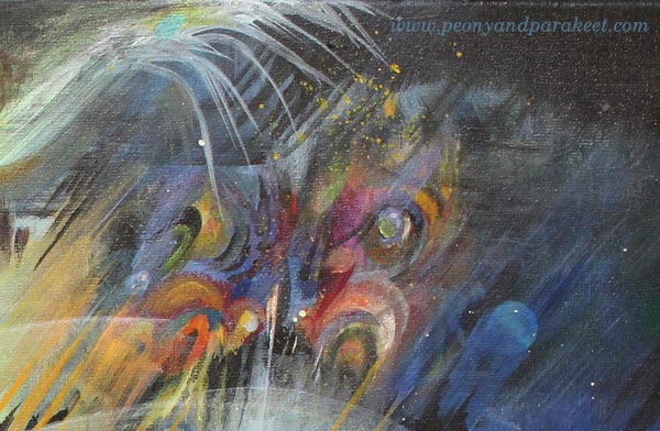
For example, the project for the first week of the class is “Rising Butterfly.” I practiced the techniques on a big canvas and then sought for the easiest and most enjoyable way to create a butterfly on a smaller canvas.
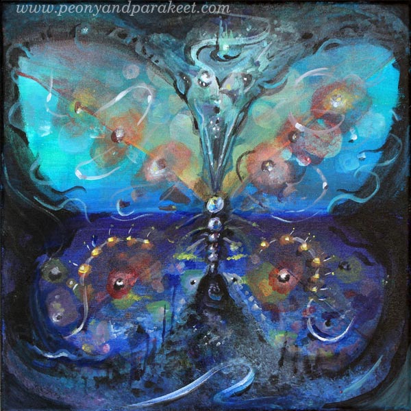
This kind of experimenting transformed the big canvas to my playground. The size was no longer intimidating.
4) Big Brushes are Great for Details
Thin lines, little dots, all look so much better when working with a big brush! It has changed my attitude towards broader brushes. I have started to use them on smaller paintings too.

It was surprising that sharp lines can be so easy with a big brush!

5) Big Canvas, Big Story
If you have been following my blog for a while, you know that my style is detailed. I know now why I wanted so badly to create a big painting and why I was so intimidated by it. You can express a much greater story on a big canvas. It’s much easier to create images that are like events or scenes on a big canvas. When one detail connects with another, it’s like moving from one chapter of a book to the next one.
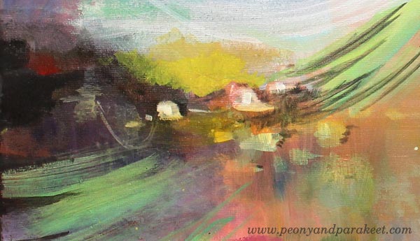
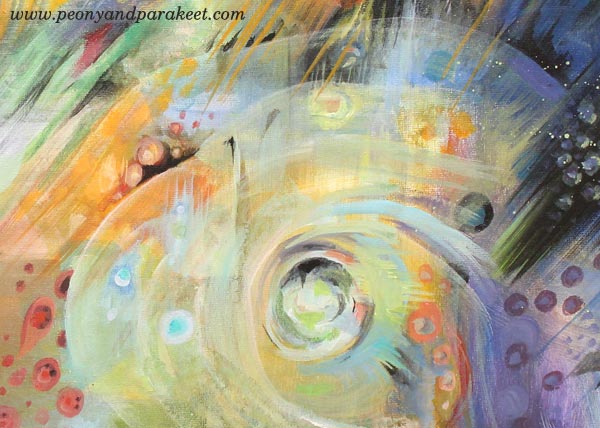
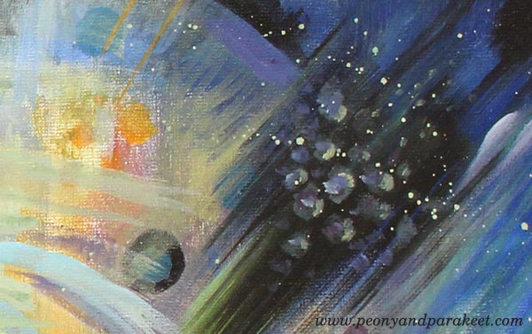
My story is about human nature: how we are spiritual beings, have imagination and ideas and are conscious about the circle of life. I doubt if I could have expressed all this on a smaller canvas.
Let me be your mentor in art: Subscribe to my weekly emails!
How to Know when Your Artwork is Finished?
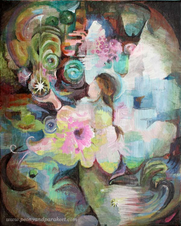
This is my latest painting called “Healing Power”. Painting this piece was so much fun so I decided to work with acrylics on a canvas. I’ll show you the main phases of creating this painting while giving my view on how to know when the artwork is finished.
Finished Artwork? – How to Analyze?
I have heard many bits of advice on how to decide when your artwork is finished. The worst is: “When you feel like it is”. Often you are just tired, fed up and that’s not a good point to finish. Take a break instead, sleep overnight and then continue!
Then there are more technical approaches like this one including infographics or based on historical studies and interviewing artists like this one. But as my students usually want to bring more content and self-expression to their art I have composed a simple and short check list focusing on those only. And instead of diagrams, I show how I deal with the issue in practice.
1. Do You Have an Opinion?
Every time I begin creating, I have pretty conventional ideas. Like here, I thought that I would make a flower painting and express “tranquility”. But to truly express tranquility, I show also include anxiety. I should have an opinion, a personal view on the difference between tranquility and anxiety.
Now you say: “But this is just flowers and nothing deeper”. I don’t think so. If you want to express yourself, you should express an opinion of some kind. This doesn’t mean you have to begin with an opinion. It’s more like vice versa: stay open to what is going to appear! But if you don’t have any more thoughts than “flowers”, “tranquility”, “pink”, you are not finished yet.
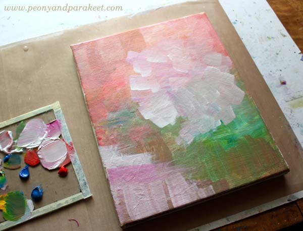
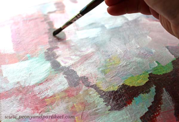
So while thinking about opinions, I got anxious and added some of it: brownish red!
Another way of asking this: “Does the painting have both light and darkness?”
2. Do You Have a Focus?
When I continued the painting, it felt good to add rectangular shapes on it. Then some more colors, then some directional brush strokes. But directional or not, I really didn’t have a clue where I was going. Maybe this could be a flower bunch and the white part on the bottom could be a pot. If so, I should make them more clear.
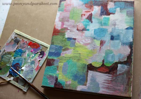
Another way of asking this: “Is it easy to know where to look at first?”
3. Have You Told a Story?
I continued the painting by turning the it upside down as it seemed to be even easier to build a pot with flowers that way. When I was at step 1 (see the image below), the painting was a bit too busy so I added dark thin layers to make it easier to look at (step 2). But then, what does this painting mean? Does it really connect with my thoughts? No, not really!
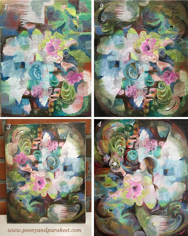
After a break, I turned the painting upside down (3). I saw a woman there, wearing a hat and taking care of the flowers. Maybe that could be a start for a story? I continued painting, trying to make the woman clearer.
Then it hit me: she was some kind of an angel, holding some kind of a magic ball. And finally: this is about healing, a subject I have been thinking a lot lately. My older dog Cosmo has had stomache problems and I have worried about him. I have also thought about many of my students, either in the middle of the sickness or having someone close to worry about. If only I could have the magic power to make everything what’s wrong, back right!
Another way of asking this: Does every element on your artwork contribute or lead to what’s most important?

This finished artwork is for you who would like to have that magic ball of healing power.
Let me be your mentor in art: Subscribe to my weekly emails!