Sunflowers – Tell Me How to Improve
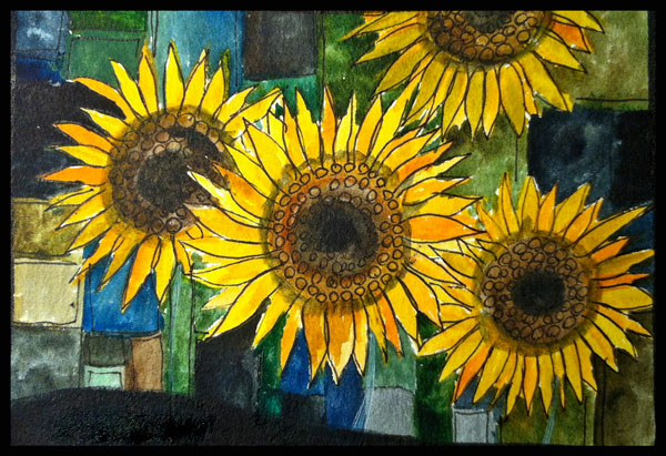
Sunflowers bring light to darkness and look very powerful. Perhaps that’s why they symbolize a life change for me. This fall they are more relevant than ever. I resigned from my day job just few days ago and started as a full-time creative entrepreneur!
In the past, I have always admired the people who make changes in their lives. But I never thought I could do that myself. It seemed to require exceptional courage and ability to take risks. Seven years ago I experienced a small change when I decided to change my professional identity from computer engineer to designer. I went to study industrial design.
Little did I know back then that it was the seed for the big change that I am experiencing now. I thought I would be perfectly happy developing new products focusing on user experience more than their technical qualities. But with designer studies something reappeared to my controlled life that had been hiding for a long time: the compelling need to create art.
The assignments connected to my studies gave some basic skills but I missed more – self expression! That goal in mind I spent years practicing most of the evenings, analyzing what went wrong and where to improve. At some point I realized that I do not want to be the greatest artist on earth. I do not want my blog to be the showcase of my artwork only. I want to share what I have learned and also what I am currently learning while struggling. I want to teach art.
It took years to dream and nine months to plan the big leap. I have gone through the fears of being lonely, poor, inadequate and uninteresting.
Now, in this special phase of my life, I ask you: help me improve and develop new products and services!
Answer the reader survey of this blog!
While answering, think where you want art to take you!

Art Journal Inspiration from Children’s Books

The art journal spread shown above is created from hand decorated papers, colored pencils, and markers. The main message here is “You can ride with your imagination in any way you want.” As it implies, I like my art journaling to capture dreams and fairy tales, not so much everyday life.
Mini-Worlds and Fantasies
I think that an art journal can be childish and playful. The way I see it, children’s books are the predecessors of them. Children’s books also combine illustrations and text to create mini-worlds and stories. I love to add both decorative and naive elements on the same page, and children’s books are great inspiration for that!
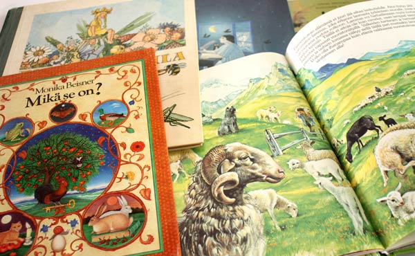
I buy used children’s books from recycling centers. They cost only a few euros (few dollars). That is a fantastic value considering all the inspiration they can give. I pick the books that have a lot of good quality illustrations. As I love detailed drawings, I try to find books with sharp lines and many details. Browsing children’s books can be a good practice for finding your artistic style. Pick the books that you feel most drawn to and then list all the things they have in common. I prefer books that have matte pages because I sometimes create collages from them. Then it is good if I can draw or paint on them.
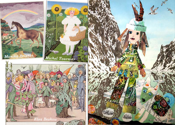
I made the collage on the right while teaching at a workshop last fall. It’s one of the pages where I have used the papers from children’s books. I often give few pages from various books for each participant of the workshop. It’s much easier to start creating when you don’t need to stare blank paper.
That little explorer resembles anyone who is entering the world of children’s books!
Subscribe to my weekly emails – Get a free mini-course!
How to Trust Yourself when Creating Art
When I begin creating art, I often have petty thoughts like: “I want to draw a flower” or “I want to create something pink.” Even if I create regularly many times a week, I am still bothered by the fear of failure. I know I have to handle that at as soon as it comes, preferably before the first brush stroke. Why? Wouldn’t it be fun sometimes to draw that single flower or create that pink square? I believe that if we give ourselves that kind of clear commands and simple tasks, we don’t really trust our creativity. The big question is always: do you trust yourself when creating art?
The Unpredictable Nature of Art
If you trust yourself, you can step into the world of unpredictability. Not knowing exactly what to aim for is a major factor when creating art. We can set restrictions and principles, but we have to leave space for unpredictability. It means that we are more creative if we do not have the clear picture of the result.
Setting Restrictions on Supplies
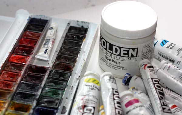
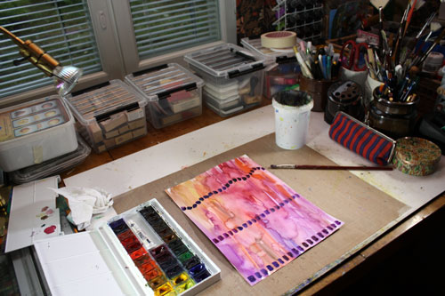
These are the art supplies that I gathered when I began making the collage of this post. Watercolors, acrylic paints, and fiber paste. I also picked a thick watercolor paper and cut it to a square. I chose the supplies but left behind the thoughts about what I was going to make.
Find what You Want to Express
My method is to browse art books just before creating art. I do it only for few minutes, and I try to pick art that really lifts my spirit, raises the bar, sparks my imagination. Usually, it is something from the history of world art. This time I browsed a picture book from impressionism.
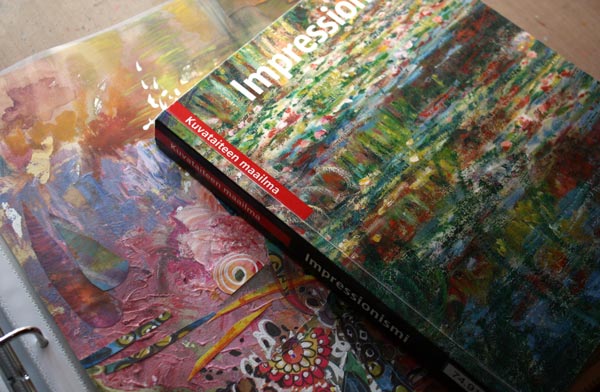
So, do I advise you to get a book of impressionism? No. I advise you to name what spheres you want to reach when making art and pick images which resonate with that. They do not have to be the same style than what you want to accomplish. The more important is the feeling that they evoke in you. When I browsed the book of impressionism, I thought how art is above all the mundane things. How those artists who lived at the end of the 19th century have managed to describe the beauty in the way that is still understood. How the brush strokes, full of paint, were successfully set to represent weightless light. All that would be exciting to see in my piece too.

When the first watercolors hit the paper, I still had some self-doubt: I could not ever do anything like the great impressionists. I heard the sarcastic voice in my head: “Reborn Monet, yeah right!” But that sarcasm is the moment when I know I am almost there: I am almost leaving the rational side of me behind. Then I just need to wow to trust myself, stop seeing any desired images in my mind and start working fiercely.
Layering (With Some Moments of Self-Doubt)
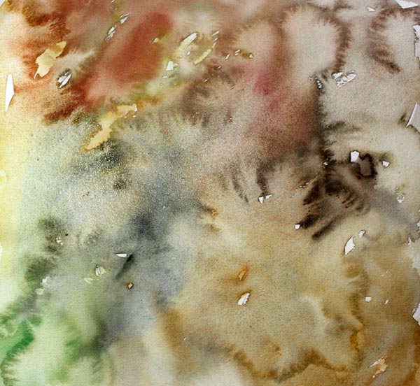
I often start with watercolors because they cover the paper quickly. Even if I have the idea of creating some surface structure, I wanted to use watercolors first to get into the mood of uncontrolled splashes.

While waiting for the watercolors dry, I mixed some acrylic paint. Pastel shades like many impressionists used to choose. 
To get some interesting texture with the paint, I used a palette knife instead of a brush.
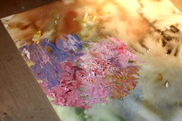
After playing a little with the palette knife and thick paint, I became clueless of how to continue. It’s important to recognize these moments. If you are not aware of these, your rational side takes the control and decides to do things you really cannot justify. Like: “Let’s use the rest of the paint to cover the surface evenly.” Or: “Let’s get some other colors and splash the paint here and there.” When you feel that you do not know what to do, don’t do the obvious. I might browse some pages of the book again to get back into the mood. Or change the media, the solution that I made this time. I doodled something not so important with the colored pencils just to realize I wanted to continue with watercolors and a thin brush.
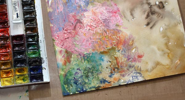
When I got bored with colored pencils and watercolors, I opened the jar of fiber paste. Even if I often prefer to stay with the basic art supplies, fiber paste is something I like. It not only creates an interesting texture like watercolor paper, but it also works like a watercolor paper. You can paint over it with watercolors and create beautiful details to your work! 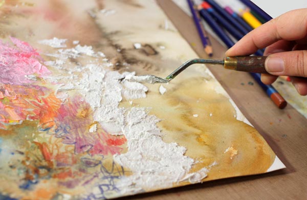
Trying to achieve distinct variation in the surface texture, I used the palette knife again.

Then my mind was empty again, so I browsed few pages from the book again and then continued with colored pencils.

When I reached the next point of frustration, I decided to change to the watercolors and work with high speed. Working fast helps to get creativity flow.
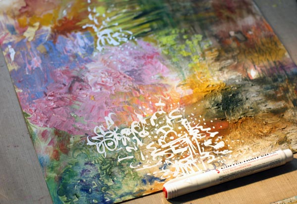
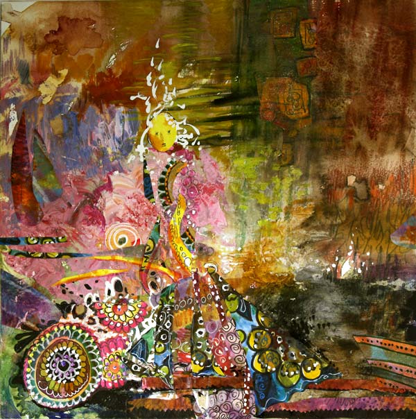
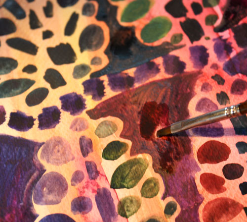
Once the paper was covered all over, I started adding details. A white correction pen is great as it usually works on any surface.
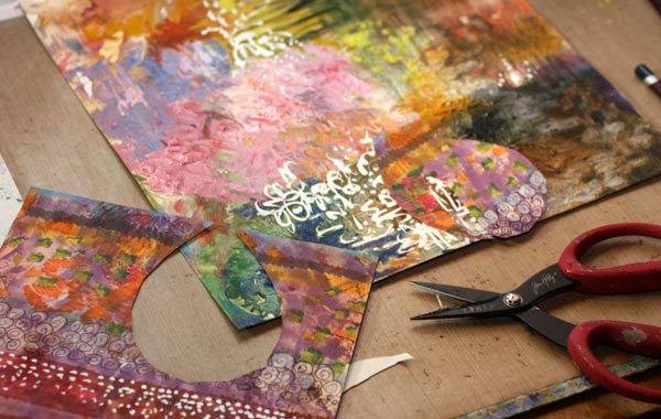
Hand decorated papers are great for details. I picked some of my prettiest papers and began to cut them. The paper shown in the picture isn’t that great as an artwork, but it’s versatile for collages as it has a lot of variation.
Finishing
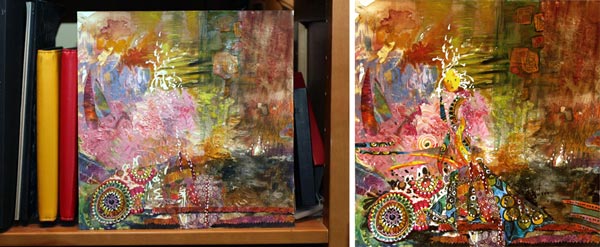
I felt that it was time to begin finishing the work. It is always useful to stop and think. I often put the artwork somewhere where I can look at it, like on the nearest bookshelf. Then I step away and try to figure it out where to lead the viewer’s eye. Here’s another step where you should not question your trust: It will be great! You just need to connect some dots and find the lost pieces of the puzzle. Like I did when I realized that there is someone in the picture. I added the faces and made the rest of the character more visible. Then some tiny adjustments to the composition and after that, the work was finished.

I think that this piece is aesthetically very much my style, but the impressionistic approach to the surface structure makes the work interesting.
Never underestimate the power of layering: this is my favorite detail, the white area showing the blank watercolor paper. It was created in the first phase, and it still exists in the end. If I had done the obvious and filled the paper with each media layer by layer, this little detail would not exist. So, cherish each stroke and trust your creativity! Focus on the feeling, not to the result! You are allowed to feel like a world-class artist even if you know you are not. Fly to the world of imagination!
This might also interest you: – Stretch Your Artistic Style
Let me be your mentor in art: Subscribe to my weekly emails!
Arboretum Patterned Paper
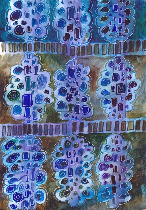
My newest design for hand decorated papers is called Arboretum. Arboretum as a word means a collection of trees. It is often used for the gardens where various kinds of trees from the collection. As you can see below, this design is very versatile: you can create any trees and play with the colors and pattern repeats.

I have used mainly watercolors here, but you can create this pattern with almost any supplies. When I designed this, I was inspired by two things: 1960s retro style and modern quilting.
Living in a house built in the 60s, we have brown, sturdy floor tiles and pine trees in the garden. The whole era celebrated the simple shapes forming simple designs. In modern quilting, solid fabrics are combined with modern patterns. Modern style quilts also often use asymmetrical and improvisational piecing.
I wanted to create a design that would be improvisational as well. I aimed for the painted design that leaves space for variations and self-expression. The simplified black and white pattern picture shows the structure more clearly.
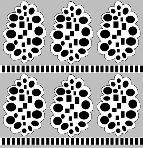
Each of the trees has rectangular shapes in the middle. They represent the trunk of the tree. The rectangles are surrounded by round shapes, which represent leaves. Each row is separated by the row of rectangles, representing the fence or earth. A single tree can also be used alone, as an element in an illustration or as the only image illustrating a text.
Step by Step Instructions for the Painted Design
1) Create the background

Use several colors to create the background. The colors can be intensive but not very dark as this is only the bottom layer that shows behind the trees.
I used thin watercolor paper, watercolors, broad brush and plenty of water. I worked with long strokes from top to bottom and vice versa. The paper was dry, but the brush was very wet. In the end, I added splashes of water to create even more variation.
Let the background dry well. If you like the result, and you have a scanner, scan it so that you can use it multiple times by printing it!
2) Add the fences.
The fences can be straight or curvy. They can break or continue from edge to edge. The distance of these rows determines the size of your trees.
3) Add the trees.

Start with the rectangles of the trunk. Continue by adding circles near them. Create the rectangles and circles in different sizes and different colors. Color variation looks great especially if you maintain the intensity of the color fairly even between the shapes.

Leave some space between the trees.
3) Darken the background around the trees.
Add darker color to the space between the trees. You can use various colors here too. The dark background represents the sky.
4) Finish with doodles.

Create details to the rectangles and circles. I like to use white gel pen here. You can make each tree look different if you like.
My finished piece is inspired by fall. Thus some trees only had few leaves. On the top row, there ‘s also a tree that has rectangles set like branches. The darkest tree in the upper left corner reminds me of a cone. I could have made an art journal page too by replacing the fence with the journaling. There’s so many little tweaks you can make to this pattern to tell your personal story!

After creating these, I have begun to wonder: what if I cut some of the trees out and created a collage from them!

More patterned papers: Basic instructions + links to more
More inspiration from simple shapes: What to Create from Simple Shapes? 6 ideas
Let me be your art teacher: Subscribe to my weekly emails!