Semi-Abstract Floral Still Life: A Painting Inspired by Dutch Masters
This week, I want to show you a piece called Damask. It is a dark, semi-abstract floral painting. I often try to create lighter works because they sell faster, but if it were up to me, I would paint almost only dark pieces.

There is something valuable and very private about dark tones. The painting felt so private that I originally thought about just posting a photo of the finished work and keeping the process to myself. But the purpose of my blog is to inspire you to create. Seeing only the final result rarely inspires as much as seeing the imperfect beginning where everything started.
Inspired by Dutch Old Masters
My painting is about how ornaments can be traced back to nature, but it is also a tribute to 17th and 18th-century Dutch floral paintings. The concept – dark background, lots of details, beauty after beauty – doesn’t leave me alone – it is like a recurring fever.
>> See the blog post “Flower paintings at Rijksmuseum”
And there is only one cure: starting a new dark still life, without references, just by painting freely.
How to Start a Semi-Abstract Floral Painting
At first, I used a broad brush and painted simple shapes with different colors.

Then I decided what flower to enlarge and what to hide. Some flowers appeared, but then disappeared when the painting progressed. I like to think that some flowers are born just to give birth to other flowers.

Why Mastering Technique Is Never Enough
I have noticed technical progress in my work. As things get easier, I can set more challenging goals for myself. However, I don’t believe that art is just about mastering technique, or that painting flowers is only about using them as decoration.
When you start a new work, you create a space around you.
It is a private and special place.
While I was making this piece, I felt like I was in an old room. I could hear the wooden floor creak and the wind blowing behind the old window glass. And yet, I felt I was wealthy. I was far away in the past, but I didn’t feel homesick at all.
The longer I have made art, the clearer my vision has become. Intuitive work is not about copying an image from your mind. It is about your work and your imagination starting to share the same atmosphere.
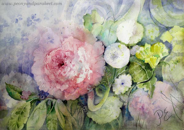
Here you can see the painting in different stages. Some might please you more, but I was after the special place, remember.


Here’s the finished piece, ready to be photographed.

Your Intuition – Your Private Atmosphere
So, what matters is the atmosphere you want to build. This is why it doesn’t really matter if you paint flowers or faces. From this perspective, all art is abstract. It is not just about thinking of the composition as abstract —it is about the character of each detail and how it connects to your private place (that then opens up to the viewer, too).
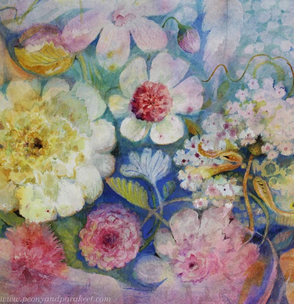
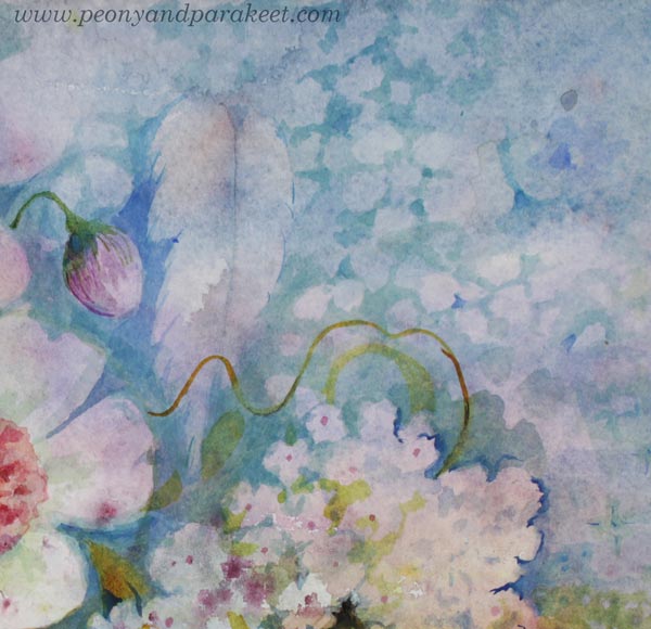
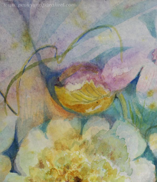
Here are some detail pics of my semi-abstract floral painting called Damask.


Friends in Art
Art is a private experience. Through my online courses and videos, I am visiting your private space. I often imagine that we are visiting each other. When the lesson ends, we both return to our own worlds, feeling inspired. It is hard to grow—both technically and as an artist—if you always keep the door closed.
Welcome to my courses to improve your skills and your artistic thinking! If you need more inspiration, feel free to browse my blog archives by date, category, or supply. I have shared my journey here every week for over ten years.
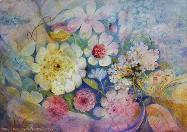
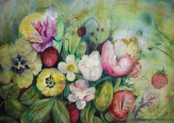
Floral Watercolor Painting – Finding the Expression from the Details
This painting, “Touched by an Angel,” is the latest in a series of three floral watercolors I’ve created for the Finnish Painters’ Union’s art sales event. I will also have two oil paintings available there, but the three watercolors were also an effort because they have a lot of details.
Finding the Name
It’s quite rare for me, but I had the name for this watercolor in mind very early on. The other two paintings in this series were about scent and taste, so I wanted this third one to be about touch.
The title “Touched by an Angel” reminded me of the 90s TV show, but it also made me think of old churches with their beautiful decorations. In addition to peace and timelessness, I wanted to express spirituality, lightness, and gentleness.
My Creative Process
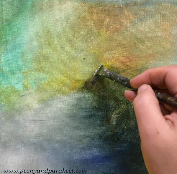
I usually start my watercolors simply by playing with water and paint.
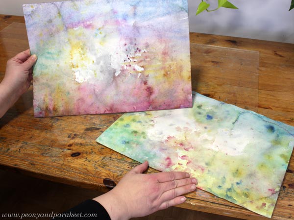
Once that “mess” has dried, the real work begins. I start with the background, and the flowers slowly find their shape.
This is a process I teach in my Wild Garden course.
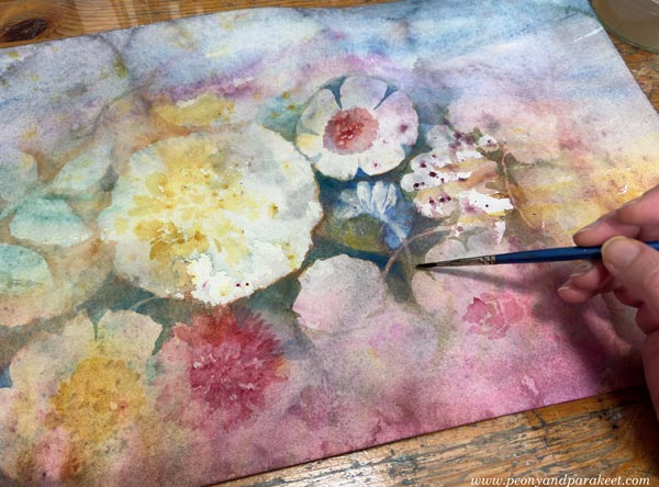
The Power of Subtle Details
I have found great joy in painting details in watercolor. I like to forget the “big picture” and focus on making one small part as expressive as possible. When every detail speaks to the theme in its own way, the whole painting comes together naturally.
Not every detail has the same role, though. For example, you can paint a lot of detail in the background so that it doesn’t distract the viewer. The secret is to keep the contrast low.
Believe it or not, this simple thing took me a long time to learn. The light details seem so modest, yet they make the painting so much richer!
The heart of the expression is often not about the subject you choose, but how you work on the details. When every detail builds the story, the whole painting becomes expressive. In my piece, I wanted every detail to bring up the angelic touch.
Details also make a painting feel more finished. Even if those tiny, delicate brushstrokes seem invisible to some, they add significant value to the final piece.
Also notice that when you paint details with a light touch, you can keep the color scheme more limited, and thus, more elegant!
Three Watercolor Paintings with Details – Scent, Taste, Touch
Here are all three paintings of the series.
Tell me, which of these is your favorite?
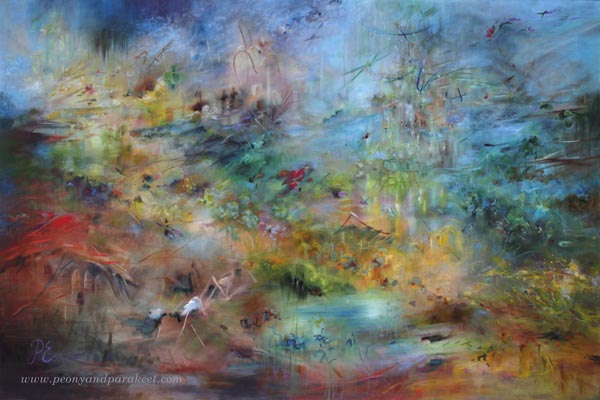
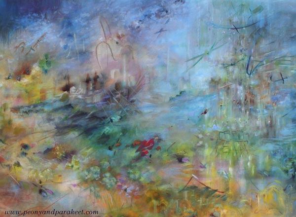
Painting Seascapes – Making The Scenery Look Bigger
This week, we dive deeper into painting seascapes and other big sceneries. In spring, I thought my painting Atlantis was already finished, but after seeing the ship paintings in the Rijksmuseum in Amsterdam in May, I realized that I had made my seascape painting too simple and small-scale, and went back to working on it. Now it’s finished!
Painting a Bigger Sea
Despite the size of the canvas, you can make the seascape or any scenery look larger by adjusting the composition and the size of the brushstrokes. Compare the finished version with the one below!
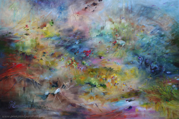
When you want to make a seascape look bigger, add tiny strokes, especially near the horizon, and adjust both left and right edges so that it looks like the seascape continues outside the painting.
The changes may look small when you look at the small photos, but in reality, they make a big difference. Here’s a close-up photo of before and after.
There are so many details that it was easier to make a short video instead of sharing more pics.
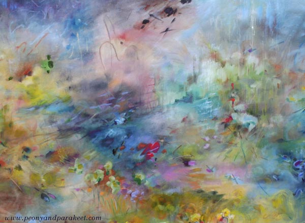
Seascapes don’t have to be boring and all blue. They can include all kinds of events and creatures, even buildings like in my painting.
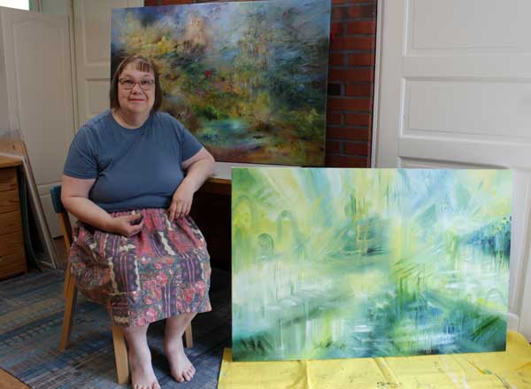
A Series of Big Sceneries in Progress
It’s been a hot July in Finland, and my little studio is really warm in the afternoon. But I have big canvases in a queue, and the next one is already in progress.
New Course Is Coming Up!
Painting seascapes and other sceneries is exciting, but as you know, I also love flowers. I will be running a new watercolor course called Wild Garden from 22nd September to 14th November. Here’s a small teaser pic …
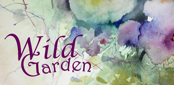
The early-bird sale of Wild Garden will start next week, so stay tuned!
Painting Small Wildflowers
This week, we explore the beauty of small wildflowers and find what we can learn from nature when painting them.

>> See more pics at the Taiko Online Art Store!
I had a small blank canvas that I wanted to paint on before Midsummer. I did it with acrylic instead of oil because acrylic paint dries faster and you don’t have to wait days for the layers to dry.
My idea was simple: wood geraniums – or do you call them cranesbills? In Finnish the plant is called “metsäkurjenpolvi” and they bloom everywhere now in June. We have them in our garden too, but I mostly study them on morning walks. As a child, they were my favorite flowers when it comes to wild flowers.

Even if I sometimes take photos of small wildflowers, I don’t want to paint from reference pictures, but freely. I can check the structure and shapes of flowers or leaves from photos, but if I start copying the exact detail, my expression stiffens. It’s like my head begins to ignore my heart, and that’s never good for art-making.
Starting with Big Brushes
At the beginning of the painting process, I don’t even know exactly what I want to express. The mood of the painting grows little by little and when I start, I’m clumsy and quite careless.
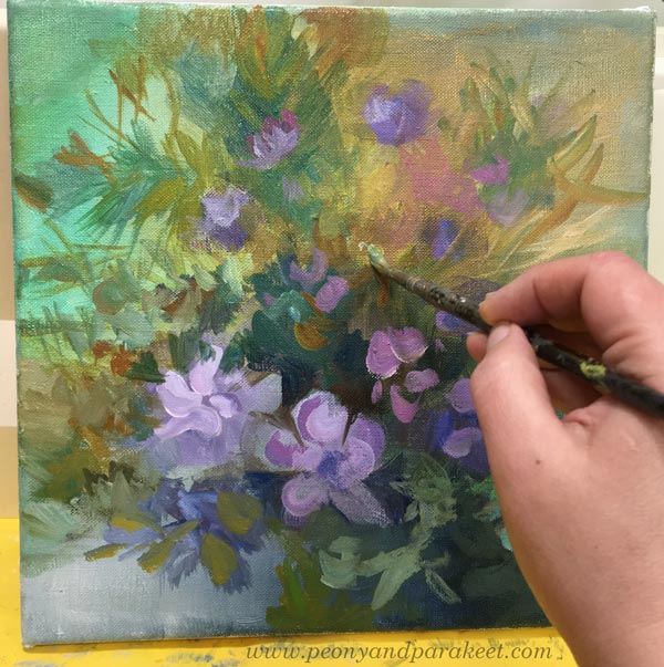
It’s actually pretty quick to make a nice little flower painting if you only think about one plant and don’t aim for anything else. But these days, I don’t want to leave any painting at that level. I want to offer more to look at and combine many observations in the same painting.
Here’s my painting from Day 1 to Day 2. The right lower corner didn’t change much, but the center and the right upper corner changed a lot. And the painting became more detailed.

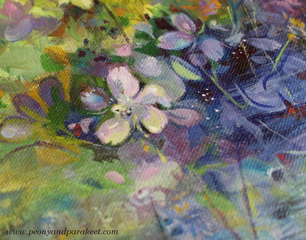
Some paintings are great with the more abstract and loose touch. But here, I wanted to express the delicacy of small wildflowers and honor their tiny details. I also wanted to make the painting look more natural.
Beautiful Mess with Thin Strokes
Nature is wild and messy. We easily overlook that beautiful mess when we look at wildflowers in a meadow. Our eyes pick out our favorite flowers, and we don’t see all the other plants that are trying to get in the way. Grasses come to the front of the flowers and intersect everywhere. There are endless layers of plants if you look at the view as accurately as possible. Even when looking at this photo, did you notice all that layering?
It seems contradictory that the more romantic and spiritual I want to paint, the more I have to open my eyes to the reality. I need to paint those hays over the pretty wildflowers and let the nature make a beautiful mess in the canvas too.

Small Doses of Conflicting Colors for Flavor
In nature, the colors also get mixed with each other, and there are reflections and conflicting tones. So, even if the number of colors in the painting is limited, you always have to find a small dose of some different tone to spice it up. For example, add some bright red to make the purple flowers delicious! Similarly, cold greens need brownish tones.

In Finland, Midsummer is a big celebration. The nights are white now in the end of June and you can admire the flowers without going to sleep at all.

Paint abstract florals in acrylics with me: >> Buy Floral Freedom!
With these pictures, I wish you a wonderful Midsummer and lots of joy in observing and painting tiny treasures – small wildflowers!

Painting small wildflowers – Could this be your next art project?