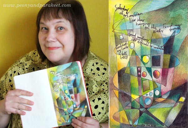
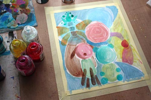
Draw Your Own Coloring Page
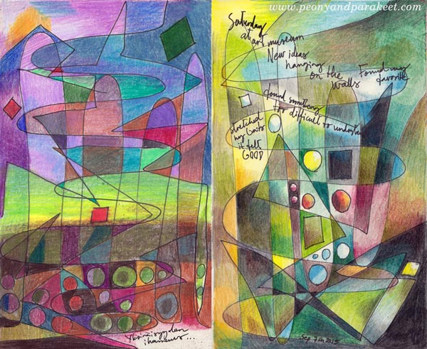
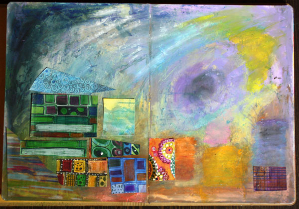
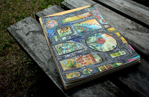
These two art journal pages have been made in the same way: drawing simple lines and shapes and then coloring them with colored pencils. This is a fun exercise especially for those who like abstract art and want to show it in their art journals, and for those who are into coloring but want to create more personal images.
A) Draw a Coloring Page!
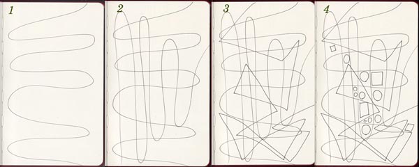
With a thin-tipped drawing pen, create lines and shapes:
1. Draw a wavy line across the page.
2. Draw another wavy line in the opposite direction.
3. Add 1-2 angular lines on the top. The example above has only one long angular line.
4. Add some circles and squares in an area where you want to turn the focus.
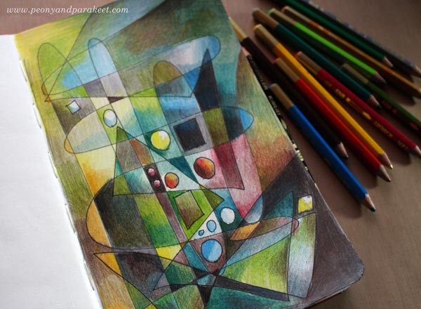
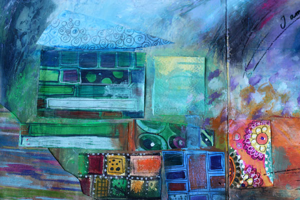
B) Color Freely!
Choose your color scheme and add layers of color.
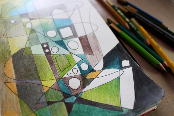
Add even more layers …
C) Add Journaling!
With a drawing pen, add your thoughts on the page. You can erase lighter areas for the journaling.
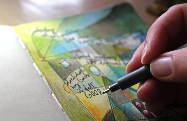
My page is about my latest visit to an art museum. They are such inspiring places!
Get more coloring instructions: Buy Coloring Freely!
Create Pastel Softness!

This time it’s all cute! I had the feeling that this blog is getting too serious. Don’t get me wrong! I want serious, I love serious and hope that you do too! Still, behind all good art, there’s a big portion of imagination. And the best way to embark that imagination is to play a little!
Pastel Colors in Teddy Bears

So I asked my teddy bears if they were willing to help me with this post. And they responded: “Yes, sure!” When I interviewed them, they reminded me that there are two big factors in cuteness: softness and pastel colors. “My friend is a black teddy and he does not get so many hugs as I do”, said Apple Blossom. Pink Princess continued: “It’s not just the color, but it’s the fluffy softness that’s important too!” And then they both agreed that the huge nose and strong eye contact make a teddy even more successful.
Pastel Colors in Old Scrap Pictures
Then I showed them the old scrap pictures that I had found from an antique flea market some years ago.

“Oh yes!”, they giggled. “If you want to create something cute, these sure are good examples! Round shapes make them look reaaaaally soft!”
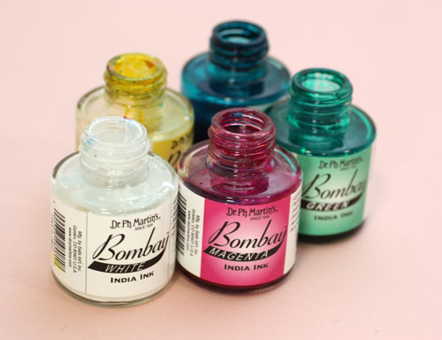
India Ink and Circles
I picked up my India ink bottles (used also in the video blog post last week) and tried to think about what kind of soft and cute to create with them.
Then I remembered the round shapes. That could be the start.
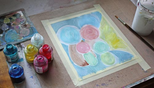
So I painted some round shapes with pastel colors on a thin watercolor paper. While painting, I noticed that to get beautiful pastels you need to use a lot of white. Sometimes adding a lot of white can create hues that lack softness if the base color is cold. You can fix that by adding some yellow or a tiny portion of black. Speaking of soft and white, meet another teddy of mine called Niamh …

I am not a big fan of white but who could not love the color after seeing her!
Clustered Shapes
Back to the painting: Small shapes were added near the large ones to create cute creatures. I made some large shapes form the part of the background. More shapes were painted to made creatures more interesting.
I made the shapes look dimensional and detailed with colored pencils.

Finishing
I finished the painting by adding more details and sharpening them with a white gel pen and a thin tip black marker. As a final touch, I added white acrylic paint on the face of the biggest creature. It lightens up the work and makes a great contrast with the black. Namely, if you look at the scrap pictures and the teddy bears, the black color makes pastels look so soft and bright. Small black dots here and there on a pastel colored circles can be enough to create a page that’s all soft and cute.

So, why not have a go: create a pastel colored art journal page to soften the hard world!
Let me be your mentor in art: Subscribe to my weekly emails!
How to Mix Colors?
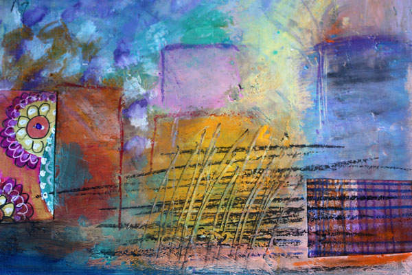
Here’s an art journaling page that I made to show you the gentleness of pastels and the strength of muted, darker shades. I often see art journaling pages that have a potential to be awesome, only if the color palette would be more unified! Meaning: only if the artist would have mixed the colors instead of using them straight from the tubes.
Choosing Color Combinations
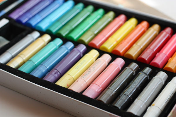
Here’s the problem: we are pampered with many great colors by the art supply manufacturers. Like the colors of my Faber & Castell Gelatos, they look so pretty!
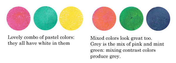
Still, you can pick colors there that won’t look so great together. Those colors have no common base color. Like the bright red, blue purple and mint green shown below. They have nothing in common. The bright red is a primary red; blue-purple is muted with black and mint green is muted with white. If you take out the mint green and mix the red and blue- purple, you can get a better combination. The brown, which is the mix of purple and red, ties the two colors together.
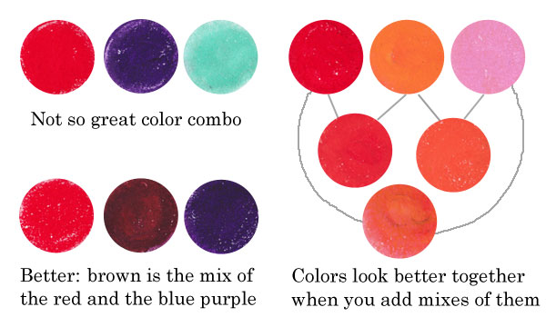
Similarly, if you use only red, orange and pink straight from the box, they look more separate than if you also use the colors that are mixes of them. Like parents and children, they form a unified color family.
Another example: the colors that have a common base color, like the pastels below, suit well together. You can also mix them without fear: they produce lovely combinations. If you don’t want grays or muddy browns, avoid mixing contrast colors together. The contrast color pairs are red and green, blue and orange, yellow and blue-purple.
Sometimes people are afraid of getting grays and browns, and so they avoid mixing any colors. But those muddy colors make the brighter colors pop. See how muddy colors support the other colors in the art journal page that I made.
Playing with Tints and Shades
 One reason to mix colors is to get more natural, lively look. If you look at any photo, you can see a lot of colors there. The variation of light causes the huge amount of colors.
In the late 19th century, there was a genre of artists called impressionists. They were inspired by the daylight. They wanted to focus on the light, not on the objects themselves. If you are afraid of mixing the colors, look closely at Claude Monet’s Cliffs at Etretat and count the various tones there!
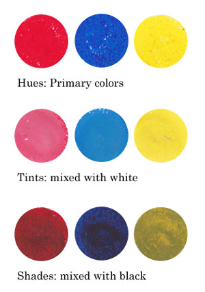
Instead of using primary colors like basic bright reds, blues and yellows and mixes of them, I encourage you to play with tints and shades: mix white or black to the primaries and get softer colors!
Using Faber & Castell Gelatos
When I began creating the art journal page, I chose to use gelato sticks with acrylics and hand decorated papers. I decided to use the background that I had made weeks ago, as its pastel colors reflected the cheerful mood I was having.

I like to create backgrounds when I am tired or uninspired. Then, when I start creating, I feel that I am already half done. When using various supplies in each layer of a page, I will get more variation in color without extra effort.

Faber & Castell Gelatos look like lipsticks, and they have similar kind of waxy feel. You can dilute them with water, but I think the greatest way is to mix them with a paper towel or soft sponge.
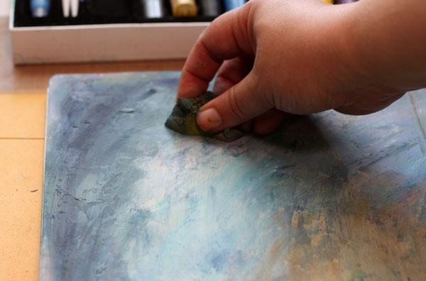
Gelatos work great on a painted surface. Notice that I created color mixes with slight variation in darkness. I used both tinted colors (mixed with white) and shaded tones (mixed with black).

Repeating Colors
One more thing to consider: color repeats. I am very careful of not repeating the same color too much. In general, when the color is used only once, it represents an individual. If it’s used twice or three times and the areas are closely located, they represent a group. But if the same color is here and there or evenly spread, it is often just a mess. The rational side of us wants to create color repeats. But once the work is finished it does not look rational at all! One more reason to mix those readymade tones!
When I began to add hand decorated papers, I followed the same rule of controlling the number of repeats: not too much of the same paper.
Using hand decorated papers is a great way to add thin lines to a page. The gelatos have a waxy surface that can be difficult to handle with thin markers. For the journaling, I used Faber & Castell PITT brush pens.
To make the collage look more integrated to the page, I added color with Gelatos on the papers.
If I had to define art shortly, the definition would be: creating great color mixes and communicating with them. At least that is the step to take when you feel that the page you made does not represent what you wanted to create!
Read more about colors: Yellow, 5 Tips to Choosing Colors
Let me be your art teacher: Subscribe to my weekly emails!
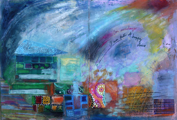
Using Black in Art Journaling
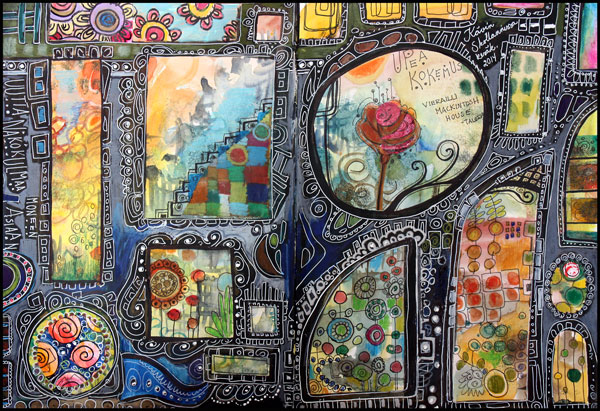
Last week was great. I went to Scotland! I started with a small business conference in Glasgow and then had a couple of days sightseeing. My husband joined me in the end of the week and we really enjoyed our time. To celebrate the journey, I made an art journal spread which is based on the easy, yet effective technique, using black in art journaling.
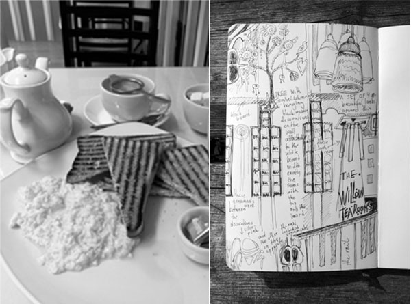
Before I get into the process of creating the spread, I want to show a page of a smaller art journal which I had with me. I made the page while I was eating breakfast at Willow Tea Rooms in Glasgow. It is a wonderful place for a Charles Rennie Mackintosh fanatic as I am.
Charles Rennie Mackintosh was a designer and architect in the early 20th century. I have admired his and his wife’s Margaret MacDonald’s work for ages, so I wanted to look around the tea room area really carefully. Because sketching not only makes me observe things in detail but also memorize better, I recorded most things that I saw. The first tip of this post is to create sketches before making the actual pages. It is easy to keep a black pen and a small journal in the bag.

When I saw this doorway of St Conan’s Kirk, I knew it would be inspirational after getting back home. When thinking of doorways and windows I remembered a page spread in my largest art journal which was started some time ago but was not finished. I often create jumpstarts for the future pages. This was just perfect for the theme!
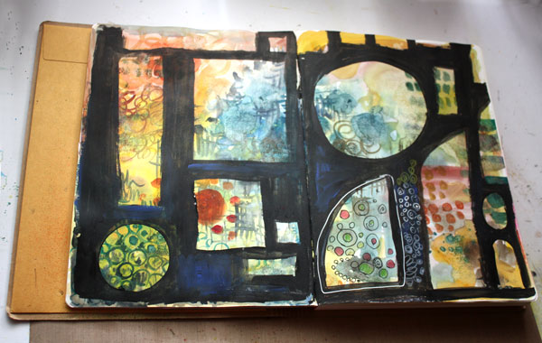
To get to this stage is really easy:
1) Paint a background with watercolors. Use various colors and brush sizes. Do not repeat colors or patterns too much but create areas that differ from each other. Create few layers and let each layer dry before adding the next.
2) With black watercolor, add a new layer on the top. Leave empty areas so that the previous layers show through.

And after the black layer is dry, the real fun begins:
3) Doodle on the black areas with color pencils and gel pens. You can also add details in the other areas. Feel free to use decorative papers too.

I wrote to the art journal that my best experience of the journey was to visit Mackintosh house. Taking photographs was not allowed but I did manage to take a couple of photos of Charles Rennie Mackintosh work. The first photo is from Kelvingrove art museum which is located near the Mackintosh house. In the second photo I am standing on the front door of Mackintosh house. There were no stairs as the house was a replica of the real house and was built inside Hunterian art gallery.
When walking around the interiors designed by the creative couple, Charles and Margaret, I wondered what kind of discussions they had had in their beautiful home. Margaret’s remarkable collage art showed extreme talent but she was not valued as an artist back then. Charles also struggled at times. Still, what those two people shared with each other, must have been wonderful and deep. I just wish I could take a time machine and spend at least one evening with them, talking about the form, design and philosophy of art!
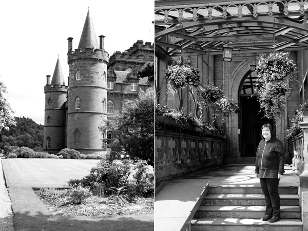
These photos also worked as inspiration to the art journal spread. Here is Inveraray castle and its beautiful entrance with summer flowers.
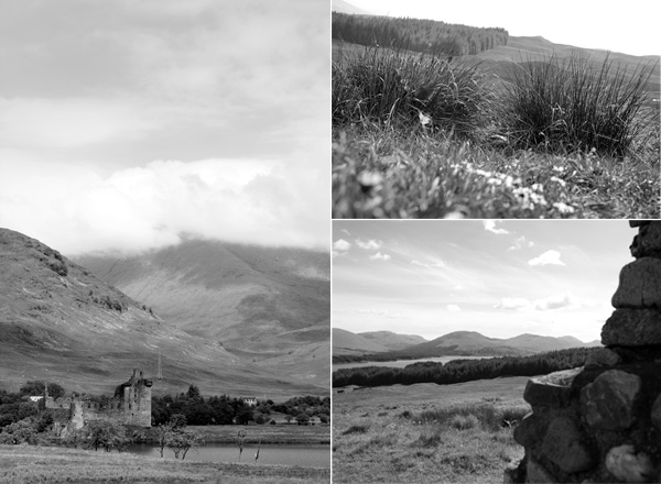
The day we visited the highlands was sunny and the nature looked incredibly beautiful. The Stalker castle was not available for visitors but the view from it must be breath-taking.
Here’s the finished spread again. Hopefully you enjoyed the photos of the journey and fell in love with Mackintosh couple’s work. I also wish that you’ll try my technique of using black in your art journal!
Let me be your art teacher: Subscribe to my weekly emails!