Create Abstract Botanical Art!
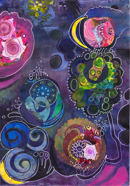
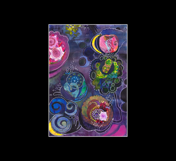
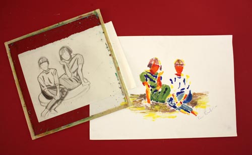
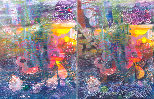
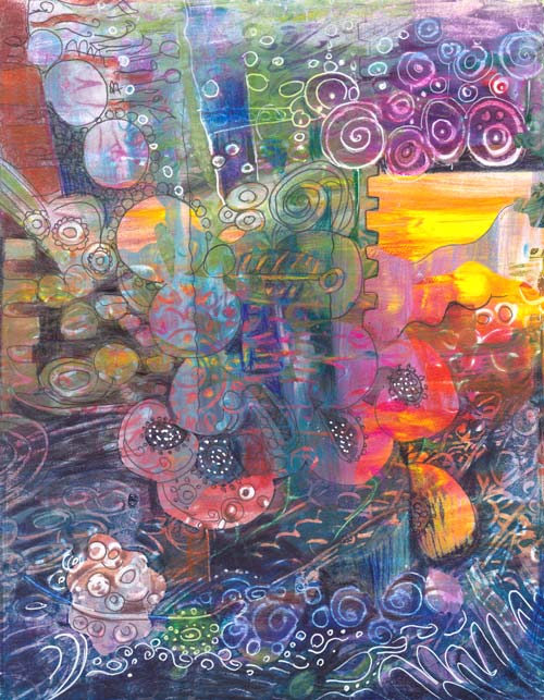
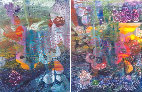
Last Friday I saw impressive paintings. When I see something that appeals to me, I try to analyze that in pieces. It is fascinating to find out little things that make a painting so memorable. I created this collage called “The Odd Nature” by using those factors. The whole subject – abstract botanical art – is mind-blowing.
Inspired by Hilma af Klint
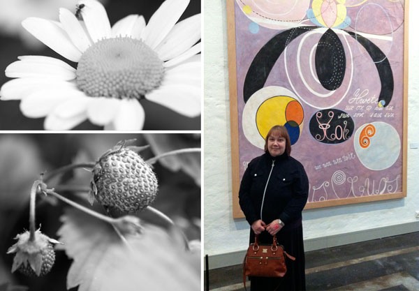
Starting from the beginning: I was at Hilma af Klint‘s exhibition at Kunsthalle Helsinki. I had seen a few of her works before, but never this many at the same time. Hilma af Klint (1862-1944) painted botanical art and landscapes but then moved to create abstract art. She was a female artist and one of the pioneers of abstract art. When that is combined with her interest in spiritual ideas, no wonder she did not make her work public. In fact, she ordered that her work should be shown not earlier than 20 years after her death! Look at some of Hilma af Klint’s paintings on the Swedish Moderna Museet’s website.
Here’s what inspired me with Hilma af Klint’s art:
1) Odd compositions that were skillfully balanced.
2) Graphic, often decorative shapes which reminded me of plants and biology.
3) The combination of bright and muted colors with great contrasts.
Zoom in on Nature!
After the exhibition, I began to think about how far we often look at the world around us. To me, it felt like Hilma af Klint had divided living objects like plants into small components and then constructed new pieces out of them. So I began to zoom in on the photos I had taken from my garden this year.

When thinking about the structure of apple blossom, I remembered something which is small too: the little box where I save the tiniest scraps of my hand-decorated papers.
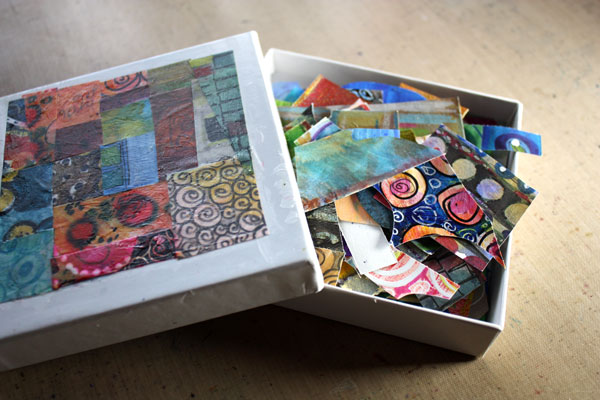
Creating abstract botanicals from the paper scraps would be the thing to do!
Color Inspiration

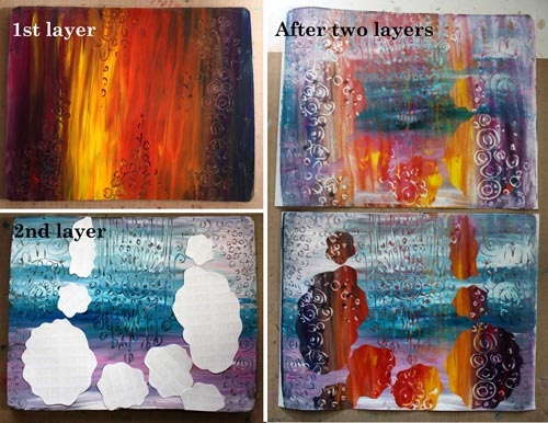
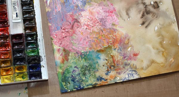
The idea for the color scheme and the atmosphere came from this photo, taken just a while ago. I painted the background blue purple by adding several layers with watercolors.
Collage Shapes
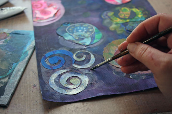
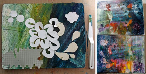
After the background had been finished, I began to create the abstract shapes.
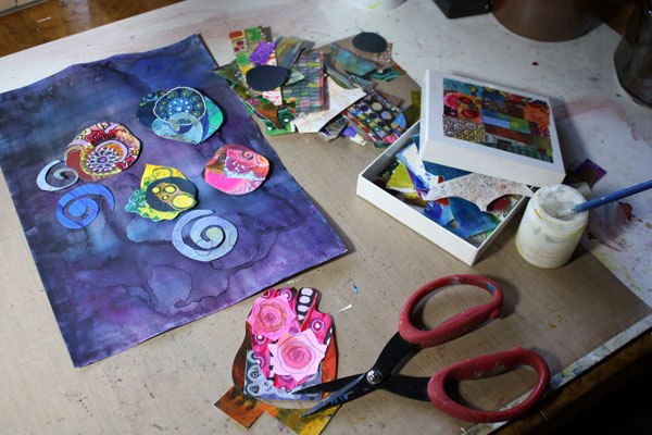
You can easily create intriguing collage pieces by combining small scraps together. Your cut shape does not need to be perfect before gluing it on the background. You can think of the shape as the beginning of the final shape. You can add more details with paint and pen around the shape later.
Composition
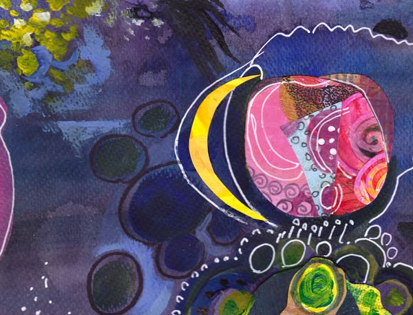
When gluing the shapes before they are finished, you need to make bold moves in the composition. I advise not to think of the composition more than this: make sure that the shapes are not evenly spread in the background. After the preliminary shapes are glued, you can then continue working with them by expanding them with painting and drawing. At the same time combine some of the shapes together and create new, smaller shapes to balance the work.
In my work, the center of the work is left almost empty. There I created a tiny detail that adds dimension to the work: a blue horizontal line near the two small circles.
So why not pick up your scraps and honor Hilma by creating surrealistic botanical art!
Read also
Fun Designs from Decorative Papers – An easy technique to create collage elements.
How to Draw a Rose – A simple rose seen in the collage above. You might want to use it as a decorative element too.
Self-Expression with Gelli Plate
Printing with a Gelli plate was one of the things that popped up from the reader’s survey. As I happen to love mono printing techniques, it was quickly selected for the theme of the week!
Glass Plate
Almost 30 years ago, long before Gelli plates, I used glass plates for mono printing. I usually made a sketch first and then added each color as a separate layer.
This monoprint was made in 1988, and it represents my sisters.
Gelli Plate
Gelli plate is a great invention, and it’s available in various sizes and shapes. My plate is 8 x 10 inches in size. Acquiring one is not a necessity. Glass plates work fine even today. You can also use any plastic transparent like overhead projector transparencies. The advantage of Gelli plate is that it has a flexible and sticky surface. That makes the using of masks easier. So if you fall in love with mono-printing, I would recommend purchasing the Gelli plate.
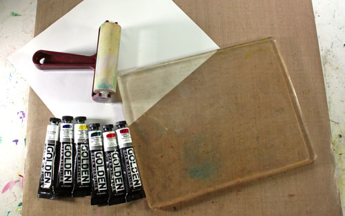
In addition to the plate, I have Golden Open acrylic paints. These paints have extended drying time, so they are especially suitable for mono-printing. I only have six colors, but by mixing them, I can get a huge variety of colors.
To create monoprints that include self-expression, I have 6 tips for you.
Tip 1: Use brushes instead of a brayer
The most common tool with the Gelli plate is a brayer. I have a Speedball brayer, but I often use brushes instead. They make the prints much more artistic, unique and expressive. With brushes, you can easily create non-repeating details and large color areas – the elements that contain more communication than monotone repeats.
Tip 2: Use a variety of tools
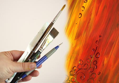
Your artwork is much more interesting if you use a variety of tools. For this post, I have used two different brushes, a double-ended embossing needle for doodling and a long palette knife for wider strokes. Your imagination is the only limitation when tools are considered. Just remember to avoid sharp objects!
Tip 3: Use hand-cut shapes for masks
When combining a variety of colors and surface patterns with hand cut shapes, the result is much more organic than using one color and cutter-cut shapes. The temptation to create a repeated design is bigger than when using freely cut unique shapes.
Here are some patterned papers that I printed from machine-cut shapes.
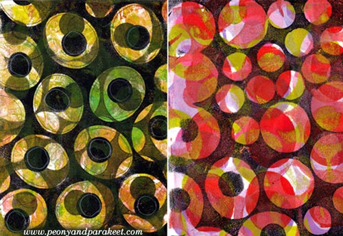
But with freely cut shapes, I avoided repeating the same motif.
Tip 4: Let each layer bring something new to the artwork
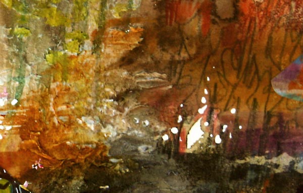
When creating a new layer, I do not mix and match colors too much. Sometimes colors look even more amazing on a plate than on a print, so I had to take a close-up from the plate!
I also think that cutting new shapes for each layer can really pay off. Add new and different with each layer, still letting the lower layers show too!
Tip 5: Create at least two monoprints at the same go
If you use slowly drying acrylics, you can get at least two monoprints from the same layer of paint. You can also experiment with that by creating two different artworks by changing the printing direction. I have turned the last layer upside down in the second monoprint. Thus the two prints differ slightly.
Tip 6: Doodle and color over
I doodled over the other of the two monoprints created for this post. Besides a white gel pen and a black thin tip marker, I also used colored pencils to fine-tune the colored areas slightly.
Here’s the bigger picture of the decorated print:
Finished Prints
Here are the two finished pieces. Which one do you like more, the one that is not decorated or the one that is?
My husband asked after seeing these: What are you thinking while making these? – I try to think of nothing while creating, I said. I believe that you have to think before you create, not while you create. However, after a vivid discussion, I named these: the one on the left is Humanity, and the one on the right is Technology.
Gelli Printing Project in a Video – Apples and Tomatoes!
In this video, I talk about how and why to add diversity to your art. At the same time, I am creating a monoprint with a Gelli plate showing easy techniques to create an image.
All Gelli Posts
Let me be your mentor in art: Subscribe to my weekly emails!
How to Trust Yourself when Creating Art
When I begin creating art, I often have petty thoughts like: “I want to draw a flower” or “I want to create something pink.” Even if I create regularly many times a week, I am still bothered by the fear of failure. I know I have to handle that at as soon as it comes, preferably before the first brush stroke. Why? Wouldn’t it be fun sometimes to draw that single flower or create that pink square? I believe that if we give ourselves that kind of clear commands and simple tasks, we don’t really trust our creativity. The big question is always: do you trust yourself when creating art?
The Unpredictable Nature of Art
If you trust yourself, you can step into the world of unpredictability. Not knowing exactly what to aim for is a major factor when creating art. We can set restrictions and principles, but we have to leave space for unpredictability. It means that we are more creative if we do not have the clear picture of the result.
Setting Restrictions on Supplies
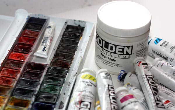
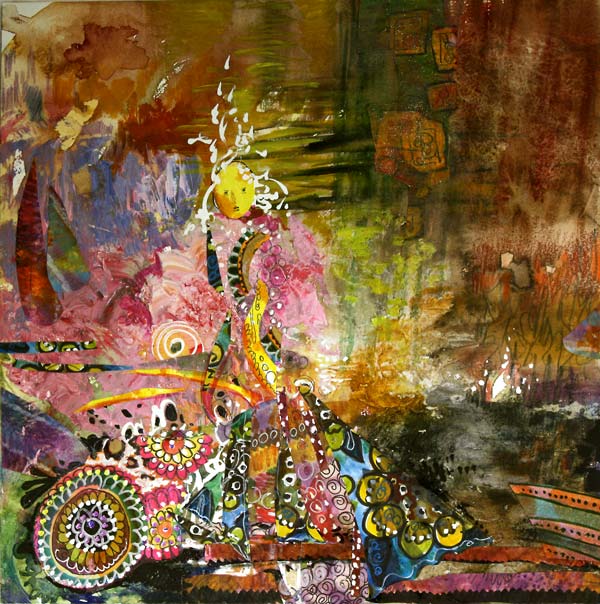
These are the art supplies that I gathered when I began making the collage of this post. Watercolors, acrylic paints, and fiber paste. I also picked a thick watercolor paper and cut it to a square. I chose the supplies but left behind the thoughts about what I was going to make.
Find what You Want to Express
My method is to browse art books just before creating art. I do it only for few minutes, and I try to pick art that really lifts my spirit, raises the bar, sparks my imagination. Usually, it is something from the history of world art. This time I browsed a picture book from impressionism.
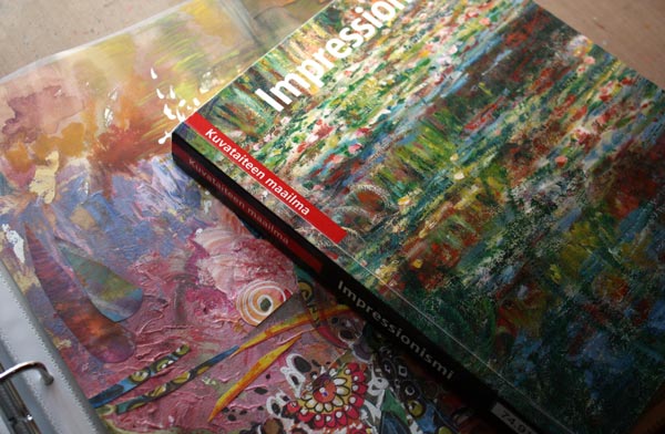
So, do I advise you to get a book of impressionism? No. I advise you to name what spheres you want to reach when making art and pick images which resonate with that. They do not have to be the same style than what you want to accomplish. The more important is the feeling that they evoke in you. When I browsed the book of impressionism, I thought how art is above all the mundane things. How those artists who lived at the end of the 19th century have managed to describe the beauty in the way that is still understood. How the brush strokes, full of paint, were successfully set to represent weightless light. All that would be exciting to see in my piece too.

When the first watercolors hit the paper, I still had some self-doubt: I could not ever do anything like the great impressionists. I heard the sarcastic voice in my head: “Reborn Monet, yeah right!” But that sarcasm is the moment when I know I am almost there: I am almost leaving the rational side of me behind. Then I just need to wow to trust myself, stop seeing any desired images in my mind and start working fiercely.
Layering (With Some Moments of Self-Doubt)
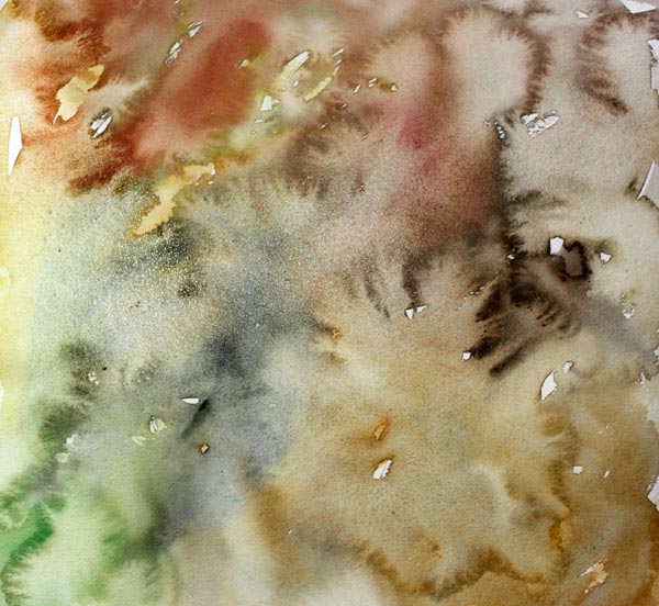
I often start with watercolors because they cover the paper quickly. Even if I have the idea of creating some surface structure, I wanted to use watercolors first to get into the mood of uncontrolled splashes.

While waiting for the watercolors dry, I mixed some acrylic paint. Pastel shades like many impressionists used to choose. 
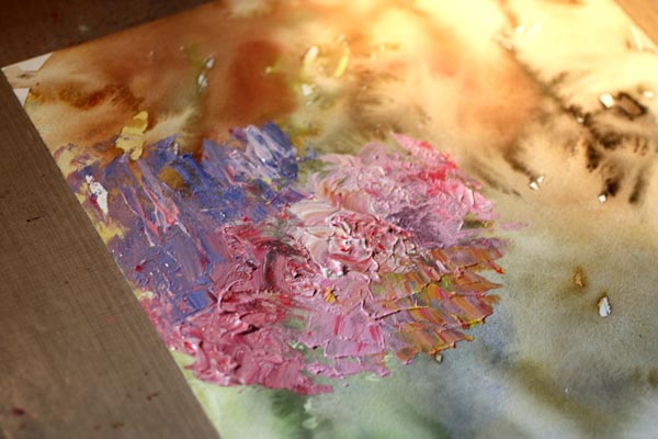
To get some interesting texture with the paint, I used a palette knife instead of a brush.
After playing a little with the palette knife and thick paint, I became clueless of how to continue. It’s important to recognize these moments. If you are not aware of these, your rational side takes the control and decides to do things you really cannot justify. Like: “Let’s use the rest of the paint to cover the surface evenly.” Or: “Let’s get some other colors and splash the paint here and there.” When you feel that you do not know what to do, don’t do the obvious. I might browse some pages of the book again to get back into the mood. Or change the media, the solution that I made this time. I doodled something not so important with the colored pencils just to realize I wanted to continue with watercolors and a thin brush.
When I got bored with colored pencils and watercolors, I opened the jar of fiber paste. Even if I often prefer to stay with the basic art supplies, fiber paste is something I like. It not only creates an interesting texture like watercolor paper, but it also works like a watercolor paper. You can paint over it with watercolors and create beautiful details to your work! 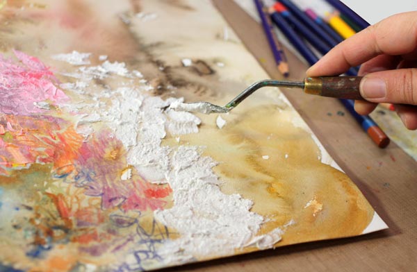
Trying to achieve distinct variation in the surface texture, I used the palette knife again.

Then my mind was empty again, so I browsed few pages from the book again and then continued with colored pencils.

When I reached the next point of frustration, I decided to change to the watercolors and work with high speed. Working fast helps to get creativity flow.
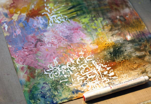
Once the paper was covered all over, I started adding details. A white correction pen is great as it usually works on any surface.
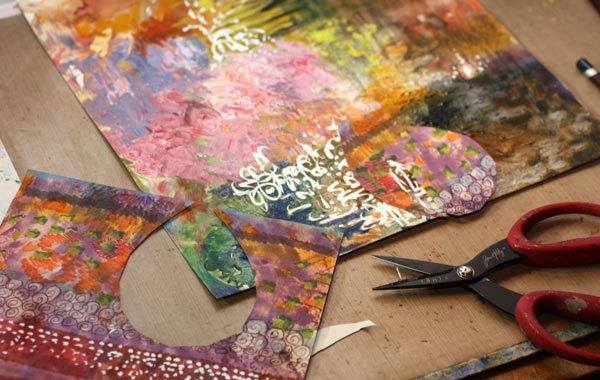
Hand decorated papers are great for details. I picked some of my prettiest papers and began to cut them. The paper shown in the picture isn’t that great as an artwork, but it’s versatile for collages as it has a lot of variation.
Finishing
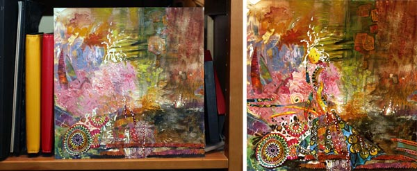
I felt that it was time to begin finishing the work. It is always useful to stop and think. I often put the artwork somewhere where I can look at it, like on the nearest bookshelf. Then I step away and try to figure it out where to lead the viewer’s eye. Here’s another step where you should not question your trust: It will be great! You just need to connect some dots and find the lost pieces of the puzzle. Like I did when I realized that there is someone in the picture. I added the faces and made the rest of the character more visible. Then some tiny adjustments to the composition and after that, the work was finished.

I think that this piece is aesthetically very much my style, but the impressionistic approach to the surface structure makes the work interesting.
Never underestimate the power of layering: this is my favorite detail, the white area showing the blank watercolor paper. It was created in the first phase, and it still exists in the end. If I had done the obvious and filled the paper with each media layer by layer, this little detail would not exist. So, cherish each stroke and trust your creativity! Focus on the feeling, not to the result! You are allowed to feel like a world-class artist even if you know you are not. Fly to the world of imagination!
This might also interest you: – Stretch Your Artistic Style
Let me be your mentor in art: Subscribe to my weekly emails!
How to Mix Colors?
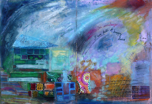
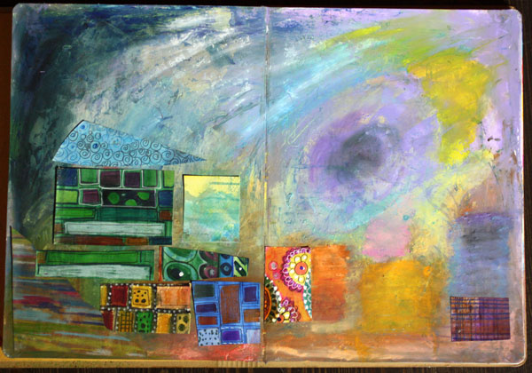
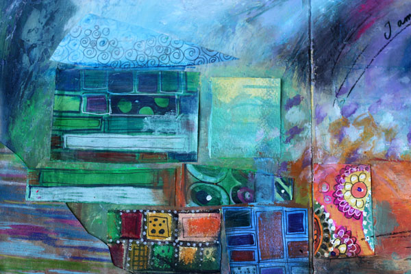
Here’s an art journaling page that I made to show you the gentleness of pastels and the strength of muted, darker shades. I often see art journaling pages that have a potential to be awesome, only if the color palette would be more unified! Meaning: only if the artist would have mixed the colors instead of using them straight from the tubes.
Choosing Color Combinations
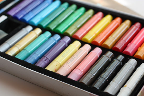
Here’s the problem: we are pampered with many great colors by the art supply manufacturers. Like the colors of my Faber & Castell Gelatos, they look so pretty!
Still, you can pick colors there that won’t look so great together. Those colors have no common base color. Like the bright red, blue purple and mint green shown below. They have nothing in common. The bright red is a primary red; blue-purple is muted with black and mint green is muted with white. If you take out the mint green and mix the red and blue- purple, you can get a better combination. The brown, which is the mix of purple and red, ties the two colors together.
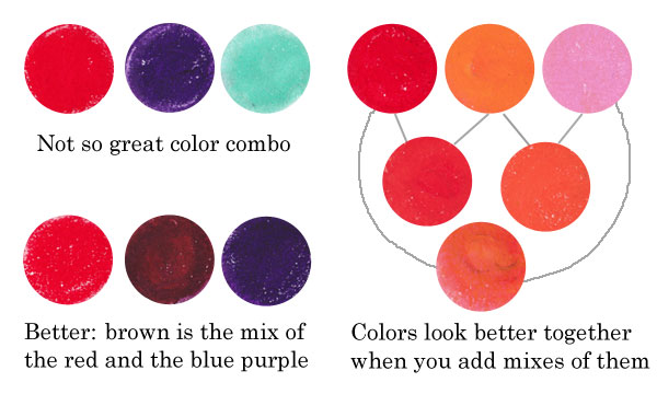
Similarly, if you use only red, orange and pink straight from the box, they look more separate than if you also use the colors that are mixes of them. Like parents and children, they form a unified color family.
Another example: the colors that have a common base color, like the pastels below, suit well together. You can also mix them without fear: they produce lovely combinations. If you don’t want grays or muddy browns, avoid mixing contrast colors together. The contrast color pairs are red and green, blue and orange, yellow and blue-purple.
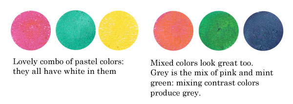
Sometimes people are afraid of getting grays and browns, and so they avoid mixing any colors. But those muddy colors make the brighter colors pop. See how muddy colors support the other colors in the art journal page that I made.
Playing with Tints and Shades
 One reason to mix colors is to get more natural, lively look. If you look at any photo, you can see a lot of colors there. The variation of light causes the huge amount of colors.
In the late 19th century, there was a genre of artists called impressionists. They were inspired by the daylight. They wanted to focus on the light, not on the objects themselves. If you are afraid of mixing the colors, look closely at Claude Monet’s Cliffs at Etretat and count the various tones there!
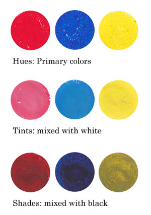
Instead of using primary colors like basic bright reds, blues and yellows and mixes of them, I encourage you to play with tints and shades: mix white or black to the primaries and get softer colors!
Using Faber & Castell Gelatos
When I began creating the art journal page, I chose to use gelato sticks with acrylics and hand decorated papers. I decided to use the background that I had made weeks ago, as its pastel colors reflected the cheerful mood I was having.

I like to create backgrounds when I am tired or uninspired. Then, when I start creating, I feel that I am already half done. When using various supplies in each layer of a page, I will get more variation in color without extra effort.

Faber & Castell Gelatos look like lipsticks, and they have similar kind of waxy feel. You can dilute them with water, but I think the greatest way is to mix them with a paper towel or soft sponge.
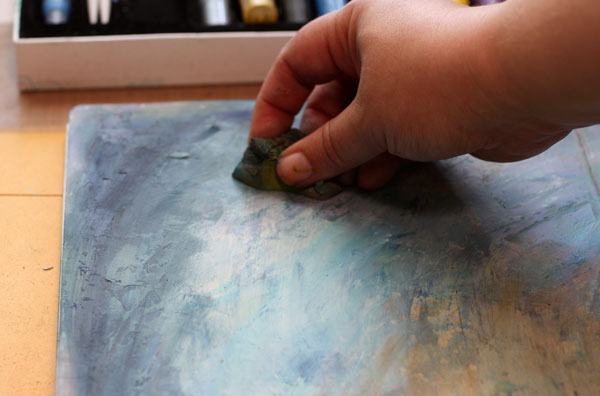
Gelatos work great on a painted surface. Notice that I created color mixes with slight variation in darkness. I used both tinted colors (mixed with white) and shaded tones (mixed with black).

Repeating Colors
One more thing to consider: color repeats. I am very careful of not repeating the same color too much. In general, when the color is used only once, it represents an individual. If it’s used twice or three times and the areas are closely located, they represent a group. But if the same color is here and there or evenly spread, it is often just a mess. The rational side of us wants to create color repeats. But once the work is finished it does not look rational at all! One more reason to mix those readymade tones!
When I began to add hand decorated papers, I followed the same rule of controlling the number of repeats: not too much of the same paper.
Using hand decorated papers is a great way to add thin lines to a page. The gelatos have a waxy surface that can be difficult to handle with thin markers. For the journaling, I used Faber & Castell PITT brush pens.
To make the collage look more integrated to the page, I added color with Gelatos on the papers.
If I had to define art shortly, the definition would be: creating great color mixes and communicating with them. At least that is the step to take when you feel that the page you made does not represent what you wanted to create!
Read more about colors: Yellow, 5 Tips to Choosing Colors
Let me be your art teacher: Subscribe to my weekly emails!