From Movie Posters to Art Journal Pages
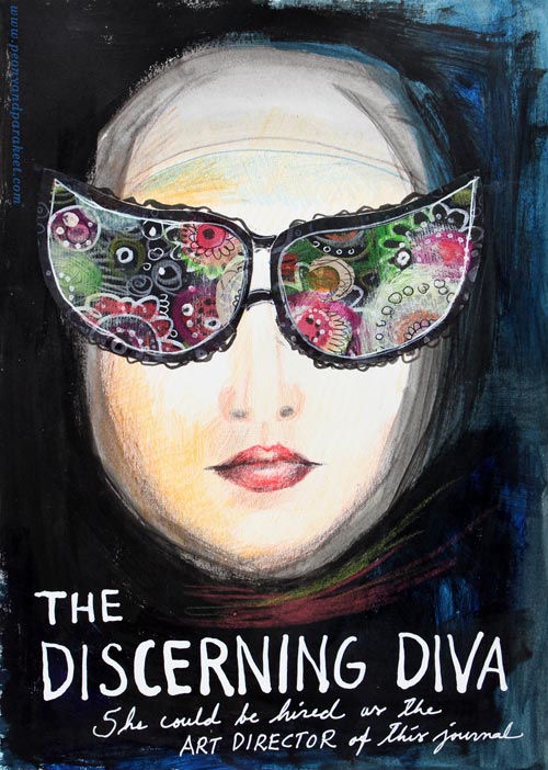
“The Discerning Diva – She could be hired as the art director of this journal.”
This page is my version of the poster for the movie “The Big Lebowski”. I have borrowed the concept of weird glasses and the composition from the poster, but it is still a separate artwork, not an exact copy.
The Discovery of Movie Posters
After learning that I like to use alphabet stamps in the art journal pages, I had been thinking about the next step in journaling. Last week I watched the poster artist James Victore‘s course Bold & Fearless Poster Design on Creative Live. His style has very little to do with mine, but I became fascinated by the visual concept of posters.
Last weekend I found a book about 1990’s movie posters at the local library. I became fascinated by the compositions used in the posters. Then it hit me: maybe I could replace the main elements with my own and apply the visual concept of the poster to my personal stories!
How to pick ideas from movie posters?
I will show you how to make your own “Discerning Diva” (very easy) but before that, I want to show you another poster-inspired page.

The page on the left is inspired by the poster for the movie “The Matrix”. I picked few main elements and the general atmosphere from the poster. The page on the right is made a long time ago, but I like how the two pages tell the story about being inside someone’s brain.
Four tips for picking ideas from the movie posters:
1) Composition: Examine the placement of the title, the grouping of the main elements and the most noticeable color contrasts.
2) Subject: Think about how your life could be applied to the movie.
3) Process: Examine the poster carefully but when you start creating, focus on your page and make it your own.
4) Imagine: Remember that you can replace the elements of the poster with whatever you like. For example, a person can be replaced with a vase of flowers.
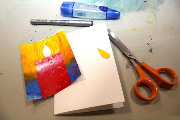
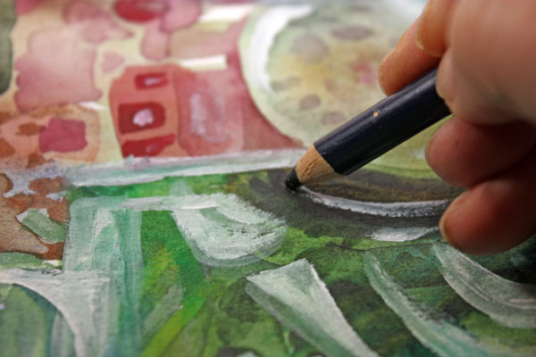
Create Your Discerning Diva!
1) Paint the background of the page.
I used acrylic paints to make the background strong and heavy-looking. Leave an unpainted area for the face. Add water to the paint and gently brush the area around the face. Wet strokes create the impression of a thin scarf and add dimension.

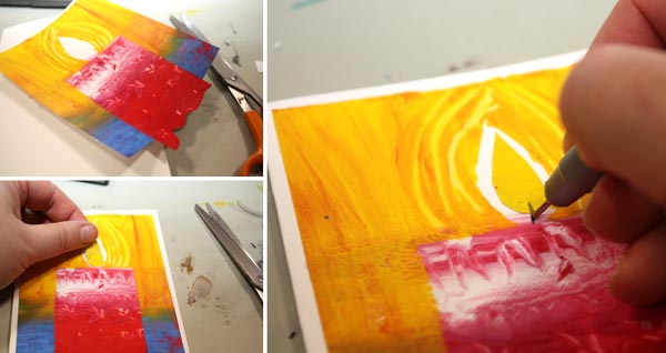
2) Color the face.
I used colored pencils to maintain the big contrast between the background and the face. Add some color to the skin. Draw a mouth and a nose.

3) Add glasses.
Go to your box of hand drawn papers. Cut two lenses. Attach with glue or gel medium. Add frames with pens. Make the glasses as decorative as you like!

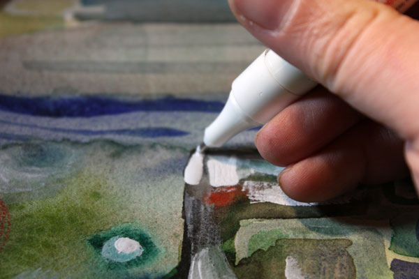
4) Add text.
Pick a color that has a high contrast with the background and journal on the bottom of the page. I have used a correction pen for the title and a white gel pen (Uni-Ball Signo) for the text below the title.

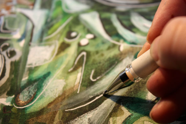
5) Add finishing strokes.
With colored pencils, add some strokes below the face to represent a scarf.
Add few strokes to outline the scarf near the forehead.
More Ideas for Compositions

Believe or not, this page is inspired by Austin Powers movie poster and hand embroidery! I think that hand embroidery has a lot in common with hand drawing.
Learn to draw from imagination and inspiration!
>> Buy Inspirational Drawing 2.0
Quick Gelli Christmas Cards

This year I had two requirements for the Christmas cards: quick and handmade! The theme had also been selected: candles, suitable for all religions and all ages. All I had to do was to figure out how to make a lot of cards and fast. This first photo is a snapshot from my studio while I was making the cards.
Planning
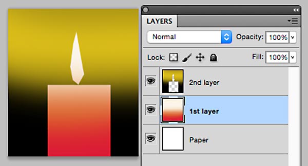
Before I got my table full of cards and more under making, I had to discover the process of creating the cards. My artistic side wanted something that looked handmade but was still somewhat warm and painterly. The task was transferred to my engineering side who turned on the computer and made a sketch of a single card in Photoshop. The card would consist of two layers of paint. Needless to say, using the Gelli plate would be handy!
But this plan was not enough. I wanted to create not only one card, but several at the same go. While walking the dogs, I solved the problem. Here are the step-by-step instructions of how to make simple candle holliday cards. You can make them more complicated by adding doodles and such but the basic design is very simple. By following these steps, you can serially produce handmade cards!
Supplies

You will need: Paper, glue, cardboard, acrylic paint in few colors, brush, brayer, scissors, black pen and 8” x 10” size Gelli plate.
Optional: Paper trimmer for cutting the straight edges. Some kind of a stick, a pallette knife or a knitting needle for example, for drawing surface patterns.Double-sided tape if you prefer that to glue for attaching the printed image to the cardboard.
1) 1st Layer: Candles
Paint the center of the plate. The width of the painted area is 5 to 6 inches of the height of 10 inches. You can cut a paper of that width and use it as a guide by putting it beside or under the plate.
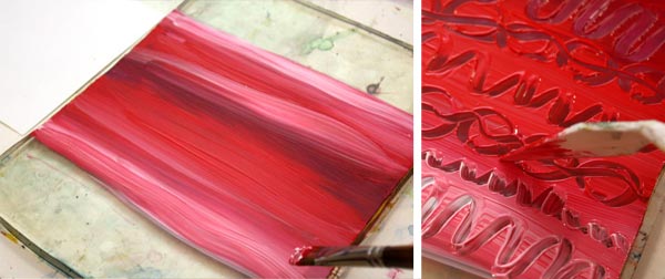
You can draw patterns with a stick if you like. I like to use more than one color to make the candles look lively. You can use brayer for the paint but I prefer to use brush and work horizontally. That way the candles will have horizontal color slides.

Cut your papers to the size of the Gelli plate before printing them. You will get 2 to 3 prints from the one layer of paint. Let dry.
2) 2nd layer: Backgrounds
While waiting the paint to dry, cut the masks for the candles. You will make four candles from the one print. For the four candles, you will need four rectangles, 2-3 inches wide and 5 to 6 inches long. Furthermore, you will need four flames. Fold a paper twice in half and cut one flame at the same go or enjoy your time with the scissors and cut the shapes individually.
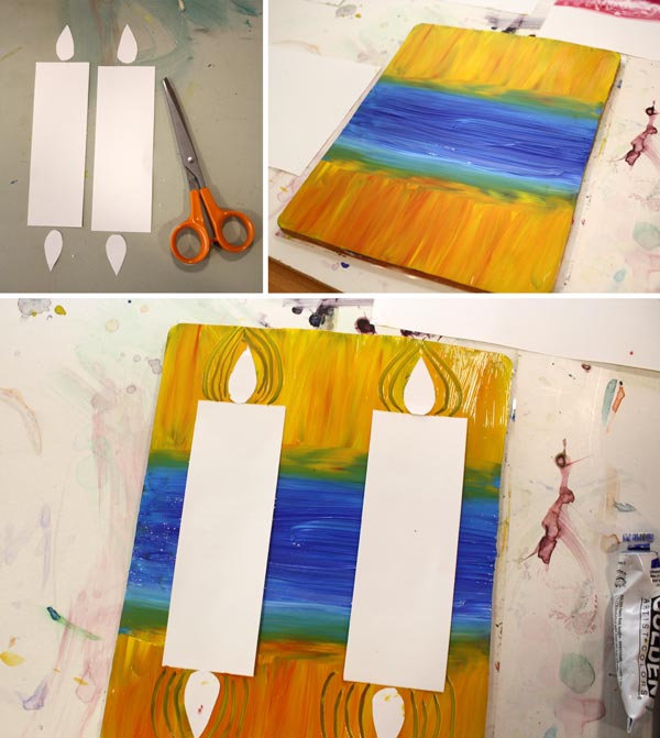
Paint the background with two colors. The center with a darker color (blue, black or green, for example) and the sides with orange yellow. I like to use color mixtures here too. Place the masks so that the distance between them is the twice longer than the distant from the edges. If you want, you can emphasize the flames by drawing lines around them. Make the prints. Let dry.
3) Cut the prints, save the flames
Save the masking papers for the flames. Cut the prints in four parts with scissors or with a paper trimmer.

In the third photo beside the trimmer you can see one alteration of this pattern: use Gelli plate in the other way and create an image with a several candles! By cutting various sizes of masks you get variation for your candles.
4) Finishing
Cut a small part of the background away from the both sides of the print. Cut curvy lines to the bottom edge of the candle. These will make the candle look like it’s set on the snow.
Attach the print to the cardboard. Glue the mask on place or color the center of the flame with a colored pencil or a marker. Draw a wick with a black pen.
5) Variations!
You can make all kinds of variations from the basic instructions. You can add the number of candles, cut them out and glue many candle on the same card, doodle on the candles etc.

I still have few cards to finish and one more task to do: Write “Merry Christmas” or “Hyvää joulua” (same in Finnish) on each one!
More holiday crafts from the previous years:
Wrapping Paper from Newspaper and Elegant Christmas cards
How to Imitate Glass with Paint
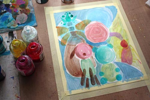
For this painting, I learned how to imitate glass. It is called “We Will Protect You,” and it’s about parents trying to protect their children. The parents have good intentions, and they do their best, but in the end, they have to let the child step into the world. I have painted two glass vases to represent the parents. The child sees the world through the parents, and even if they want to protect the child, they are fragile too.
Artistic Inspiration from Glassware
The idea for the painting began last Saturday when I went to the local library to get some ideas for the future blog posts. I saw the book called The Art of Glass. It was about Kaj Franck, a Finnish designer who was extremely skillful in designing glassware.
 Most Finns have Kaj Franck’s glassware. He didn’t design unique pieces only, but everyday glass as well. My most precious glass item from him is this red “Goblet” which was originally owned by my aunt. She passed away ten years ago, and the color of this Goblet reminds me of her vivid character.
After browsing few pages of the book, I knew I had to make something glass-related. It’s not the first time the glass has inspired me: see the collage inspired by Nanny Still, and I have also knitted a folk bag inspired by Oiva Toikka. Both Nanny Still and Oiva Toikka are Finnish glass designers as well.
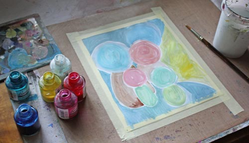
This time, I wanted not only to find out how to imitate glass but to explain it to you too. Before beginning the bigger painting, I painted few circles on a small paper and tried to make them look like glass.
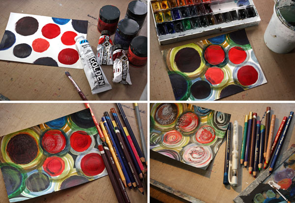
I used acrylic paints to paint the circles and then watercolors to add more circles around the previous ones. The shapes were softened with colored pencils. Then I added white with acrylic paint and a gel pen, and black with a PITT Artist Pen.

I made each circle a bit different. I was not fully satisfied with them, though. The center circles were too solid in color. I decided to start the bigger painting with watercolors as they are easier for making transparent layers.
8 Tips on How to Imitate Glass

1) Paint several transparent layers which intersect each other. Use a lot of water to create thin layers.

2) Use a lot of hues and shades of the same color. Mix colors to get new tones which have slight differences from each other. Use small spots of other colors too as glass reflects its surroundings.

3) Paint geometric shapes like circles, squares, half-circles, and triangles.

4) Add white with acrylic paint. When painting the white shapes, soften one side of them by adding water.
5) Use a black colored pencil to add dark near the sharp edges of white areas. Make the dark areas soft too.
6) With correction pen, add brilliant white to highlight parts of the white areas.

7) Add jet black with a black marker (I used a brush tip PITT Artist Pen) to make dark areas pop as well.
8) Finish with thin lines using a gel pen and a black marker. It will make your glass look a bit thinner and more elegant.

What kind of glass do you like the most? Does mimicking materials interest you too?
Let me be your mentor in art: Subscribe to my weekly emails!
Create Pastel Softness!

This time it’s all cute! I had the feeling that this blog is getting too serious. Don’t get me wrong! I want serious, I love serious and hope that you do too! Still, behind all good art, there’s a big portion of imagination. And the best way to embark that imagination is to play a little!
Pastel Colors in Teddy Bears

So I asked my teddy bears if they were willing to help me with this post. And they responded: “Yes, sure!” When I interviewed them, they reminded me that there are two big factors in cuteness: softness and pastel colors. “My friend is a black teddy and he does not get so many hugs as I do”, said Apple Blossom. Pink Princess continued: “It’s not just the color, but it’s the fluffy softness that’s important too!” And then they both agreed that the huge nose and strong eye contact make a teddy even more successful.
Pastel Colors in Old Scrap Pictures
Then I showed them the old scrap pictures that I had found from an antique flea market some years ago.

“Oh yes!”, they giggled. “If you want to create something cute, these sure are good examples! Round shapes make them look reaaaaally soft!”
India Ink and Circles
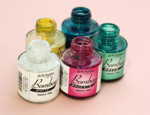
I picked up my India ink bottles (used also in the video blog post last week) and tried to think about what kind of soft and cute to create with them.
Then I remembered the round shapes. That could be the start.
So I painted some round shapes with pastel colors on a thin watercolor paper. While painting, I noticed that to get beautiful pastels you need to use a lot of white. Sometimes adding a lot of white can create hues that lack softness if the base color is cold. You can fix that by adding some yellow or a tiny portion of black. Speaking of soft and white, meet another teddy of mine called Niamh …

I am not a big fan of white but who could not love the color after seeing her!
Clustered Shapes
Back to the painting: Small shapes were added near the large ones to create cute creatures. I made some large shapes form the part of the background. More shapes were painted to made creatures more interesting.
I made the shapes look dimensional and detailed with colored pencils.

Finishing
I finished the painting by adding more details and sharpening them with a white gel pen and a thin tip black marker. As a final touch, I added white acrylic paint on the face of the biggest creature. It lightens up the work and makes a great contrast with the black. Namely, if you look at the scrap pictures and the teddy bears, the black color makes pastels look so soft and bright. Small black dots here and there on a pastel colored circles can be enough to create a page that’s all soft and cute.

So, why not have a go: create a pastel colored art journal page to soften the hard world!
Let me be your mentor in art: Subscribe to my weekly emails!