
What Acrylic Colors to Buy?
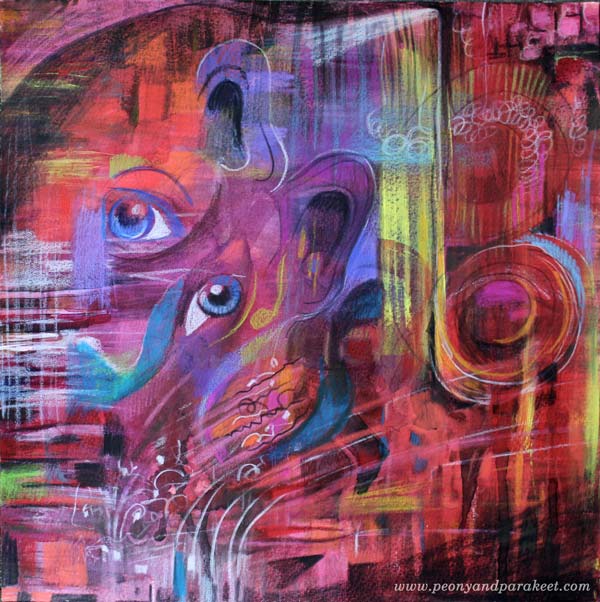
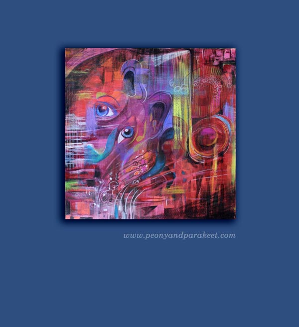
This is a very practical blog post but let’s start it with my recent artwork, called “Tosca.” It is inspired by Giacomo Puccini’s opera. I went to see the opera last week and it was an experience that I wanted to communicate visually. The drama has always appealed to me and the contrast between the most beautiful sounds and the big emotions, often agony, was unforgettable.
Before the evening at the opera, I had just realized that I need to buy some more acrylic paints. I had run out of almost all the basic colors. I love Golden Heady Body Artist Acrylics, so I went to a local art supply store to get some. I know there are lists of what colors you should buy when buying the basics, but as my selection is a bit different, I thought I might not only share it but also give some general guidelines of what acrylic colors to buy. These can be applied to colored pencils and watercolors as well.
Guidelines that I Follow when Choosing Acrylic Colors
1) Always buy basic white and black. They give contrasts and are great for color mixes.
2) Never underestimate the number of yellows you need. I use yellows for everything. I love the color itself, and use it a lot for color mixes as well. I often make a mistake of adding too much another color with yellow and then I need to add some more yellow to get the right tone. So I need a lot of yellows!
3) Warm and cold tones of each primary color are usually enough. I don’t buy browns and greens unless I find a specific tone that I fall in love with.
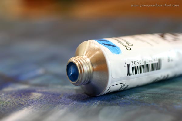
4) Always include some personal favorites. When I open the box where I store the tubes, I want to become happy. Cerulean blue reminds me of the time when I painted icons. I think of the sky when I see it and it makes me feel creative and happy. Whatever the current color trends are, cerulean blue always feels great. When I buy colors, I think about creating as an experience and don’t just focus on what is generally recommended.
My Basic Collection of Acrylic Paint Colors
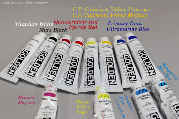
Basic Colors:
1) Titanium White – because it’s basic white
2) Mars Black – because it’s basic black
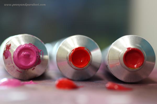
3) Quinacridone Red – because it is great for mixing pinks and purples
4) Pyrrole Red– because it’s fiery and pure warm red
5) C.P. Cadmium Yellow Primrose – because it’s ideal to get beautiful greens but it is still a strong pigment, not a mix
6) C.P. Cadmium Yellow Medium – because it’s the most beautiful warm yellow I know
7) Primary Cyan – because it’s basic and more affordable than many other blues
8) Ultramarine Blue – because I have used to using it for decades
Extra Colors:
1) Medium Magenta – because I like pinks
2) Hansa Yellow Light – because it is an affordable extra yellow
3) Cerulean Blue Chromium – because it makes me happy
4) Manganese Blue Hue – because I like turquoises
I also have some special effect tubes, for example, gold and silver and some odds and ends. The more I paint, the more I rely on basic pigments and don’t like to spend money buying color mixes in tubes or jars.
A Red Day
Sometimes one color seems to be more appealing than the others. This happened to me last week; it was “red red red” that I thought all morning.
Even if I had the new tubes and all, I started with watercolors and 12-by-12 inch watercolor paper. Playing with water is so liberating!
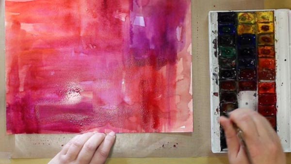
Then I changed watercolors to acrylic paints and turned the music on.
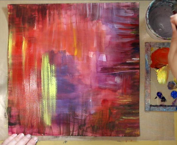
Puccini’s Tosca was playing in the background but as I had not visited the real performance yet. So I put this away to wait for the more detailed insight.
Colored Pencils Make the Details
A couple of days after seeing the opera, I was ready. I continued with colored pencils. They are wonderful art supplies. They are brilliant with watercolors, but they are ok with acrylics too of you create thin and even layers.
Subscribe to my weekly emails! Get a free mini-course Loosen Up!
Drama and Contrasts in Art
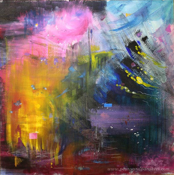
This is my latest painting called “Counterforces”. The idea for this came from the books that I have read recently. They are Outlining Your Novel and Structuring Your Novel by K.M. Weiland. I picked those books, not because I would be writing a novel, but because I want to understand more about drama and how to bring it to visual art. With self-expression, I aim for describing scenes and experiences rather than static figures. I want to experience the drama while I am creating and show the drama in the result as well.
Create Contrasts and Suspense – Watch the Video!
I recorded the process of creating the painting. While creating, I tried to bring as many contrasts as possible to the painting. The most memorable moments in our lives often include some drama – countering forces or feelings.
Let me be your mentor in art: Subscribe to my weekly emails!
Art Journal Doesn’t Have to Be Perfect
Every time I buy a new blank sketchbook, I get the feeling that I should not make a mess on it. But then, my art journals are meant for maintaining artistic inspiration, and messy making is part of that too. I often create pages in many phases and my art journals are never perfect in a way that they would have high-quality art all over. But I think that the imperfections make the books more approachable and more inspiring.
On this video, I show pages of my two Moleskine sketchbooks. If you are new to art journaling or would like to introduce this wonderful hobby to your friend or relative, share the video!
Let me be your art teacher: Subscribe to my weekly emails!
A Natural Approach to Creating Art

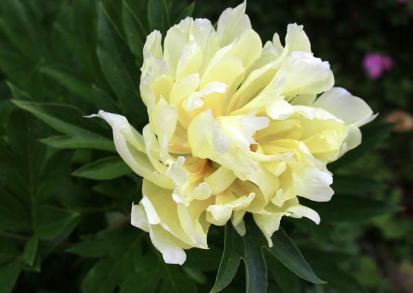
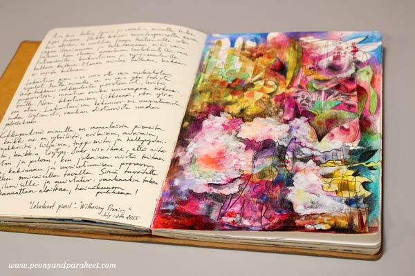
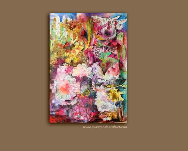
My latest art journal page is called “Withering Peonies.” What I love most about peonies is that they are always graceful and brave, whether they get ready for blooming or withering, whether it is late autumn or early spring. They are living in the middle of the continuous transformation, and it’s always enjoyable to watch them. They seem unique and individual; even every flower looks different from each other.
No Fixations, Just Painting and Doodling
When watching peonies, I think about the word “natural.” To be able to grow as artists, we need to learn to express ourselves naturally. Like peonies bend towards the light, we should bend towards our inner thoughts and feelings. So when I began to create the artwork, I did not think about anything particular, not even about peonies.

I started with acrylic paints and a palette knife creating thin spots of color using a restricted color palette. Then I changed to a drawing pen and let it move freely, without any fixated thought.

I believe that we suffocate our creativity when we have fixed images in our minds. We get disappointed if we cannot copy the images exactly on paper. But then, the fixed image is often imperfect, impossible to copy. It is more like a collection of visuals, a movie or an emotion that is not very detailed. If we fixate on that, we turn away from what is natural.
Moving forward is natural. It’s natural to let thoughts flow freely and add more colors and layers.
More Mixed Media
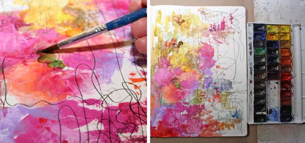
I used watercolors for some areas.
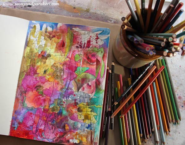
After watercolors, I worked with colored pencils.
A Theme Emerges
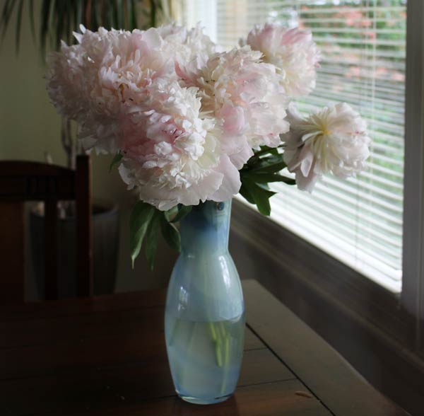
While coloring, I saw peonies emerging on the page and I remembered the peonies that were put in a vase to save them from the rain.
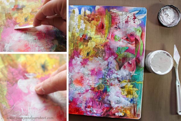
When peony flowers mature, they will lose their color. That gave me the idea to take some gesso and rub it on the surface of the piece. First with a palette knife but then with fingers, to soften parts of the edges.
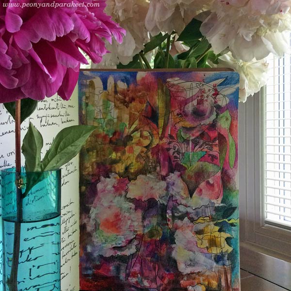
Finally, I sharpened some details with a drawing pen and made some color areas clearer with colored pencils.
Journaling
Writing thoughts after creating an artwork feels natural too. Drawing or painting is not only a technical process, but it’s also a way to process thoughts.
The Natural Approach
Withering peonies can be a symbol of letting go. When you open yourself to art, something beautiful might disappear. But it is so exciting to see what else will appear – naturally!
Subscribe to my weekly emails – Get a free mini-course!