Drawing a Summer Ornament
This week, I want to show that an ornament can be more than just a decoration. An ornament can be a framework for expression in the same way as a portrait, a still life, or a landscape.
I love drawing ornaments. It feels as though the universe is shouting at me: “This is right, this is a good thing!” If I’ve had past lives, I’d think this is the work I’ve always done in some form, because it feels so natural.
Step 1 – Grid
If I decide to draw an ornament, nothing holds me back—not even the requirement of symmetry. This time, I made a grid to help me achieve similarity on both sides more easily.
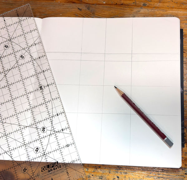
It’s good to have center guidelines, but there can be more and placed anywhere. All guidelines are helpful when drawing the ornament freely.
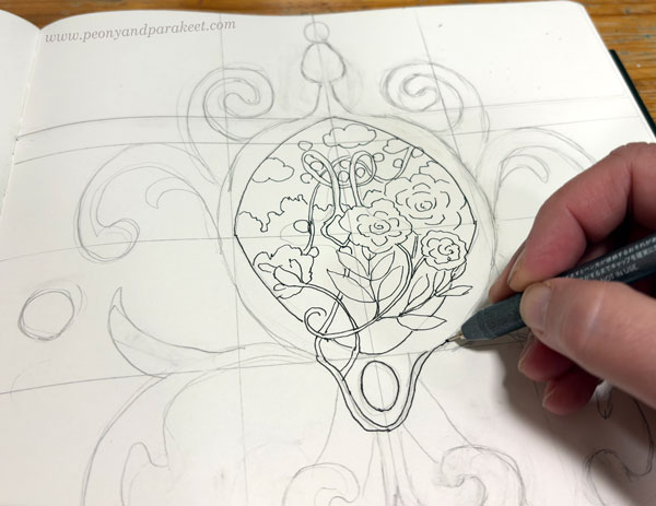
Step 2 – Pencil Sketch
I sketch the biggest symmetrical parts in pencil. But I try to keep this phase short because the best part of drawing ornaments is letting loose and discovering how the symmetry can be broken.
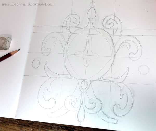
Drawing an ornament is like putting your soul into a lion’s cage and then watching it break out with cleverness, rather than violence.
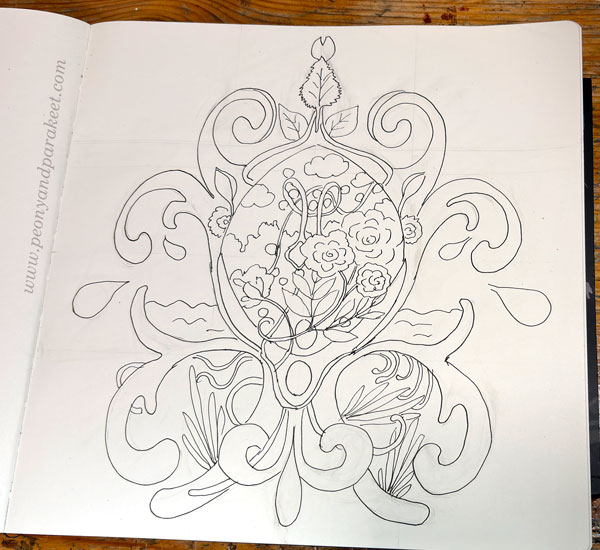
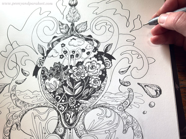
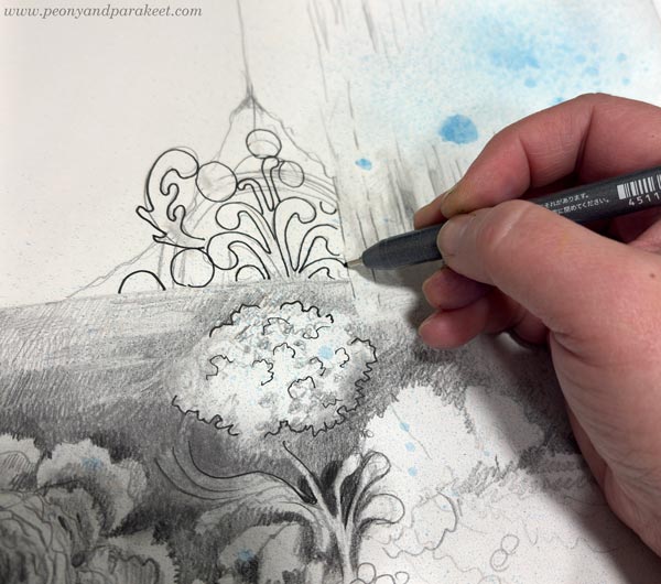
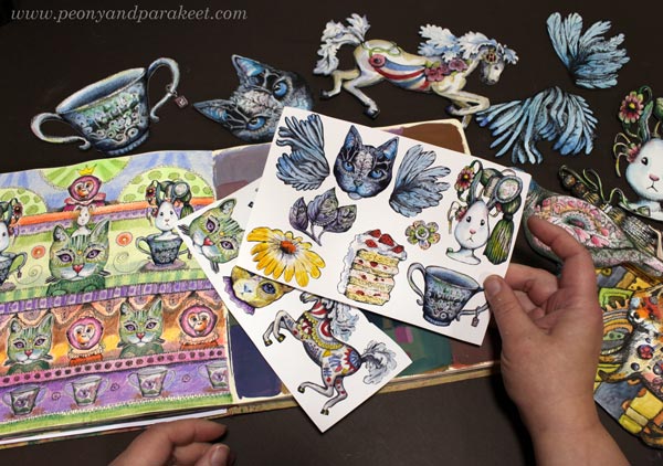
Step 3 – Getting Creative with a Non-Erasable Pen
For the actual drawing, I use black markers. Here, I’m using Copic FineLiner pens and a Copic Gasenfude brush pen. An ornament is like a meandering canvas where you can draw anything. You can draw both the realistic and the abstract, and it all looks great because it’s embedded in the ornamental structure.
We currently have summer here in Finland, so I wanted to draw summer-related things: the sea, a garden, and birch leaves.
Step 4 – Getting Lost in the Details
When I have most of the things in place, I put on an audiobook or a talk show and focus on the details!
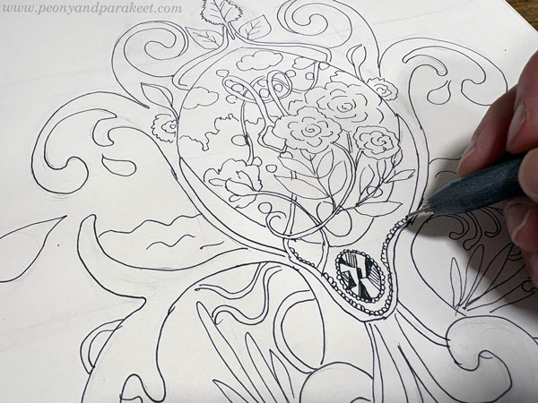
My ornaments almost always have jewels because I find them fun to draw and the result rewarding. A jewel comes to life when you draw geometric shapes with a fine pen and fill them differently.
I always include elements that are pitch-black to create contrast. The brush pen is quick in these details.
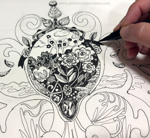
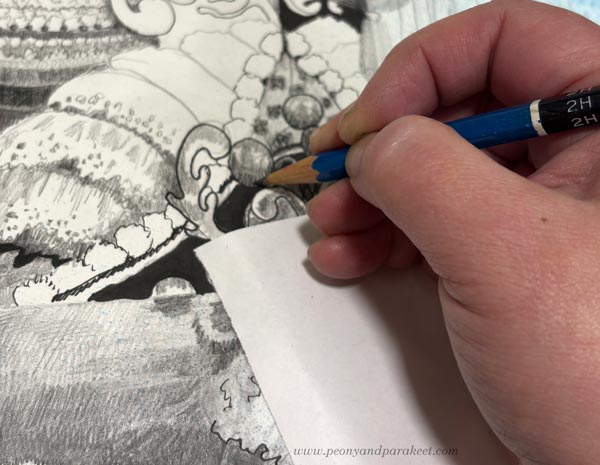
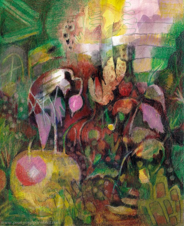
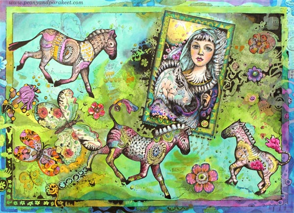
The Freedom in Drawing Ornaments
The longer I draw, the more I want to create tension and asymmetry. In this ornament, the lines took on a life of their own and spread beyond its borders. Ah, so liberating!
It’s exciting and even contradictory that such freedom can be evoked from a rigid ornament.
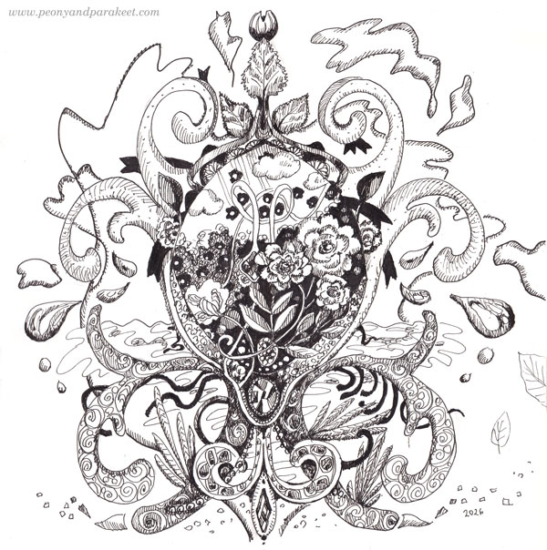
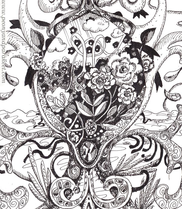
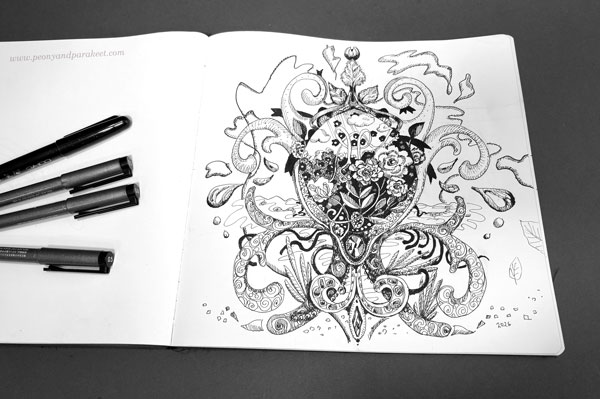
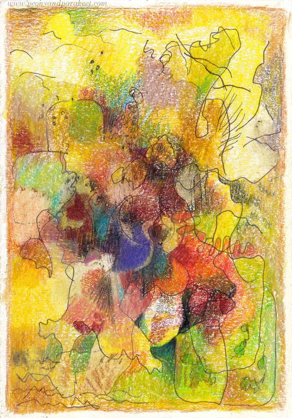
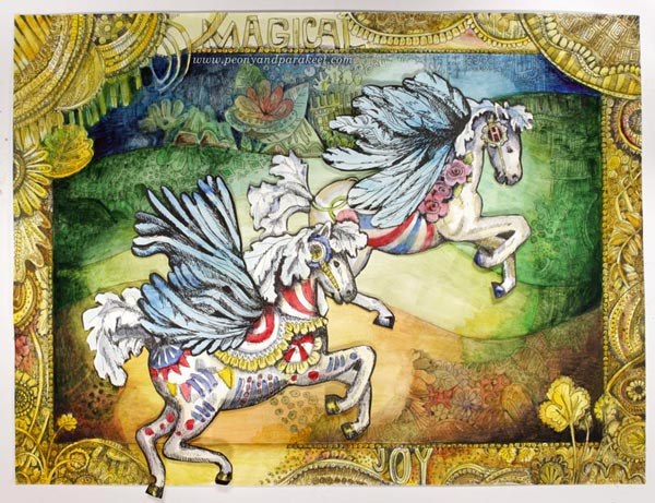
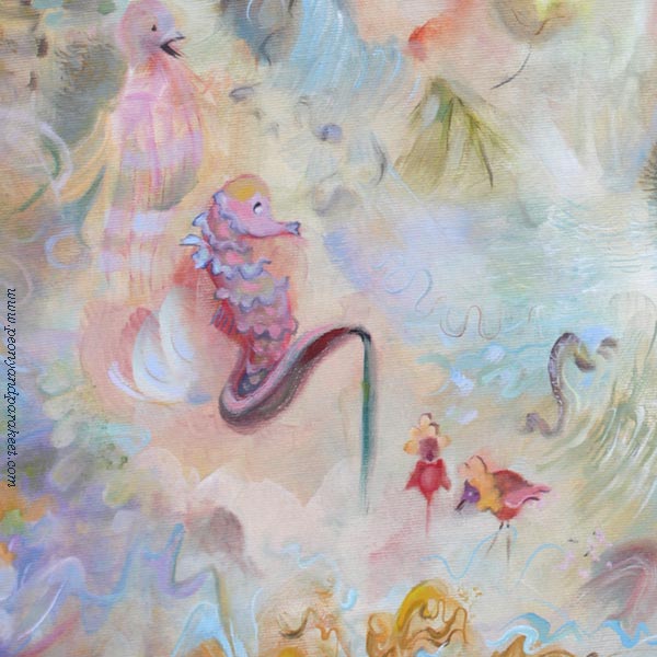
The Summer Ornament
Here you can see how I’ve used the pens for the fine details in the center.
I hope this summer ornament inspires you to pick up your pens and start drawing!
For more inspiration, see also these blog posts:
What Tsubaki Stationery Store Taught Me About Making Art
I listened to a wonderful book. It was like a refreshing rain pouring straight into my heart.
The book is new and by the Japanese author Ito Ogawa. Its Finnish title is Paperikauppa Tsubaki, and it is also being released in English as Tsubaki Stationery Store (Amazon – affiliate link, Goodreads)
Tsubaki Stationery Store
The book tells the story of Hatoko, who has inherited a small paper shop from her late grandmother. It isn’t a sticker shop, but a very minimalistic one. Additionally, Hatoko offers handwriting services. For Hatoko, “beautiful” isn’t a static concept. Case by case, she carefully considers not only the message itself, but also the shape of the letters, the paper she chooses, the writing instrument, the envelope, and even the postage stamps.
You absolutely must read this book.
Refreshing Rain
I loved the book so much that I wanted to make a drawing about its impact. It started by spraying some ink.
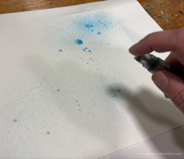
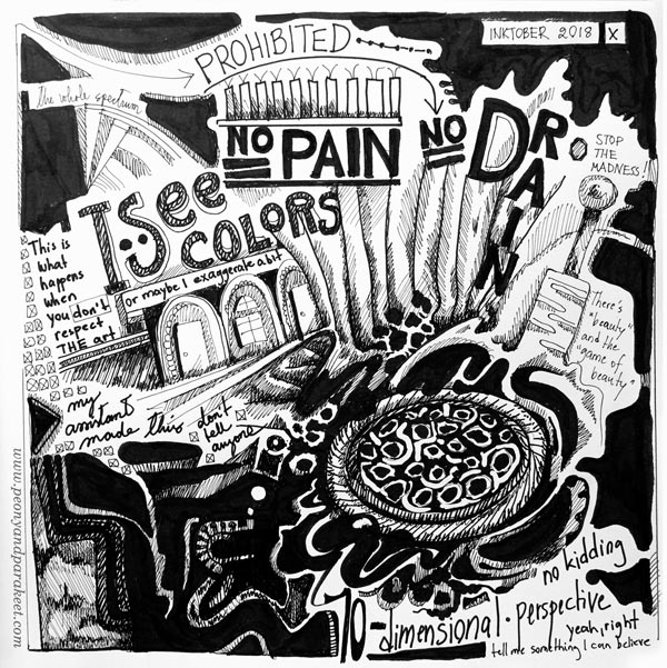
I got the idea of spraying ink when browsing the pages of my sketchbook. See this blog post from 2019: 10 Black and White Art Techniques with Personal Stories
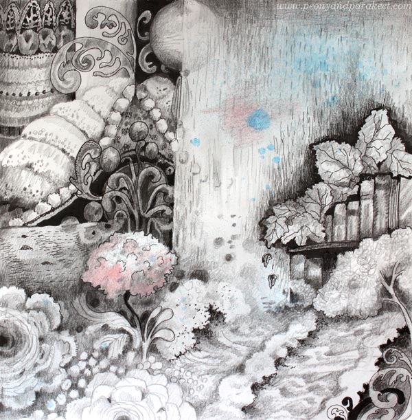
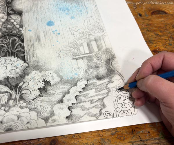
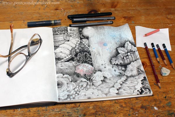
I then made the drawing with pencils and ink pens (Copic brand).
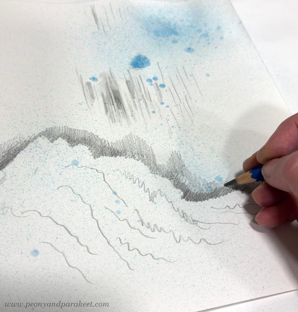
I started with graphite pencils.
And then introduced black ink pens.
When I wanted to have something darker or more clearly outlined, I used the ink pens. The pencils were for softer greys and shadowing.
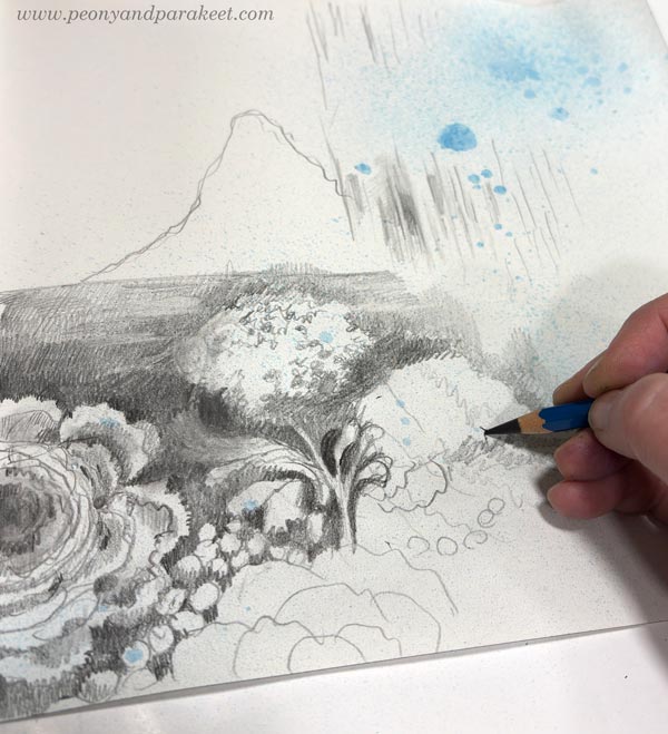
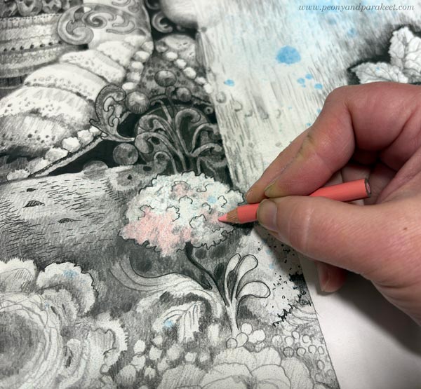
A piece of paper under the hand protects the drawing.
I wanted the drawing to grow freely and express the impact that the book had on me. The last step was to add a little color to the central flower.
Here’s the finished piece again. I had so much fun drawing the waves. When I draw, I try to follow the principle: “Draw what you love.”
This is about my inner world getting the refreshing rain from Ito Ogawa’s wonderful book.
Simple and Small Can Lead to Better
Tsubaki Stationery Store made me think about how simple things can become when we stop ignoring the basic truth.
You see, this spring I have been thinking a lot about how I could make better paintings. It has felt like a complicated question. Just breaking down what “better” means takes time. The choices feel big, as if I were standing at a highway junction in the middle of this constantly changing, chaotic world.
But Ito Ogawa’s book brought me back to a small street. A series of small decisions that naturally follow each other can overcome grand choices. At its best, that is exactly what drawing is about, too. One thing leads to another, and only small adjustments are needed to take the drawing to the next level.
Tiny Things in Practice
Instead of this week’s small drawing project, I was actually planning to show you a much bigger one – a painting called Ikigai. I have been working on it for a couple of months now. But after listening to the first few chapters of the book, I realized that the painting isn’t finished yet. The book helped me to see small fixes that would make the painting “better.”
Now, Ikigai needs to dry before I photograph it. You will see it in a week or two.
But in the meantime, let’s keep drawing!
Artistic Line Drawing – What Do You Think About This Course Idea?
To me, all visual art begins with drawing. When you want to get to know yourself, draw! When you want to develop as an artist—say, as a painter—draw! To draw is to think. Make your lines come alive, and gradually, a whole new world will emerge, even on a small piece of paper. That’s what artistic line drawing is about.
Black drawing pen and colored pencils.
Past and Present Drawing Courses
In most of my courses, drawing plays some role. Free and artistic line drawing is especially close to my heart. In the past, I have taught two courses on the subject: Inspirational Drawing and Inspirational Drawing 2.0. These are already retired. Of my current courses, Mystical Minis comes closest to these.

Passion For Teaching Artistic Line Drawing
For some time, I have wanted to offer more help with line drawing. Not just how to draw, but also how to alter the process to take it in a more artistic direction. By “artistic,” I mean moving beyond the conventional and creating something that is both personal and at least partly abstract. I want to speak especially to those of you who want to create freely and push your boundaries—both in how you think and how you create.
Watercolors and colored pencils.
At first, I thought the material I had gathered over the past few months would be just for these blog posts. But as I have started to unpack the topics, I find myself wanting to share more than what fits into a single post—to show things in both theory and practice. So, I’ve started developing a new course, under the working title Artistic Drawing.
Artistic Line Drawing – Course Themes
Here are the themes I have selected for the upcoming course:
- Ways to Start a Drawing: I want to help you explore how you begin. You can approach your drawing like an architect, building a clear structure first—or like a gardener, letting everything grow from a single seed.
- Letting Go: If drawing does not make sense and feels directionless, letting go can be difficult. I want to give tips on how to feel free and draw anything without too much inner resistance.
- Interaction: I want to help you notice the possibilities of interaction in the creative process. This is about both how you speak to yourself and how you work with drawing. For example, a line you draw can invite another line to join the conversation.
- The Scale of Shapes: An impressionist draws in a pixel-like manner, placing tiny dots one after another. An expressionist creates larger, vector-like shapes. I want to help you use both approaches and find the combination you enjoy most.
- Presence: At its best, your drawing radiates presence. I want to help you become like a singer who doesn’t just go through the notes, but pours their whole soul out to the audience.
- Clarity: You can begin a drawing with plenty of elements, but towards the end, it is worth striving for clarity. I want to help you discover a minimalism that is not based on scarcity, but on the ability to pick the essential.
- Sense of Style: I want to help you find the things you want to add to your drawings, and the ones you want to get rid of. It is not just about developing a style, but also about developing your sense of style.
Which of these themes interests you the most? What else do you hope to be included in the course?
Can Playful Art Be Serious?
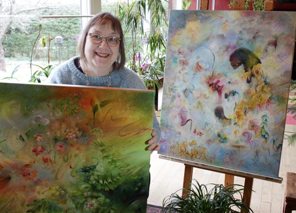
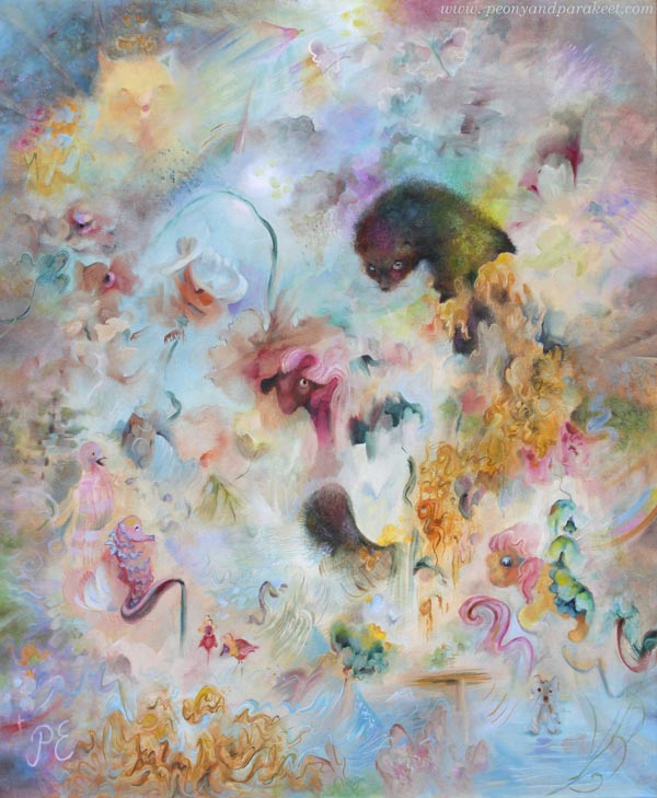
This week, I want to talk about my newly finished painting titled Fauna. This is one of my most peculiar pieces, filled with strange ideas. With this, I want to challenge us to ponder the question: Can playful art be serious?
Ideas Have a Mental Age
This painting combines many ideas. I tend to come up with all sorts of ideas quite easily, and I usually try to categorize them: some make it here to the blog, some become sketches in my planner, and others turn into courses. Only the most mature ones are usually included in the paintings.
But let’s think about this word: mature.
Ideas have a mental age. Some ideas are like those of a five-year-old, while others contain ancient wisdom. For a long time, I have tried to ensure that my best ideas are “sensible adults”.
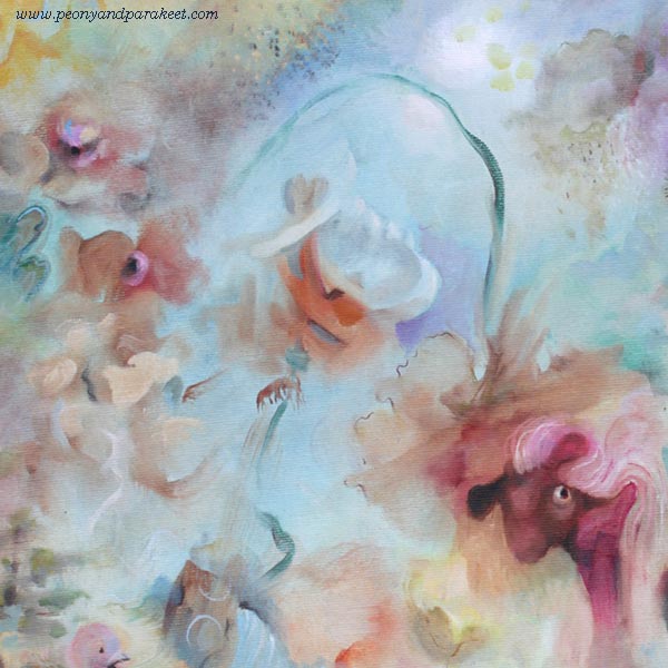
Fauna’s Ideas
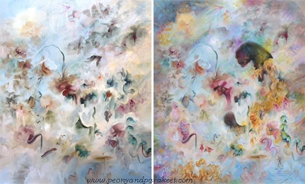
Fauna started from an old idea: the Baroque style and historical ceiling murals. So I thought that the painting could feature flowers and have plenty of light blue. Here’s how it started:
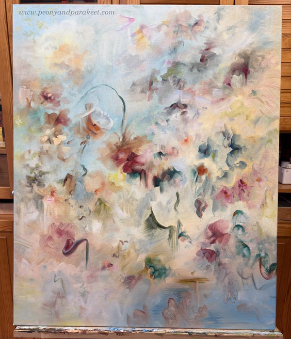
But then I heard my inner child whisper that I should include an animal: “Fur is so wonderful to paint. Let’s include something like a ferret!” The adult me wondered, “Who would want a painting featuring a weasel?” But you know, some ideas are like tiny butterflies that appear and vanish in an instant, while others are like moose that take over your entire mind. And this was a “moose idea.” It wouldn’t leave me alone, so fine —let there be a weasel of some kind!
But what else could be included?
Words help when I am brainstorming. I read through various word lists and wait for the moment my intuition says “Bingo!” That’s how I found the word “hunaja” – honey. I thought about the intricate swirls of the Baroque style and the way honey drips, and I boldly added them to the painting.
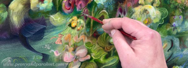
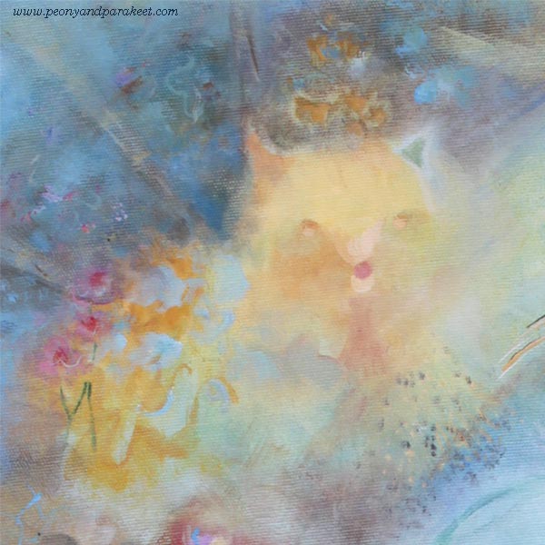
Here I am painting the fur. I use not only short strokes, but also paint small patches with different tones. Layering is the key!
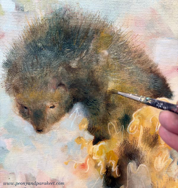
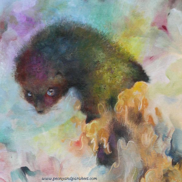
In the final version, the fur is softer and shorter, and lit by a rainbow. It took some time to decide whether the fur should be spiky or softer.
With the idea of painting honey, I found myself on a “mad path” where I stopped categorizing my ideas and challenged myself instead: could I create a painting that looks like a floral piece from a distance, but reveals a more playful character upon closer inspection? Could the animal theme lead toward animal figures—even toys? I wanted to achieve a purity of style that isn’t tied to a single era, but rather to my own way of dealing with shapes and lines.
Here you can see the beginning and the end side by side.
Playful Art – Drawing Animals
I have always loved animals and have drawn them a lot. Drawing with a pen is much easier than drawing with a brush.
Animal Inkdom and Magical Inkdom have been highlights of my course creation because, while making them, I decided to believe that everyone wants to draw animals. That mindset brought a lot of confidence and joy to the process, which also translates into the atmosphere of the courses.
I have had so much fun with all the animals drawn in those courses. My father used to draw with quite a similar technique, so I have continued on his path here.

The Playfulness is in the Details
Fauna is full of playful details. Many of them are quite subtle, barely noticeable. Here are some detail pics.
I see myself in this painting—all the versions of me at different ages, with ideas of all ages.
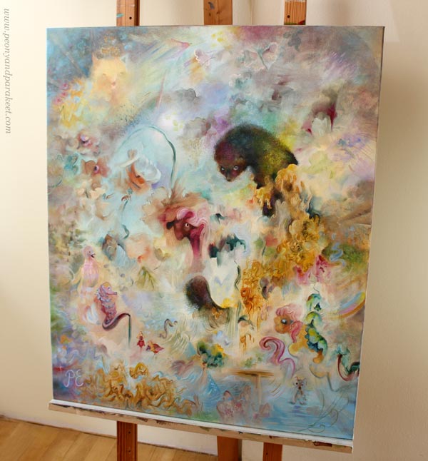
Even if Fauna was a challenge to create, it was also fun. I think I will create more of this kind of playful art.
Age of Ideas – Just Playing or Only Focusing on the Serious Side
This painting process made me reflect on how people who start making art often fixate on the “age” of their ideas. Some decide they are just having fun and playing. Others believe that skills—and thus art—can only be born through realism. But as artistic thinking and skills develop, there is an opportunity to combine the playful with the more serious. It is possible to be a child, an adult, and an elder all at once. Art doesn’t need to be narrowed down, because creating is a search not just for oneself, but for a broader understanding of humanity.
Fauna is a bit different from Halo – the painting that I showed last week.
See the blog post about creating this painting
See more pics and a video at Taiko Finnish Online Art Store
Which one do you like more – Halo or Fauna?