The Inspiring World of Details – Ideas from Uffizi Gallery
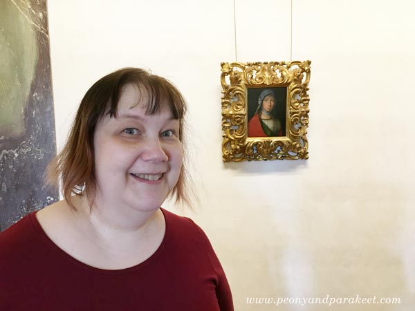
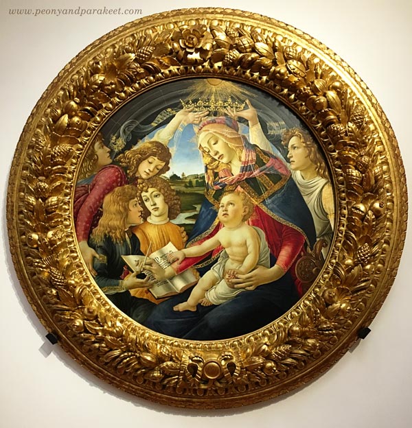
If you have followed my blog for some time, you know that this photo is very meaningful to me. It was a hot day in June when I visited Uffizi Gallery in Florence, Italy. The huge old building was filled with world-class art. But I wasn’t just going to look at the famous masterpieces like Botticelli’s Primavera or Birth of Venus. I was searching a small painting of Boccaccio Boccaccino.
Meeting Boccaccio Boccaccino at Uffizi
Boccaccino’s painting made my heart bounce when I saw it on Google at the beginning of this year. I made my version of it during the spring.
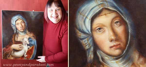
After finishing the painting, Boccaccino’s Gypsy Girl continued to fascinate me so that in June, I traveled to Italy with my husband to see the original painting. I tried to prepare myself for the situation that I wouldn’t see it. Sometimes museums lend paintings for other exhibitions or don’t have everything on display. But my journey wasn’t wasted: I got the chance to admire the painting, so tiny that I couldn’t believe my eyes. Namely, the whole spring I had tried to capture the gentle features for much bigger size, and it felt challenging!
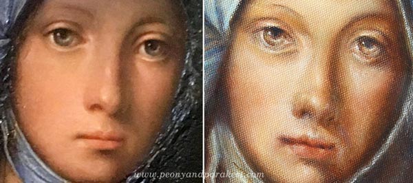
Now when I compare the details, I see many differences. My gypsy girl is not the same person than the original, but it’s ok. I feel that it resembles me and especially how I would like to be seen: gentle but observing, always protecting what’s precious.
Wouldn’t it be if I could tell my story to Boccaccio Boccaccino? I would tell him how I saw his painting on the Internet, in a big catalog that anyone can browse. I would tell him how I examined the images of the painting and painted a bigger version of it. He would probably wonder how I could afford for all the paints for the big version, and who had ordered such a large painting of a modest gypsy girl. “It’s just for me,” I would say, “this painting is so special that I don’t want to sell it.” “You must be a wealthy woman,” he would probably say and then continue: “Where did you say you come from?”. I would tell him about Finland, an area in the far north and show it on a map. Then I would tell him about airplanes. He wouldn’t probably believe anything!
But at the end, all I would like to say to him is this: “People from all over the world come to see your painting. They buy the ticket in advance. They queue. They sweat. They book the hotel based on its location. They take pictures of it. They examine them when they are back home.”
Isn’t that something any artist would like to hear?
More Uffizi – Some Ideas for Your Art Journals
1) Fresco Pages
Like any museum in Florence, Uffizi Gallery’s ceilings had a lot of frescos. The long hallways were full of illustrations.
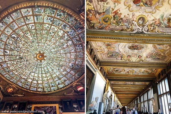
The round ceiling is so brilliant that I have to show you a close-up photo:
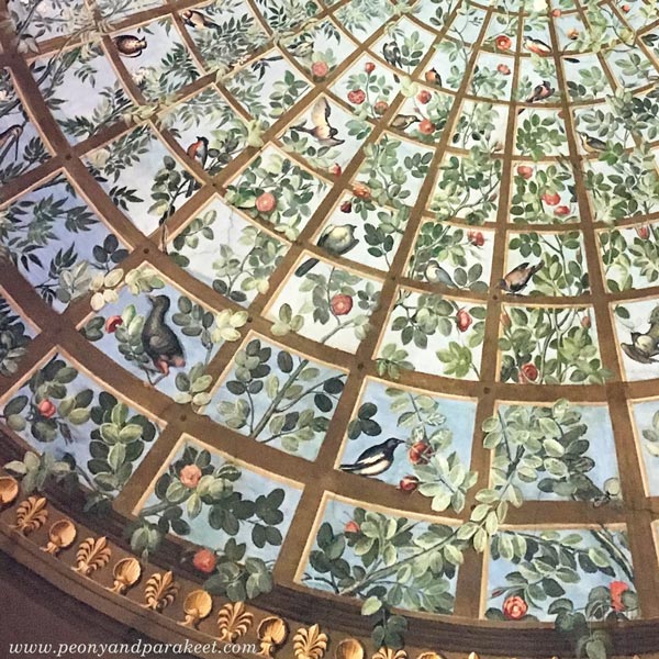
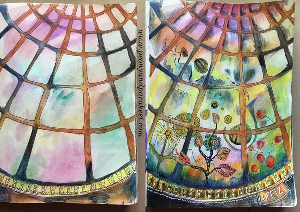
I love how the branches go to the back and to the front of the bars, and how the color changes in the background. It’s such a great idea that I also quickly recorded it onto my art journal!
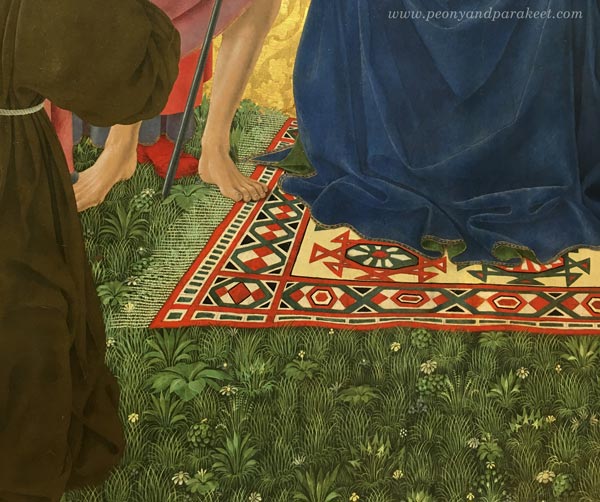
2) Delicate Patterns Filling Solid Areas
Another idea is to see the possibility of a solid or dull area. See how the grass can be more than just green color or green strokes. I saw quite a many paintings that had this:
3) Translucent Elements
I am fascinated by the number of veils in Renaissance art, and especially how they are painted.
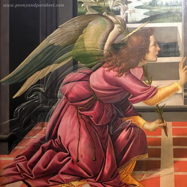
They are like abstract art if you look at them closer! See how the line changes in strength and how a little bright spot makes the fabric look shiny!
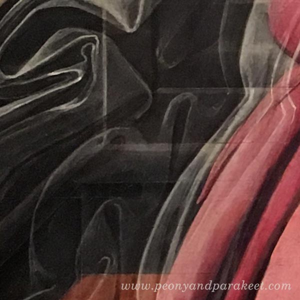
I also loved how the veil was painting in this painting:
Another idea: add stripes on those translucent elements!
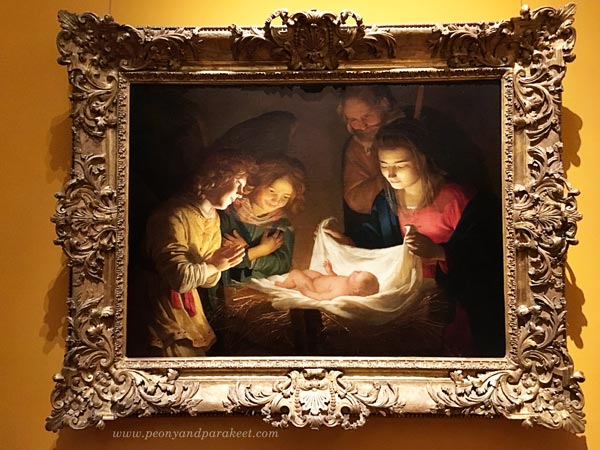
4) Light on the Center
I end this blog post with the simple idea that came from a stunning painting. Create a very bright element in the center and then add dark shadows around the painting!
As you can guess, it was an inspiring visit, and I could easily write and show more. Hopefully these inspired you, and hopefully, I will see you in the classes this fall.
Coming Up!
Online classes
Aug/Sept Collageland – a self-study class (textile-inspired collages)
Aug/Sept Inspirational Drawing 2.0 – available as self-study (drawing from imagination)
Oct/Nov Flower-themed online workshop (not your regular flower art class!)
Local workshops in Finland
Sept 9-10 Draw Freely – Piirrä vapaasti 1-2 (Suomeksi! – in Finnish)
Other news
I am planning to offer a free live webinar in September if I can just fit that into my schedule. Many have asked about my coaching program The Exploring Artist. I will rerun that at the beginning of next year.
Stay tuned and if you haven’t subscribed my weekly emails yet, subscribe here!
Paint Gentleness – Watch the video!

It’s the time for a video blog post! This week, I talk about gentleness and how you can experience that through a painting technique. I show some basic elements from the old masters painting techniques. In the past, artists painted with oil paints. For acrylic paints, the secret is to use glazing medium for thinning the paint. Have fun!
Let me be your art teacher: Subscribe to my weekly emails!
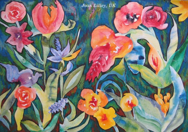
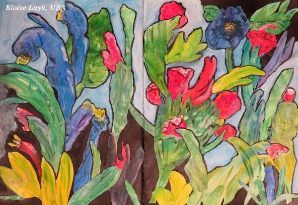
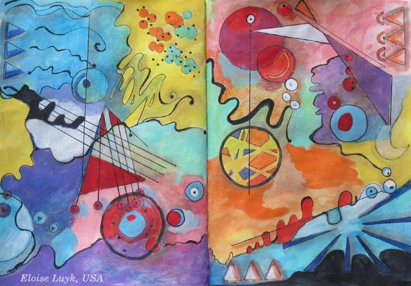
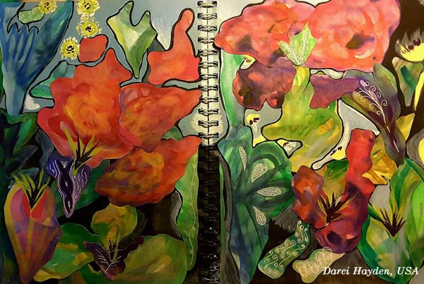
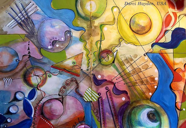
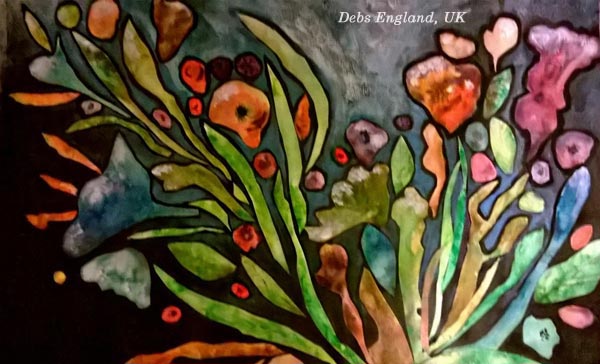
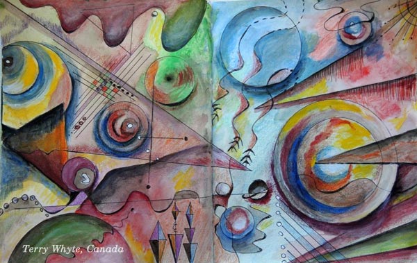
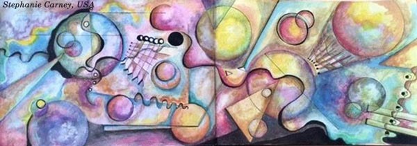
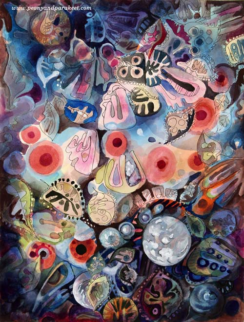
13 Prompts for Expressive Art – Illustrated by the Students of Peony and Parakeet

When you wonder what to create next, here’s a list of prompts for expressive art! Use these for art journal pages, drawings, paintings, mixed media, even for creative writing. The inspirational quotes from famous artists complement each of the short prompts. The students of Peony and Parakeet created the beautiful pieces that illustrate the prompts. They are based on the mini-courses “Botanical Discovery” and “Romantic Geometry.” These mini-courses are included in Imagine Monthly Art Journaling Class Bundle 2.
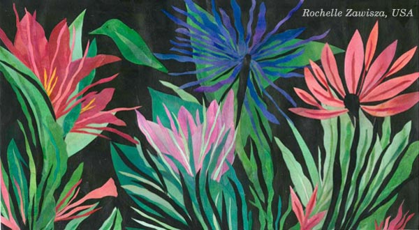
1) Living Colors
Claude Monet: “I perhaps owe having become a painter to flowers.”
2) Dreamy Sharpness
Rene Magritte: “If the dream is a translation of waking life, waking life is also a translation of the dream.”
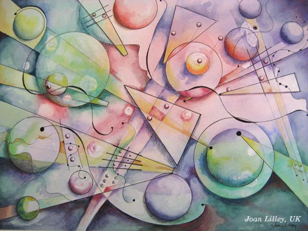
3) Speaking with Shapes
Vincent van Gogh: “The emotions are sometimes so strong that I work without knowing it. The strokes come like speech.”
4) Composition of Absurdness
M.C. Escher: “Only those who attempt the absurd will achieve the impossible. I think it’s in my basement… let me go upstairs and check.”
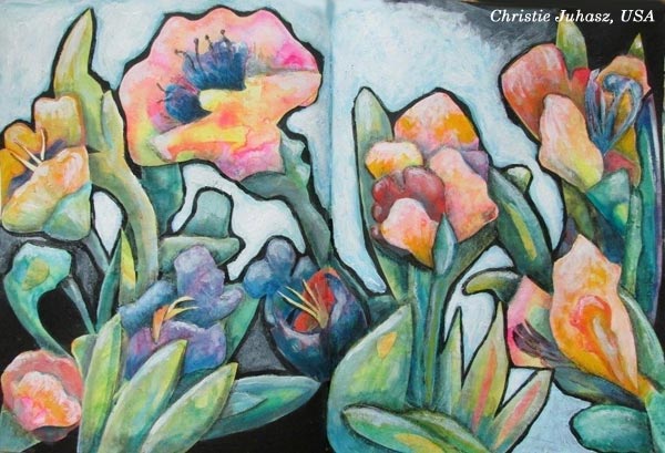
5) No Stereotypes!
Henri Matisse: “There is nothing more difficult for a truly creative painter than to paint a rose, because before he can do so he has first to forget all the roses that were ever painted.”
6) Bring in The Sun!
Pablo Picasso: “Some painters transform the sun into a yellow spot, others transform a yellow spot into the sun.”
7) Taking Flight
Michelangelo: “I saw the angel in the marble and carved until I set him free.”
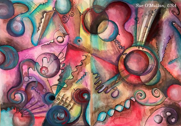
8) Blue Escape
Wassily Kandinsky: “The deeper the blue becomes, the more strongly it calls man towards the infinite, awakening in him a desire for the pure and, finally, for the supernatural… The brighter it becomes, the more it loses its sound, until it turns into silent stillness and becomes white.”
9) Nature’s Mystery
Francis Bacon: “The job of the artist is always to deepen the mystery.”
10) Colors of the Night
Vincent van Gogh: “I often think that the night is more alive and more richly colored than the day.”
11) Strong but Gentle
Paul Klee: “One eye sees, the other feels.”
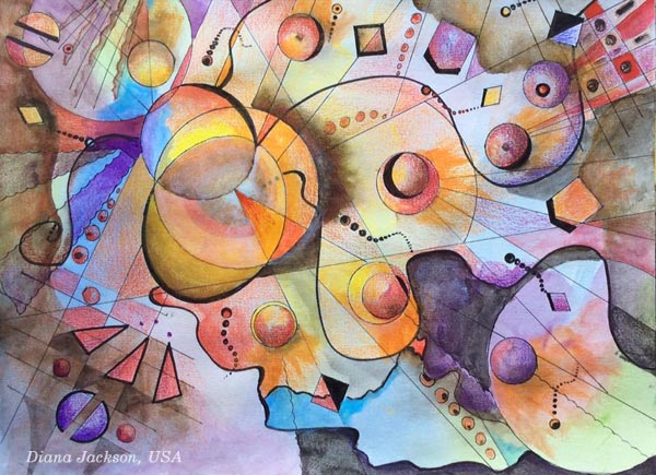
12) Explosion
M.C. Escher: “We adore chaos because we love to produce order.”
13) Panorama of Your Inner World
Wassily Kandinsky: “To create a work of art is to create the world.”
Buy Botanical Discovery!
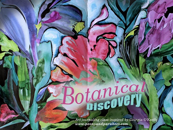
Georgia O’Keeffe: “I decided that if I could paint that flower in a huge scale, you could not ignore its beauty.”
Botanical Discovery is a mini-course inspired by the famous American artist Georgia O’Keeffe and botanical art. Create beautiful collages from hand painted papers – Buy here!
Buy Romantic Geometry!
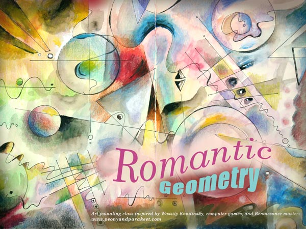
Wassily Kandinsky: “Everything starts from a dot.”
Romantic Geometry is a mini-course inspired by the famous abstract artist Wassily Kandinsky, Renaissance masters and computer games. It’s a journey through centuries and especially suitable for you who want to make your art more dynamic! – Buy here!
Let me be your art teacher: Subscribe to my weekly emails!
Mixed Media Painting Idea – Revisiting Your Old Style
Between 2010-2014 I was enthusiastic about decorative art. I called myself as a “decorative artist” and saw myself more as a designer than as an artist who focuses on expression. My upcoming class Collageland (thank you, everyone, for the feedback you gave in the last blog post!), is a retrospective to that period in my life. While editing the videos, I have been pondering about what inspired me back then and how it’s different from what motivates me now.
Some themes and styles often feel too familiar to me. They don’t seem to challenge me anymore, so I have moved on. But now it hit me how harsh it sounds and how unnecessarily harsh it sometimes also is. So when creating the pieces shown in this blog post, I gave myself permission to take it easy and get decorative. I also became curious about comparing my past decorative work with the pieces that I would produce today.
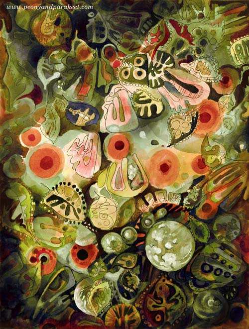
My comfort zone is getting inspired by design and translating that inspiration into art. So I made a mixed media painting that is inspired by the world of fashion, jewelry, lace, Renaissance murals, and botanical art. I call it “Lost and Found”. To embrace a designer’s approach to art, I also made two different color versions by processing the photo of the original artwork digitally in Photoshop.
Here’s Marine:

And here’s Botanical:
I don’t have many phase photos because I wanted to relax with that too but this is what I drew on my planner the previous day:

These quick sketches are the core of my creative process.
Another Painting with the Same Idea
I also made another design-inspired painting. The idea came from the ceramic art of the 1960s.
The photo below shows how the piece looked like before adding the decorative layers. Glowing watercolors remind me of the glazing used in ceramics. When this happens, I feel like I am a ceramic artist, playing with colors.
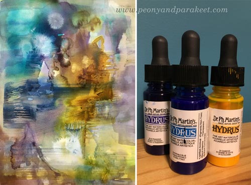
A student of mine kindly donated Dr. Ph. Martin’s Hydrus watercolors some time ago. First, I liked them, now I adore them. They are intensive and easy to use, and I especially love the coverage of white. I used Hydrus watercolors for “Lost and Found” too.
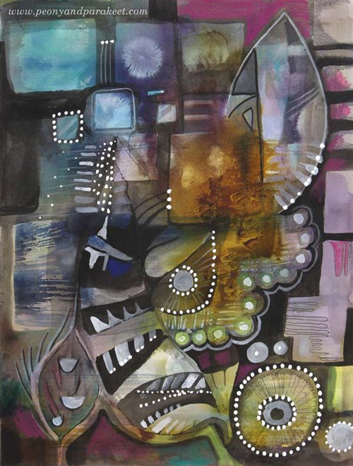
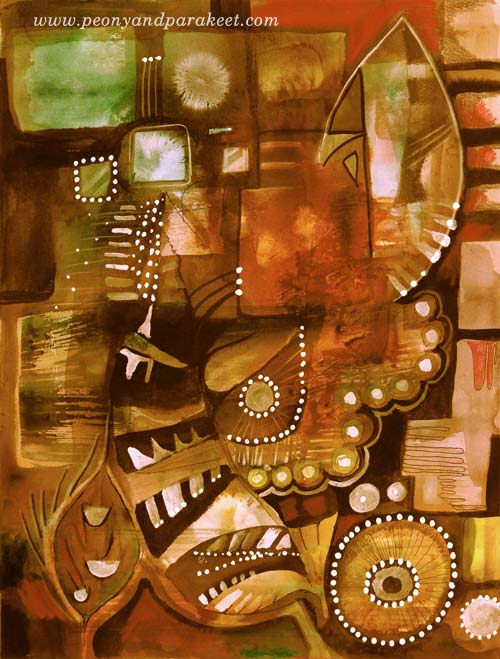
Here’s the finished painting called “Retro Living”. It is also a mixed media piece. I used colored pencils, PITT Artist Pens, and a correction pen for the last layers. I love these muted colors, so typical for the Finnish ceramics from the 60s. But then, I thought they might be too gloomy for many, so I made another version digitally that reminds me of furniture from that era:
Comparison
See my new gallery showing decorative art and designs from 2011 to this day. When I look at the newly-created pieces as a part of that collection, it looks to me like I have traveled a long journey in art. And I have – I just never thought that it would show in this decorative style as well. It makes me want to explore more of this and also, see exciting challenges in this direction too.
My challenge to you: Pick an old piece and make a new one using the similar techniques and style!
Let me be your mentor in art: Subscribe to my weekly emails!