How to Know when Your Artwork is Finished?
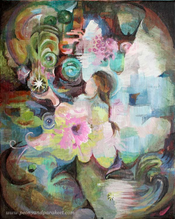
This is my latest painting called “Healing Power”. Painting this piece was so much fun so I decided to work with acrylics on a canvas. I’ll show you the main phases of creating this painting while giving my view on how to know when the artwork is finished.
Finished Artwork? – How to Analyze?
I have heard many bits of advice on how to decide when your artwork is finished. The worst is: “When you feel like it is”. Often you are just tired, fed up and that’s not a good point to finish. Take a break instead, sleep overnight and then continue!
Then there are more technical approaches like this one including infographics or based on historical studies and interviewing artists like this one. But as my students usually want to bring more content and self-expression to their art I have composed a simple and short check list focusing on those only. And instead of diagrams, I show how I deal with the issue in practice.
1. Do You Have an Opinion?
Every time I begin creating, I have pretty conventional ideas. Like here, I thought that I would make a flower painting and express “tranquility”. But to truly express tranquility, I show also include anxiety. I should have an opinion, a personal view on the difference between tranquility and anxiety.
Now you say: “But this is just flowers and nothing deeper”. I don’t think so. If you want to express yourself, you should express an opinion of some kind. This doesn’t mean you have to begin with an opinion. It’s more like vice versa: stay open to what is going to appear! But if you don’t have any more thoughts than “flowers”, “tranquility”, “pink”, you are not finished yet.
So while thinking about opinions, I got anxious and added some of it: brownish red!
Another way of asking this: “Does the painting have both light and darkness?”
2. Do You Have a Focus?
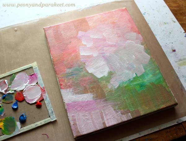
When I continued the painting, it felt good to add rectangular shapes on it. Then some more colors, then some directional brush strokes. But directional or not, I really didn’t have a clue where I was going. Maybe this could be a flower bunch and the white part on the bottom could be a pot. If so, I should make them more clear.
Another way of asking this: “Is it easy to know where to look at first?”
3. Have You Told a Story?
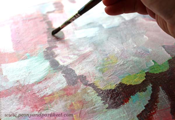
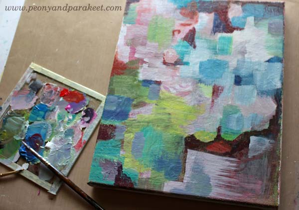
I continued the painting by turning the it upside down as it seemed to be even easier to build a pot with flowers that way. When I was at step 1 (see the image below), the painting was a bit too busy so I added dark thin layers to make it easier to look at (step 2). But then, what does this painting mean? Does it really connect with my thoughts? No, not really!
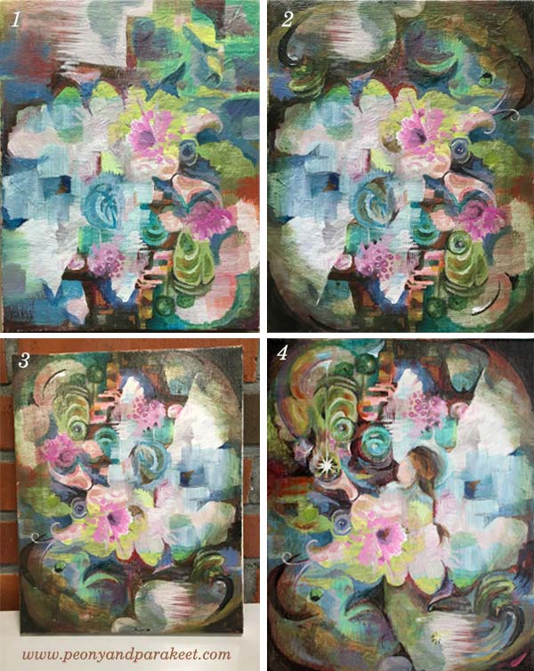
After a break, I turned the painting upside down (3). I saw a woman there, wearing a hat and taking care of the flowers. Maybe that could be a start for a story? I continued painting, trying to make the woman clearer.
Then it hit me: she was some kind of an angel, holding some kind of a magic ball. And finally: this is about healing, a subject I have been thinking a lot lately. My older dog Cosmo has had stomache problems and I have worried about him. I have also thought about many of my students, either in the middle of the sickness or having someone close to worry about. If only I could have the magic power to make everything what’s wrong, back right!
Another way of asking this: Does every element on your artwork contribute or lead to what’s most important?

This finished artwork is for you who would like to have that magic ball of healing power.
Let me be your mentor in art: Subscribe to my weekly emails!
What Artistic Direction to Take?
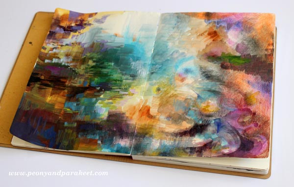
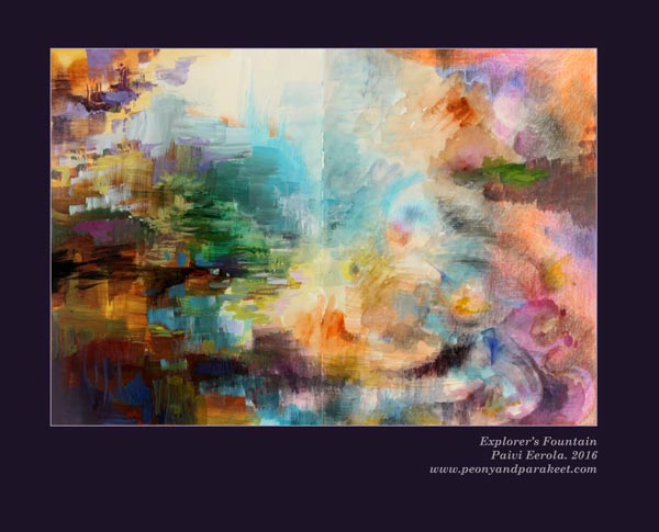
This is my latest art journal spread called “Explorer’s Fountain”. Before showing how I made it, I want to ask you the question that I have been pondering.
When Is the Beginning of a New Phase?
All artists have phases. But how to know when a new one begins? Is creating a continuum or are there certain points when you make the change? Or at least began to change?
I posted this image to Peony and Parakeet’s Facebook page with the text below, and I want to share this here too:
As children, we know what we love. I wanted to be an artist and a teacher. I wanted to write and publish books. I wanted to live with pets. When we grow up, there seem to be more possibilities, and still, they feel less. It’s not much to be a manager when you have dreamed to be an artist. This is how I have felt personally and this is why I think we should do what we have always loved. Because it feels more fulfilling than anything else.
Just recently, art has begun to feel more fulfilling and exciting than ever before. I feel I have new skills, even if I can’t fully point out what they are. I feel I have new thoughts but when I try to grab them, they seem to disappear. My mind is filled with new kind of artistic focus, and still, it’s like it has always been there, now I am just more connected to it. This makes me think that I am experiencing some kind of artistic change, moving from one phase to another.
The changing process is like a rain that starts with small drops. You can then decide whether you go back inside or get out and see what happens!
Learning from Practicing
Teaching classes have been small drops to me. As an art teacher, I see all kind of styles and seek solutions to many kinds of creative problems. I am often so excited about my students and their creations that my own art feels like a secondary thing. But while I have helped people to bring out the best of their skills and get more clarity for their creative direction, it has been a school for me too. It’s like I have got a gift from my students, being able to build my own focus in a new way. So while you have practiced, I have practiced too!
What’s Your Ambition in Art?
I have never understood the controversy between commercial approach and artistic freedom. I think we should search for the best audience to our art and find ourselves through the process. I know most of the people disagree with this. I do understand that many great art pieces wouldn’t have been born with this mindset. But my own ambition of being an artist doesn’t mean creating world-class art and being the greatest of all. I think art as a service instead of end result only. I want to understand how people experience art and develop ways to make creating as fulfilling as possible. – What’s your ambition in art?
Triptych Approach – Create with Me!
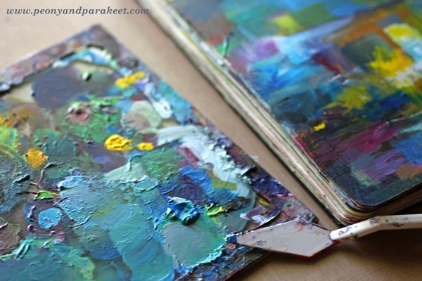
Instead of focusing on single artworks, I look for creative concepts and processes. Just recently I got an idea of a triptych. The piece would be created with three different mediums, each taking one-third of the final piece. But this triptych would have soft edges so that it would look like a one piece despite the three distinct elements. Create this triptych with me and while creating, ponder about your artistic direction!
1) Start with Colored Pencils
Color freely with colored pencils so that you fill approximately one-third of the page.
Add few small separate colored areas too.
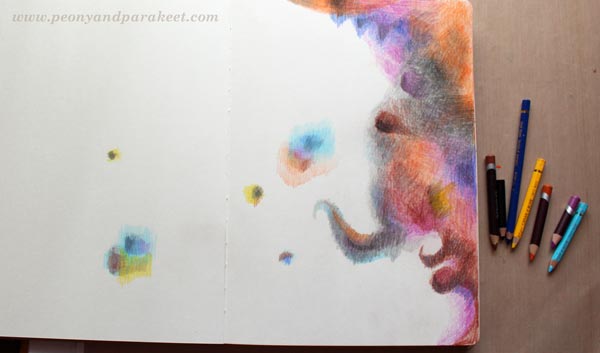
Using Old Pencils
I use Prismacolor and Garan d’Ache Luminance pencils “officially”. For example, all the images of the e-book Coloring Freely have been colored with them. But when I am making a quick spread like this one, I often grab some odd short pencils and use them instead of the fancier ones.
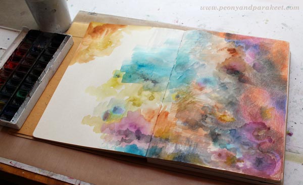
2) Continue with Watercolors
Change to watercolors and paint the second third of the spread.
Try to make the transition from colored to painted areas as soft as possible.
In the end, paint an area that is separate from the main area.
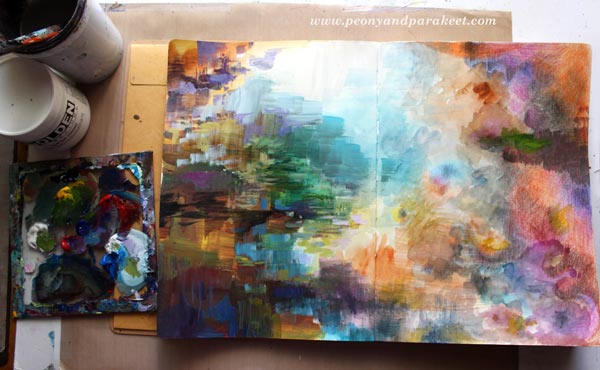
3) Fill the Rest with Acrylic Paints
Paint most of the remaining blank area with acrylic paint.
Add a small painted area on the right where you have colored with pencils. Acrylic paints can be used easily over colored pencils. Don’t cover too much, let every medium show!
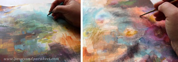
4) Finishing
Go through the whole page and fine-tune the spread with colored pencils and acrylic paints.
Add little details and nuances, don’t repaint the whole page.
Here’s is my finished spread again.
5) Use Leftover Paint
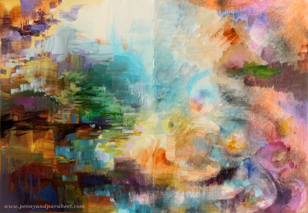
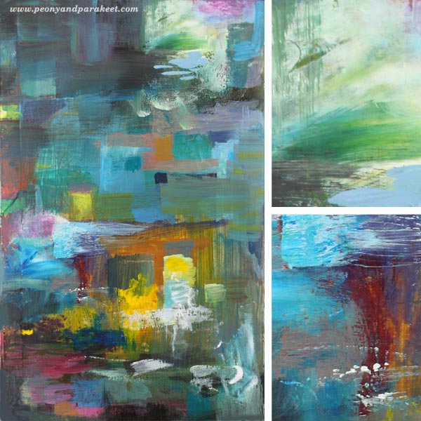
If you still have some leftover paint on a palette, grab a new page and create a quick abstract!
Here’s mine, called “House with a View”.
Analysing Artistic Direction
When thinking about artistic direction, it’s natural to analyze what’s good at the end result – what do you want to take from that to move forward. But it’s as important to think about the creative process and analyze that what felt good there.
After analyzing both ways, I think that my direction is this. I have always loved art history. I want it to show in my art but in a fresh way. I want to build bridges between old art created hundreds of years ago and today’s contemporary art. My latest art class Imagine Monthly already does a lot of that. But I also want to grow as an artist so that my personal expression grows stronger and so that I can reach more like-minded people with both my art and my classes.
Challenge yourself to find your artistic direction
Sign up for Imagine Monthly Fall 2016!
Mid-Century Modern Style for Art Journals
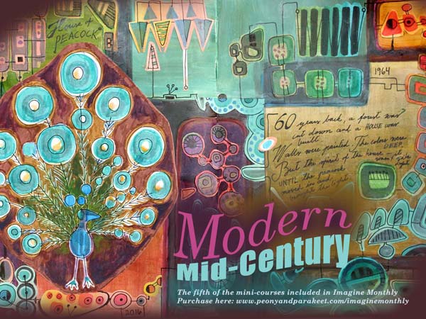
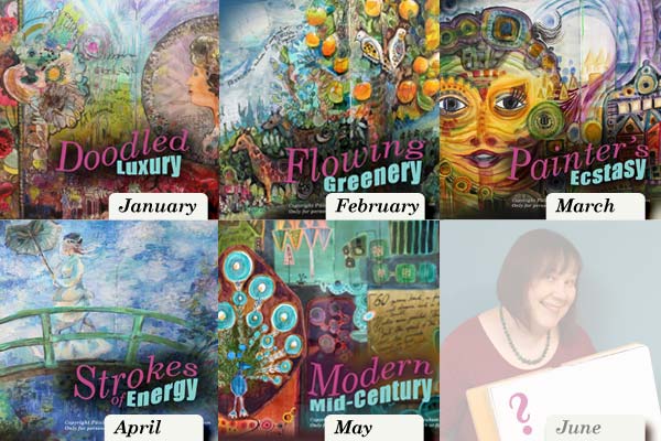
This spring, I have published a new art journaling mini-course each month for Imagine Monthly. May’s mini-course is called Modern Mid-Century. This mini-course is all about mid-century modern style. You can use it to create decorative art journal pages that are not only flowers and hearts but show a wider range of designs.
Discovering a Magic Formula of Mid-Century Modern
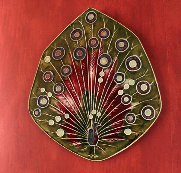
The main inspiration for the Modern Mid-Century mini-course came from Annikki Hovisaari’s ceramic Peacock (“riikinkukko” in Finnish). Annikki Hovisaari was a designer in the Finnish ceramic factory Arabia in 1960s. We have the peacock on the living room wall. I look at it each day, admiring. So much can be expressed with simple shapes and thin lines! The mini-course includes plenty of samples.
When I begin examining a new style, I try to see what’s essential there. What could be removed without changing the impression. And also: what could be added without loosing it. It’s like calculating a formula for a certain style. The secret is not trying to solve the whole big equation. It would be too difficult and highly argumentative. Even the experts of 20th century styles argue whether something is mid-century modern or not. I try to avoid that and just pick few of the central features. Then I focus on their relationship, forgetting the rest.
The best art classes give you ideas that you can expand and adjust to your liking. Whether you like mid-century modern or not, you can use the basic formula. With that, you can move forward towards your own ideas and aesthetics. This kind of conceptual approach will bring focus to more personal than to the style itself. Instead of trying to follow the style, you will be making new discoveries through it.
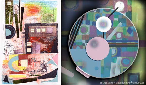
I made a couple of small pieces after finishing the mini-course. The first one, on the left below, is a birthday card made for my husband’s nephew. The second is a digital piece combining the idea of mid-century modern and the concept of a watch.
Create Your Own Mid-Century Modern Art
Sign up for Imagine Monthly! You will not only get Modern Mid-Century, but all the mini-courses published so far, immediately after the purchase.
Imagine Monthly also has a private discussion group at Facebook. It’s fun to see what everyone has created from the mini-courses. In the middle of the month, I also lead a discussion topic related to the month’s theme.
I believe that every art journal needs pages that are handpainted and handdrawn. It is joyful to browse pages that are more like illustrations than just layers of paint. With Imagine Monthly you will get new formulas for stretching your skills and discovering new techniques. Sign up now!
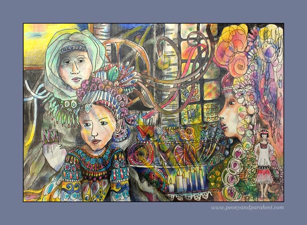
Bringing Life to Illustrations – Coloring the Air
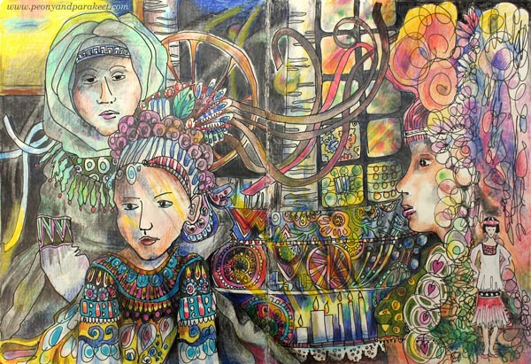
This is an art journal spread called “Chain of Generations.” I made this to express how decorative arts and crafts have connected women through generations. I feel I am part of that long chain, one foot in crafting and another in creating art.

From an Accidental Start to an Intentional Theme
The making of the art journal spread began almost accidentally. I had doodled a border on the right page a long time ago. Then many months later, I had quickly drawn a woman from 1920s and glued it beside the doodles.
A few weeks ago, I saw wonderful photos of Ukrainian folk art (pinned some to my Pinterest board Fantastic Folk Art). I got an idea of women connected with flying ribbons. I made a quick sketch with a pencil and then added more details with a drawing pen. I also got started with the coloring, but finishing felt too much work back then.

This happens to me often: I begin with one idea and end with another sometime later. I think it’s one of the best things in creating art and especially in creating art journal pages. When there are no fixations, surprising connections can happen. Like here, the women on the right are from different eras: Rococo and 1920s, just perfect to tell the story of how folk art and fashion and their timeless connection.
Inspiration from Atmosphere
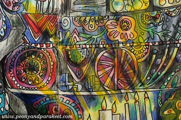
While coloring the spread, I thought how I have always felt disconnected with folk art of my country Finland. Instead, I have always loved Russian and other Slavic countries’ approach to it. Finnish folk art feels very plain and unimaginative to me. Before the success in IT and education, Finland was a poor country. Many who come to Finland are surprised how few historic buildings there are and how modest the life seems to have been.
I have been born in Eastern Finland, near the Russian border, but visited Russia only three years ago. The grand atmosphere of the big churches in St. Petersburg made a big impact on me. The mosaics at Church of the Savior on Blood (yes, all the “paintings” are made from tiny mosaic pieces) lighted by the candles inspired my coloring.

The atmosphere in these kinds of old, precious buildings is amazing. As the theme of the spread was not only practical but also spiritual, an atmosphere of an old church felt a good choice to bring in.
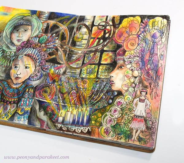
Coloring “The Air”
Imagine that I had colored the spread so that I had stayed inside the outlines only. The page would have been much flatter, contained much less atmosphere and emotion. When I color, I also try to color “the air”. I try to think not only about the light but also how the air feels on the face and how it interacts with the light.
Things don’t have only one color when they are exposed to light. When coloring, think about the air and the lights flowing through space. Color over the outlines and show those less obvious, but so essential streams!
Buy the E-Book – Coloring Freely!
Coloring doesn’t only have to be calming. It can be expressive and inspirational. Purchase my e-book Coloring Freely to learn more about coloring freely with colored pencils. The book can be used with any coloring page or with any blank page. Buy now!