
10 Black and White Art Techniques with Personal Stories
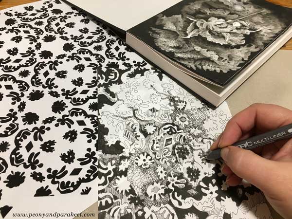
I have made the first ten prompts of Inktober 2019, and want to share the art techniques and stories behind the images. I have been following the official Inktober prompts that are single words. By brainstorming around the prompt, I have decided what the first element is, and then worked from one association to another. After creating the image, I have documented my thoughts in writing. For me, Inktober is as much about finding personal stories than making the drawings. The stories help me to see where I am as an artist and as a person in general.
For these first ten images, I also set an art technique to make creating in black and white more interesting. I hope you find these black and white art techniques inspiring too!
Day 1 – Ring
Technique: A big solid shape in the background. I like to use a brush pen for large black areas.
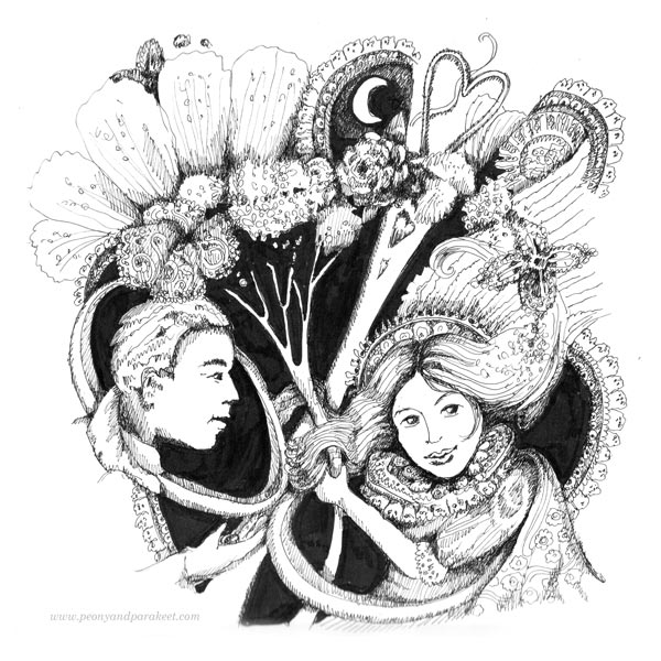
Story: As a teenager, I read Jane Austen’s novels and wondered if those handsome and honorable men really exist. But when I moved to a bigger town to study at the university, I found my Mr. Darcy. Dark hair, brown eyes, doesn’t smile or talk much, but when he does, it’s always worth listening. He looks at my art like Mr. Darcy watches Lizzie playing the piano. He has many skills, but he never brags about them. What others might consider as faults, are what makes him whole to me. So here’s to commitments and true love!
Day 2 – Mindless
Technique: Strong shadowing so that the outlines disappear to the background. It is quite time-consuming but I love the 3D effect.
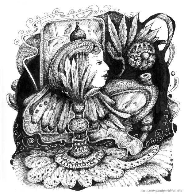
Story: Instead of mindfulness, I practice mindlessness. I like to think about thinking, imagine the impossible, and when I relax, I knit, because it can be done mindlessly. Pick a circular needle and row never ends – until it’s 3 am and the low energy level makes you stop! The mindless world of imagination where no one needs to do laundry, make dinner, or find a missing sock, is what we humans need every single day. It’s a world of magic that we carry inside us, and no matter how mindless it feels, it’s one of the best things in being alive.
Day 3 – Bait
Technique: Using white space. The earlier I get the idea about the content of the image, the easier it is to leave white space as well.
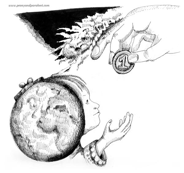
Story: In today’s world, money seems to be everything. Still, we know that there are more precious things like saving the globe. Sometimes I wonder if someone gives us small rewards just to distract our attention from the bigger destruction. Is the world only a big purse waiting for the next coin, or can we stop the fire?
Day 4 – Freeze
Technique: Spraying black ink. It’s often the best way to remove blank page syndrome!
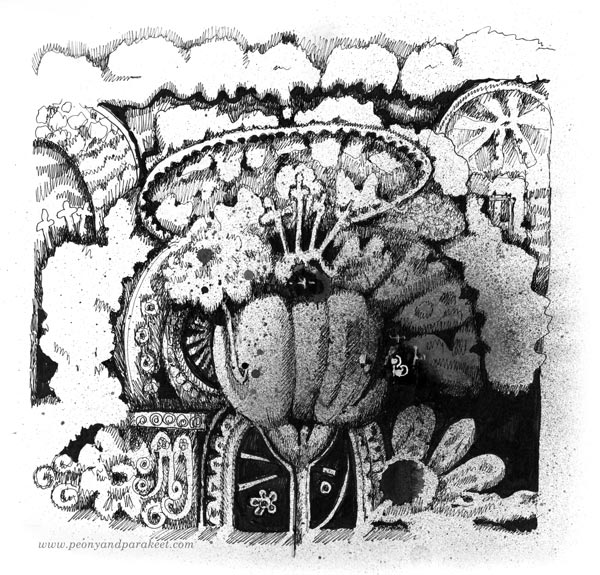
Story: I love historical places and old art. When I begin to create, I imagine time-traveling to the past. My pens take me to an old palace and start vigorously blowing dust away. I imagine revealing all the beautiful designs under white cloths, opening windows and letting fresh air come in. What’s frozen begins to warm up and get color. My biggest dream is that I can make the forgotten world bloom again.
Day 5 – Build
Technique: Using lots of circles and round shapes. I also like to start with a simple circle and then slightly adjust it. See the jewels, for example!
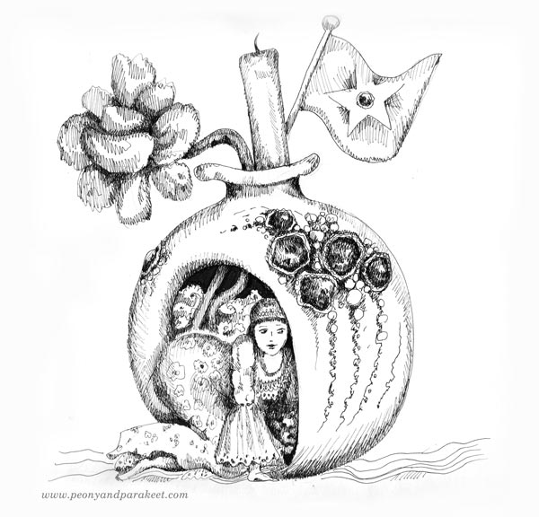
Story: When we draw, we are free to build anything. Impossible becomes possible, small can be big and big can be small. All the things we see and collect can be toys for the imagination.
Day 6 – Husky
Technique: Shades of grey. I sprayed ink to make the start grey already. Then I added more grey shades by drawing thin parallel lines.
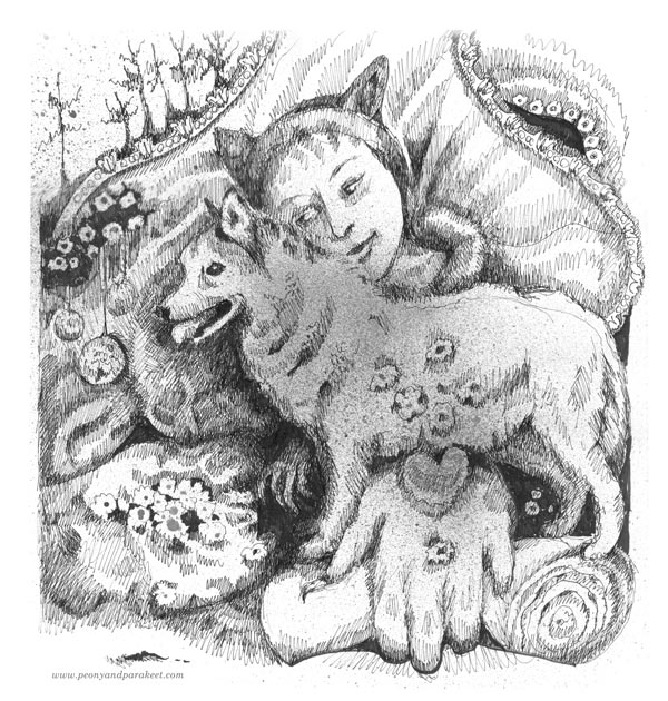
Story: Having a dog of my own – that was my dream as a child. I drew dogs and imagined taking them to shows and running a kennel club. I read books about dogs, learned to identify hundreds of dog breeds, knitted stuffed toys that were as close to real dogs as possible. I wondered how it would feel to be a dog, to look at the world from the animal’s perspective, to run with four legs, and to love undoubtedly. It was a long wait. I was over 20 years old when I finally got a dog, a little spaniel. Now I have two beagles, and I hope I don’t ever have to live a day without a dog. Yes, I am definitely a dog person, what about you?
Day 7 – Enchanted
Technique: Rectangular blocks in watercolor. I used only Dr. Ph. Martin’s Hydrus liquid black for the image.
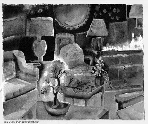
Story: If I had to choose between outdoors and indoors, my choice would be indoors. Now when it’s autumn, it’s easy to make the home look like an enchanted place. Just switch off most of the lights, light some candles, and make sure you have houseplants, preferably bonsai trees. They look magical in the dark and bring some outdoors to the indoors as well!
Day 8 – Frail
Technique: Combining watercolors and drawing. Some of the areas are painted only so they look softer.
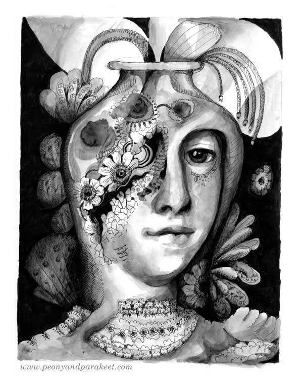
Story: I hope that it wouldn’t be so difficult to remember that people are like plants, not always saying aloud what they feel, think, and plan to do. Their pots can be broken, their roots can be too dry, and their vision can be blurry. But they function, participate, and comprehend anyway. Their beauty is more about persistence than perfection. Their origin is more about cohesion than separation. I wish I could remember that like plants, every person is unique but still shares the need for warmth, hope, and attention.
Day 9 – Swing
Technique: Detailed figure as a focal point, and abstract freely-painted shapes in the background. I love to play between abstract and representational.
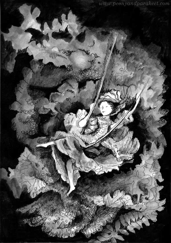
Story: Rococo is one of my favorite historical styles, and I always try to find a way to include some of its abundance in my art too. So no wonder that today’s prompt immediately brought a famous Rococo painting to my mind. It’s Jean-Honoré Fragonard’s Swing, where the main character is a young woman, and other people and details are secondary to her. When we are creating, we are that lady on the swing. The outer world becomes more distant, and we get to rest in the sceneries of our minds.
Day 10 – Pattern
Technique: Designing a pattern, then making it look like a representational image.
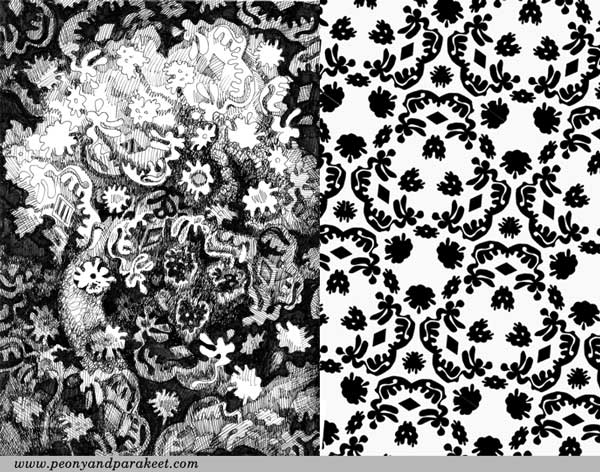
I drew a few black shapes in Photoshop and arranged them so that they formed a pattern. Then I traced the printed pattern on another paper by hand. By changing the darkness of the shapes and the background, I made a fall scenery.
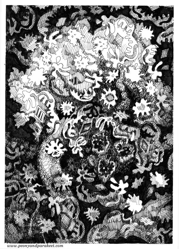
Story: I haven’t ever taken an ink blob test, but I assume I would see plants. Bonsai trees, orchids, herbs, flowers in bloom, seedlings, you name it. “I hate nature,” I said as a child when a teacher praised my essay. She was astonished: “But you write so beautifully about your surroundings!” I have always wanted to get away from the influence of plants but have never succeeded in it. They enchant me with their silent whispers. Their organic shapes are like stamps in my mind when I start drawing. They never leave me alone, let me be who I am not. The more I age, the more I surrender. My imagination lives in a pot, blooming only when plants are.
What can’t you escape? What do you keep creating time after time?
Hello Fall! – 10 Problems and Solutions for Watercolor Landscapes
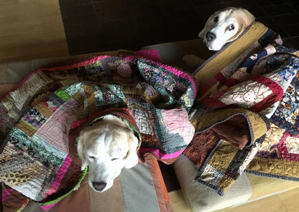
It’s fall in Finland, and it’s a bit sad, even if it’s also beautiful. Our beagles Cosmo and Stella have their quilts, and when we go for a walk, we have to speed up because it’s getting colder every day.
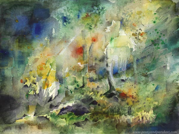
I have done a lot of drawing lately, and to relax a bit, I picked my watercolor set and a piece of Arches cold press watercolor paper. My watercolor set is a good friend, always ready for a new adventure. This time I started with a photo that was taken when walking the dogs, but I also painted freely. I hope you enjoy the video below!
10 Problem and Solutions for Watercolor Landscapes – Watch the Video!
Paint with me! Take a photo of the nature scene of your surroundings, and create a watercolor painting with this video tutorial. This time I built the video so that I picked 10 common problems in watercolor painting and explain how I solve them in practice.
Express Yourself by Painting Watercolor Landscapes – Buy Watercolor Journey!
Connect the dots between techniques and expression! Watercolor Journey has expressive watercolor techniques for beginners who want to loosen up and for more experienced artists who want to boost their imagination.

To celebrate the season and beautiful autumn colors of Finland, Watercolor Journey is for sale this weekend. Get 20 % off! The sale ends on Oct 6, 2019, midnight PDT.
Inktober Warm-Up Exercise
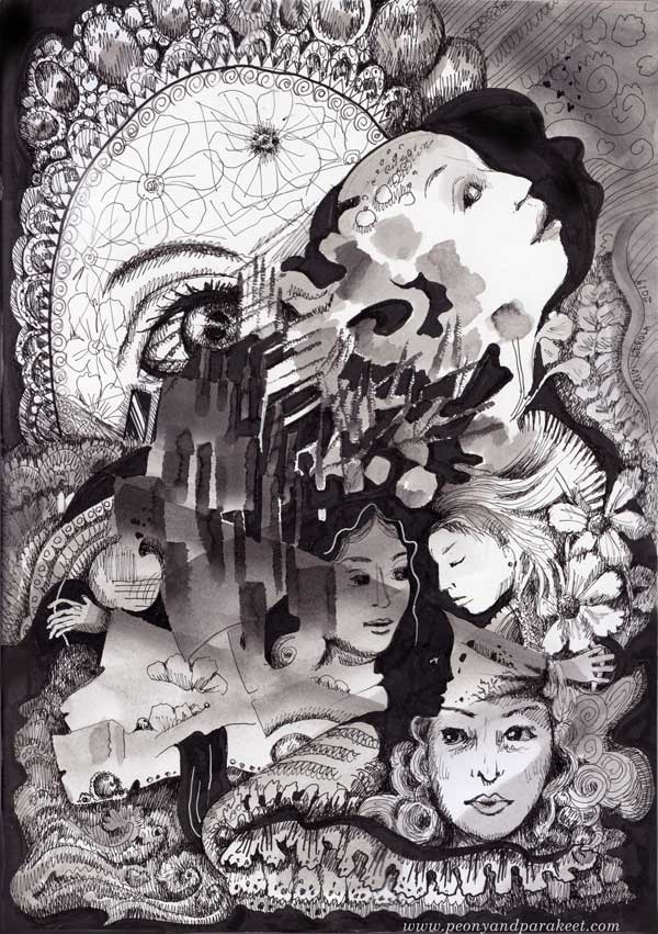
It’s soon October and with that – Inktober! Last year, I did all 31 prompts. Read about my previous experience here and here!
This year, I intend to make at least some drawings. And because Inktober was such a great experience for me last year, I want to support you to take it too. Here’s an Inktober warm-up exercise. I hope it inspires you to use inks and black felt-tipped pens to create black and white art. Follow the steps to keep going!
1) Paint an Abstract Composition
Let’s start by playing with liquid ink! Mine is Dr. Ph. Martin’s Bombay India Ink. I make the image on Leuchtturm 1917 Sketchbook.
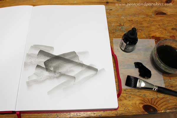
Put a few drops of black ink on a palette. Mix some water to the ink so that it’s grey rather than pitch black. Make some pale strokes with a flat brush. Then add new strokes on the top of previous ones. Work slowly! Enjoy each stroke and the translucency of it.
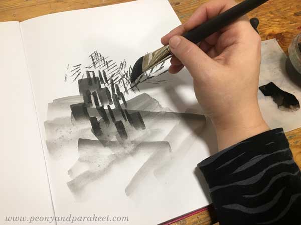
Turn the brush upward and make narrow strokes by using the tip of the flat brush. Experiment with both wet and dry brush.
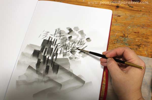
Pick a small round brush and add some ink on the top of the narrow strokes. Now you should have an abstract composition that has a variety of painted elements.
2) Fill Spaces Between the Painted Areas
Use a brush pen or black ink that hasn’t been watered down. Focus on the center of your composition.
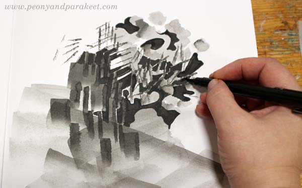
Fill most of the spaces between the painted areas with black ink. Leave some white to highlight the best parts. Black adds depth to the grey composition.
3) Draw Realistic Objects
Select black thin-tipped drawing pens of various thicknesses. I use Copic Multiliners from 0.05 to 1.0.
Choose a realistic object that you want to repeat in the image. My choice was women’s faces. For example, flowers or birds could be great too.
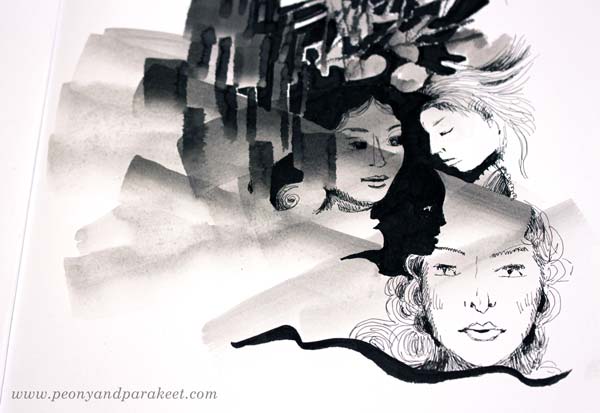
Look at the abstract composition and seek for places where you can add the objects. Add more black, and adjust the shape of the pale areas so that they partly outline the objects. When drawing the objects, play with the scale so that some are big and some small no matter where they are located in the image. All the objects don’t have to be fully visible. Some can hide partly behind the abstract elements.
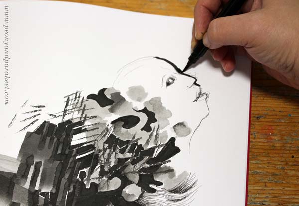
I like to draw faces so that I sketch it first with a thin ink pen, and then adjust it by adding a black element beside the face. (In my classes Animal Inkdom and Magical Inkdom, I show easy step-by-step methods for drawing all kinds of fun figures.)
4) Doodle Decorations
Continue with the black drawing pens, and doodle on the blank and pale areas. I also use a handmade oval template to get a big geometric shape that is fun to decorate.
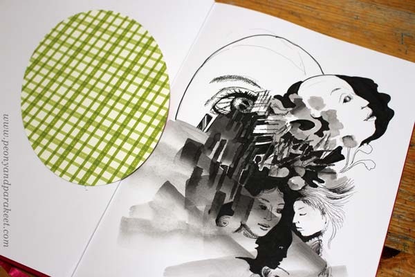
For decoration, the sky is the limit, but I like jewels, frills, laces, waves, and flowers!
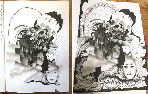
When doodling, I also add shadows to the elements by drawing thin lines side by side.
5) Finishing Touches: Shadows and Highlights
Squeeze your eyes and point all the white areas. Usually, there are too many and it makes the image look busy. Pick a brush and paint most of the white with diluted black ink.
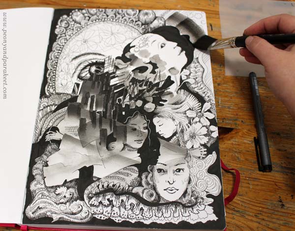
Especially the areas that are near the edges are worth toning down.
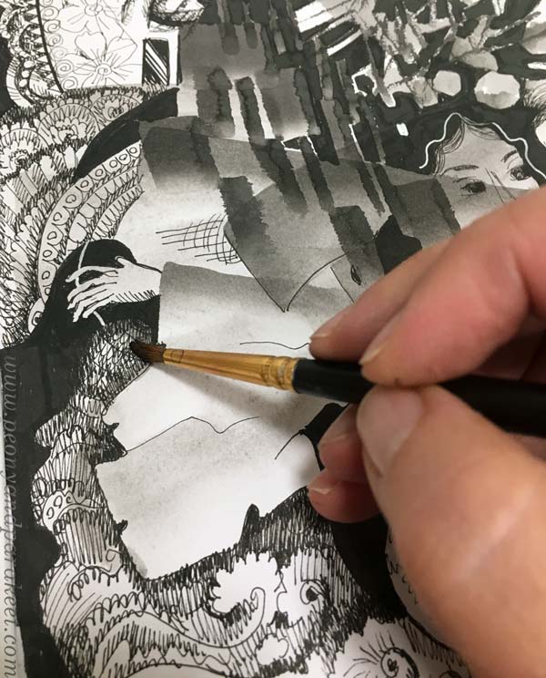
I also like to paint over the shadowed areas to give them a softer look.
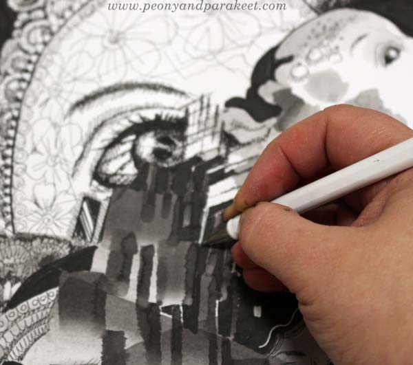
White gel pen can be handy for those areas that need a little bit more white.
Inktober Warm-Up – Finished Piece
Here’s my finished piece again. See how limited the number of white areas is.
I hope you enjoyed this Inktober warm-up! Tell me – are you going to participate in Inktober?
Intuitive Painting in 60 Colors of Arteza Gouache Set
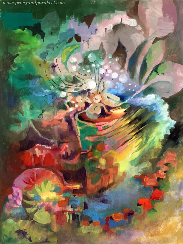
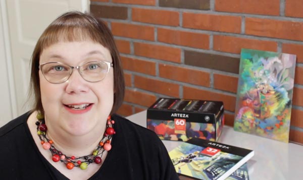
Paint with me! This week, I have a video tutorial of making an intuitive gouache painting with Arteza Gouache set.
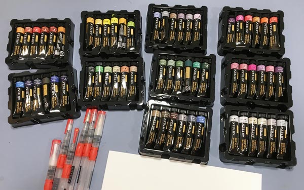
In addition to the gouache paints, I also use Arteza water brushes, Arteza watercolor paper (mine is A4 from Arteza’s UK store, but here’s the link to the similar paper in the US store), and Arteza Fineliner. These supplies are all donated to me by Arteza (US Store, UK store). You can get 10% off with coupon code peonyandparakeet1. This coupon is valid till Oct 25th, 2019.
Intuitive Gouache Painting – Watch the Video!
Gouache Comparison – Arteza vs. Schminke
Arteza’s gouache paints are very affordable compared to artist quality paints. I have few tubes of Schminke Horadam Gouache paints, and with the price of 60 colors of Arteza, you can only get a few tubes of Schminke!
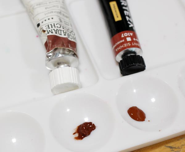
But of course, there are differences too. Schminke, manufactured in Germany, has a higher pigment level than Arteza, manufactured in China. These tubes are both Burnt Sienna, but Arteza’s color is much more pastel and creamy.
Most of Arteza’s colors have names that are not pigment names. They describe the tone very well and sound tempting, like “Blush Pink.” But if you have used to dealing with pigments and their individual qualities in transparency and archival quality, it can feel frustrating. If pigments are individual spices, Arteza’s gouache paints like spice mixes – easy to use for beginners, but a bit joyless for professional cooks.

The differences between these paints are small, and it requires an eye for nuances and experience on pigments to notice them.
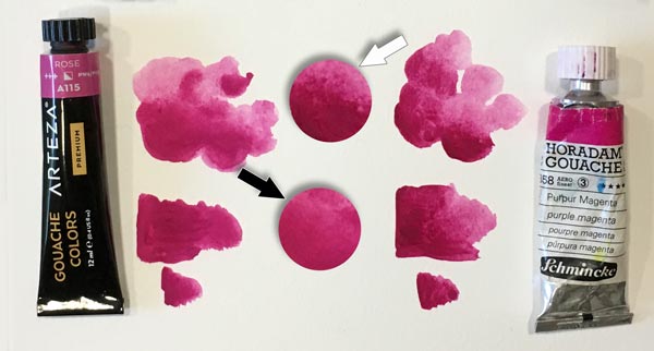
When painting, Arteza’s creamy paints are like family vehicles, easy to maneuver. Schminke’s gouache paints are more like sports cars, quick to react with water and more suitable for fine brushwork.
Traditional vs. Acryl Gouache – Reacting to Water
Some gouache paints are marked as acryl gouaches. It means that they are not opaque watercolors as gouaches normally are, but translucent acrylic paints. I had some Turner acryl gouaches (made in Japan), and you can see the difference below. Unfortunately, I didn’t have similar magenta tone, but the color doesn’t matter when testing how the dried layer reacts to water. Both Arteza gouache and Schminke Horadam bleed, Arteza a little more than Schminke. But acryl gouache doesn’t bleed at all!
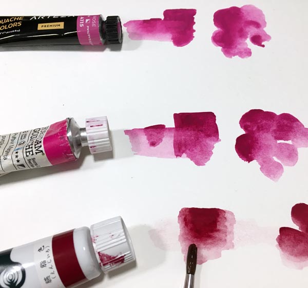
Bleeding is not necessarily a bad thing. Actually, I prefer paints that bleed because I often like to remove color in later stages.
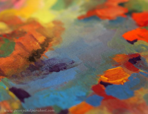
Bleeding wasn’t any problem when making this painting either. I used both thin and thick paint quite effortlessly.
I hope you enjoyed the video, and let’s keep creating!
Let’s share the passion of creating art!
Subscribe to my weekly emails | Welcome to my classes