
When Pens Replace Needles
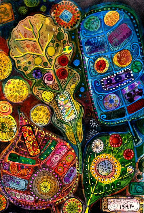
I confess: I am constantly thinking about textiles. I often try to hide my love for fabrics, quilting, sewing, embroidery, knitting, crochet, yarn, and wool. It is like I married paper but have a secret relationship with textiles. If you look at the collage, can you see it?
Creating Textile Inspired Art
When attaching the pieces on paper, I feel that whatever glue or medium I use, the pieces still look like that they are floating. Then I pick a pen and add a stitch line here and another there. And soon I am lost in the details!
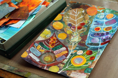
When people try to find their own style, they often deny what they know best. It is probably too mundane, something they take for granted. Often, it is easier for other people to see where our strengths are. Anything genuine touches people.
I want to thank Denise who pinned the last week’s horse themed collage art to her Pinterest board called “Clever Stitch Artists”. I got curious about what she saw in the collage. She had written in the description: “Embroidery inspiration”. I tried to hide my love for embroidery but she saw it! So this week I decided to create a project that is a celebration of felted fabrics and hand stitching.
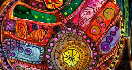
The concept is very easy. Just add some shapes on the painted background paper and then: take your markers and stitch your heart out! Here pens really replace the needles!
Let me be your mentor in art: Subscribe to my weekly emails!
Subconscious Goals

Here’s an illustration that came out without any pre-planning. I just added a layer after another and in the end was surprised about the animals, and the scene. What was I thinking about?
Creating Subconscious Art
First I created the background paper in Photoshop. I duplicated my old sticker designs there!
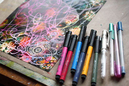
After printing the background I made some random spots with alcohol inks and random lines with white correction pen. Then I added a lot of details with markers and gel pens.
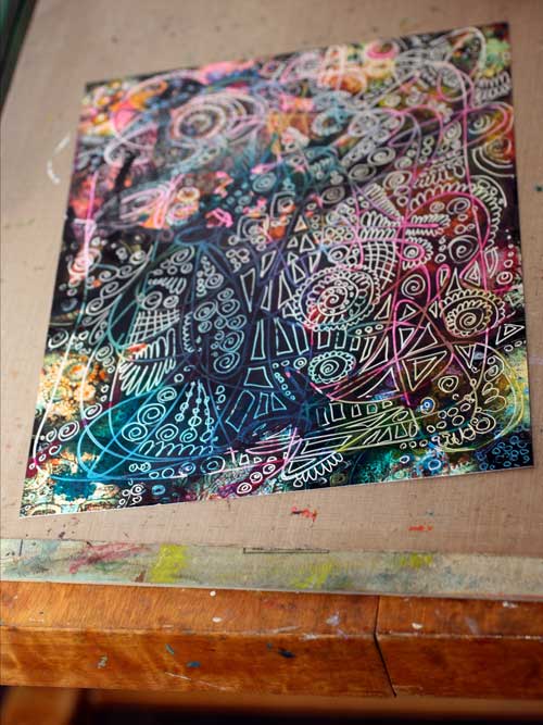
Yes, a lot of details.
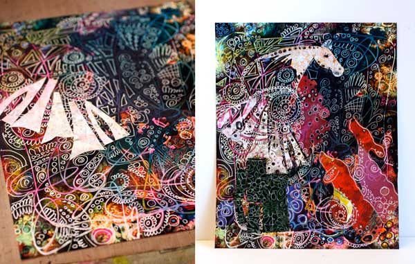
Finally, I constructed the main elements from decorated papers. Then it came: the horse on the pedestal and the dogs. The horse tells a story for the dogs, and the dogs are captivated by listening to it. When finished, I realized that I want to be that white horse! I want to develop skills to tell visual stories. I want to learn how to create images which not only appeal to the eye but the mind as well.
Isn’t it a wonderful thing that with creativity we can reveal our subconscious goals!
Subscribe to my weekly emails – Get a free mini-course!
Doodled Lace Patterns

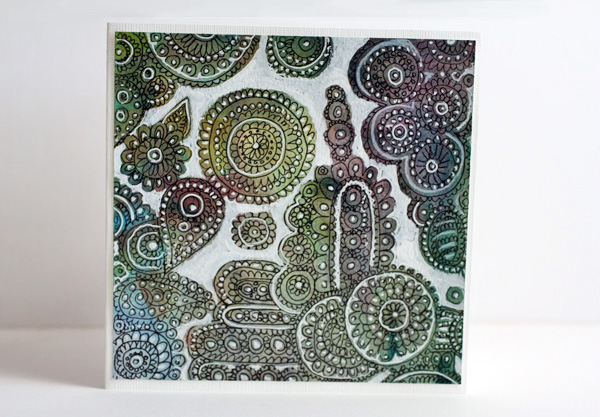
I am constantly inspired by surface patterns and textures. From a pile of doodled papers I found lace like doodling on unbleached printing paper. I decided to decorate it by adding white on some of the details and empty areas. It was a quick card: just adding the white and cutting it to the proper size. I pretty liked it so I made another card using the same concept but with different background paper. So, here are instructions to create these fun lace cards!
Doodled Lace on Paper
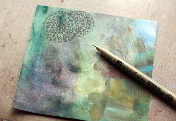
You can create an interesting effect of color changes in the background by painting the background paper with watercolors. Pick a thin black pen for doodles. I love making doilies that look like they are on the top of another. Draw the doily on the top first. Group your doodles and leave some empty areas around the groups.
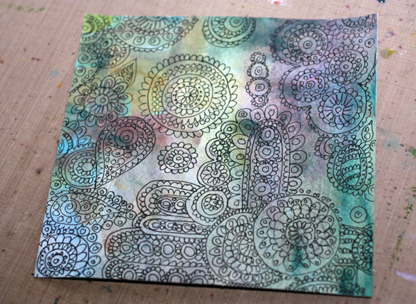
Add White to the Background
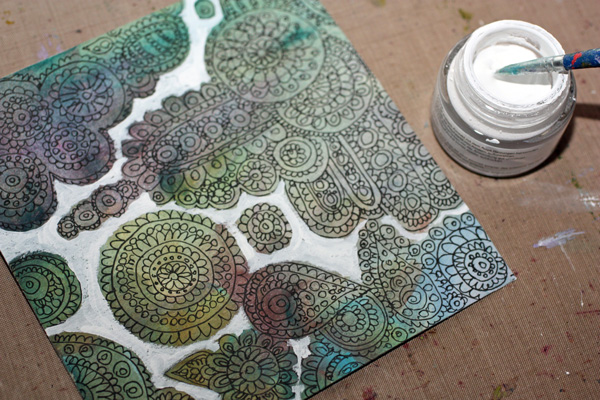
I used Copic Opaque White in a jar for bigger areas and Uniball Signo pen for smaller areas. A white color pencil was used too. White acrylic paint does the job too.
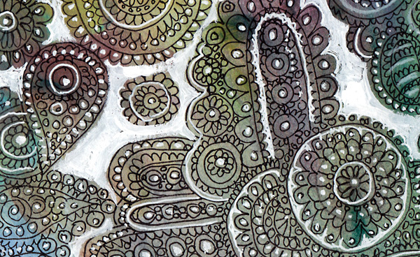
You can easily make georgeus and unique projects with this technique!
Let me be your art teacher: Subscribe to my weekly emails!
A Formula for Composition

You can create wonders with composition. Many worry about the balance but it’s also important to add interest. In this post I will show you how this still life was created and give a formula for a balanced composition that is also appealing and interesting.
1) Create a background without color repeats.
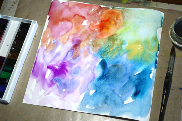
The background was painted with watercolors. I avoided repeating the same color. It is good to create separate colored areas instead of color repeats. That way our mind begins to associate colors with meanings. The areas seem to be individual elements and their relation to each other is more interesting than if we repeat the same color over and over.
(Did you notice that I have a new set of watercolors, White Nights! Love them!)
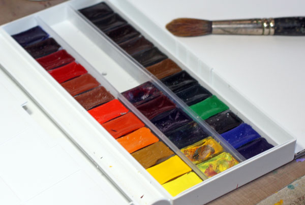
Few tips on watercolors: I never wet the background paper first but use wet brush instead. That way I can control the areas better even if I use a lot of water. I also prefer to mix colors on background paper. The way the colors mix is beautiful to watch and the result is more interesting than when the color is even. Let the background dry before the next step. If you use a lot of water as I did, drying might take a while. I often make backgrounds on the previous day.
2) Change colors and brushes when adding elements.
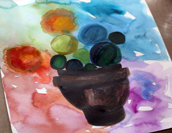
I continued with watercolors. Much drier brush was used than when painting the background. And more importantly, I changed the brush! Use at least three different brush sizes in the same artwork. In my still life you can see the difference of brush strokes between the red splashes (flowers) to the other elements.
Also, change and mix colors as often as you can. Especially subtle changes in color look very appealing. (More tips to choosing colors)
3) Create focus with fine lines.
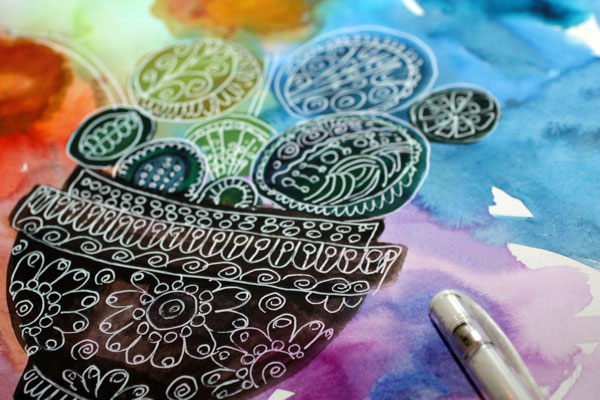
I love fine lines. They make the picture sharp and focused. I used Uniball Signo white gel pen for details. I love the way the watercolors get new shine when the white is added. And if the watercolor is slightly damp, it will also color the white, which I think is adorable!
4) Include a variety of elements.
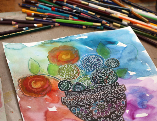
Even if that white gel pen is enjoyable to use on the watercolor background, do not decorate everything in the same way. I added some details with color pens to add variety in colors but also to create new elements like leaves.
I often purposefully create a composition that is not in balance and only finally add the balancing elements. Here you can see how I left the blue area empty for a new kind of element.
Next I chose a new colour, yellow, and picked a paper that was painted with acrylic paints. I also added few other elements like some details on the bowl and a leaf, by cutting them from my big stash of hand decorated papers. When you create your own papers, they always fit seamlessly with your other art! Also notice that I used various papers to avoid too many color repeats.
5) Maintain a slight off balance.
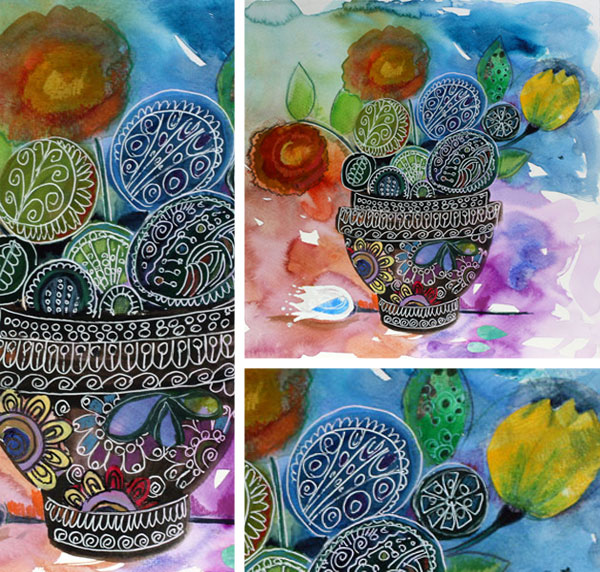
I used to create very balanced compositions until it hit me: a slight off balance is more interesting! The difficult thing is that it must be so slight that it’s almost controversial if the composition is balanced or not. Bringing that white tulip a little bit to the left would create a perfect balance. But with this still life I wanted to tell you that we are all human, we make mistakes, nobody is perfect or pure. When you notice your mistakes and allow them anyway, that’s when you stop copying and start creating unique art.
Let me be your art teacher: Subscribe to my weekly emails!