
Tribute to the Old Watercolor Set
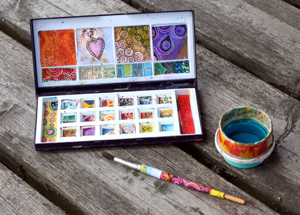
I loved my old watercolor set. I bought it at the time I thought I should learn how to use watercolors. I also bought a book about watercolor painting. It would explain to me how to do it in correct way. That meant: merrily paint those landscapes and still lives in a row like all watercolor artists seemed to do. Soon I realized that even if I admire all those great artists I got nothing out of painting like that myself. Partly blaming my watercolors for it I put them away.
They must have been sad. All those beautiful things that they held inside was in the dark for years. How happy and thirsty they must have been when they were finally able to see the light again. They persuaded me to give them another try. They promised to be ready what ever I would assign them to. “Come on, stroke us with those soft brushes you have”, they pleaded.
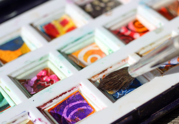
I gave them a stroke, and another… After many long and hard discussions I realized that all I had to do is to let go. Not only put away my assumptions about their purpose but also their nature. These were social guys. Ready to talk not only with me but also with my color pencils, acrylics, inks, markers, you name it.
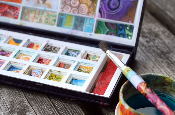
Now the pads are all gone. But even if the tray is empty, the beloved colors can be found in my art journals and display books. I kind of think that I have set them free. To celebrate their freedom and the happy moments spent with them I made a tribute for them. I even dressed their favorite brush and their water cup.
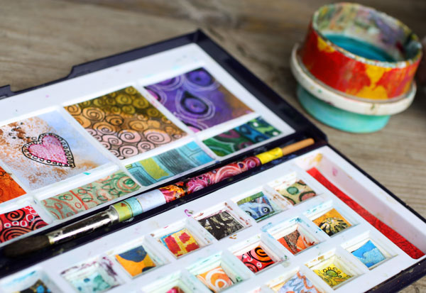
With this tribute I let my watercolors speak to you: use your art supplies and let them show you where art can take you. Art is not a competition, neither any other predefined experience. Art is not too noble or too serious. You have the privilege to fly to the world of imagination and your art supplies crave to help you with that!
Let me be your art teacher: Subscribe to my weekly emails!
Hand Bags Only You Can Make

The fashion themed Smash book is just perfect to show my love for bags. When I made these hand decorated papers became heavy fabrics and leather in my mind. It was so fun to draw stitched seams, add layers and choose decorations.
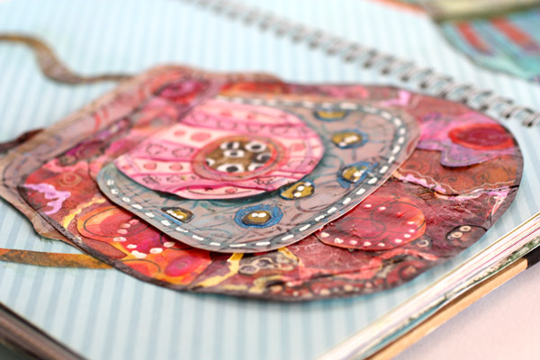
I have a lot of ugly papers in my hand decorated paper collection. I do not take my papers too seriously. Their common nominator is that they are made by myself and thus they fit together whether pretty or ugly.
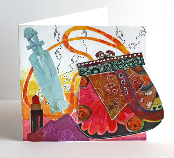
If you prefer to make cards instead of art journal pages, you don’t have to miss the fun. Create bag themed cards like I did! This card is a birthday card for my sister. She loves everything red. I also added some stuff that could be found inside the bag: a lipstick, perfume bottle, small scarf and a necklace. We can always give dreams, even for people who have everything and do not want to own more.
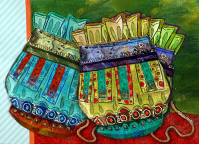 I want my art journals to be like catalogs: full of items to pick and choose. I am like a dream shopper with a hand made credit card (how would that look like, or a row of them!). I could ask from the maker of the turquoise pouch: “Do you make these in green too?” And the maker would respond: “Of course, which tone would you like?” With a little help of image processing in Photoshop, the options are right there.
Think about it: there are millions of hand bags which you, and only you, can make!
Let me be your art teacher: Subscribe to my weekly emails!
Kiwi Patterned Paper

I am continuing the theme of the week to celebrate yellow. Here are step-by-step instructions for a striking patterned paper where yellow and orange are combined with dark colors. You can make variations on the pattern by choosing different colors, adding you own details and picking the materials that you prefer.
1) Fill the Paper with Big and Small Ovals
Fill the paper with intersecting ovals using freely cut templates. Cut plastic templates for a big and a small oval. To achieve an organic form, handcut the shapes freely. I used transparent plastic from a plastic sleeve meant for name tags. Also transpacency sheets for overhead projectors or any easy to cut plastic will do.
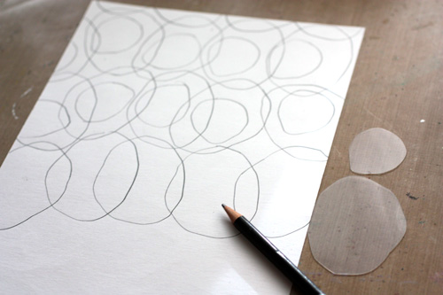
Starting with the bigger template, draw ovals on the paper so that they intersect slightly. Change the orientation of the template now and them. That way the pattern will look more lively. After filling the paper with bigger ovals, draw smaller ovals inside the bigger ones. Each smaller oval should cross one or two lines of the bigger ovals. Change the orientation and placement of the smaller ovals as you did with the bigger ones.
2) Paint the Centers of Small Ovals
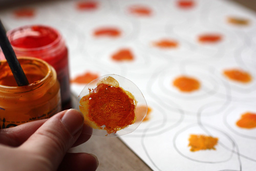
Add acrylic paint to the centers of the smaller ovals. Paint the centre of the smaller template and press one center at a time. Mix yellows and reds to get orange hues on the template. Each center can be a bit different from another.
3) Add Watercolor to the Smaller Ovals
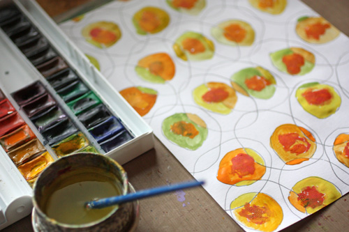
After the acrylic paint has dried, paint the smaller ovals with watercolors. Use yellows mixed with blues and reds. Color each part of the oval with different color. This way you will get an appealing look of ovals that have many hues.
4) Add Watercolor to the Bigger Ovals
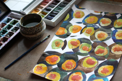
After the smaller ovals have dried, paint the bigger ovals with watercolors. Use mixes of browns, blues and blacks. Color each part of the oval with different color.
5) Fill The Background
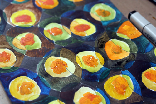
Using black marker, color pencil or watercolor, fill the small white background areas with black.
6) Add Details with Colored Pencils
Draw white lines around smaller ovals. Add black outline for smaller ovals. Color the edges of smaller ovals with red and green depending on the hue of the oval.
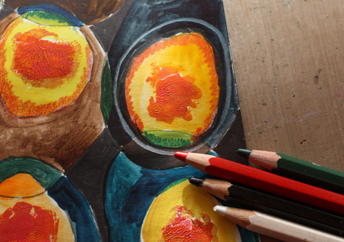
7) Final Touch: Thin Lines and Dots
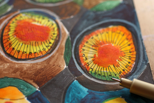
Finally pick a thin black marker or drawing pen. Add radial lines to the smaller ovals and decorate the lines with dots.
Let me be your art teacher: Subscribe to my weekly emails!
Yellow Color
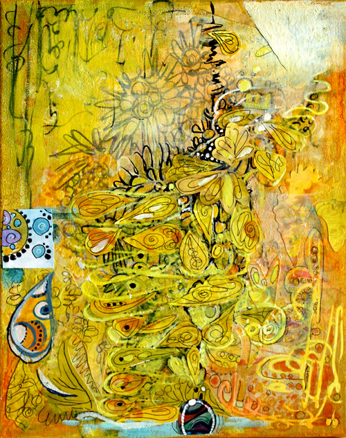
If I had to pick only one color, I would choose yellow. It is unconventional, energetic, and brilliant with other colors, mixed or not. I love to make green by mixing yellows with blues or black. Yes, isn’t it surprising that you’ll get olive green if you mix yellow with black! Best oranges come when mixing yellows with reds instead of buying ready-made oranges. I often put a tiny portion of black to get a slightly muted shade.
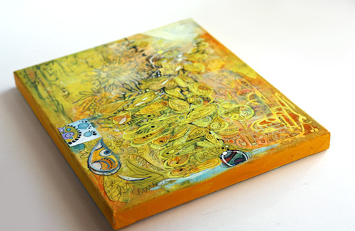
I created the yellow collage on a canvas mostly with acrylic paints. If you buy only one tube of acrylic paint, I would recommend buying good quality yellow, warm or cold. Then create your art with color pencils, markers or watercolors and finally add a very thin layer of yellow on one or two areas. You will witness the arrival of the sun, warmth, and all the good things!
If you buy two tubes of paint, I would recommend yellow and another primary color, red or blue. You can create almost anything with those. The intensity of good quality yellow paint is amazing and in acrylics, I prefer to buy few and good quality instead of buying cheap sets.
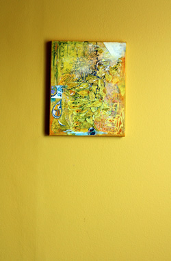 In our house, we have a long hallway painted yellow. It is a particular shade of yellow that was not found in any color charts. I mixed it myself by adding some black to the closest yellow I could find. I saw this yellow first time in Tricia Guild’s old book Design and Detail about 20 years ago. I fell in love with it, and when we bought our house a few years ago, I knew that the dark hallway would look amazing with that yellow.
I think that yellow has a special connection to two colors. The first is black. Try this: pick your yellows and think about blacks. If it helps, find music that represents black for you and turns it on. Paint yellow and think about black. I love that mind game!
Another color that I connect yellow with is blue purple. It is the contrast color of yellow, and it makes yellow pop even more and vice versa. If you look at the collage, there are a couple of tiny circles on the small square on the left. Yellow makes them look lovely and bigger than they really are.
Yellow Color begins a blog post series about color. I will post these color-themed posts now and then. Hopefully, you’ll enjoy these!
Let me be your art teacher: Subscribe to my weekly emails!