
Illustrating Poems in Art Journaling
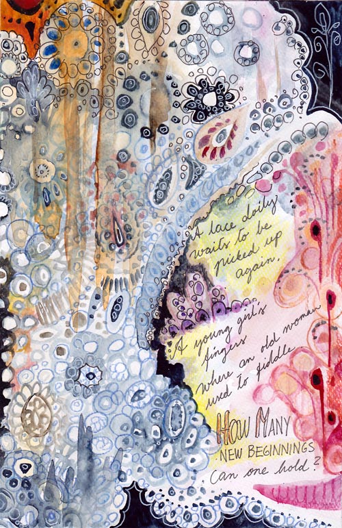
A lace doily waits to be picked up again.
A young girl’s fingers where an old woman used to fiddle.
How many beginnings can one hold?
This is an art journal page which illustrates a poem. I usually create the image first and then add the text. This time, I wrote the poem first and then illustrated it. Namely, for a long time I have had a desire to include creative writing in my art journals. I have loved poems since a small child and I used to write them all the time. After I grew up and moved away from home, it gradually stopped. But now years later, poems seem a great addition to art journal pages. Especially because I usually start writing a poem with a visual image in mind. Wouldn’t it be suitable to document that image too?
Of course, you do not have to be a poet to get into illustrating poems. You can also illustrate the poems that other people have written. Poems are great tools to get connected with the visual images that represent feelings. I think poems make a perfect pair with visual self-expression!
Illustrating Poems
1) Getting in touch with the feeling
Read the poem several times.
What kind of atmosphere does it create? What metaphors does it use? Are there physical objects or people to include?
There’s a risk of getting too rational here. Try answering these too:
What kind of memories or thoughts does the poem raise in you? What kind of rhythm, music or dance does it resemble?
2) Sketching
Lightly sketch the elements you want to include to the page. Write the poem or at least reserve a place for it.
I used watercolors for sketching. Light painting can bring a more intuitive approach to your work than using a pencil. You don’t need to know your exact composition yet. Think this phase as the first steps in the dark! Do not take it too seriously (= too rationally)! Focus on the feeling you want to express!

3) Expressing with composition
After sketching, adjust the composition by adding more elements to the page! With poems, I often feel that if the composition delivers the message, the rest is trivial or easy. There’s so much content in the words itself.
I wanted my page to lean to the right and then up. Right – because there’s a strong connection to the future in the text. Up – because the doily waits to be picked up in the story. I also chose the colors accordingly: blue representing the old and red representing the new.
4) Finishing
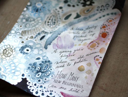
This phase is to fine-tune everything already created.
I wanted to add the feeling of fabric and emphasize the upward movement by adding thick lines with watercolors. I also made the lace more detailed. Then I added some dark areas to make lighter areas pop. A thin black marker and colored pencils are great for the finishing touches when using watercolors on the page.

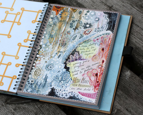
The page was made on a separate watercolor paper and then attached to the journal. Watercolors work best on watercolor paper. Even if you use a thin watercolor paper it’s better than using a smoother surface.
Illustrating Poems – A Minimalistic Approach
You know that I am not a particularly fond of minimalism in self-expression but with poems, I think it can be a very effective approach.

A yellow spot on a white painting.
A happy thought when leaving.
I saw the sun on a cloudy morning,
The one to brighten my being.
This poem of mine began with a visual image that called for simplicity. When aiming for lots of space, acrylic paints can be a better medium to use than watercolors. Acrylic paints have more substance themselves, and it’s easy to add slight, yet powerful color changes with them.
In this page, I divided the poem into three parts. The composition was built accordingly.

The first part is focused on expressing the latter sentence: the leaving. It is bittersweet, light peachy orange.
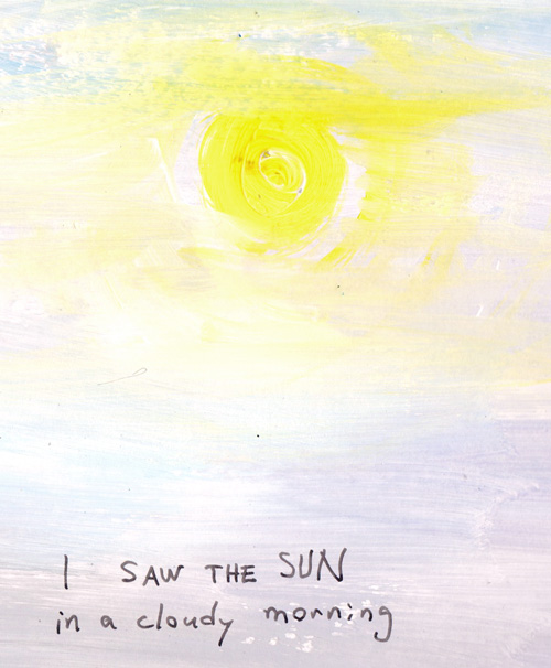
The second part visualizes the sun in cloudy weather.
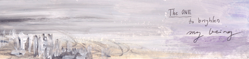
The last part communicates the person, her being and her relation to the world that she is leaving behind.
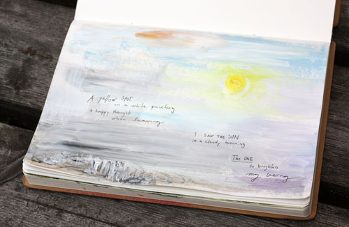
With acrylics, it’s easy to work on any surface. I used white gesso instead of white paint but only to save some money.
Art Journal of Poems
Think about having an art journal that is filled with illustrated poems! What a treasure would it be! The best things in life are those we can create ourselves.
Let me be your art teacher: Subscribe to my weekly emails!
Express Yourself with Colored Pencils
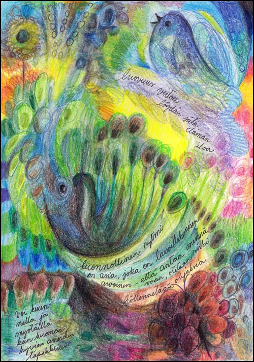
Simple art supplies fascinate me. Colored pencils have been my favorites recently. They are so easy! There are no worries about making the pages too thick even if there’s a lot of layers.
Colored pencils seem to be used for traditional artwork mostly. I think they are as suitable for improvising as any other media, like watercolors. In this post, I will show you few easy techniques for expressing yourself with colored pencils.
1) Color by Doodling
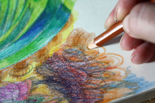
Starting with a blank page or paper, draw circulating and continuous lines to color a small area. Then change the color and continue. Create layers and let the colors intersect. You can get a wide range of colors with layering. Think your pencils as doodling tools!
2) Rotate the Page while Coloring
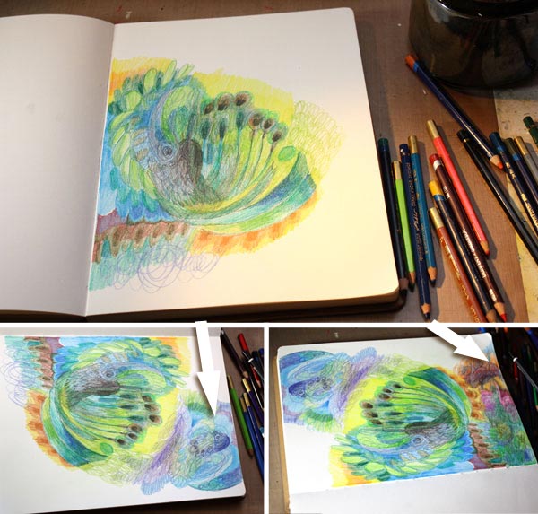
You will get more variety and interest to the page if you rotate it while working. Work one area at a time, changing the orientation once in a while. The areas can be fairly large as in my page, or smaller.
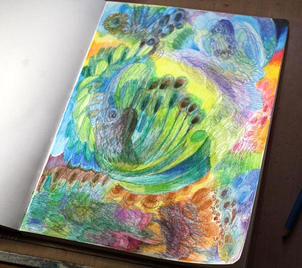
Here’s the page before I used the eraser …
3) Use Eraser to Create Lighter Areas
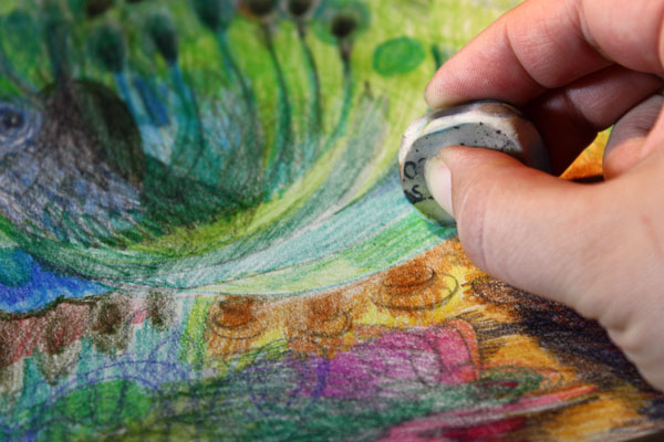
Erased areas bring light to the work. In an art journal page, use the eraser for the areas where you want to write the journaling.
4) Add More Clarity

I am a big believer of finishing. When you improvise, the result may be self-explanatory for you without the finishing touches. But if you want to communicate with others too, then sharpening some areas and adding some layers here and there for more intensive color is a minimum. I realized that my page had some animals in it so I made them easier to see. Like the photos include sharp and unsharp areas, you do not need to work through the page. Picking the focal points and working with them is often enough.
Coloring with Pencils is Like Painting by Drawing
By discovering these easy techniques, I have learned to love colored pencils. It is like mixing painting with drawing. With colored pencils, you can have a gorgeous art journal or a unique greeting card collection! Show your free expression with colored pencils!
Express yourself with colored pencils! >> Buy Coloring Freely!
Surface Patterns for Hot Summer Days

This July has been wonderful in Finland. I have enjoyed gardening and photographing and it shows in my art journal too.
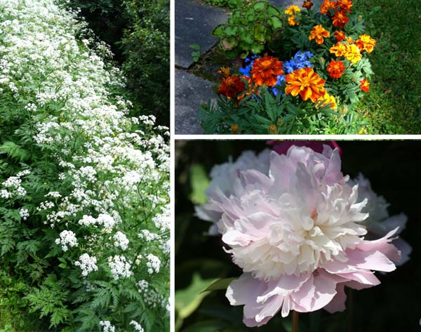
Both the wildflowers and flowers in the garden look great with a dark background. So when I made the drawing with colored pencils, I added some shadows too. Great way to express sunshine is to combine black with yellow!
But my main focus was on summer fabrics. It is so much fun to design prints for summer dresses.
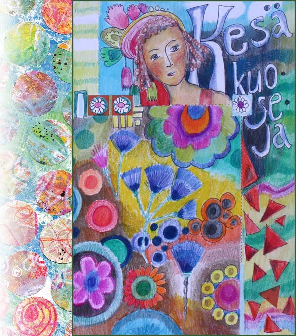
The collage of the left is an old one. A sketch for a surface pattern made in 2011. It was made by cutting circles from handdecorated papers. This time I replicated the design by cutting circles from stamped papers.
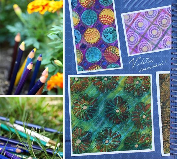
The summery prints are mostly made by stamping here. Paper scraps like old scrapbooking papers can be altered easily with markers, colored pencils and stamps. I always try to add subtle color variation in the background to keep the result interesting. Thinking about shadows help here too.
As you can see, my colored pencils are always with me! Hopefully your summer has been as wonderful as mine!
From Photos to Art Nouveau – Doodling on Photos
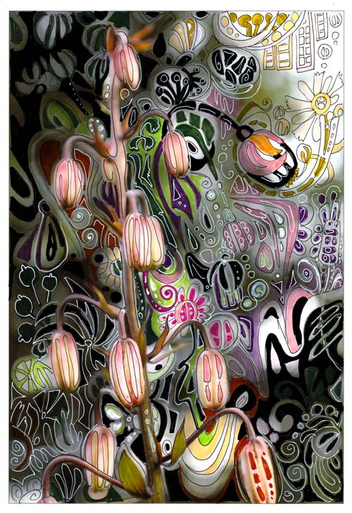
One of my favorite styles, art nouveau, thrives from natural forms. So, when I am walking in the garden, I see art nouveau everywhere. I often have a camera in my hand, and I snap photos while admiring the flowers.
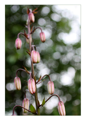 When checking photos after one of those walks, this snapshot of martagon’s flower buds caught my eye. It almost shouted art nouveau to me. Its shape reminded me of the Mackintosh lamp shades seen in Scotland a month ago.
Art Nouveau Martagon
I printed the photo on Canon matte photo paper. Simply using markers and gel pens, I doodled streamlined shapes to move the martagon to the era of renewal and decorative beauty.
In the original photo, the direction of the elements was downwards. I wanted to change the composition so that it would be upwards. The upward direction would refer to the spiritual renewal, a centric theme in art nouveau. I doodled several upward shapes like the flower seen in the upper right corner.

The colors of the plant were also a source of inspiration. I wanted to keep the narrow range of colors seen in the stem but also brighten the muted tones with splashes of bright green and pink.

Drawing on a photo was such a fun process that I will do it again. One idea would be to create art nouveau portraits. Art Nouveau style doodles would look great on portrait photos too. Actually, like in the best days of art nouveau, anything can be “beautified”!
Doodling on Photos
This was not the first time I used the technique of drawing on the photo.
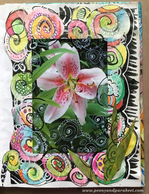
In 2010, I combined doodles and a photo. This page was also very easy to do:
1) doodle with pens on the background paper
2) attach a photo and then doodle on the photo.
More projects with doodling on prints
These posts also combine printed images and doodling:
>> Subconscious Goals
>> Creating Wood
Let me be your mentor in art: Subscribe to my weekly emails!