
Intarsia in Watercolor
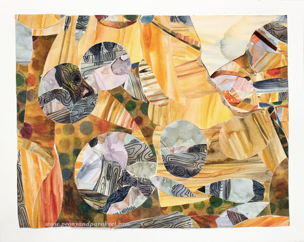
Last week I visited a fascinating exhibition. The gallery displayed Yoshinobu Nakamura’s wood intarsia art. Yoshinobu Nakamura is a Japanese artist living in Finland. He creates masterpieces by combining tiny wooden pieces. I was deeply impressed how the characteristics of various tree species and specimens showed in his work. I wanted to try the subtle color scheme and some kind of intarsia myself. And I did, only using watercolors and watercolor paper instead of natural wooden blocks!
Love for Tiny Pieces
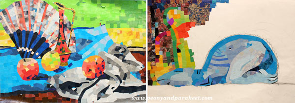
Speaking of tiny pieces of paper, I have always loved them. When I was a teenager, I cut the pieces from magazines and made a mosaic type of work. Some of them never got finished as they were painfully slow to create!
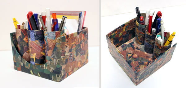
Years later, I made a pen holder for my husband using paper scraps cut from magazines. I carefully covered every surface that could be reached and finished the penholder with gel medium. It has survived at least ten years!
Watercolor Paper Intarsia
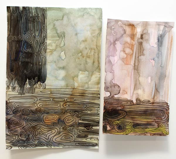
But this intarsia project was going to be different from mosaic work. I would not only cut the paper into small pieces but also adjust each piece in line with others! I started the project by painting the papers. For some of the painted areas, I also added lines resembling wood grains with a black drawing pen.
Next, I tried cutting the pieces. I discovered that they have to be put on top of each other, right side up. The cut line will then fit perfectly.
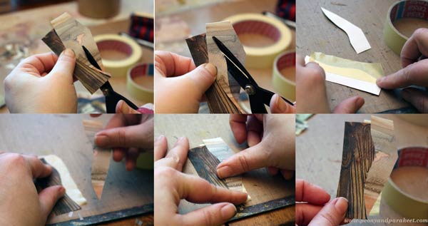
I used masking tape to attach the cut pieces together.
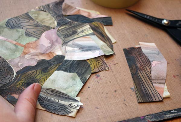
The big piece that I made looked pretty interesting. But it looked even better when the geometric shapes were cut out of it!
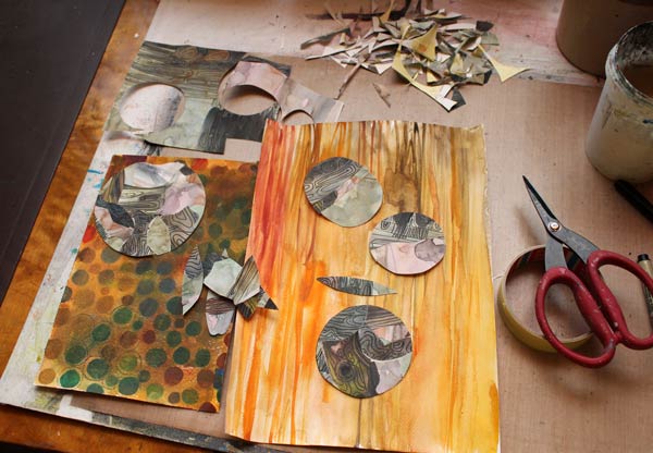
I painted one watercolor paper to look like pine wood. The spotty paper was found from the stash. After hours of cutting and adjusting, the artwork was finally finished. See, all the papers are on the same level, not on top of each other! With intarsia technique, you can use thick papers for collage art!
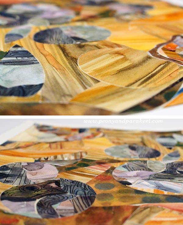
My belief in watercolors continues to stay strong. I love how easy it was to imitate wood with them!

Once the artwork was put together, I attached the piece, with masking tape background and all, onto a white watercolor paper using gel medium. I think I call it “Rolling Stones.” Have fun with this technique!
Let me be your mentor in art: Subscribe to my weekly emails!
From Movie Posters to Art Journal Pages
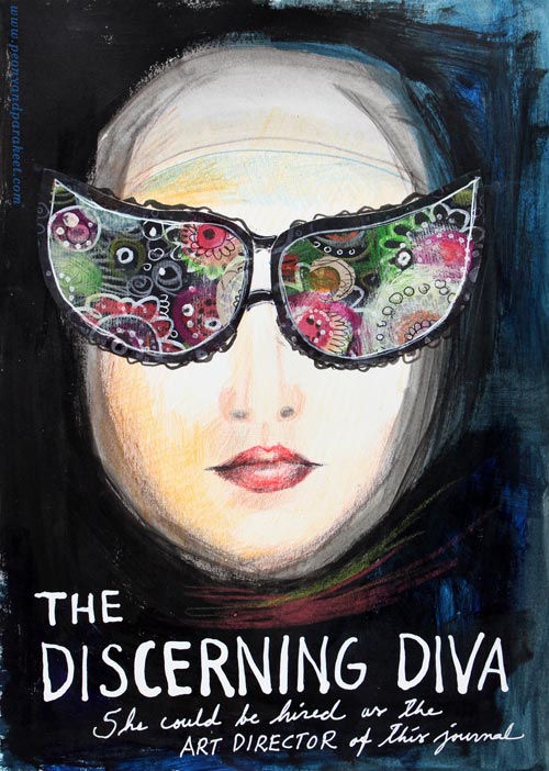
“The Discerning Diva – She could be hired as the art director of this journal.”
This page is my version of the poster for the movie “The Big Lebowski”. I have borrowed the concept of weird glasses and the composition from the poster, but it is still a separate artwork, not an exact copy.
The Discovery of Movie Posters
After learning that I like to use alphabet stamps in the art journal pages, I had been thinking about the next step in journaling. Last week I watched the poster artist James Victore‘s course Bold & Fearless Poster Design on Creative Live. His style has very little to do with mine, but I became fascinated by the visual concept of posters.
Last weekend I found a book about 1990’s movie posters at the local library. I became fascinated by the compositions used in the posters. Then it hit me: maybe I could replace the main elements with my own and apply the visual concept of the poster to my personal stories!
How to pick ideas from movie posters?
I will show you how to make your own “Discerning Diva” (very easy) but before that, I want to show you another poster-inspired page.

The page on the left is inspired by the poster for the movie “The Matrix”. I picked few main elements and the general atmosphere from the poster. The page on the right is made a long time ago, but I like how the two pages tell the story about being inside someone’s brain.
Four tips for picking ideas from the movie posters:
1) Composition: Examine the placement of the title, the grouping of the main elements and the most noticeable color contrasts.
2) Subject: Think about how your life could be applied to the movie.
3) Process: Examine the poster carefully but when you start creating, focus on your page and make it your own.
4) Imagine: Remember that you can replace the elements of the poster with whatever you like. For example, a person can be replaced with a vase of flowers.
Create Your Discerning Diva!
1) Paint the background of the page.
I used acrylic paints to make the background strong and heavy-looking. Leave an unpainted area for the face. Add water to the paint and gently brush the area around the face. Wet strokes create the impression of a thin scarf and add dimension.

2) Color the face.
I used colored pencils to maintain the big contrast between the background and the face. Add some color to the skin. Draw a mouth and a nose.

3) Add glasses.
Go to your box of hand drawn papers. Cut two lenses. Attach with glue or gel medium. Add frames with pens. Make the glasses as decorative as you like!

4) Add text.
Pick a color that has a high contrast with the background and journal on the bottom of the page. I have used a correction pen for the title and a white gel pen (Uni-Ball Signo) for the text below the title.

5) Add finishing strokes.
With colored pencils, add some strokes below the face to represent a scarf.
Add few strokes to outline the scarf near the forehead.
More Ideas for Compositions

Believe or not, this page is inspired by Austin Powers movie poster and hand embroidery! I think that hand embroidery has a lot in common with hand drawing.
Learn to draw from imagination and inspiration!
>> Buy Inspirational Drawing 2.0
Quick Gelli Christmas Cards

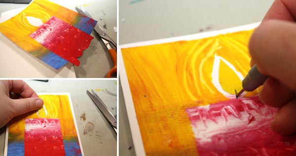
This year I had two requirements for the Christmas cards: quick and handmade! The theme had also been selected: candles, suitable for all religions and all ages. All I had to do was to figure out how to make a lot of cards and fast. This first photo is a snapshot from my studio while I was making the cards.
Planning
Before I got my table full of cards and more under making, I had to discover the process of creating the cards. My artistic side wanted something that looked handmade but was still somewhat warm and painterly. The task was transferred to my engineering side who turned on the computer and made a sketch of a single card in Photoshop. The card would consist of two layers of paint. Needless to say, using the Gelli plate would be handy!
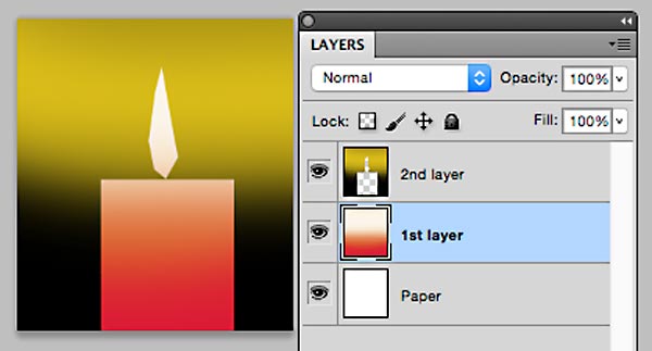
But this plan was not enough. I wanted to create not only one card, but several at the same go. While walking the dogs, I solved the problem. Here are the step-by-step instructions of how to make simple candle holliday cards. You can make them more complicated by adding doodles and such but the basic design is very simple. By following these steps, you can serially produce handmade cards!
Supplies

You will need: Paper, glue, cardboard, acrylic paint in few colors, brush, brayer, scissors, black pen and 8” x 10” size Gelli plate.
Optional: Paper trimmer for cutting the straight edges. Some kind of a stick, a pallette knife or a knitting needle for example, for drawing surface patterns.Double-sided tape if you prefer that to glue for attaching the printed image to the cardboard.
1) 1st Layer: Candles
Paint the center of the plate. The width of the painted area is 5 to 6 inches of the height of 10 inches. You can cut a paper of that width and use it as a guide by putting it beside or under the plate.
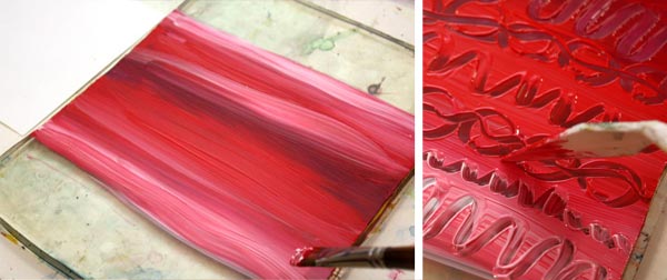
You can draw patterns with a stick if you like. I like to use more than one color to make the candles look lively. You can use brayer for the paint but I prefer to use brush and work horizontally. That way the candles will have horizontal color slides.

Cut your papers to the size of the Gelli plate before printing them. You will get 2 to 3 prints from the one layer of paint. Let dry.
2) 2nd layer: Backgrounds
While waiting the paint to dry, cut the masks for the candles. You will make four candles from the one print. For the four candles, you will need four rectangles, 2-3 inches wide and 5 to 6 inches long. Furthermore, you will need four flames. Fold a paper twice in half and cut one flame at the same go or enjoy your time with the scissors and cut the shapes individually.
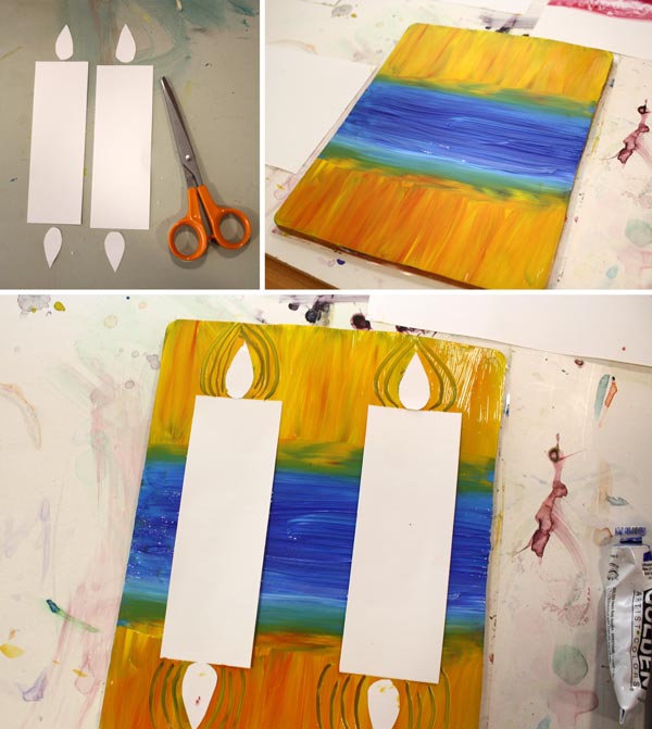
Paint the background with two colors. The center with a darker color (blue, black or green, for example) and the sides with orange yellow. I like to use color mixtures here too. Place the masks so that the distance between them is the twice longer than the distant from the edges. If you want, you can emphasize the flames by drawing lines around them. Make the prints. Let dry.
3) Cut the prints, save the flames
Save the masking papers for the flames. Cut the prints in four parts with scissors or with a paper trimmer.

In the third photo beside the trimmer you can see one alteration of this pattern: use Gelli plate in the other way and create an image with a several candles! By cutting various sizes of masks you get variation for your candles.
4) Finishing
Cut a small part of the background away from the both sides of the print. Cut curvy lines to the bottom edge of the candle. These will make the candle look like it’s set on the snow.

Attach the print to the cardboard. Glue the mask on place or color the center of the flame with a colored pencil or a marker. Draw a wick with a black pen.
5) Variations!
You can make all kinds of variations from the basic instructions. You can add the number of candles, cut them out and glue many candle on the same card, doodle on the candles etc.

I still have few cards to finish and one more task to do: Write “Merry Christmas” or “Hyvää joulua” (same in Finnish) on each one!
More holiday crafts from the previous years:
Wrapping Paper from Newspaper and Elegant Christmas cards
Start Art Journaling!
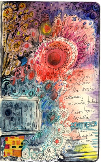 With this post, I want to introduce more people to art journaling. I will create this art journal page step by step using a simple concept and few basic supplies. You only need watercolors, colored pencils, and a thin black marker pen.
I have created this page on a Moleskine notebook (size: 5 x 8 1/4 inches, 13 x 21 cm). Your journal can be larger or smaller. This page is created on the actual page of a journal. But you can also use a separate paper and attach it later, so you do not even need a journal to get started!
Journals
You can make an art journal from almost any notebook or old book. You can also bind one yourself. If you paint on the pages, thick pages are better than thin ones. For watercolors, absorbent paper is better than waxy one. But if you use water sparingly, even pages with a waxy surface can handle some watercolor.
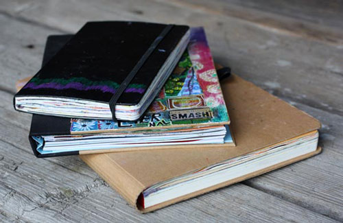
I am currently working on three various sized journals. In addition to the Moleskine notebook, I have a black Smash book and a Dylusions journal. The paper in Moleskine notebooks is less absorbent than in the other two, but it still works with watercolors.
General Inspiration
An art journal can consist of any visual material. You can create a collage of cut-out images or printed photos. Or you can paint or draw, or do it all! The pages often have some writing too. You can cut words from magazines, write them on a computer and print them or journal by hand. As art journaling is a form of self-expression, I think that pages are at their best when you create everything by hand.
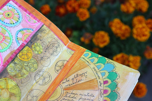
I do not believe in waiting for the inspiration. Once I have made the page, I usually realize what things have affected on it. Like when walking in the garden, I realized that my marigolds had had something to do with the page! So, do not wait until you have something to say or draw, just start creating! With these step by step instructions, you do not need a single idea before you begin!
Step by Step Tutorial for an Art Journal Page
1) Choose the page and draw the first shape
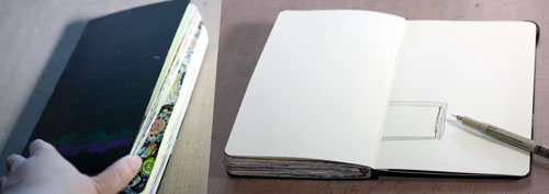
When I begin an art journal page, I usually feel quite stiff. The routines of everyday life can block our creativity. So it is no wonder that when you hold that brand new journal, you feel intimidated to start. Pick the page randomly as the first pages are the most usual causes of the blank page syndrome. Then take your thin marker and begin to draw. Slowly. Then a bit faster.
My imagination at this point was close to zero. I drew a rectangular and was able to mess it up so that I needed many lines to hide those clumsy strokes. Now I could have easily given up, no inspiration, nothing, just ruined one perfect blank page. But I knew better and went on.
2) Paint the shape with watercolors

To get my creativity flowing, change the marker to the watercolors. Constant interruptions are something that our rational side hates. That’s why it is important to be impatient, work quickly and continuously change the way of working. Paint the shape with watercolors and do not care how ugly it looks!
Painting the square did not make me feel especially creative. And with all the color choices I had, I chose a very conservative blue. Some would say that all the hope is lost, but I promised myself to continue to the next step.
3) Doodle around with colored pencils and finish with a large shape
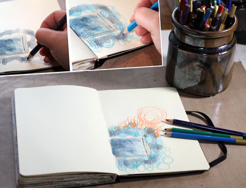
Start doodling with colored pencils. Believe me; you want to stay focused and work close to the shape. The rational thing to do would be doodling all over. Just stick to the area around the shape!
At this stage, I began to feel a bit anxious. It would have been so much fun to fill the page. But I followed my rules and remembered to change the color so that the process of coloring got interrupted. You can see that I began very traditionally, just with strokes. Then I changed the color and moved to drawing circles. After that, I picked another pencil and colored the circles.
The whole process so far has been pretty dull: First a square, then strokes, then circles. I felt a bit sarcastic at the moment: “What next? Triangles?” You can choose your doodles freely but end this phase with a bold movement: draw a large shape. Then abandon the colored pencils for a while.
4) Paint a new large shape with watercolors
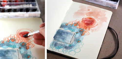
Watercolor the large shape drawn in the previous step. Then clean your brush by dragging it around the shape.
You can see that when choosing the colors, I did not repeatedly use the same colors so that they would have spread evenly. Instead of that, I created two color areas: blue and orange. They both contain various hues of color. The blue area varies from gray-blue to blue-green, and the orange area includes warm red. This way there are two elements on the page: blue rectangle and orange circle.
They say in poetry: two is a conversation. Even at this early point, the page looks like an image. It makes you think: who are they?
5) Doodle with the marker
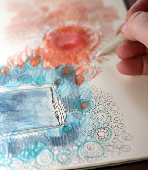
Fuzzy watercolors and soft color drawings look beautiful when they are partnered with a thin marker. Like in photos where something is blurry, and something is sharp, your page will look more appealing when you create the same effects.
Doodle around and over the shapes that you created in the previous steps. Don’t be afraid of crossing the shapes. In art journaling, a lot of time and energy can be spent in layering, but it requires nothing more than drawing over something beautiful to create even more beauty!
6), 7), 8) Colored pencils, watercolors, doodling
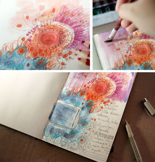
At this point of repetition, I began to feel pretty inspired. After coloring some doodles with colored pencils and painting some blank areas with watercolors, I felt inspired enough to write something that I thought that I am experiencing. I wrote: “When I decide that I have to be under control, I will be out of control. Then I make an agreement with myself: let’s be both!”
9), 10), 11) Watercolors, colored pencils, doodling
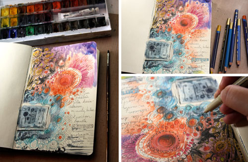
Now we are in the final round of making the page. Because these are the steps where you fine-tune your artwork, use a thin brush and very little water with watercolors. When adding details with the marker, change the orientation of the work once in a while. Many times it is easier to focus on the details if you turn the page upside down.
In poetry, they say that if two is a conversation, then three is a dance. I emphasized the upper left area to create a third element. It made the page more dynamic. Namely, at that point, I was feeling super dynamic and inspired!
12) Finished?
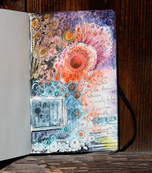
When you assume that your page is finished, it is time to take a pause and examine the work.
When I examined mine, I saw that my rational side is there in the form of a computer screen and my creative side in the form of an orange flower. I decided to add a little hand decorated paper piece under the computer screen to make it look more like a computer. Then I added another tiny blue piece besides the orange flower to make the orange pop.
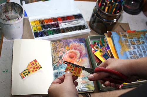
When you use your own hand drawn papers for collage, they will integrate beautifully. (New to hand decorated papers? See the basic instructions.)

The finished piece now expresses my love for the internet and computers. If that subject was given to me at the beginning, would you think that I could have created that image? Never! I would have stared the blank page and after a while, be as bored as my beagle is at the moment! Getting started even if you don’t feel like to and still finding the happiness of self-expression along the way – that is the magic of art journaling!
Let me be your art teacher: Subscribe to my weekly emails!