
Find Your Hidden Inspiration for Drawing Details

This colored pencil drawing is an art journal page. It is called “Growing Towards Light.” It’s inspired by the beauty of tiny details found in plants.
For a long time, I have wanted to write about looking at tiny treasures for drawing inspiration. It is the subject that I might have mentioned, but not put fully in focus. Last week two things happened that made me decide to bring it up.
Blooming Houseplant
First, one of our houseplants blossomed. The plant is probably a prayer plant, and it has such modest flowers that we almost missed the whole thing. But once I took few photos and examined them more closely, I was in awe of the blossom’s beauty.

I admire the shape of the stem, how beautifully angled it is, the sharp buds, dark seeds, and the delicate flower. It all looks like perfect, well-thought, well-executed combination of aesthetics and science. I feel not only inspired by the little details but how it also makes me think of the quality of my art: I should continuously raise the bar a little bit higher, work more carefully, become more patient and get further in my thoughts. It sounds a bit harsh as I am writing this, but when watching the nature, it is very inspiring. Maybe we all should sometimes follow the prayer plant: use the time to create a smaller work but take more care of the details!
Mr. Mac and Me
The second thing that is related to the subject of the post is the email that I got from Claire, one of the readers. One of the best things about writing the blog is the interaction. My favorite thing is when I get ideas and suggestions about what to examine next. Claire remembered that I am a big fan of Charles Rennie Macintosh and his wife (see this post when I visited Scotland to see their art). She sent me a link to the review of a newly published novel. The novel is Esther Freud’s “Mr. Mac and Me, “ It tells a story about Charles Rennie Macintosh through the lens of a 13-year-old boy who gets to know him. Very interesting! I added the book immediately to my wish list.
At the end of the review, there’s a quote from the book where the young boy talks about Macintosh’s flower drawings: “I go closer. I look at everything for what else is hidden. There’s the head of a duck folded into a sunflower’s stem …” For me, that implies how the beauty can be the result of many little details. That challenges us to build our art from well-formed shapes, no matter how small they are, and believe that each of them will increase the beauty of the whole artwork.
Drawing Details
Like said, the perspective in decorative art is in the details and their perfection. Instead of sketching something grand, the decorative artwork starts small and gets bigger by adding tiny details one after another.
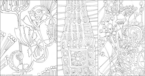
These are some of my unfinished art journal pages. I love to draw with a thin black permanent pen. The inability to erase anything makes me start small! If a blank paper feels scary for you, create a watercolor painting first and then start doodling. My video “Watercolor 101 for Intuitive Painting” presents the method how to get started without any specific pre-thought idea in mind.

More Skills and Inspiration!
Grow your skills in creative coloring >>Buy the e-book Coloring Freely!
Illustrating Poems in Art Journaling
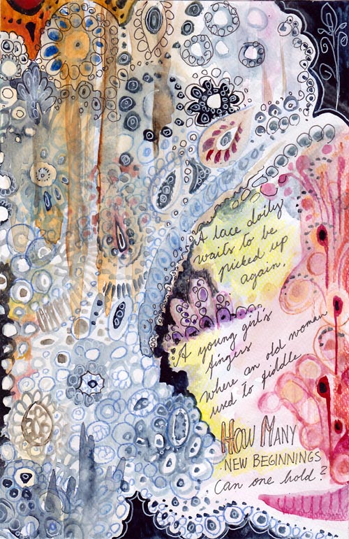
A lace doily waits to be picked up again.
A young girl’s fingers where an old woman used to fiddle.
How many beginnings can one hold?
This is an art journal page which illustrates a poem. I usually create the image first and then add the text. This time, I wrote the poem first and then illustrated it. Namely, for a long time I have had a desire to include creative writing in my art journals. I have loved poems since a small child and I used to write them all the time. After I grew up and moved away from home, it gradually stopped. But now years later, poems seem a great addition to art journal pages. Especially because I usually start writing a poem with a visual image in mind. Wouldn’t it be suitable to document that image too?
Of course, you do not have to be a poet to get into illustrating poems. You can also illustrate the poems that other people have written. Poems are great tools to get connected with the visual images that represent feelings. I think poems make a perfect pair with visual self-expression!
Illustrating Poems
1) Getting in touch with the feeling
Read the poem several times.
What kind of atmosphere does it create? What metaphors does it use? Are there physical objects or people to include?
There’s a risk of getting too rational here. Try answering these too:
What kind of memories or thoughts does the poem raise in you? What kind of rhythm, music or dance does it resemble?
2) Sketching
Lightly sketch the elements you want to include to the page. Write the poem or at least reserve a place for it.
I used watercolors for sketching. Light painting can bring a more intuitive approach to your work than using a pencil. You don’t need to know your exact composition yet. Think this phase as the first steps in the dark! Do not take it too seriously (= too rationally)! Focus on the feeling you want to express!

3) Expressing with composition
After sketching, adjust the composition by adding more elements to the page! With poems, I often feel that if the composition delivers the message, the rest is trivial or easy. There’s so much content in the words itself.
I wanted my page to lean to the right and then up. Right – because there’s a strong connection to the future in the text. Up – because the doily waits to be picked up in the story. I also chose the colors accordingly: blue representing the old and red representing the new.
4) Finishing
This phase is to fine-tune everything already created.
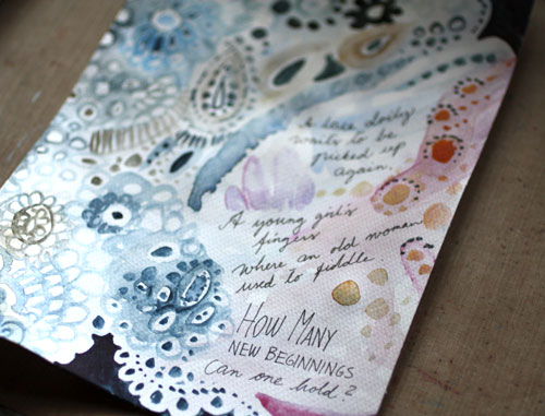
I wanted to add the feeling of fabric and emphasize the upward movement by adding thick lines with watercolors. I also made the lace more detailed. Then I added some dark areas to make lighter areas pop. A thin black marker and colored pencils are great for the finishing touches when using watercolors on the page.

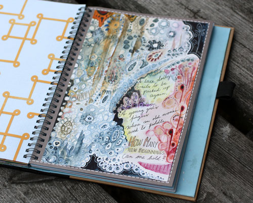
The page was made on a separate watercolor paper and then attached to the journal. Watercolors work best on watercolor paper. Even if you use a thin watercolor paper it’s better than using a smoother surface.
Illustrating Poems – A Minimalistic Approach
You know that I am not a particularly fond of minimalism in self-expression but with poems, I think it can be a very effective approach.

A yellow spot on a white painting.
A happy thought when leaving.
I saw the sun on a cloudy morning,
The one to brighten my being.
This poem of mine began with a visual image that called for simplicity. When aiming for lots of space, acrylic paints can be a better medium to use than watercolors. Acrylic paints have more substance themselves, and it’s easy to add slight, yet powerful color changes with them.
In this page, I divided the poem into three parts. The composition was built accordingly.

The first part is focused on expressing the latter sentence: the leaving. It is bittersweet, light peachy orange.
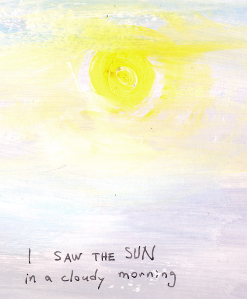
The second part visualizes the sun in cloudy weather.
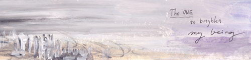
The last part communicates the person, her being and her relation to the world that she is leaving behind.
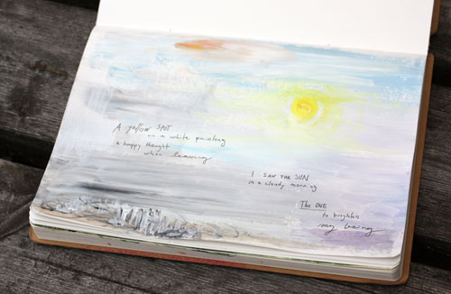
With acrylics, it’s easy to work on any surface. I used white gesso instead of white paint but only to save some money.
Art Journal of Poems
Think about having an art journal that is filled with illustrated poems! What a treasure would it be! The best things in life are those we can create ourselves.
Let me be your art teacher: Subscribe to my weekly emails!
From Photos to Art Nouveau – Doodling on Photos
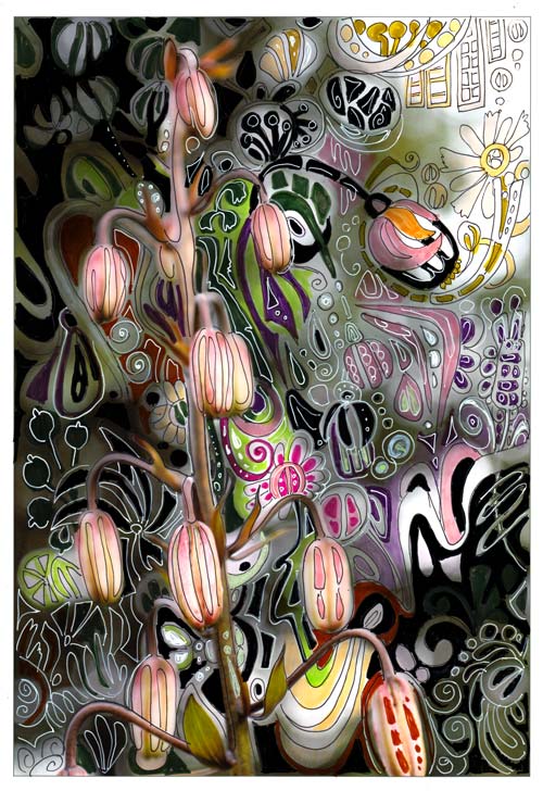
One of my favorite styles, art nouveau, thrives from natural forms. So, when I am walking in the garden, I see art nouveau everywhere. I often have a camera in my hand, and I snap photos while admiring the flowers.
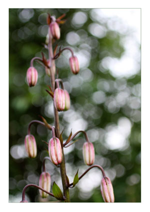 When checking photos after one of those walks, this snapshot of martagon’s flower buds caught my eye. It almost shouted art nouveau to me. Its shape reminded me of the Mackintosh lamp shades seen in Scotland a month ago.
Art Nouveau Martagon
I printed the photo on Canon matte photo paper. Simply using markers and gel pens, I doodled streamlined shapes to move the martagon to the era of renewal and decorative beauty.
In the original photo, the direction of the elements was downwards. I wanted to change the composition so that it would be upwards. The upward direction would refer to the spiritual renewal, a centric theme in art nouveau. I doodled several upward shapes like the flower seen in the upper right corner.

The colors of the plant were also a source of inspiration. I wanted to keep the narrow range of colors seen in the stem but also brighten the muted tones with splashes of bright green and pink.

Drawing on a photo was such a fun process that I will do it again. One idea would be to create art nouveau portraits. Art Nouveau style doodles would look great on portrait photos too. Actually, like in the best days of art nouveau, anything can be “beautified”!
Doodling on Photos
This was not the first time I used the technique of drawing on the photo.
In 2010, I combined doodles and a photo. This page was also very easy to do:
1) doodle with pens on the background paper
2) attach a photo and then doodle on the photo.
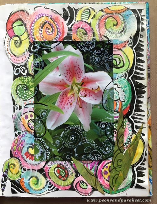
More projects with doodling on prints
These posts also combine printed images and doodling:
>> Subconscious Goals
>> Creating Wood
Let me be your mentor in art: Subscribe to my weekly emails!
Kiwi Patterned Paper

I am continuing the theme of the week to celebrate yellow. Here are step-by-step instructions for a striking patterned paper where yellow and orange are combined with dark colors. You can make variations on the pattern by choosing different colors, adding you own details and picking the materials that you prefer.
1) Fill the Paper with Big and Small Ovals
Fill the paper with intersecting ovals using freely cut templates. Cut plastic templates for a big and a small oval. To achieve an organic form, handcut the shapes freely. I used transparent plastic from a plastic sleeve meant for name tags. Also transpacency sheets for overhead projectors or any easy to cut plastic will do.
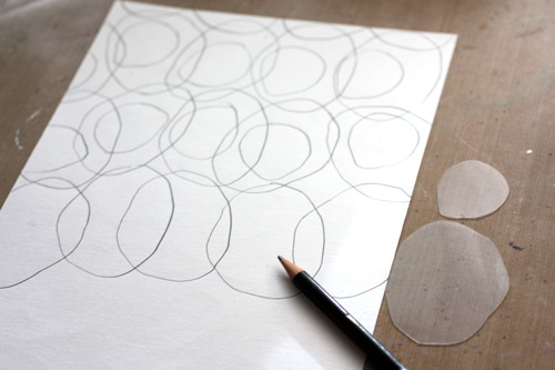
Starting with the bigger template, draw ovals on the paper so that they intersect slightly. Change the orientation of the template now and them. That way the pattern will look more lively. After filling the paper with bigger ovals, draw smaller ovals inside the bigger ones. Each smaller oval should cross one or two lines of the bigger ovals. Change the orientation and placement of the smaller ovals as you did with the bigger ones.
2) Paint the Centers of Small Ovals
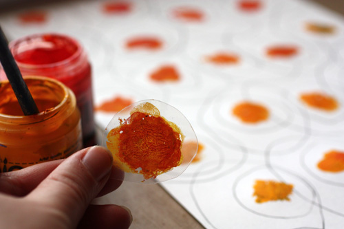
Add acrylic paint to the centers of the smaller ovals. Paint the centre of the smaller template and press one center at a time. Mix yellows and reds to get orange hues on the template. Each center can be a bit different from another.
3) Add Watercolor to the Smaller Ovals
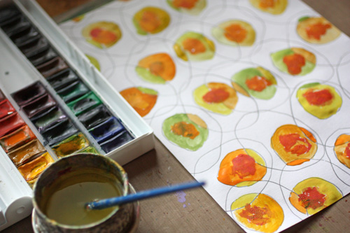
After the acrylic paint has dried, paint the smaller ovals with watercolors. Use yellows mixed with blues and reds. Color each part of the oval with different color. This way you will get an appealing look of ovals that have many hues.
4) Add Watercolor to the Bigger Ovals
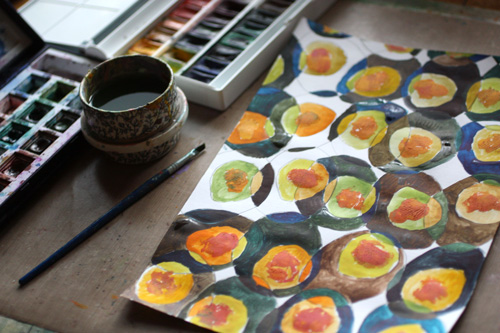
After the smaller ovals have dried, paint the bigger ovals with watercolors. Use mixes of browns, blues and blacks. Color each part of the oval with different color.
5) Fill The Background
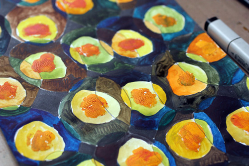
Using black marker, color pencil or watercolor, fill the small white background areas with black.
6) Add Details with Colored Pencils
Draw white lines around smaller ovals. Add black outline for smaller ovals. Color the edges of smaller ovals with red and green depending on the hue of the oval.
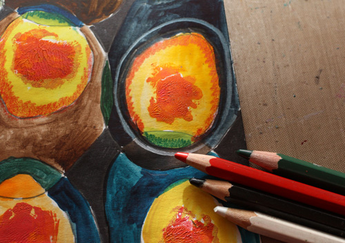
7) Final Touch: Thin Lines and Dots
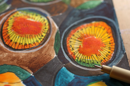
Finally pick a thin black marker or drawing pen. Add radial lines to the smaller ovals and decorate the lines with dots.
Let me be your art teacher: Subscribe to my weekly emails!