
Let Unconventional Inspire You

You know I love beautiful and decorative things. But the more I create, the more I feel that creating art should be expression first, aesthetics second. This watercolor collage is called “Leftright Wrongright” and it is about how sometimes the old wrong and unconventional can be the new right.
Rubber Stamp Art
If you think of experimental and avant-garde, would you ever consider using rubber stamps? In that context, they are the most boring thing. They are the absolutely wrong choice when you want to create unique and advanced art. But as my mission was to express how wrong can be right, I just could not resist taking the risk and using them! I painted the background with watercolors and then started stamping.
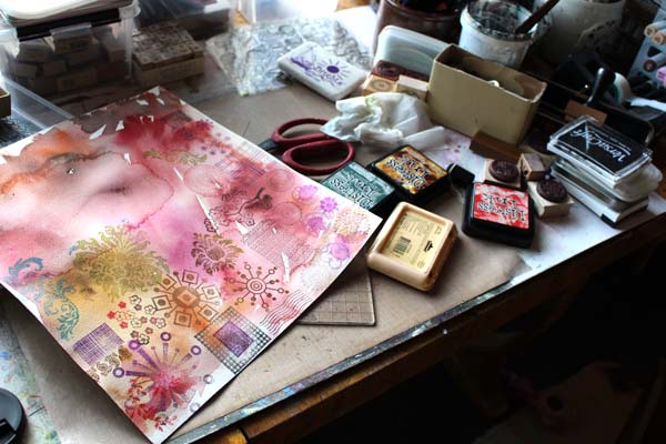
I only stamped once with each of the stamps. That way they were seen as individuals, not as a bunch of clones. I have used this principal before too, see Can Rubber Stamping be Art and Make Samplers to Save Bits and Pieces.
Watercolors
Watercolors are my trusted friend. They make the best backgrounds but also, they make rubber stamps look much more interesting. After the whole background was covered with stamped images, all different from each other, I added water and brushed the water-based ink to blend with watercolors.

With the big brush, I doodled this and that thinking fierce fully about destruction and bravery.
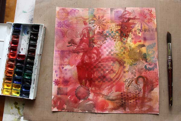
With a smaller brush, I added details and enhanced them with colored pencils.
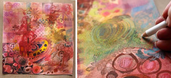
Imitating Rubber Stamps
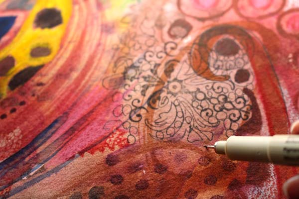
To make the stamped images even more individual, I added hand drawing to make few of them bigger and more handmade. A thin drawing pen is great for imitating rubber stamps that have delicate details.
Finishing
When I worked with this artwork, it became clear to me that the final touches are crucial here. I should not only do what I usually do but add something that is against the rules, disrespectful even. First, I doodled with a white gel pen and let the doodling look a bit dreadful. Then, I grabbed a piece of paper, painted red and yellow with heavy acrylic paint. The unsophisticated color and the clumsiness of the shapes when I cut it made it look so wrong.
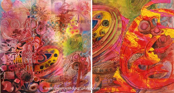
But I finished this artwork with a new attitude. As I wanted to express that sometimes we need to do things that make us feel uncomfortable, I needed to break my ordinary rules. I added few rough elements without over-decorating them. They are the wrong that makes the right spin. They make me ask: do right and wrong exist at all when creating art? If we think that unconventional is wrong, are we denying the true power of art and where it can take us?

Hopefully, this inspires you to add something wrong to your art, and make it right!
Let me be your art teacher: Subscribe to my weekly emails!
The Essence of Your Art
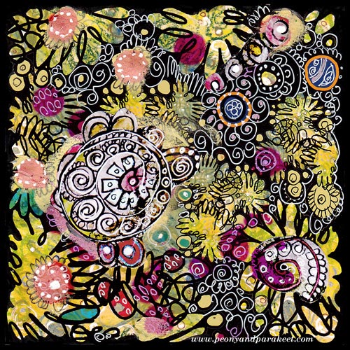
I found this old collage piece when I organized my archives. It is a design that I have used as a part of the fabric called Flow. As art journaling cute little girls with lovely little animals, is so popular nowadays, this made me think: what’s the essence of art is for me. And also, I would love to hear what it is for you!
For me, it’s not the play, even if I love playing. It’s not the colors even if I am totally for them. It’s not even the circles, my favorite shapes. I might aim for the certain styles, I love art nouveau and expressionism, for sure. But the essence of everything is that I want to create “everyday icons”, the images that make me stop, drop everything mundane and get in touch with my the inner thoughts.
Technically compositions, colors, shapes, styles, etc. create that. But when I am happy with the result, I do not think about those anymore. I think about what I feel and think right now and where it can take me.
The best thing is that everybody can create their personal icons, sacred images, mandalas, whatever you want to call them. They don’t need to be connected to any religion. They can just be connected to experiences, moments or beauty which uplift your spirit.
This is what I thought when I saw this old artwork. And now I wonder, what can I do better. How can I make this blog be the place for anyone to stop, then start creating – the essence of their art!
Subscribe to my weekly emails – Get a free mini-course!
From Movie Posters to Art Journal Pages
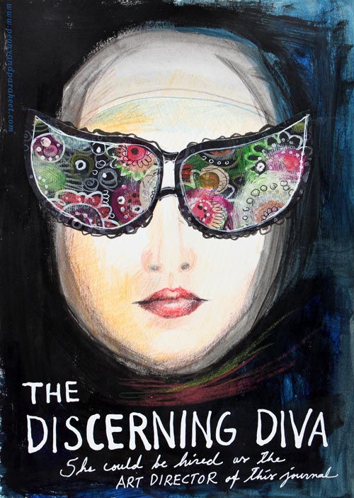
“The Discerning Diva – She could be hired as the art director of this journal.”
This page is my version of the poster for the movie “The Big Lebowski”. I have borrowed the concept of weird glasses and the composition from the poster, but it is still a separate artwork, not an exact copy.
The Discovery of Movie Posters
After learning that I like to use alphabet stamps in the art journal pages, I had been thinking about the next step in journaling. Last week I watched the poster artist James Victore‘s course Bold & Fearless Poster Design on Creative Live. His style has very little to do with mine, but I became fascinated by the visual concept of posters.
Last weekend I found a book about 1990’s movie posters at the local library. I became fascinated by the compositions used in the posters. Then it hit me: maybe I could replace the main elements with my own and apply the visual concept of the poster to my personal stories!
How to pick ideas from movie posters?
I will show you how to make your own “Discerning Diva” (very easy) but before that, I want to show you another poster-inspired page.

The page on the left is inspired by the poster for the movie “The Matrix”. I picked few main elements and the general atmosphere from the poster. The page on the right is made a long time ago, but I like how the two pages tell the story about being inside someone’s brain.
Four tips for picking ideas from the movie posters:
1) Composition: Examine the placement of the title, the grouping of the main elements and the most noticeable color contrasts.
2) Subject: Think about how your life could be applied to the movie.
3) Process: Examine the poster carefully but when you start creating, focus on your page and make it your own.
4) Imagine: Remember that you can replace the elements of the poster with whatever you like. For example, a person can be replaced with a vase of flowers.
Create Your Discerning Diva!
1) Paint the background of the page.
I used acrylic paints to make the background strong and heavy-looking. Leave an unpainted area for the face. Add water to the paint and gently brush the area around the face. Wet strokes create the impression of a thin scarf and add dimension.

2) Color the face.
I used colored pencils to maintain the big contrast between the background and the face. Add some color to the skin. Draw a mouth and a nose.

3) Add glasses.
Go to your box of hand drawn papers. Cut two lenses. Attach with glue or gel medium. Add frames with pens. Make the glasses as decorative as you like!

4) Add text.
Pick a color that has a high contrast with the background and journal on the bottom of the page. I have used a correction pen for the title and a white gel pen (Uni-Ball Signo) for the text below the title.

5) Add finishing strokes.
With colored pencils, add some strokes below the face to represent a scarf.
Add few strokes to outline the scarf near the forehead.
More Ideas for Compositions

Believe or not, this page is inspired by Austin Powers movie poster and hand embroidery! I think that hand embroidery has a lot in common with hand drawing.
Learn to draw from imagination and inspiration!
>> Buy Inspirational Drawing 2.0
Get the Most Out of Art Critique
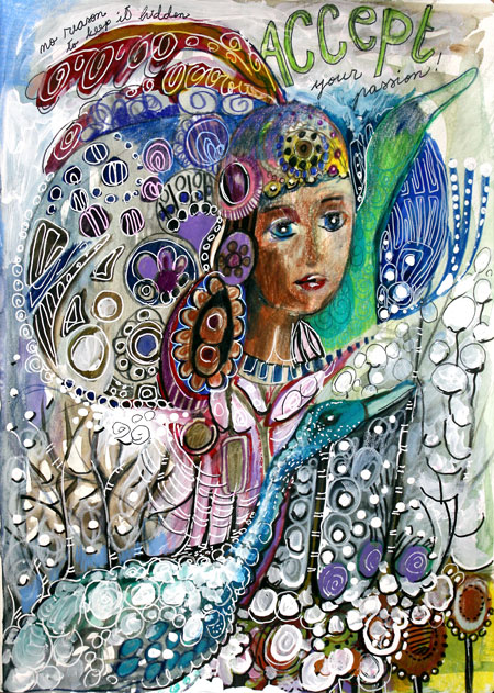
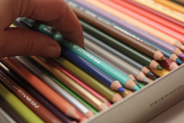
My latest art journal page is inspired by a discussion in an art journal group. It was about how to deal with the criticism towards your art. One woman told a story which touched me deeply. Someone had accidentally seen photos of her art and asked if they were made by her little grandchildren. After that she did not feel comfortable making art again. The story made me think about how important other people’s reactions to our arts and crafts is. How much we yearn for comments and how the critique can scare us. I also share those feelings. These are my conclusions of the subject. (And yes, I have new pencils!)
1) Pick Your Specialists
“Can you simplify, Paivi?”, said my teachers in so many words while I was studying industrial design. Because, in design, it all starts from the basic concepts, basic shapes and little alterations to them. I have always loved decorating. So I rushed through the first design decisions to get into adding swirls and tiny dots to the each of the designs. When I completed a sketch for a bar code reader, a teacher said: “What can I say, it is like a Russian icon painting with a flair of folk”. And he did not even know I had painted icons as a child!
“Your sketches all look the same”, he continued.
I did not get it. For me, they were all so different.
– “The same shape is repeated all over again.”
When I went back home, I thought that studying industrial design was going to change me to the direction I did not like. Within a year I would be living on a white box with no carpets on the floor and wear black glasses. But the end result was nothing like. My interest in art history and decorative art only increased within the time as practicing different styles helped me realize there’s no need to create a too narrow image of my own art.
At the end of the studies, one of the teachers said to me, carelessly: We just got an application from a person who reminded you: so many details, so little simplifying! We can’t accept him in. To design is to simplify. Despite your beginning, you do have learned that.” It meant a world to me – according to her, I was a simplifier, a designer.
In today’s world, there’s a specialist for everything. I yearned for the specialist to testify, objectively. And once she did, I was happy. But later I have begun to think that actually, in art, everyone has to define their own specialists. The range of art and design is huge and surely, everybody doesn’t like every piece of art.
So, don’t even expect that everybody likes your art – is a specialist of your style. Pick those that you want to please and forget the rest!
2) Improve Your Communication
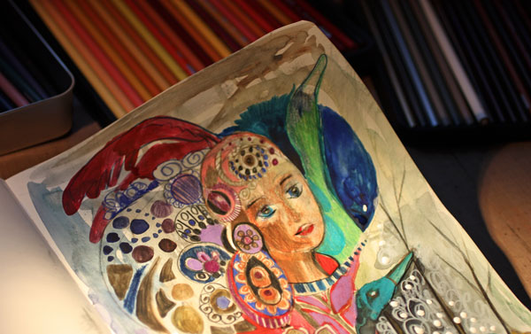
An artist Ann Rea has said: “Art is communication”. I think that focusing on what we want to say with our art is often more beneficial than focusing on the techniques. When someone comments our art, whether the feedback is positive or negative, we can always ask: “What do you see here? How does it make you feel? What do you like the most?” (Or “like the least”, if you are brave enough, and if you have chosen the person to be your specialist.)
Sometimes it is not so much about delivering a certain message, but touching people. When we are touched by our own art, it may seem surprising that others do not get touched by it. Then we need to improve our visual communication or fill in the story verbally. (The power of art journaling!)
Instead of thinking “I want to become a better artist” you may want to think “I want to become a better visual communicator.” After that, you will often find art critique easier to swallow!
3) Set the Risk Level
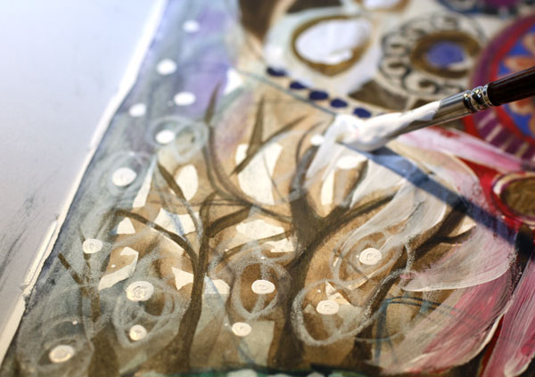
If you only want to hear positive comments, set the risk level low. One way to do that is to stick with the realistic art and copy those who have a lot of general acceptance.
But if you want to find your own style and in the end, truly touch people, take more risks! Experiment, observe, let go of the definitions you use for yourself, think about before you start to create and while creating, stop thinking! You can set the risk level for each individual piece, and go higher from one artwork after another.
Once in a while, give yourself a permission to make high-risk art! Sometimes it may also be good to take high risks when asking for comments! But never let anyone keep you away from creating when you are on the way of unique self-expression.
In need of experimenting? – Join me for an art journaling workshop!
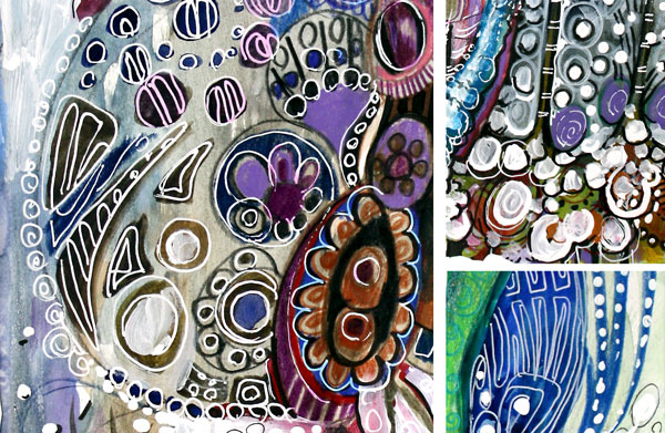
This is one of the many art journal pages inspired by embroidery techniques. Meet me at 21 Secrets Art Journaling Workshop where I will show you my favorite embroidered textiles and teach you how to imitate the embroideries with pens and paper! The perfect project if you want to stretch your style in a safe environment! The workshop begins in April, but you can preorder now!