Artist Statement, Portfolio, Prints – Presenting a New Website for My Art!
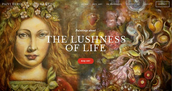
I have a new website for my art! It has an online shop filled with originals and prints, a portfolio, pictures of the paintings in progress, and my story. Go to paivieerola.com!
This Peony and Parakeet site will also continue, as well as blogging, classes, etc. but I wanted to have a better presentation of myself as an artist, not only as an art teacher. First, my intention was just to update this site, but it is already full of information, many of which I would like to bring more rather than less visible. So I decided to keep this site for art education and create a new site for selling art. Time will tell if having two sites is too confusing, hopefully not!
Artist Statement or Not?
I re-wrote the About page tens of times! It was quite easy to pick the things that I wanted to say, but it’s still difficult to not to be too boring! I decided not to put it in the form of an artist statement because I didn’t want to alienate anyone with long and grandiose sentences although the first sentences under the title could be seen as one:
“When Paivi Eerola is painting, she is a scientist who plays with the reality. Ducks can become plants, a fruit can replace fabric, and flowers can form a factory that produces glass. In this new world, everything is changing and moving, and it’s all celebrating the lushness of life.”
I wrote my story in the third person so that it can be used easily on other occasions too. While writing my story, I questioned if it’s really how you see me and my art. But in the end, everyone has their interpretations of the images, and this is just how and what I think when I am creating them. One thing that I left out is how I test my paintings.
Original Canvas Paintings and How I Test Them
When I paint on canvas, my goal is to create a treasure rather than just an image. I test the painting so that I lay it flat on the table, walk away from it and then turn back to see what my gut reaction is. If I just make a mark that there’s a painting on the table, I need to continue working on it. If the painting looks more like a thing, a glowing treasure box, then I have achieved my goal.
It’s really important to me to make paintings that stand the test of time. I have spent tens of hours painting these, and I hope that they will live longer than me. Sometimes I wonder if I have this strong aspiration because I don’t have any children.
Nothing beats the luxury of an original painting, especially when it’s varnished and the colors glow like the paint would still be wet. See the originals that I have currently available!
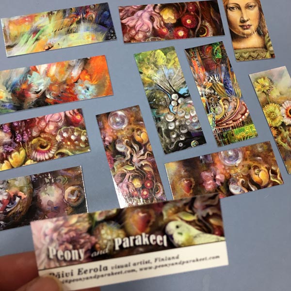
Prints from Me to You
So far, I have sold prints via Saatchi Art. It’s great for US customers especially because the prints are delivered directly from there, and they also provide canvas prints. However, I also want to have few prints available directly from me, and there’s a small selection at my new store. I have printed them with an inkjet printer on a lovely fine art paper.
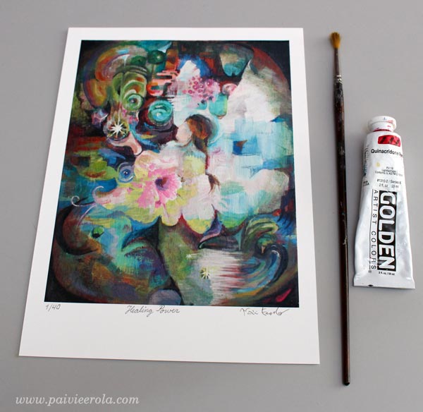
I am selling one of the prints as a limited edition. Every copy of it is signed and numbered. The painting in the print is called Healing Power. The original painting is sold, and I only produce 40 art prints from the image. So if you wish to have some healing power, would like to give that to someone, get your copy!
Portfolio
To show a big picture of what I have done, I wanted to include a portfolio that is like a small art gallery on my new website. I tried to pick the pieces that present my style but there was a lot to select from.
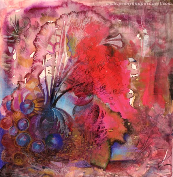
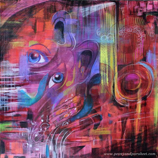
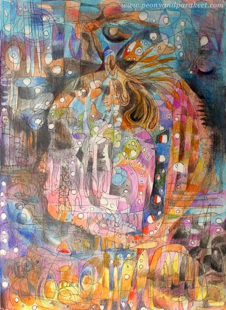
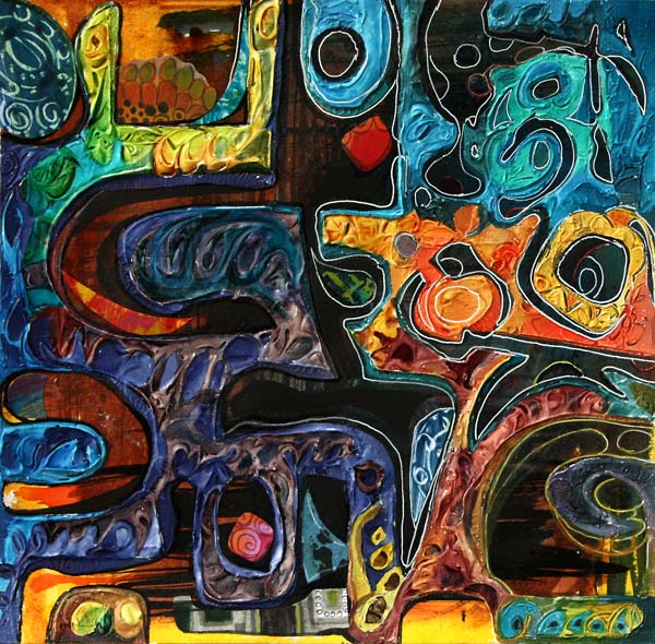
For example, I didn’t pick this one because I didn’t want to add too many. Anyway, I have a gallery on this site too, and it can be less curated!
Picking pieces for the portfolio is a really good exercise. It made me think about my artist’s path and see how my ideas have merged and grown to produce new work.
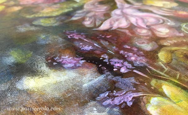
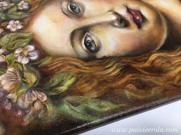
Paintings in Progress
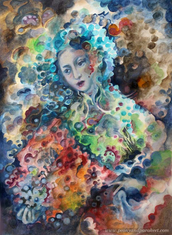
I always aim to be as transparent as possible. Being very secretive has never worked for me, it’s against my personality. So there’s a section called In Progress which shows the paintings that I currently work on. Now it shows my first series of oil paintings. Here’s one of them so far:

Oil paintings take even more time than acrylic paintings because I need to let them dry properly before adding a new layer. You can follow the progress at the new site. I also have a separate mailing list for all who are interested in buying my paintings. Subscribe to the list here!
Hopefully, you enjoy the new site!
Intuitive Painting with a Reference Image
Intuitive painting with a reference image – can it be possible? Let me show you how!
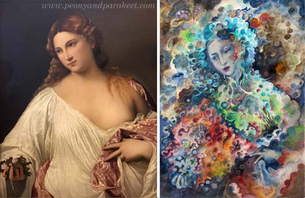
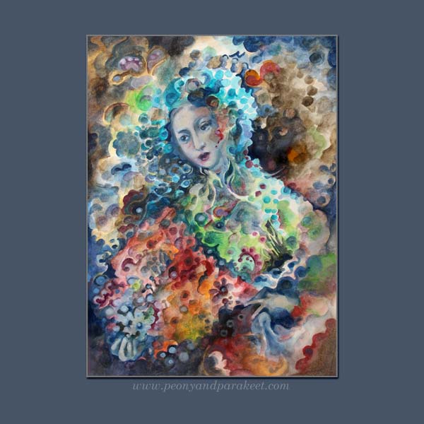
Here’s a painting from my sketchbook. It’s called “Madama Butterfly.” My reference image was this Renaissance painting called “Flora” by Tiziano Vecellio, 1515-1520. I took the photo last summer when visiting Uffizi Gallery, Florence, Italy.
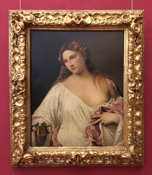
There are very little similarities in these two pieces. The pose is fairly similar, the composition and the facial features have some similarities, but that’s it. The style, the theme, and the technique are all different.
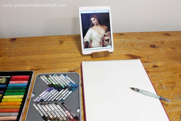
The Supplies And the Setting
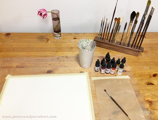
I like to do fairly quick paintings on my big A3-sized sketchbook. For this sketchbook, I often use Derwent Artbars, a water brush, and Faber-Castell Gelatos because they are easy to layer and I am more relaxed than when working with tube paints. I use acrylic or oil paints for canvas paintings, and working with them is more serious. This time I wanted to demonstrate a concept or a method rather than creating a 30-hour painting.
1) From Intentional to Intuitive Painting
The first idea was to pick the pose and the composition loosely from the reference image and then add geometric shapes to fill the space.
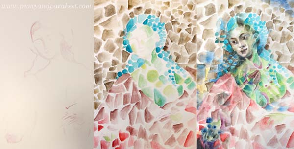
After sketching the foundation of the figure, the triangles, rectangles, and circles were fun to paint without looking at the reference at all. I painted the face roughly, and then I used the reference image as a guide. But because at this early stage, I didn’t know what I want to express and what kind of person the figure could be, I didn’t bother to spend time perfecting the facial features. At this point, my painting resembles cubistic pieces from the early 20th century.
2) Changing the Style
When creating art for the sketchbook, I like my style to be a bit more illustrational than when I make bigger paintings. Even if I love cubism, I wanted my piece to be a bit more current.
Nowadays, illustrations often use geometric shapes but rather than triangles or rectangles, the shapes are often round, and scallop edges seem to be a bit hit. So I started changing the painting by altering the shapes. This routine work gave me plenty of time to connect with my inner world and work intuitively from one association to another. I tend to be both nostalgic and romantic, so I thought how portrait painters often spend time with the clothing even if they are just a shell. Why not use it as a canvas for the memories, the ideas, and the achievements of the person?
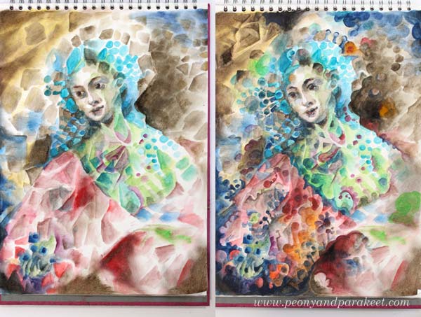
3) From Intuitive to Intentional
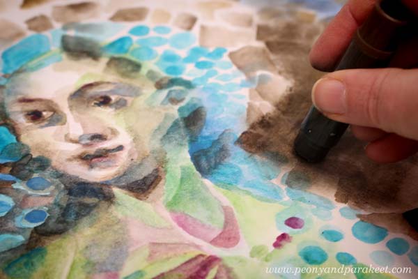
After rounding hundreds of triangles and rectangles, I realized that I was painting Madama Butterfly, the opera that I just saw last Saturday! I finished the face after this realization and adjusted other elements so that they fit with the theme.
More Intuitive Inspiration from Opera
This is not the first time I have been intuitively inspired by opera!
>> Tosca
>> La Traviata
And there’s also a video about
>> Kaija Saariaho’s Emilie
More About Simple Shapes
>> What to create from simple shapes – 6 ideas
Self-study classes:
>> Planet Color – release your mind by focusing on color!
>> Modern Mid-Century – put a modern twist to simple shapes!
Let me be your mentor in creating: Subscribe to my weekly emails!
Loose Realism in Watercolor – 6 Tips for Expressive Floral Art
It is the last week to sign up for my floral art class, so I wanted to show why flowers are so inspirational to create and give tips for expressive floral art. In this blog post, I make a fairly quick watercolor painting that treats the flower as a miracle of its own rather than a boring stereotype. Because let’s admit, we have all drawn these:

Using reference photos or real flowers as a reference doesn’t help if we just try to build the bridge between the stereotype and the real thing. The result can be even stiffer and more boring.
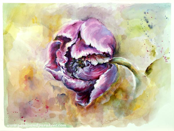
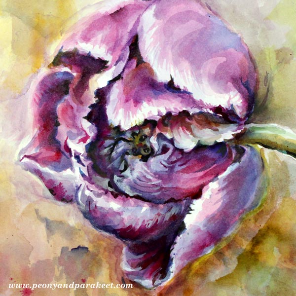
But flowers are not boring at all! I picked one fairly modest tulip from a vase to show you how to highlight its beauty and create expressive floral art.
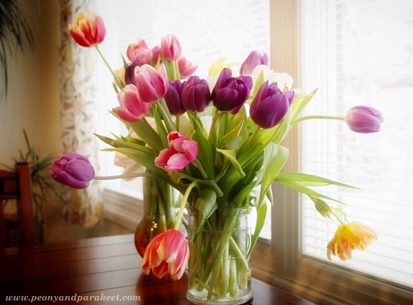
Here’s the setting:
And here are my six tips:
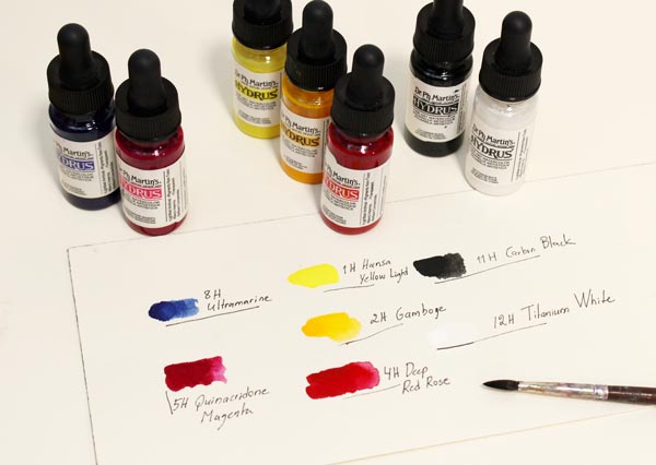
1) Flowers are Never Solid-Colored
You don’t have to use a huge range of colors, but mixing them to get several tones is essential. Here are the colors that I used for this project, just seven, and I mostly used only two of them: blue (ultramarine) and pink (Quinacridone Magenta).
2) The Structure of a Flower is Always More Elaborate Than You Think
Accept that you don’t quite understand the structure of any flower. It is much more elaborate than you can ever imagine. So when painting realistically, don’t simplify what you see!
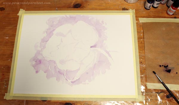
I began the painting by sketching the biggest petals with the mixture of blue and pink. Notice how pale my sketch is! In reality, it is even a bit paler, but I enhanced the photo so that you can see it more clearly. When painting with watercolors, it’s important to start with a very pale color so that you can fine-tune the painting as it progresses.
3) Flowers Have Strong Shadows
We usually connect flowers with light and light-weightedness and don’t want to use dark colors for them. But if you imagine being an ant living inside a flower, there are a lot of hiding places between the petals. Without those murky dens, bright plazas lose their shine, and the flower looks flat.
With the mixture of pink and blue, I continue by adding more shadows to the flower. The result is a bit like an underpainting (one of the techniques in the floral art class). It focuses on the lightness and darkness instead of the actual tones of color.
4) Flowers Are Full of Gently Flowing Streams
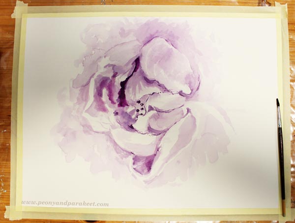
In general, flowers may look static but when expressing them with paint, take a different mindset! Every petal, shadow, bright spot, any detail, is a part of a dynamic, circulating and flowing stream.
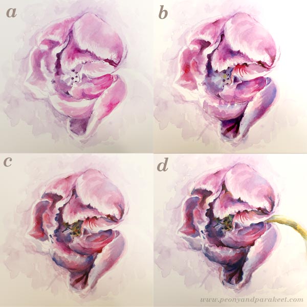
Instead of fixating to the big picture, I move from one detail to another and change them so that they are more curvy and organic.
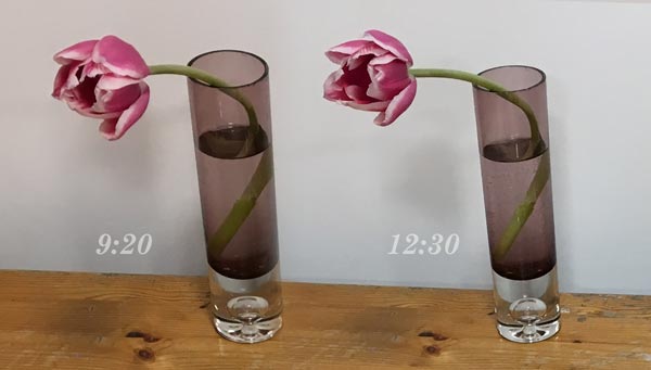
My tulip is not static either. The petals open with the daylight! It doesn’t bother me because I follow the streams of my painting more than the reference.
5) Flowers Are Never Separate from Their Surroundings
If you aim for a realistic look, don’t make the background too separate from the flower! In reality, colors interact with each other, and there are blurry reflections everywhere.
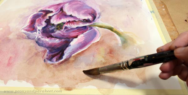
I mix some neutral colors for the background before finishing the flower. Then I go through all the details one more time, and finally paint and splash colors carelessly for the background.
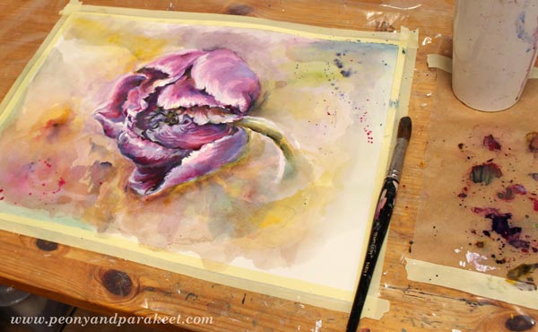
I use the same pink and blue in most of the color mixes than what I used for the flower. It makes the painting more unified.
6) Macro-Painting: Flowers Can Be Big!
When you want to give a realistic impression, don’t start with a tiny sketch! The smaller your flower is, the more difficult it becomes. My paper is 16 x 12 inches, and the flower is approximately 8 x 7 inches. I can easily think about creating a flower twice the size to get the details even more aesthetic.
Floral Fantasies – Create Expressive Floral Art!
Stylish floral designs, abstract intuitive flowers, and loose realistic art may seem different, but they all use similar building blocks, just in a bit different way. In Floral Fantasies, you grow your imagination, expression, and technical skills by creating beautiful floral art together with like-minded art enthusiasts! I will show methods that make your art bloom and help you to finish your pieces so that the expression shines through.
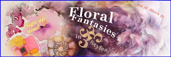
Floral Fantasies in Three Styles
Level up your skills and let flowers show the way to expressive art!
The registration closes on Sunday midnight, Feb 18th (PST). Sign up here!
How to Add Depth when Creating Abstract Mixed Media Florals

When I started drawing and painting as an adult, it took quite a long time for me to understand the power of creating visual depth. Before that, every time I wanted to highlight a particular element, I added more lines to it and it just looked stiffer and stiffer. When you add depth, your art is not like a sentence where every word is underlined.
Instead, your art becomes more like a paragraph that invites the viewer to dig deeper.
How to Add Depth – Create with Me!
In the video, I create a floral painting without any reference photos and give you some basic tips along the way. I use a mixed media approach and combine pens with paints to make the job easier!
Come and Create Unique Floral Treasures!
Level up your skills, find the process you love and let flowers show the way to expressive art! You don’t want to miss this class!
Floral Fantasies in 3 Styles begins on Feb 19th – sign up now!