
Mixed Media Painting Idea – Revisiting Your Old Style
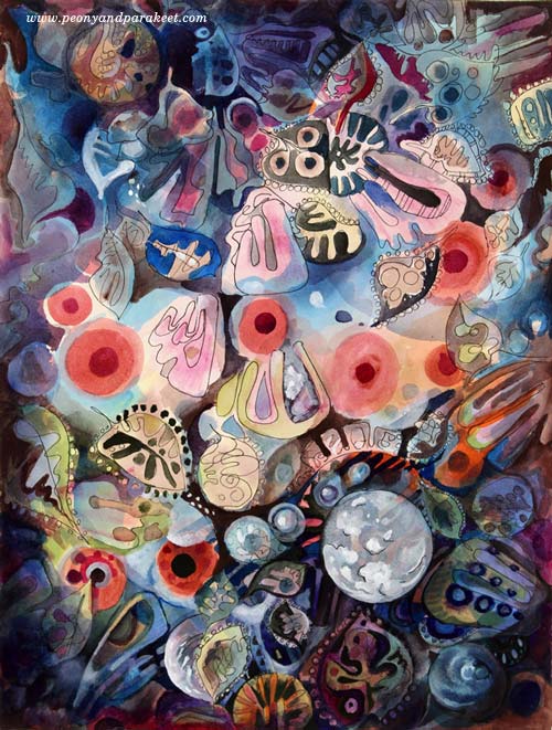
Between 2010-2014 I was enthusiastic about decorative art. I called myself as a “decorative artist” and saw myself more as a designer than as an artist who focuses on expression. My upcoming class Collageland (thank you, everyone, for the feedback you gave in the last blog post!), is a retrospective to that period in my life. While editing the videos, I have been pondering about what inspired me back then and how it’s different from what motivates me now.
Some themes and styles often feel too familiar to me. They don’t seem to challenge me anymore, so I have moved on. But now it hit me how harsh it sounds and how unnecessarily harsh it sometimes also is. So when creating the pieces shown in this blog post, I gave myself permission to take it easy and get decorative. I also became curious about comparing my past decorative work with the pieces that I would produce today.
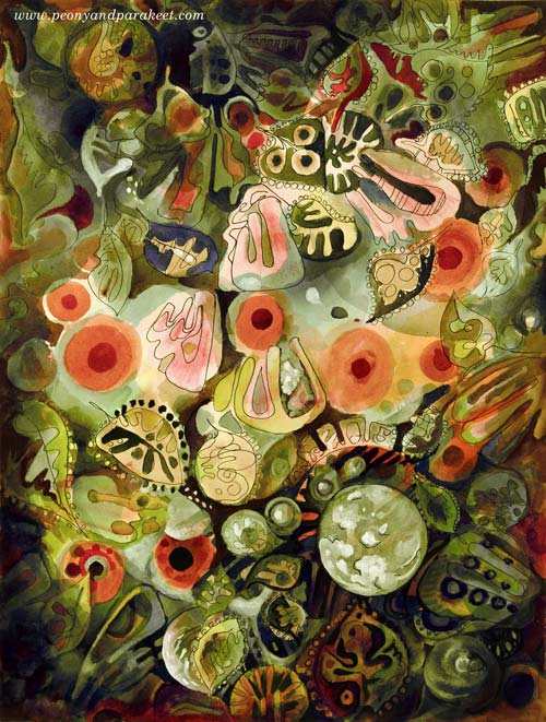
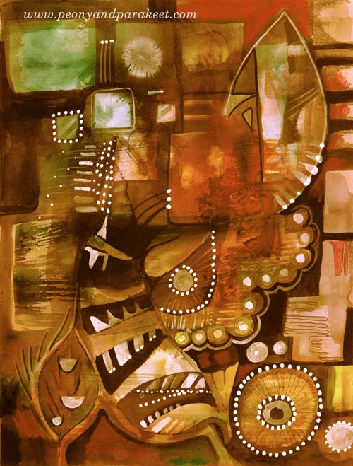
My comfort zone is getting inspired by design and translating that inspiration into art. So I made a mixed media painting that is inspired by the world of fashion, jewelry, lace, Renaissance murals, and botanical art. I call it “Lost and Found”. To embrace a designer’s approach to art, I also made two different color versions by processing the photo of the original artwork digitally in Photoshop.
Here’s Marine:

And here’s Botanical:
I don’t have many phase photos because I wanted to relax with that too but this is what I drew on my planner the previous day:

These quick sketches are the core of my creative process.
Another Painting with the Same Idea
I also made another design-inspired painting. The idea came from the ceramic art of the 1960s.
The photo below shows how the piece looked like before adding the decorative layers. Glowing watercolors remind me of the glazing used in ceramics. When this happens, I feel like I am a ceramic artist, playing with colors.
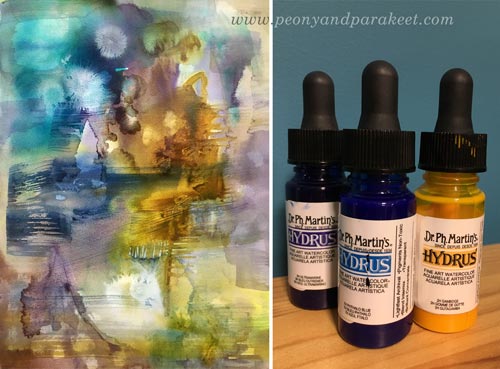
A student of mine kindly donated Dr. Ph. Martin’s Hydrus watercolors some time ago. First, I liked them, now I adore them. They are intensive and easy to use, and I especially love the coverage of white. I used Hydrus watercolors for “Lost and Found” too.
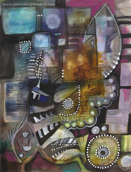
Here’s the finished painting called “Retro Living”. It is also a mixed media piece. I used colored pencils, PITT Artist Pens, and a correction pen for the last layers. I love these muted colors, so typical for the Finnish ceramics from the 60s. But then, I thought they might be too gloomy for many, so I made another version digitally that reminds me of furniture from that era:
Comparison
See my new gallery showing decorative art and designs from 2011 to this day. When I look at the newly-created pieces as a part of that collection, it looks to me like I have traveled a long journey in art. And I have – I just never thought that it would show in this decorative style as well. It makes me want to explore more of this and also, see exciting challenges in this direction too.
My challenge to you: Pick an old piece and make a new one using the similar techniques and style!
Let me be your mentor in art: Subscribe to my weekly emails!
Secret Language – Combining Two Ideas and Two Styles into One Image
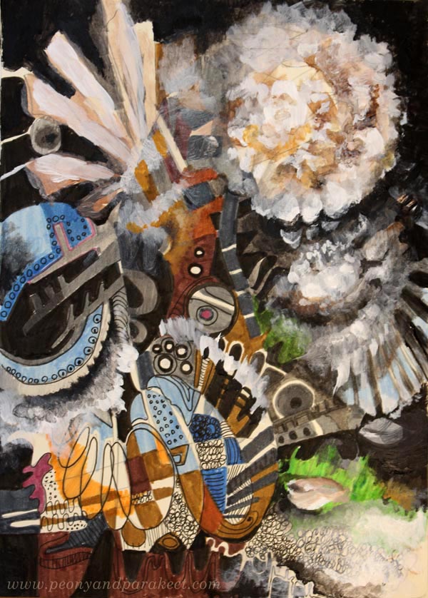
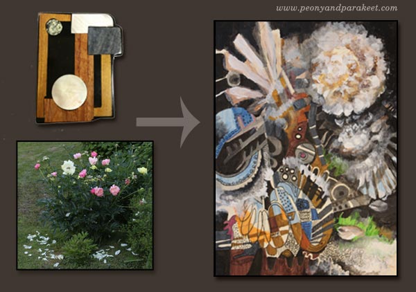
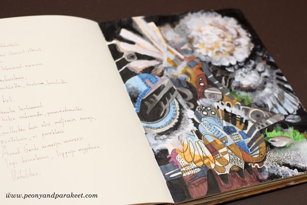
This is my latest art journal page called “The Secret Language of Peonies.” I had two inspiration sources for this page.
Mid-Century Modern Brooch
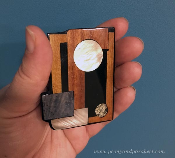
The first part of my inspiration was a brooch that I found at an antique fair. I think it could be a Danish design from the 1950s or 1960s. It only cost 5 EUR, and I liked the idea of having a brooch that is like a piece of abstract art.
Drawing Shapes – Pencil and Felt-Tipped Pens
When I began the journal page, I only had an idea of creating something more graphic than usual.
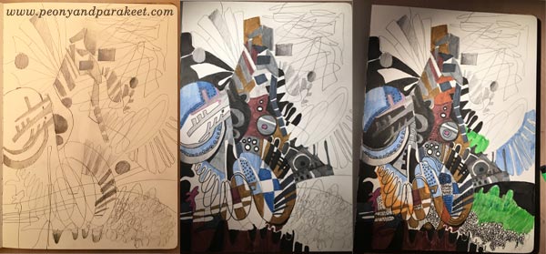
I made a rough sketch with a pencil and then colored a part of it with Faber-Castell PITT Artist Pens. Once the coloring progressed, I felt that I need another idea for the page. I also needed to get more clarity of what I want to say with the image. So I didn’t finish the page but left it to wait for another time and inspiration.
For the Love of Peonies – If They Could Speak …
I have nine peony bushes in the garden, and eight of them are blooming this summer. It’s like a big celebration to me, and I have been taking photos a lot. I also belong to the Finnish Peony Society, and they have a lively discussion group. While browsing my photos and seeing other people’s snapshots of peonies, I began to wonder why we always take these close-up photos, like the ones below.
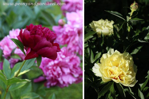
I took some steps further away from the flowers and tried to capture the atmosphere in my garden, instead of photographing just one flower.
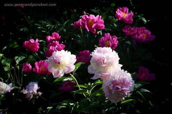
And then it hit me: I should also include the falling petals, the whole thing.
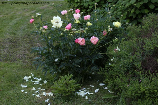
I imagined how peonies are setting a big show, fireworks included, and how we people don’t always get it. Everything in this performance is beautiful in some way. We should let go of the idea of a single flower and embrace the whole experience instead.
It also made me think how it can be liberating for the peony bushes to let go of the flowers. Falling petals and the wind blowing through the bushes must make soft sounds that only spiders and ants can hear. This whispering sound, in turn, made me think about the imaginative language of peonies – what kind of language would that be? And while I photographed the bushes, it became apparent to me: if that language exists, if peonies can really talk, it would be something rich, with a lot of nuances, many kinds of words, complicated structures. Something that we people are perhaps too inadequate to understand.
Two Ideas and Two Styles – Combining Ideas to Deliver the Message
I felt the urge to express my thoughts about peonies visually. Then I remembered the art journal page that I hadn’t finished yet. The complicated and secret language of peonies fit perfectly with the abstract shapes. All I needed to do, was to add some reference to peonies to complete the visual message. Because the language was something that had a dimension of its own, I wanted to use different media for the flowers.

So I painted the flowers with acrylic paint, just intuitively, without any fixated idea of how peonies should look.
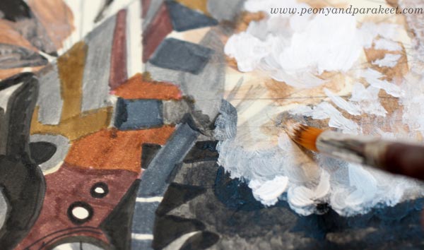
When peonies talk to each other, they see themselves in a different way than how we people see them. The flowers are just the frills. The heart of peonies is more intelligent than we think. It’s more like the brooch that I bought! Showing this controversy with two styles makes the page more interesting than sticking with one approach. What do you think?
When there’s an imaginative story behind the image, I like to write down some thoughts on the opposite page of the journal. It makes the journal as an idea book for bigger paintings where I want to include more than one or two ideas.
I also have something else to share …
Coming up: “Collageland”
Many of you who have been following me for some time, know that some years ago I made a lesson for 21 Secrets Spring 2015 art journaling class called “Artistic Embroidery with Pens and Paper.” This class is no longer available, and I have got back the rights to publish the lesson as an individual piece separate from the rest of the class. However, a lot has happened in the video quality since those times. When I watched my lesson, I wanted to re-record it. And not only re-record it but add more ideas and inspiration into it.
I got the idea of inviting you to my studio to get inspired by the many embroidered pieces, fabrics and quilts I have to show you. I also wanted to deliver the experience of spending a day in my studio and creating paper collages from that textile inspiration. So it would be like seeing my country Finland as “Collageland” and then rebuild it in your imagination.
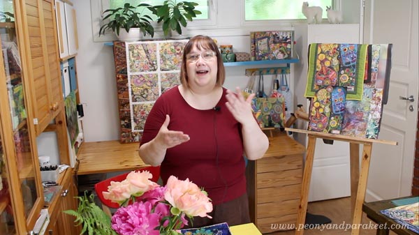
Last week, I recorded videos for one whole day from morning to evening. My husband also helped me so that we got the best footage for each step. I am currently in the process of editing the videos. Collageland is geared for beginners who like to doodle and see more possibilities in self-expression through it. My original thought was to publish a self-study, but I also want to ask you: are you interested and if so, how would you like this class to be delivered?
Consistency and How to Get Inspired by It

When artists say that they need to focus and find their style, a big part of the problem is the lack of consistency. To me, “consistent” used to be a negative word meaning “boring,” “predictable,” and even “unimaginative.” But during the recent years, I have realized that there can be a lot of freedom in the consistency.
Here’s an example. Last Sunday, I wanted to do some art journal pages inspired by my recent trip to Italy. I was already heading towards my paints and brushes when something else came to my mind. It hit me that I have art supplies I haven’t used for a long time. One of them was Faber-Castell Gelatos. They weren’t very cheap, but I had only used a little of them. They were too clumsy and creating with them felt like painting with lipsticks. These were definitely a wrong choice when thinking about old master paintings and the era of Renaissance.
But now the challenge of using Gelatos started to intrigue me. The idea of bringing those crafty sticks to the past felt like turning on a time machine. For some artists, it would be a sign of inconsistency not to stick with particular art supplies only. But when my goals are to bring people with different skill levels together, reveal the treasures of art history, and regularly offer new ideas for creating art, it’s very consistent. So I didn’t unnaturally have to limit myself but was able to enthusiastically create the art journal pages and write this blog post.
Inspiration: Palazzo Doria Pamphilj, Rome

My favorite place in Rome was a private art museum Palazzo Doria Pamphilj. It was located in the busy center, but after entering there, I was in a peaceful and beautiful world. There were a lot of inspiring paintings, but Jan Brueghel was a new artist to me, and his landscapes were unbelievably detailed. These paintings could have been huge, and they would still look detailed. But they weren’t very big; the length was under 1 meter in the painting below.

Another interesting thing was that Jan Brueghel collaborated with another artist Hendrick van Balen, who was specialized in painting figures. No wonder, the quality of these paintings is amazing! The painting above belongs to the series of four allegorical paintings, expressing the elements of water, fire, earth, and air. What a great theme for today’s artists too! And speaking of consistency: painting a series can also enforce that.
Abstract Landscape with Faber-Castell-Gelatos
I usually create art journal pages when my ideas are not mature enough for bigger paintings. Documenting these ideas in an art journal keeps the creative process flowing and maintains one aspect of consistency: the regularity of creating.
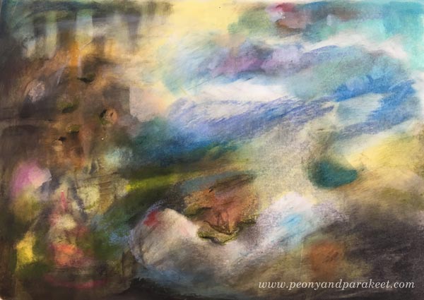
Experimenting with Gelatos was fun, and I especially enjoyed inventing ways to add details with those clumsy sticks. By building layers, I was also able to achieve a color scheme that brings old paintings in mind. The consistent inspiration from the many styles seen in the history of art sets me free. It goes so deep into what I ponder the most: how things change all the time and how timelessness can still be present.
3 Technique Tips for Art Journaling with Faber-Castell Gelatos
One way to be consistent is to develop techniques that are reusable. Often when I invent a technique for a specific media, it can also be applied to a variety of supplies. I will now show you some ideas for working with Faber-Castell Gelatos. You can adjust these for many other art supplies as well. I begin a second art journal page to demonstrate the techniques.
1) Blending and Softening
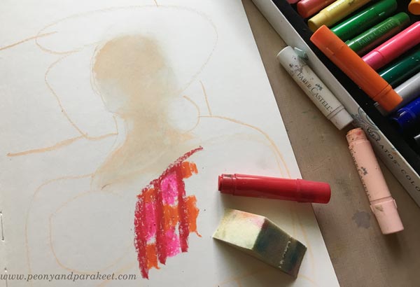
The more I have studied Renaissance art, the more I have been into creating soft color transitions and muted colors. When beginning a new painting, I like to blend and soften a lot. With Gelatos, the best way to mix the colors is to use a sponge. In the photo below, you see that I have mixed white and pale pink for the face but haven’t blended reds and oranges together yet.
2) Adding Details
Thick sticks don’t work very well for details. You can use the edge of the stick and get fairly thin lines, but to me, they weren’t thin enough!

However, I discovered that by using water, it’s possible to draw thinner lines with a brush. By adding water and rubbing gently, you can also remove some color and make tiny decorative spots that way.
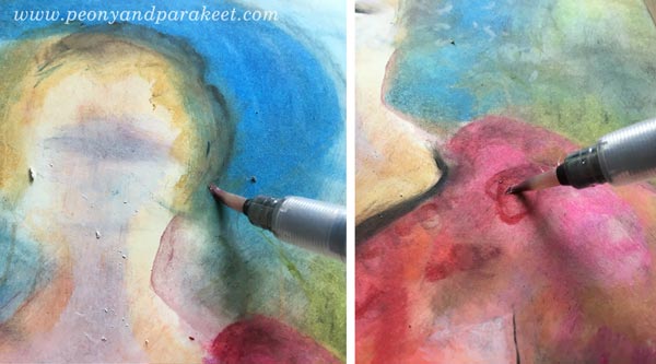
When painting with watercolors or acrylics, I like to work similarly: add a splotch of paint in one area and then quickly use it for details in other areas. It’s a fast and handy way to color details that need only a tiny portion of color each.
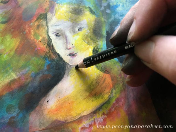
When finishing the face, I used colored pencils to draw the tiniest details. When keeping the Gelatos layers thin and smooth, it’s easy to add other media on the top.
3) Keep on Adding Layers!
When I started making the art journal page, I only had an idea of a lady or a Madonna because that would complement the landscape. I rarely use reference photos when creating art journal pages. To me, it’s more about getting in touch with vague ideas and then process them to express something that’s deeper and more defined. When I was in the middle of making the page, I was pretty clueless about what to express. But I kept on adding layers and slowly improving the image. One way to practice consistency is to keep on working with the same piece even if it looks like crap. See how much my page changed – examine the phase photos below!

In phase two, I remembered the atmosphere and the candles of Santa Maria Novella, a huge church in Florence. After finishing the page, I went to my photo archive and found an image that looks very similar to my page. It’s so surprising how many of its elements exist on the page even if I didn’t look at the photo at all!
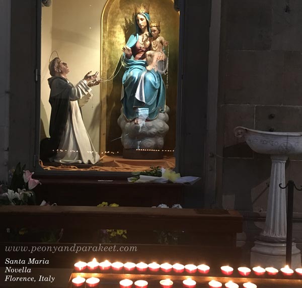
Regularly taking photos and browsing them is one way to add more consistency to the creative process.
Consistency is In the Way You Adjust the Nuances
After I had created the page, I felt that the opposite page should continue the same atmosphere. So I quickly made an abstract landscape there. Now when I open the spread of the journal, it feels more intense.

However, there are many things in these two pages that I don’t like. First and foremost, I don’t like the color scheme. It has too many bright colors and too few muted colors, and thus, it looks more modern that I would like it to look. I would like a color scheme that would be more like this:
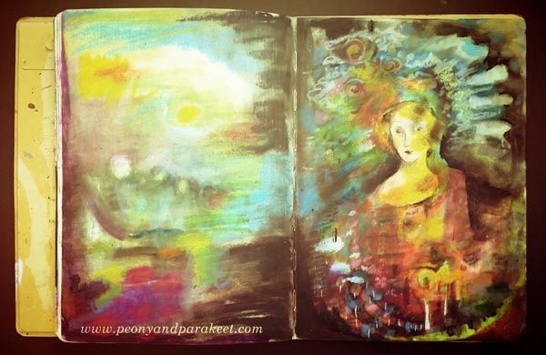
Also, if my art journal spread would be a big painting instead, I would make the face much more detailed. It’s simplicity, and the 2-dimensional look bothers me! By self-evaluating your work, you can also increase the awareness of the nuances you like. Adjusting the nuances, in turn, results in more consistency. Because many times consistency is more in the way you work with the nuances than how you select the themes and choose the supplies.
Let me be your mentor in art: Subscribe to my weekly emails!
When Another Art Class or Business Class is Not What You Need
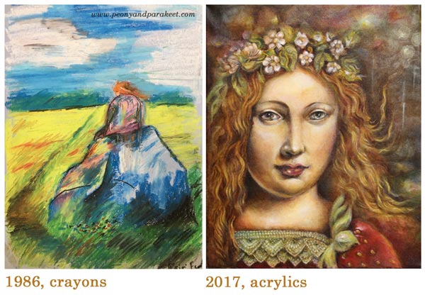
I was 17 years when I drew that red-haired girl sitting on a stone. Back then, I didn’t think about art as a business. I didn’t try to find my style. I wasn’t even fully aware of my lacking skills. Still, the image feels genuine to me. It illustrates the place where I still want to go in my imagination. I want to get rid of the everyday life, I want to climb higher, see the big picture, and feel the wind of change blowing against my face.
It took me tens of years to put my feeling into words – to become conscious of what I want to create and how I want to lead myself as an artist. I found my way by building methods that connect my imagination with what I do in practice. They include answering questions, finding images that speak to you, and creating art to process it all.
My coaching program The Exploring Artist is based on those methods. It is just what you need if you have been creating art for some time already. It’s different from the classes you have used to see and take.
When an Ordinary Art or Business Class Doesn’t Help You
Namely, the world is full of business classes that claim to know how you can sell your art. They teach you how to make a marketing strategy, review your business model, build your website, etc. But if you haven’t grown as an artist, know what kind of advocate you are, the investment is rarely worth all the money.
Similarly, the world is full of art classes. They teach you techniques that may grow your technical skills, but they don’t help, when you want to dive deeper, use the full potential of your imagination, and create from your personal standpoint.
The Exploring Artist – Sign up Now!
After The Exploring Artist, you might get excited about finding your people and take a business class. When you already know what kind of art you want to make and what kind of advocate for art you want to be, it will be enjoyable.
After The Exploring Artist, you might want to take an art class. When you know your blind spots, choosing the class and making the most of it, will be much easier.
So when you consider the price of The Exploring Artist, think how much you would spend on those other classes. Consider how much time have you already spent without truly growing your artistic identity.
This is a rare opportunity to work with your art, and give it the attention it has needed for years already.
>> The Exploring Artist begins July 1st – Hurry and sign up now!