Happy Holidays with Video Artwork
This week, I have a video artwork for you. Here’s how the background story goes:
Far away in an unknown land there is a crazy chapel. Your imagination is this chapel. When you’re there long enough, you can see anything, and experience anything, and some of it leaves a mark on your heart and thus on your art.
Art is born when you deviate from the paths and go alone to scary places. When you say: “That bench is just an inanimate object,” but still see it breathing. When you say: “These ornaments are just decorations,” but still see them dancing. Then time goes in a direction you don’t recognize, and you can’t control everything that starts spinning in your mind. This wild and crazy imagination is the source of both creative and spiritual life.
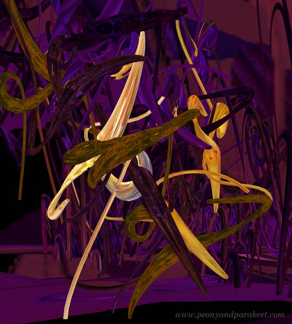
Crazy Chapel – Watch the Video Artwork!
I made this video artwork “Crazy Chapel” digitally step by step. The music was improvised on the iPad. The shapes were drawn in the Blender 3D modeling program. The movement and the generation of the shapes were programmed in C# programming language. The code and the shapes were put together in the Unity game engine. The introductory texts and the recorded scene were combined in the Da Vinci Resolve video editing program. This year was special to me, because I not only drew and painted, but also created animated art. (See more of how I make these animations: From Painting to Digital 3D – Video 1, Video 2)
Happy Holidays!
With the video artwork “Crazy Chapel”, I want to wish you happy and relaxing holidays. There are many ways to create, let’s celebrate it during these holidays!
P.S. This blog will be on a break for a week, but will be back after New Year.
P.P.S. I have often publiched a video greeting near Christmas. For example, check the video “Dreaming and Painting at Christmas” from 2015!
Watercolor Flower Obsession
This week, I have a fun video for you. In the video, I create a watercolor greeting card and talk about my obsession of painting flowers.

The card is A5 in size, so about 6 x 8 inches and I have painted it on watercolor paper.
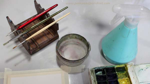
My smallest brush is very narrow and I could have coped with two brushes. In the course Freely Grown, we use the similar process, but finish with colored pencils, so it’s much easier than working with tiny brush strokes.
Watercolor Flower Obsession – Watch the Video!
In this video I confess how goal-oriented I am about painting flowers but also talk about the importance of play.
This video has a lot of material, you may want to watch it more than once to see them all! Also, here’s the link to last year’s greeting card, watch that video too!
Boutique of the Heart
In the video I talk about a boutique that’s not a commercial thing at all, vice versa:
“I believe that we can create the best boutique out of our own art. Imagine your workspace as a paper shop where you sell hand-painted cards, bookmarks, hand-drawn stickers, patterned papers – everything that is already art as such, but from which you can look for inspiration for bigger works. I have even come up with a name for this kind of personal shop. It’s Boutique of the Heart. There’s only one customer in the Boutique of the Heart – you, and one seller and manufacturer – you! The longer you keep the shop, the more you learn to love the things you draw and paint yourself.”
My message is that the essence of art is in play. Thus no matter how high you want to reach, you can still create art with a playful attitude and have your Boutique of the Heart. I know there are art instructors that solely focus on the techniques and those who are about fairytales and imagination, but I feel I am something between. I want to create art with people who want to move forward in art-making, but who also love imagination and free expression.

We can have obsessions, but there should always be time to play too.
What do you think?
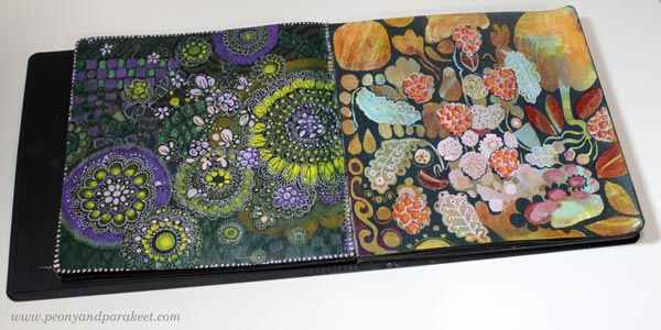
Black Art Journal Pages as Banners
I want my Black Friday campaigns to be inspiring for art-making, and this year my theme is “Black Berry Friday.” It means juicy art journal pages on black paper. I am pretty sure you have one like my black and square Dylusions Creative Journal (affiliate link).
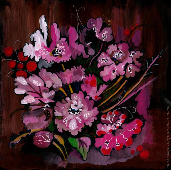
I use my black art journal for using up old supplies that don’t inspire me anymore. And if I have leftover paint on a palette, I make a few brush strokes on a page rather than toss the paint away. This floral page was born from those kinds of careless strokes and now, much later, I finished it with paint markers.
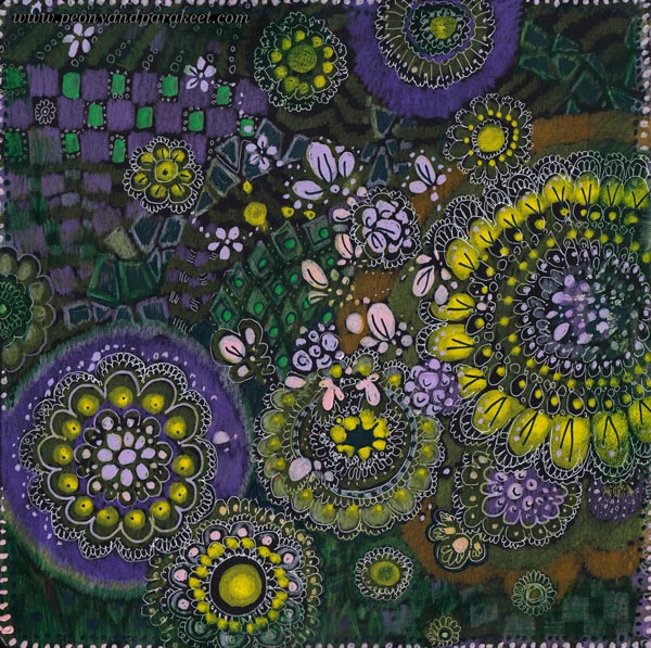
Edges and Banners
Usually, the center of the page is the most important area, but for banners, the edges need to draw attention. Here, the circular floral design, enhances the center text area beautifully.
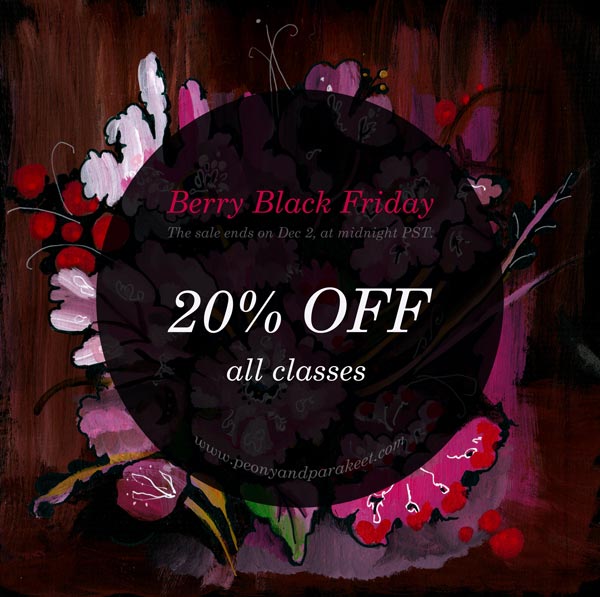
I made the banner in Photoshop, and boosted the colors a bit.
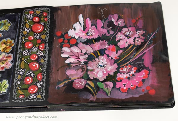
I also drew a long rectangle of cherries that not only makes a great banner but also looks great on the journal. I think we treat art journal pages too often as one unit when a page could be divided in sections and thus bring more variation to the journal.
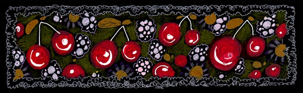
My banner wasn’t long enough for all the purposes, so I made it longer by duplicating the design in Photoshop.
Colored Pencils on Black Art Journal Pages
I like to use colored pencils with paint markers. Marker pens produce thick and opaque shapes but colored pencils are softer and more translucent. Colored pencils are great for backgrounds. Look at these stripes!
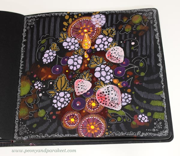
I also used gel pens to add thin lines.
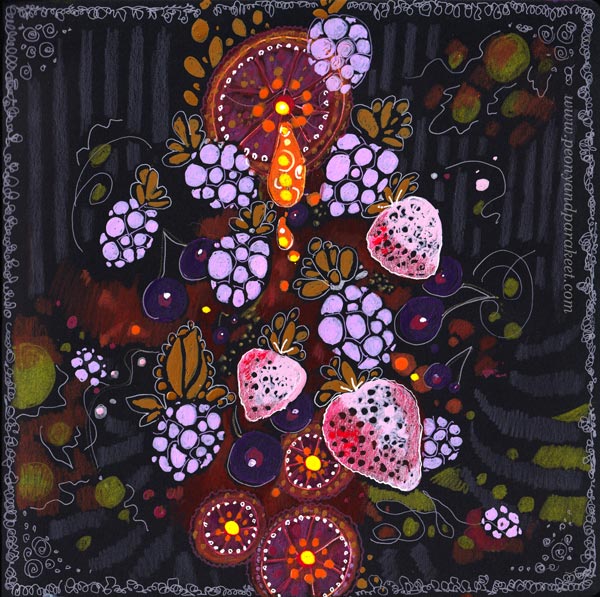
Again, I became more interested in the background than the center. The center is not very elegant, but here, in the banner you mostly see the edges.
Doodling on Black Art Journal Pages
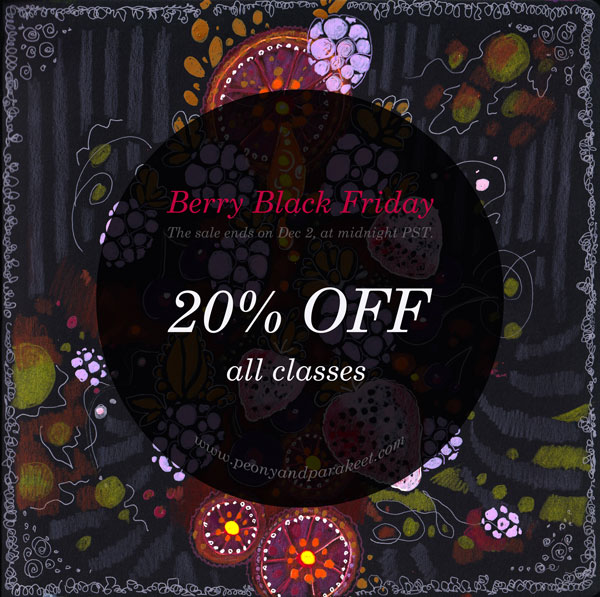
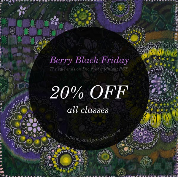
My Black Friday offer is simple: All classes are 20% OFF. So I wanted the banners have some simplicity too. Doodling circles is easy and doesn’t require much thinking.
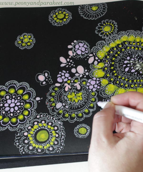
I got a bit carried away though!
I was talking on the phone and watching a movie while doodling, and once I stopped, I thought that I doodled too much. But the banner looks great and of course, there can’t be too much of anything in art!
Designs for Fabric
I got so inspired making these pages, that I had to play with Photoshop a bit more than necessary. I combined many pages into one design and I think something like this would make a great fabric.
Black Over Painted Background
I have been contemplating whether I should use both sides of the pages on my black art journal. Using only one side would give a blank page to protect the art on the opposite page. But the journal looks much more inspiring when both pages are covered!
Here’s one more idea for an art journal page, and this works on any journal. When you have painted backgrounds, use dark marker or paint on top to make shapes from the background.
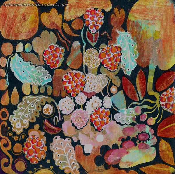
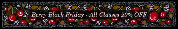
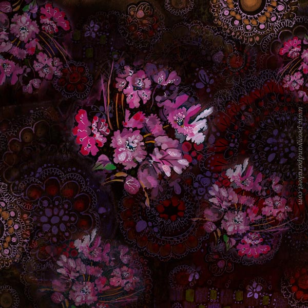
I wanted to make one banner that has fall and thanksgiving themes with berries. The page became a bit busy, but again, the banner is ok, I think!
And now: it’s time to shop the sale!
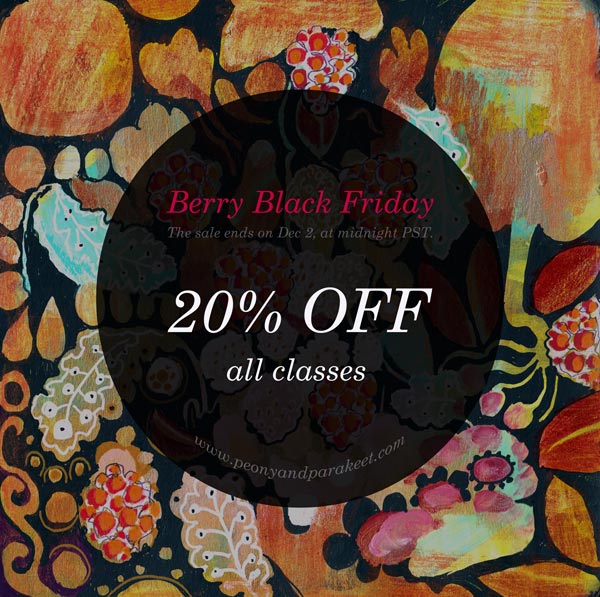
The Black Berry Friday sale ends on Dec 2, 2024, at midnight PST.
Berry Black Friday Sale Begins Now!
This year, for some reason, I am thinking about juicy berries and their deliciousness and beauty, so the sale is called Berry Black Friday. All of my online art classes are 20% OFF!
This is my biggest sale of the year, so now is the perfect time to get new inspiration for art-making! >> Buy here!
P.S. I have also written a new page How Classes Work for those who want to check the techninal things before purchasing. These are all very basic things, nothing special, but this is for newbies who want to check everything before purchasing their first class.