
Create Pastel Softness!

This time it’s all cute! I had the feeling that this blog is getting too serious. Don’t get me wrong! I want serious, I love serious and hope that you do too! Still, behind all good art, there’s a big portion of imagination. And the best way to embark that imagination is to play a little!
Pastel Colors in Teddy Bears

So I asked my teddy bears if they were willing to help me with this post. And they responded: “Yes, sure!” When I interviewed them, they reminded me that there are two big factors in cuteness: softness and pastel colors. “My friend is a black teddy and he does not get so many hugs as I do”, said Apple Blossom. Pink Princess continued: “It’s not just the color, but it’s the fluffy softness that’s important too!” And then they both agreed that the huge nose and strong eye contact make a teddy even more successful.
Pastel Colors in Old Scrap Pictures
Then I showed them the old scrap pictures that I had found from an antique flea market some years ago.

“Oh yes!”, they giggled. “If you want to create something cute, these sure are good examples! Round shapes make them look reaaaaally soft!”
India Ink and Circles
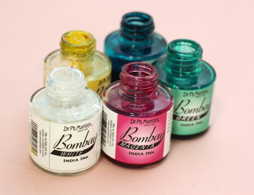
I picked up my India ink bottles (used also in the video blog post last week) and tried to think about what kind of soft and cute to create with them.
Then I remembered the round shapes. That could be the start.
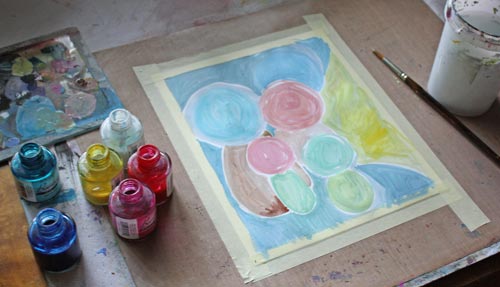
So I painted some round shapes with pastel colors on a thin watercolor paper. While painting, I noticed that to get beautiful pastels you need to use a lot of white. Sometimes adding a lot of white can create hues that lack softness if the base color is cold. You can fix that by adding some yellow or a tiny portion of black. Speaking of soft and white, meet another teddy of mine called Niamh …

I am not a big fan of white but who could not love the color after seeing her!
Clustered Shapes
Back to the painting: Small shapes were added near the large ones to create cute creatures. I made some large shapes form the part of the background. More shapes were painted to made creatures more interesting.
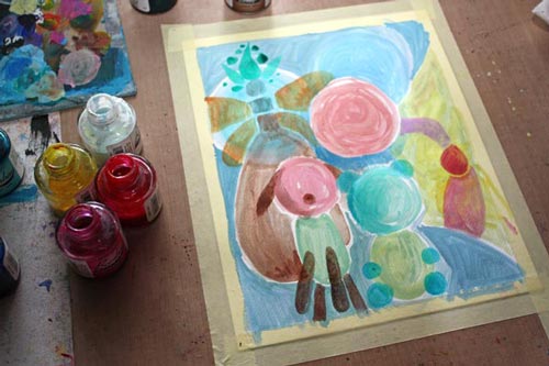
I made the shapes look dimensional and detailed with colored pencils.

Finishing
I finished the painting by adding more details and sharpening them with a white gel pen and a thin tip black marker. As a final touch, I added white acrylic paint on the face of the biggest creature. It lightens up the work and makes a great contrast with the black. Namely, if you look at the scrap pictures and the teddy bears, the black color makes pastels look so soft and bright. Small black dots here and there on a pastel colored circles can be enough to create a page that’s all soft and cute.

So, why not have a go: create a pastel colored art journal page to soften the hard world!
Let me be your mentor in art: Subscribe to my weekly emails!
Video Blog: Finding Inspiration from Plants
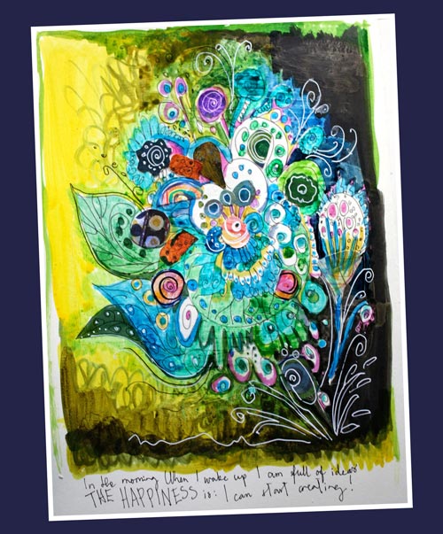
In this video blog post I am creating this art journal page and talk about finding inspiration from plants.
If you got interested in creating imaginative plant-inspired pages, see also the previous blog post mentioned on the video: Create Abstract Botanical Art!
Create Abstract Botanical Art!
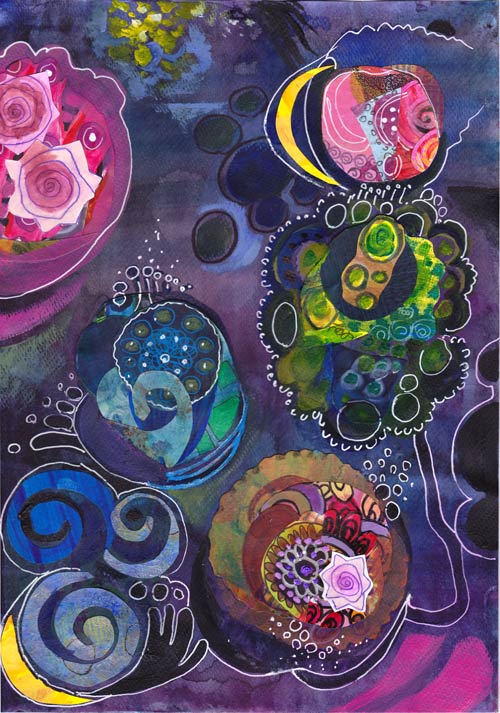
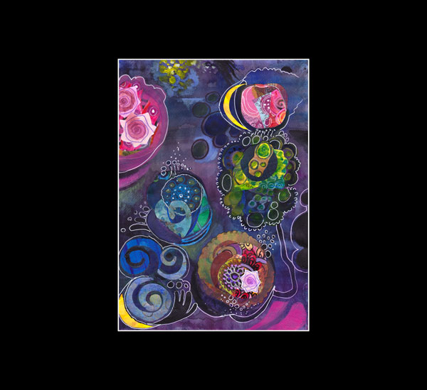
Last Friday I saw impressive paintings. When I see something that appeals to me, I try to analyze that in pieces. It is fascinating to find out little things that make a painting so memorable. I created this collage called “The Odd Nature” by using those factors. The whole subject – abstract botanical art – is mind-blowing.
Inspired by Hilma af Klint
Starting from the beginning: I was at Hilma af Klint‘s exhibition at Kunsthalle Helsinki. I had seen a few of her works before, but never this many at the same time. Hilma af Klint (1862-1944) painted botanical art and landscapes but then moved to create abstract art. She was a female artist and one of the pioneers of abstract art. When that is combined with her interest in spiritual ideas, no wonder she did not make her work public. In fact, she ordered that her work should be shown not earlier than 20 years after her death! Look at some of Hilma af Klint’s paintings on the Swedish Moderna Museet’s website.
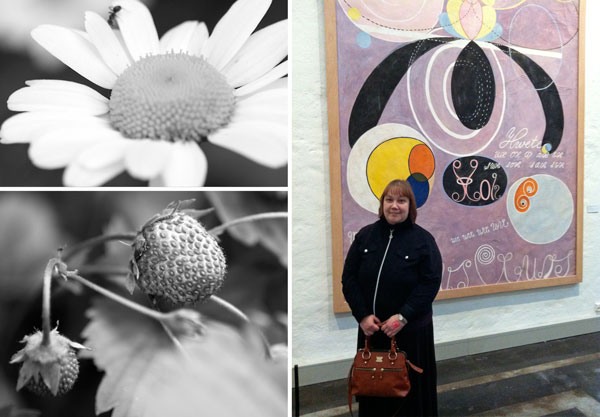
Here’s what inspired me with Hilma af Klint’s art:
1) Odd compositions that were skillfully balanced.
2) Graphic, often decorative shapes which reminded me of plants and biology.
3) The combination of bright and muted colors with great contrasts.
Zoom in on Nature!
After the exhibition, I began to think about how far we often look at the world around us. To me, it felt like Hilma af Klint had divided living objects like plants into small components and then constructed new pieces out of them. So I began to zoom in on the photos I had taken from my garden this year.

When thinking about the structure of apple blossom, I remembered something which is small too: the little box where I save the tiniest scraps of my hand-decorated papers.
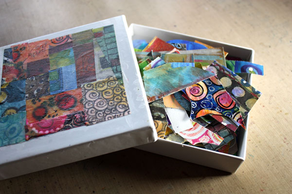
Creating abstract botanicals from the paper scraps would be the thing to do!
Color Inspiration
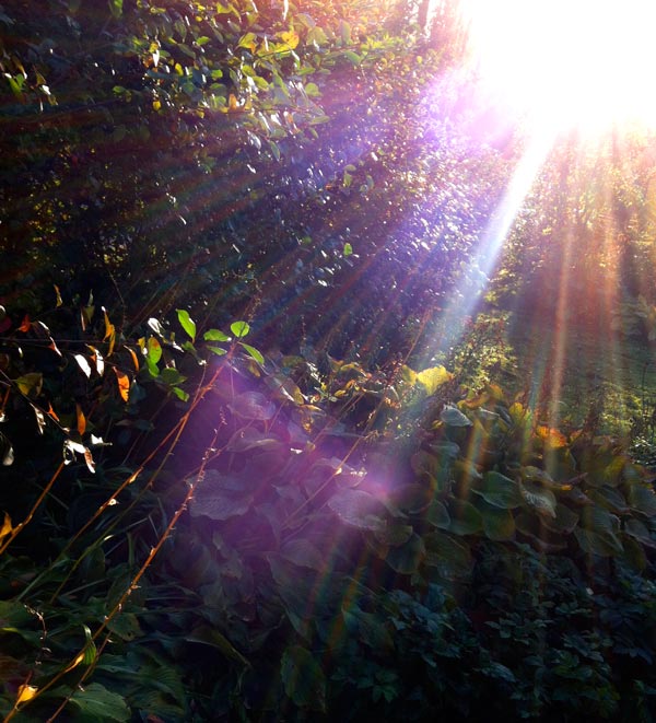
The idea for the color scheme and the atmosphere came from this photo, taken just a while ago. I painted the background blue purple by adding several layers with watercolors.
Collage Shapes
After the background had been finished, I began to create the abstract shapes.
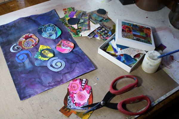
You can easily create intriguing collage pieces by combining small scraps together. Your cut shape does not need to be perfect before gluing it on the background. You can think of the shape as the beginning of the final shape. You can add more details with paint and pen around the shape later.
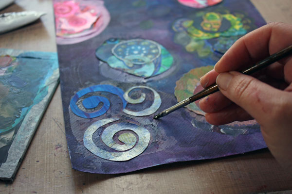
Composition
When gluing the shapes before they are finished, you need to make bold moves in the composition. I advise not to think of the composition more than this: make sure that the shapes are not evenly spread in the background. After the preliminary shapes are glued, you can then continue working with them by expanding them with painting and drawing. At the same time combine some of the shapes together and create new, smaller shapes to balance the work.
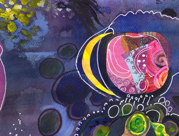
In my work, the center of the work is left almost empty. There I created a tiny detail that adds dimension to the work: a blue horizontal line near the two small circles.
So why not pick up your scraps and honor Hilma by creating surrealistic botanical art!
Read also
Fun Designs from Decorative Papers – An easy technique to create collage elements.
How to Draw a Rose – A simple rose seen in the collage above. You might want to use it as a decorative element too.
Video Blog: Mix-and-Match Inspiration
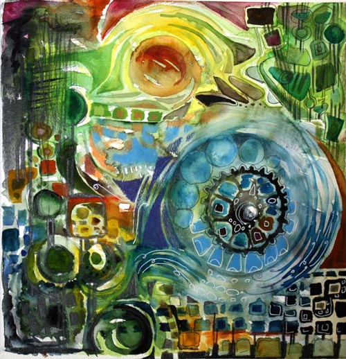
It’s time for a video blog post again! I will be creating this watercolor painting on the video. At the same time you will see how I grab pieces of inspiration here and there and add them to my work.
In the beginning of the video I am sitting on the floor of my new art studio. We are renovating a spare room for making art, photographing and shooting videos. I will show you more photos once the room is finished.

Here’s that turquoise studio wall again and me and my younger beagle, Stella. She is a very pampered pet, the sunshine of my life, also called as Princess Stephanie!
I am wearing one of my latest handknits, a sweater knit from Finnish naturally dyed wool, bought from a small Finnish company Riihivilla. If you are interested in knitting, here’s another picture of the sweater and more information about it.
Hopefully you will enjoy the video! Have a wonderful weekend full of inspiration!
Subscribe to my weekly emails – Get a free mini-course!