
Arboretum Patterned Paper
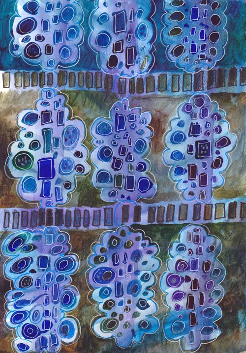
My newest design for hand decorated papers is called Arboretum. Arboretum as a word means a collection of trees. It is often used for the gardens where various kinds of trees from the collection. As you can see below, this design is very versatile: you can create any trees and play with the colors and pattern repeats.

I have used mainly watercolors here, but you can create this pattern with almost any supplies. When I designed this, I was inspired by two things: 1960s retro style and modern quilting.
Living in a house built in the 60s, we have brown, sturdy floor tiles and pine trees in the garden. The whole era celebrated the simple shapes forming simple designs. In modern quilting, solid fabrics are combined with modern patterns. Modern style quilts also often use asymmetrical and improvisational piecing.
I wanted to create a design that would be improvisational as well. I aimed for the painted design that leaves space for variations and self-expression. The simplified black and white pattern picture shows the structure more clearly.
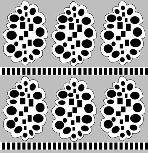
Each of the trees has rectangular shapes in the middle. They represent the trunk of the tree. The rectangles are surrounded by round shapes, which represent leaves. Each row is separated by the row of rectangles, representing the fence or earth. A single tree can also be used alone, as an element in an illustration or as the only image illustrating a text.
Step by Step Instructions for the Painted Design
1) Create the background

Use several colors to create the background. The colors can be intensive but not very dark as this is only the bottom layer that shows behind the trees.
I used thin watercolor paper, watercolors, broad brush and plenty of water. I worked with long strokes from top to bottom and vice versa. The paper was dry, but the brush was very wet. In the end, I added splashes of water to create even more variation.
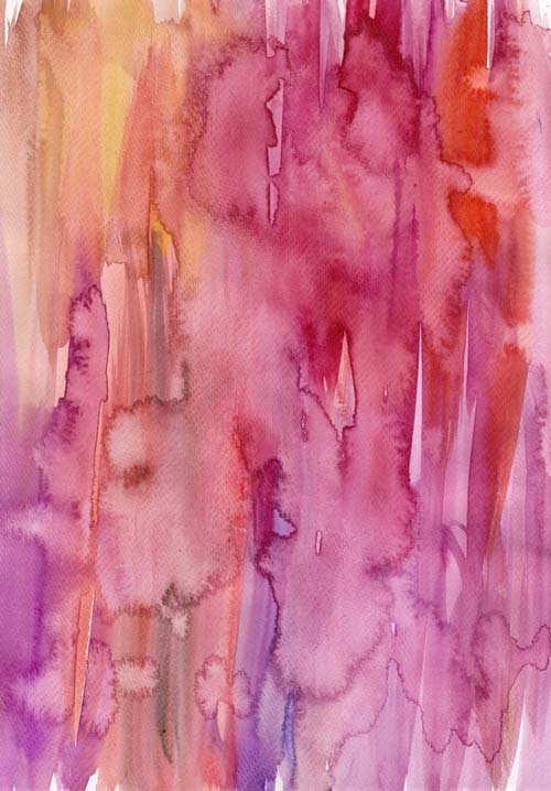
Let the background dry well. If you like the result, and you have a scanner, scan it so that you can use it multiple times by printing it!
2) Add the fences.
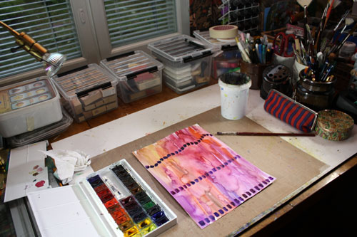
The fences can be straight or curvy. They can break or continue from edge to edge. The distance of these rows determines the size of your trees.
3) Add the trees.

Start with the rectangles of the trunk. Continue by adding circles near them. Create the rectangles and circles in different sizes and different colors. Color variation looks great especially if you maintain the intensity of the color fairly even between the shapes.

Leave some space between the trees.
3) Darken the background around the trees.
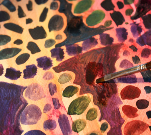
Add darker color to the space between the trees. You can use various colors here too. The dark background represents the sky.
4) Finish with doodles.

Create details to the rectangles and circles. I like to use white gel pen here. You can make each tree look different if you like.
My finished piece is inspired by fall. Thus some trees only had few leaves. On the top row, there ‘s also a tree that has rectangles set like branches. The darkest tree in the upper left corner reminds me of a cone. I could have made an art journal page too by replacing the fence with the journaling. There’s so many little tweaks you can make to this pattern to tell your personal story!

After creating these, I have begun to wonder: what if I cut some of the trees out and created a collage from them!

More patterned papers: Basic instructions + links to more
More inspiration from simple shapes: What to Create from Simple Shapes? 6 ideas
Let me be your art teacher: Subscribe to my weekly emails!
How to Mix Colors?
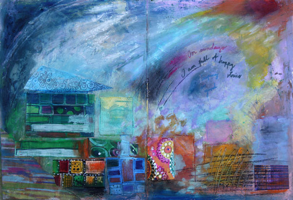
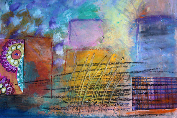
Here’s an art journaling page that I made to show you the gentleness of pastels and the strength of muted, darker shades. I often see art journaling pages that have a potential to be awesome, only if the color palette would be more unified! Meaning: only if the artist would have mixed the colors instead of using them straight from the tubes.
Choosing Color Combinations
Here’s the problem: we are pampered with many great colors by the art supply manufacturers. Like the colors of my Faber & Castell Gelatos, they look so pretty!
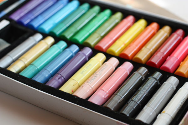
Still, you can pick colors there that won’t look so great together. Those colors have no common base color. Like the bright red, blue purple and mint green shown below. They have nothing in common. The bright red is a primary red; blue-purple is muted with black and mint green is muted with white. If you take out the mint green and mix the red and blue- purple, you can get a better combination. The brown, which is the mix of purple and red, ties the two colors together.
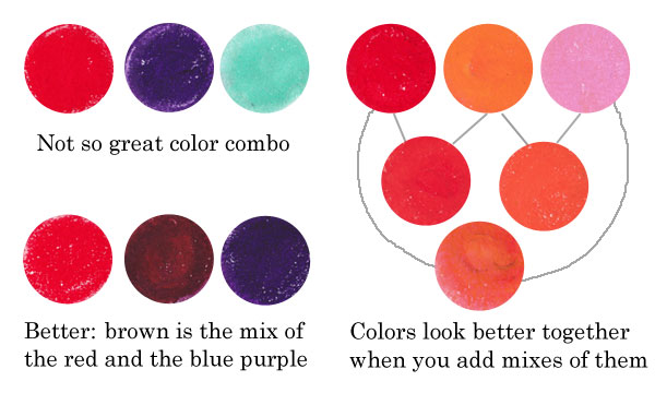
Similarly, if you use only red, orange and pink straight from the box, they look more separate than if you also use the colors that are mixes of them. Like parents and children, they form a unified color family.
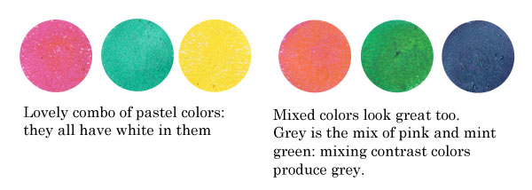
Another example: the colors that have a common base color, like the pastels below, suit well together. You can also mix them without fear: they produce lovely combinations. If you don’t want grays or muddy browns, avoid mixing contrast colors together. The contrast color pairs are red and green, blue and orange, yellow and blue-purple.
Sometimes people are afraid of getting grays and browns, and so they avoid mixing any colors. But those muddy colors make the brighter colors pop. See how muddy colors support the other colors in the art journal page that I made.
Playing with Tints and Shades
 One reason to mix colors is to get more natural, lively look. If you look at any photo, you can see a lot of colors there. The variation of light causes the huge amount of colors.
In the late 19th century, there was a genre of artists called impressionists. They were inspired by the daylight. They wanted to focus on the light, not on the objects themselves. If you are afraid of mixing the colors, look closely at Claude Monet’s Cliffs at Etretat and count the various tones there!

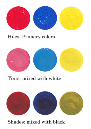
Instead of using primary colors like basic bright reds, blues and yellows and mixes of them, I encourage you to play with tints and shades: mix white or black to the primaries and get softer colors!
Using Faber & Castell Gelatos
When I began creating the art journal page, I chose to use gelato sticks with acrylics and hand decorated papers. I decided to use the background that I had made weeks ago, as its pastel colors reflected the cheerful mood I was having.

I like to create backgrounds when I am tired or uninspired. Then, when I start creating, I feel that I am already half done. When using various supplies in each layer of a page, I will get more variation in color without extra effort.

Faber & Castell Gelatos look like lipsticks, and they have similar kind of waxy feel. You can dilute them with water, but I think the greatest way is to mix them with a paper towel or soft sponge.
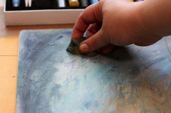
Gelatos work great on a painted surface. Notice that I created color mixes with slight variation in darkness. I used both tinted colors (mixed with white) and shaded tones (mixed with black).

Repeating Colors
One more thing to consider: color repeats. I am very careful of not repeating the same color too much. In general, when the color is used only once, it represents an individual. If it’s used twice or three times and the areas are closely located, they represent a group. But if the same color is here and there or evenly spread, it is often just a mess. The rational side of us wants to create color repeats. But once the work is finished it does not look rational at all! One more reason to mix those readymade tones!
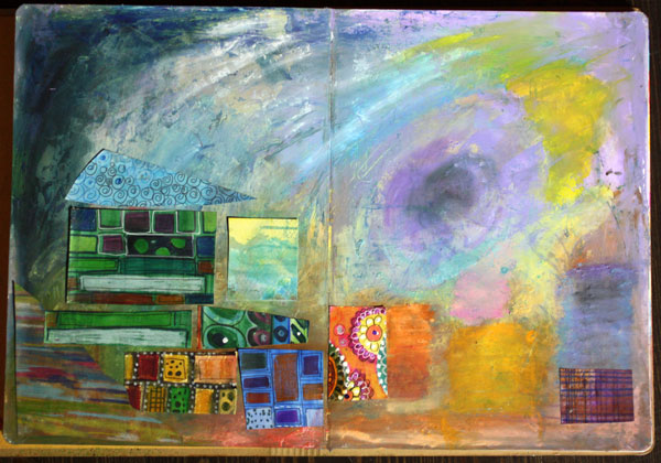
When I began to add hand decorated papers, I followed the same rule of controlling the number of repeats: not too much of the same paper.
Using hand decorated papers is a great way to add thin lines to a page. The gelatos have a waxy surface that can be difficult to handle with thin markers. For the journaling, I used Faber & Castell PITT brush pens.
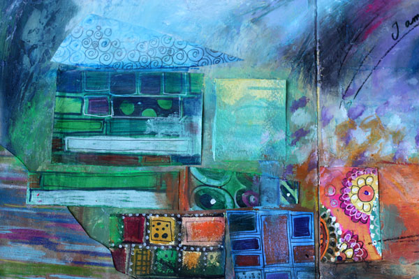
To make the collage look more integrated to the page, I added color with Gelatos on the papers.
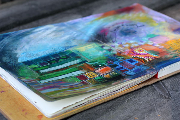
If I had to define art shortly, the definition would be: creating great color mixes and communicating with them. At least that is the step to take when you feel that the page you made does not represent what you wanted to create!
Read more about colors: Yellow, 5 Tips to Choosing Colors
Let me be your art teacher: Subscribe to my weekly emails!
How to Paint Watercolor Postcards in Vintage Style
I have beautiful, old floral postcards which inspired me to create some of my own. When making the cards I realized that it would be almost impossible to show the techniques with static images and text only. So I made a short video about how I improvised the cards. Only watercolors, two brushes, and a watercolor paper needed!
Watch a more comprehensive subscriber-only video!
>> Subscribe to my weekly emails!
Illustrating Poems in Art Journaling
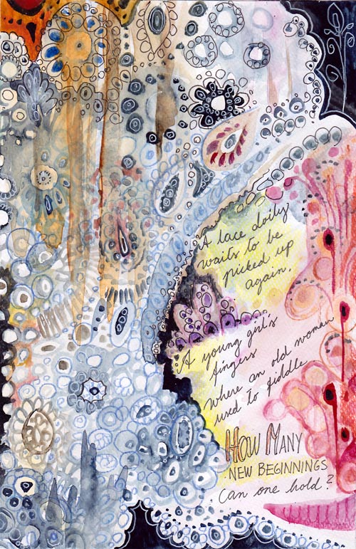
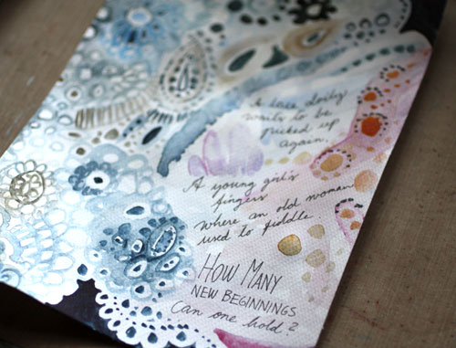
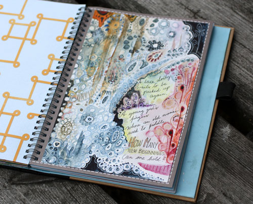
A lace doily waits to be picked up again.
A young girl’s fingers where an old woman used to fiddle.
How many beginnings can one hold?
This is an art journal page which illustrates a poem. I usually create the image first and then add the text. This time, I wrote the poem first and then illustrated it. Namely, for a long time I have had a desire to include creative writing in my art journals. I have loved poems since a small child and I used to write them all the time. After I grew up and moved away from home, it gradually stopped. But now years later, poems seem a great addition to art journal pages. Especially because I usually start writing a poem with a visual image in mind. Wouldn’t it be suitable to document that image too?
Of course, you do not have to be a poet to get into illustrating poems. You can also illustrate the poems that other people have written. Poems are great tools to get connected with the visual images that represent feelings. I think poems make a perfect pair with visual self-expression!
Illustrating Poems
1) Getting in touch with the feeling
Read the poem several times.
What kind of atmosphere does it create? What metaphors does it use? Are there physical objects or people to include?
There’s a risk of getting too rational here. Try answering these too:
What kind of memories or thoughts does the poem raise in you? What kind of rhythm, music or dance does it resemble?
2) Sketching
Lightly sketch the elements you want to include to the page. Write the poem or at least reserve a place for it.
I used watercolors for sketching. Light painting can bring a more intuitive approach to your work than using a pencil. You don’t need to know your exact composition yet. Think this phase as the first steps in the dark! Do not take it too seriously (= too rationally)! Focus on the feeling you want to express!

3) Expressing with composition
After sketching, adjust the composition by adding more elements to the page! With poems, I often feel that if the composition delivers the message, the rest is trivial or easy. There’s so much content in the words itself.
I wanted my page to lean to the right and then up. Right – because there’s a strong connection to the future in the text. Up – because the doily waits to be picked up in the story. I also chose the colors accordingly: blue representing the old and red representing the new.
4) Finishing
This phase is to fine-tune everything already created.
I wanted to add the feeling of fabric and emphasize the upward movement by adding thick lines with watercolors. I also made the lace more detailed. Then I added some dark areas to make lighter areas pop. A thin black marker and colored pencils are great for the finishing touches when using watercolors on the page.

The page was made on a separate watercolor paper and then attached to the journal. Watercolors work best on watercolor paper. Even if you use a thin watercolor paper it’s better than using a smoother surface.
Illustrating Poems – A Minimalistic Approach
You know that I am not a particularly fond of minimalism in self-expression but with poems, I think it can be a very effective approach.

A yellow spot on a white painting.
A happy thought when leaving.
I saw the sun on a cloudy morning,
The one to brighten my being.
This poem of mine began with a visual image that called for simplicity. When aiming for lots of space, acrylic paints can be a better medium to use than watercolors. Acrylic paints have more substance themselves, and it’s easy to add slight, yet powerful color changes with them.
In this page, I divided the poem into three parts. The composition was built accordingly.

The first part is focused on expressing the latter sentence: the leaving. It is bittersweet, light peachy orange.
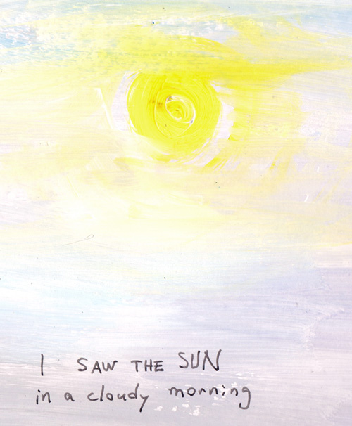
The second part visualizes the sun in cloudy weather.
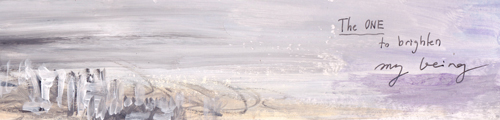
The last part communicates the person, her being and her relation to the world that she is leaving behind.
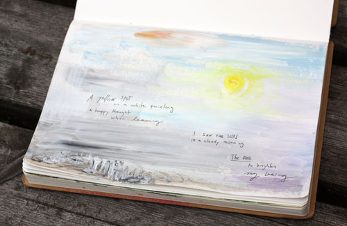
With acrylics, it’s easy to work on any surface. I used white gesso instead of white paint but only to save some money.
Art Journal of Poems
Think about having an art journal that is filled with illustrated poems! What a treasure would it be! The best things in life are those we can create ourselves.
Let me be your art teacher: Subscribe to my weekly emails!