
How and Why I Create Art?
I was challenged by Anu-Riikka for the blogging challenge “A Blog hop with a difference”. There are six questions to be answered so let’s begin!
1. What am I working on right now?
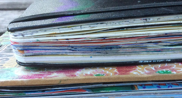
More than a single project I’d like to think about what’s new in my process. I always try to learn new things and expand my skills to keep creating interesting and exciting. At the moment I practice writing poems in English! I want to improve journaling in my art journal pages and use writing to enforce imagination. I used to write poems until young adulthood and have always loved literature. Writing in English provides an additional challenge because my mother tongue is Finnish. The world is so much bigger and better if you are not limited to the language. I can also write in Swedish, and I used to study German at school, but Spanish or Portugal would be great to master too!
2. How long does it take to create a project?
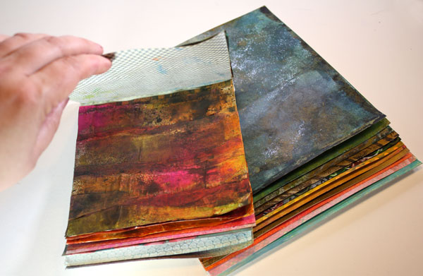
A small art project for the blog usually takes at least two days to create. I do not like to finish anything at one go because the quality gets better if I have time to ponder. I often work with projects in phases so that decorated papers or sketches are created a long time before I execute the final project. I also use a lot of time to think about techniques and ideas before I start. Sometimes when I start creating, I realize that my thoughts have gone wrong. Luckily it is easy to turn a new page from my art journal and start it over!
3. What are my fave things I love to create with at the moment?
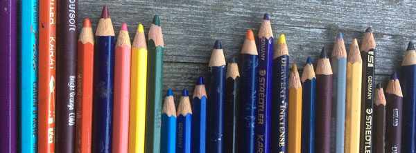
I have tried a wide variety of art and craft supplies but enjoy basic supplies the most. You do not need much to start creating. My favorite supplies are colored pencils, markers, watercolors, acrylic paints, blank paper, and scissors. It has become more and more difficult to enjoy creating projects that use ready-made products. I get a lot of satisfaction of not buying and creating things myself. Even if I enjoy seeing art in general, I do not get much out of following projects that use heavily ready-made products like paper flowers or stickers. I wish more and more people could give a chance for their imagination and experience how satisfying it is to create something from start to finish.
4. How does my writing/creating process work?
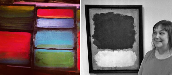
I believe that we should act creatively but ensure that it’s made thoughtfully. That’s why it is good for anybody to clarify the reasons why they create. I make art for two main reasons: 1) to be able to communicate with other people 2) to show my admiration for the great masters of art and design.
My creative process is very formal because I love organization. During my designer studies, I learned the basics of the design process. It includes background study, collecting, combining and testing ideas, executing in phases and getting feedback in appropriate stages. Even if it sounds controlled and complicated, it doesn’t feel like that. Each phase is adjustable: it can take very short or long time, and it can be repeated when needed. Working systematically gives full power to my creativity. I also like to work towards a pre-planned schedule. When I have set a limited time for creating I feel freer than constantly questioning whether the process has taken too much time or not.
5. How do I become inspired and stay inspired?

I love art, design, and architecture. Show me any picture of the history of art and design, and I get inspired! I become very easily inspired, and that can sometimes be distracting. On the other hand, I think that inspiration is overrated and regularity in creating underrated. I hope that I can help people create more regularly so that they get to know themselves and love their own work. I also hope that my regular practice will improve my skills to communicate visually and verbally.
6. What is my signature style?
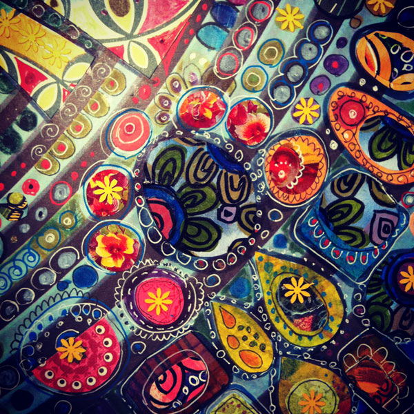
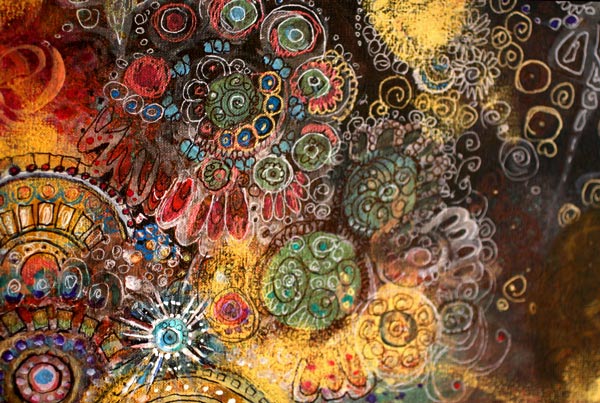
My work has a lot to do with colors. I think that colors can communicate feelings most effectively. In composition, I often aim for dynamicity. I also try to achieve the balance between relaxed and free-flowing line and accuracy, almost engineer-like look. My style is some mixture of folk style and art nouveau with a twist of the 1970s. However, I have begun to hope that I would have no signature style at all! The more I create, the more I have become to value diversity. I want to learn to understand as many styles and artists as possible and help others find them too.
How would you answer these questions? Share it by commenting this post or if you have a blog, linking a post to the comment!
Subscribe to my weekly emails – Get a free mini-course!
Imitate Ceramic Art!
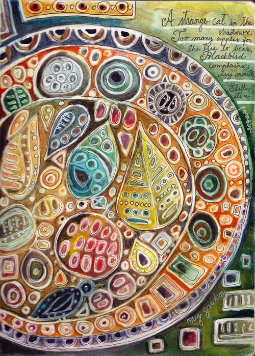
A strange cat in the shadows.
Too many apples for the tree to bear.
A blackbird complains: Dry mouth!
Still, it’s a paradise: my garden.
This is an art journal page where I wanted to achieve two things:
1) imitate Scandinavian ceramic artists of 1940-1960s
2) write a poem and illustrate it
Scandinavian Ceramic Art
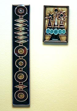 Let’s start with the artists: Annikki Hovisaari from Finland and Lisa Larson from Sweden. They are women who made beautiful ceramic art in 40s-60s. Annikki Hovisaari died in 2004 but Lisa Larson is still alive and she has a website too.
Me and my husband own a couple of Annikki Hovisaari’s work. We have bought those from antique fairs.
I found out about Lisa Larson in Scandinavian Retro magazine nr 1/2014. You can also see the best work of hers by searching from Google with the search term “Lisa Larson tile”
When I examined the work of these two artists, it was clear that a white correction pen would be perfect to imitate the lines. I made a couple of small pages by combining the correction pen with acrylic paints and PITT Artist Pens. However I was not fully satisfied with the outcome. These did not have the liveliness in color that I wanted to achieve.
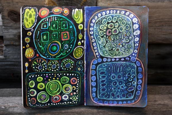
But after making these I realized how I would use the correction pen and what I would combine it with: watercolors! Here’s how you can create your own ceramic tile look!
1) Doodle with correction pen
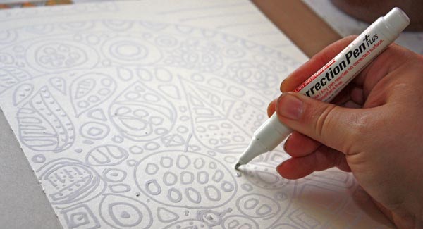
2) Use watercolors for coloring
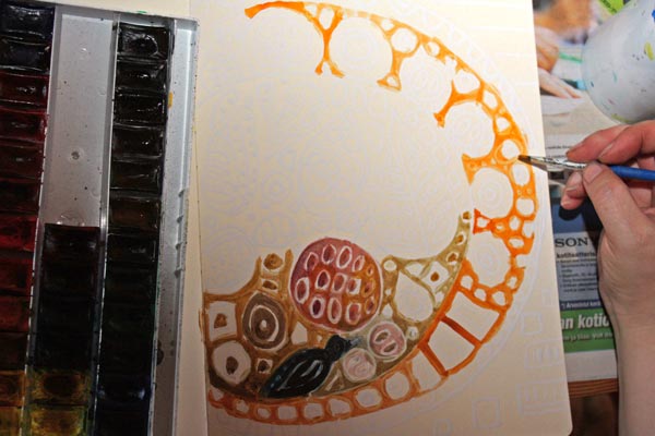
The correction pen works as a resist. You can watercolor over the white doodles. After painting add some water and wipe the paint off from the doodles.
3) Add contrast and draw thin black lines

When you are done with watercolors, don’t stop yet. Add color variation and contrasts to doodled shapes. You can also work with colored pencils when finishing if it feels easier. Finally, take a thin black marker and add thin lines in the center of white doodles or both sides of the doodles. These lines will make your work look sharper and more dimensional.

Here you can see the difference that finishing makes. At this stage, I have also added the poem. Actually, my process began by writing the poem. I have discovered that if I want more depth in journaling, it’s better to write it first.
Have fun with this simple technique!
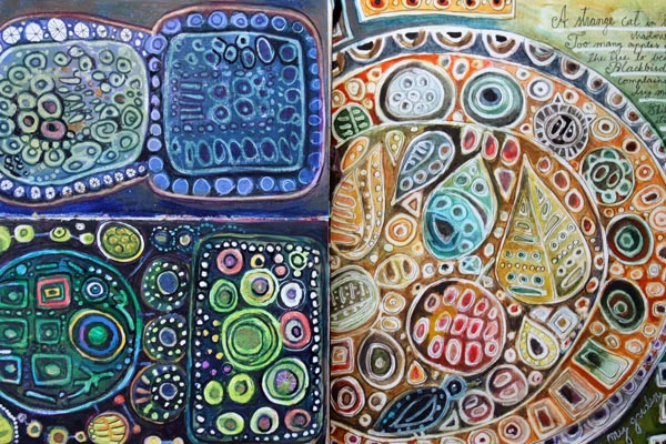
More ceramic art inspiration and playing with simple shapes
>> Modern Mid-Century art journaling mini-course
Express Yourself with Colored Pencils
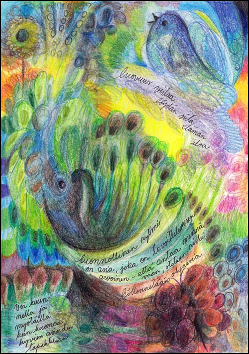
Simple art supplies fascinate me. Colored pencils have been my favorites recently. They are so easy! There are no worries about making the pages too thick even if there’s a lot of layers.
Colored pencils seem to be used for traditional artwork mostly. I think they are as suitable for improvising as any other media, like watercolors. In this post, I will show you few easy techniques for expressing yourself with colored pencils.
1) Color by Doodling
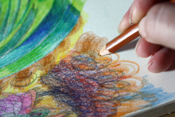
Starting with a blank page or paper, draw circulating and continuous lines to color a small area. Then change the color and continue. Create layers and let the colors intersect. You can get a wide range of colors with layering. Think your pencils as doodling tools!
2) Rotate the Page while Coloring
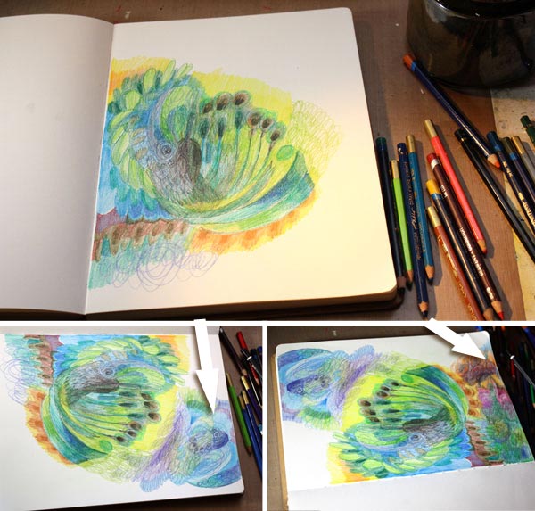
You will get more variety and interest to the page if you rotate it while working. Work one area at a time, changing the orientation once in a while. The areas can be fairly large as in my page, or smaller.
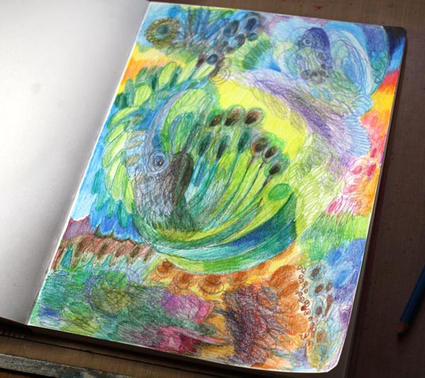
Here’s the page before I used the eraser …
3) Use Eraser to Create Lighter Areas
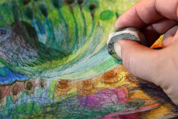
Erased areas bring light to the work. In an art journal page, use the eraser for the areas where you want to write the journaling.
4) Add More Clarity

I am a big believer of finishing. When you improvise, the result may be self-explanatory for you without the finishing touches. But if you want to communicate with others too, then sharpening some areas and adding some layers here and there for more intensive color is a minimum. I realized that my page had some animals in it so I made them easier to see. Like the photos include sharp and unsharp areas, you do not need to work through the page. Picking the focal points and working with them is often enough.
Coloring with Pencils is Like Painting by Drawing
By discovering these easy techniques, I have learned to love colored pencils. It is like mixing painting with drawing. With colored pencils, you can have a gorgeous art journal or a unique greeting card collection! Show your free expression with colored pencils!
Express yourself with colored pencils! >> Buy Coloring Freely!
Move Towards the Flow State!
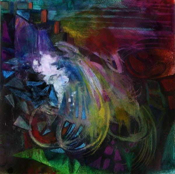
This mixed media painting is called Waterfall. It is inspired by the light in dark spaces.
Last week, I visited two places with old glass windows. The first was National Museum of Finland in Helsinki. The second was the Finnish painter Pekka Halonen’s summer cottage “Halosenniemi” in Tuusula. Both of them were built at the beginning of 20th century. Despite their windows, there’s fairly dark inside. While walking there, I saw how dark colors can be seen as soft and how daylight can look sharp.
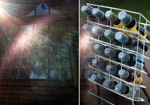
Perhaps the especially hot summer weather had it’s role too. No wonder I thought so positively about shadows and … water! I was tempted to use color sprays for this artwork. That way I could work outside and move around while creating.
A Big Mess with Acrylic Paints
Before spraying, I used acrylic paints to create color areas. They would work as a resist so that I could reveal them again after spraying. But the most important thing with the acrylics was: I grabbed a wide brush and said goodbye to rational thinking.
When you start with big brushes and create intersecting layers, you will naturally get into the creative mood. You will also begin to move. It’s often necessary to even stand up to make those big strokes wide enough. Check the front page of Heikki Marila’s website. He is a Finnish painter who creates huge paintings inspired by art history. See how those paintings are created, lots of movement there!
Also remember to change and mix colors as often as possible! Think that you are climbing towards the flow state where the creativity meets the happiness! Each interruption, the change in the movement and color, is one step closer to the flow.

The mess that I created with acrylics made my rational side cry and emotional side warm up. I was ready to get some fresh air and start even the bigger mess with sprays.
Entering the Flow State using Spray Mists and Handcut Stencils
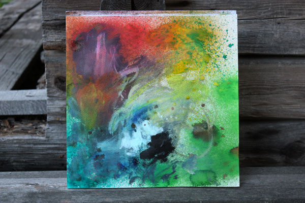
Here’s the first sprayed layer. Moving around the lawn and shaking the spray bottles were like a jump towards the flow state. I shook away the last rational thoughts and entered the happy state. I was flying.
Now, this is important: Be prepared to work quickly! When you get creative, you will get faster. There should be no need to rationalize what to do next or where to get the materials. They all have to be there. I had taken the scissors and a piece of paper with me. That allowed me to create stencils while waiting the layers to dry. I had also set up the blow dryer near the back door.
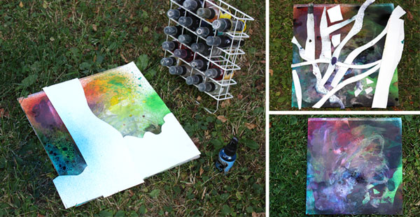
Running around the back garden with spray bottles, then inside to dry layers, then back again, I sprayed about five layers in total. As a result, I got the ugly mess shown in the photo right below. But I was not worried. I thought it looked amazing! One good thing when moving towards the flow: the inner critic leaves far behind!
I ended the day with spraying some areas with water. When wiping some of the spray ink away the acrylic paint areas were revealed.
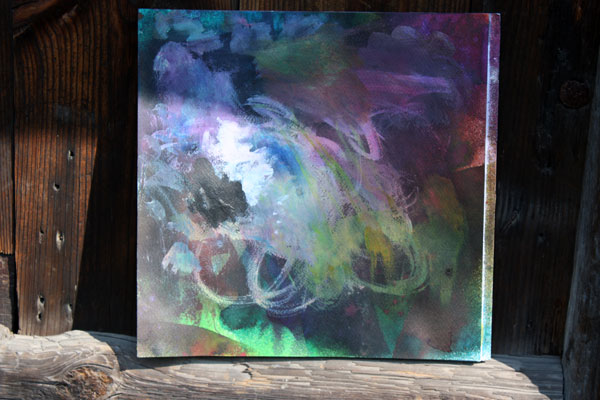
Next morning I had a problem to solve. How to finish the painting? I decided to create small geometric shapes with colored pencils to resemble the sharpness that light makes in the dark space.
Finishing with Colored Pencils
When using big brushes and big movements, creating details with small strokes adds interest and balance.

Colored pencils are wonderful to highlight the best and reshape the worst areas. When working with small details, I try to focus on one small area at the time.
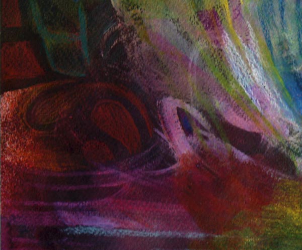
In the “big” phase, my focus was in the big picture. Now, when working small, my focus is in the details.
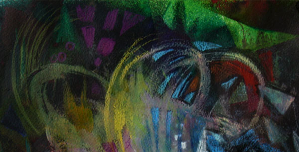
Balanced Composition
When I had gone through all the areas, I began to look at the big picture again. Then I made the final tweaks. So here it is:
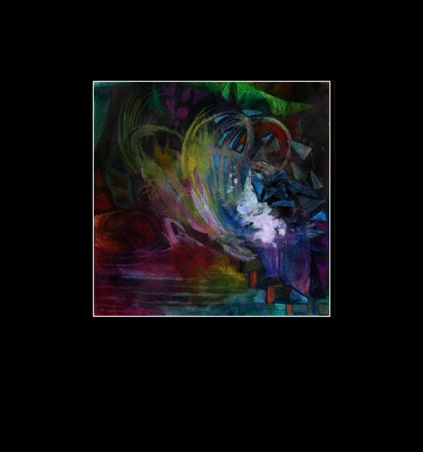
Hmm … wait a minute! Now it is upside down! Well, while coloring the work, I thought the direction would be this. But then, I noticed that it could be any of these three:
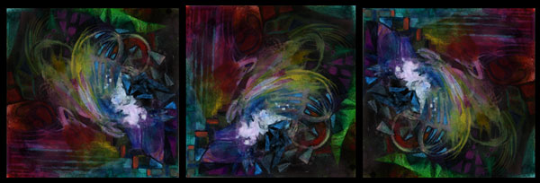
If the composition is balanced, the work will look balanced in any directions. By changing the direction, you can test if your composition is successful. Still, I rarely come to the result where changing the direction not only works but also tells the same story. I think that moving around the lawn had an impact here!
Experiment this in your art: Try to include physical movement into your creative process!
Subscribe to my weekly emails – Get a free mini-course!