Flower Time – Watercolor Video
This week, I have a treat for you – a free video about painting flowers. In the video, I claim:
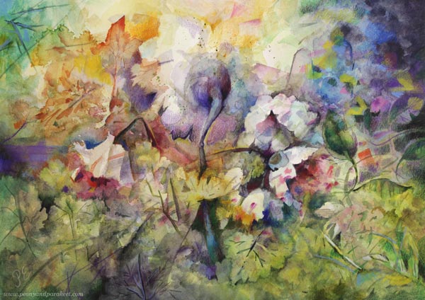
“When you create art, sometimes it’s adventurous “bird time,”
and sometimes driven by the need for beauty and comfort, so “flower time.”

I believe that we are not only inhabited by an inner bird but also by inner flowers. At the adventure, the flowers are only seen as passive decorations. But when you get friends with the flowers, you notice that they are active characters who like to get together. The inner bird is a hermit adventurer, but flowers tell the common story. This togetherness is also what we need as humans.
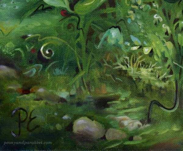
“Janonsa sammuttaneet” could be translated to “those who have quenched their thirst.” In this painting, I thought about wallpaper and how its flowers jump from the wall to quench their thirst.
Flower Time – Watch the Video!
Everytime I see a bird flying across a landscape, I feel the need to paint something big, dramatic, and immersive. Art invites us to fly high and see far – to live the adventurous life of a brave bird. Imagination is our inner bird that wants to experience new things and move forward … Watch the video!
More instructions for flowers in watercolor: Buy my newest course Freely Grown!
Flower Portraits
I used to think of flower paintings as still lifes, but now I look at them as portraits. The delicacy of flowers makes my inner bird rest and roots me in a comforting life. From the inner bird’s point of view, there are always new sceneries to travel, and the world is never enough. But from the flowers’ point of view, it’s always good to look close to one’s heart and express that we are enough.

“Valosta voimaantuneet” is Finnish and means “Empowered by Light.”
Think about birds and flowers as symbols for two kinds of art – the other is adventurous and escape-seeking, and the other is easier to digest and connection-seeking.
What do you think of this? Do you have more “bird time” or “flower time?” Leave a comment!
Painting Flowers Freely with Watercolors
This week, I share thoughts about my new course Freely Grown, and about its central idea of allowing the painting to grow freely.
I’ve been in a really good mood lately. I have two great sources of joy. The first is that a new period in my life will begin this month when I start a year-long half-time grant period for digital artwork. Another source of joy is the new course Freely Grown, which I started making in the summer and whose material I have now been finishing.
Freely Grown
This course has been like a friend to me and I hope it will be like that to you too. Like paintings, courses also have their own character. This course is both playful and goal-oriented. I usually look for a suitable course name for many months, but this one gave me its name right away and I haven’t even thought about alternatives!
I’ve been so enthusiastic about the subject of the course that the abundance of plants is appearing in the work planner too.

Painting Flowers Freely
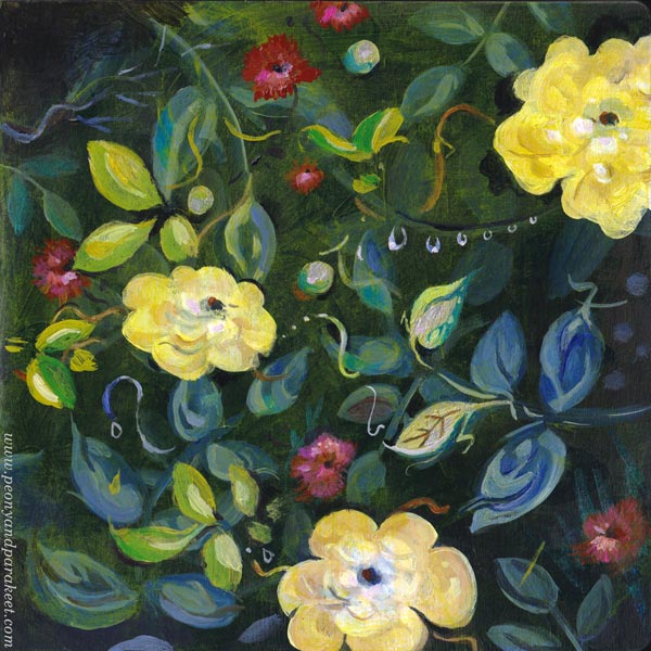
I am really inspired by the idea that a plant can grow freely. I don’t think it has to be a wildflower at all. Even if a plant grows in a flower bed, the gardener can let it sprawl. Similarly, our lives can have certain routines and restrictions, but still, imagination can grow freely.
When the brush spins and twists on the paper, it’s wonderful to indulge in its play. The painting can also grow freely.
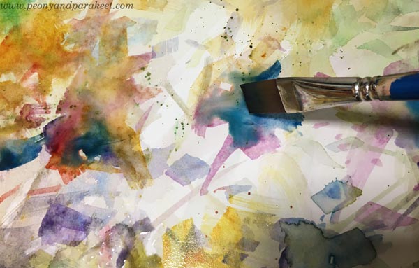
I like to consider that a painting is an independent party, not so much an extension of my own self. When I relax a little about what I want and let the painting suggest a direction, a new kind of pleasure is offered, even an adventure!
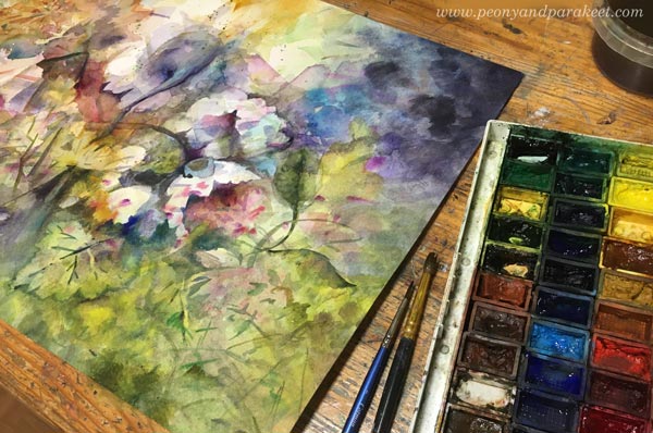
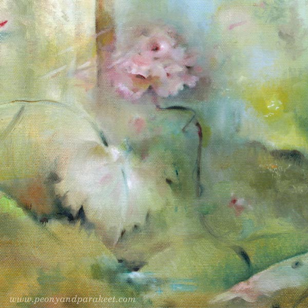
A surprising thing in this painting was that the largest flower suggested turning away from the viewer. I wondered if I could let it do that. Would the setting look impolite?
But when I study old flower paintings, their natural charm is that the flowers stretch out in every direction. So why couldn’t we let our flowers grow freely where they want?
Only when the painting was about to be finished did I realize that the flower turns towards the light as if to welcome a new era! When you give the painting freedom, you always get more than if you strictly control it.

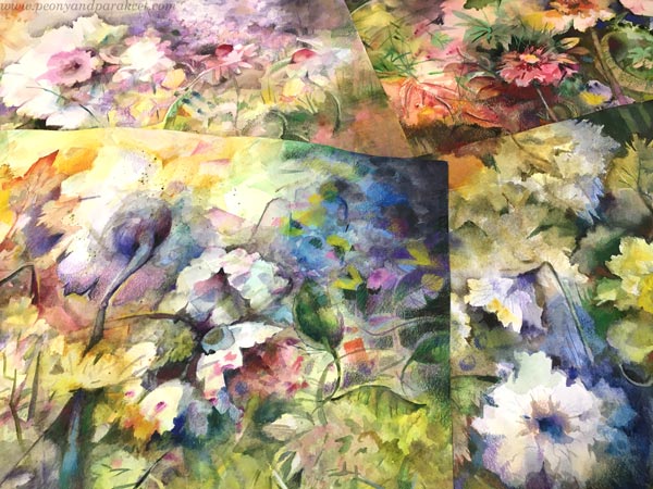
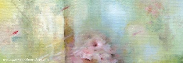
I think this A3 size (11.7 x 16.5 inches) is really nice because it’s big enough. It’s hard for the flowers to look expressive if they are very small.
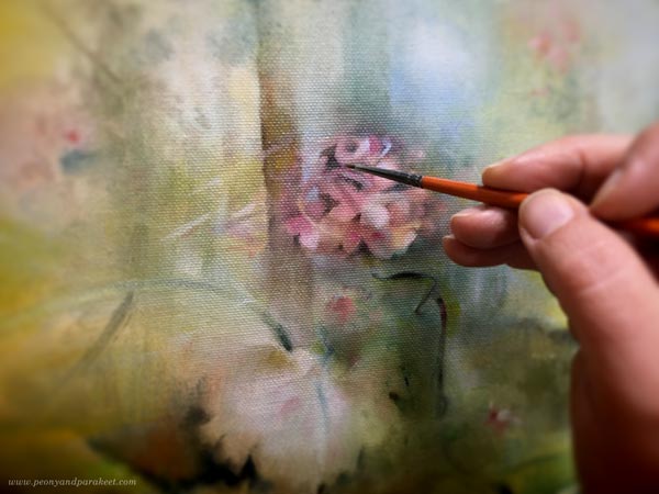
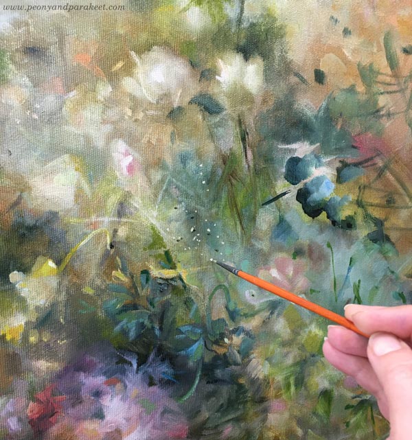
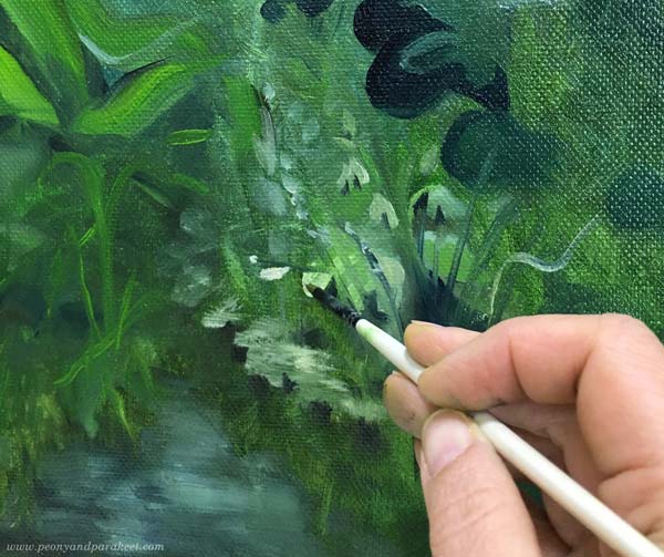
Coloring on Watercolor Painting
When I finish with colored pencils, I aim for the colored parts to continue painting naturally.

Here you can see a close-up of the coloring. I always leave watercolor visible too.

I’ve done a lot of colored pencil stuff in the last couple of years and the number of pencils has reduced. But it’s fun that every now and then I can buy an out-of-stock color and introduce a new arrival to the old pals.

I love this abundance of flowers – born by painting freely, without reference pics!
I hope you will come to the course!
Finding Emotional Connection Through Imagination
Imagination and emotional connection go hand in hand in art-making. If you don’t feel a connection with what you are creating, bring in more imagination and treat different areas of your work as characters – even if you won’t be including any humans. Let’s look at this example!
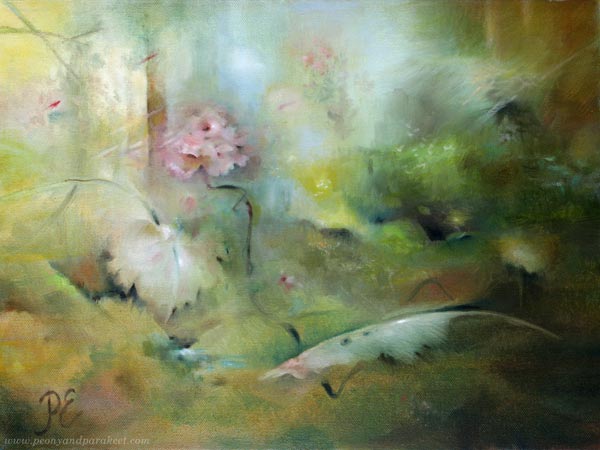
This small painting is part of a series I made for the Albert Edelfelt Foundation exhibition. It will take place in August-September.
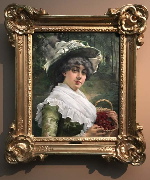
Inspired by Albert Edelfelt
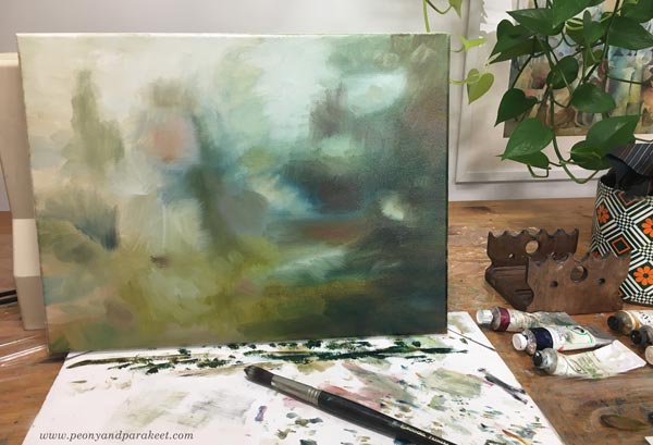
For the colors and composition, I was inspired by Albert Edelfelt’s artwork “Koivujen alla – Under the Birches”. It is not this painting that I photographed in the Albert Edelfelt exhibition at the Ateneum Art Museum, but another similar work that I made a mirror image of.
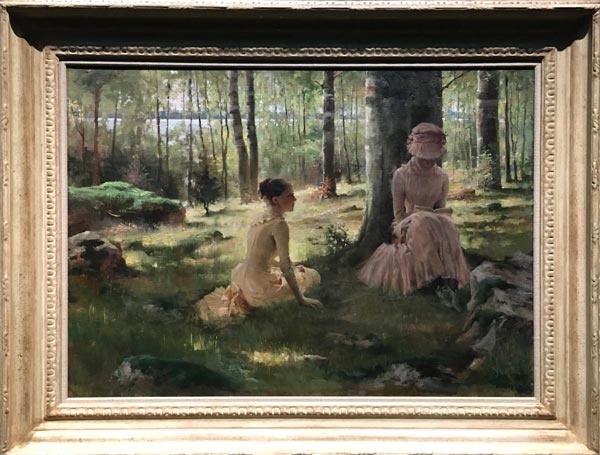
However, I was more inspired by another “Koivujen alla.” See the picture here!
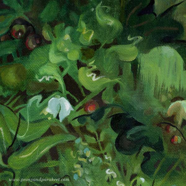
My version of “Koivujen alla” didn’t have any people. Instead, I used my imagination to depict human characters in the form of a plant and an object.
Combine Inspiration and Observation!
A good way to get the imagination going is to combine two different things. For example, if you saw an artwork that inspired you to create, also gather unrelated observations from your surroundings. This way, you need your imagination to bring them into the same image.
In this project, I remembered a pine seedling that I had seen in a nearby rocky forest. The name of the area is Pöllökallio (owl rock) and we often go there with our dogs. This little pine tree was like a bonsai! It was so sweet that I took a photo of it.
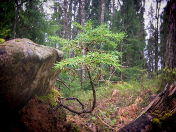
When the pink color of Edelfelt’s painting met a crooked stem of the pine, a tree-like rose was born!
Emotional Connection by Asking: Who is This?
The rose became the most challenging part because I wanted it to resemble the woman with a hat in Edelfelt’s painting. I thought about the hat when I painted a rose, but it didn’t work at all.
But then I came up with thinking about the character of the woman instead of her hat. That way my imagination met the emotional connection, and I quickly got the impression I wanted.
Build a Story to Boost the Emotional Connection!
One of the most common problems is that our art is full of separate islands. The sun might shine but the effect doesn’t show elsewhere. The person may smile but the eyes are not affected. There may be three ladies but what are their roles? Use your imagination to find connections between these islands and add elements that make the overall story make sense!
In my painting, there are not two women like in Edelfelt’s painting, but a rose, a leaf, and a feather – three introverts! The rose reaching for the sky has agreed to be the center point. The leaf examines herself through the pond. The feather has been a part of a bigger adventure and is now ready to shift the focus to others.
The small pond is a central element here. It brings the leaf and the feather together.
You can also see the colors of the rose elsewhere in the painting. For example, there are flying thoughts (red lines) that the rose tries to catch, and a bigger punch of roses that is in the background.
The painting is about three romantic introverts who went on a trip to a rocky forest on a lovely summer day. They are together, but in their own thoughts, just like the women in Albert Edelfelt’s painting.
When we paint or draw people, we hope to bring the character to life with their facial features. But we don’t need facial features to find an emotional connection. Once you get the hang of it, you can draw or paint anything, even just different shaped spots on paper.
What do you think?
Imagining Flower’s Spirit
When you want to draw or paint flowers that look unique and alive, imagine their spirit and discover what they would love to wear.
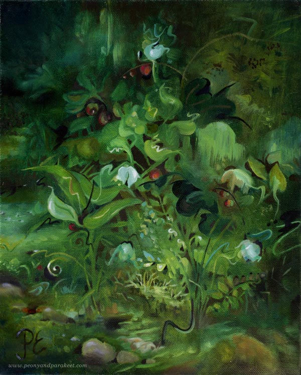
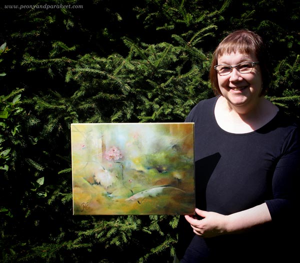
Art is not only about techniques and replicating what we see. When you create, you have permission to imagine and be convinced that you know something more than anyone else. You are the best scientist in your imaginary world! In your world, you can mix different fields, like botanical illustration with fashion design. That’s what I did in this painting called Kielomieli.
Kielomieli – The Mind of Lily of The Valley
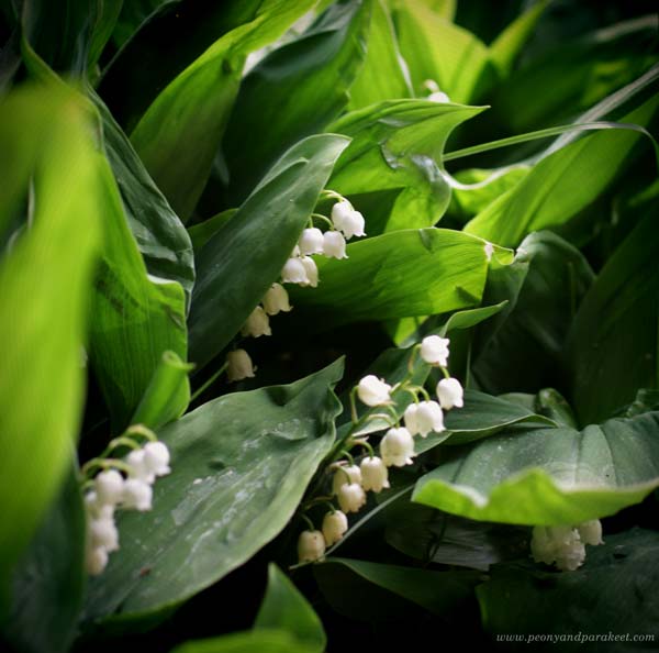
We have lily the valleys growing in our yard and even though I don’t pay much attention to them, I feel like I know them. That plant spreads in the shade and may seem modest, but its mind is always alert and it observes the world sharply.
This little flower also knows how to influence people. Even before I was born, in 1967, Yleisradio, the Finnish national broadcasting company, organized a vote for Finland’s national flower and the overwhelming winner was kielo – the lily of the valley. It makes Finns kneel and admire its fine shapes. Unlike other flowers, the color is secondary to the lily of the valley, until it produces berries. With berries, it underlines that it is not just a white, innocent little flower. Everyone knows their toxicity.
The lily of the valley’s mind is a group mind where everyone dances to the same rhythm. It still doesn’t mean that a single plant would not also be an individual. She just doesn’t share her own thoughts publicly.
Many people love lily of the valleys, but this plant is not a rose that craves attention. Even if it lies low on the border of the earth, its mind is more sublime than that of other flowers. It sees far and high, and nothing can discourage it.
Choosing the Style to Go with the Spirit
When you think about the flower that you want to draw or paint, ask her about her style and aesthetics. For example, is it bohemian, classic, gothic, or country? If the flower would be a human, how would she like to dress?
Clothes can express the spirit.
In flowers, the details of petals and leaves are also very similar to the folds and seams of clothing. I often find it helpful to think about dresses, hats, and jewelry when painting plants.
I imagined the lily of the valleys to be formal and stiff. They wouldn’t wear a bathrobe in a photo but choose a classic-lined dress or a jacket. So I chose to paint them in a decorative style. First, I practiced painting roses in that way – see this blog post for more instructions!
I have noticed that making a study speeds up my painting process even if the final painting would be different.
Once I had “loaded” that decorative style to my hand, I painted Kielomieli – the lily of the valley’s spirit.
Flower’s Spirit – Flower’s Portrait!
When visualizing the flower’s spirit, think about yourself as a portrait painter.
You don’t need a face to express a flower’s spirit. When the color choices, shapes, and lines are aligned, they all paint a picture of a character.
I hope this blog post gave you new ideas to break the glass between reality and imagination!
