
Get Intuitive Focus + Reader’s Comment!

“I am all over the place. I need to focus”.
It’s what I often hear when people talk about their creativity.
I used to scold myself there too. After a quilting class, I swore I would use all my creative time to modern quilting only. But after finishing one quilt project, I was ready to knit again. I questioned myself when I drew because I had just made a promise to focus on painting. I found it impossible to stick to one style or one genre of creating, and I saw that as my worst weakness.
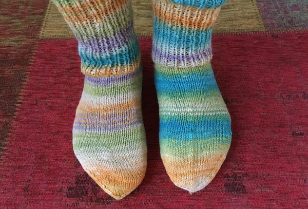
But the more I have been into intuitive art, the more I have realized that creative people often underestimate the connections between what they do. The more conscious I have become about how my creative process works, the less I need to criticize my natural behavior.
4 Ways of Creating
I classify creating as:
– reflecting by creating
– generating ideas by creating
– imagining by creating
– and finally, focusing on the insight you’ve got by creating
If I write about past events in my planner or knit, it’s reflecting. When I get ideas, I create art journal pages or quick craft projects. With a collection of ideas, I can gradually gear my imagination towards the bigger themes that I want to express.
When I create just to save my ideas, I don’t work for hours to get everything right. It’s a piece that had to be created so that I can move on. But when I am creating a bigger project, like my big canvas painting last week, I fine-tune every little detail and put a lot more time into the project.
What Does Intuitive Focus Mean?
Intuitive focus means that you treat your activities as part of creative process. You continuously collect and process theories, techniques, ideas, approaches so that you can create your best pieces now and then. You embrace diversity in techniques, themes, styles, etc. Diversity will not be distracting if you spend enough time for reflecting.
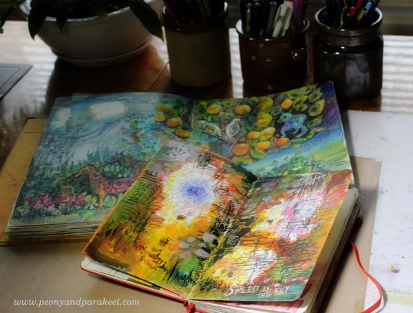
Once you do this, you will get in touch with your root problems:
Your lack of focus on one activity or idea turns into a lack of ways to combine it all together.
Your lack of focus on one technique turns into a lack of foundation that can be applied to many techniques.
Teaching Art – Reader’s Comment
In my last weekly email (do subscribe!) I wrote about whether teachers share openly or not and why would they not:
“Last week, I read a comment somewhere on the internet. It praised a teacher about sharing openly. The commenter also said that she often gets the feeling that teachers hide something. Even if this was not about any of my classes it made me think. Do I share openly? Why would a teacher not share openly? When building classes, I try to focus on the essentials and be understandable, clear and not all over the place. That’s good, right?”
“But when teaching intuitive art, I have to admit that almost anything can be meaningful to the process. A random thought can steer the painting to a new direction. So I decided to add more video to my next class Nature in Your Mind showing how I ramble while creating and how it affects my painting. I also show how I use music to help me let go. While recording, I felt vulnerable. Every time I became silent, I forced myself to ask: what did I just think? There’s also the pressure of time. I can’t create for 7 hours and then make an educational video out of that.”
“So I have to choose smaller projects for the exercises and recordings. But truly, I don’t intentionally hide anything. I don’t think many teachers do. For some, explaining is more difficult than for others. Some find it difficult to give honest feedback. When I started teaching, I made a promise always to give as useful and as personalized feedback as possible while the workshop is running. For many, understanding the slight changes they can make is a game changer. It’s a pity if the teacher never points out those. Probably that’s the situation when the teacher seems to be hiding something. What do you think?”
Meri Andriesse wrote to me as a response to the email:
“I sign up for a lot of workshops in painting and mixed media and I find they vary greatly in content. To be honest, I don’t think some teachers have enough substantive content in their classes and they rush through without explaining why they are doing or not going or un-doing something. So much of what we see and hear focuses on the intuitive part of creativity but I think in order to use intuition you really need some foundation in composition and color theory/experimentation. Your workshops offer that and more and that is why I continue to sign up for them even though I don’t have adequate free time for art making.”
Teaching art is often based on process videos only. Meri comments that too:
“Videos are great, but I also appreciate the pdf documents and diagrams and photos. I wouldn’t hesitate to recommend your classes to anyone really interested in growing their art-making.”
Create intuitive art + set a foundation for your creating!
>> Sign up for Nature in Your Mind!
This is the last chance to register! The registration will close on Oct 10th midnight PST.
What’s in a Good Composition?
Quick question:
When you create art, how much time do you spend for composition?
I mean: trying to make it work, trying to balance it, trying to make it look more eye-catching?
For me, finishing the composition can take as much as 50% of my creating time! Some years ago, it was easily 75 % … I don’t find adjusting the details particularly relaxing. I take photos, use a mirror, and change the orientation of the piece to see if I have missed something. Sometimes I sleep overnight and make the last adjustments in the morning.
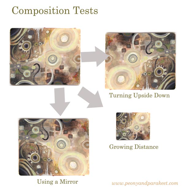
But teaching art has had some benefits here. I get to help people to make better compositions and thus, I have become faster. Namely, the two top requests that I get in my classes are: 1) How can I make this look finished? 2) What more could I add here?
So when I created a new class, Planet Color, I wanted to build a step-by-step creative process so that when you add elements, you don’t have to worry about the composition so much. I wanted to find ways that support you so that you can release your mind and fully enjoy working with colors.
What’s in a Good Composition?
Here’s my conclusion. A good composition has elements that a great party has:
1) concierges who invite the viewer to the painting
2) a star singer who takes the viewer’s attention
3) clear routes and breathing space which make wondering around easy
4) good food and good company which makes the viewer stay in the party
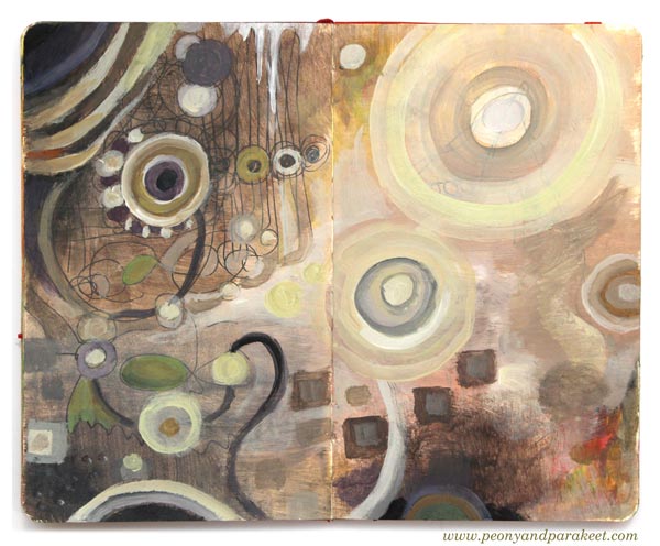
I have built all these elements in one 7-step process. It doesn’t mean that this process produces identical paintings. It means that when you enter the finishing phase, you have already done most of the work you should do anyway. But without all the agony and with all the creative enjoyment! That’s why my workshop Planet Color is as much about composing elements as about releasing your mind with colors.
And again, if you have problems in making the final adjustments, I am there to help for all the 14 days.
See you there!
How to Transform Ideas into Paintings
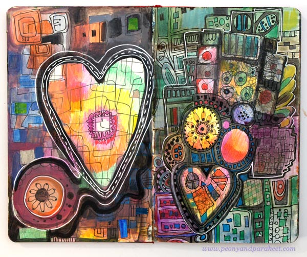
I am an idea person. When I get exposed to new things, my mind fills up with new ideas. Most of the ideas that pop into my mind are not that good. They are either too conventional or too radical. Some ideas are impossible to implement, and some have nothing to take on.
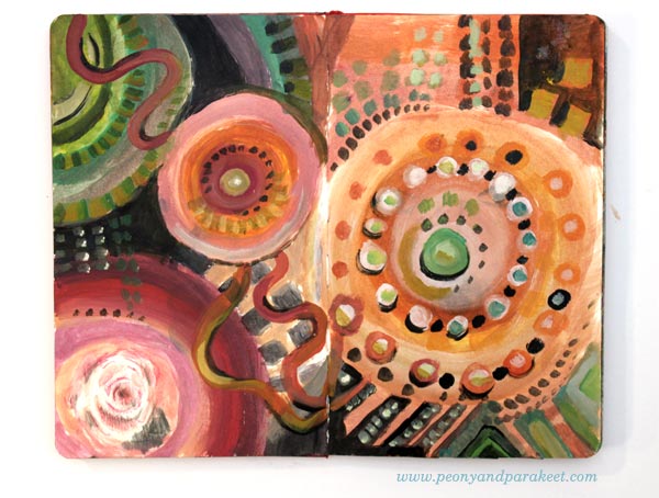
When I was a child, I happily filled the days playing with what came to my mind. But when I was studying computer engineering at a university, I became a master in shooting down my ideas. It may sound depressing, but it has led to a brilliant realization for me: the number of ideas doesn’t equal to the number of projects. When you have limited creative time, you don’t have to divide it with all your creative ideas.
Raw Ideas – Bad that Produce Good
When a new idea comes to your mind, call it “a raw idea.” If you get visual ideas, quickly sketch them on your journal. If they are more words than images, write them down. Don’t over-analyze your sketches, treat this just a routine that makes you move on and continue producing new ideas.
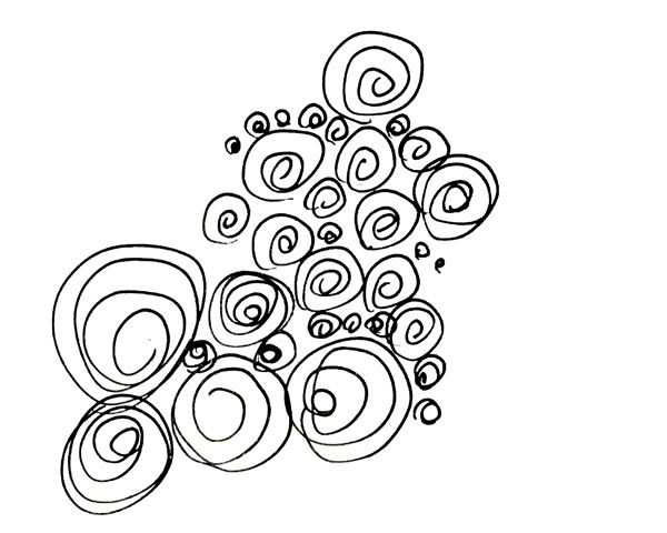
Raw ideas are often not so great, and you have to be careful not to spend too much time in implementing them. Raw ideas are like raw potatoes. Add some rosemary, salt, pepper, olive oil, carrots, onions, and zucchini and put them all in the oven for 30 minutes, and you will have a brilliant idea.
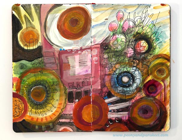
Many believe that getting new ideas is the thing. They fall in love with their raw ideas and then get disappointed with how they look on paper. But the essence of creating is in the processing. It’s about combining tens of ideas into one focused idea.
Record Everything!
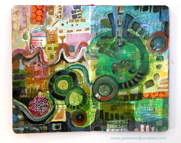
We humans are very similar to computers in one aspect. We have a limited capacity of processing unsaved ideas. If you never draw or paint or write down your ideas, the processing of them becomes difficult, almost impossible.
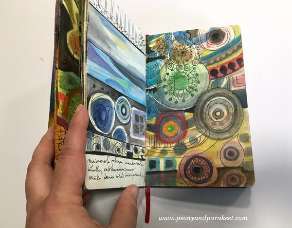
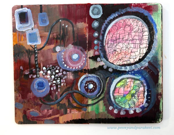
I often have an illusion that if I just think a little bit longer before I begin painting, l can start with better ideas. But then I remember that it’s just the opposite: when you see your raw ideas on paper, you can make them better. When you use the raw ideas to create the new painting, you can then visualize stories instead of creating single conventional elements.
From a Disappointment to a Happy Art Journal Page
Here’s an example of how a conventional raw idea can turn into an expressive story.
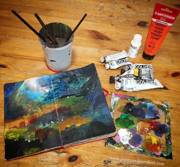
When I am finishing a painting session, there’s always the same problem: I still have paint on my palette. Have you confronted this too?
It doesn’t feel good just to wash it away, so I take one of my art journals, and use it up. I often feel tired already, and painting isn’t particularly inspiring, especially when there’s a limited amount of colors left on the palette. I made this gloomy landscape on one of those moments. The painting looked sad and empty. It felt like I had wasted my time for a lousy raw idea. But then, another day came, and I got the idea to add pastel elements in the dark painting.
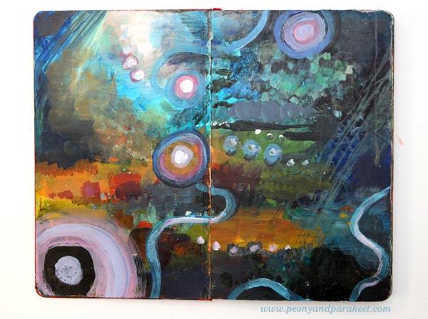
While painting, I remembered a television series, The X-files, that we used to watch with my boyfriend, now a husband, a long time ago. When an episode began, I always whistled the tune then grabbed my knitting. Although the episodes were terribly exciting, we always laughed at the whistling. The same mixture of suspense and happiness entered my spread after adding the pastel elements. The painting that had no real emotional connection became a reminder of a happy memory.
Ideas that Keep Coming Back
When you sketch ideas, you will also notice that most of them are very not different from each other.
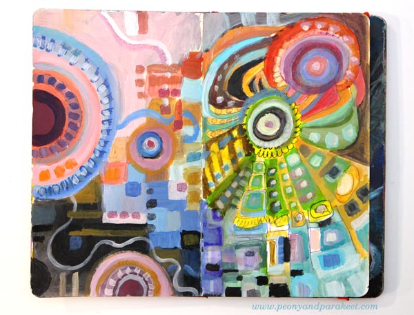
This similarity of ideas is fascinating. When I come up with the same idea again and again, I have to find out what’s behind it. Why does my mind repeatedly travel to the same place?
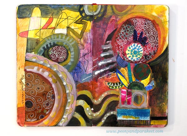
When preparing for the fall, I was about to release only one new painting workshop: Nature in Your Mind. It’s an online class where I have processed a lot of technique ideas to give you the very best experiences and results in painting. But while working with Nature in Your Mind, I had one more idea that I kept shooting down again and again. No matter how much I did that, it always came back. I saw color. I saw circles. And yes, I sketched them hundreds of times just to get rid of them! But then one day I said to myself: “Ok let’s find out what behind this idea.” So I discovered a compelling formula for creating abstract paintings so that you can fully enjoy painting with colors.
Planet Color – Get the 7-step Formula!
With the 7-step formula, you can release your mind and focus on color. You can create unique paintings while experimenting with unique color combinations. You can work with your raw ideas and combine them to a bigger picture. The workshop is called Planet Color, reserve your spot now!
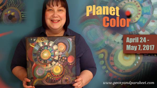
Enjoy colors and release your mind!
>> Sign up for Planet Color!
Limited Creative Time – A Personal Story
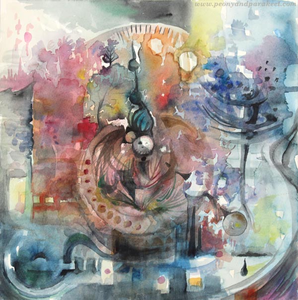
Here’s my latest watercolor painting “The Sense of Time”, made just a couple of days ago. I limited my creative time immensely when painting this. But this time I want to share the whole story, not just images of how I made the painting. At the same time, you will see some of my summer crafting projects and learn a couple of fun facts about Finnish summer.
Peonies Embrace the Midnight Sun
When people ask what would be the best time to come to Finland, I always suggest summer. Finnish summer begins in June and ends in August. In my opinion, the best month is July. Even in the south, where I live, you can experience the midnight sun, warmth and see the best in Finnish people. Like peonies, we are all introverts in the dark and cold winter, But when the sun comes up, it’s all smile.

Colors Compete with Shapes
My husband always has his summer vacation in July. As dog owners, our possibilities to travel are limited to day trips unless we take them to kennels or arrange somebody to look after them. As both of us love old art and antique, we always go to Billnäs and Fiskars for an antique fair. If you have watched a British television series Lovejoy, these are the places where you could see him and his assistants if they traveled to Finland. There are two antique fairs at the same time. They last 4 days and are packed with people selling and buying antique items in the middle of Finnish countryside. The fairs are partly indoors, partly outdoors and truly a collector’s heaven whether it rains or shines.
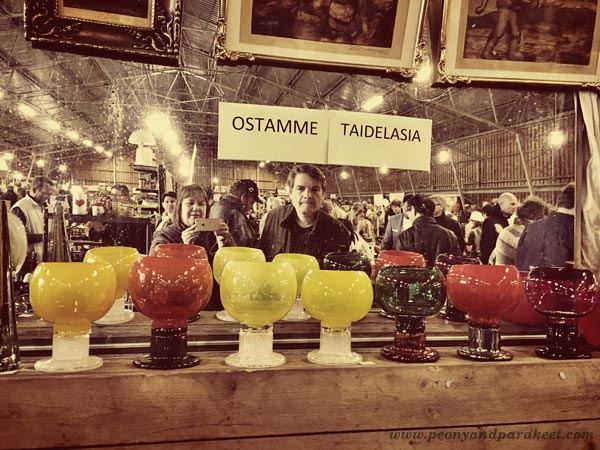
When looking at the sales tables, I always notice color first. My husband, a skillful woodworker, examines the shapes. Together we are unbeatable!
Art Rises from the Dollhouse
It was both unfortunate and fortunate that I found an old display cabinet from Billnäs. Fortunate, because it’s just what I had dreamed of for my doll collection. Unfortunate, because I didn’t have the space for the dollhouse anymore. I had to empty the tiny kitchen with miniature wine bottles and delicacies as well as all the other tiny rooms filled with similar items.
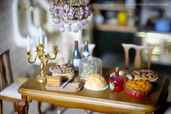
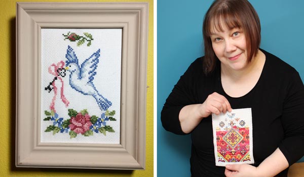
While taking the little paintings off from the walls, I realized that one of them wasn’t just printed image. It was a cross-stitch project that I had made years ago! I remembered not being very happy with it. When I started it, I thought that I could make more than one and then sell some. I didn’t have any pattern and the end result didn’t look as painterly as I would have wanted. So I gave up the idea of making more and placed the piece above the dining table, in the spot where it wasn’t as visible as other pictures. No wonder I had forgotten it!
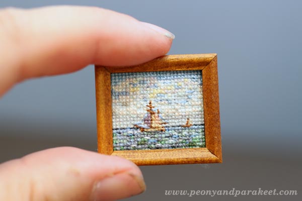
But now, it looks just perfect to me. Now I see more than just clumsy stitches. I see how my love to combine arts, crafts and design came out even when I was decorating a dollhouse.
William Morris Visits Ikea
One of my creative routines is organizing things. Even at antique fairs, I sometimes get the urge to rearrange items and I have to restrain myself. This spring, I was organizing a storage space of our house and found an old Ikea Moppe mini chest of drawers. Putting old stuff to use is a creative challenge that I am often willing to take. I went to Pinterest, saw boards like this and was ready to get started.
The first challenge was that I also wanted to use up old paints. The only paint with the suitable quality was baby blue. I wanted to place the mini chest in the library room near my doll collection and store fashion doll clothes in it. I had a hard time seeing baby blue suit to the style and color scheme of the library room. We have decorated the library room in the styles of 1890-1930s. The curtains have William Morris’s pattern. How could the Ikea mini chest ever with the style? Trusting that I could figure it out, I refused to buy new paint as I had another purchase in mind. I wanted to buy ceramic knobs for it.
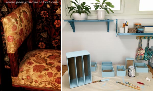
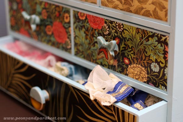
If I had to choose one material that I adore, it would be a difficult decision between ceramics and glass. But I think the winner would be ceramics. Even if I have never really dived deep into creating with clay, I love ceramic items. Especially if they are both decorative and expressive. I also like them to be a little rustic, have some handmade feel without being overly clumsy. The knobs I wanted to buy should also have some baby blue, some William Morris, look both old and modern and be traditional but somewhat innovative. Despite the high expectations, I optimistically began to search handmade ceramic knobs. It took a couple of days but my optimism paid off and I found just the perfect ones! They are made by an English woman living in Israel. Her Etsy shop is called “Clay is My Art”, a heaven for anyone who loves rustic, but sophisticated ceramics.

As you can see in the photo, I was able to find decorative papers that not only matched the knobs, they fit perfectly to the style of the library room. The papers with palm plants are leftover wallpapers. The other two are from my scrapbooking paper stash.
But wait, this story continues …
Leftover Flosses Praise the Pattern
Have you ever had anything in your home that was ok before you changed everything in its surroundings? My number one thing was a small key storage cabinet, which was fine in our old home on a muted dark red wall. But when placed on a bright yellow wall of our current home, it really bothered me. With the experience in cross stitching for dollhouses, I got an idea of stitching a dollhouse carpet pattern from Janet Granger‘s book Miniature Dollshouse Carpets.
It took all spring when working slowly but at the beginning of summer, I got it stitched. I also repainted the wooden parts. This time I did buy the dark green paint but this is still a project using leftovers. Namely, I didn’t just use the few colors set in the pattern. I used leftover skeins of embroidery floss creatively so that the carpet looks like an old antique one. I much prefer this look to using only a few colors.
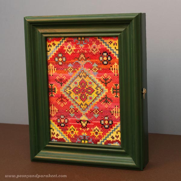
The cabinet looks great on the yellow wall. I temporarily took it down for photographing it in a better lighting. There was also another reason, connected to the watercolor painting …
Limited Creative Time – Craft Projects Inspire the Painting
This time I had limited creative time. Before I started painting, I placed the three handcrafted items on the table in front of me. The key cabinet, the mini chest and the miniature cross-stitch work were all there to inspire me. Then I glanced my watch and gave myself 15 minutes to paint the first layer. Namely, I had another project in progress too. I was editing one of the videos for Imagine Monthly Fall, the art journaling class that begins on August 1st. Editing videos requires a lot of concentration and I wanted to keep the quality good by taking small breaks. So after 45 minutes of editing, I had 15 minutes for my painting, all day.
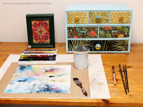
If you work in short periods of time like this, inspiration items become essential. Seeing the same objects again and again, even if you are not actually recreating any of them, maintains the focus and direction.
After four 15 minute sessions I was at the point where I had painted this and that with five different brushes but had no clue of what I was trying to express. It was fun to paint like this but clearly, I couldn’t finish the painting without setting up a longer session.
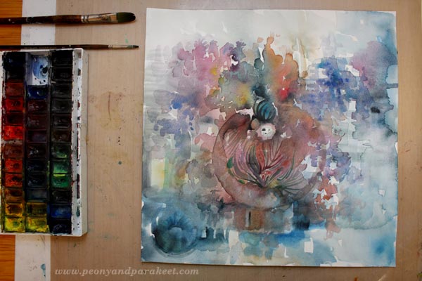
Finishing – Summing Up
I soon discovered that being so aware of the time had also affected the painting. I saw clocks and pointers which made me ponder about the concept of time. It flies so quickly in creative activities that it’s difficult to think about it as a simple measure. This, in turn, made me think about the antiques and how great designs last time. After my husband and I are gone, there will always be new enthusiasts who will drool over those Kaj Franck‘s bowls.
I often finish my watercolors with colored pencils to easily add new layers of details and decorative lines. But this time, I was reminded of my craft projects: “Make the most of what you currently have.” So I resisted the urge to go to another room and get the jars of colored pencils. It only took an hour to finish the painting.
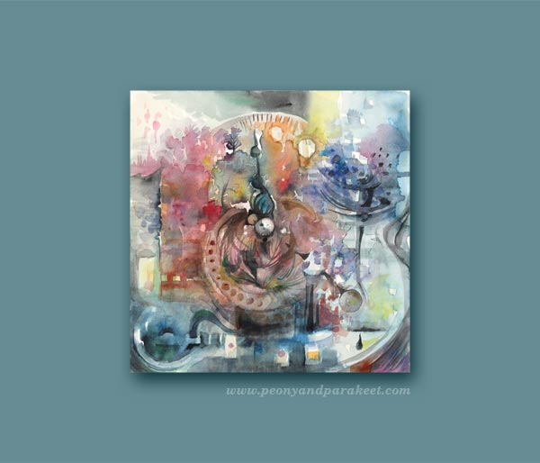
Some midnight sun, some glassware, mini horizons, small amounts of leftover colors, block shapes and last but not least: the description of how my inner artist sees the sense of time.
The Way I Process Ideas and Produce Classes
This blog post demonstrates how I work with ideas. It’s not only one idea that goes into one piece of work, it’s a collection of ideas that have different levels. Some are more abstract, others are more concrete. I believe that every good art class is filled with multi-level ideas that in turn, embark your own ideas. That’s why I never underestimate the importance of the background study that I do for my classes. I listen to audiobooks. I go to libraries to browse books. I collect Pinterest boards and inspirational items. I make sketches and paintings that I call pre-class paintings (yes, the one above is one of these). They prepare me to bring my best to the classes that I produce. They ensure that the class is not only about one whimsical thing that I fell in love with but about a holistic, yet clear and inspiring view to the subject. All in all, we all have limited creative time.
Sign Up for Imagine Monthly Fall!
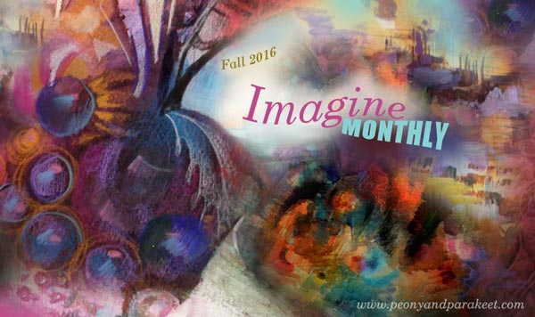
Take your art to a new level by practicing drawing and painting with themes inspired by fine arts. Express prestigious nostalgia, impactful aesthetics, and futuristic imagination through art journaling. Let’s make idea-full art journal pages your channel to move forward in art making!
Imagine Monthly Fall 5 challenges, great community >> Sign up now!